


Whether you realized it or not, you've experienced progressive disclosure.
Quite possibly when you found yourself 3 to 5 levels deep in your phone’s settings, possibly a little lost, just trying to adjust the intensity your smartphone’s vibration setting. Why is this function buried so deep in the UI, you might've wondered.
Most likely, it’s because vibration intensity is a setting you’ll only access once or twice in your phone’s lifetime.
And that’s what we call “progressive disclosure.”
What’s progressive disclosure?
Progressive disclosure defers advanced or rarely used features to a secondary screen, making applications easier to learn and less error-prone.
–Jakob Nielsen, “Progressive Disclosure,” Nielsen Norman Group
The core idea of progressive disclosure, then, is to highlight the most important actions site visitors can take, and offer more-complex and less-used actions deeper within your site structure.
Common uses of progressive disclosure in web design
However, progressive disclosure isn't limited to digital product design. You’ll find progressive disclosure techniques used in many different ways in web design, typically to control the amounts of information a site presents to a visitor.
Here are a few examples of progressive disclosure in action:
Expanding navigation menus (i.e., dropdowns and mega-menus)

Best Buy has a dropdown menu, with nested product category links for quick navigation. This allows them to simplify their navigation, and allow room for the search bar, which is likely used more often to find specific products. After all, it’s typically easier to just type in what you’re looking for, rather than hunt through a site’s information architecture.
Interestingly, Best Buy’s Products dropdown is expanded on load, a move they likely made to increase interaction with the menu, and to hint to visitors that the Services and Deals links will behave similarly.
That often proves to be one of the central challenges of progressive disclosure: how to hide content, but provide people enough “scent of information” to help them find that hidden content. Here the pre-expanded dropdown serves as an affordance that helps people “learn” the interface.
Sliders and carousels
Sliders have become one of the most common progressive disclosure techniques in web design — to the point that many would say they’re overused.
That said, showcasing products in this way can keep the user engaged and interacting with the site. Amazon takes advantage of this method to help people discover popular and related products, which makes sense — like most retailers, they rely on upsells and impulse buys.
Note how Amazon uses large arrow “buttons” that change colors to indicate which way you need to go to find more content.
The “hamburger” menu
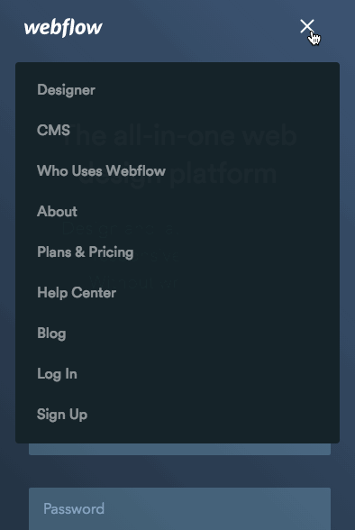
You’ve probably seen hamburger menus on hundreds of mobile, responsive, and adaptive websites — usually because it can be very difficult to pare navigational systems designed for desktops down to fit mobile screens.
It’s very important to make your site navigation experience a fluid and simple one. Just keep in mind that not everyone will recognize what functionality a hamburger menu hides. If your audience is very web-savvy, it probably won’t be a problem. But adding the word “Menu” shouldn’t impact your design much, and it will probably improve engagement with the button.
Other methods of improving mobile navigation include:
- Only displaying core pages in the main nav, and relegating the rest to your site’s footer
- Using tabbed navigation at the top or bottom of the screen, a la your Facebook app
- Regularly including links to other core pages in your homepage content
The “Read More” link

Many news sites and blogs use index pages that display article summaries along with a “read more” link to the full content. This progressive disclosure technique allows you to show your site visitors a wealth of stories up-front and let them easily access the stories that interest them most.
However, the “read more” link poses significant accessibility challenges for people who use screen readers. That’s why the Webflow Blog index doesn’t use “read more” links (outside the featured story).
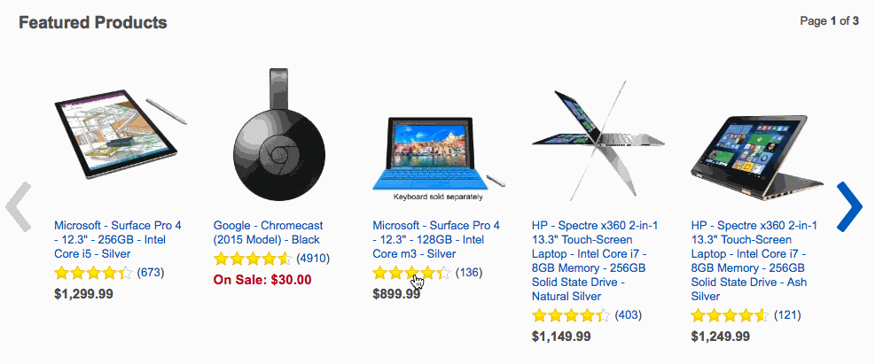
Pagination

Pagination can work really well when you have a lot of information to display, as in our web design ebooks.
However, you’re probably more familiar with an abuse of pagination: the divvying up of listicles into gallery-like chunks so as to get more eyeballs on ads. This ignores the fact that scrolling provides a better user experience than clicking.
If you must use this technique, make the pagination process simple and straightforward to create a fluid experience for your site visitors. And make sure pagination makes sense as a design metaphor for your content. It works great for ebooks and presentations, but otherwise can feel like you’re shoehorning content into a model it doesn’t fit.
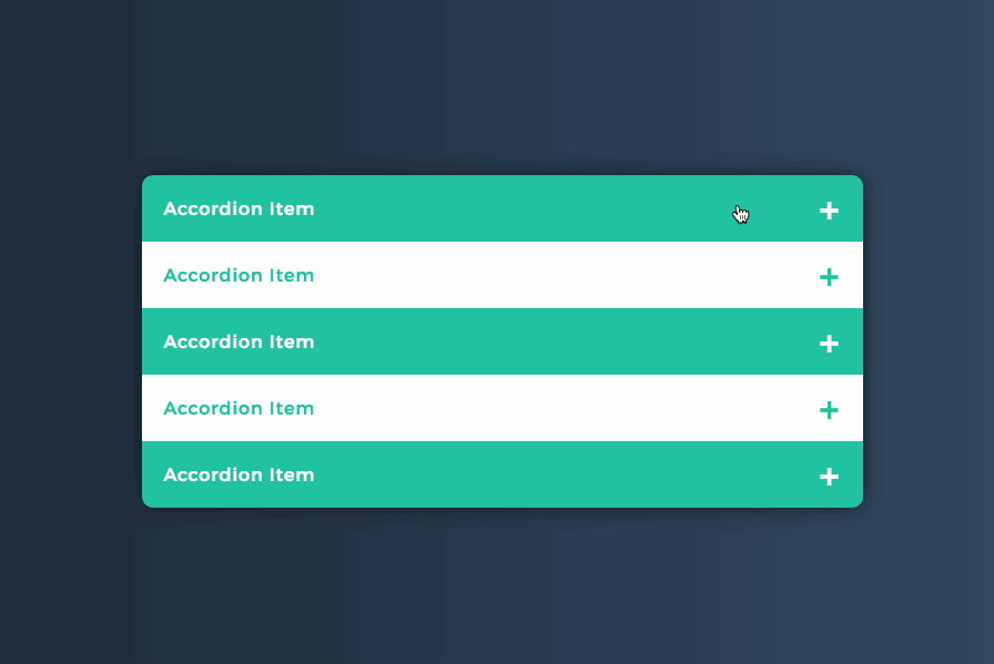
Accordion elements

Accordion elements can be very helpful when you’re trying to display a lot of information, but only some of the information will be useful to any given person. You’ll often see this used in FAQs, as well as in help center/support articles (where some people may only need to see the steps they need to take, while others want all the details).
Any questions or comments?
Have an example of a progressive disclosure technique you’d like to add, or a question on how to use progressive disclosure more effectively? Let us know in the comments below!


Free ebook: Web design 101
Master the fundamental concepts of web design, including typography, color theory, visual design, and so much more.
So now that we know all about progressive disclosure techniques, let’s walk through how you can build one of your own in Webflow.
You can quickly build a custom accordion menu in Webflow like this in a few quick steps:
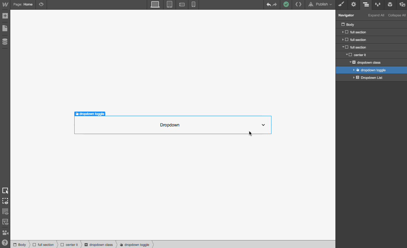
Step 1: Add a dropdown component, and style it
Open the Add Elements panel, scroll down to Components, and drop a Dropdown element onto the canvas. Then give the whole component a class name (I used “dropdown class” for this example).

Then select the dropdown toggle inside your dropdown, give it a class name, and style it however you’d like. I gave mine a width of 100% so it stretches across its container’s full width.

Step 2: Add a class to the dropdown list and style it
This step is critical. Open the Navigator tab on the right, select the Dropdown List element (which is nested inside the Dropdown component), and give it a class name.
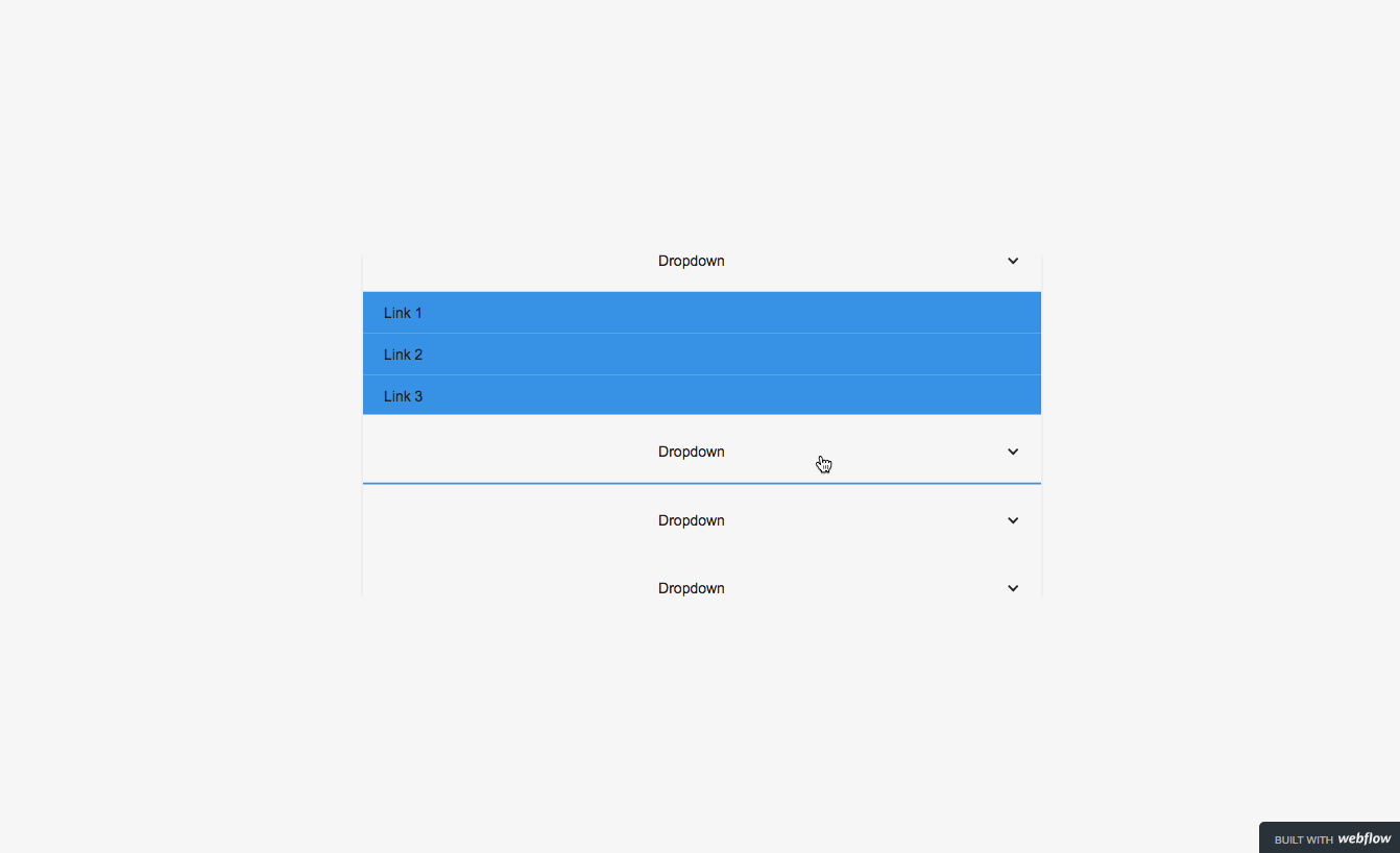
Keep your dropdown list in the closed state while making these changes. Set its position to relative, set overflow to hidden,and give it a height of 0px.
You’re setting the element to relative positioning instead of the default absolute so that the dropdown list pushes other elements down. Be sure to check out this guide to CSS properties for more information on position styles.
Step 3: Smooth out the open-and-close interaction
Select your dropdown list element, switch to the Global Objects tab, and create an interaction, naming it something memorable, like “Accordion open and close interaction.”
1. Give it an initial appearance of 0px height and display: none.

Next, add a Dropdown Trigger interaction and style the Dropdown open and Dropdown closed states as follows:
Dropdown open
1. Open state step 1 gets 0px height (zero millisecond delay) and display: block (copy this interaction for step 2)

2. Step 2 gets height auto (500 milliseconds delay) and display: block

Dropdown close
For this step, just set your dropdown list to a height of 0px and adjust the delay speed as needed.

Your interaction settings should now look something like this:

Now go to the Settings tab with your dropdown element still selected, and add a Close Delay that matches your close animation speed. For this, I used a delay of 500ms.

Now, just select your entire dropdown element and copy/paste it till you have all the panes you need.
Voila! You’ve created an accordion widget on your site.
If you run into any trouble building this out, post in our Forum’s Design Help category with as much information as possible, and feel free to tag me (@Waldo), so I can lend a hand. Be sure to include a read-only link to your site, list the page name and section where your accordion element is located, and include screenshots and a description of the trouble you’re having.