

Strong website layouts engage visitors and encourage them to explore the page.
Building functional, creative website layouts is tricky. On the one hand, you want to make something memorable and unique. On the other, specific patterns make your layout easier to navigate. The trick is to design a website that's engaging but still easy to follow.
There’s no secret formula for coming up with creative website design ideas. Making a unique website layout that showcases your client’s distinct style takes innovation, and you can’t generate that with a program. Drawing inspiration from other designers who’ve managed this balance can help you discover how to build your own site layout. Read on to learn what makes layouts unforgettable and see a few innovative examples.
What are the key elements of a creative website layout?
Great creative layouts don’t just look beautiful — they tell stories and create memorable web experiences. Here are some of elements that great website layouts include:
- Thoughtful scrollytelling that uses visual scroll animations, timelines, and parallax effects to tell your story without reducing readability.
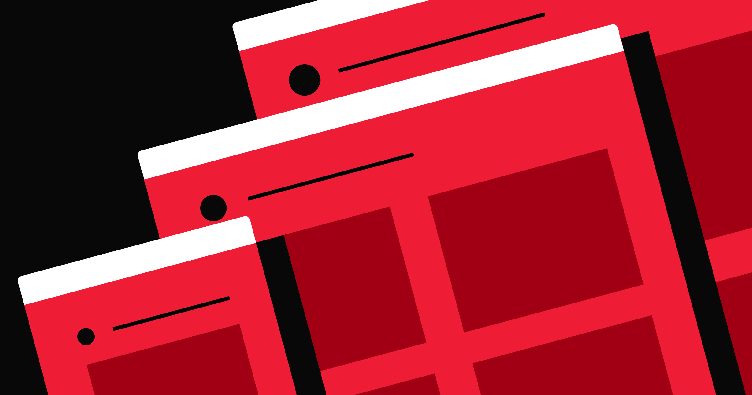
- Subtle animations that introduce movement to pages in unexpected ways — such as rolling waves, color-shifting shapes, and exploding layers — without overwhelming the viewer.
- Unique interactions, such as maps and explorable galleries, that invite visitors to actively engage with your designs and find the information they need.
- Real-world immersion that bridges the gap between the product or service and its digital representation, helping site visitors to form a connection with your brand through lifelike interactions.
10 eye-catching website layouts
From Soul Jazz Records to R2D3, here are a few website layouts that stand out.
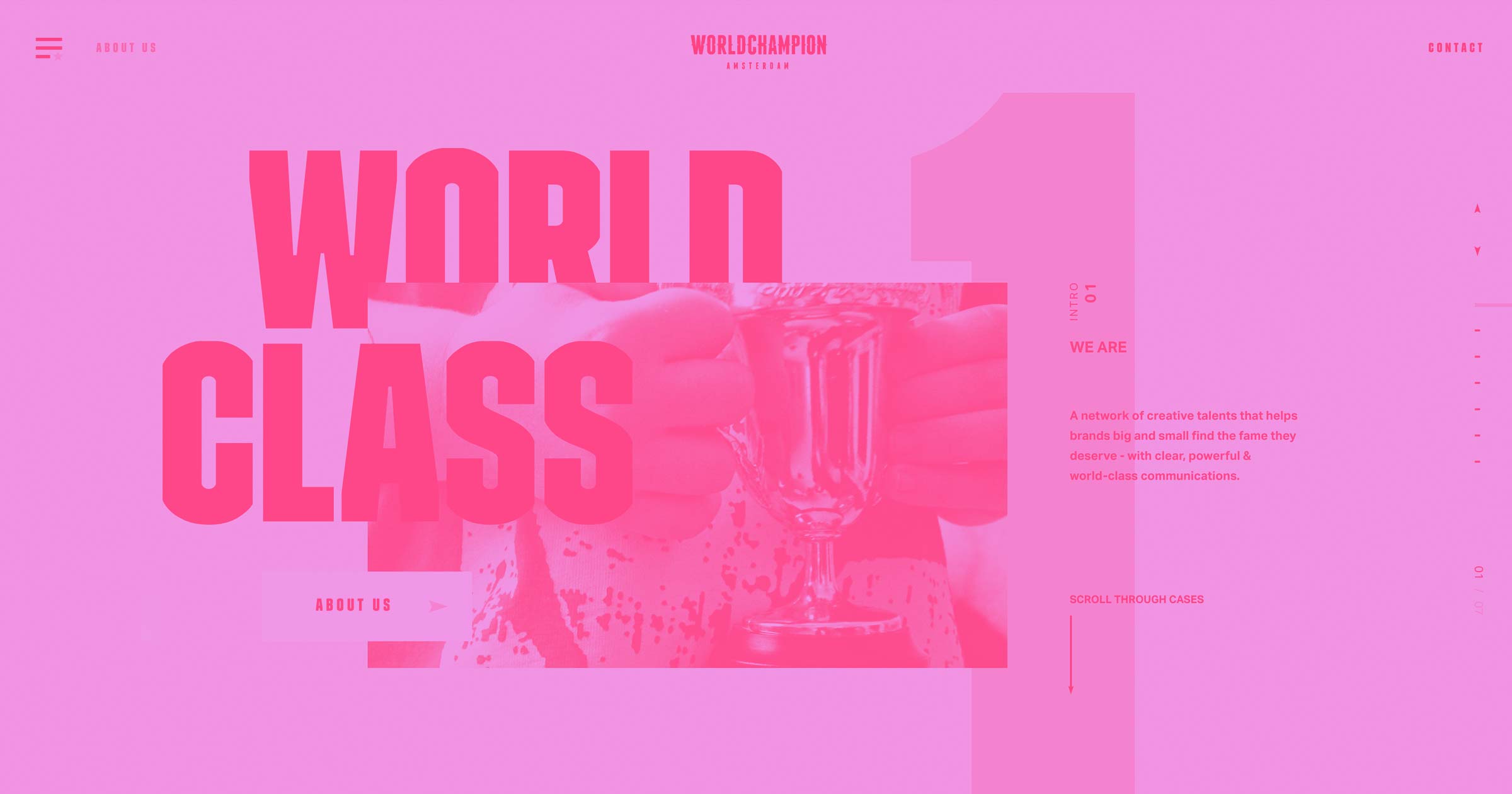
1. Heco Partners
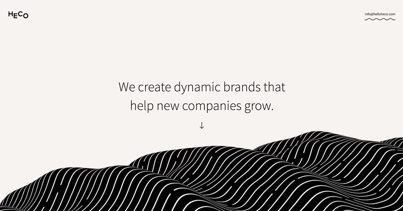
Heco Partners is a design agency whose founder JT Helms built their site entirely in Webflow. At the top of the homepage, the headline “We create dynamic brands that help new companies grow” hovers above an animated black-and-white wave. A small arrow directs website visitors to scroll down to experience the rest of the Heco Partners story.
As you explore the page, unique scroll animations bring up samples of Heco Partners’ previous work and highlight how they approach web design projects. You can also click on the work samples to visit pages that explain past projects in detail.
This layout takes site visitors through a logical progression of learning about the brand. It starts with overall values, showcases past projects, and then dives into the team and their expertise. By the end, potential clients will have a well-rounded understanding of Heco Partners and may want to reach out.
2. The Goonies
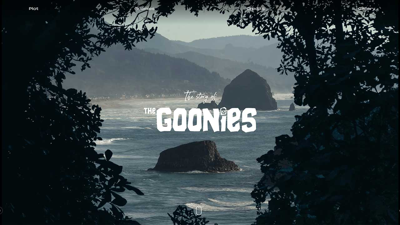
Joseph Berry is an expert Webflow designer who decided to turn the 1980s classic The Goonies into a website experience. Winner of the Honorable Mention and Site of the Day award from Awwwards, this website is an excellent example of visual scrollytelling.
Joseph used Webflow’s interactions and animations to zoom into a photo of Haystack Rock as web visitors scroll down the page. Paired with the movie’s plot summary, this animation signals that readers are entering the world of The Goonies.
As people continue scrolling, graphics slide into view to showcase the film’s main characters and production details, and the page ends with a gallery of iconic shots from the movie. This layout offers nostalgic elements that delight the film’s fans while also sparking curiosity in those who haven’t seen it yet.
3. Johnny Gu’s Portfolio

Johnny Gu’s portfolio website offers a remarkable, inviting, and memorable journey through his esteemed career as a designer. The homepage begins with a bold headline, “I make value-driven websites with…” and the icon that finishes the sentence scrolls through various tools he uses.
Smooth, responsive animations showcase his knack for bold visuals in everything that follows, from his work samples to his services. For instance, hovering over a past client pulls up a video or image, and clicking their name leads to an in-depth review of the project. This engaging and visually appealing display is a sample of Johnny’s expertise and shows viewers what to expect if they decide to work with him.
If you enjoy Johnny’s designs, he also makes web design templates that are available on the Made in Webflow marketplace.


Build a better site experience
In our ebook, learn how to approach your next website redesign — from collaboration and trust-building to finding the right tools.
4. Never Summer Snowboards

Never Summer’s website showcases its products without losing its flair for adventure. While many sports companies rely on their athletes' recognizability to sell gear, Never Summer focuses on making and advertising top-notch boards.
The brand’s product pages show shoppers exactly how each board functions on the slopes. When you click on a specific item, the descriptions feature clear infographics that outline technical specs, including details about materials and technology. Scrolling down the page reveals a video of someone testing the snowboard out on the mountains. At the bottom of the listing, you can check customer reviews to see what actual users think.
This layout focuses entirely on the snowboard and its capabilities so shoppers know exactly what they’re buying. Plus, Never Summer’s in-depth coverage of each item shows they’re confident in their products.
5. Soul Jazz Records
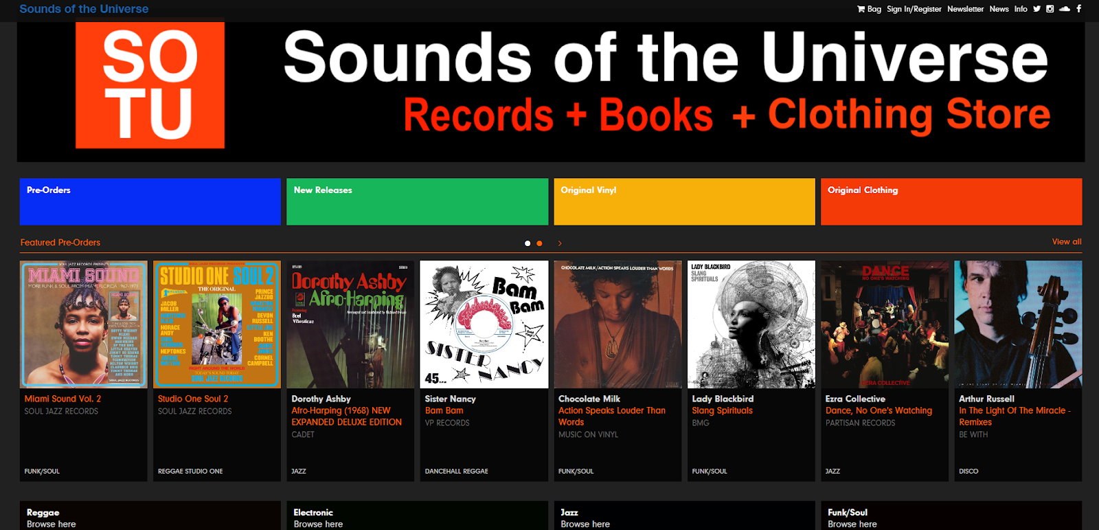
Sounds of the Universe is a digital shop for the Soul Jazz record label. Their homepage showcases the many genres they produce with a gallery of images that expand as you hover over them. Sounds of the Universe also provides album samples and plenty of background information about the artists.
These animations create a similar experience to flipping through albums at a record store. You can navigate through new and old releases in a gallery and click for a closer look if any artwork catches your eye. This layout is an engaging way to translate the physical to the digital, as it takes a familiar experience and successfully transforms it into an online experience.
6. San Francisco Museum of Modern Art
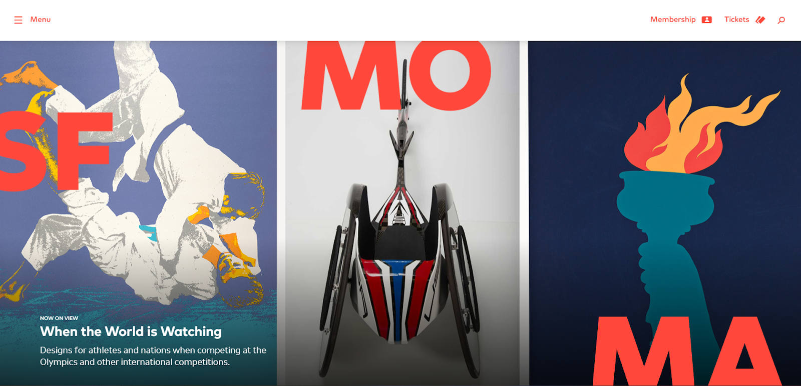
Similar to Soul Jazz Records, the SFMOMA website makes you feel like you’re experiencing the museum right on your screen. Many of the photos on the site include the visitors standing around the art, giving you the perspective you’d get if you were there. This technique replicates the real-life experience of enjoying art as a community.
This feeling extends into the website layout, as each new landing page contains colorful, modern artwork. Specifically, the What’s On section immerses readers in the heart of the museum. When you click on one of the exhibitions, a new page opens that shares in-depth information about the collection and offers a preview of each work.
Some pages even include a YouTube video touring you around the exhibition space. All these design choices come together to immerse the viewer in the museum’s offerings.
7. R2D3
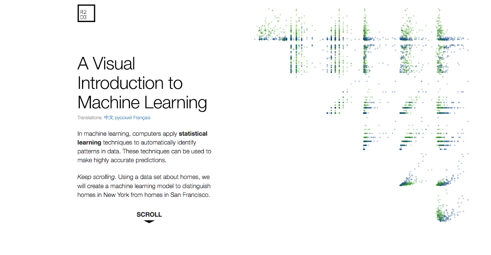
R2D3 uses the power of scrollytelling to explain machine learning in an approachable way. To teach this lesson, they built color-coded data sets measuring different attributes of homes in San Francisco and New York. Then, they created animations to show how AI uses statistics to find patterns and group similar pieces of information together.
Throughout the page, they use scrolling animations to pair descriptions with their relevant visuals. The result is an engaging layout that makes learning intuitive.
8. Peerspace

Peerspace is an international resource for creatives and other entrepreneurs seeking short-term workspaces. To mark their 10th anniversary, they redesigned their website to showcase 10 years of success.
The single-page layout begins with a timeline that follows their journey since launch and then introduces a contest they ran for their clients. The site closes with a bold message that reads, “Since 2014, over one million brands and individuals have trusted their event to Peerspace. Thank you.” This layout celebrates the company and the customer on one page, making it clear that Peerspace attributes their success to their loyal clients.
9. Intensive
Intensive is a studio that offers web design courses. They specialize in developing creative website layouts, so it’s no surprise that their website is also unique.
Since the web is a two-dimensional medium, it’s easy to fall into tired layouts and designs that stick within these constraints. But Intensive found a way to step outside these limitations with angled 3D visuals and glowing gradients that appear to break out of the screen.
Even though each section of the homepage is very angular, Intensive uses traditionally laid out text that’s less challenging to read. Combining these novel ideas with typical user expectations creates a layout that’s both intuitive and beautiful.
10. Poulos Collective
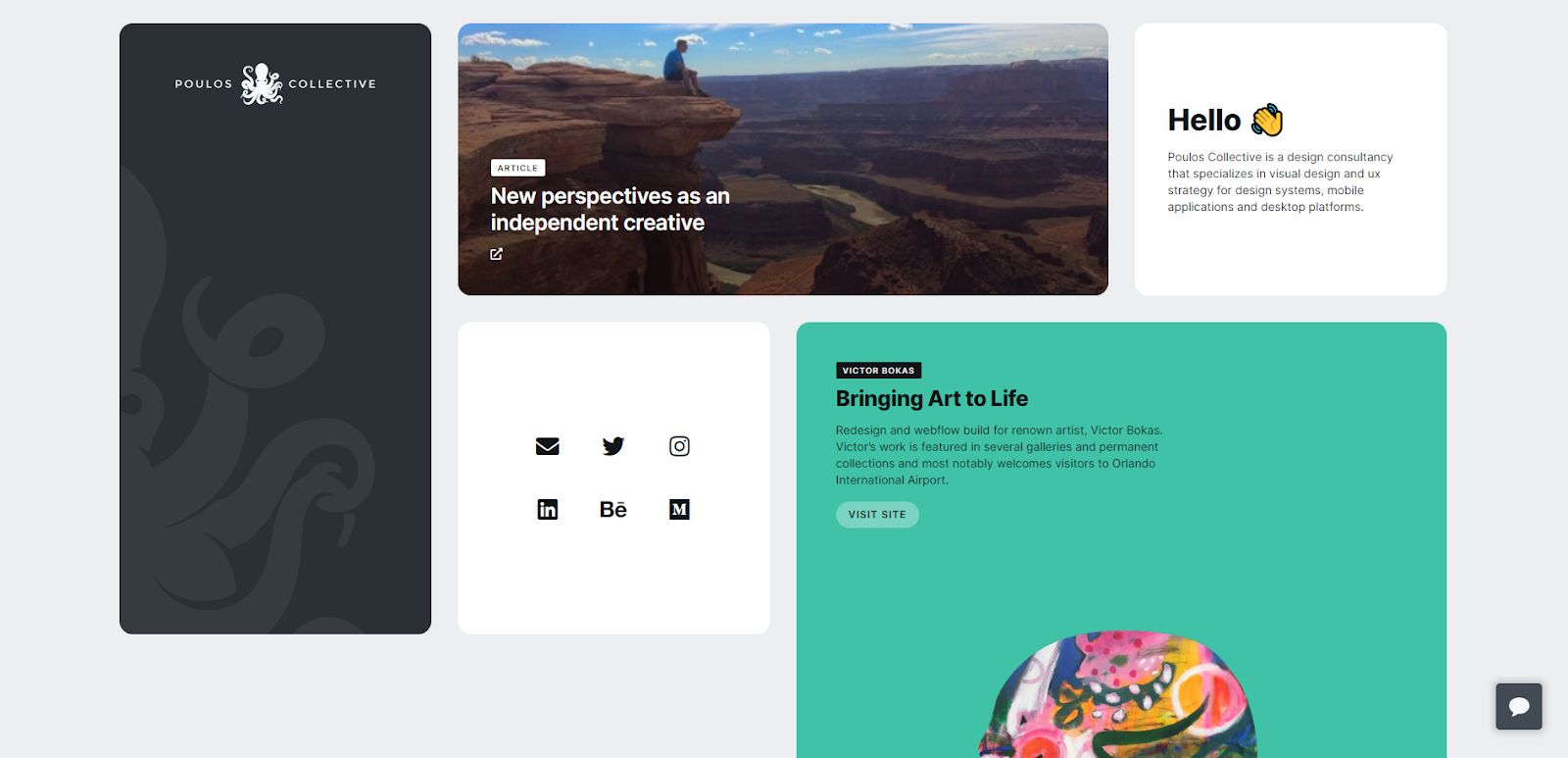
Poulos Collective is a consultancy focused on UX design, and Stefan Poulos created their site. It showcases the brand’s visual style, which prioritizes clean, simple, and functional experiences. The website’s simplicity is its greatest strength. It uses a muted color palette, plenty of whitespace, and sans-serif typography. Thanks to this approach, the page loads quickly, which reduces bounce rates.
The site uses colored rectangles to separate each topic, making navigation more intuitive. And most boxes include an in-picture gallery, so you can scroll through project examples without loading a separate page.
This website's mobile layout also follows the same commitment to simplicity. There’s no complex jargon or confusing design choices, and thanks to its stripped-down minimalism, the whole site is snappy and responsive.
Push your creative boundaries with Webflow
Great design is all about exploration. By experimenting with different site layouts and innovative approaches, you can craft a website experience that matches your clients' vision and goals.
When designers share ideas and inspire each other, we all create better web experiences. Ready to spark your next creative breakthrough? Explore the Made in Webflow marketplace, where you'll discover hundreds of stunning templates and design resources created by the Webflow community. Or get started with Webflow to create your own unique story.

Get started for free
Create custom, scalable websites — without writing code. Start building in Webflow.