
“The stakes were huge. Passion is what carried this whole thing forward.”
It’s October but it’s also April. The pandemic has made time a flat circle. Think back to April — or maybe it was early May? — and tap into the confusion you felt back then. You might still be feeling it as the virus has remained one of the most prominent background sources of global anxiety in 2020.
For those of us wondering what’s going on with a vaccine, it’s hard to stay in the loop. News will trickle out from different companies, research teams, and drug trials promising timelines that can seem unrealistic and far off at the same time.
The race to develop, approve, and manufacture a COVID-19 vaccine is evolving rapidly. Trying to navigate this process by headlines alone is not wise. The urgent worldwide desire for answers has led to the spontaneous arrival of millions of armchair epidemiologists. That’s why there’s a gigantic need for context about the different phases of development, the different types of vaccines, and how they work.
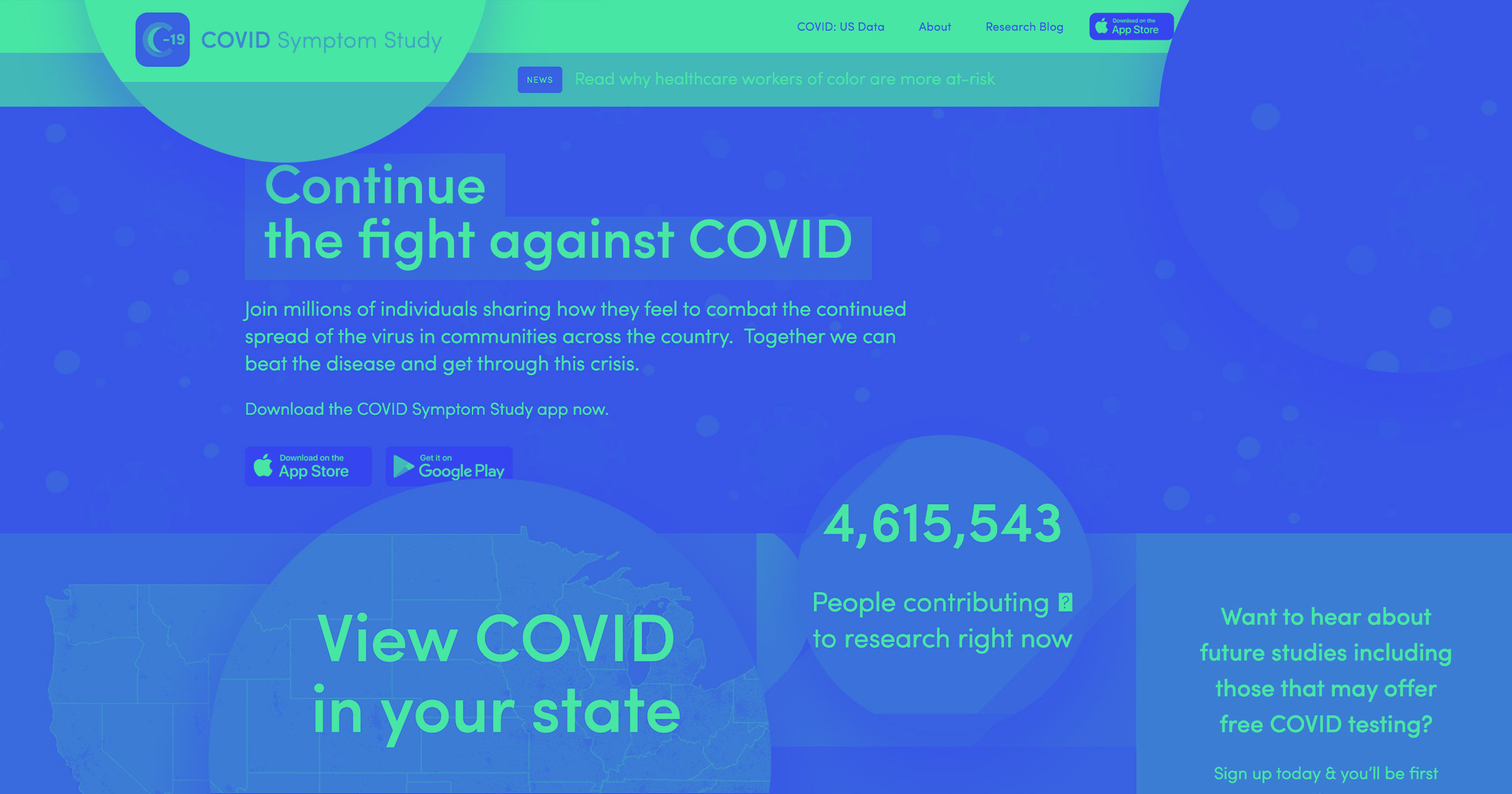
First Person, a San Francisco design and storytelling company, decided to tackle this necessary context by building a way to track the progress of COVID-19 vaccines in development. Released on June 22, in partnership with FasterCures, a center of the Milken Institute, the COVID-19 vaccine tracker aims to show how many vaccine candidates are in development, provide a timeline of vaccine development, explain how vaccines work, and describe how a vaccine goes from ideation to commercialization to widespread use.
This is the story of how that website came to be, in the words of the people who created it.
The idea
Drew Fiero (CEO/president, First Person): First Person is always looking for ways that we can contribute to important topics and use our ability to clarify complex ideas with design and storytelling. As the pandemic spread, I was looking for a way for us to get involved. After reading a great article about all of the challenges that would need to be overcome to create a vaccine — and how it would probably take at least 18 months — I got inspired. The article took me about 15 minutes to read, and I wondered if we could condense that information down to about two minutes. So I approached our creative department to see about creating a two-minute video to explain the challenges of delivering a vaccine.
Eric Melin (creative director, First Person): I went down a rabbit hole and realized it was a huge story: Compressed timelines, clinical testing phases, different vaccine approaches, global cooperation, and manufacturing all played into the race for a vaccine. There wasn’t one easily digestible source of truth. When I found the Milken Institute had a sheet they were continuously updating, I floated the idea of taking this rich and neutral data source and building some kind of data visualization from it. Company leadership and the design team loved the idea, so we set out with the strategy of mining their publicly available data to tell the story visually. When we reached out to the Milken Institute team with our prototype, they were thrilled we had found them and loved the result, and a partnership was born. I believe we went from raw idea to working prototype in about three weeks.
Visualizing the vaccines
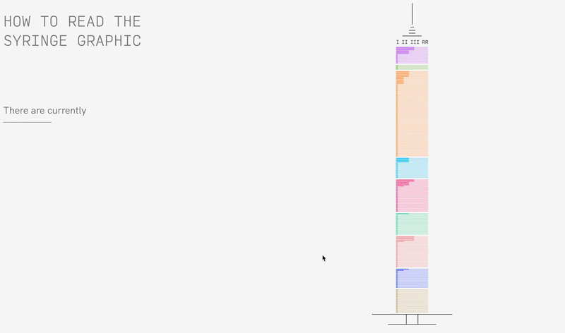
Casimir Fornalski (director of visual design, First Person): Milken’s data had tons of tables and charts that gave really important detailed info for every vaccine in production, but we wanted to find a way to visualize that in one single, concise, accessible graphic — something that conveyed the horse race aspect of different research projects, all moving at different speeds. We tried a number of visual models that technically achieved this global overview, but then I hit on the idea for the syringe.
It’s effectively just a horizontal bar graph, but if you stack enough bars and keep them relatively narrow, you can just add a few lines on top and bottom to suggest a hypodermic needle. I thought it was a bit too cheeky or on-the-nose at first. But every time we showed it to someone or explored a different graphic, there was a consistently positive response to the syringe. I think it works because it’s a simple graphic with thematic relevance. Once a user gets it, they just have to ask, “How much of the syringe is filled in?” Seeing how much (or how little) really hits you with multiple stories: how many vaccines are in development, what stage are they in, how close are we to a vaccine, and how much progress has been made globally?
"Color plays more of an informative role rather than an ornamental one, so a different color was assigned to each vaccine category, and that color is consistent in reference to that type of vaccine throughout the site."
— Casimir Fornalski
Eric: Cas came up with the syringe graphic as a way of visualizing concurrently the nine different types of vaccines as well as their progress through the phases of clinical testing, and Winston pushed for a journalistic approach. We were inspired and worked quickly — each subsequent design zeroed in on simplifying the story to its most important elements and encouraging more investment in the viewer.
Designing and building the site
Winston Struye (junior art director, First Person): We knew the idea was too good to be ours alone, so we were racing the clock to get it out. That, and the race for a vaccine was becoming increasingly complex. With Webflow and a few other integrations, we were able to make it reality ASAP. The core team was able to grow and collaborate seamlessly thanks to the software.
Cas: Winston and I were able to easily trade off and make edits in real time, and then he could port everything over into Webflow’s style guide tools as he developed the site. I took a very utilitarian approach to the design. We didn’t have a lot of runway for moodboards, design exploration, and trying out dozens of different fonts and colors. This was about delivering clear, accurate information that readers could understand and rely on. Once the syringe graphic was established, it kind of drove the overall design for the better. Clean, sparse typography, clear division between sections, minimal graphics and line work. Color plays more of an informative role rather than an ornamental one, so a different color was assigned to each vaccine category, and that color is consistent in reference to that type of vaccine throughout the site.


Design interactions and animations without code
Build complex interactions and animations without even looking at code.
Winston: Our initial designs were more data-driven, but thanks to everyone being able to jump in, we realized — as a team — that there was a lot more to this story. We jumped in and out of the design system using Figma and did extensive prototyping. Once we transferred into Webflow, we were able to smoothly integrate the complex loads of data and extensive motion strategy into our designs, without it taking too long or needing to outsource development work.
Maintaining the data flow
David Mayer (director of creative technology, First Person): Once we had the foundations of the project in Webflow, we understood the data relationship between the needs of the visualization up against protecting the data source with the Milken Institute. We were challenged with not just conforming the dense amount of data that was being updated every day, but finding a more efficient and familiar way for the Milken Institute team to enter it going forward. Without writing custom middleware, we balanced a handful of automation jobs between Integromat and Google Scripts to address visualization needs, while ensuring that the data the Milken Institute compiled was unaffected. We also had to consider how the Milken Institute preferred to maintain the data with their existing processes, while keeping it open for public consumption. I ended up building a new database in Airtable for not just their evolving vaccine data, but their evolving COVID-19 treatment data as well. This really was a work of passion for the entire team, as well as our Milken Institute collaborators. I believe in the importance of accurate information and the ability of science: Creating this resource is an important investment for all of us.
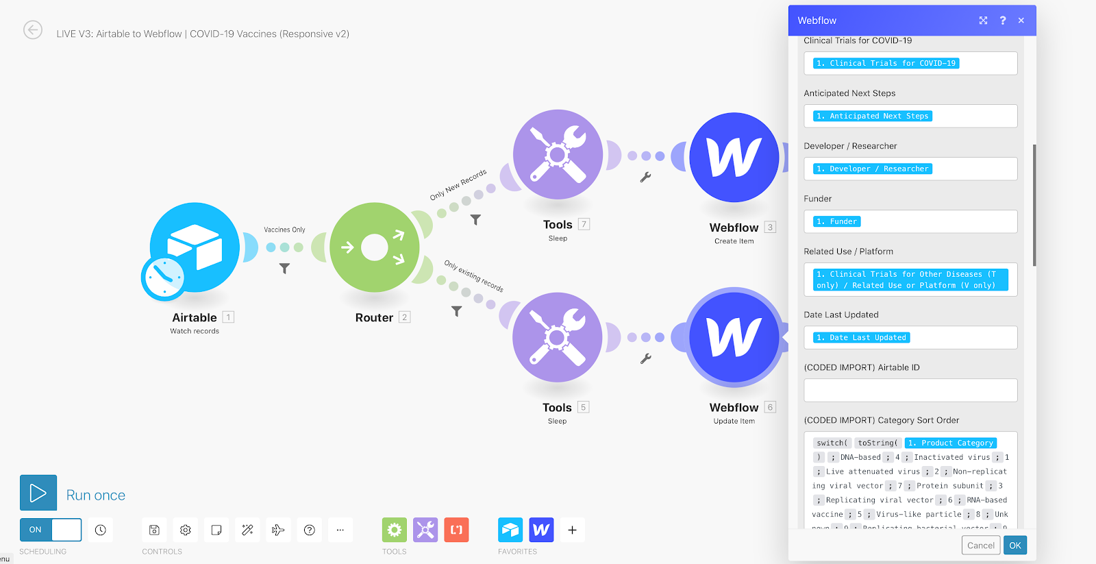
David: We had to give the story room to morph and grow over time. There were just over 100 vaccines when we started, and there are 213 vaccines now (and 318 treatments). For the syringe graphic to stay comprehensible as changes came in, it had to be a flexible design and structure. We soon found that many vaccines are concurrently in multiple phases of development, so more changes were implemented that could be reflected in the way data is entered, stored, and displayed. Here’s how the data flow works: The Milken Institute team maintains all vaccine and treatment data to ensure accuracy and consistency in a single source of truth (Airtable). Each time they create or update a record, our middleware jobs (Integromat and Google Scripts) detect those changes and manage translating and passing that data to the live site. Supplemental automations run on our side to dynamically summarize key interest points that are used inside the visualization.
Collaboration and validation on a high-stakes story
Cas: Eric, David, and Drew could get daily updates and see rapid prototypes, and Winston and I could apply feedback in real time during Zoom calls. Remember — only a month prior, we were able to walk to each other’s desks, chat in the hallway, and have group meetings in our office conference room, but lockdown changed all of that. This project was our first real stress test of being able to collaborate, design, and build something new in real time entirely through online tools.
Eric: There was a huge responsibility to get things right, especially in the early days of the pandemic. Misinformation was becoming more widespread. Things were getting increasingly politicized. The stakes were huge. Passion is what carried this whole thing forward. Drew and the First Person leadership deserve a huge amount of kudos for realizing right away that this would be useful worldwide, and they dedicated enormous resources to it from the start. The Milken Institute is doing an incredible public service, and we were thrilled to be able to bring their data to life. It’s a pretty awesome opportunity we had to bring the nonprofit and private worlds together around a crucial, high-stakes story.
"Our analytics showed that more than 50% of the viewers were on mobile. This forced us to double down on the mobile experience. With Webflow, adding responsiveness to the site was a breeze, and we were able to create a pretty comparable experience on mobile in record time."
— Winston Struye
Esther Krofah (executive director, FasterCures): COVID-19 changed the game for every sector of society, and one thing has held true since day one of the pandemic — policymakers, biomedical researchers, media, and the public have been in desperate need of clear, concise, and objective information about the scope of this crisis. Most critically, they have sought guidance on the vaccines and treatments that are in the pipeline as a way to help inform their approaches to the virus across all sectors of society.
We at FasterCures, a center of the Milken Institute, responded to this need early in the pandemic with the most comprehensive vaccine and treatment tracker available today. What started as a flat spreadsheet evolved into a multifaceted, interactive data visualization in collaboration with First Person. With their support, the Institute added information about the vaccine development process, a glossary of terms, and a more intuitive way to navigate the information. And it helped make complex data accessible to non-science-oriented audiences that are equally concerned about the quest for a cure.
Winston: I was really surprised at the number of people who interacted with the vaccine tracker on their phone. I would have thought that people would turn to a larger screen to experience it. But our analytics showed that more than 50% of the viewers were on mobile. This forced us to double down on the mobile experience. With Webflow, adding responsiveness to the site was a breeze, and we were able to create a pretty comparable experience on mobile in record time. Finally, it’s been really exciting to see researchers, scientists, and journalists refer and link to our visualization. It validates all of the hard work from our team.
* * *
Some parts of these accounts have been edited and condensed for clarity.