Back in August, Webflow held its annual Dream Big Week — a week where everyone at Webflow drops everything they’re doing and gets to dream big and work on whatever they want.
The result was nothing short of amazing. Engineers built out new product features they were passionate about, designers and marketers worked on passion projects, many others worked on projects to learn more about Webflow, and some tried to push the limits of what our platform can do.
A small Dream Big Week team I was on started with a seemingly simple idea of creating an ecommerce store. But not just any ecommerce store. A digital one.
As more of our lives are led online due to the pandemic, we wanted to create a store to showcase how Webflow can support emerging types of digital enterprises. A store where you could sell your own digital products, and brand it with your own personality and style.
What is the Digital Dollar Store?
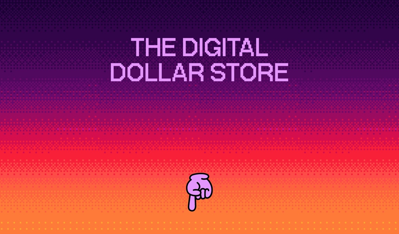
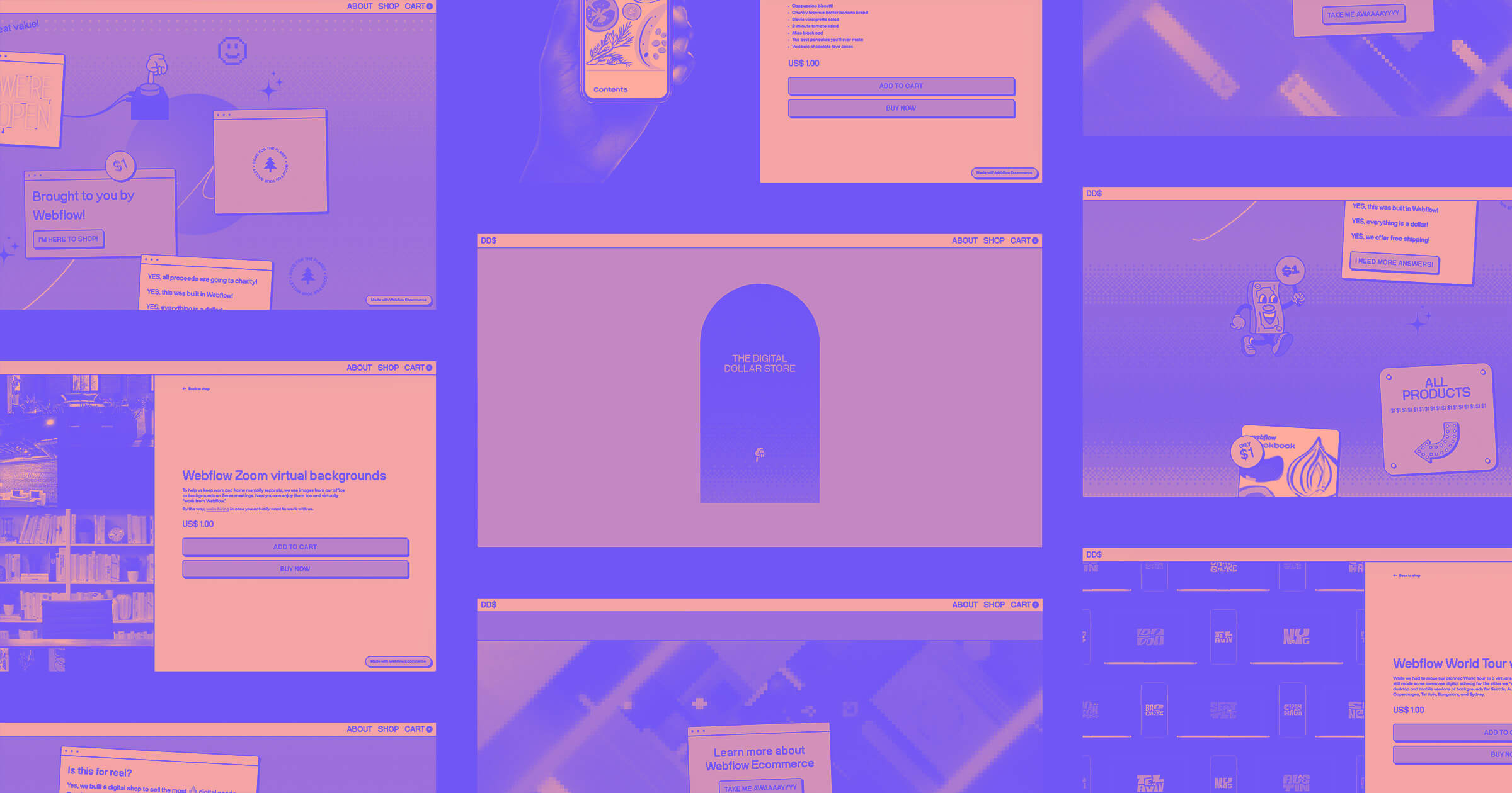
The Digital Dollar Store is a digital ecommerce store where everything is just, you guessed it, one US dollar. No shipping or crazy logistics involved. Just a place to sell products created using only a computer, from graphic designs to downloadable content.
All proceeds from this store will go to OTTP-SF, a charity that provides mental health services to youth impacted by trauma in the San Francisco Bay Area.
Going into building the Digital Dollar Store, we knew many ecommerce stores out there focus heavily on their product(s). And with good reason. It’s hard to sell anything without having a good product. But in the case of the Digital Dollar Store, the store is our product. In addition to showing off our discounts and digital downloads ecommerce functionality, we wanted to focus heavily on branding and design, because we know that as the barrier to entry to creating commercial websites decreases, branding and style become more important than ever.
How a distributed team built the Digital Dollar Store
This year has brought us some unpreced… just kidding, I'm not going to use that word — 2020 ruined it. What this year has really forced all of us to do is be better remote collaborators.
Webflow in itself has been a primarily remote company for years. But this time, those who were not remote (like me) had the challenge of trying to work asynchronously, without being able to simply walk over to someone's desk and get quick feedback. Luckily, we had tools like Miro (for team brainstorming), Slack (for messaging), and Zoom (for video meetings) to make sure we were able to stay on the same page.
The ideation phase
Step one of the project was to figure out what digital products we would be selling. We wanted to create different types of fun assets that could be created by everyone at Webflow. This included a cookbook, digital trading cards, Zoom backgrounds that we use internally, wallpapers from our World Tour, and a cheeky shoutout on our blog.
In the end, we wanted to push the meaning of digital products.
The cookbook is full of homemade recipes from Webflow employees, the trading cards feature the pets of Webflow employees, and the rest are digital assets that we made internally.
Once we had the products planned, it was time to make them.
Sourcing the products
We wanted to involve a lot of Webflow employees in the making of our products, with the pet trading cards and cookbook in particular. So I created a simple Airtable form and sent out a request in Slack, to a channel that had all of Webflow’s employees in. Within minutes, we had enough content for our cookbook.

Once we organized the content, Pear Weerawong, a designer on our Brand Studio team, worked hard on creating all the product files, from the seriously fun trading cards to the whimsical cookbook and more.
Related reads: Now in beta: Sell digital goods in your Ecommerce store
Related reads: Discounts for Webflow Ecommerce is now in beta
Designing and prototyping
As Pear made the products (and the cute little dollar mascot), another designer, Ryan Miyoshi, started a moodboard in Figma for some web design inspiration. Here’s what Ryan was up to:
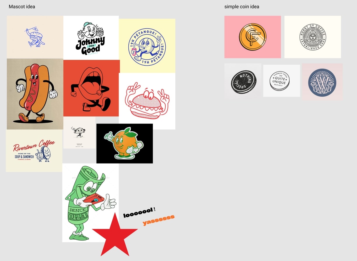
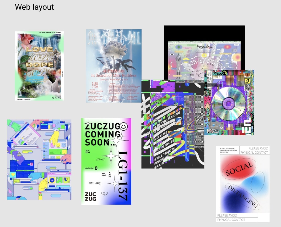
After the inspiration was set, and Ryan reviewed the angle he wanted to take with the store, the build began.
Now, at this point, what most people would do (including me) is first design and wireframe the entire website design in Figma, Sketch, Adobe XD, or classic pen and paper, then take that design and start building it in Webflow.
However, Ryan just went straight into Webflow and began designing and building at the same time. He wrote a blog post on why he does this if you want to check it out. Long story short, once you get really good at using Webflow, you realize you save time by starting your initial designs on a blank Webflow canvas. Especially if you have a lot of interactions and animations, like this project does, it’s easier to design them straight in Webflow so you can see the results in real time.
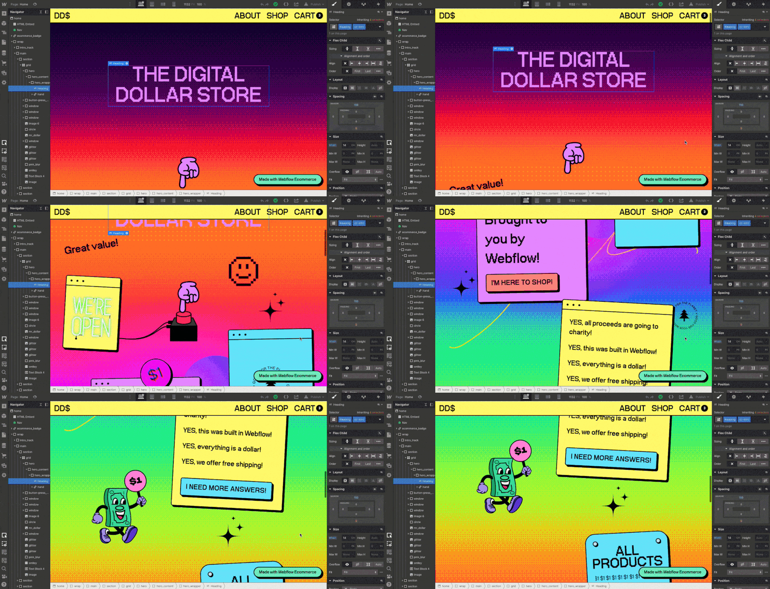
On the homepage, you’ll find our greeting section, similar to if you were to walk into a store in real life. As you scroll down, you’ll see our list of products, and, at the bottom, you’ll see a CTA (call to action) to check out Webflow Ecommerce.
When you visit the Digital Dollar Store, you’ll notice that it’s not some cookie-cutter website template. It’s a totally custom web design, finished off by another brand designer, Johnnie Gomez, and created entirely in Webflow.
Besides the homepage, we also have an about page, store catalog page, a checkout page, and a template page for each individual product.
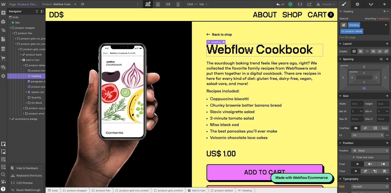
As you can see, there’s quite a bit of stuff going on. I’m not going to get too much in the nitty gritty of how everything was designed down to the pixel, or else this post would be way too long, but I am going to encourage you to check out the project for yourself. Take a look at the Navigator (on the left) to see all the HTML elements, and the Style panel (on the right) to see how each element is styled.
It’s crazy what you can do with no code.
Making it all work through collaboration
While you really only need one person to build this store, we found it to be a lot more fun to work together on it as a team.
The real magic started happening as we used Figma and Webflow for collaboration. In Figma, we all were able to hop on a Zoom call and plan designs in real time — it really felt like we were all in the room together. And with Webflow, while one person was in the Designer building the site, another person was in the editor adding the content. It made for a streamlined and efficient process to getting the store built, and products up, at the same time.
As we built the site, we needed to get access to a Stripe account to collect payments and set up our checkout flow. What working remotely has also taught me is that in some cases where you may not interact much with an executive team, now you have the opportunity to just message them in a Slack DM. For example, we needed to set up our payment system in order for Johnnie to test the checkout flow and QA everything.
As a person on the marketing team at Webflow, I don’t have access to go into a company bank account and create payment integrations. But I know who does. So a simple DM to our VP of Finance made it possible to set up our payment integration in under a day.
But seriously, the key takeaway is to reach out for help when it’s needed — even from people that aren’t on your immediate team. After all, as a company, we are a team.
Hosting and launching
Once the store was close to being completed — products were up, and a smooth checkout flow was in place, it was time to launch.
We purchased the domain digital-dollar.store and connected it to our Webflow project.
Connecting a custom domain is pretty easy in Webflow. If you run into any issues, you should check out our Webflow University step-by-step guide on how to do it.
Now it was time to host the site and go live. First step was to export the project, download all of our assets, and connect it to a hosting server. Nah, just kidding — we just clicked publish.
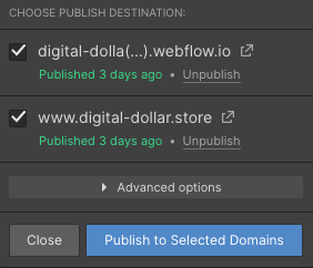
That’s it, the store was live!
Take it one step at a time
The Digital Dollar Store is meant to show off just how much personality a project can have when you put your mind to it. It was a special project for all of us who worked on it. Plus, it’s an opportunity to give to a charitable cause.
If there’s one takeaway from this post, it’s that great things take time and collaboration.
Take it one simple step at a time. Launch that product, even if it isn’t perfect, and iterate on it as time goes on. One day, you’ll look back and see how far you’ve come.
Shoutout
In no particular order, we want to give a shoutout to a few of our supporters — both for the Digital Dollar Store and for supporting OTTP-SF:
@mackenziechild, @evercastus, @themoondesigner, @CopprOnline, @thatsfinsweet, @NitishCRR, @bearsilber, @stephenwiseco, @donorkit, @ughwtfdude, @codegician, @krbarrett_, @laceykesler, @inboxstash, @hire_ar, @verasemily, @SpurwingAgency, @nocodehackers, @annawardart, @NineTheGhoul, @codegician, @austinthesing, @sarrahfanny, @codymilas, @thepixelgeek, @mtjack9, @dawidmeller, @codegician, @yyonfai, @T_bekkers, @MoenDesign, @ratheejaisal, @PsilocybinAlpha, @waldobroodryk, @badunicornvc, @tmault, @codegician, @louroboros, @parkerthompson_, @FreshlyGroundUK, @josselinco, @Pierquinto, @tinyprojectsdev, @fialaerik, @EverchatHQ


Your brand is unique. Your store should be too.
Shape your customer's experience every step of the way, and build a modern ecommerce website — all without writing a single line of code.


