

In ecommerce web design, the focus often lands on homepages and product pages. However, perfecting the product listing page is key in seamlessly guiding potential customers to both.
Product listing pages (PLPs) act like shelves in a physical store, displaying products in specific categories, prices, and essential information to help buyers choose which items to explore further.
Just as arranging products beautifully on a physical shelf enhances shopping, designing an ecommerce store to make PLPs more accessible and appealing improves visitor engagement, decreases purchasing time, and drives conversions.
Here are the essential parts of a PLP, plus best practices to ensure these pages take your ecommerce site visitors on a smooth, enjoyable user journey.
What is a PLP?
A product listing page (PLP) — also called a category page or category landing page — showcases a curated catalog of products filled with product images, prices, and pertinent information when an online shopper clicks on a category or searches for a term. Given that most digital advertising campaigns funnel customers directly to these pages, excelling in PLP design and content is crucial to secure sales.
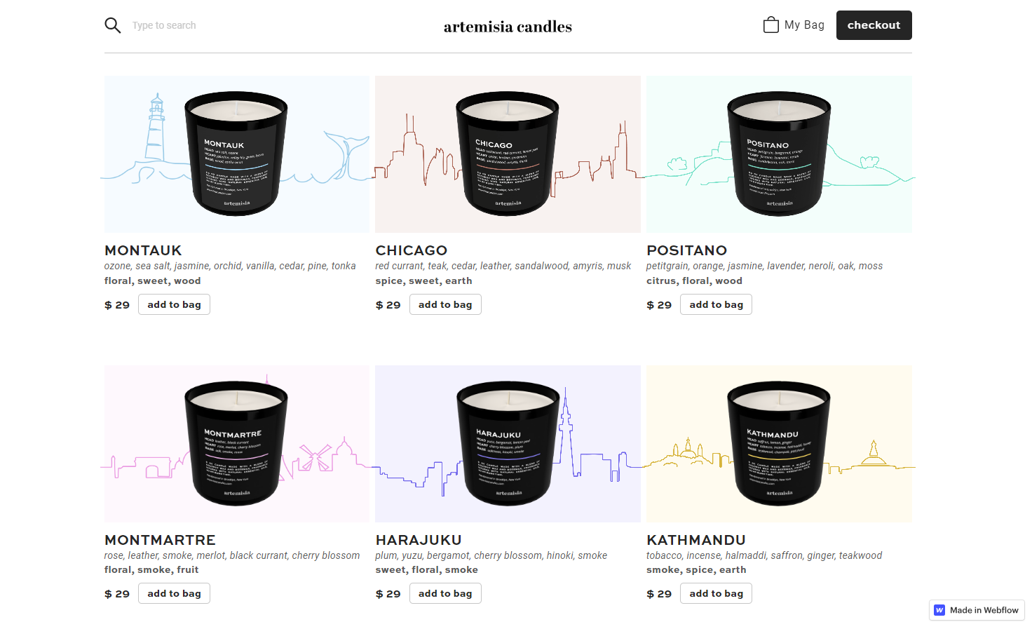
Prism Design Studio’s PLP design for scented candle ecommerce business Artemisia, for example, shows six products in a 2-by-3 grid format along with a thumbnail image and crucial details for each product.
PLPs lead to individual product description pages (PDPs, also known as product detail pages), which show the specs of a single product in detail.
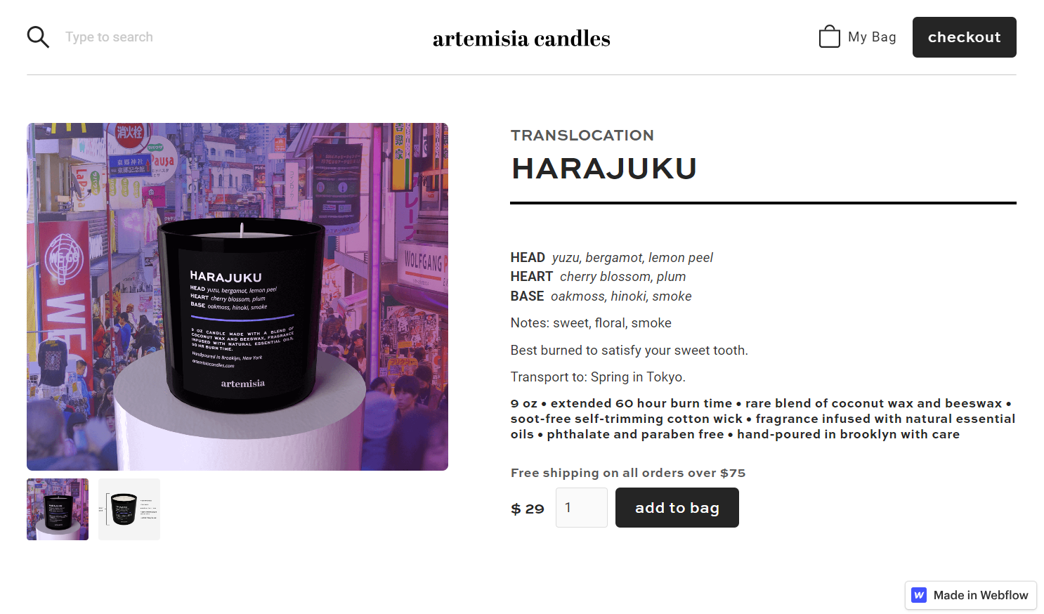
Artemisia’s PLP design presents limited details, while their product page design offers more comprehensive information. Prism’s clever website design makes the relationship between these two page types visually clear: The PLP thumbnails feature silhouettes of the candles’ namesake cities, and the backgrounds on the PDPs provide more intricate visuals of each city.
Why is PLP design important?
A well-designed PLP not only enhances the user experience, promotes product discovery, and increases sales, but also caters to diverse shopper types. It guides those with clear purchase intentions to desired products and simultaneously offers an inviting and informative display for newcomers at the beginning of the sales funnel.
Effective product listing page design helps buyers refine their search for a relevant section of products. This means enabling faceted searches for online stores with an extensive product range.
Anatomy of a product listing page
While the layout of a PLP can vary depending on the product type and the business’s conversion goals, your page needs seven fundamental elements to be effective:
- Category title: Lets visitors know where they are on the site
- Product images: Displays product images to clarify physical appearance
- Prices: Presents pricing data in different currencies, allowing visitors the convenience of viewing costs in their preferred currency
- Product descriptions: Provides a clear, descriptive product title and important information that shoppers need to differentiate between similar products
- Facets: Offers a list of specific attributes or features available for search within a category, such as color, size, or brand, enabling customers to narrow down their product search for items that match their preferences
- Sorting options: Enables customers to sort results in meaningful ways, including alphabetical order by product names, highest or lowest sales price, and average customer rating
- Breadcrumbs: Shows customers how deep they are in a site, offering an alternative navigation option to the main menu or navigation bar
For example, the website for Batik clothing brand Cloe Cassandro offers useful filter options such as clothing type, print, size, color, and availability.
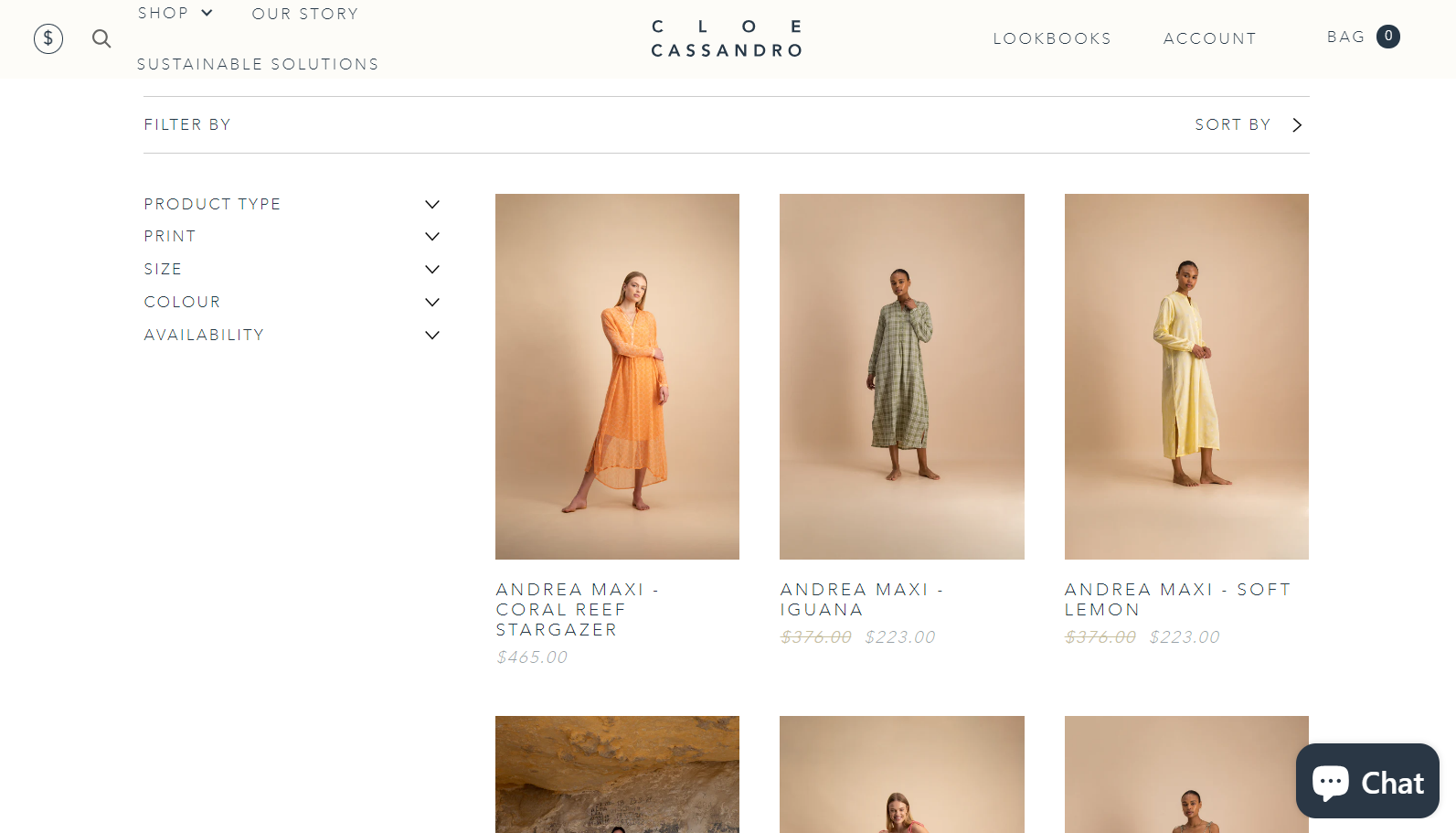
By streamlining the browsing experience with targeted facets, Cloe Cassandro enhances user engagement and guides customers to products that match their preferences.
Building on the idea of efficiency, PLPs must provide enough information for visitors to browse without needing to click on individual product pages for details. Studies by web UX research institute Baymard reveal that visitors who bounce between PLPs and individual PDPs for information are likely to grow tired of the process and leave the site.
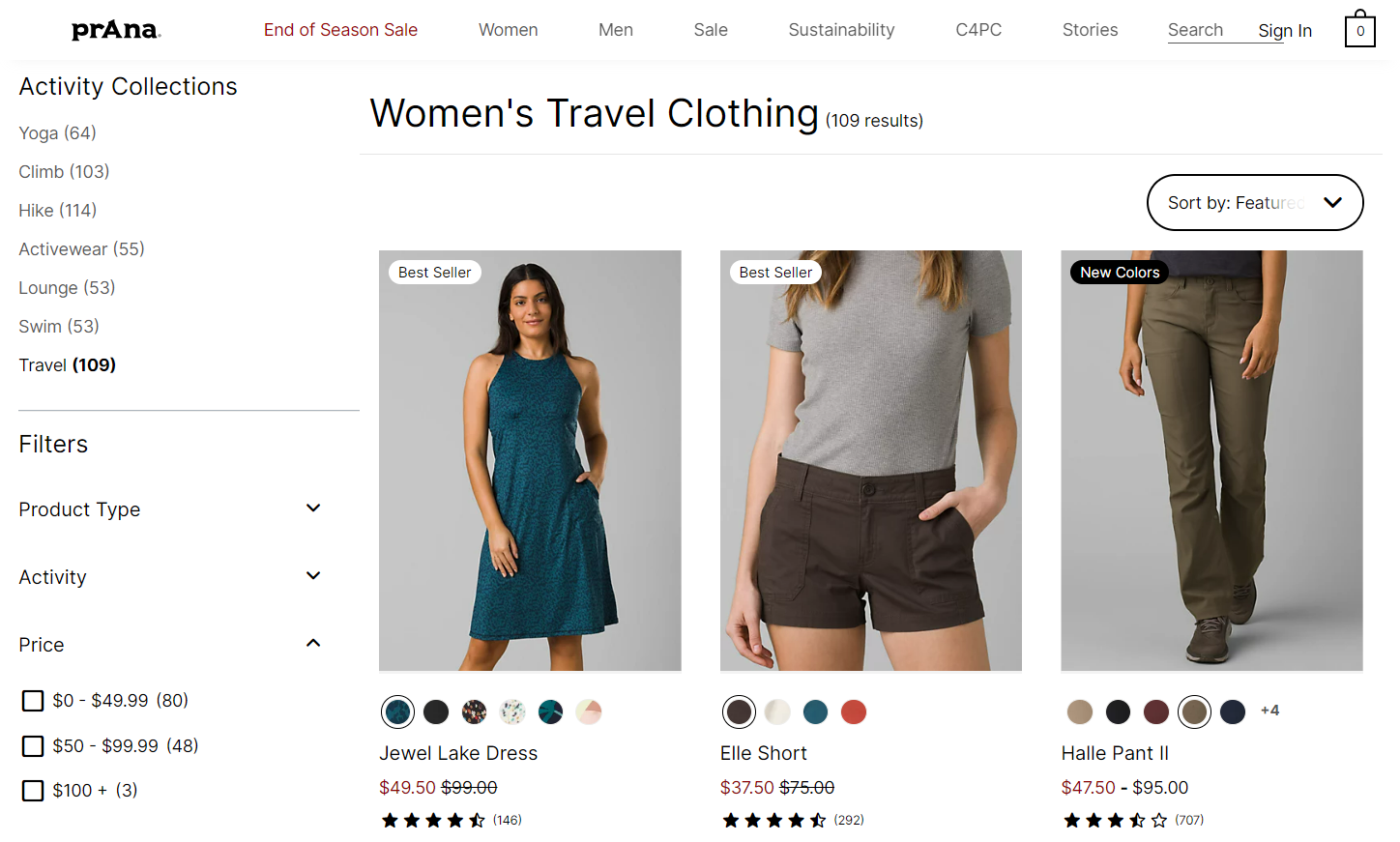
With this in mind, clothing company prAna demonstrates a thoughtful approach by featuring different color variants for each product as circles beneath the product image. When users hover over a circle, a product picture in that specific color appears. The page also displays an average customer rating and the total number of reviews to enhance credibility. By integrating social proof through ratings, prAna keeps shoppers on the product listing page, making it less likely for them to look for product reviews on other sites.


Get started for free
Create custom, scalable websites — without writing code. Start building in Webflow.
Crafting the perfect product listing page: Best practices
The best PLPs prioritize the customer’s perspective in product search and discovery. This involves combining user-focused design principles with targeted user research that unveils insights into customers’ goals, preferences, and dislikes. Here are some specific practices that shape a PLP into a powerful tool for engagement and conversion.
1. Give the user as much control as possible
Enable shoppers to quickly streamline their choices with faceted search and efficient sorting options. Faceted searches act as “smart” filters, letting customers refine the items on the PLP according to specific criteria. For example, in shoe shopping, facets can filter products by size, style, and color preferences.
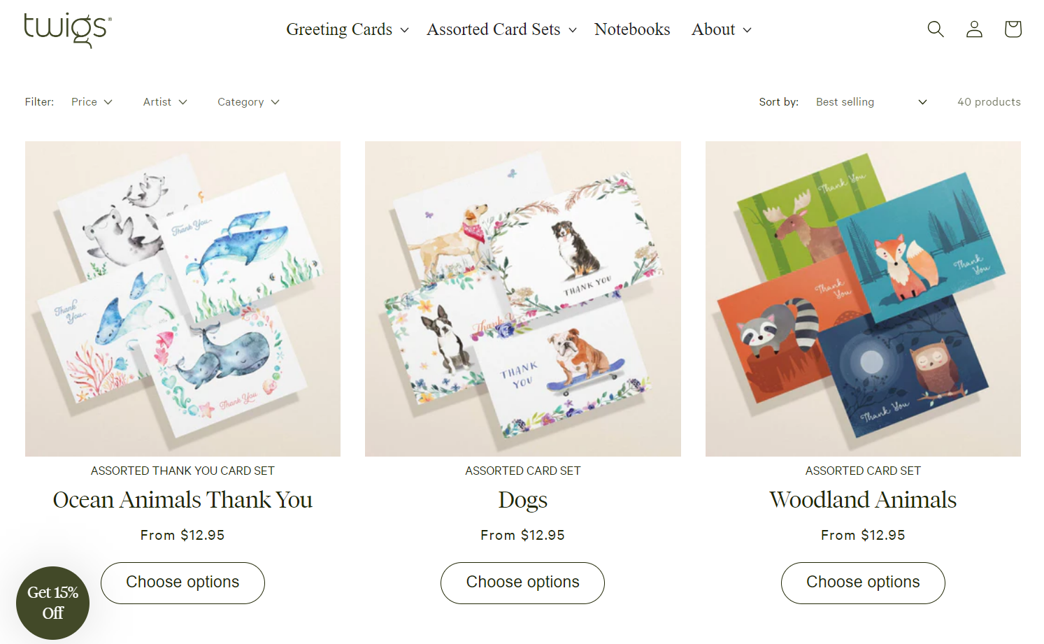
Take the example of the environmentally friendly greeting card company Twigs. Designed by Francesco Castronuovo, the website provides customers with PLP filter options by price range and artist and the option to sort them by popularity, name, price, or date added. This approach tailors the shopping experience for each customer and saves them time, driving higher user satisfaction and potentially leading to more sales.
2. Choose effective thumbnails
Minimize the cognitive load for shoppers by maintaining a consistent aesthetic in the thumbnail product images. These images should look professional and appealing, showcasing the product in the best light possible. Proper cropping ensures each thumbnail displays exactly what you intend, and compatibility across all devices guarantees a seamless display.
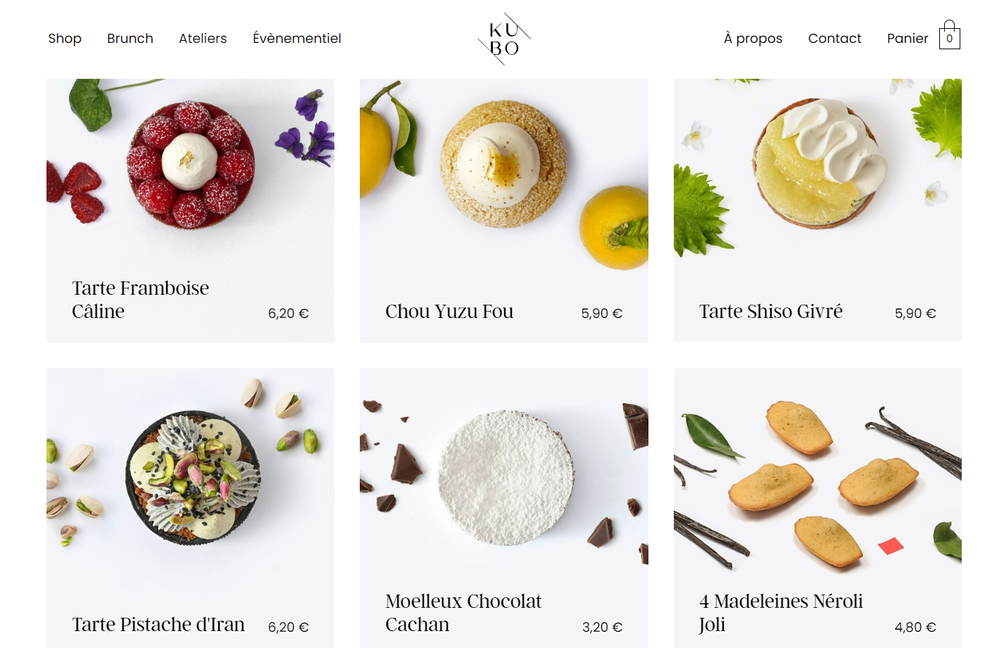
Take Kubo, a Paris-based pâtisserie, for example. Their online shop, designed by Enault Ludovic, flaunts stunning professional images of baked goods with a cohesive aesthetic. Perfectly cropped and arranged in a grid, these images not only add visual intrigue but also provide potential customers with insights into the ingredients of each item. Such meticulous presentation makes the shopping experience more immersive and underscores Kubo’s dedication to transparency and quality.
3. Experiment with multiple layouts
PLPs typically display products in a grid, with three or four product images per line. However, the optimal layout can depend on the device and product type. Mobile sites often present fewer items per line, with some using a list layout instead. With their larger screen size, desktop sites offer multiple images at once without worrying about truncation or sizing issues.
Displaying more products per line streamlines the comparison process when browsing analogous items. Conversely, luxury or distinctive products with intricate details often benefit from fewer images per line. Products with complex specifications shine when presented individually. You can explore different layouts and use A/B testing to identify the ones that resonate best with your audience and products.

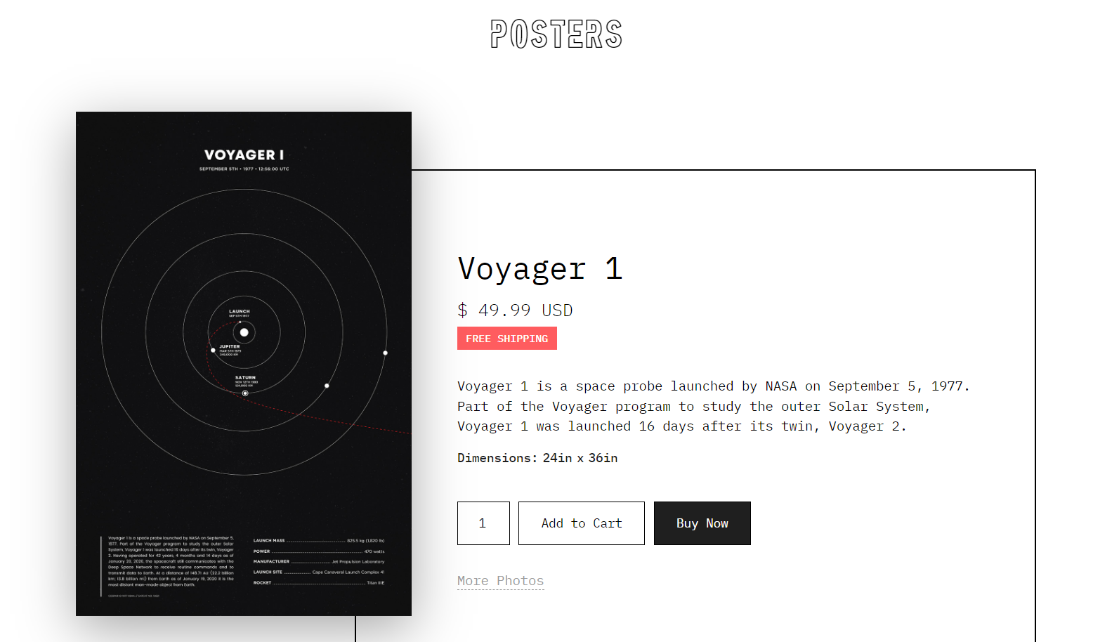
Locale’s restaurant and food categories PLP, above, shows four and five items per line, respectively, helping online shoppers compare their options more easily. This layout also speeds up decision-making by offering a broader view at once. In contrast, Space Posters’ store listings show only one item at a time, ensuring customers can absorb every detail of each poster during their search.
4. Use callouts on selected product images
In PLPs, companies frequently use visual cues to emphasize on-sale items, new arrivals, or popular products. Callouts like “Selling fast” or “Only 1 left” elicit a sense of urgency, while labels like “Best value” guide shoppers to well-priced offerings.
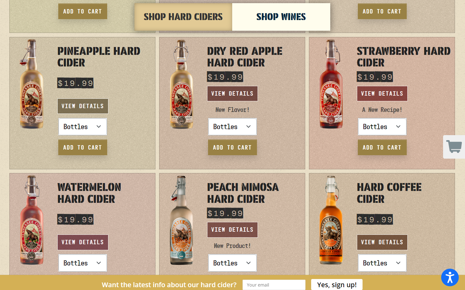
The design team at Lions Creative skillfully integrates subtle callouts for Tennessee Cider Company, highlighting new products, flavors, and recipes. By choosing black text and stencil font, they ensure that these callouts don’t overpower the primary content. Instead, they complement the site’s aesthetic, providing necessary information without disrupting the overall design flow.
5. Optimize headers and page descriptions
PLPs naturally contain a wealth of information, internal links, and keywords related to specific products and niches, making them ideal for search engine optimization (SEO). This concentration of relevant content allows search engines to understand the page’s context better, while internal links boost the site’s interconnectedness, enhancing its authority in the eyes of search engines.
Enhancing SEO can elevate your site in search engine rankings and attract more organic traffic. To implement SEO within your PLP, conduct keyword research and incorporate crucial keywords into the category header, introduction, and product description.
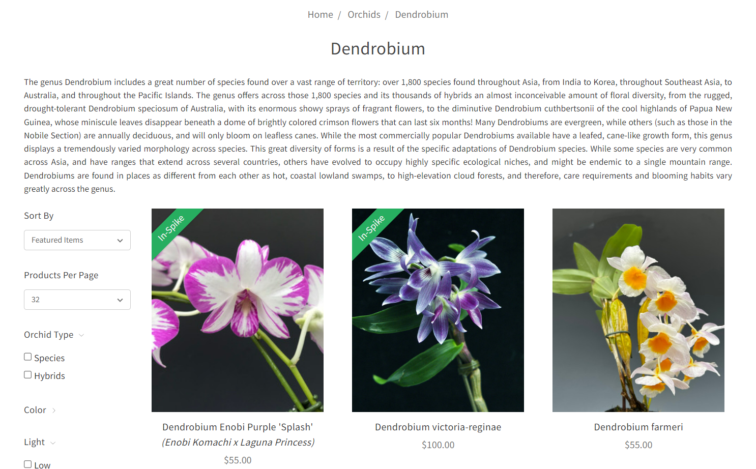
While Orchidweb’s text-heavy PLPs aren’t suitable for every product type, they’re a great choice for deciding which exotic, expensive plants to invest in. These detailed PLP descriptions propel the site to high search engine rankings for terms like “buy Dendrobium orchids” and “Dendrobium orchids for sale” and enlighten potential buyers about the plants they’re considering.
6. Personalize the experience
A study by Accenture reveals that 91% of shoppers favor brands that acknowledge their past shopping and browsing patterns and suggest products accordingly. To capitalize on this preference, consider adding a wish list feature to your site that captures information about visitors’ interests and sets the stage for targeted promotions. For those who’ve set up accounts, offer a dashboard detailing their activities and offering curated suggestions to enhance the shopping experience.
Level up your PLPs with Webflow
Don’t make the mistake of neglecting your PLPs. These pages are cornerstones of ecommerce website customer journeys and hubs for digital marketing campaigns. To find the right format for your PLPs, experiment with layout and functionality while staying faithful to user-centered design principles.
Webflow supports efficient experimentation by keeping your product pages and listings organized as dynamic Ecommerce Collections, where adding and managing products and categories is simple and straightforward.
To see Webflow PLPs in action, browse some of the best ecommerce websites made in Webflow or check out our 10 best responsive ecommerce templates.