
Optimizing your shopping cart design leads to fewer abandoned carts and a better experience for shoppers.
An effective shopping cart design uses commonplace layouts and an engaging interface to keep shoppers’ attention. It provides a streamlined user experience (UX) that ensures customers are never more than a few clicks away from making a purchase.
Fine-tuning the shopping cart design reduces friction and builds trust in your site, which helps you lower cart abandonment rates and increase conversions. Learn how to optimize the shopping journey with intuitive layouts, robust functionality, and seamless checkout experiences.
Why do people abandon their shopping carts?
The average cart abandonment rate for ecommerce websites is 70%. That means potential customers abandon their carts far more often than they complete purchases with them. To understand why they do this, it’s crucial to examine the online shopping experience.
Consider the following:
- Carts are non-committal. Shoppers browsing an online store can easily add items to a cart without committing to a purchase.
- Anyone can use carts. Ecommerce websites don’t typically restrict a shopping cart feature to registered users, so anyone who lands on the site can freely add items to a cart.
- Shoppers haven’t yet seen the total cost. Shipping costs and taxes aren’t calculated until checkout, so shoppers still haven’t seen the total price when they’re adding items to their cart.
- Digital shopping is fast and easy. Online shopping requires minimal effort. Customers don’t have to drive to a store, park their cars in the lot, or wander around looking for an associate to open a display case.
These facts illustrate how easy it is to add items to a digital cart and then casually leave it. In an online shopping experience, no shop workers or other customers are watching you browse, and you have no social clout to lose by abandoning your shopping cart.
Customers aren’t as invested in reaching checkout when online shopping. The key to reducing cart abandonment rates is to design shopping experiences that keep customers engaged in other ways.
6 shopping cart UX design best practices (with examples)
Here are six best practices that’ll keep customers engaged and invested in the items they’ve selected.
1. Place the shopping cart icon in the top-right corner
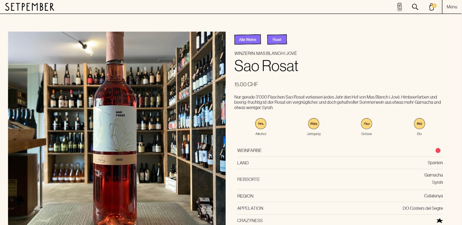
Leveraging standard patterns that users expect ensures clarity and a seamless UX. Popular ecommerce websites like Amazon, Etsy, and eBay place their shopping cart icons in the page’s top-right corner.
Hurrah design followed their example to create this website for Setpember. The website layout, fonts, and UX are eye-catching and unique, but follow a typical icon placement pattern for a seamless shopping journey.
2. Display the number of items in the cart

Include an interactive element that updates with the number of items the shopper adds to their cart, just like Floyd van Joost did on this SHUGGA website. This feature mirrors the experience customers have when they’re shopping in a physical store, where they can see their cart gradually filling up as they shop. Also, if they do move on to the checkout page, they’re less likely to be surprised by how many items they’ve selected and are more likely to complete their purchase.
3. Confirm the item has been added to the cart

The “Add to cart” call-to-action (CTA) button should involve a display that makes it clear when shoppers have added an item to their cart. This gives people confidence in the site as they receive real-time confirmation that their shopping efforts are successful.
The Mike’s Camera online store does this with a modal that includes a CTA button to proceed to the cart. You could also use a separate page, which would offer ample space to cross-sell other items.
4. Embrace the mini-cart

A mini-cart is a window that slides in from the side to show customers what they already have in their cart. It’s another way to remind shoppers how full their cart is, but this method also shows them exactly what’s in it so they can keep track as they browse. This feature also keeps a running subtotal and enables them to easily update quantities and remove items.
The Burger Queen website from Hunt, Gather does just that, to give shoppers a smooth UX, making shopping foolproof and enjoyable.


Launch with Webflow Templates
Choose from hundreds of professionally designed website templates for any industry or style. Customize visually, launch instantly — no coding required.
5. Design for mobile

According to a study from Statista, mobile devices accounted for over two-thirds of online orders in the second quarter of 2024. So, optimizing shopping for mobile users is imperative to ensure this audience has a smooth, engaging experience.
When designing an ecommerce marketplace, follow Tri-Cal’s example. They use responsive design principles to create product listings that are functional on any device.
6. Offer related or similar products
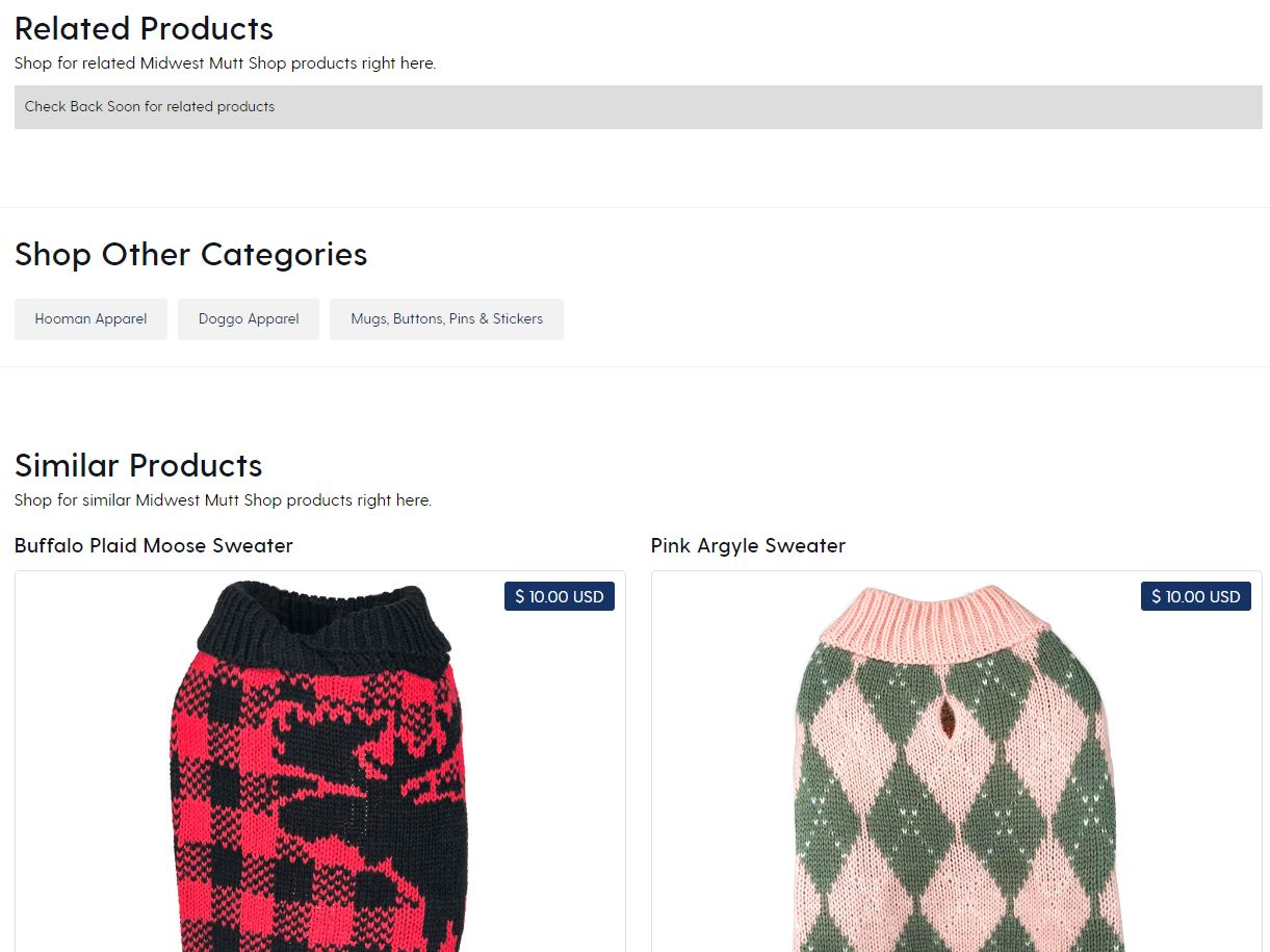
A digital shopping cart provides vital information about what shoppers are looking for in an online store. Use that information to offer them related products (cross-selling) or more premium products (upselling). This technique helps shoppers find all the items they’re looking for and discover new products they might not know they wanted.
The Midwest Mutt Shop website, designed by Waldo Broodryk, includes three sections for upselling and cross-selling: “Related Products,” “Shop Other Categories,” and “Similar Products.” You can offer similar suggestions throughout your sites’ shopping journey, such as in the mini cart or product descriptions. Just avoid including these at the checkout phase, as they might distract shoppers from completing their purchase.
4 tips to minimize shopping cart abandonment
After you’ve designed shopping cart features that engage customers and drive sales, it’s time to evaluate the whole site and identify improvement areas to further reduce cart abandonment. Consider the following four tips for enhancing the entire shopping journey.
1. Add a wishlist feature
A wishlist lets people organize and plan for upcoming shopping events like holidays and birthdays. This feature also allows shoppers to assemble all the products they’re interested in to see their combined price. Without a wishlist, people will rely on shopping carts to “draft” their purchases, often leading to carts that sit full of items indefinitely.
2. Communicate the return policy early and often
Use banners, disclaimers, and pop-ups to inform customers about your client’s refund and return policy, so they’re aware of it before they get to checkout. This mitigates any frustration they might feel at discovering that certain items they selected aren’t refundable.
3. Let customers pay their way
Integrate several payment methods into the checkout experience to allow customers to pay conveniently. On top of accepting credit and debit cards, add support for PayPal, Google Pay, and Apple Pay. There are also payment methods like Affirm that set up financing options for purchases.
4. Lead customers to checkout
The online shopping experience should subtly but steadily encourage shoppers toward the checkout process. There are several ways to do this, such as:
- Offering multiple opportunities to proceed. Take every opportunity to place “Check out now” buttons throughout the shopping journey.
- Using engaging colors. Many ecommerce stores use blue or orange for their “Check out” buttons because, according to color theory, blue represents integrity and orange signals optimism — two emotions that align with making confident purchases.
- Adding a “Buy now” button. Give shoppers the option to skip the shopping cart and buy a single item immediately. This frictionless UX will attract shoppers who want a fast, seamless shopping journey.
Grow your ecommerce sites with Webflow
Optimizing your clients’ sales funnels to drive conversions often requires considering even the slightest UX components. The shopping cart is one such essential detail — finding ways to improve it can make all the difference in cart abandonment rates.
Pay close attention to your online store design decisions to deliver a quality shopping journey. Webflow gives you complete design control over the UX for your ecommerce website. Strategically customize landing pages, product descriptions, and the checkout process to each client. Use Webflow Optimize to create highly personalized and dynamic shopping experiences, A/B testing the variations to discover what works best.
Check out Webflow’s ecommerce app integrations to discover all the ways you can create a unique, memorable purchasing journey for shoppers.
Build websites that get results.
Build visually, publish instantly, and scale safely and quickly — without writing a line of code. All with Webflow's website experience platform.