


Elegant, timeless color combinations help luxury designs shine.
The colors on your website are one of the most immediate ways to convey your brand’s style. A viewer will likely subconsciously register the colors on your website before interacting with a single element. If your brand image is upscale, an elegant color palette can help people understand what you offer.
The right hues for your website leverage color psychology, which studies how colors influence a client’s perception of a brand. Here, you’ll find a list of eight color combinations for designers looking to create elegant brand design.
How color works: Color theory and the color wheel
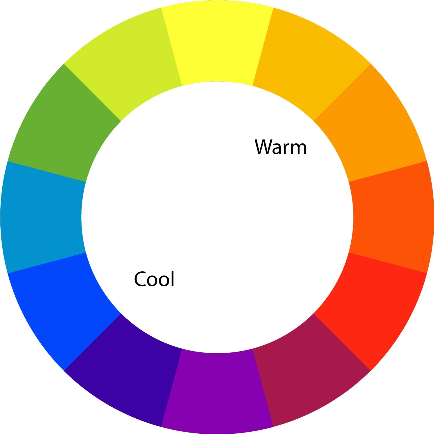
Some color combinations work better than others. One way to experiment with these relationships is by using the color wheel. This visual tool illustrates the spectrum of color, from cool tones (blue, purple, green) to warm tones (red, orange, yellow).
Colors can be sorted into three categories:
- Primary colors: Red, blue, and yellow are the fundamental colors you combine to make all possible hues.
- Secondary colors: Orange, green, and purple are secondary colors created by mixing two primary colors.
- Tertiary colors: Any color that is the result of mixing a primary and secondary color creates a tertiary color. Examples include teal, burgundy, and burnt orange.
Different types of color combinations
Since the color wheel visually represents color relationships, you can identify and select the best color combinations by looking at where each color sits on the wheel.
There are six main types of color combinations:
- Complementary: Complementary colors are directly opposite each other on the color wheel, like red and green or blue and orange. They make a bold, high-contrast color scheme that grabs attention, but can easily overwhelm viewers if unbalanced.
- Monochromatic: This color combination starts with a single base color and adjusts the shade, tone, or tint to create a subtle color scheme. An example of this is red and pink.
- Analogous: These colors are next to each other in the color wheel, such as teal, blue, and indigo. The similar hues result in a color combo that harmonizes well but lacks contrast.
- Split-complementary: This combination uses a base color and the two colors on either side of its complementary equivalent, like orange with teal and indigo. This softens the tension that occurs with complementary color combinations.
- Triadic: A triadic combination includes three colors evenly spaced around the color wheel, like violet, green, and orange. They provide the contrast to be visually surprising, but are still harmonious enough to be elegant.
- Tetradic: Also known as a rectangular combination, tetradic colors combine two complementary pairs. This creates a harmonious and vibrant palette often used in trendy marketing, such as blue, orange, yellow, and purple.
What makes a color palette elegant?
Elegance is in the eye of the beholder, but we can determine what colors people associate with the quality using color psychology.
While color theory gives artists and designers a way to study the relationship between colors, color psychology looks at color meanings, or how color affects our behavior. This includes why blue is considered calming or why red and yellow might make us hungry.
Elegant color palettes generally have the following characteristics:
- Harmony: Choices that are adjacent or evenly spaced around the color wheel create a sense of balance. Black, gold, and dark green is a harmonious palette used by some high-end spirit and makeup brands.
- Subtlety: Many elegant color palettes use muted colors to convey calmness and sophistication. Luxury brand colors for spas, for example, might use sage green and cream.
- Simplicity: Analogous and monochromatic color schemes don’t draw attention to themselves, so the focus remains on your site’s content. Neutral colors are common in high-end fashion brands.
- Timelessness: Many elegant color schemes rely on colors historically associated with sophistication and high status, like royal blue, purple, and gold.
8 elegant color palettes to inspire your designs
Elegance takes many forms. Here are eight examples of elegant color palettes, with hex codes so you can incorporate them into your own luxe web designs.
1. Refined elegance palette for luxury branding

- Ethereal Ivory #E4E4DE
- Sophisticated Sage #C4C5BA
- Eerie Black #1B1B1B
- Muted Moss #595f39
Muted neutral tones come together in this color palette for a soft, natural appeal.
Ethereal Ivory is bright yet easy on the eyes, and Sophisticated Sage is a contemporary gray that’s well-suited for backgrounds. Muted Moss green provides a contrasting hue to subtly draw attention, while Eerie Black works well for borders, text, and UI elements.
2. Enchanted nature palette for eco-friendly and sustainable design

- Cerulean Blue #0F2143
- Muted Olive #43572E
- Pacific Blue #354E56
- Yarrow Gold #8B6212
Rich, saturated colors convey an eco-friendly charm in this triadic color palette.
Muted Olive and Yarrow Gold start the palette on an earthy note, while Cerulean Blue and Pacific Blue add cool, oceanic tones that balance the rich, warm tones.
On your website, you’ll need to add a light neutral color, like beige or white, to keep the body text legible. Lightening one of this palette’s colors into a pastel shade or adding a light accent color can also help UI elements stand out.
3. Serene coastline palette for spa and wellness brands

- Soft Mint Green #D1E8E2
- Dark Cyan #19747E
- Light Blue #A9D6E5
- Platinum #E2E2E2
This analogous color scheme uses three blue-adjacent colors (light blue, teal, and light green) in contrasting shades to create harmony. The combination of pastels and light gray makes Dark Cyan stand out without feeling too bold.
Color theory associates blues and greens with calmness and relaxation, making this palette perfect for wellness brands. Using a delicate script font for your website can further enhance the coastal feelings and tranquil appeal.
4. Sunset glow palette for lifestyle and fashion campaigns

- Vivid Orange #FF9F1C
- Hunyadi Yellow #FFBF69
- Buff #CB997E
- Pale Peach #FFE8D6
These warm colors bring a friendly, inviting tone to a website with a palette that’s attention-grabbing but not ostentatious.
The sandy desert colors are analogous with similar saturations, so they harmonize well, but you’ll have to contrast them carefully. For example, you can layer Pale Peach onto Vivid Orange, but on Hunyadi Yellow it would be unreadable.
If you use this elegant color palette, it’s best to use Pale Peach or Vivid Orange as a background so you have enough contrast to use the other three.


Ultimate web design
From 101 to advanced, learn how to build sites in Webflow with over 100 lessons — including the basics of HTML and CSS.
5. Monochromatic blues palette for corporate and financial services

- Dark Blue #023E8A
- Ocean Blue #0077B6
- Soft Cyan #90E0EF
- Pale Blue #CAF0F8
In color psychology, blue is associated with trustworthiness, reliability, and security. This monochromatic color scheme leans into those associations with four high-saturation tints.
Though they’re all blue, the palette’s colors provide ample flexibility in your web design. For example, you can create a dark mode website using a Dark Blue background with Pale Blue or Soft Cyan for your text and Ocean Blue as your accent color.
6. Forest whispers palette for outdoor and environmental projects

- Forest Green #2B9348
- Bright Green #55A630
- Strong Green #80B918
- Bountiful Gold #E9C46A
While this palette is almost monochromatic, a muted warm yellow grounds its earthy elegance with a complementary hue.
In areas that need a lot of contrast, like accents and calls to action (CTAs), the yellow will be your best bet. However, you’ll need to use a deep tone in your web design to meet accessibility standards for text. Forest Green isn’t dark enough to contrast against white or beige.
7. Classic neutrals palette for minimalist interior design

- Darkest Forest #283618
- Ash Gray #B7B7A4
- Light Gray #D4D4D4
- White Picket Fence #F0EFEB
This sophisticated color combination uses desaturated hues to impart a sense of subtle modesty and minimalism that’s common in contemporary interior design. The two gray-green tones provide an earthier note next to Ash Gray and White Picket Fence without making a too-bold statement.
The neutrality of this color palette offers plenty of flexibility in your website’s design. It’s a reserved, versatile set of colors that allows your site’s content to stand out to viewers.
8. Dreamy pastel palette for wedding and event design

- Pastel Pink #FFADAD
- Pastel Peach #FFD6A5
- Pastel Yellow #FDFFB6
- Pastel Green #CAFFBF
These rainbow-toned pastels make for an elegant color palette, especially in the spring and summer. Despite the high saturation of these colors, their light tint grounds them and gives them a warm, inviting appeal.
Use complementary color combinations, such as green and peach or yellow and pink, for the best visibility. And to make it even more elegant, dress your site with plenty of white.
Best elegant color palette tools
These eight color combination examples are useful on their own, but they’re far from your only options. If you’d like to build a color palette that perfectly captures your elegant web design, try the tools below.
Adobe Color
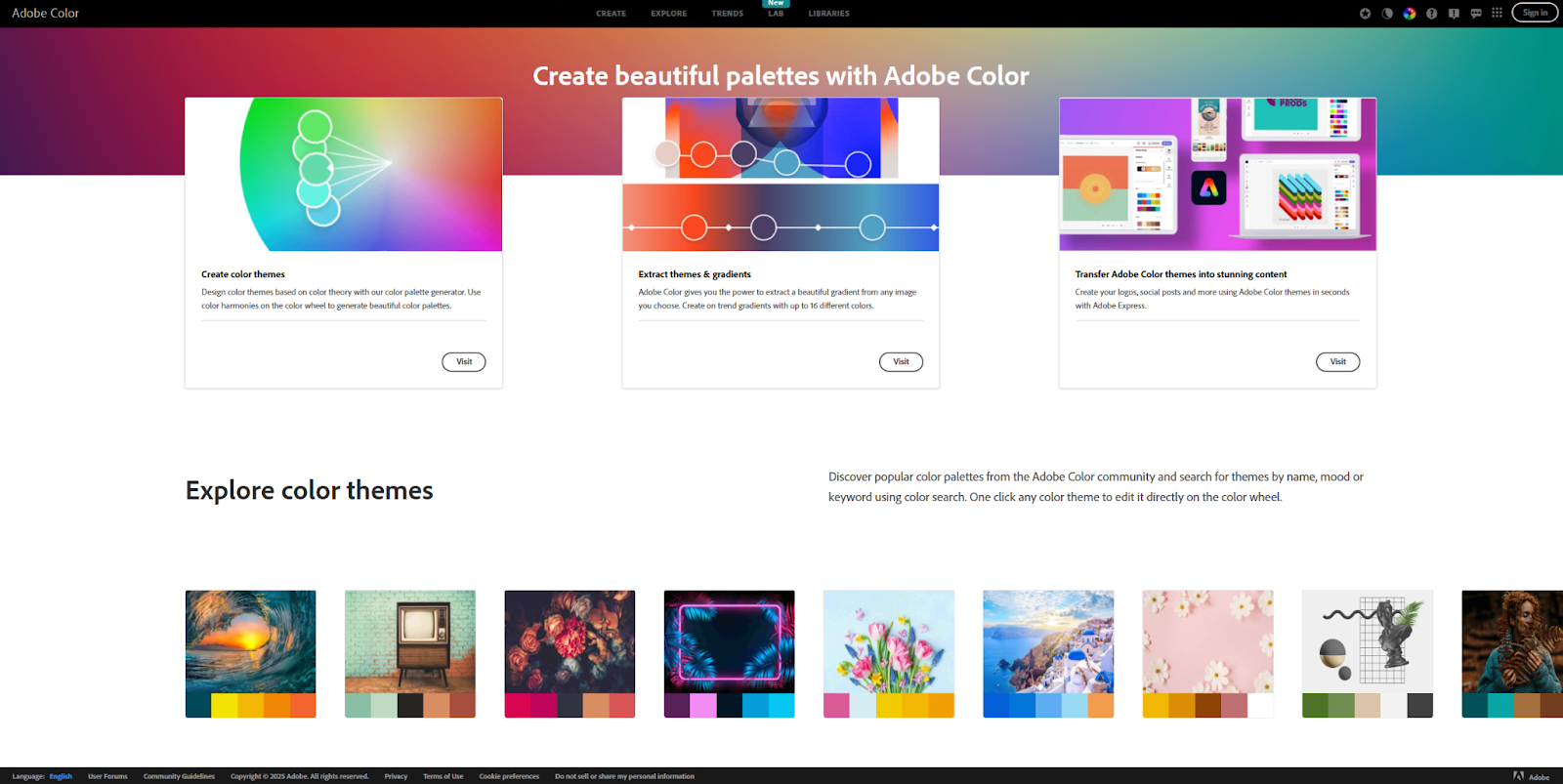
Adobe Color lets you create your own palette using a few different methods. Its extraction tool can identify a color palette from a reference image, and its color wheel automatically generates a palette based on a few inputs, like a base color and relationship.
There’s a large library of palette ideas searchable by keyword (such as “luxury” or “elegance”). You can save any of them to reference later or use in any Adobe Suite product. You can also check your palette against WCAG accessibility standards to ensure it passes.
Khroma
Khroma is an innovative AI tool that lets you train an algorithm to generate color palettes for you. Select 50 colors you like, and the AI will assemble a color scheme based on your choices.
If your choices were too narrow, the tool will let you know, and it makes other useful suggestions, like selecting different saturation and shade levels to improve results.
Coolors
Coolors has been a trusted resource for web designers since 2014. It’s a fast online color palette generator with a robust free plan. An inexpensive Pro subscription opens even more features, such as palettes with more than five colors and a contrast checker for WCAG accessibility.
The tool also supports popular plugins and extensions for Figma and Google Chrome, so you can easily export your favorites.
Bring these elegant color combos to your next project
Your color choices establish your brand persona and influence how a viewer interacts with your website. Luckily, now you’ve got several palette suggestions, as well as the knowledge and tools to customize your favorite choices quickly.
You can launch consistent, on-brand web pages faster with Webflow’s visual-first page-building platform. Customize Webflow’s pre-built templates and drag-and-drop assets with your elegant color palette to build exactly what you want.
Learn more about the best practices of web design with Webflow.
Build websites that get results.
Build visually, publish instantly, and scale safely and quickly — without writing a line of code. All with Webflow's website experience platform.