Color is one of the quickest ways to influence how people feel about your website.
The right color combination can make your brand stand out, increase your site’s readability, and guide visitors toward an action — all before they read a single word.
Good web design uses color theory and psychology to inspire your audience with impactful colors. Read on to explore 30 good color combinations and find out how you can use each pairing to your advantage.
Color theory and the color wheel
Color theory and the color wheel are two foundational tools many designers use to create appealing palettes and reinforce a message. Here are a few basic facts you should know about both:
Color theory
Color theory is the study of how colors interact with each other and influence how we feel. It explains why some combinations feel harmonious while others clash, and why you might salivate over a red box but not a purple one.
In web design, color theory provides a guide to creating palettes that improve readability, highlight important elements, and set the right emotional tone for visitors.
When you apply color theory to your layouts, it shapes the visitor’s experience and directs their behavior in subtle, yet effective, ways. For example, a bold, bright color can lead people toward a call-to-action (CTA) button, while a pale background makes darker text easy to read.
You can lean on psychological associations, too. For instance, red tones stoke feelings of urgency and excitement, tapping into long-encoded danger signals, so you’ll commonly find it on e-commerce sites during sales.
The color wheel
The color wheel is a visual tool for understanding the ways in which colors interact with each other. It’s a circular chart that maps out primary, secondary, and tertiary colors in rainbow order:
- Primary colors: red, blue, and yellow
- Secondary colors: green, orange, and purple
- Tertiary colors: a primary color mixed with a neighboring secondary color, including red-orange, yellow-orange, yellow-green, blue-green, blue-violet, and red-violet
The wheel exists to make relationships between colors easy to visualize, such as monochromatic, complementary, analogous, and triadic colors — more on those in the next section. In web design, the color wheel is a visual shortcut that helps you quickly find complementary color combinations.
Color combination categories
Monochromatic color combinations
A monochromatic color combination uses a single hue with variations in lightness, darkness, or saturation. This approach creates a very cohesive and harmonious look because all colors are closely related. It’s easy on the eyes and feels polished, but designers often rely on contrast in brightness or texture to avoid the design feeling flat.
Complementary color combinations
Complementary color combinations pair colors that are opposite each other on the color wheel. This creates strong contrast and visual energy, making elements stand out quickly. While the effect is bold and eye-catching, it works best when one color is dominant and the other is used as an accent.
Analogous color combinations
Analogous color combinations are made up of colors that sit next to each other on the color wheel. Because these colors share similar undertones, they naturally work well together and create smooth, visually pleasing transitions. This scheme feels organic and balanced, though it typically offers less contrast than other combinations.
Triadic color combinations
A triadic color combination uses three colors that are evenly spaced around the color wheel. This creates a vibrant and balanced palette with more variety than monochromatic or analogous schemes. Because triadic palettes can feel energetic, designers often adjust saturation or brightness to keep the overall look cohesive rather than overwhelming.
Let’s explore a range of color schemes that work well together and can inspire your next design project.
30 best color combinations for web design projects
The color combination you choose for a project should create a mood, guide attention, and reinforce your brand identity while staying legible. An online color palette generator can help you discover potential brand colors, but it still takes a discerning eye to understand what will resonate most with your audience.
Below are 30 color scheme ideas that inspire engagement and anchor brand identity, so you can find the right palette for your needs.
1. Blue and pastel pink for wellness and beauty brands

Commonly associated with nurseries and newborns, blue and pastel pink radiate calmness and warmth. Blue communicates trust and stability, while pastel pink adds softness.
These two colors also work well for beauty and wellness sites as they make layouts feel clean, gentle, and inviting. Brands like Glossier use similar palettes to appeal to younger, style-conscious audiences who value self-care without performativity.
Hex codes: #2F3C7E, #FBEAEB
2. Dark gray and bright yellow for athletic or urban lifestyle brands
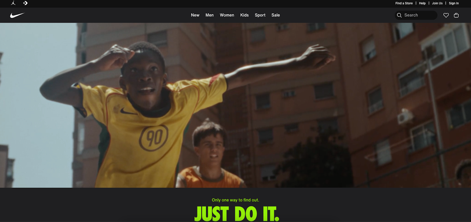
Charcoal gray provides a neutral base for this combination, while yellow provides a high-energy, friendly, attention-grabbing contrast. It’s an excellent pairing for CTAs on websites, with its highlighter-like visibility that drives urgency without the same pressure as red. Athletic and streetwear brands targeting city audiences, like Nike, often use this palette.
3. Red and yellow for youth-focused food and beverage packaging

Studies show that seeing the color red can make us hungry. Psychologically, red and yellow are also associated with speed, joy, and energy, making them a staple color combo in the food and beverage industry.
In design, these colors attract attention but feel fun rather than overwhelming. McDonald’s set this standard for fast food color combinations with their famous yellow “M” arches on a bright red background.
Hex codes: #F96167, #F9E795
4. Cherry red and off-white for romantic or bridal branding

Cherry red is a rich, saturated shade that conveys passion and intensity. Shades of off-white, like ivory and cream, add balance as a neutral tone associated with purity and elegance. Together, they’re a romantic combination for bridal, luxury, or Valentine’s Day-related designs.
Hex codes: #990011, #FCF6F5
5. Light blue and white for childcare, healthcare, or nonprofits

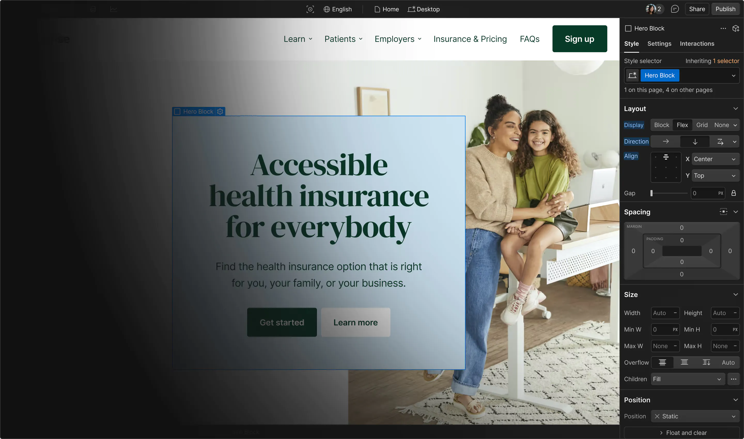
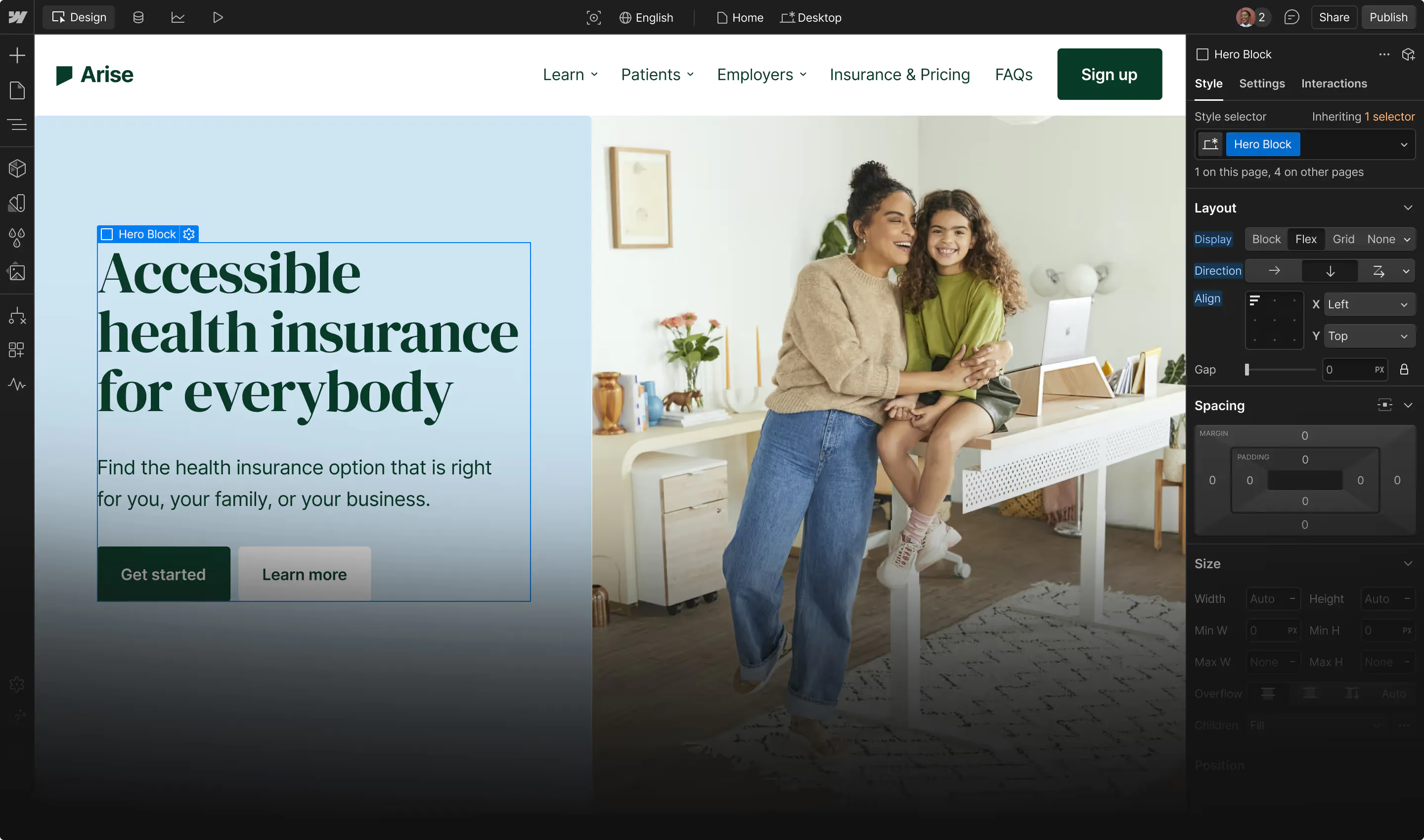
In color psychology, light blue is associated with calmness, trust, and healing. White adds an “openness” as a blank canvas to let the blue shine. This pairing expresses a safe and welcoming environment on a website, making it a great option for healthcare providers, childcare services, and nonprofit organizations.
UNICEF, for instance, uses light blue prominently in its branding to convey hope and compassion — feelings that translate well for a humanitarian agency.
6. Dark and light blue for insurance or financial services

Combinations of dark and light blue are an excellent example of a monochrome palette that doesn’t look flat. Many insurance and financial companies use varying shades of blue, as darker tones convey stability and lighter shades express clarity. In combination, they speak to something trustworthy and easy to use.
For example, PayPal uses navy and light blue to instill confidence in cautious audiences, which was especially important during the early days of online finance.
Hex codes: #00246B, #CADCFC
7. Sky blue and bubblegum pink for parenting or children’s products

Sky blue and bubblegum pink are a brighter, more playful alternative to baby blues and pinks. It’s a well-balanced combo that appeals to caregivers and children alike. Many companies using these colors put pink at the forefront, as it’s more attention-grabbing than a calm blue. Barbie and Baskin-Robbins both use this color combination for branding and product packaging.
Hex codes: #89ABE3, #EA738D
8. Cherry red and bubblegum pink for expressive beauty or lifestyle brands

Bubblegum pink softens cherry red’s passion while maintaining boldness and intensity. Together, they form an attention-grabbing palette that many beauty and lifestyle brands targeting young women use to feel daring yet approachable. For example, Sephora’s website often combines strong reds with lighter pinks to create a lively energy.
Hex codes: #CC313D, #F7C5CC
9. Forest green and moss green for eco-friendly and sustainable brands

As another monochromatic combination, forest and moss greens make an earthy palette that instantly feels organic and rustic. Forest green’s deep, rich tone mimics the feeling of being surrounded by trees, signaling growth, while moss green’s lighter olive hue plays the calmer role.
Brands offering eco-conscious products often choose these green-on-green color schemes to visually remind people of what they’re protecting.
Hex codes: #2C5F2D, #97BC62
10. Midnight blue, royal blue, and burgundy for luxury fashion or fine dining

Midnight blue, royal blue, and burgundy form a rich triad of indulgence. The deep blues evoke elegance, while burgundy stokes passion for luxury fashion and upscale restaurants.
Think high-end menus printed on navy stock with burgundy accents, or fashion websites with dramatic blue gradients and deep red focal points. Their similar depth of hue allows burgundy to attract attention without overwhelming the overall palette.
Hex codes: #1E2761, #408EC6, #7A2048
11. Terracotta, beige, and muted teal for home decor or wellness products
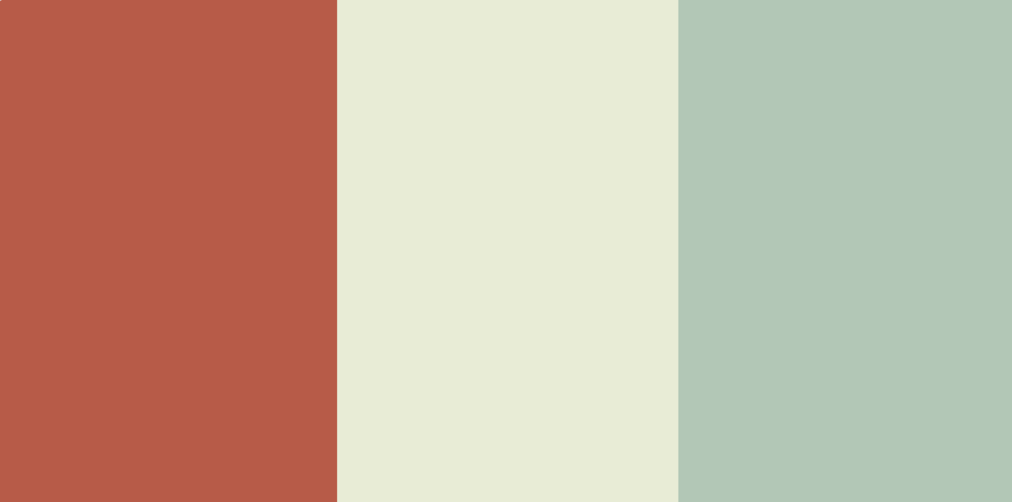
In this color combination, terracotta adds earthiness, muted teal brings a pop of color and serenity from the opposite end of the color wheel, and beige gives a natural, neutral background to showcase the contrasting colors. It’s a common palette for wellness and interior design brands, such as West Elm.
Hex codes: #B85042, #E7E8D1, #A7BEAE
12. Subdued palettes for financial services, healthcare, and minimalist brands

Muted colors, like gray, navy, and off-white, reduce visual noise and are easier on the eyes. They communicate your message seriously without distracting viewers, making them ideal for companies that want stately, institutional appeal.
Banks like JPMorganChase and healthcare organizations like Mayo Clinic use subdued tones to reassure customers and express stability. On websites, light subdued backgrounds with dark fonts improve readability, emphasize content hierarchy, and align with modern minimalist design principles.
13. Dark and earthy tones for heritage, artisanal, and sustainability-focused brands
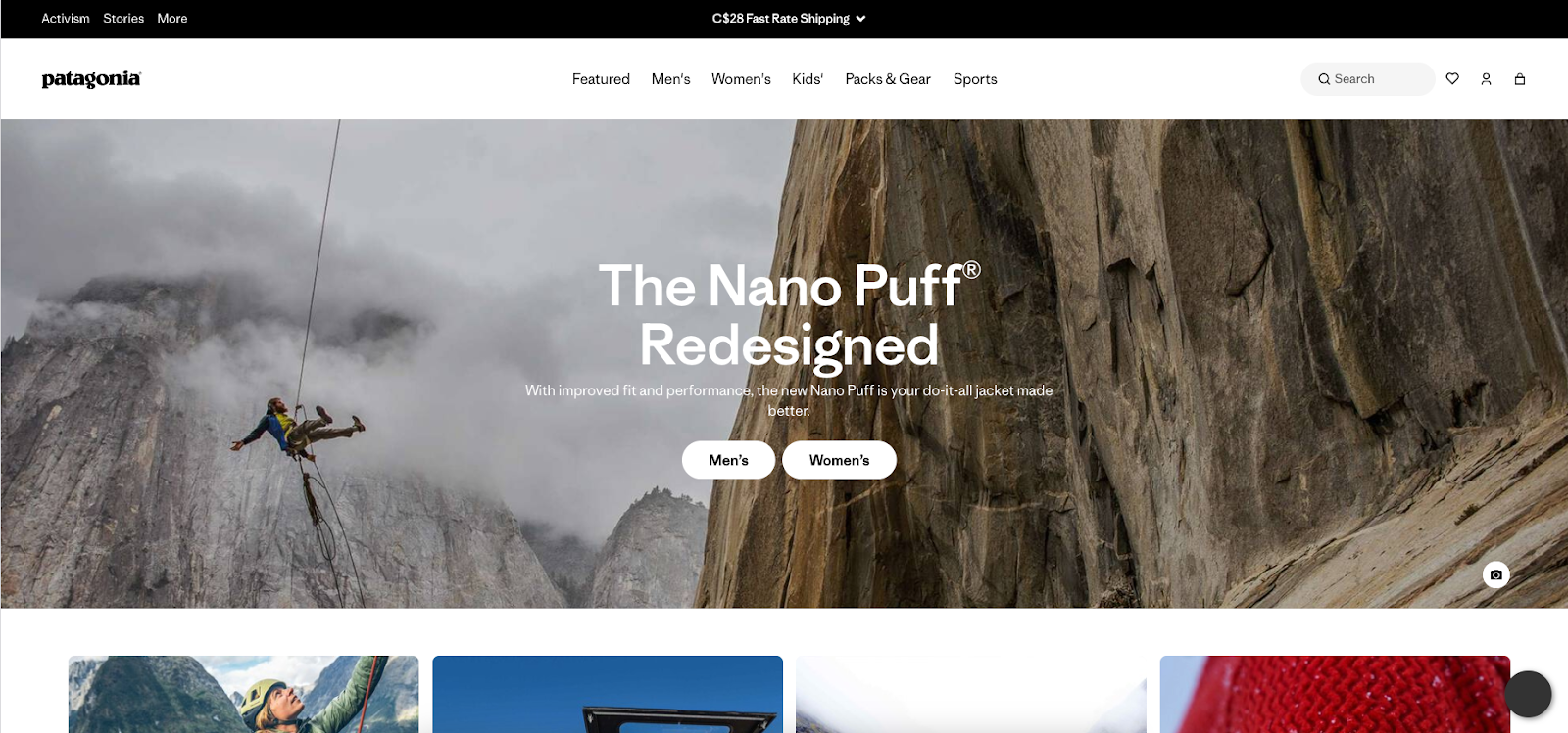
Deep browns and olive greens imply rustic craftsmanship. These colors connect brands to natural materials, suggesting their products are high-quality and long-lasting.
For example, Patagonia uses earthy brown and grays, highlighting not only their product quality but also their environmental mission of “restoring lands, air and waters to a state of health” and “saving our home planet.”
14. Crisp and dramatic contrasts for bold, expressive, or luxury branding
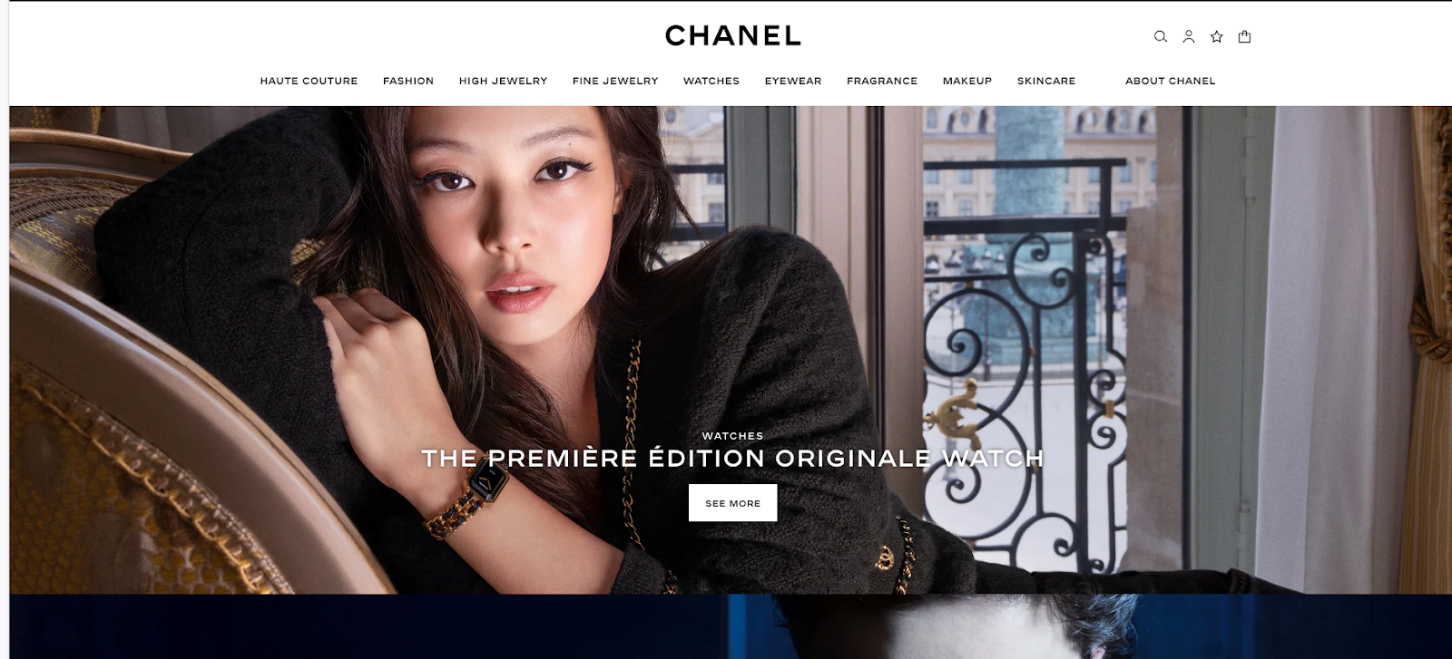
High-contrast color combinations, like black and white, instantly command attention due to their stark difference. Fashion companies like Chanel heavily rely on black-and-white color schemes because they invoke a feeling of timeless elegance while matching modern minimalist trends.
In web design, contrasting colors improve readability. Combined with negative space and effectively placed visual elements, a high-contrast color palette can intuitively direct people where you want them to focus.











Get started for free
Create custom, scalable websites — without writing code. Start building in Webflow.
15. Cool blue tones for wellness, tech, and corporate identities

From ice to deep navy, cool blues radiate a calm and composed energy. In tech, these blues can showcase innovation and reliability working hand-in-hand. IBM and Dell both use cool blue colors to show their forward-thinking sides, and the meditation and wellness app Calm uses blue gradients to relax users as they scroll.
16. Pale olive green and salmon pink for eco-friendly or mindfulness brands

Olive green, especially in lighter tones, communicates natural growth and sustainability. Salmon pink brings the warmth of sunsets into the palette. The two colors add a terrestrial touch for an approachable yet grounded combination for wellness and eco-friendly brands.
Many eco-conscious skincare labels use muted greens and softer pinks on packaging and online channels to allude to environmental issues with warmth and care.
Hex codes: #A1BE95, #F98866
17. Periwinkle and lilac for wellness or spiritual products

Periwinkle and lilac sit on opposite sides of purple in the color wheel: Periwinkle is a blue-violet color, and lilac is a shade of red-violet. Together, they form a tranquil and dreamy palette that’s ideal for wellness brands and organizations centered around spirituality.
Many yoga studios and meditation apps use this combination, especially with a deeper periwinkle contrasting a lighter lilac for better readability.
Hex codes: #735DA5, #D3C5E5
18. Light pink and soft peach for children’s brands or beauty packaging

Baby pink and peach tones are warm and playful, reminiscent of a day at the beach. Children’s products and beauty brands often use this combo to recreate those emotions without overwhelming the viewer.
For example, Johnson’s Baby uses gentle pinks and peaches on its baby oil products, and Coppertone uses the same shades on its infant-friendly sunblock line.
Hex codes: #F98866, #FFF2D7
19. Seafoam green and light blue for spa and travel-related brands

Seafoam green and light blue evoke the colors of the ocean and the sky, instantly tying them to relaxation and travel. Like the wind on your face, it can make you feel fresh, rejuvenated, and modest — qualities spa and resort companies want to highlight in their marketing.
Hex codes: #C4DFE6, #66A5AD
20. Teal and light green for nature-inspired or wellness brands

Teal is a tertiary color, mixing blue’s calmness and green’s vitality. When paired with light green, this palette feels refreshing and organic, but with a stronger sway toward green’s balancing influences.
Wellness brands, yoga studios, and eco-friendly startups often use teal-green color schemes to visually associate themselves with nature and healing.
Hex codes: #20948B, #6AB187
21. Dark green and light gray for high-end or organic products

Dark green and light gray might seem like an unusual combination, but the forest-like energy of dark green blends well with muted gray to create an elevated, balanced feel that works well for luxury brands.
Williams-Sonoma, for instance, often uses dark green and light gray combos in its web design. This provides a pop of color in a modern minimalist aesthetic without compromising the form.
Hex codes: #31473A, #EDF4F2
22. Pink, purple, and gold for creative fashion or cosmetics brands

Gold symbolizes wealth in many cultures. Next to pinks and warm-toned purples, the contrast captures attention and feels distinctly fashion-forward and luxe. The makeup brand Too Faced uses pinks, purples, and golds in its packaging, which targets younger audiences entering the luxury market.
Hex codes: #f1c232, #ce7e00, #c90076, #6a329f, #8e7cc3
23. Deep blue, orange-red, and yellow-orange for adventure or food brands

The high-energy warm side of the color spectrum can be balanced with a single, deeply grounding blue. Combined, these colors offer a more mature alternative to red and yellow brand palettes.
Travel companies like Southwest Airlines convey movement and excitement through these colors, while fast food companies like Burger King use them to invoke appetite with less pressure than a red tone evokes.
Hex codes: #375E97, #FB6542, #FFBB00
24. Mauve, dusty rose, and soft blue-gray for bridal or beauty brands

Romantic tones like mauve and dusty rose sweep a viewer off their feet, while a calming blue-gray balances it. Bridal designers, florists, and beauty companies often use blue-gray tones to add timelessness to colors that remind people of being freshly in love, like mauve and rose.
Hex codes: #962E2A, #E3867D, #CEE6F2
25. Dark reddish brown, taupe, and light peachy brown for artisan or rustic brands

This color combination is inspired by natural materials like wood, clay, and stone, making it ideal for artisans. Dark reddish brown conveys strength through its associations with brick and trees, while taupe and peachy brown are warm neutral tones that balance the reddish brown’s richness.
Coffee roasters and furniture companies typically use these earthy tones to imply high-quality craftsmanship.
Hex codes: #330000, #73605B, #D09683
26. Dark blue, scarlet red, and lemon yellow for retro or sports brands
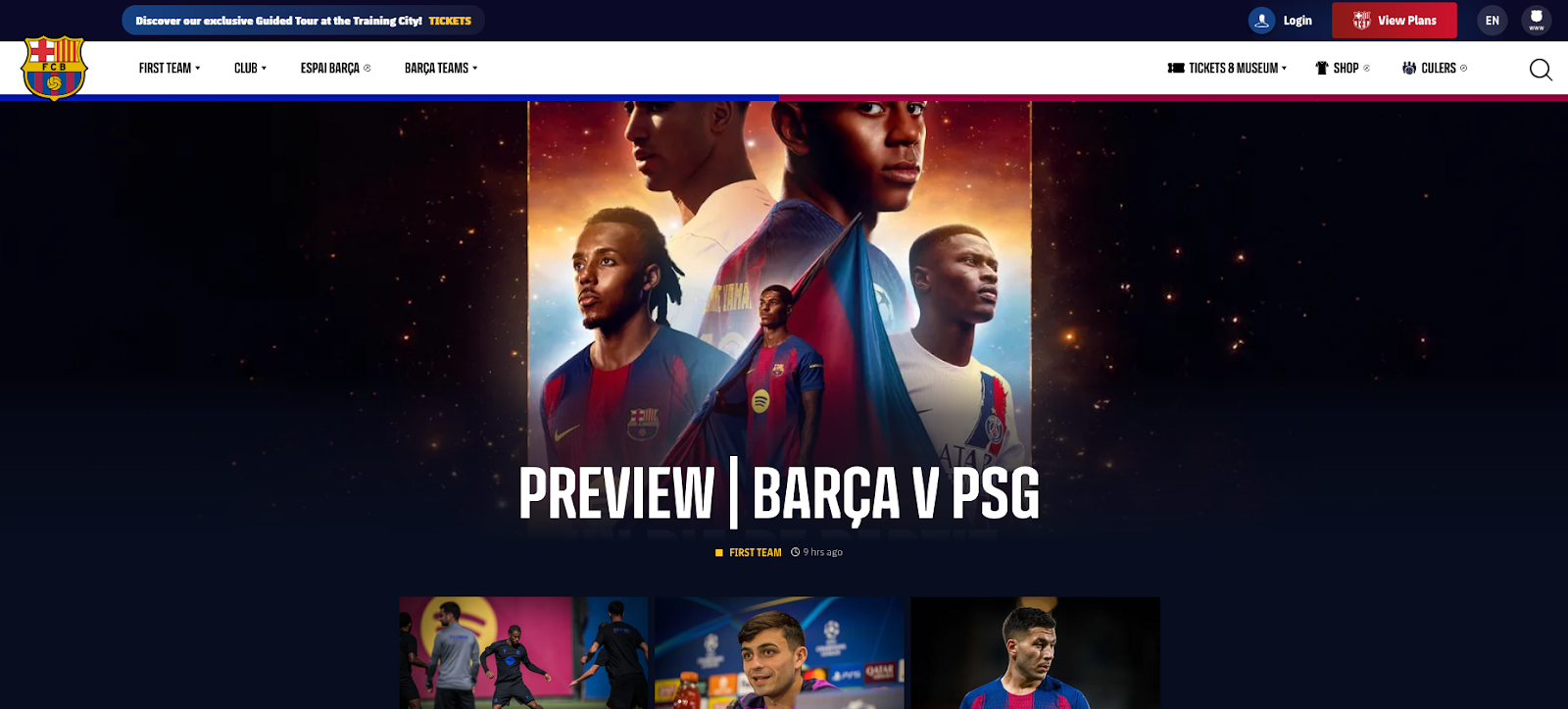
Dark blue, scarlet, and lemon yellow are a bold, high-energy triadic color combo. These primary colors were especially popular in the United States during the 1970s, so contemporary use of this palette brings a nostalgic, retro vibe.
Sports teams like FC Barcelona and the NBA’s Cleveland Cavaliers use variations of this palette to inject optimism and inspire loyalty and bonding for upcoming seasons.
27. Teal blue, light blue, and light gray for healthcare or security tech

The blues in this palette provide the color’s typical associations (innovation, stability, and healing) while light gray adds neutrality. These colors can reassure viewers that the brands’ work behind the scenes will fix problems without impacting or influencing daily life.
Healthcare providers like Pfizer and cybersecurity firms like Kaspersky and Cisco often use similar palettes for their branding.
Hex codes: #1995AD, #A1D6E2, #F1F1F2
28. Navy blue, bright red, and pale pink for luxury or fashion brands

Pale pink is a daring alternative to white or ivory when paired with dark navy and bright red. Fashion houses like Tommy Hilfiger use navy, red, and white to create iconic logos, but switching white for pale pink brings personality while retaining the primary colors that visitors associate with rich materials like velvet.
Hex codes: #002C54, #C5001A, #FDF6F6
29. Chestnut brown, burnt sienna, and cream for farm-to-table or coffee brands

This color combination is full of earthy, food-adjacent tones. Chestnut brown is rich, burnt sienna is rustic, and cream adds a dollop of neutral to balance darker colors. Coffee brands and farm-to-table restaurants frequently use browns and creams to emphasize their products’ natural origins.
Hex codes: #46211A, #A43820, #F1D3B2
30. Dark charcoal, deep rust, and sky blue for architecture or high-end design firms
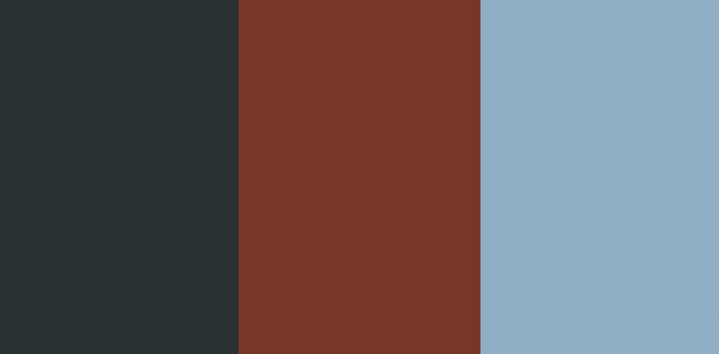
Charcoal and rust offer a subdued neutrality that provides a clean background for sky blue accents, which bring freshness to an otherwise muted palette. It’s a combo that works well for architecture or design firms that want to show authority while remaining approachable.
High-end studios often use these types of dark neutrals accented with lighter blues for a creative twist on luxe monochrome palettes.
Hex codes: #2A3132, #763626, #90AFC5
Find the perfect palette for your website with Webflow
Every color evokes an emotion, and knowing how they influence website viewers can shape your choice of the best color combination for your website. Whether you want to make a warm-toned layout to increase excitement or use cool colors to simplify complicated ideas, you need the right website builder to integrate them into your brand.
Good web design is important to turn viewers into repeat customers, and it doesn’t end with picking a color scheme. Try these color schemes in Webflow.
Learn design basics and more through Webflow University, with free videos, courses, and interactive learning options.

Get started for free
Create custom, scalable websites — without writing code. Start building in Webflow.
