


The visual appeal of a website may be the single most important factor for a new visitor.
Studies have found that 94% of website first impressions are based on design, and appealing design can actually improve usability ratings.
So, what makes a good design? Several design principles come into play including spacing, hierarchy, and scale. But one thing you’ll most definitely want to pay close attention to is your color choice.
Your website’s color palette directly impacts how well viewers can see or read different elements on each page as well as the way they feel when interacting with your brand — because each color has a unique meaning. And if you don’t decide on a color palette up front, it’s easy to wind up with mismatched hues that are hard to see, don’t look great together, or undercut your intended message.
In this article, we’ll cover the basics of how to create a color palette for a website from common types of color palettes to tools you can use to simplify the process.
Why every website needs a great color palette
A poorly selected color palette can negatively impact user experience, but that’s not the only downside. There’s an opportunity cost to not choosing a great color scheme, too. A study conducted by Reboot found that “using a signature colour can cause an 80% increase in a consumer’s recognition of your brand”.
Just look at the color palette below. Does a brand name come to mind?

You may recognize these colors from the Google logo. Let’s try another one. Does the color palette below bring a brand name to mind?

If the three colors above made you yearn for a cup of coffee, it’s likely because they’re the brand colors of Starbucks.
Brand recognition is an important factor for every company because it helps you build trust with your audience and convert more potential buyers into happy, loyal customers — and brand recognition is just one variable that your color palette impacts.
Quicksprout also found that “85% of shoppers place color as a primary reason for why they buy a particular product.” A separate study conducted by Beamax found that simply changing the color of a CTA button on a website can increase click through rate (CTR) by as much as 50%. So, choosing a great color palette can help you build brand recognition, increase CTR on your website, and secure more sales.


Get our 100 video course on web design — for free
From the fundamentals to advanced topics — learn how to build sites in Webflow and become the designer you always wanted to be.
6 types of color schemes and how to create them
There are six main types of color schemes you can leverage to create a stunning color palette.
1. Monochromatic
Monochromatic color schemes are made up of different tones, tints, and shades of a single color. Tints are created by adding white, tones are created by adding gray, and shades are created by adding black (as pictured below).


Many color palettes at least partially include monochromatic color schemes. They’re very simple to create and great for beginners because it’s hard to create a bad color palette if you’re sticking with monochromatics.
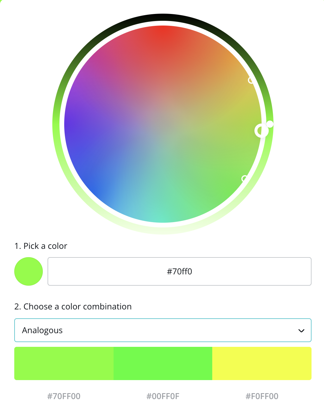
2. Analogous
Traditionally, an analogous color scheme consists of three colors that are next to each other on the color wheel — but you can definitely select more than three if you want to.
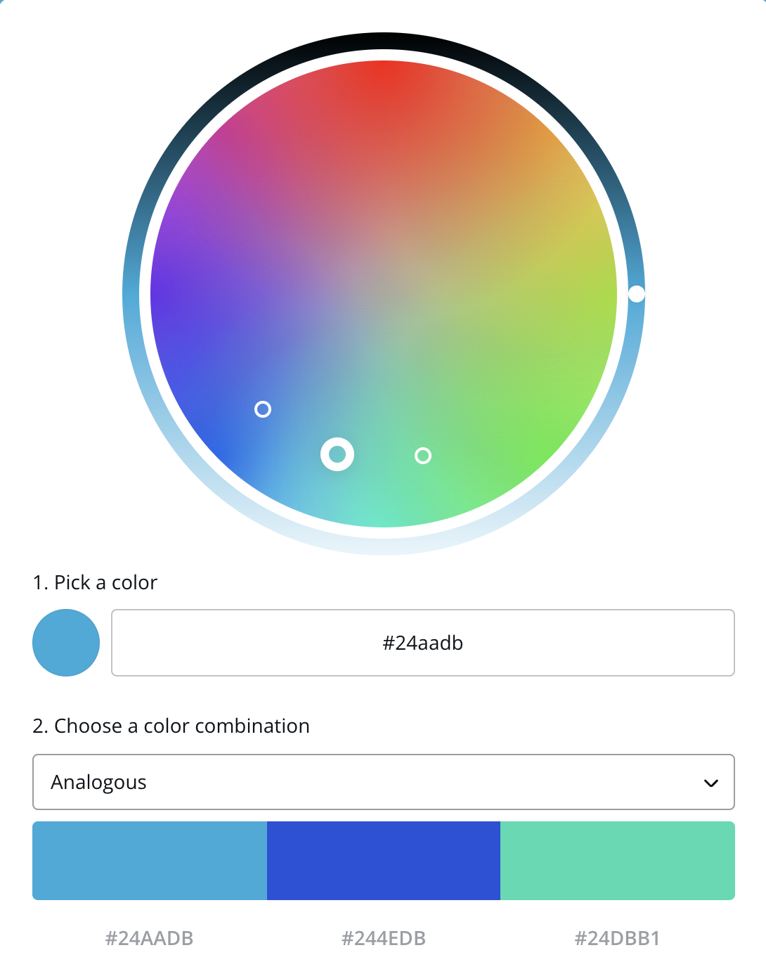
If you’re new to creating color palettes I highly recommend playing around with Canva’s interactive color wheel. You can select “Analogous” or other color scheme types from the drop down menu and slide the color picker around the wheel to see different combinations of analogous colors.
You’ll notice that analogous colors are side by side.
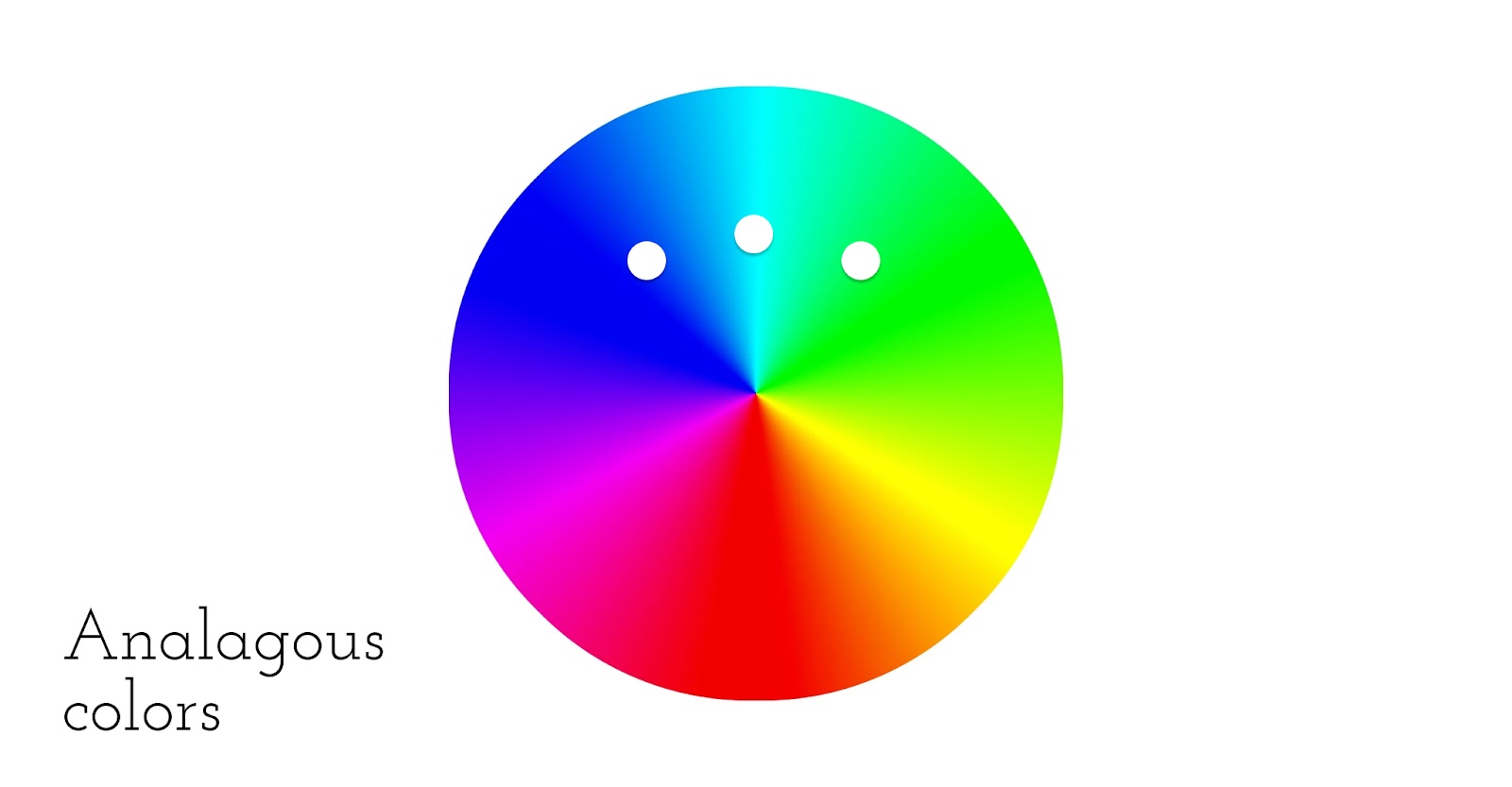
Analogous colors can often be found in nature, which may explain why we humans find analogous hues so appealing. Picture a fiery sunset or the green and blue hues of tropical ocean waters and you’ll feel the allure of analogous colors. Here’s an example of a five-color palette created using analogous colors with Electric Violet (Hex code 8F00FF) as our main color or starting point.

You’ll probably want more than just five colors to play with when designing a website. This is when combining color schemes can come in handy, as pictured below.
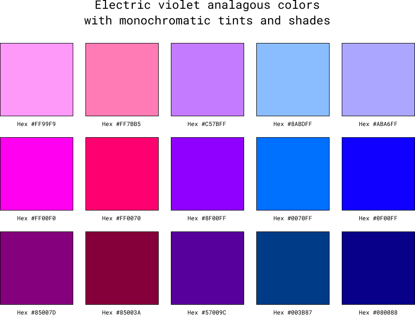
This color palette combines analogous colors with their respective monochromatic tints and shades, giving us fifteen different colors that all look great together, again centered around electric violet.
3. Triadic
Triadic color schemes are composed of three colors that form an equilateral triangle on the color wheel. The three primary colors (red, yellow, and blue) are triadic colors, as are the secondary colors (orange, green, and purple).
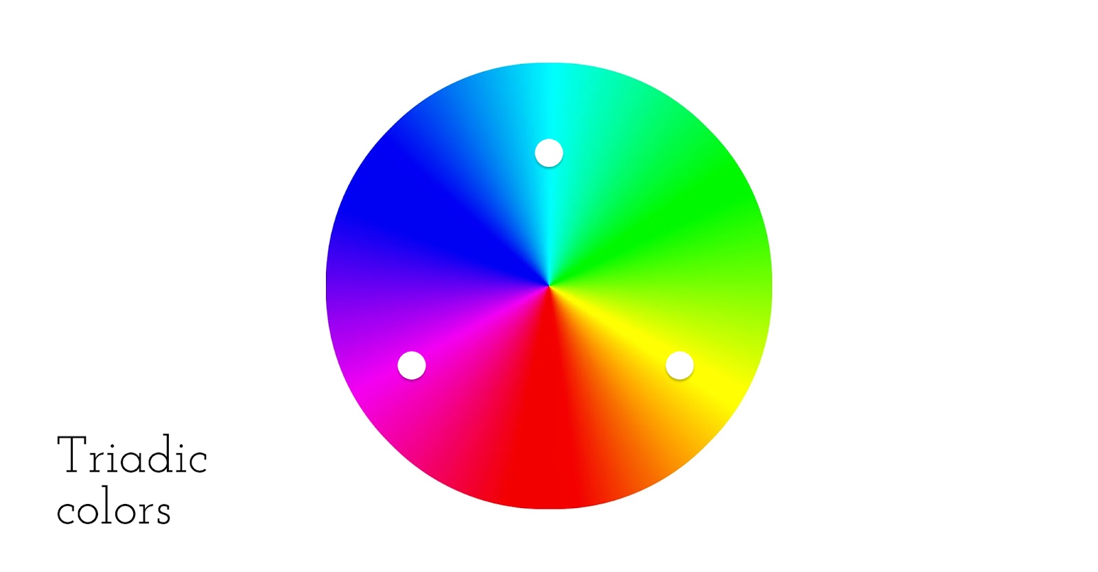
The above image shows a triadic color palette and you can see that the small circles form an equilateral triangle. In the image below we’ve included another triadic color palette created using Electric Violet along with monochromatic tints and shades.
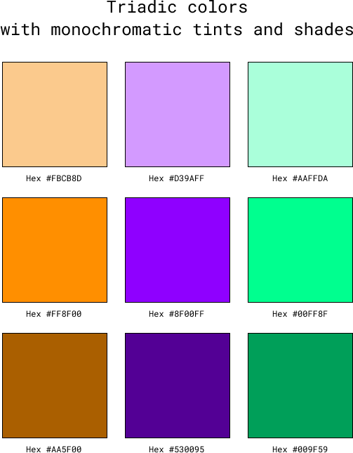
By combining triadic and monochromatic color schemes we can get a palette of nine, twelve, or more, depending on how many tints, shades, or tones you desire.
4. Complementary
You’re probably familiar with complementary colors even if you’re not a color expert. Complementary colors are those that are on opposing sides of the color wheel. So, Electric Violet’s complementary color is Bright Green.

5. Tetradic
Tetradic color schemes are made up of two sets of complementary colors and together they form a rectangle or square on the color wheel. Here’s an example of tetradic colors:
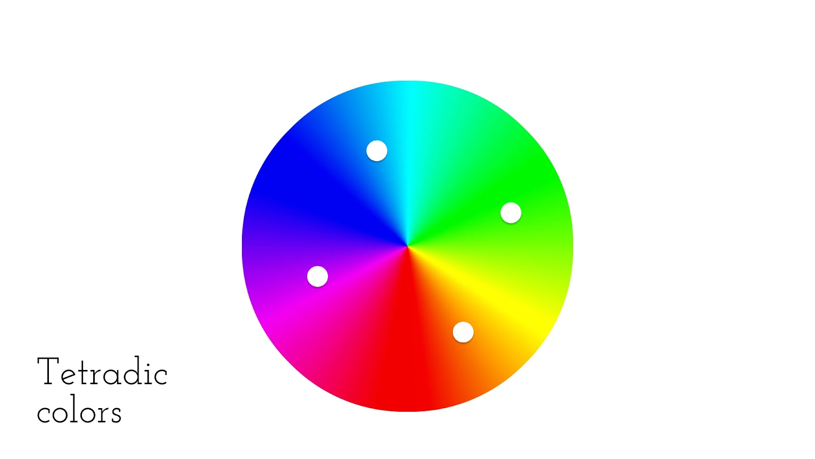
Here are a couple more examples of tetradic color palettes. Below are two different tetradic color schemes including Electric Violet and Bright Green.

Just like the previous color schemes, you can also combine complementary and triadic color schemes with monochromatic color schemes to get a wider range of colors that look visually appealing together.
6. Split-complementary
To create a split-complementary color scheme, you take two complementary colors and then swap one out for that color’s analogous colors (or two shades next to that color on either side). For example, let’s again look at the complementary colors Electric Violet and Bright Green.
To create a split-complementary color scheme including Electric Violet, we’ll need to swap out Bright Green for two analogous colors.
Here’s the resulting color palette.

As you can see from the examples above there are many different ways to approach color selection and a wide variety of colors that can look good together. If you’re having difficulty creating a color palette that you love, try adding a swatch of black, white, or gray to the mix.
Color palette creation tools
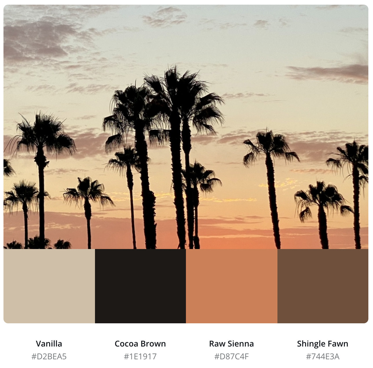
You don’t have to be a color theory expert to create a beautiful color palette for your website (though it certainly helps). I often pull color palettes for websites and other design projects from photos I’ve taken of beautiful scenes on hikes or vacations.
You can use the color picker or eyedropper tool in Photoshop (or most photo editing and illustration tools) to hand select colors from an image or simply use a color palette generator. All you need to do is upload a photo and it’ll give you a custom color palette in seconds. The best part is that your photos don’t even need to be high quality. As long as you’ve got some color variation in there, it’ll work.
There are lots of cool color tools for isolating colors as well as color scheme generators available online. So, no matter how you like to work or where you prefer to draw inspiration from, there’s likely software that can help simplify your workflow. And when in doubt, it’s always helpful to start with a classic or trending color combination and build off of that.
Important color considerations
In addition to making sure your color scheme is visually appealing and well contrasted, you also need to consider your audience, message, and inclusivity when deciding on a color scheme for your website or other graphic design project.
- Your audience: People respond to colors differently depending on their geographical location, culture, and many other factors. People from New Orleans, for example, may associate the colors purple and gold together as a symbol of Mardi Gras, while Los Angeles residents might associate these as Lakers’ colors. If you can, conduct a survey of your audience before committing to brand or website colors.
- Your message: Once you understand your audience, choose colors that will strengthen your message. If you’re creating a website for a relaxing spa, you’re probably going to want to stay away from bold red and orange colors.
- Inclusivity and accessibility: Roughly 4.5% of the world population has some type of color vision impairment. To ensure your website is inclusive and accessible, you’ll need to check out how it looks for people with different types of color blindness. This is easy to do in Webflow using the Vision preview tool.
Finally, remember to let your personality (or your brand’s) shine. There are millions of color combinations to choose from, so take the time to find the right colors for your unique project.