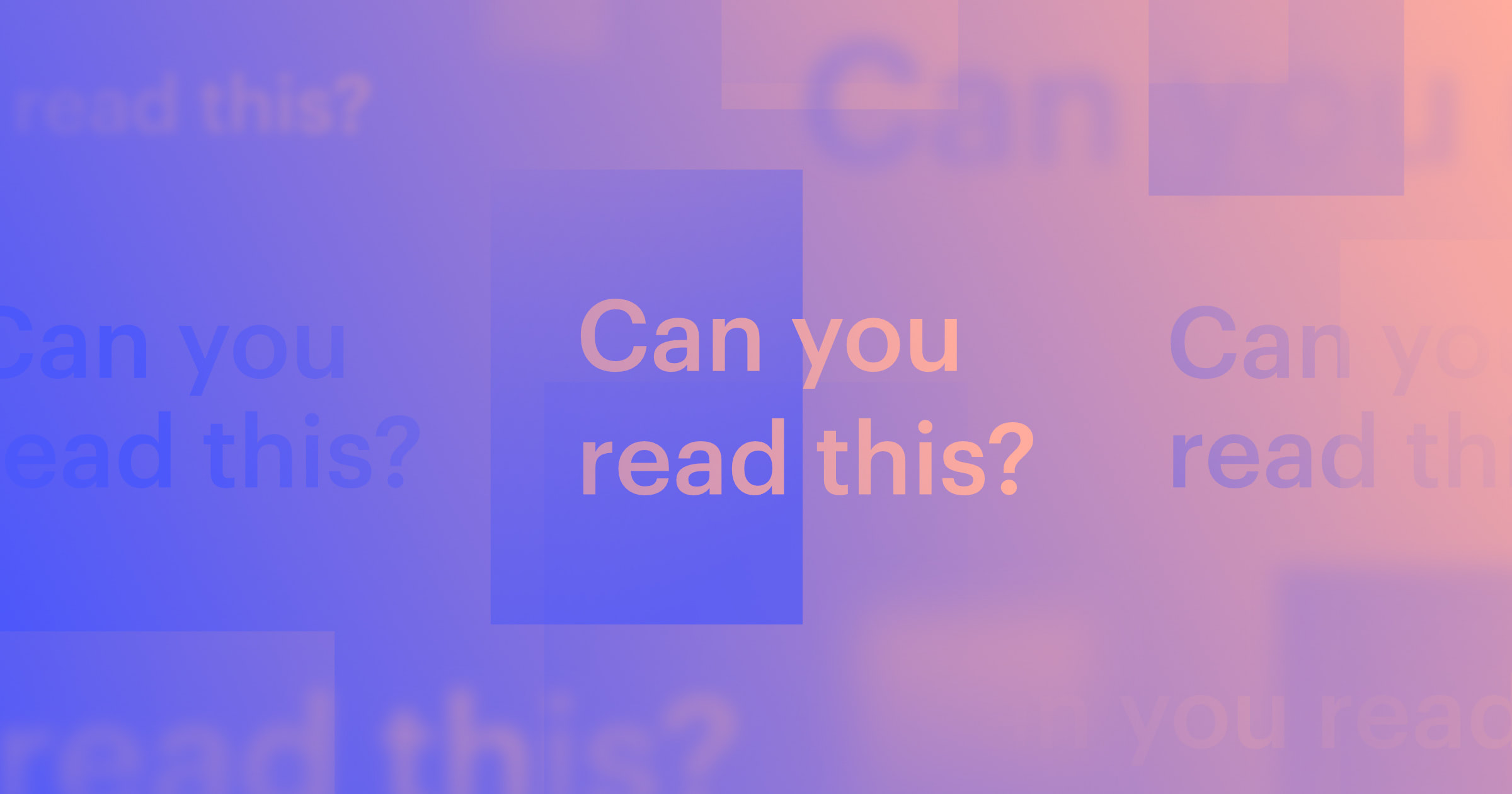
Every color carries emotional weight, subconsciously shaping how people perceive your website.
Our ability to see colors and instill them with emotion is a valuable tool in a designer's toolkit. When you understand colors and their perceived meanings, you can use color psychology to create elements that evoke the reactions you want from your visitors.
Read on to learn about the meanings of colors and how to use a robust palette to shape your site's user experience.
What influences color meanings?
While colors carry general symbolic meanings, their impact isn't always universal. Several factors shape how people perceive colors in web design, including:
- Cultural context: Colors have different meanings depending on culture. For example, white often symbolizes purity and harmony in Western cultures, while people in Eastern cultures may associate it with mourning. Understand your audience's background to use colors more intentionally.
- Personal experiences: People bring their own memories and emotions to colors. Some might associate yellow with happiness from childhood memories, like sunshine and flowers, while others may link it to caution or warning signs. Part of color psychology is personal, so it’s important to understand as much as possible about your target audience’s general perception toward specific colors before using them.
- Industry norms: Certain industries commonly use similar color palettes to build trust with their customers. For instance, financial trackers often use red to denote market losses, while organic or health brands lean toward green to reflect nature and wellness.
- Design trends: Trends can shift how people perceive colors. A color that once seemed outdated might feel fresh and modern after a viral marketing campaign or new design movements. For example, during the Prohibition era, barrels that contained Coca-Cola were painted red to signal that they contained no alcohol.
- Color combinations. A color's meaning can change depending on the colors you pair it with. For example, red and green might evoke festive holiday feelings because of Christmas, while red with black might feel bolder and more intense.
What does each color mean?
Here's a breakdown of what different colors typically mean and how they influence perception in web design.
Red
Red is one of the most emotionally intense colors, symbolizing energy, excitement, passion, and urgency. It grabs attention and can trigger faster decision-making for promotions or limited-time offers. However, it's best to use red carefully to avoid overwhelming visitors.
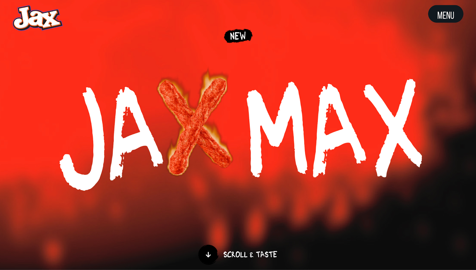
Jax Snacks' homepage has a fiery red background to match the intensity of their product — spicy, flavorful snacks. The red immediately tells potential customers that Jax brings heat with bold flavors.
Two flaming hot chips form an "X" within the text "Jax Max," reinforcing the idea of spiciness through animated visuals. The bold, white, handwritten-style font also contrasts strongly with the red, making the text stand out even more.
Orange
Orange combines the warmth of red with the optimism of yellow. Sitting in the middle of the two, it's often thought of as a friendlier color than red, making things seem more approachable, energetic, and open. In web design, orange highlights innovation and growth.
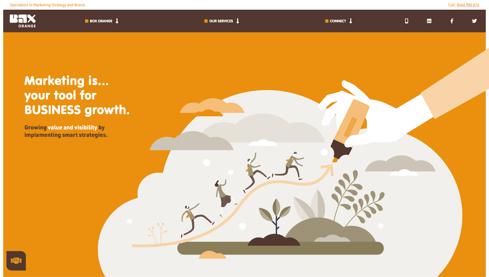
Box Orange's orange background, designed by Matt Blak, tells people that the marketing agency is a bright-eyed, approachable group that helps companies grow. The orange highlighter motif and budding plants in the illustration visually reinforce the idea of marking a clear path forward.
Yellow
Yellow shades symbolize optimism, warmth, and fresh thinking. They evoke happy or carefree feelings, making people feel more positive. In web design, yellow can energize a layout. You can use it to highlight important areas and spark interest. However, too many overly bright yellow shades can create fatigue in the viewer, so it works best with darker or neutral tones.
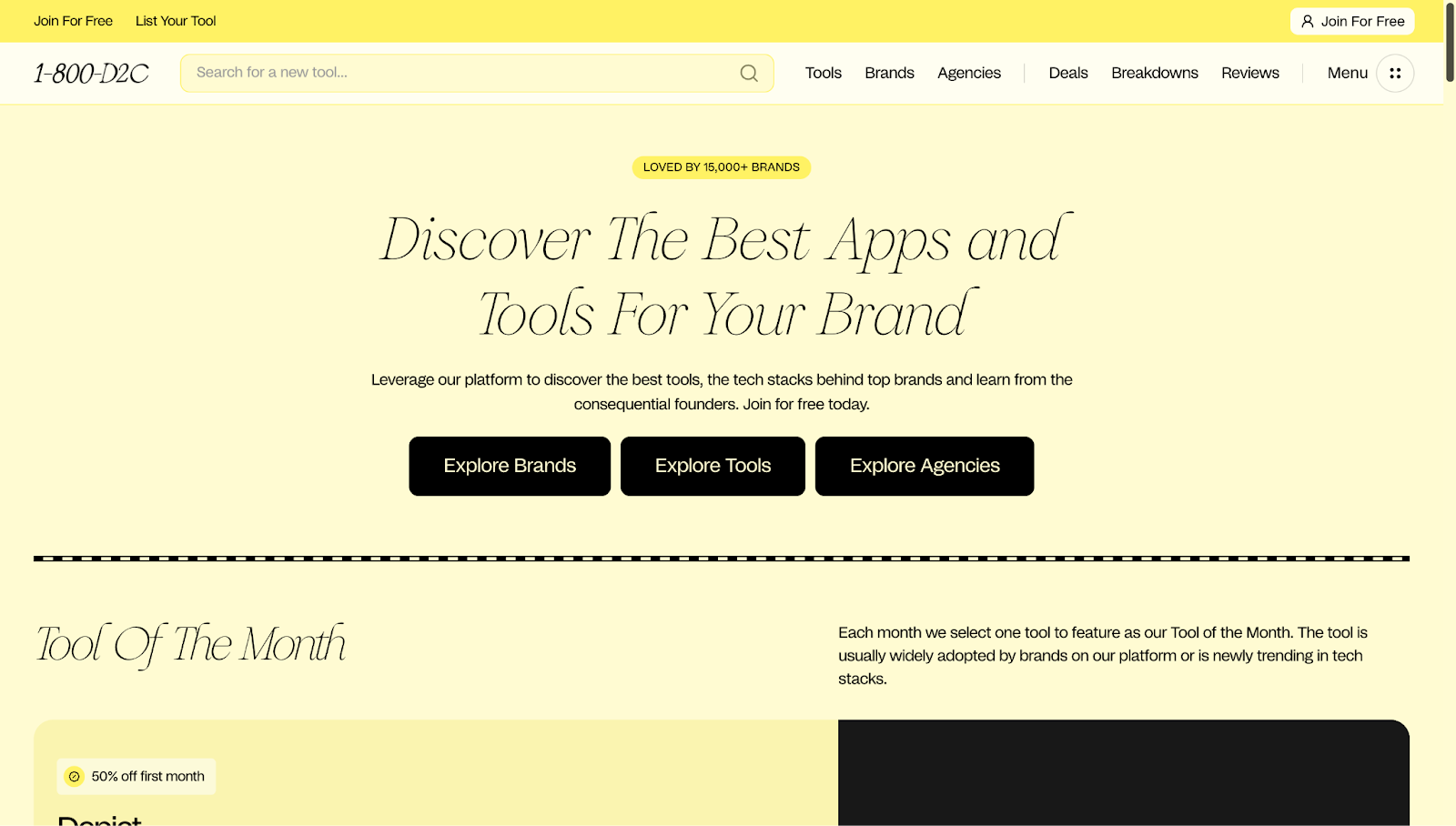
The 1-800-D2C website has a soft yellow backdrop across nearly every section to create a warm, welcoming atmosphere. The pastel tone avoids the harshness of brighter yellows, giving the platform a calm appearance while still standing out.
Designer RC Williams uses different shades of yellow on this website to help users navigate. Darker hues are used for headings and titles, while muted yellows highlight buttons, tags, and labels, intuitively guiding attention to subtopics without overwhelming the interface.


Ultimate web design
From 101 to advanced, learn how to build sites in Webflow with over 100 lessons — including the basics of HTML and CSS.
Green
People tend to associate green with growth due to its presence in nature. It evokes calmness, sustainability, and stability. Green is great for your website's branding if your company is about eco-friendliness, health, wellness, or ethical business practices. In finance, it also symbolizes positive market gains.
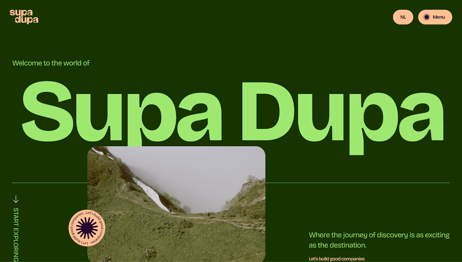
For example, SupaDupa's primary background color is calming forest green. This green isn't just aesthetic — it matches the brand's mission of building purpose-driven companies and making a positive, sustainable impact. Lighter neon green and soft yellow accents create contrast, keeping the layout vibrant while still feeling earthy.
Blue
Blue is one of the most versatile colors in web design. It represents professionalism, intelligence, and calm reliability. Many companies in tech, finance, healthcare, social media, and SaaS use blue for their branding because it conveys competence, especially when paired with minimal layouts and clean typography that allow the blue to stand out.
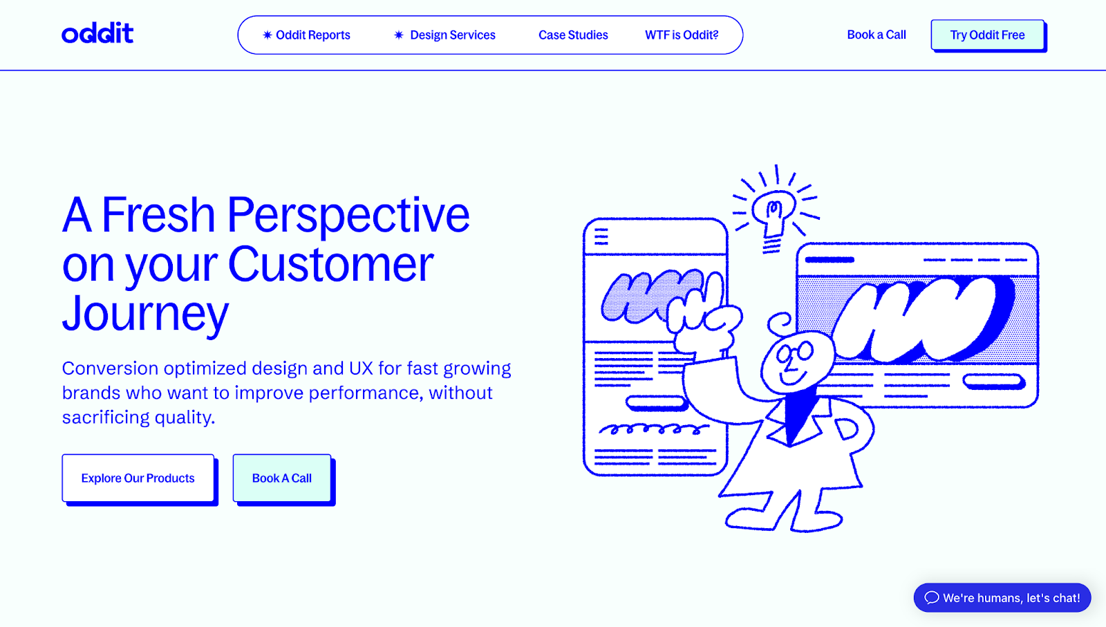
Oddit leans into a crisp royal blue across its entire page, with shades of the color appearing in text, illustrations, and button shadows. The digital-friendly tone feels sharp and modern, while the caricatures add a playful personality to the website.
The royal blue hue stands out against the white and soft blue backgrounds, helping CTAs, testimonials, and illustrations pop without relying on more aggressive or urgent colors like red or pink.
Purple and pink
Though not primary colors, purple and pink blend the stability of bluish hues with the energy of red. They often represent luxury, wisdom, and forward-thinking. At times, these colors can feel mystical or exotic, a nod to their rarity in nature. Depending on the shade, purple and pink can be bold, standout choices, or provide a calming, sunset feel. They seem energetic in brighter tones but add softness and ambiance in gradients.
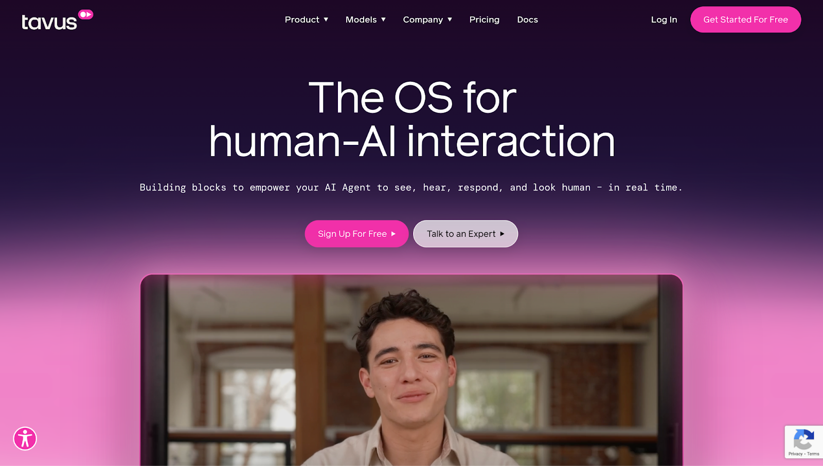
Tavus uses bold pink and glowing accents to position itself as a "human-first" AI brand. The homepage opens with a deep purple-to-pink gradient, setting a warm, cinematic ambiance.
Neon pink buttons grab attention and contrast strongly against the darker purple backdrop. Throughout the page, Tavus integrates pink into facial graphics, interactive illustrations, and highlight states, giving a human warmth and movement to their AI models. The overall effect is a brand that feels intelligent, emotionally aware, and futuristic.
Black, white, and gray
Black, white, and gray create contrast while providing clarity and form. Black has a stronger, authoritative tone, while white is simpler and adds negative space to a layout. Gray lives in the middle — refined, balanced, and often subtle.
Darker monochrome color schemes remove distractions, giving the content or product center stage. Depending on contrast and tone, the emotion can be calming, minimalistic, or dramatic.
In web design, premium agencies or design-forward brands use monochrome palettes when they want their work to speak louder than their interface. It puts typography, structure, and form at the forefront.
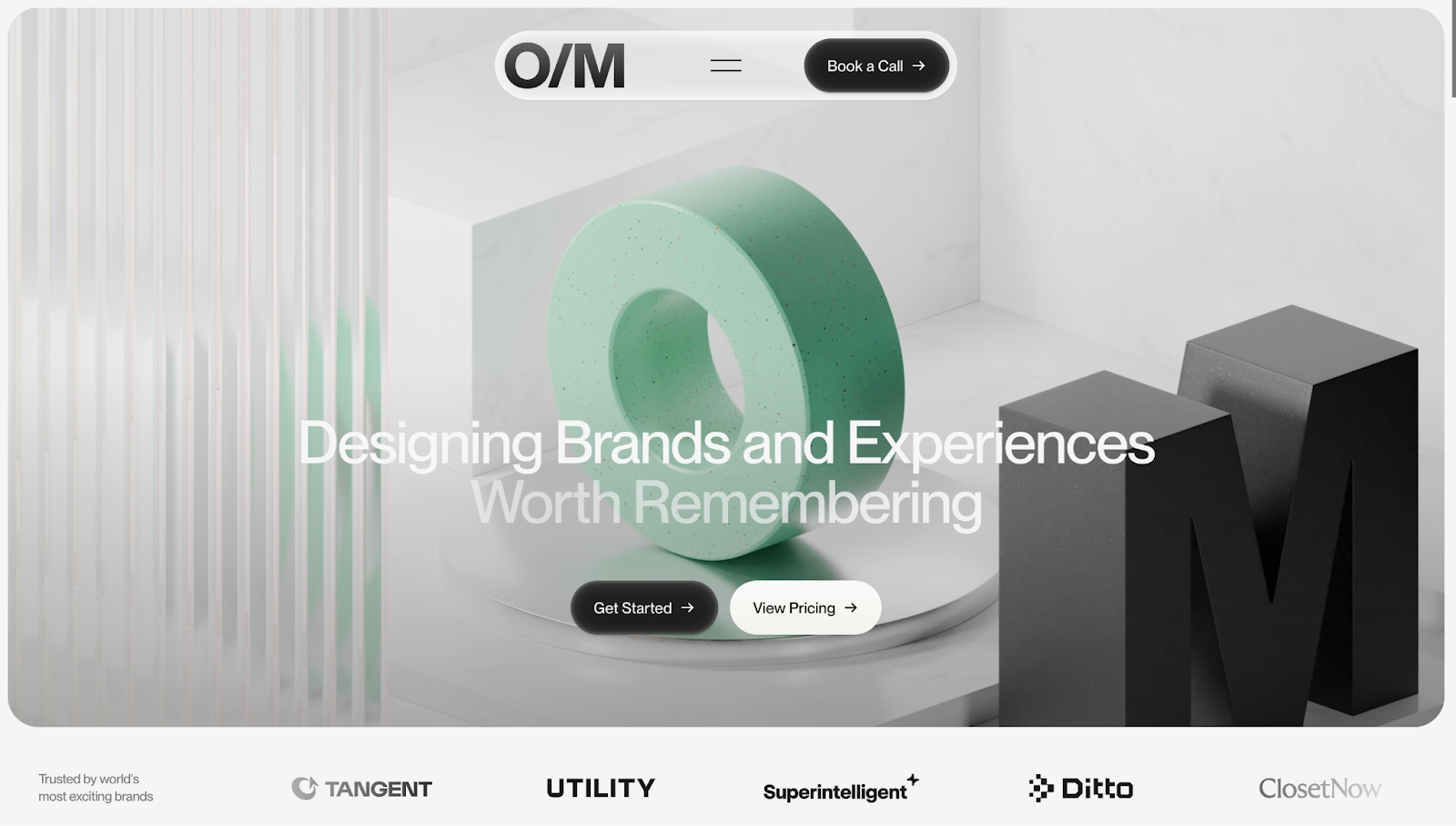
For example, OFF MENU's crisp monochrome palette helps highlight typography-led messaging and 3D visuals, with subtle mint green accents used sparingly for contrast. The lack of bright colors enables the brand's identity to come through in the layout and copy. Instead of overwhelming visitors with color, OFF MENU lets their messaging do the talking.
Beige and brown
Beige and brown are grounded, neutral colors that draw from nature; this is due to their presence in natural materials like wood, clay, sand, and rocks. People generally associate these colors with warmth, comfort, and stability — qualities that feel timeless, human, and handcrafted.
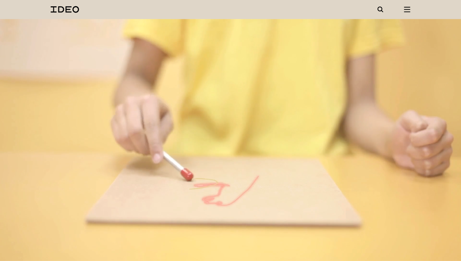
IDEO uses beige as its core background color, creating a warm setting that lets the video header and typographic headlines take center stage. Paired with complementary black text and yellow accents, the beige tones make the site feel earthy and rustic, reflecting IDEO’s human-centered design approach.
Use colors to connect with your audience
The colors you choose can instantly shape how visitors feel about your website, guide their attention, and even influence their decisions. Through color psychology, you can make smarter design decisions that look good and contribute to your goals.
With Webflow, you’ll be able to put your color insights to work. Create websites in a visual design environment and let our platform bring your favorite colors to life.
Make lasting impressions with every shade — get started with Webflow.
Build websites that get results.
Build visually, publish instantly, and scale safely and quickly — without writing a line of code. All with Webflow's website experience platform.