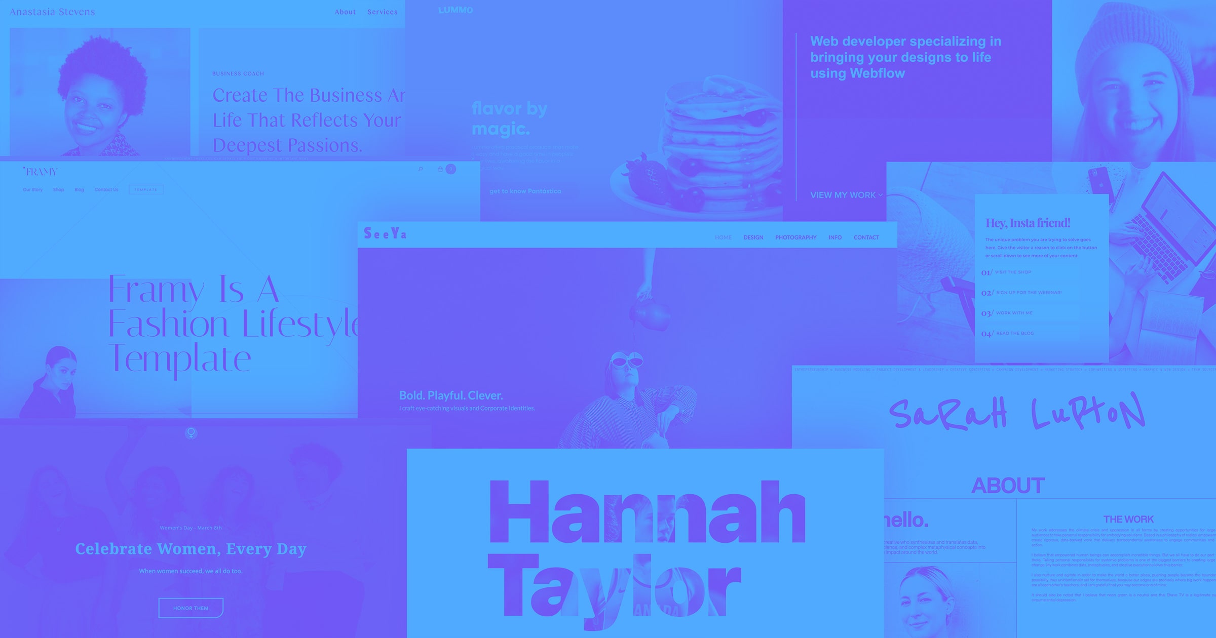
Check out these 13 fantastic websites showing off the work of women designers who use Webflow.
It may no longer be Women’s History Month, but let’s continue the spirit of celebrating their accomplishments! We’re going to take a look at thirteen fantastic websites built with Webflow, all designed by women.
1. Burger Queen
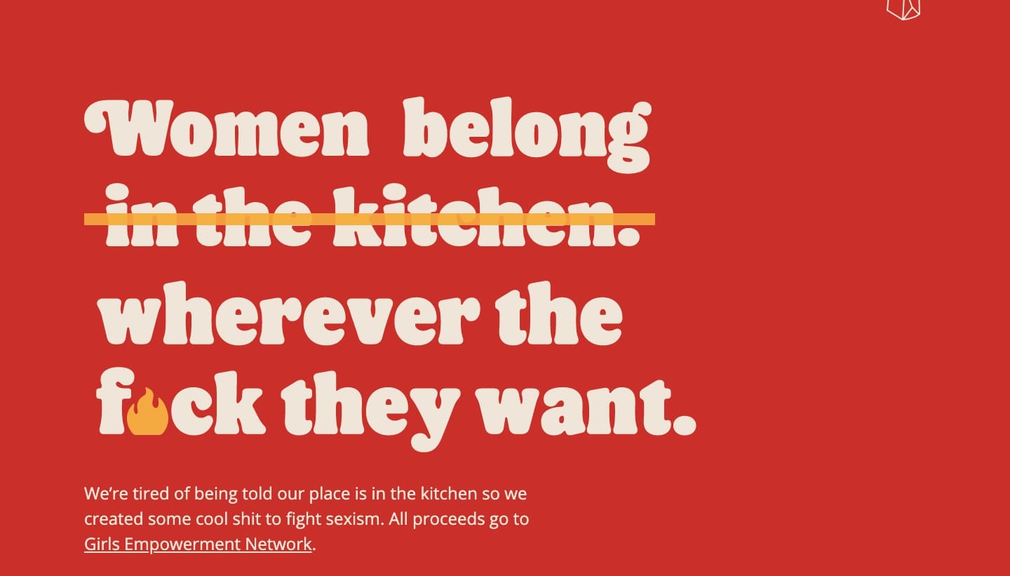
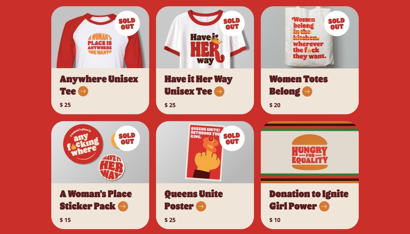
With a dark red website background and retro-styled typography, this design captures the aesthetic of a well-known fast-food restaurant that recently stepped in it with a poorly thought out tweet. The team at Hunt, Gather built Burger Queen in response (in just a day!) to sell feminist t-shirts with all proceeds benefitting the Girls Empowerment Network.
2. Sarah Lupton
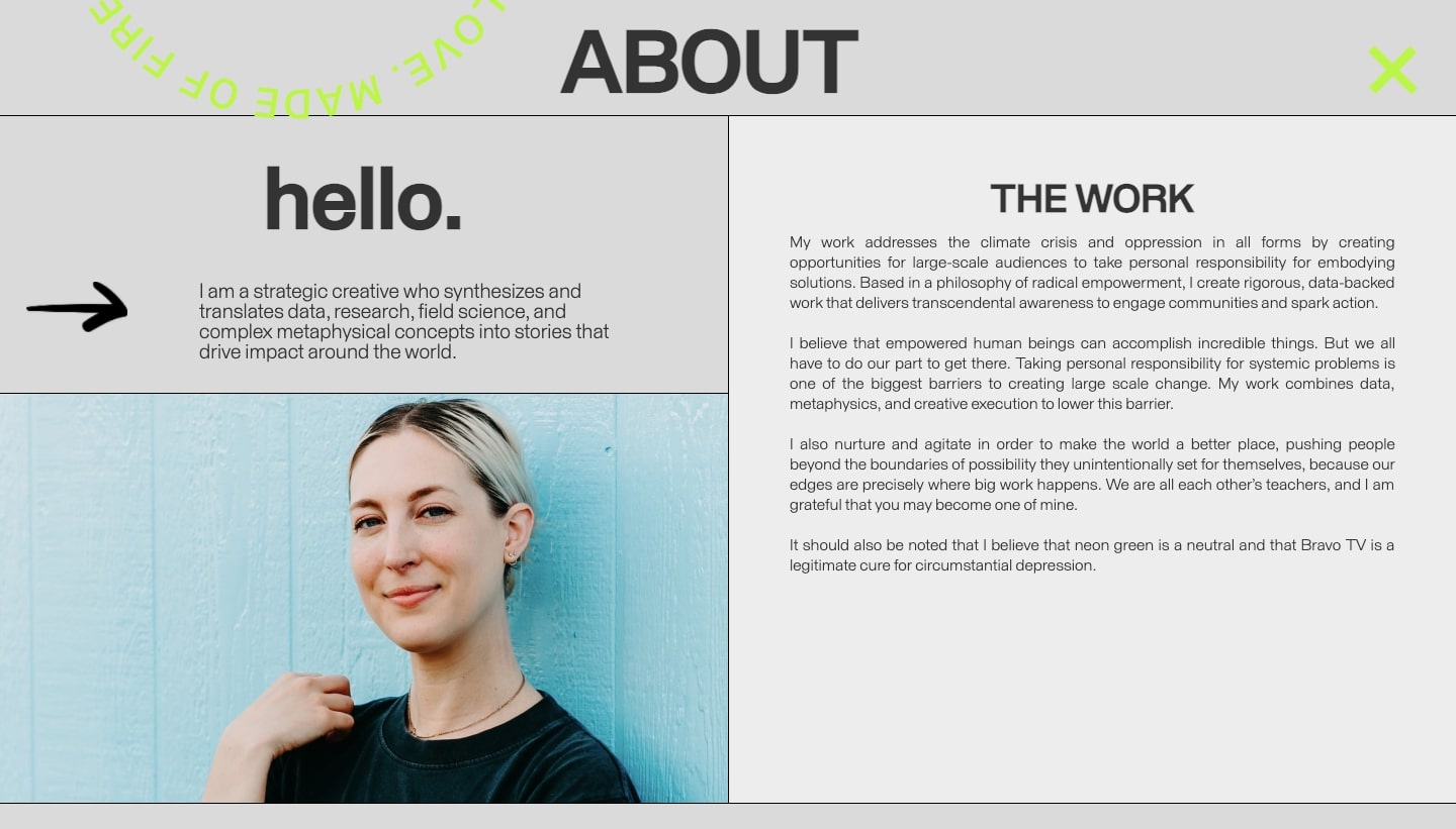
It’s always great to see creatives using their talents for the greater good. Sarah Lupton brings together her skills as a filmmaker, marketer, and business knowledge in creating media that brings awareness to environmental and social issues. From documenting the fragility of the Amazon to a film about women’s sportswriters, there are many great examples of the meaningful work she does on her portfolio website.
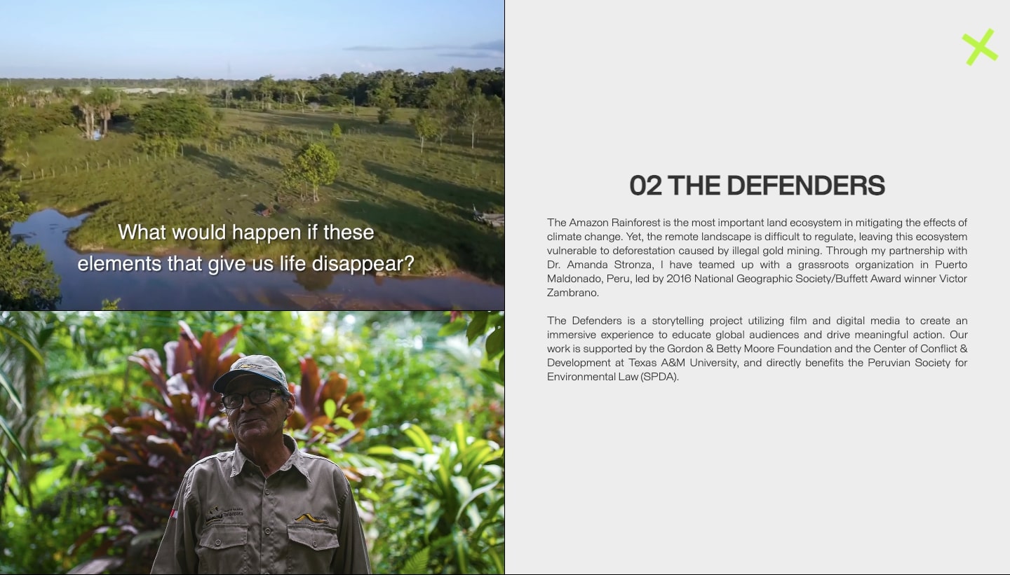
This is a one-page website, putting everything about her work including photos, videos, and text right there in front of you. With a layout made of big blocks, this design projects a sense of strength and professionalism. There are also several scroll-triggered effects, like moving text and image zoom-ins that add some action while navigating through it.
Sarah’s work on its own is impressive, but this design makes it shine even brighter, showing everyone her artistry as well as dedication to making the world a better place.
3. Celebrate Women
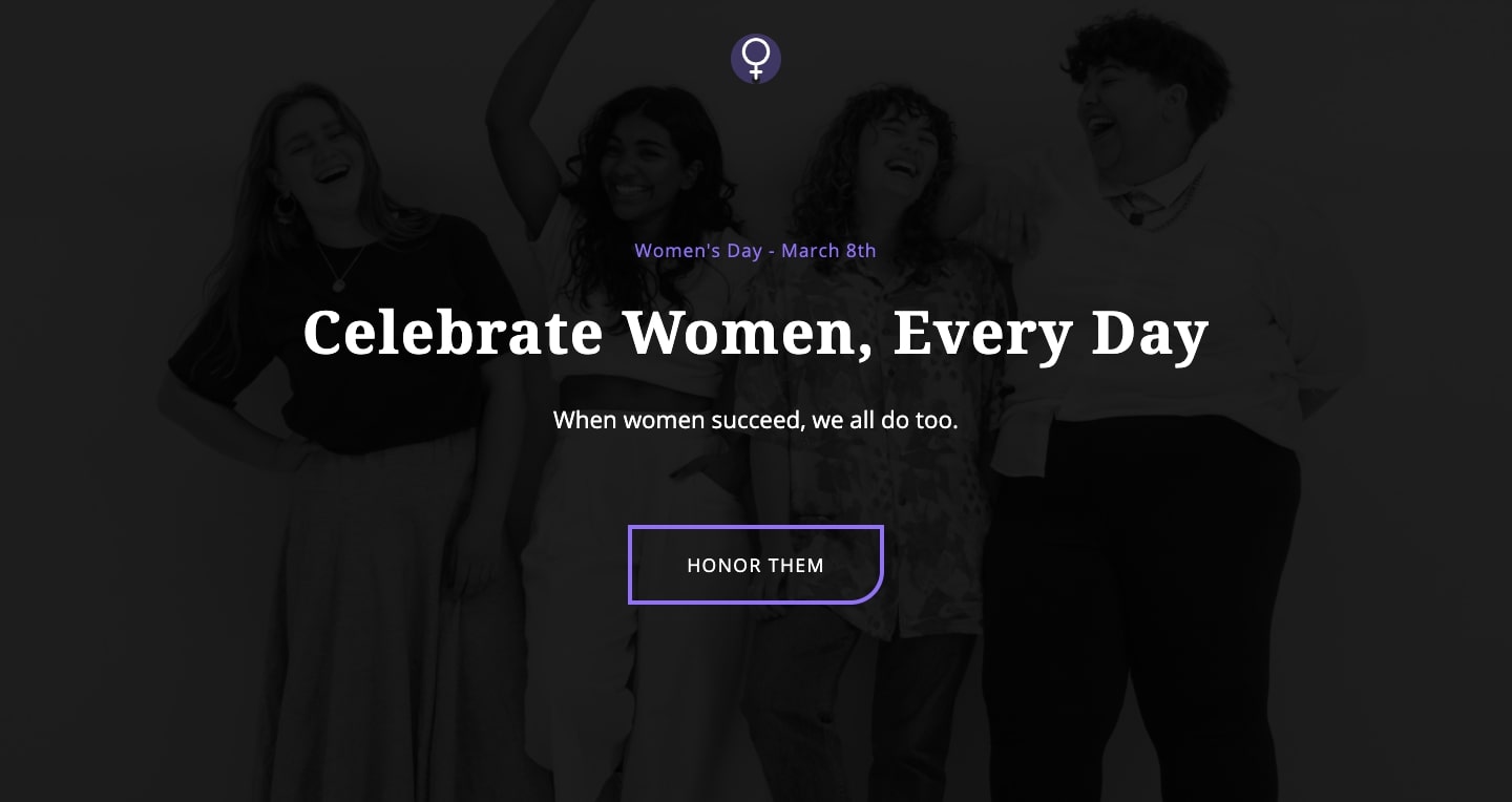
This one-page design which begins with, “Celebrate Women, Every Day” is full of images, quotes, and text that honors women. This website isn’t only a great source of feminist inspiration but also links to a women’s charity.
This website is fairly new, and we’re looking forward to seeing in the future more content that captures the amazingness of being a woman.
This template is available to clone for free to use for your own Webflow projects.
4. The perfect Instagram links landing page
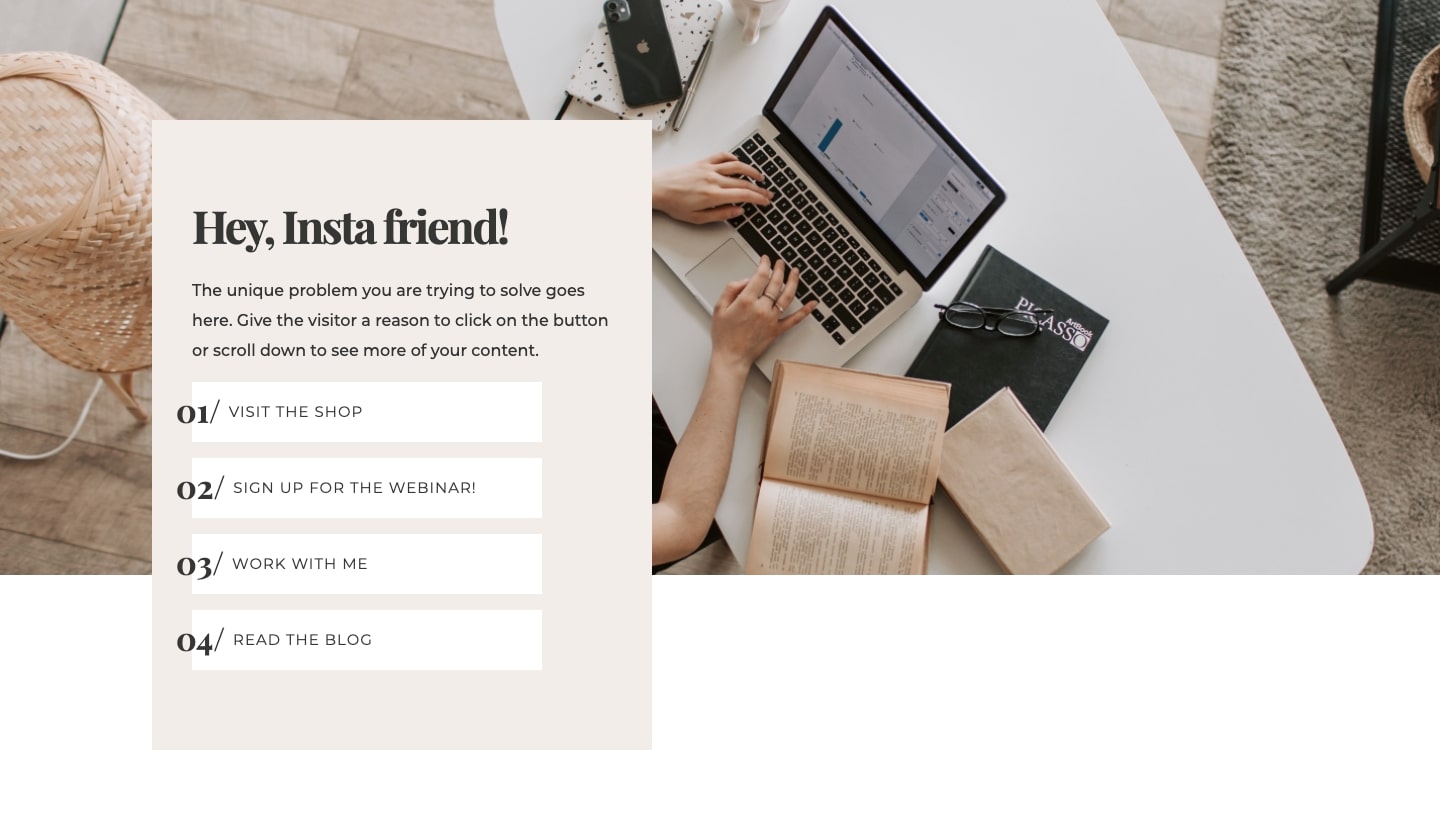
Many use Linktree on their Instagram profiles to send people over to different pages. But this isn’t the only way to do this. Iglika the designer behind this links landing page used Webflow to put together a more stylish version. Along with a visually pleasing layout, there’s space dedicated to highlighting products or services, as well as room for featuring blog posts.
She shows that you don’t have to be content with what’s available. Webflow gives you the power to create and build exactly what you need.
5. Hannah Taylor
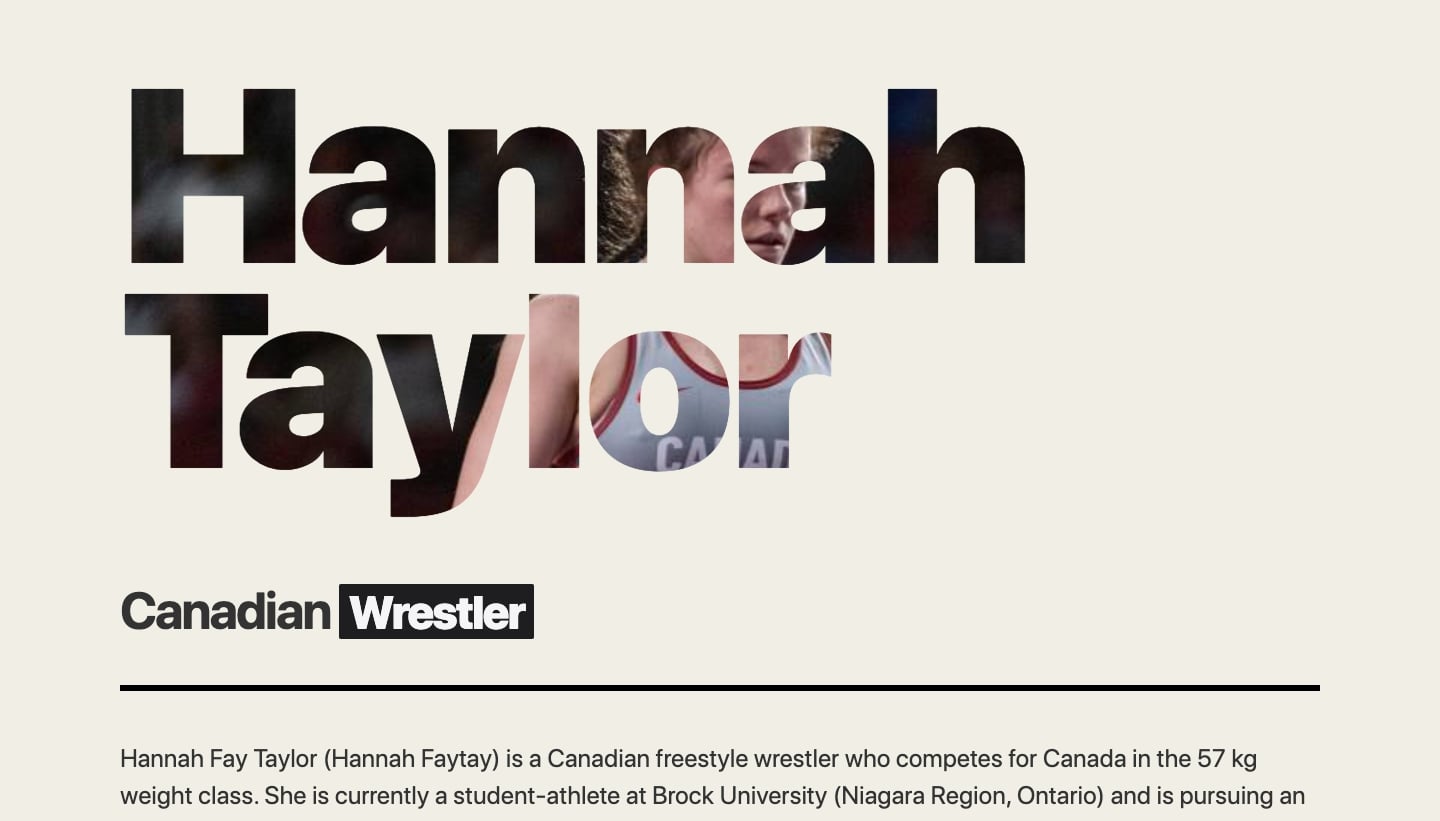
Hannah Taylor, a Canadian wrestler, uses this straightforward web design to tell about who she is and to send people over to her active social media accounts on Twitter and Instagram. There’s also a link to her profile on the Team Canada website, which gives more in-depth biographical information about her.
Not every personal website has to be a huge undertaking. Sometimes you just need a website that functions in pointing people to the platforms that you currently post on and keep up to date. This landing page does the perfect job of doing just that.
6. Studio SeeYa
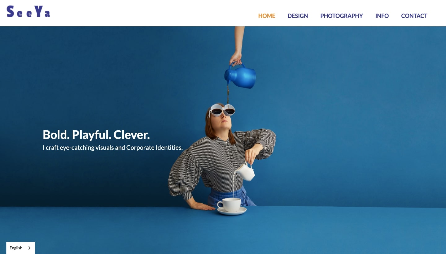
Sandra Junker is the woman behind Studio SeeYa. She is an expert at creative branding and design and is also an accomplished photographer.
Her skills behind the lens add so much. With bold colors and a quirky sensibility, her photos fill this website with personality.
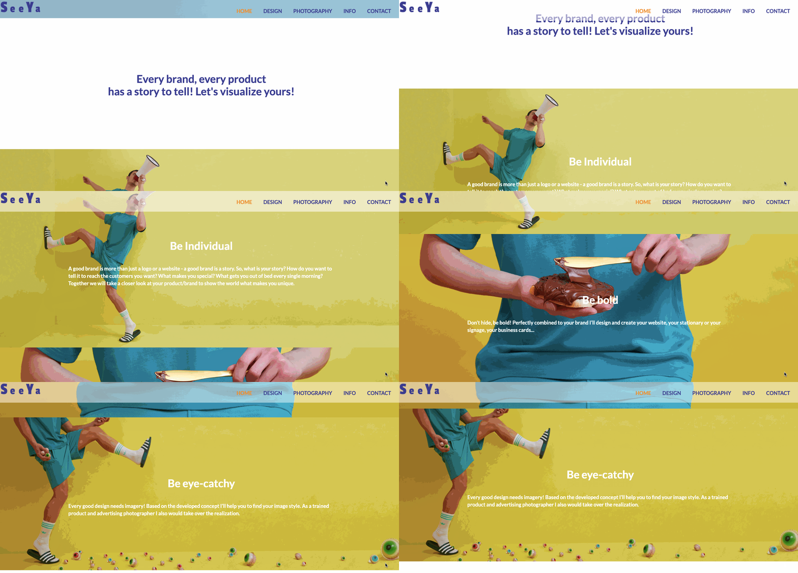
With eye-catching visuals and straight-to-the-point copy, we see right away that Sandra is someone who can bend conventions in delivering branding solutions that will get people’s attention. It certainly got ours!
7. Hey Jane
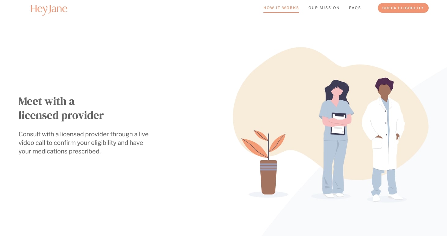
Hey Jane, a health provider, keeps women at the center of their design. With an airy color palette, circular shapes, and an orderly layout, they present all that they do in a way that’s easy to follow and has empathy for those in need of their services.


Get our 100 video course on web design — for free
From the fundamentals to advanced topics — learn how to build sites in Webflow and become the designer you always wanted to be.
8. Jamie Dowls
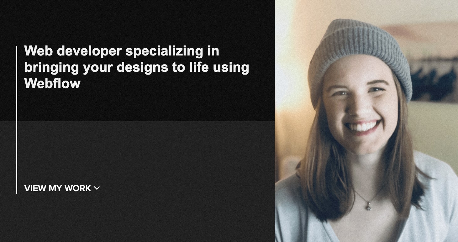
Not only is Jamie a great web designer, but we’re so happy to see that she uses Webflow as her choice of design platform!
Huge expanses of solid background colors can weigh a design down, and Jamie’s choice in using a subtle buzzing background, as well as scroll-triggered animations, fills this design with warmth and energy. It has a very fluid feel, escaping the rigid lines that hold so many web designs captive.
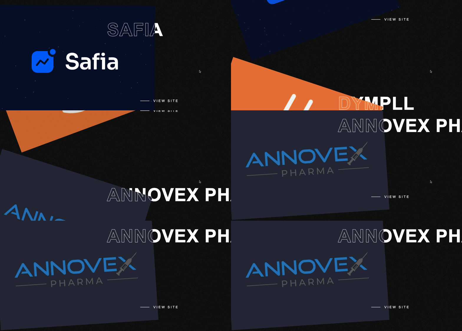
Jamie shows off a tidy selection of featured projects. There are no lengthy explanations or navigating to different parts of the website. Instead, she sends people over to the live websites, immersing people in her work.
This is a great example that a one-page website isn’t limiting, but in its short space can communicate so much.
9. Lummo
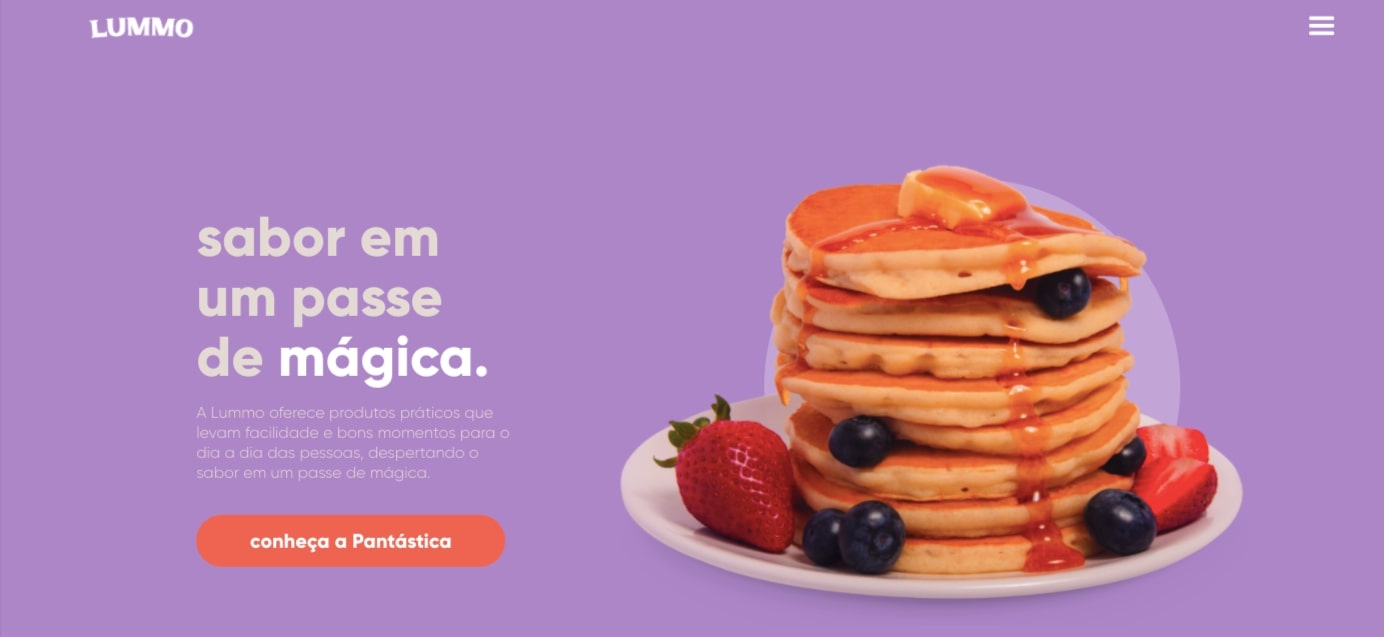
Lummo is a Portuguese food company, whose main product is pancake mix. This web design takes what’s a simple breakfast food, and showcases it in a very hip and modern design.
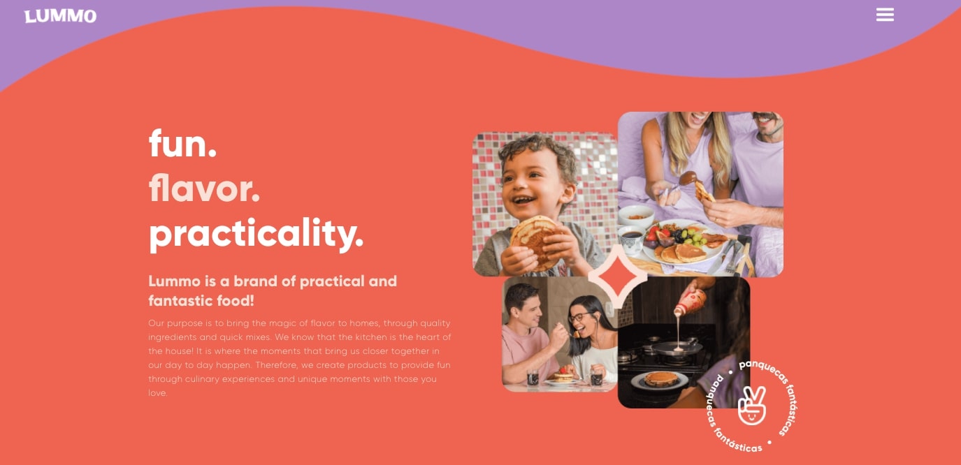
With its waves of purple and orange, and photos of smiling people eating pancakes, it has a very playful and welcoming feel. There’s a few nice animated touches as well, like a floating container of their pancake mix on the opening screen as well as a scroll-triggered plate of pancakes that spins across the screen on the bottom.
The elements of this design come together like a perfect plate of pancakes — warm, light, and inviting.
10. Framy
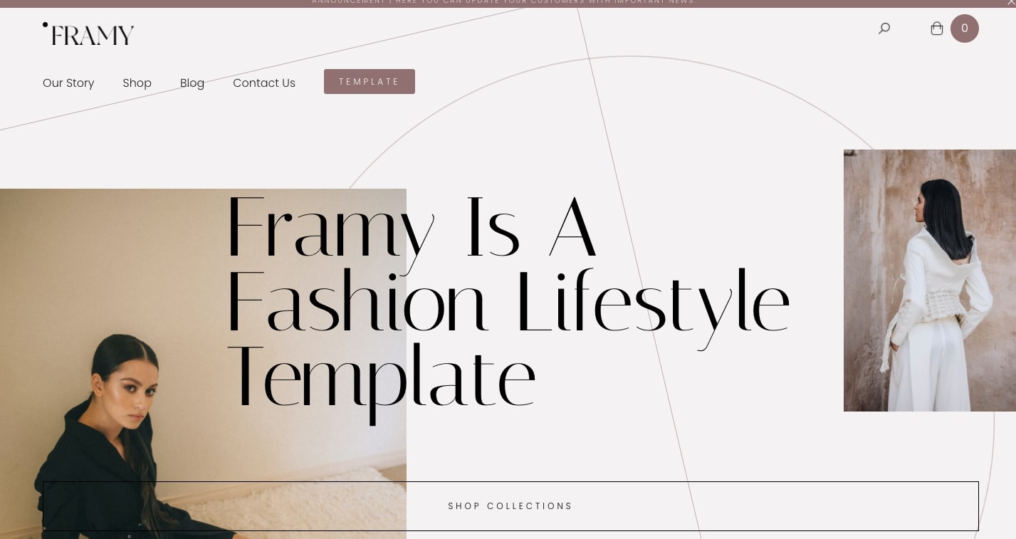
A fashion-focused website needs to have an air of elegance and sophistication. Framy, a Webflow template, has in place all of the elements and embellishments that any fashion-minded business would want to have.
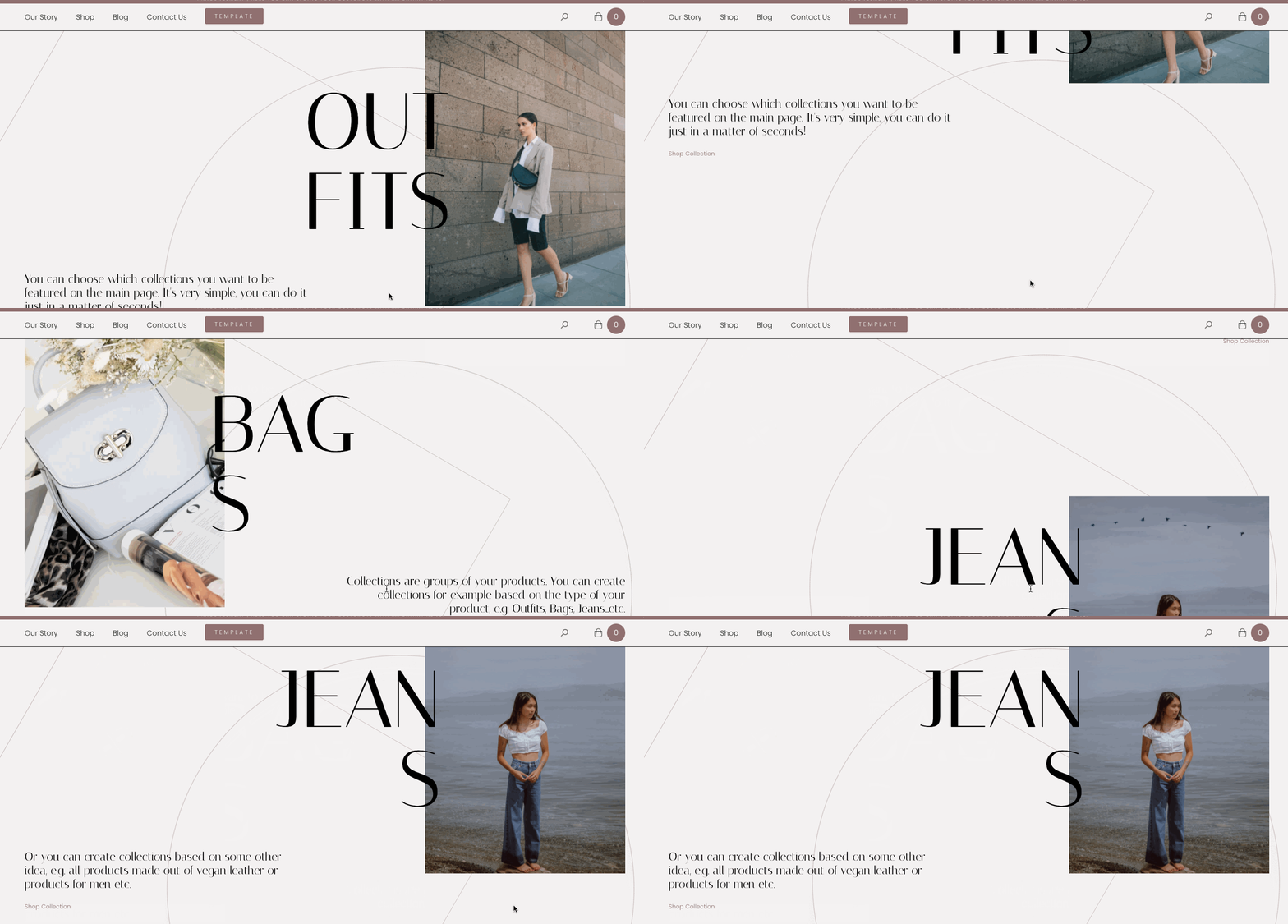
From the use of the suave font Italiana in the header text to the wide-open backgrounds with delicate linework, this template offers a high-class experience. For those wanting to launch their own fashion website, Framy is the perfect template to get you started.
11. Anastasia Stevens
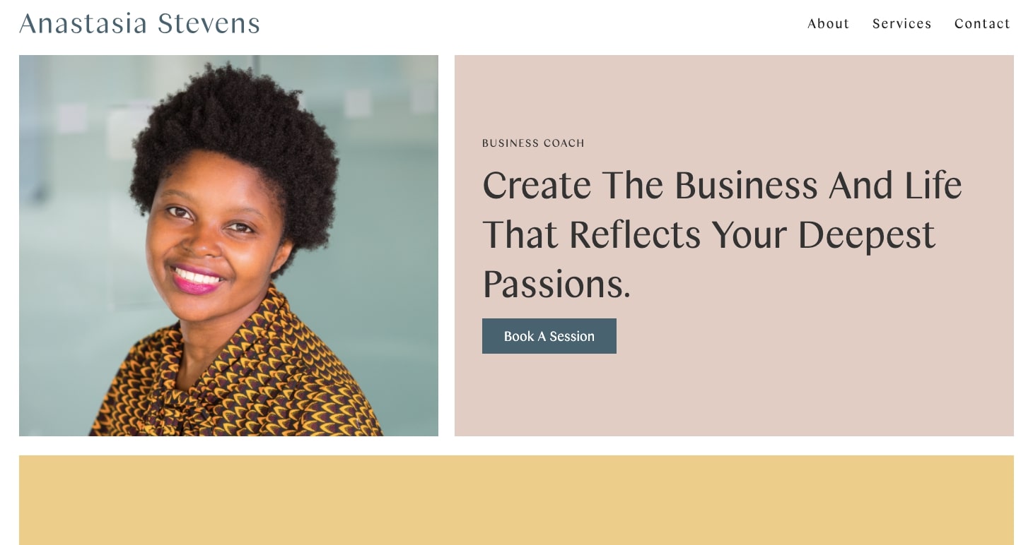
For those who are mentors, or offering any sort of career guidance or coaching, this stellar design for Anastasia Stevens should serve as an example of the right way to put a professional website together.
The layout is clean and professional, with neat grids and a strong sense of order. With a pleasing combination of subtle colors, it projects a sense of calm and stability, immediately instilling trust.
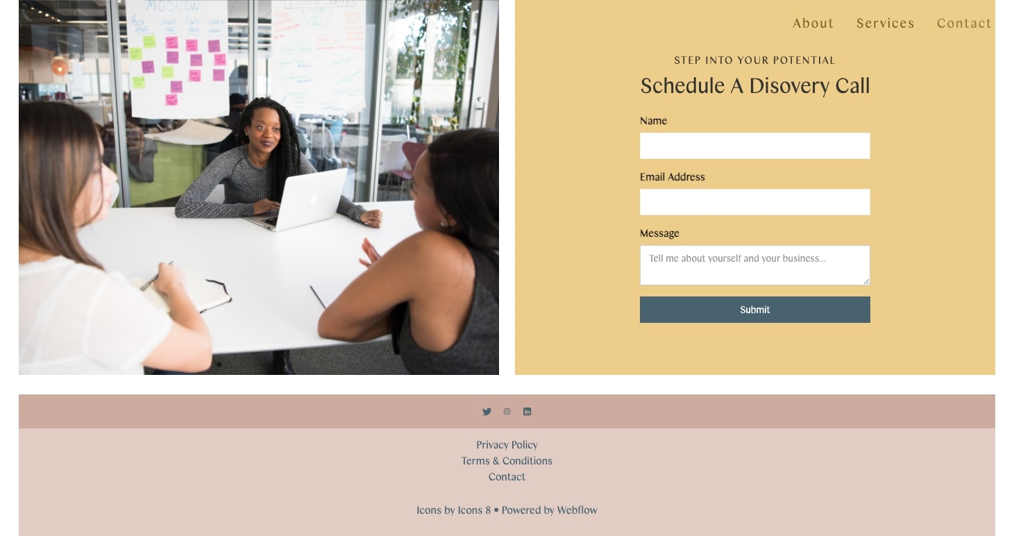
This is another example of how effective a one page design can be. This website distills Anastasia’s skills and services down, leaving someone with only what’s important for them to know. Along with attention grabbing calls to action buttons, and a clean input form, anyone interested in her services are able to immediately act in learning more.
12. George Rickey Foundation
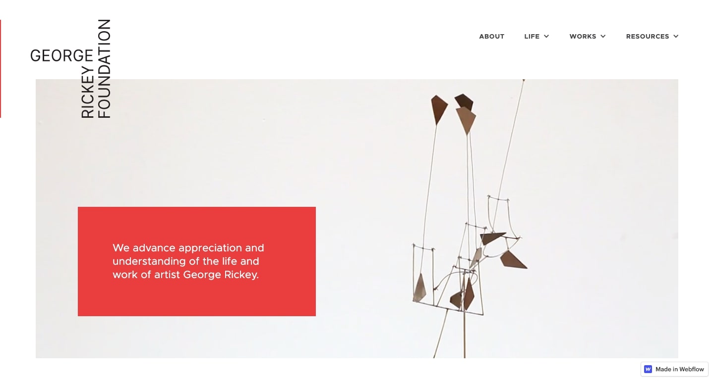
George Rickey was an artist known for creating kinetic metals sculptures. This website is for the foundation that honors his career as an artist and helps spread awareness of his work.
This design is full of many examples of his artistry. There’s an entire section that lists his public art installations state by state, that’s a valuable reference to anyone wanting to check out his sculptures in person.
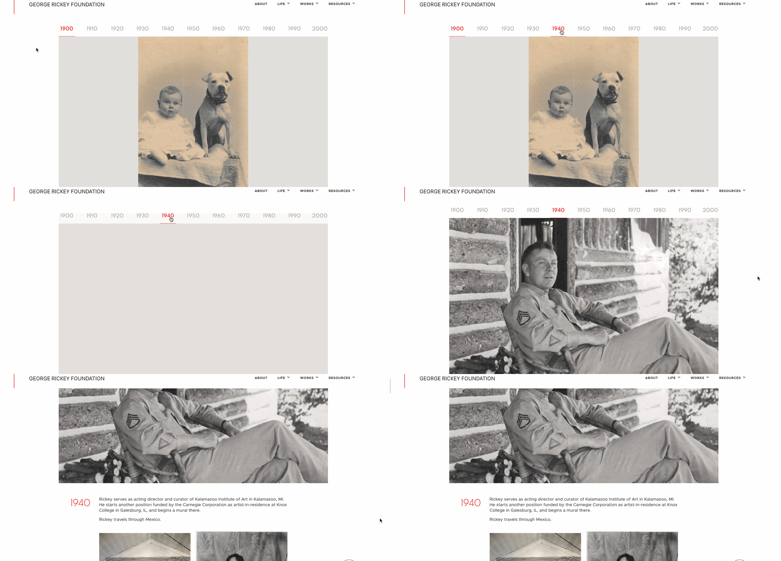
There’s a wealth of in-depth information about his career. The chronology section pictured below collects his accomplishments, with navigation at the top allowing a user to pick what decade they want to learn about. Rather than being one big scroll of text and images, this gives users complete control in how they navigate through this content.
13. Sunwest Credit Union
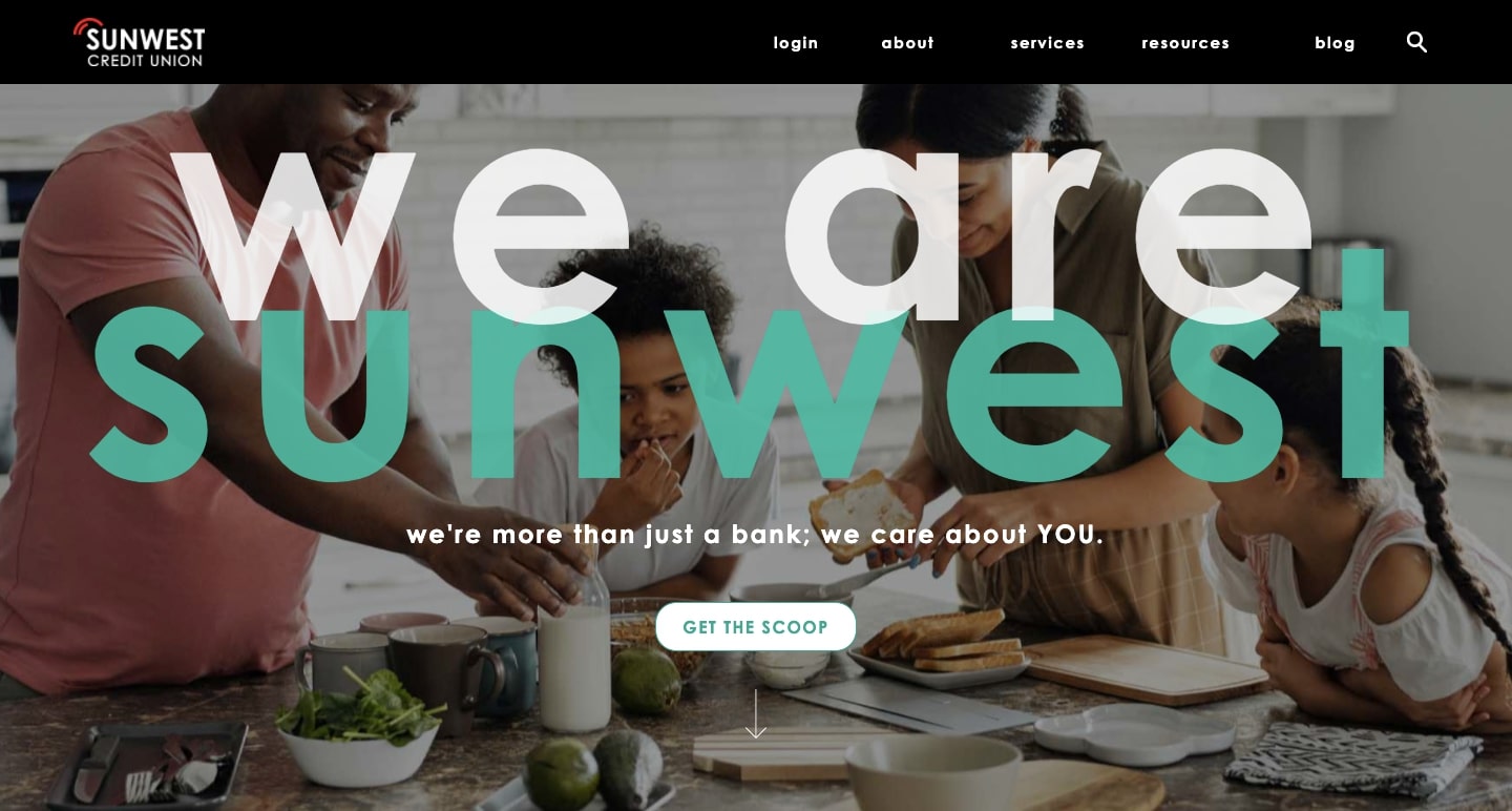
Sunwest Credit Union has a bright and lively design that avoids the genericism that so many financial business websites fall into. With brilliant blues, big text, and photos of customers, the design feels very personable. Sunwest Credit Union doesn’t feel like someone far removed from the lives of its members, but more like a friend.
Let’s see your Webflow designs!
We’d love to see what you’re creating in our Webflow Showcase. Who knows maybe one of your websites will make our monthly round? Let’s see what you got!


