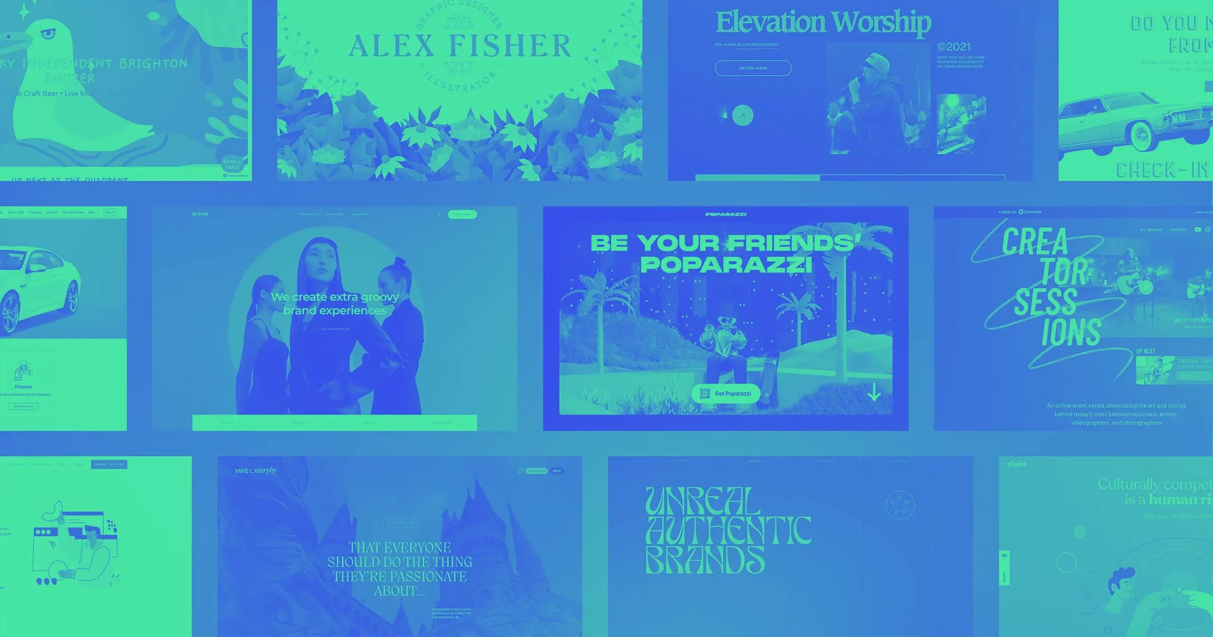
From interdimensional motels, to feminist focused design agencies, here are 14 websites built in Webflow that caught our attention this May.
Lately, we’ve been inspired by websites that are driven by strong visuals and that really lean into non-traditional design practices. Let’s take a closer look at 14 websites built in Webflow that embody the spirit of breaking the mold.
1. Madcap Motel
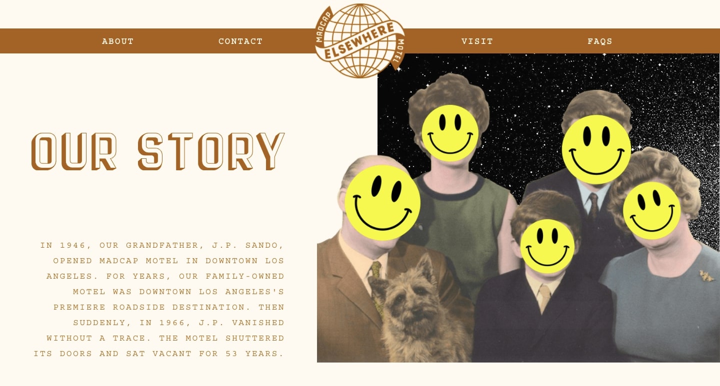
According to lore, Madcap Motel’s heyday as “Los Angeles’ Premiere Roadside Destination” came abruptly to an end when founder JP Sando disappeared in 1966. For the following 53 years, the motel was boarded up and abandoned, until 2019 when his grandchildren decided to restore the beloved family motel.
Here’s where things get weird. Mysterious postcards began arriving from their long-missing grandfather, revealing a hidden portal to another dimension in Room #433. Now, the grandchildren have made it their mission to open the portal to the public, and offer an out-of-the-box hotel experience including time-warping tunnels, floating furniture, and other elements of absurdity.
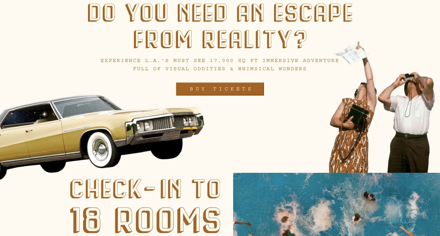
The experience doesn’t just start when you arrive. With a design full of mid-century zaniness like polaroid cameras, clunky cars, and polyester-clad people on vacation, you’re immersed in the world of Madcap Motel from the second you enter the website.
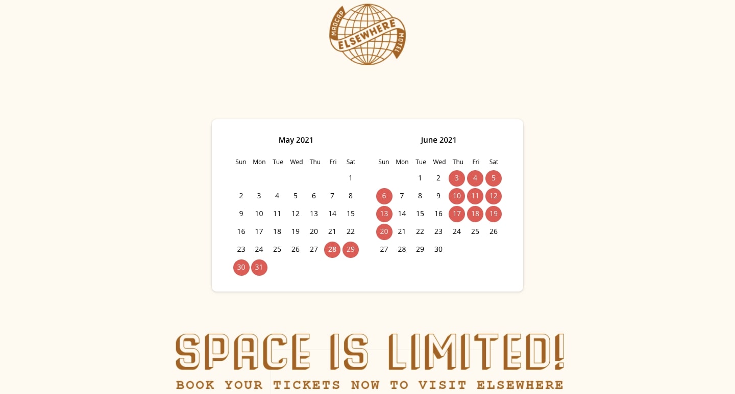
Beyond design, Madcap Motel utilizes effective sign-up strategies like multiple calls to action. Regardless of where you are on the site, there’s a CTA in every block of content. For reservations, Madcap Motel makes the purchasing process easy and straightforward with an interactive calendar that shows all of the available days.
2. Poparazzi
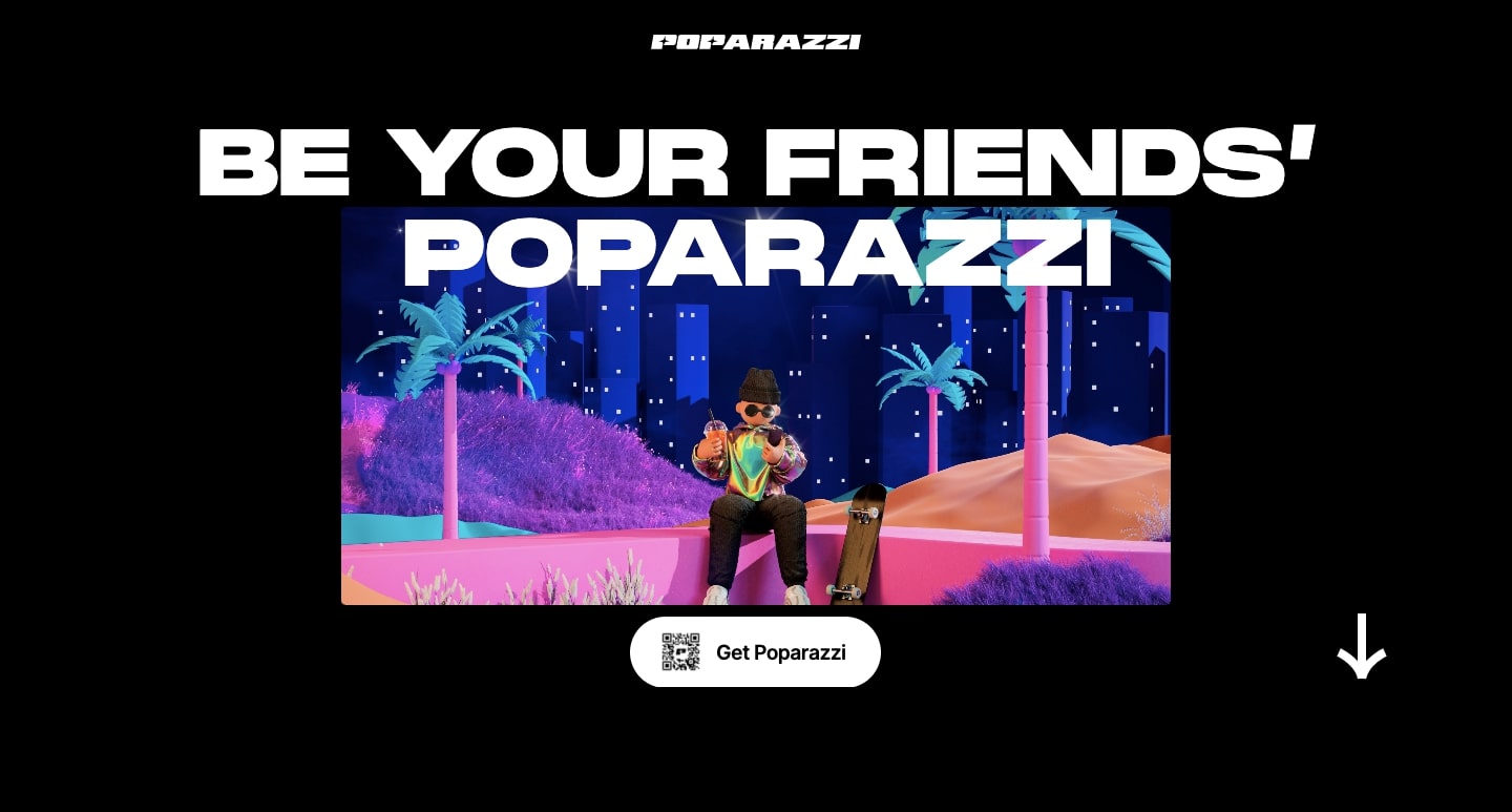
Poparazzi is one of the top apps in the App store in the US. Their site opens with a strong and concise declaration, “Be your friends’ poparazzi.”
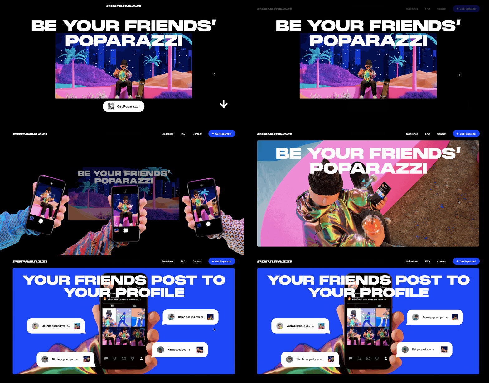
A downward scroll uncovers the app’s functionality and all it has to offer. Friends effectively act as paparazzi for each other, allowing people to post “pops” to their pages, capturing fun and excitement on a whim.
3. The Quadrant
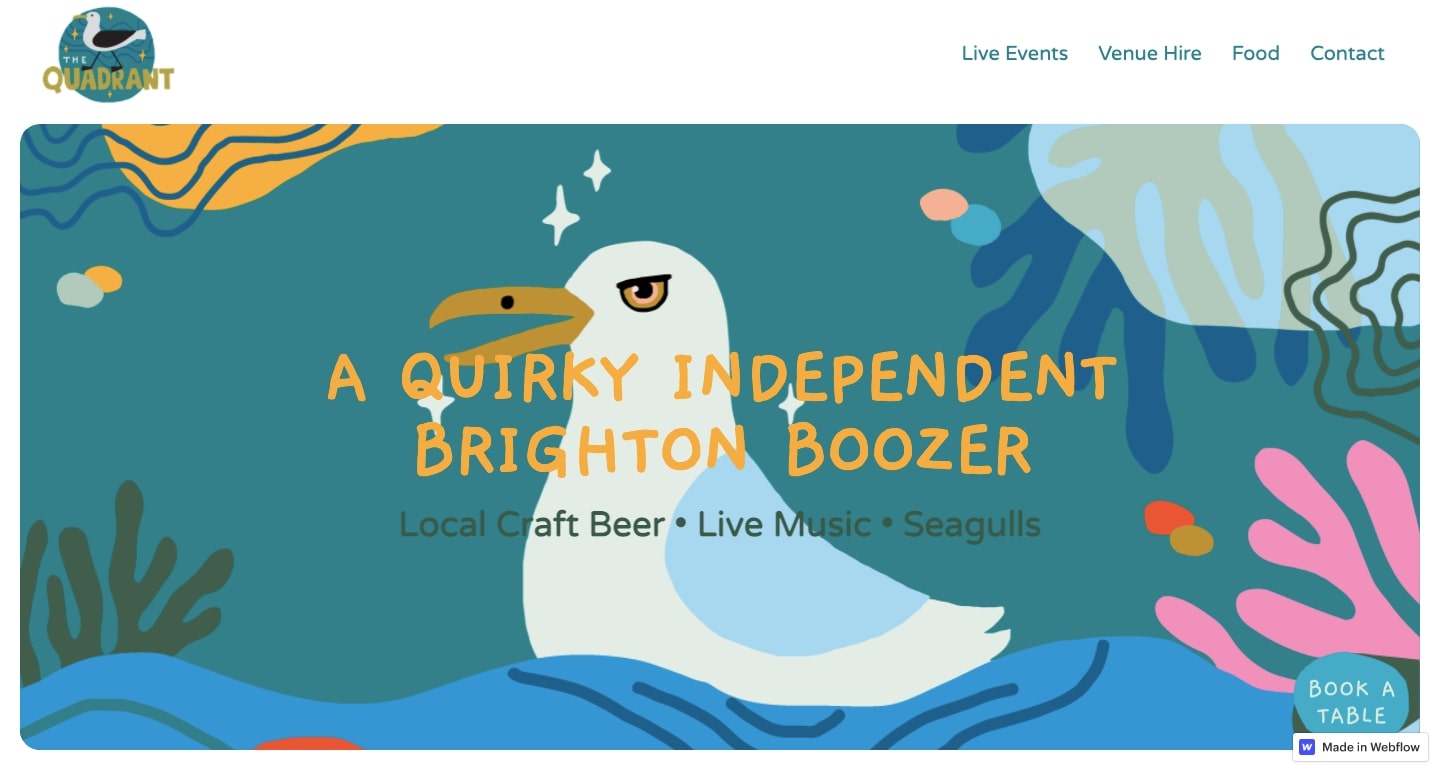
With a hero image featuring a cheeky seagull and the text, “A quirky independent Brighton Boozer,” we know right away that The Quadrant is more than just a boring neighborhood bar.
Just a short scroll from this colorful opening, The Quandrant’s website gives us an in-depth look into events, a collaboration with vegan fried chicken shop Really Happy Chicken, opening hours, and recent Instagram posts. Overall, The Quadrant comes through with a design as offbeat as the comedy that happens on their stage.
4. SaaS product landing page template
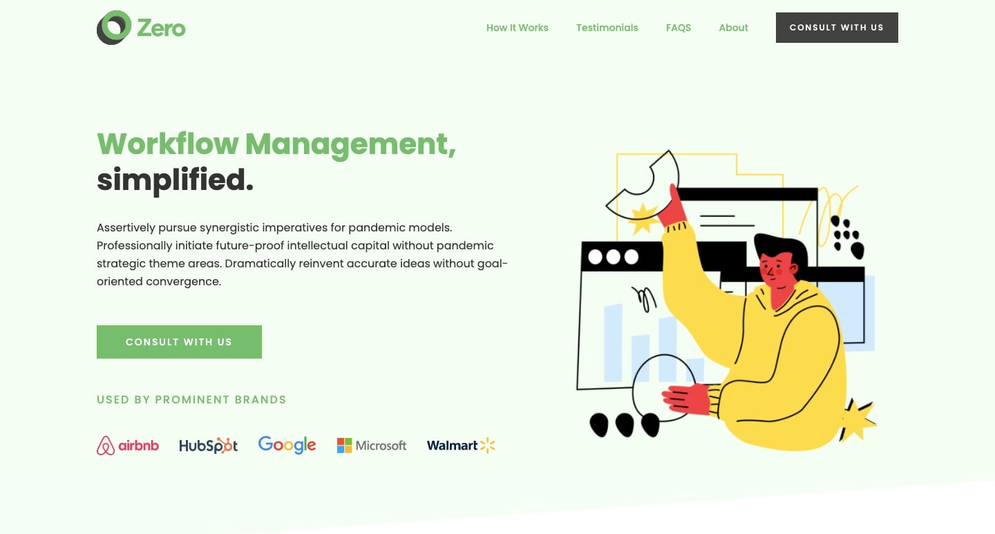
Created by John D Saunders, “the SaaS product landing page” is a well-designed template for SaaS companies that you can clone for free.
This cloneable is packed with all of the building blocks any SaaS company would need to put together a website. There’s a hero section with a prominent call to action (CTA) button, a three-columned section to showcase company services, and a space for testimonials and frequently asked questions (FAQ).
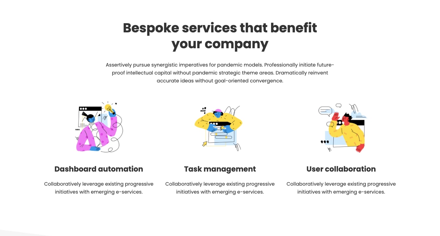
All of these pieces fit perfectly together, with a nice sense of space, clean design, and smart typography. There are plenty of opportunities to customize this template to better reflect a unique brand identity — a perfect starting point for any SaaS company.
5. Alex Fisher Design
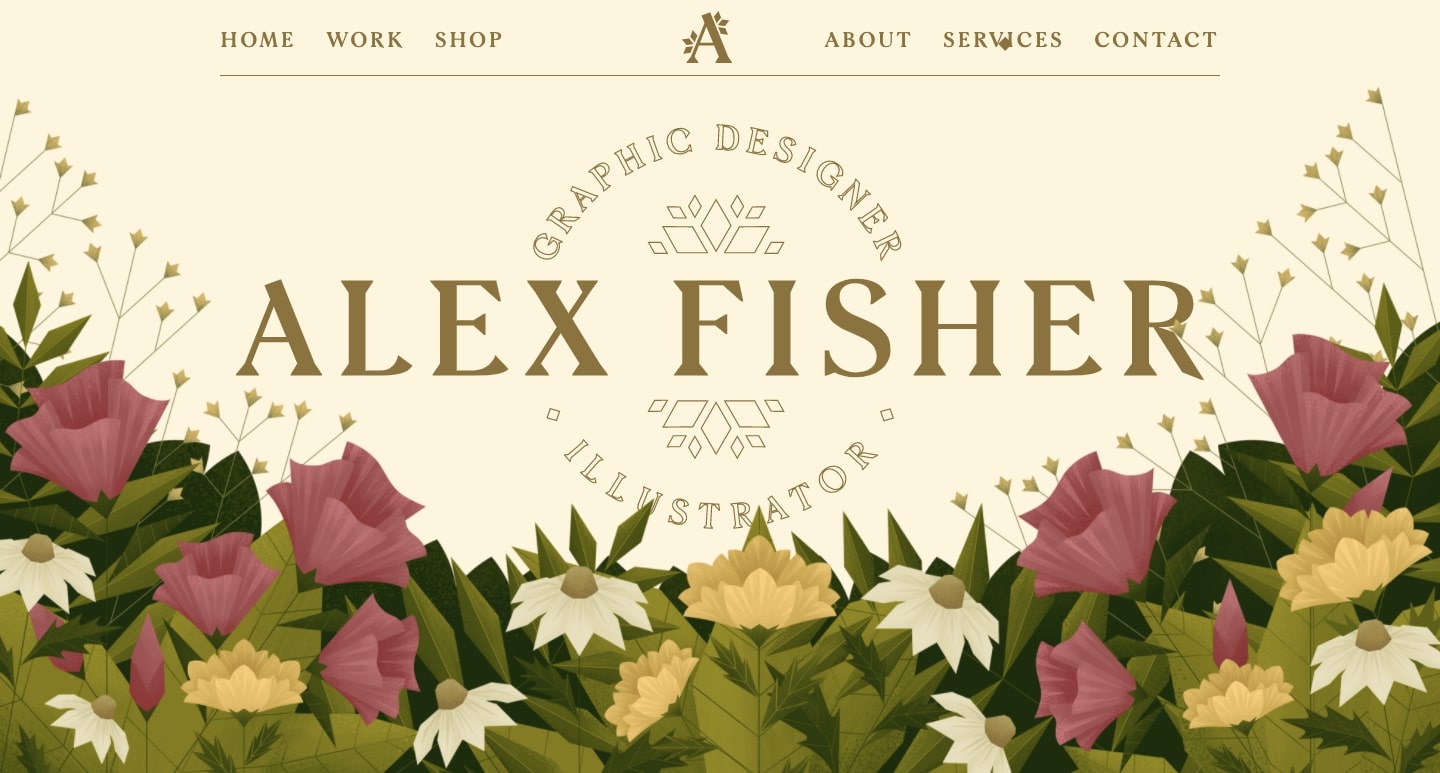
It can be easy for a designer to create branding or marketing collateral for their clients, but when it’s time to market our own skills, the right direction may be less obvious. In this portfolio, Alex Fisher focuses on their expertise as an illustrator, showing off their talents in the featured projects and in the design itself.
Alex is an illustrator who is greatly inspired by the natural world, and also takes cues from fine art. This sensibility is reflected in the design, opening the portfolio with a lush bed of flowers and Art Nouveau inspired lettering.
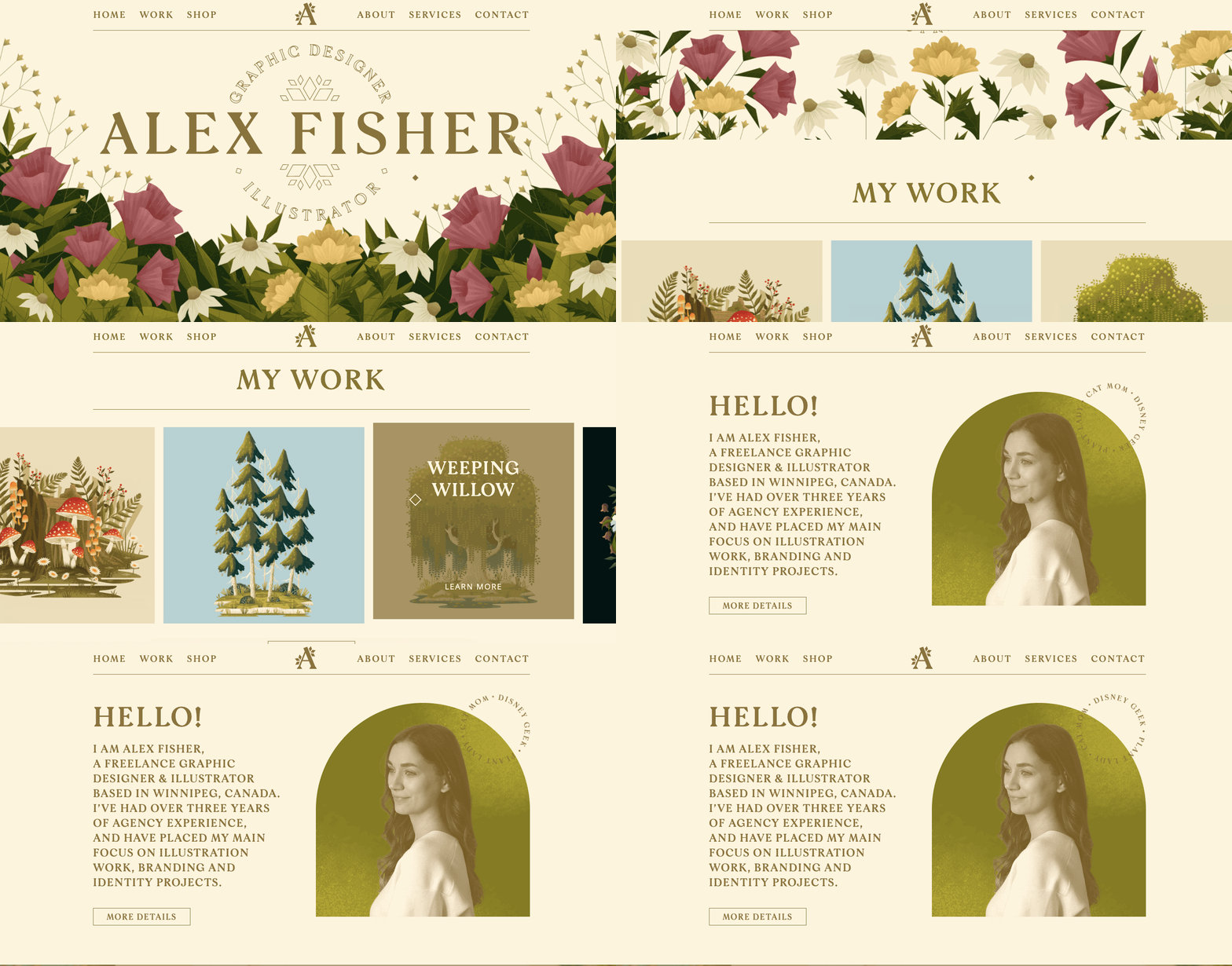
Along with brilliant examples of Alex’s illustration work, there’s plenty of action in this portfolio. Parallax scroll effects, animated transitions, and other dynamic elements are featured throughout the site.
For anyone trying to figure out how to put together their own portfolio, Alex Fisher’s is a fantastic example of how to craft a website that captures creativity, personal style, and design excellence.
6. RYTHM
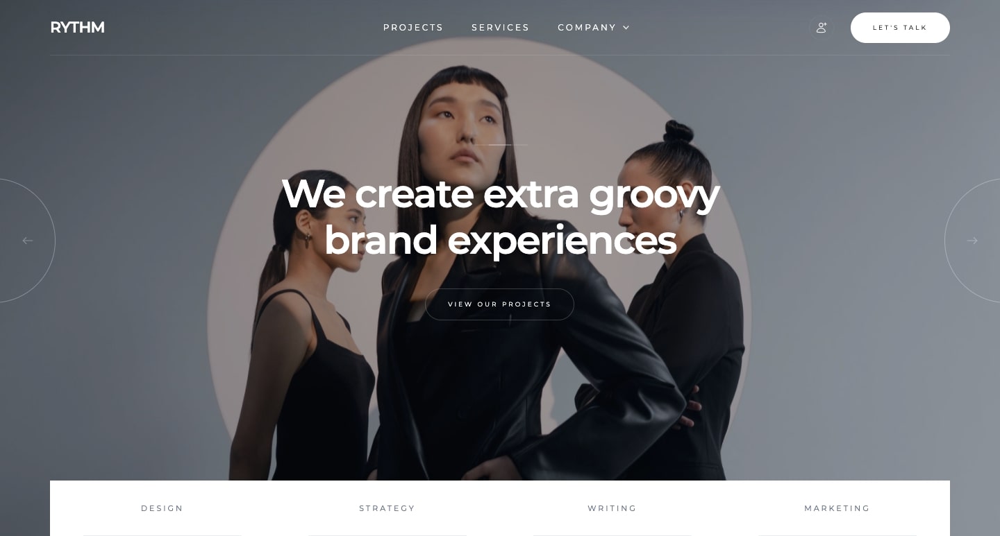
RYTHM is a free Webflow template that not only looks great, but also harnesses the power of Webflow CMS.
With a focus on creative agencies, it has all of the design elements and functionality an agency would require. We’re especially fans of the featured projects section at the bottom of this opening page. This section leans into the visuals of each project and utilizes a subtle hover animation to emphasize each image.
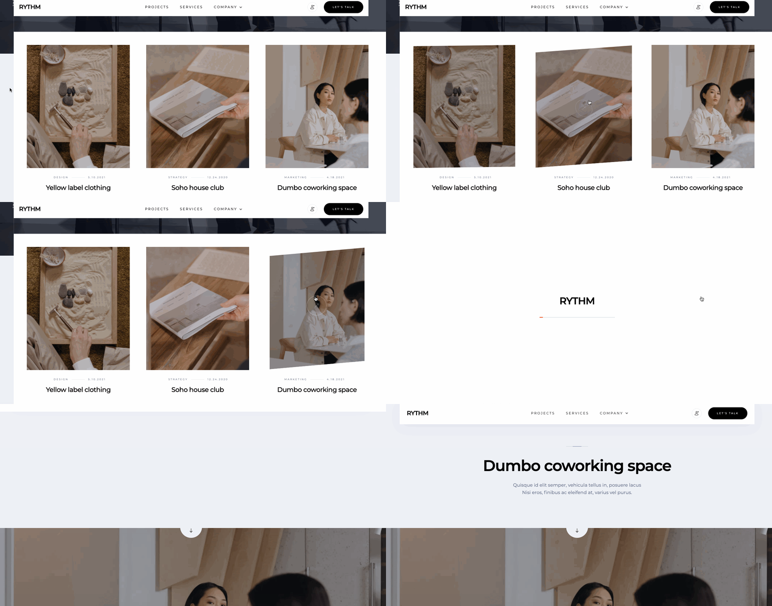
For those who want a dynamic web design that utilizes the Webflow CMS, RYTHM may be the exact template that you’re looking for.
7. Violet
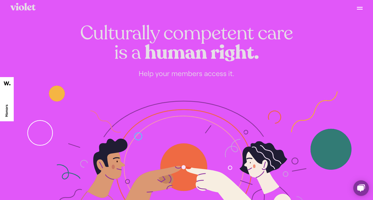
So many healthcare websites are about as warm and inviting as a hospital cafeteria. Violet breaks free from the clinical and sterile feel of medical websites with a web design full of bright colors and fun illustrations.
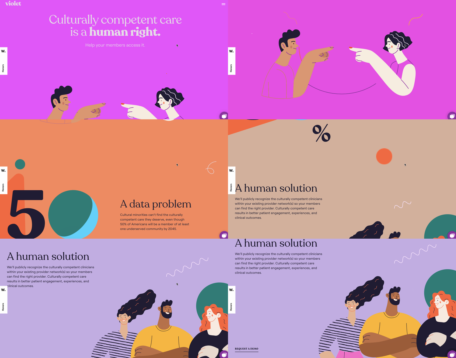
Almost every moment of scrolling reveals a new visual element. Background colors shift, shapes and lines dance across the screen, and different illustrations appear on the screen. Everything comes together by staying in line with their core message of positivity and care.
Violet is a great example of how effective a website design can be to create a warm and friendly ambiance for the visitor.













Design interactions and animations without code
Build complex interactions and animations without even looking at code.
8. Mike Murphy
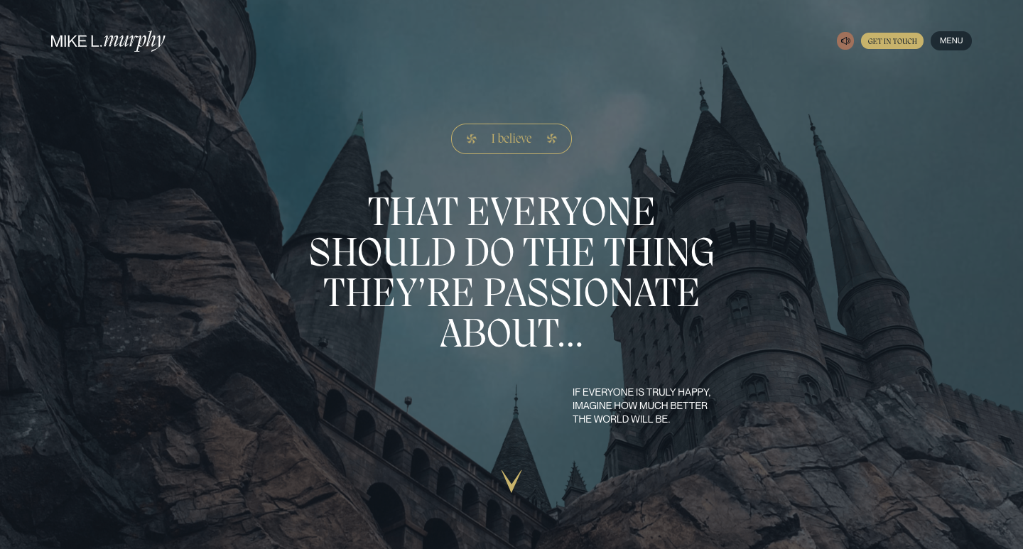
Starting with a march of timpani drums, a triumphant swell of strings, and a looming castle that fades in, Mike Murphy’s portfolio website feels like the opening scene of a movie. We’re here at the beginning of a hero’s journey — not of a knight clad in armor — but of Mike’s story as an animator.
Mike has worked on movies such as Lord of the Rings, Iron Giant, and Harry Potter. As a result, they’ve taken inspiration from their experience in filmmaking in creating this portfolio. This website is a blockbuster of non-stop action with horizontal scrolling, morphing background shapes, scroll-triggered text animations, and a compelling narrative about their career path.
9. Faker Agency
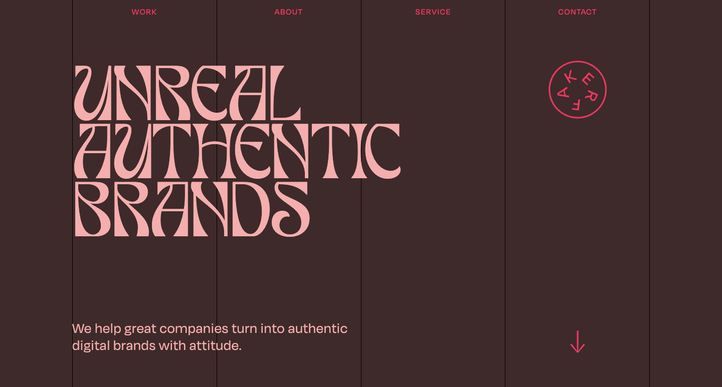
Opening with the header “Unreal Authentic Branding” in the off-kilter typeface Tan Paradiso, we get the idea right away that Faker is an agency not afraid to do things outside the standard conventions of marketing and design. Their mission statement, “We help great companies turn into authentic digital brands with attitude,” emphasizes this ethos.
With a roster including a cold press juice maker, a wetsuit manufacturer, and an interior design company, Faker is able to showcase the wide breadth of clients that they’ve worked with. For niche, inventive, and out-of-the box companies, it’s clear that Faker is the perfect fit.
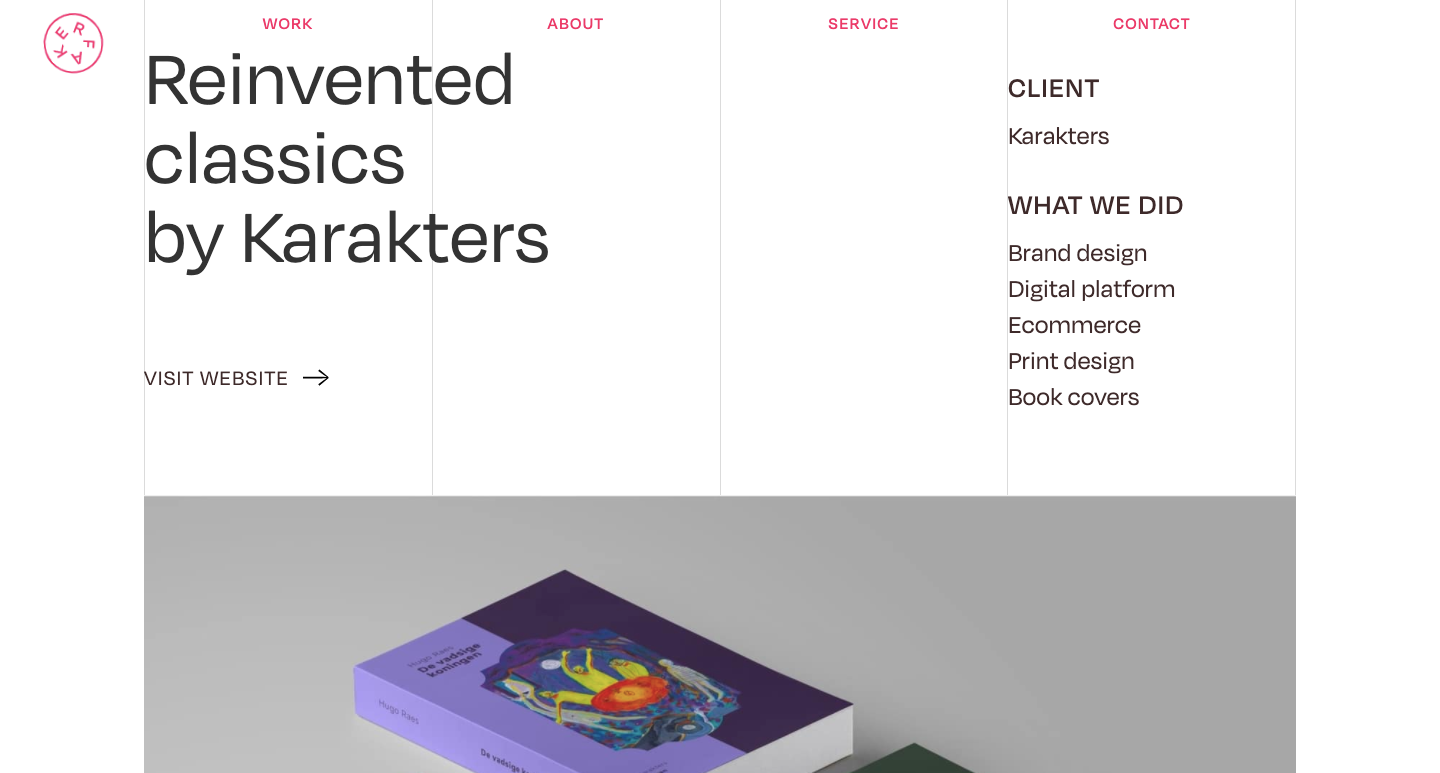
Their web design reflects their unorthodox approach. With a brown background, pink text, and projects that shift from side to side, Faker embraces an eccentric design style to reflect their own unique perspectives. This site was given an honorable mention for Awwward's Site of the Week.
10. Shift
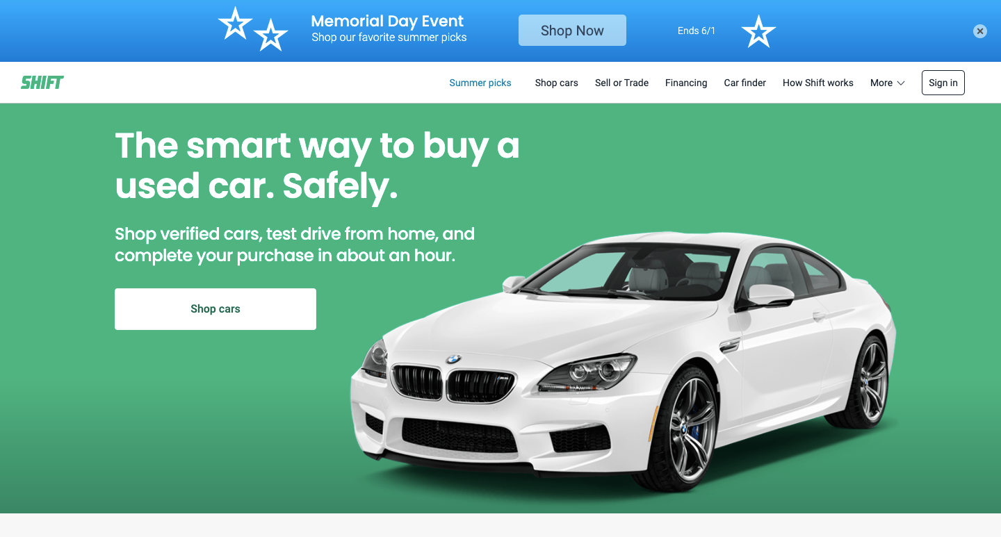
Shift offers an easy online experience for those looking to buy a new ride.
Their website layout features clean lines and a fresh and approachable feel. There’s a strong sense of organization and order, making it easy for buyers to identify the car, make, and model of their choice.
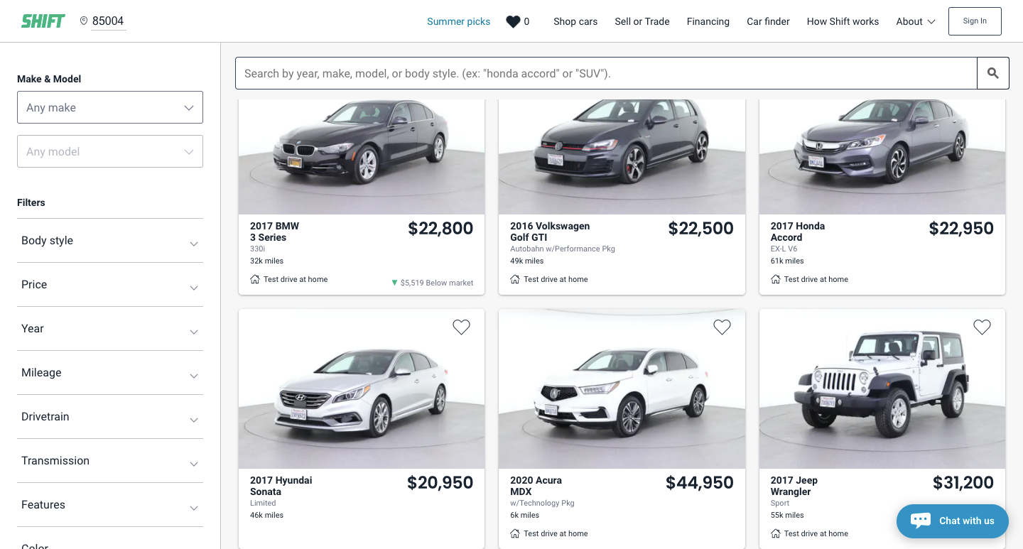
If you’re building an ecommerce store of any kind, Shift is a great example of how to create one that keeps customers at the center of the experience.
11. The Agency
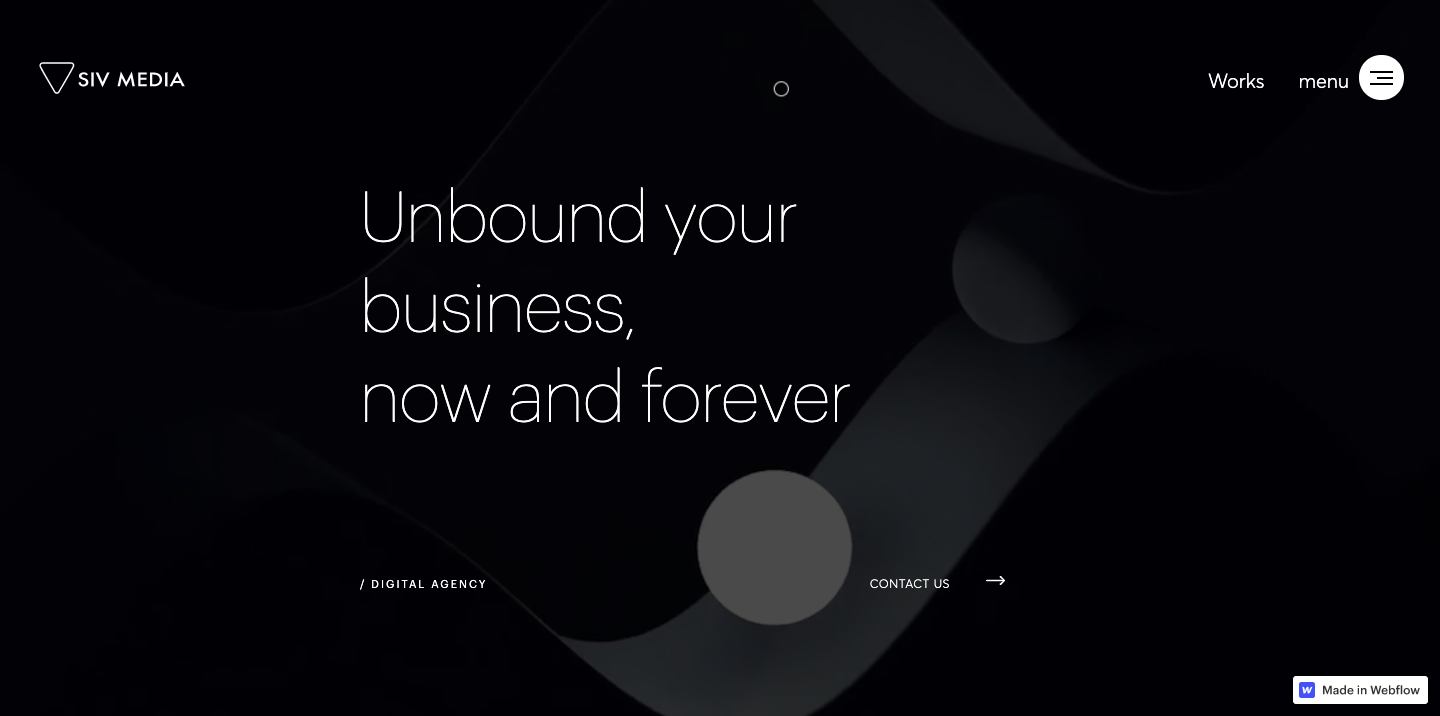
Consider the cursor. It’s an often-overlooked element with most designers resigned to the fact that it will never be more than a utilitarian arrow. The Agency is a template that shows us the potential for the cursor to become an integral part of the user experience.
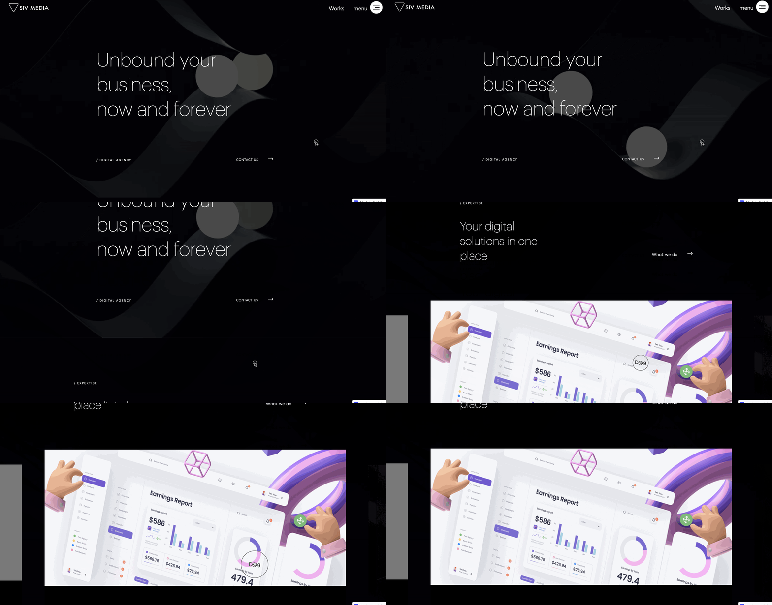
In this sleek and modern design, the cursor becomes an active part of the website with a circle highlighting where it’s at on the page. Moving through the template, the circle responds to a hover. It becomes a CTA, instructing one to “drag” certain elements, or showing an active link to go somewhere, like the “About” section.
We’re always happy to see designers taking something unremarkable and putting a new and fresh spin on it.
12. Creator Sessions
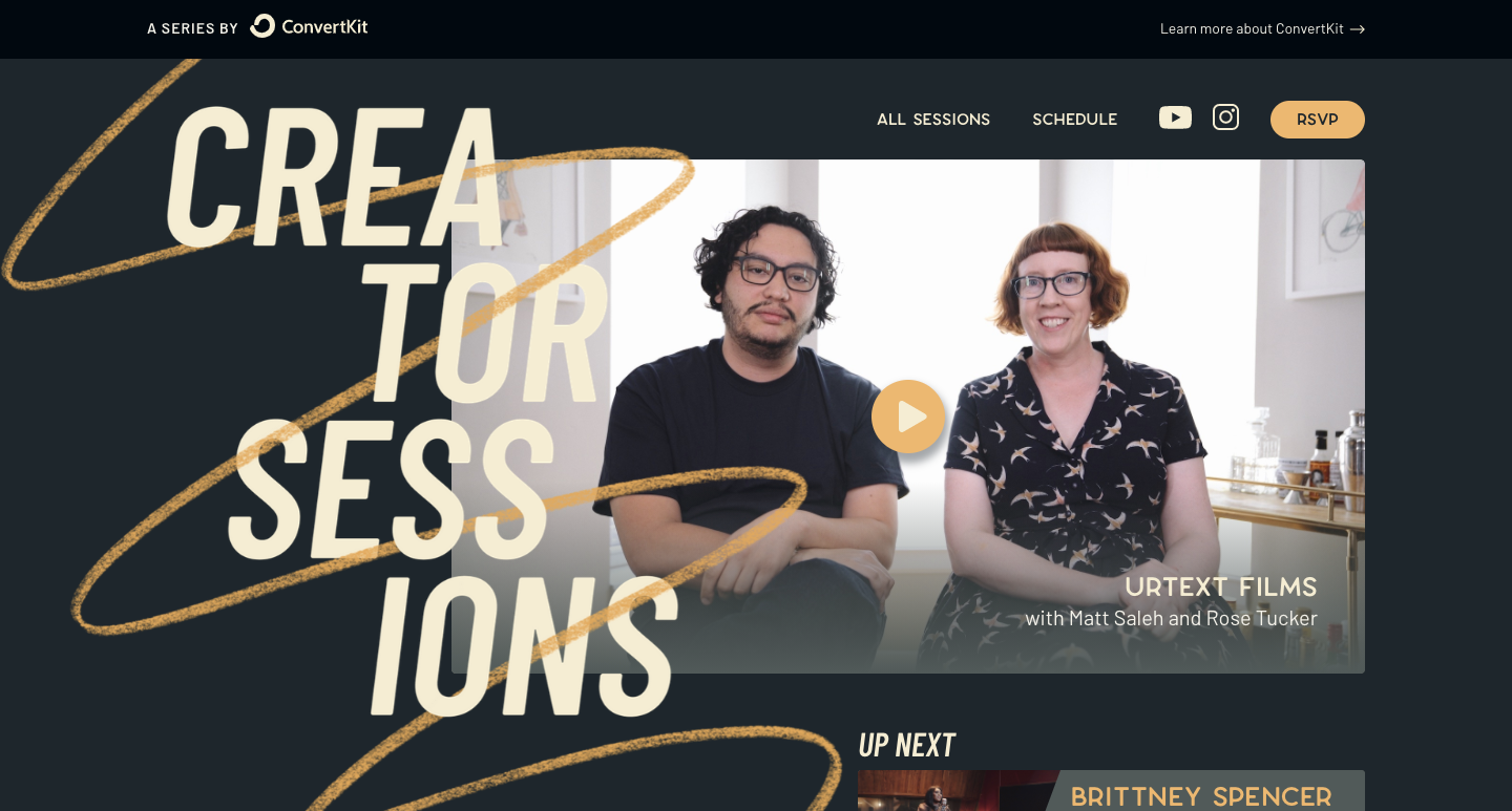
Whether it’s music, photography, painting, or some other form of artistic expression, most designers have other avenues of creativity. This is one of the many reasons why we love Creator Sessions.
Creator Sessions puts on online events that give people an intimate look into the work of various filmmakers, artists, musicians, and other creatives.
The design of the website is well executed with a variety of different sized typography and a sleek black and beige color scheme. Creator Sessions intentionally leans into a muted design and color palette to let the artists and creatives they feature become the focal points.
It’s easy to go overboard with a design that overpowers content. Creator Sessions is a great example of striking just the right balance.
13. Community Club
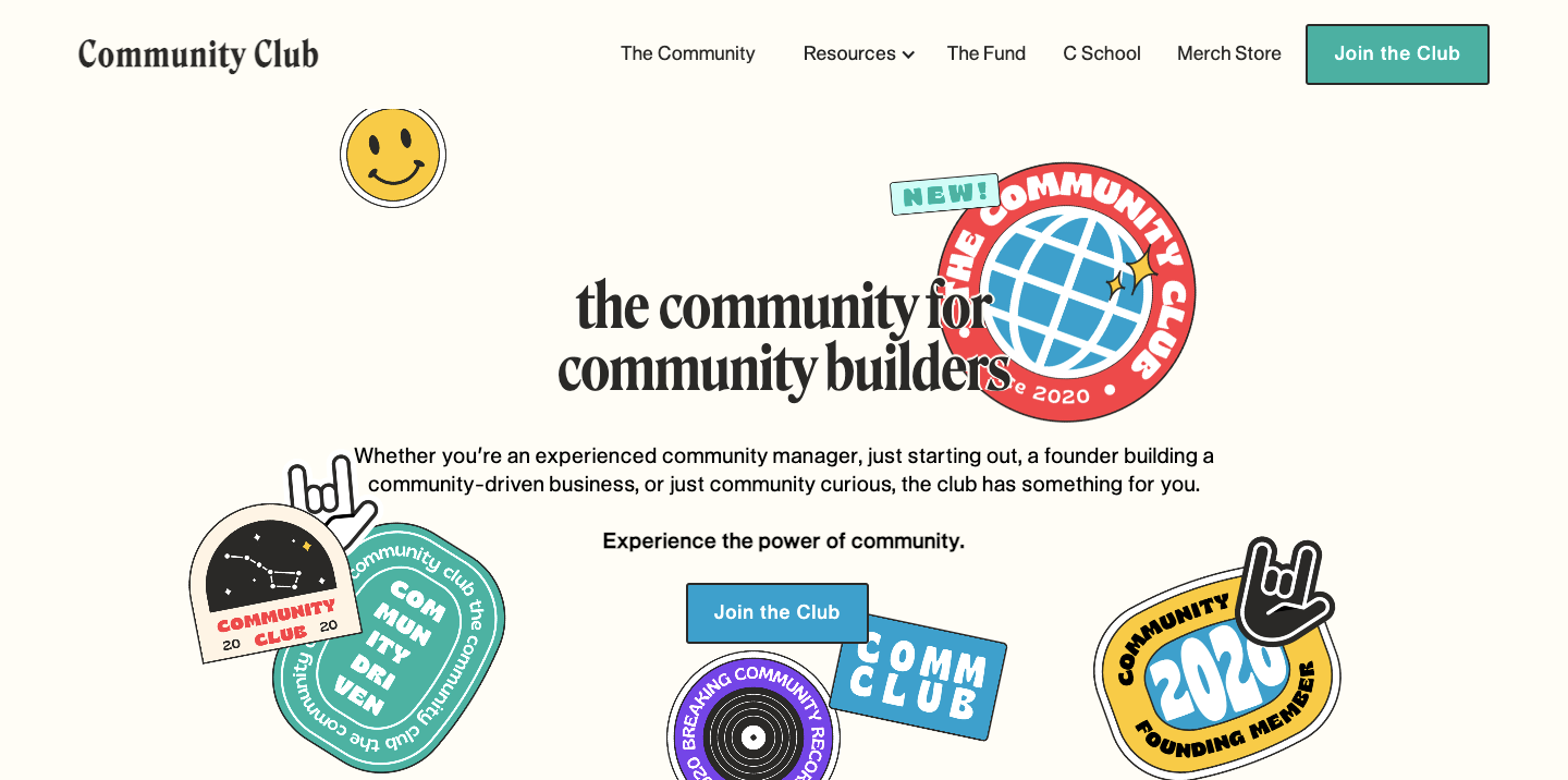
Community Club provides resources and other information for community managers and others involved with general community building. There are sections of the website dedicated to things like tools and software, a job board, and a well-put-together message board for connecting with other community-minded individuals.
We’re impressed by the site’s simplicity, grid arrangement, and carefully selected color scheme. It’s an easy-to-use website that gets people the information and resources they need fast instead of being muddled down by too much UI.
14. Studio Jayne
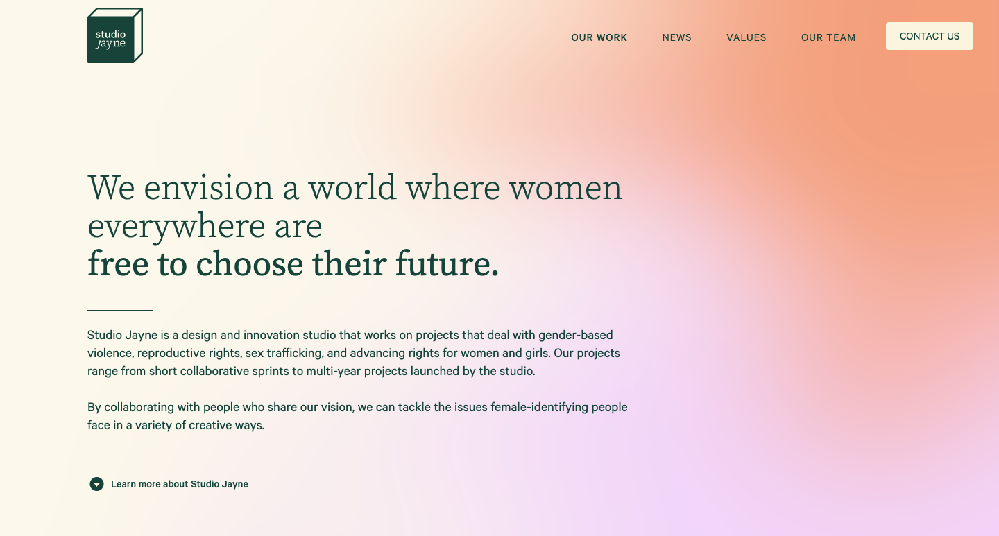
There are so many agencies out there doing great design, but when we encounter one who also has a socially-conscious focus, we take notice.
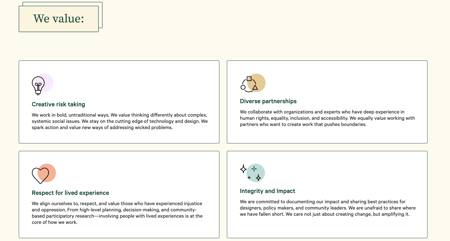
Studio Jayne isn’t your typical design agency — they’re on a greater mission to empower and uplift women. Their work is centered around ending domestic violence, championing the right to choose, and eliminating human trafficking.
Unblock your creativity with Webflow
Feeling inspired? Good! Be sure to check out our showcase, forums, and tutorials to help you accomplish your dreams as a designer. We’re looking forward to seeing what you create.
