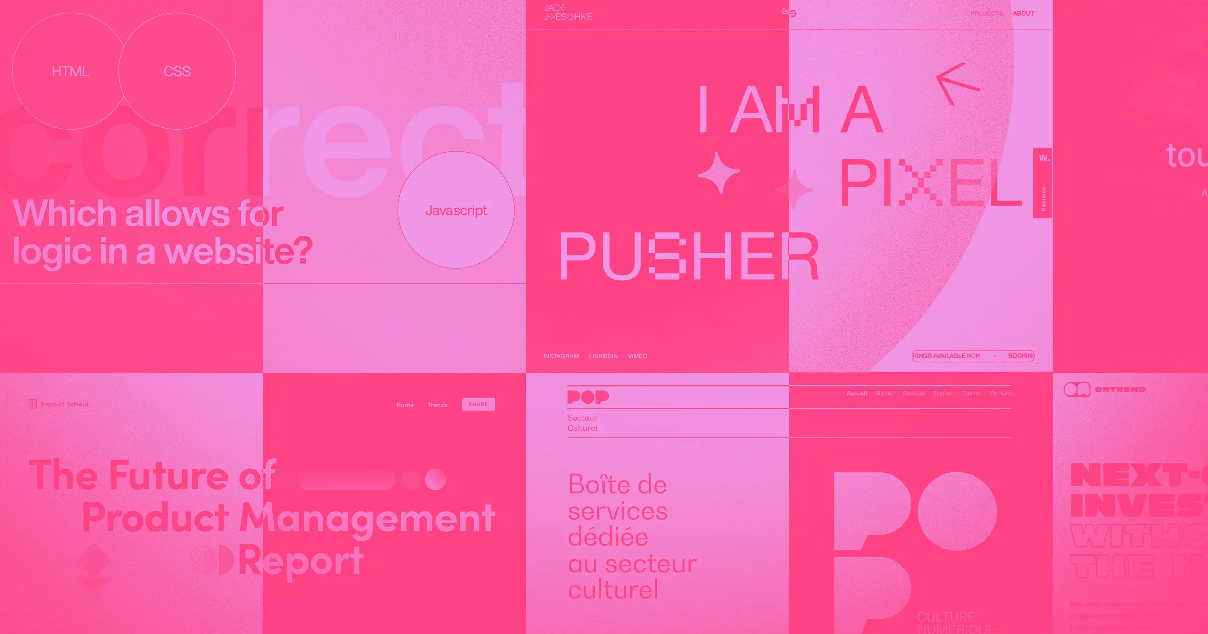
Spring has sprung. And since we can’t bring you actual flowers, we’ll shower you with some inspiration, courtesy of Made in Webflow.
The month of March brought us a fresh mix of sites that promote mindfulness, encourage fun competition, tap into your sense of nostalgia, and more.
1. Headspace Health
Headspace Health opens with warm yellow and orange tones, which pairs nicely with their focus on mindfulness.
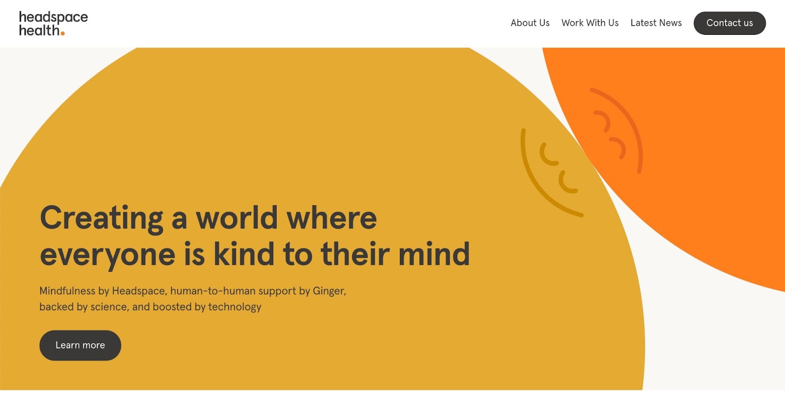
Most information is presented in simple black or gray text, which makes the site easy to read and skim. Pops of color throughout draw our eyes to smiling photos, important stats, and announcements. We love the subtle movement of the geometric shapes that seem to slide into place as you scroll. This site also makes use of collapsible menus, keeping the layout uncluttered while still giving us the option to find more information.
2. Jack Jaeschke (motion warning)
Animator, motion designer, and editor Jack Jaeschke greets us with a pixelated animation that swaps out the words after “I am a..” for titles that range from serious to silly.

The experience of scrolling through Jack’s portfolio feels like a mix between channel surfing on an old school TV and browsing the early 90s internet. The glitchy, pixelated style of the website showcases his personality and motion design skills. And while touches of that nostalgic design technique are all over the site, Jack’s video and client work samples – by contrast — shine in high-definition.
3. Webflow CMS Tournament Bracket (cloneable)
The Webflow CMS tournament bracket lets you map out head-to-head competitions — whether you’re keeping track of your fantasy league standings or pitting sweets against each other to find the ultimate dessert (ice cream is #1, don’t @ me).
The bracket was inspired by the No-Code Conf 2021 speed build challenge, which included 8 competitors. But you can customize the bracket with up to 64 contestants (or dessert types, movies, teams, etc). Clone this project for your next big tournament or heated discussion with friends.
4. Harriet
Harriet gets right to the point with oversized typography that tells us who she is, what she does, and what she loves.
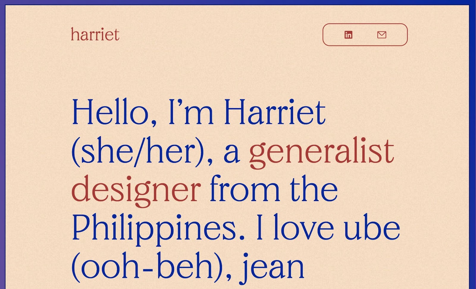
Harriet’s one-page website design is clean and simple while still providing all the information potential clients need. Each project under “work” includes a gorgeous illustration in her distinctive style, along with a brief description of her involvement. We love the subtle touches throughout, like the grainy background animation that looks like light static.
5. On Trend
On Trend provides “bite sized videos from curated content creators,” so it’s no surprise that their site is peppered with mobile phone animations featuring different video clips.

The website breaks its one-page design into categories we can access via jump links in the top menu bar. Each section has a clear header, a brief description, and an animated mobile phone demoing the product in action". The organized-but-playful aesthetic is on-brand for an investing site aimed at young investors.


Get started for free
Create custom, scalable websites — without writing code. Start building in Webflow.
6. Product School: The Future of Product Management Report
The Future of Product Management Report website — created by Product School — is full of smooth scroll-trigger animations featuring the same shapes and colors we see in the hero section.

These animations and surprise switches between horizontal and vertical scrolling keep us engaged, gently nudging us to explore more. It’s a clever, eye-catching design that draws site visitors in and keeps them scrolling.
7. Drag and Drop Quiz (cloneable)
Creator Timothy Ricks treats us to a simple but effective quiz cloneable.
This straightforward drag-and-drop quiz template allows you to create a question and add various possible answers as draggable elements. Dragging the correct answer into the “drop answer” circle triggers a quick animation — with the word “correct” sliding onto the page from the right side of the screen.
8. Type Racer Game (cloneable)
Calling all 90s kids who remember when “computer class” was a thing. This Type Racer Game will bring you back to the days of finding your keyboard’s home row and competing against your classmates.

The goal of this game is to type as quickly and accurately as possible. As you make your way through the randomly generated quotes, the site keeps track of your words per minute (wpm) and accuracy. How high can you score without peeking at the keys?
9. Jude Wasfi
Self-proclaimed pixel lover, Jude Wasfi, delights us with a portfolio reminiscent of an original Nintendo game.
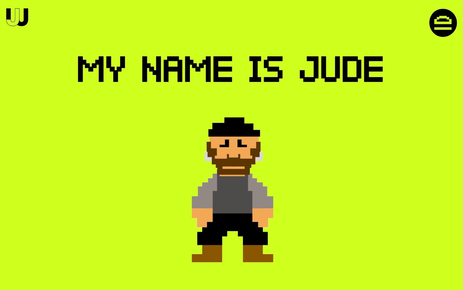
Jude even invites us to play along — awarding us “pixel points” for clicking on hearts and daring us to “throw shade” by clicking on past client logos. (Don’t worry, the shade Jude is referring to is actually a color scheme change.)
What ideas are blossoming in your Designer?
We love seeing fresh new sites popping up in Made in Webflow. Next time you create something you’re proud of, be sure to share it with us!


