Abe Storey, Founder and CEO of Entri, shares how no code platforms are leveling up user onboarding.
“Is that normal?”
I’m looking at a Datastudio dashboard for the first time. Normally I sit on the customer acquisition side. Today, I’m behind the scenes with the product team at a lean startup, trying to figure out why there’s such a big disparity between installs and monthly active users.
The elegant branches of the path analysis are flaring outward into an intricate web from the beginning of the user journey, and right away, I notice a problem.
Because what I see is a literal cliff. Around eighty-percent of users are dropping off after the signup screen. Eighty. Freaking. Percent.
Later we would discover that the problem was relatively straightforward: a cumbersome signup process with too many complex password requirements.
We streamlined and went passwordless, and saw an immediate improvement.
This was my first experience in seeing just how big of an impact onboarding could have in a SaaS product’s business metrics. We were paying for those users, and we were losing them before they’d even completed signup.
The business case for better onboarding
Anyone close to product analytics will tell you: onboarding has the potential to make or break the results of user acquisition efforts. You can build an incredible UI, but if most of your users aren’t getting past their account setup, then only a fraction of your users will reach activation and desired product utilization.
Onboarding is not the afterthought — it’s your greatest opportunity to turn those installs into monthly active users.
Here’s what we know:
- Onboarding is a requirement to bring someone into your user pool
- If they drop out of onboarding, this increases your customer acquisition cost (CAC)
- If the user doesn’t complete onboarding, then you have a user that’s more likely to churn out of your monthly active user (MAU) pool
Tl;dr: better onboarding = more product adoption = better conversion rates and lower CAC.
What is user onboarding, really?
Alright, let’s get on the same page before we dig into some examples.
Product onboarding is whatever you need your user to do in order to become an activated user. Sometimes this means becoming a paid user, sometimes not – it all depends on your monetization strategy. But in general, onboarding looks something like this:
- Download
- Registration
- Product setup (core features)
And what we know is this: the sooner after registration a user sets up the product, the more likely they are to stick around.
User onboarding KPIs
There’s a lot of jargon in product performance, so let’s review the KPIs that are at stake here:
- Net revenue retention (NRR): This is the amount of recurring revenue that’s coming from your existing customer base, and it’s arguably the most important business metric in SaaS.
- 30 day rolling retention: How many users are still actively engaged with your product after 30 days?
- User drop-off: What percentage of your users carry past the onboarding process?
- MAUs: How many users are actively using your product every month?
There are plenty of metrics we can cover, but these are a good place to start when you’re trying to improve your onboarding experience.
Four examples of brilliant onboarding innovations
Onboarding optimization can be a costly exercise in trying to get it right, but there are some innovative brands out there that have done a lot of the heavy lifting for us. Here are a few brilliant ways companies are enhancing their product onboarding for more immediate user activation.
1. Making it easier for users to connect their domains
Nobody using a website builder (or really, any product) has a burning desire to set up their own DNS records.
Ask any customer success professional, and they’ll tell you themselves: DNS configuration represents a lot of support tickets, and an unquantifiable amount of frustration and irritation on behalf of your users.
With the number of WYISWYG website builders out there, it’s a small wonder that nobody has thought to simplify this major point of friction in the process of publishing a website. The reality is that there’s a really good reason for that: DNS configuration is a tough problem to solve for in-house.
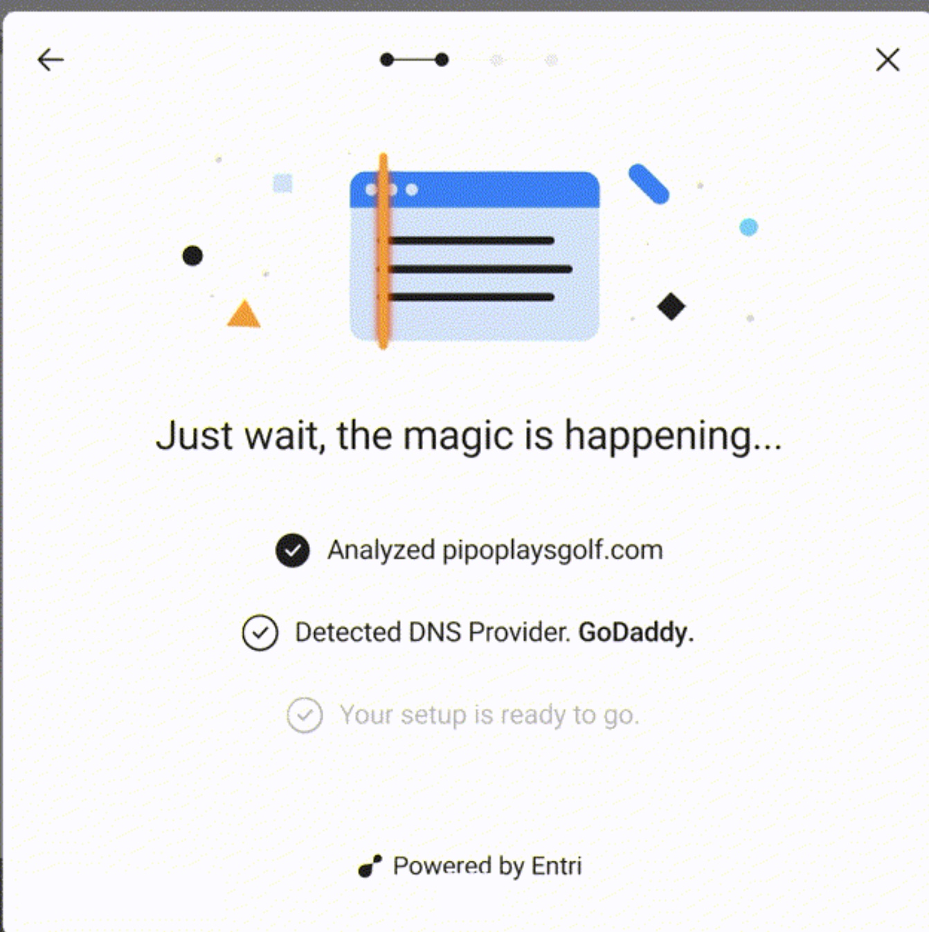
Thankfully, Entri came up with a solution. Entri is the first (and only) API for DNS configuration, and we make it easy for your customers to connect their domains to your product.

2. Guided onboarding
Guided onboarding has been shown time and time again to reduce the probability of your users dropping out of the flow, never to be seen again. Companies who adopt guided onboarding solutions see faster user activation, and way less drop-off.
But onboarding guidance is costly and cumbersome to build from scratch in-house, so solutions like Lou are rising to fill the need.
Acadle is a learning management system (LMS) that allows its users to create their own in-house training programs. Acadle uses Lou to help onboard their users quickly, so they can ramp them to full product adoption as soon as they register.
“Guided user onboarding is extremely effective at getting new users through the initial onboarding process by offering guidance in-app at the exact moment it's relevant to users,” says Rachel Pardue, Co-Founder at Lou.
“In-app onboarding experiences like product tours and tooltips break down what can be an overwhelming onboarding experience into easy to understand steps that help users unlock the value of a product in their first login.”


Get started for free
Create custom, scalable websites — without writing code. Start building in Webflow.
3. Eliminating passwords and security questions
Countless security studies have proven time and time again that even with the threat of a security breach, most people reuse the same passwords over and over again. In fact, a 2020 survey conducted by IDG revealed that 53% of security breaches were directly related to mismanagement of user credentials.
In short, people are only human, and it’s almost impossible to remember dozens of unique, random passwords. Luckily, tools now exist to create not only a better user experience, but also a more secure one.
Feathery took control of their signup conversion by implementing passwordless registration with Stytch. Using email magic links and OAuth in place of cumbersome password requirements, they were able to increase their conversion rates, and ultimately make their customers happier.
"Feathery's native Stytch integration for a passwordless auth solution allowed us to set up our sign up flow very quickly with magic link verification and Google social login,” says Peter Dun, CEO of Feathery
“Passwordless solutions offer quick and secure authentication compared to traditional solutions, and Magic Link auth comes with email verification out of the box. Feathery's Stytch integration also saved us hundreds of developer hours when setting up auth for our platform."
4. Partnering with agencies
Sometimes, all of the usability testing and automation in the world can’t bridge the gap between a technical solution and a pool of non-technical users. When that happens, the onus is on the product to do two things: acknowledge the gap and create a resource to address it.
In the past, that resource has been well-written knowledge bases and responsive support teams, both of which are still relevant.
But when your user doesn’t have time to develop a more technical skillset, you have a unique opportunity to connect them with the experts who can help them maximize their utilization of your product.
Webflow does this exceedingly well (and I’m not just saying that because this is their blog). They created a no-code product — a visual development platform that still has some more technical elements. Then they created an incredible network of expert agencies and freelancers to help their end-users build on their platform.
It’s kind of genius, and it’s extremely useful to the people on the other side of their product.
Go all the way for no-code users
No-code is a great first step in democratizing technology even further for non-technical users. Beyond that though, it’s a nod to what’s possible in usability. Someone once told me in a huff as we discussed DNS friction, admins are users too, and that always stuck with me.
Because the reality is that building usability into a product may help non-technical users become active users faster, but it’s also going to make everyone’s lives easier. It’s both a quantitative and qualitative win, one that can be measured in business outcomes and in user sentiment.
“Activation is all about getting users to realize a product's value—and user onboarding is an effective tool to support them through this journey,” says Anand Patel, AppCue’s Director of Product Marketing.


