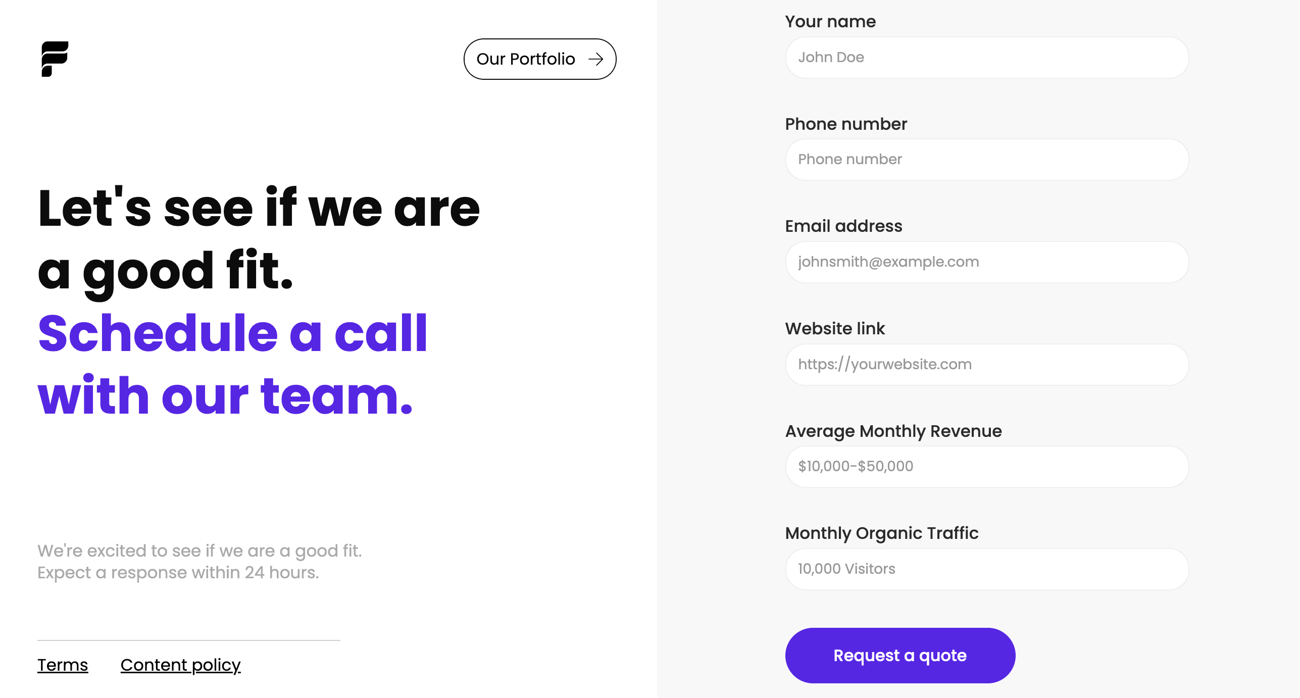
A website contact form offers valuable insights and encourages customers to reach out.
A contact form is an excellent way to establish a communication channel between you and your customers. You can use it to request feedback, generate leads, and encourage engagement.
To help you create your own for your website, we’ve gathered some helpful tips along with contact form examples and templates you can work from. Whether crafting a basic contact form or a complex, multi-step system, you’ll be set for success.
Why use a contact form?
Inviting customers to reach out to your company using pre-configured fields provides users a consistent communication structure. And on your end, it’s easy to respond and then pull and track data from correspondences.
Here are a few more benefits of including a contact form on your site.
Reduce spam emails
Spam accounts and bots can easily send emails in huge quantities, but they can’t complete contact forms at the same scale. It’s more challenging for these bots to find and fill contact fields, which often contain disruptive CAPTCHA tests. Using contact forms ensures that most communications your company receives are legitimate.
Track inquiries
Contact forms use consistent fields that lend themselves to automation. Many task management tools, such as Jira and HubSpot, help you automatically create tasks based on contact form information. This feature makes tracking and managing these contacts significantly simpler.
For example, if your form includes fields for customer platform, related product, and issue description, your task management tool can extract these values, automatically place them into the relevant fields, and file a ticket. This process is much easier to automate than an email, which would lack these fields. Your automation would have to dump the whole message into a blank task, and you’d have to sort out the fields manually.
Generate more leads
Forms involve less friction than email correspondences because they provide a clear structure, leading to a more seamless contact experience for users. This seamless experience encourages more customers to reach out, resulting in more high-quality leads.
How to create a contact form for a website
Contact forms have become a mainstay in website design, so it’s no surprise there are many ways to set them up. The following are the two most common methods.
Online tools
Web development platforms offer templates and form builders that let you set up contact forms and other interactions with little to no code. This method is the simplest, allowing you to leverage the creativity and experience of web designers who specialize in creating intelligent, flexible user experiences. You can check out Webflow’s contact form templates for some ideas.
Design your own
Designing a contact form from scratch is a more involved method, but doing so allows you to make one that suits your brand. However, you must take adequate measures to ensure the form stores and transmits information securely whenever a user completes it. Consider investing in a data governance tool like Informatica or Alation to help navigate data privacy regulations like GDPR.
You’ll also need a firm grasp of these coding languages:
- HTML — You’ll need to use the <form> element along with all the <labels> and <inputs> required for each section.
- CSS — You need CSS to style the various form elements, deciding their spacing, fonts, and colors.
- PHP — You can embed this scripting language in HTML to gather the inputted data and send it where it needs to go.
What should you include in a contact form design?
When designing your contact forms, you don’t need to get overly creative. Remember that your customers have probably filled out similar forms before, and they have expectations about how quick or simple they should be. Follow this familiar structure to ensure a smooth customer experience:
- Name field — A simple field for inputting the customer’s name
- Email address — A field where customers input their email addresses (validated to ensure accuracy)
- Subject — A character-limited field where customers enter a title for their message or select from a dropdown menu
- Message or comments — A text box where customers input comments, concerns, or intentions (with a limited character count to encourage concise responses)
- Security features — A CAPTCHA or other feature that blocks bots
- Confirmation message/page — A pop-up or separate page that gives the customer a chance to review their input before submitting
- Privacy and data usage information — A paragraph or two describing how you’ll protect the customer’s information and what you’ll use their data for


Get started for free
Create custom, scalable websites — without writing code. Start building in Webflow.
Contact form types and examples
Contact forms come in many shapes and sizes, and which type you select depends on your company’s needs. Are you trying to generate leads, reach out for feedback, or establish a platform for fielding concerns? As you read the following contact form options and examples, consider which ones suit your unique use case.
Pop-up form
A pop-up form is a simple message that pops up on a screen and encourages customers to fill out a few simple fields. Brands typically use them to ask visitors to sign up for their mailing list. They can also work to offer promotional discounts. Webflow offers pop-up form templates you can seamlessly integrate with your web design.

Vertical contact form
Vertical contact forms are the typical format for contact pages. They lay out every field vertically, usually featuring additional information or calls to action in the adjacent space.
To improve your customers’ experience, include information about how soon they can expect a response and suggest actions they can take in the meantime, such as visiting a help center or watching informative videos. You can explore templates made in Webflow, like this vertical contact form template designed by Flagship Ads, which cover various use cases.

Multi-step form
A multi-step form takes the vertical contact form further. Businesses use these forms to ask questions in high volume, breaking various interactions up across multiple fields.
For example, this onboarding form template, designed by Flowbase, uses a clean, simplified UI that breaks questions into separate interactions. As the customer fills out each field, they click the button to move to the next. This results in a more interactive experience.

Footer form
A footer form serves a similar purpose to a pop-up but works in the opposite way. Rather than grabbing the customer’s attention, it lays unobtrusively at the bottom of each page. Customers will only notice this subtle form if they scroll down, but it’s an excellent way to provide a sign-up method for a mailing list or let users reach out with one interaction.
This footer component template, also designed by Flowbase, is an excellent example. It includes some simple navigation options, a header, and a single field and button customers can use to subscribe to emails.

3 tips for a perfect contact form design
Contact forms may seem simple, but a perfect structure goes a long way to increasing conversions and engagement. These three tips will help you craft an ideal form that engages customers and invites them to interact with your brand.
1. Anticipate user inquiries
Start with a clear expectation of what inquiries you’ll receive from the form. Then, choose fields that request information relevant to those inquiries. For example, if you’re looking for customer satisfaction feedback, ask which product the customer is referring to and their satisfaction level. Alternatively, if your form is for demo scheduling, include a field for selecting time slots and a dropdown for common use cases.
2. Keep forms short to boost conversion rates
The shorter your form is, the higher the chance customers will complete it. If possible, fit your entire form in one screen so it doesn’t require scrolling down. In a multi-step form, use a visual indicator that shows how many pages the form has and try to include the fewest possible fields on each page.
3. Dedicate a form for social media
Social media creates segmented communities, so it’s easy to reach out to specific target audiences through these channels. Tap into multiple social media avenues by creating dedicated forms that appeal to each platform’s users.
Enhance user interaction with Webflow
Contact forms are vital to the user experience, but your website’s overall design also requires thoughtful planning to promote seamless interactions. Webflow offers a suite of helpful templates to inspire and streamline your development process. You can also leverage tools like Quick Stack elements and reusable components to fine-tune designs for your unique brand.
This video breaks down how Webflow forms work, including form elements, submissions, notifications, and integrations. It's everything you need to launch forms with confidence.
Next time you assemble a contact form, update your site layout, or add a new feature, start with a template and see where your creativity takes you.

Get started for free
Create custom, scalable websites — without writing code. Start building in Webflow.


