


Have you ever wondered what makes professional web designs so visually appealing?
It isn't just harmonious colors, clean fonts, and interesting shapes that make some designs more attractive than others. There's a deeper explanation: The golden ratio. This phenomenon is observable in everything from the shape of the Parthenon to the spacing on a web page.
You can use the golden ratio in web design to create shapes that proportionally and harmoniously separate a page into smaller and smaller parts. Learn how to use the golden ratio in your site development and optimize your design’s appeal and impact.
What’s the golden ratio?
The golden ratio is 1:1.618, and it occurs in natural and artificial objects, from seashells to artwork. The ratio appears in nature as the Fibonacci sequence, and is also known as the golden mean, golden spiral, and golden rectangle. There are many names for the golden ratio because there are so many ways to apply it.
The Fibonacci sequence is extremely common in nature. Every number in the sequence (other than 0) is added to the number that precedes it to determine the following number: 0, 1, 1, 2, 3, 5, 8, 13, 21, 34, 55, 89, etc. This sequence prescribes the number of petals a flower should have, the strongest shape for a ram’s horns, and the proper curve for the arms of a spiral galaxy.
The golden ratio in design
In design, you can use the golden ratio to create layouts that appear more harmonious and interpretable. The goal of the golden ratio in design is to guide viewers’ attention to each design component, starting from the largest element and leading them in order to the smallest. Being able to guide the viewers’ eye along the page helps designers prioritize information as they plan a website.
And since the golden ratio frequently occurs naturally, we’re accustomed to its visual effect — even if we’re unaware of it. As a result, designs that use this ratio are more appealing than those that don’t. For example, Leonardo Da Vinci's famous Mona Lisa uses the golden ratio.

As you can see, Mona Lisa’s facial features all precisely fit the ratio. From the width of her nose to the height of her head, each feature aligns with the edges of squares that fit into the Fibonacci sequence.
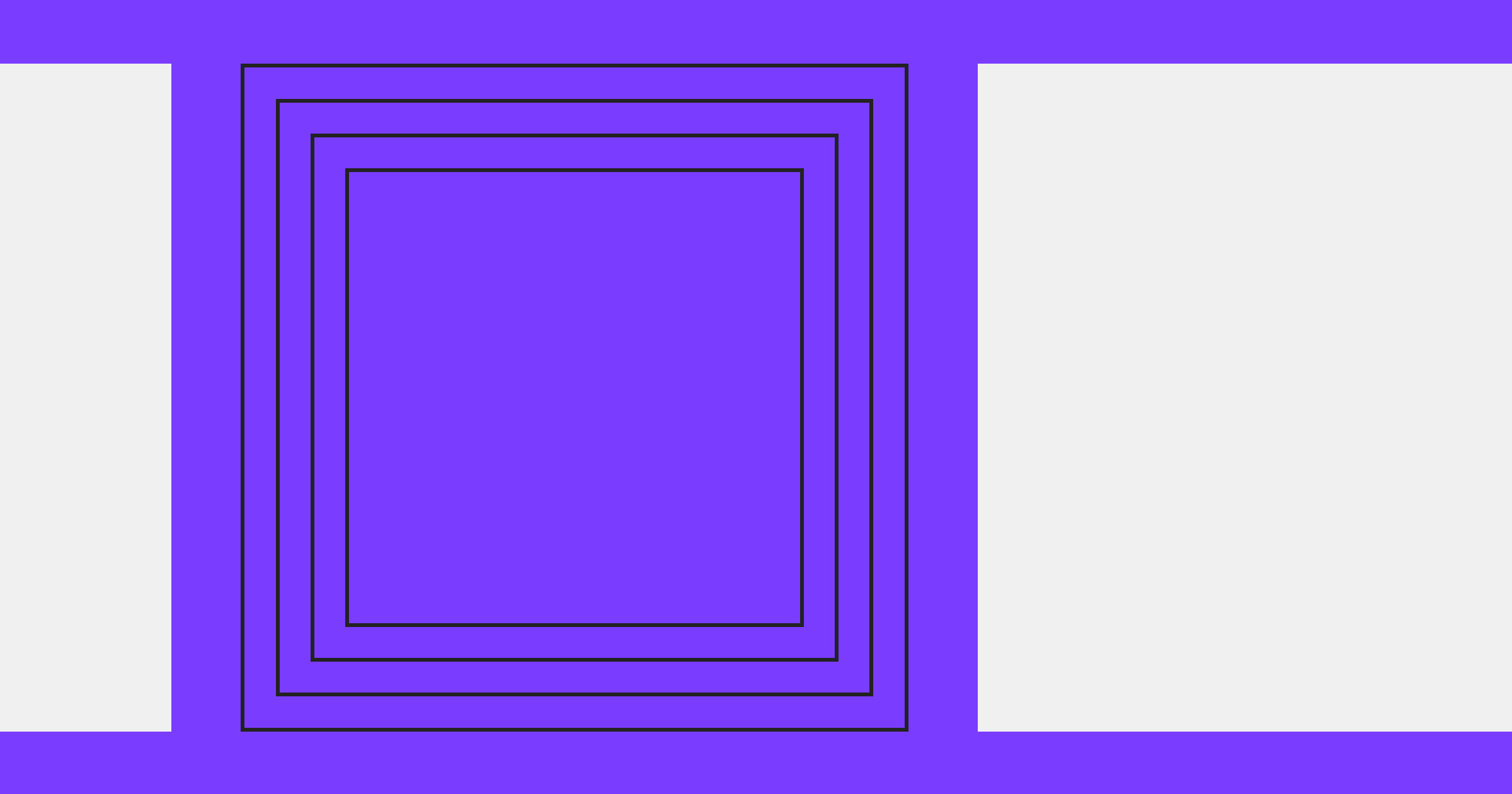
There are a few formulas for determining the golden ratio, but designers tend to simply multiply or divide dimensions by 1.618 and round up or down to find the right size for a page element. For designs with many elements, they use the Fibonacci sequence to determine how to size each one. For example, here are a series of squares that follow the Fibonacci sequence:
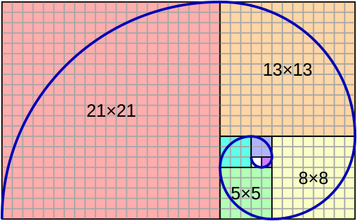
If you start with a square that’s 1 pixel on each side, you can use the Fibonacci sequence to determine what the next size up should be: another 1, followed by 2, 3, 5, 8, and so on. To create a harmonious visual hierarchy, each page element needs to increase in size according to this pattern.


Ultimate web design
From 101 to advanced, learn how to build sites in Webflow with over 100 lessons — including the basics of HTML and CSS.
4 ways to apply the golden ratio in web design
Just as the golden ratio gives artists a foundation for sizing elements, it also provides website designers a formula for creating layouts. When you lay out a web page based on the golden ratio, you create a naturally attractive and intuitive appearance.
Here are four design elements that can benefit from using the golden ratio.
1. Typography

The text size on a web page doesn’t just indicate that copy’s importance, it also affects the overall readability of your content. The golden ratio can help you create headlines and body text that reduce eye strain, encouraging viewers to keep reading.
For example, if your body text is size 13 font, you can multiply 13 by 1.618 to determine the appropriate proportion for a headline: 21. At those sizes, readers will notice a clear difference between headings and body text and have an easier time interpreting the page.
2. Layout
Laying out a page often involves using shapes to separate elements, and the golden ratio plays a crucial role in determining how to size them. This ratio can help you determine the best size for every element so they fit harmoniously together.
For example, the most common screen resolution is 1920x1080, and you can use the golden ratio to create a harmonious design at those dimensions. If you divide 1920 by 1.618, you arrive at 1187, and 1080 divided by 1.618 roughly equals 667. That gives you 1187 x 667, the rectangle dimensions you can apply to important parts of the page design. If you keep dividing those dimensions, you’ll create other shapes that follow the ratio:
- A medium rectangle that’s 734 x 413 pixels
- A medium square that’s 255 x 255 pixels
- A small square that’s 157 x 157 pixels
Combining these complementary shapes in your layout will produce a coordinated page that’s visually intuitive to comprehend.
3. Spacing
The golden ratio is the best way to determine how much padding you need around an element, such as a symbol, icon, or text. First, divide the element's height by 1.618, then divide the result in half and apply that amount of padding.
For example, if a font is 55 pixels tall, divide it by 1.618 to arrive at 34. Then, divide 34 in half to determine you need 17 pixels of padding.
4. Logo design
Many industry-leading brands use the golden ratio for their logos. Even on this small scale, it produces an appealing image that displays well on various devices and mediums. Here’s an example from a Pixabay user named Petra.

This entire logo consists of many shapes, but your eyes are first drawn to the whale’s eye, the bubbles, and the blue underbelly. As you take in the whole image, you’ll notice the larger elements, such as the fin, tail, and body. All these elements are sized according to the golden ratio, and their order along that ratio determines the order in which you notice them.
Why the golden ratio matters in web design
When you use the golden ratio to develop a web page layout, you establish a visual hierarchy users can understand. The intentional proportions and locations naturally guide viewers’ attention to each design component, first bringing their focus to the largest element and drawing them sequentially to the smallest.
Pages that apply these principles appear more balanced, leading to a pleasant viewing experience. Consistently applying the golden ratio creates designs that are eye-catching and professional, contributing to an appealing and authoritative brand image.
Create intuitive designs with Webflow
To leverage the power of the golden ratio, you must intricately craft your page layouts — and you need a development platform that supports building visually stunning, high-functioning sites.
Webflow offers visual development features like reusable components and Quick Stack elements. Our platform lets you quickly create elements like logos and layout sections, which you can drop into any page on your site. To get started, try Webflow for free or explore the lessons and interactive courses at Webflow University.
Ultimate web design
From 101 to advanced, learn how to build sites in Webflow with over 100 lessons — including the basics of HTML and CSS.