

A finished website might look like a work of art, but there’s a science to laying out page elements.
It’s called visual hierarchy, and it’s all about making layout decisions based on people’s expectations of how everything should flow. So if you want to create a successful webpage, you must understand how the human brain interprets information.
What is visual hierarchy?
Visual hierarchy is a methodology that organizes design elements by importance, creating a user experience (UX) that draws attention to the focal points you want users to interact with, whether that’s text, images, or buttons.
Colorful logos, white space, bold typography, and more contribute to which details a visitor notices, but the placement of these design elements is equally important. Think about where you might naturally look for information on a website. Many people start at the top or center before seeking the smaller, less prominent elements. In web design, visual hierarchy predicts this user flow, placing calls to action (CTAs) and other important information in the spots you’re most likely to see first.
Why is visual hierarchy important?
Hierarchy is one of the four pillars of visual design principles, along with space, contrast, and scale. Together, these principles create a more intentional relationship between design elements like fonts and images, strategically organizing your website layout to guide users toward a specific goal or outcome or highlight a message you’re trying to communicate.
Incorporating visual hierarchy into your web design also:
- Grabs attention: Hierarchy directs attention to enhance user engagement
- Guides the user journey: Visual hierarchy helps visitors navigate content effectively so they can absorb information to make informed decisions and take desired actions, such as filling out a form or making a purchase
- Creates a scannable layout: Crucial items and content stand out, helping visitors engage with the website more readily
Designing a beautiful website without following all the rules is doable. But just as a well-executed hierarchy improves UX, disregarding the hierarchy in your layout decreases usability and readability. If any of your pages have a high bounce rate, a poorly executed visual hierarchy might be why.
7 principles of visual hierarchy for web designers
These principles help construct a visual hierarchy to keep visitors engaged and informed, ultimately delivering a better UX. You don’t have to incorporate all of them, but knowing what they are can help you make more intentional design decisions.
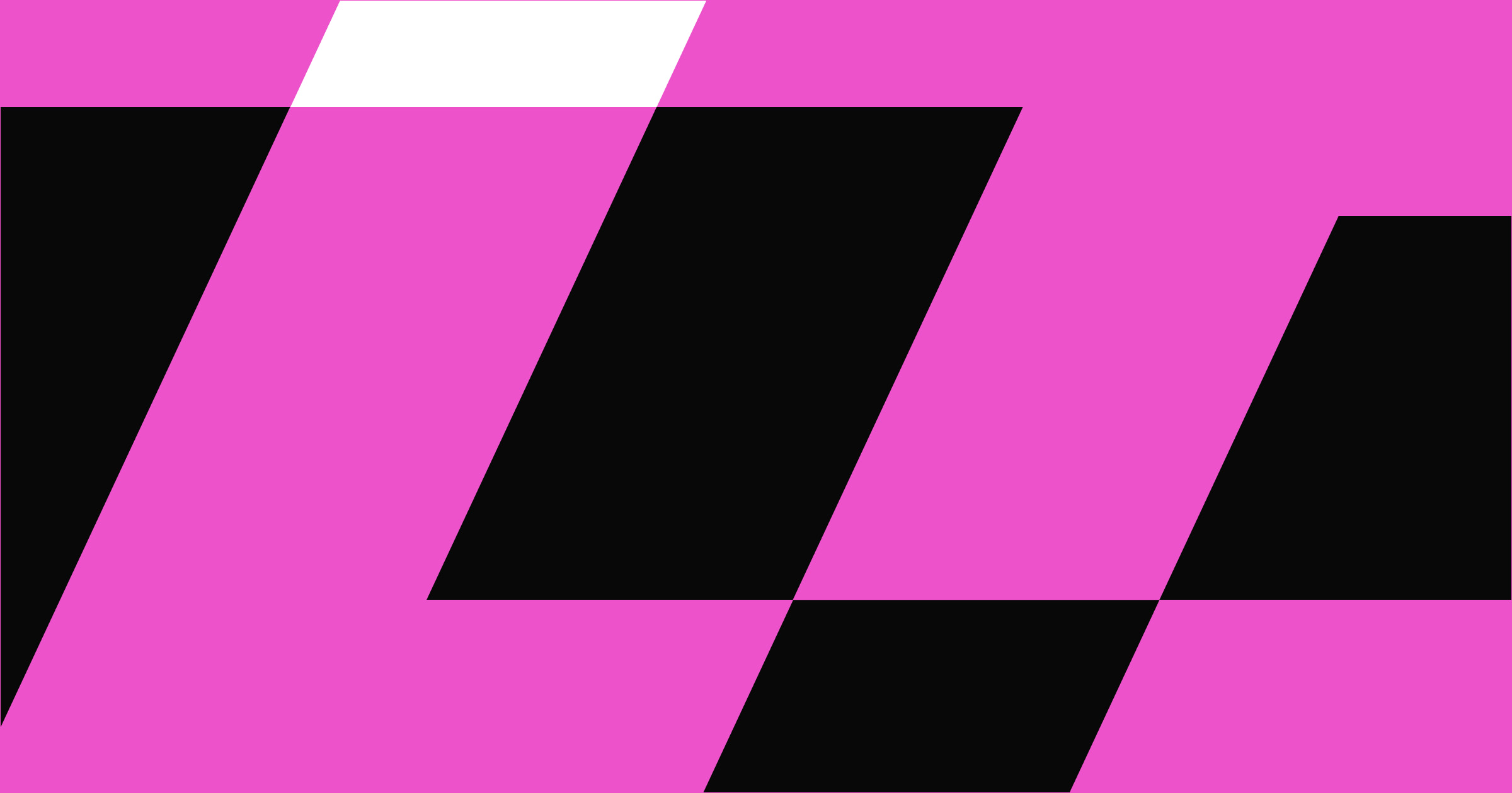
1. Reading patterns
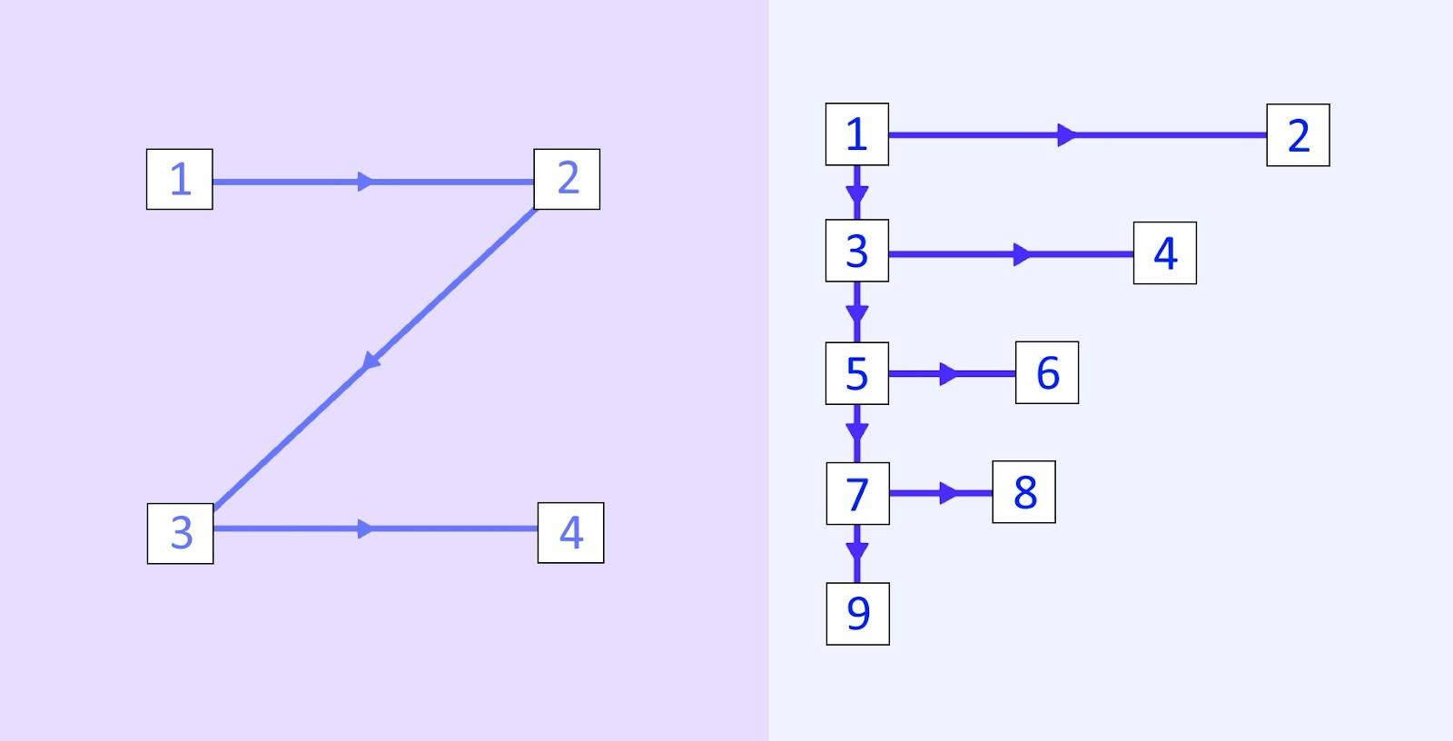
There are two primary reading layouts: Z pattern and F pattern. These support visitors’ natural reading habits — which for most people in Western cultures is left to right — by strategically placing information to tell a cohesive story that makes sense to visitors.
A Z-pattern layout draws attention to the top-left corner first before moving to the top right, then down to the bottom left, with the bottom-right corner as the last stop. Each corner has a visual cue (like a logo) or CTA (like a contact button). An F-pattern layout, which follows a more crowded pattern leading visitors from left to right and back again, works well for text-heavy pages.
2. Rule of thirds
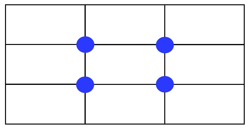
The rule of thirds is a common (and even well-loved) concept that influences many types of design, like movie posters and photography. The rule of thirds is based on a grid pattern that breaks a rectangle horizontally and vertically into thirds. This creates four points of intersection on the grid. Placing items at one, some, or all of these points creates visual interest without disrupting balance — the points aren’t centered, but they’re also not entirely off to the side.
3. Size and scale
Size and scale are used in visual hierarchy to communicate prioritized information. Size refers to the physical dimensions of an element, while scale defines its proportion relative to other elements on the page. Large elements generally attract more attention in the hierarchy, while smaller ones are secondary.
A large logo in the foreground creates a focal point, while less prominent elements, such as social media icons, can be grouped together in a smaller scale to let other details — like header text or product images — shine. Playing with size and scale creates a sense of perspective, guiding users to focus on the most important information first.
4. Typography
Visual hierarchy in typography uses intentional font pairing and different-sized typefaces to emphasize text-based information. The ideas you want to highlight should appear in larger or bolder text, ensuring visitors interact with them first, while any supplementary text should be smaller or in a less dominant font. A hierarchy could start with a large headline, then move on to mid-sized subheadings, and then smaller body copy.
5. Color and contrast
Strategically using color and contrast draws visitors toward elements you want them to see first. A high-contrast CTA button will visually pop against a muted background (and vice versa), and bright illustrations add visual interest while still communicating ideas. Use your color palette wisely so information stands out and stays on brand.
6. White space
White space, or negative space, aids legibility and balances visual hierarchy by preventing too many elements from cluttering the layout. The white or negative space around and between elements also helps readers absorb information without getting distracted.
7. Proximity and repetition
The human brain naturally seeks out patterns. Placing web elements near each other or using patterns to organize them helps visitors understand how they’re related and what their purpose is. If your website has a blog, organizing posts side by side or on top of each other shows visitors they serve the same purpose.


Get started for free
Create custom, scalable websites — without writing code. Start building in Webflow.
Visual hierarchy in action: 3 examples
Let’s put the concepts we’ve discussed into practice by examining examples of the hierarchy in action on real websites. The layouts on these pages create focal points to draw visitors toward vital information, and each design guides the user journey, whether to a CTA or informational content.
Free Faces
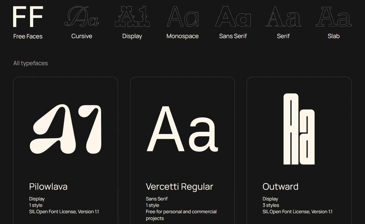
Free Faces, designed by Simon Foster, employs high-contrast colors — an off-white for the text against an almost-black background — to make every typeface pop. Each typeface listing places the most critical information at the top and the least important at the bottom to cater to readers’ tendency to consume information from top to bottom.
Free Faces uses repetition to group its offerings in a balanced three-item layout, allowing each typeface enough space to showcase its distinct characteristics. And presenting each font in the same size gives visitors the freedom to choose their preference, indicating that no typeface is more significant than the other.
2ET Labs
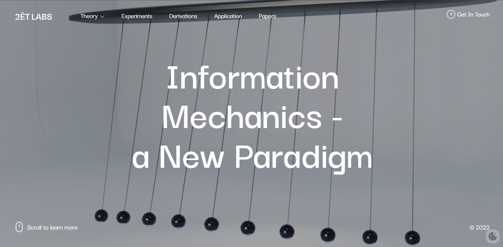
2ET Labs by Carter Ogunsola uses negative space to highlight its mission statement in the center of the homepage. The minimalist white text subtly contrasts the blue-gray background, standing out without taking too much of the user’s attention away from other elements.
This website also uses a Z pattern, placing information at different corners of the page. The logo and contact form CTA appear in the top two corners where visitors will find them first. Secondary information — scrolling instructions and a copyright icon – appear at the bottom corners of the page, guiding users to prioritize interaction with the elements that matter most.
Juno
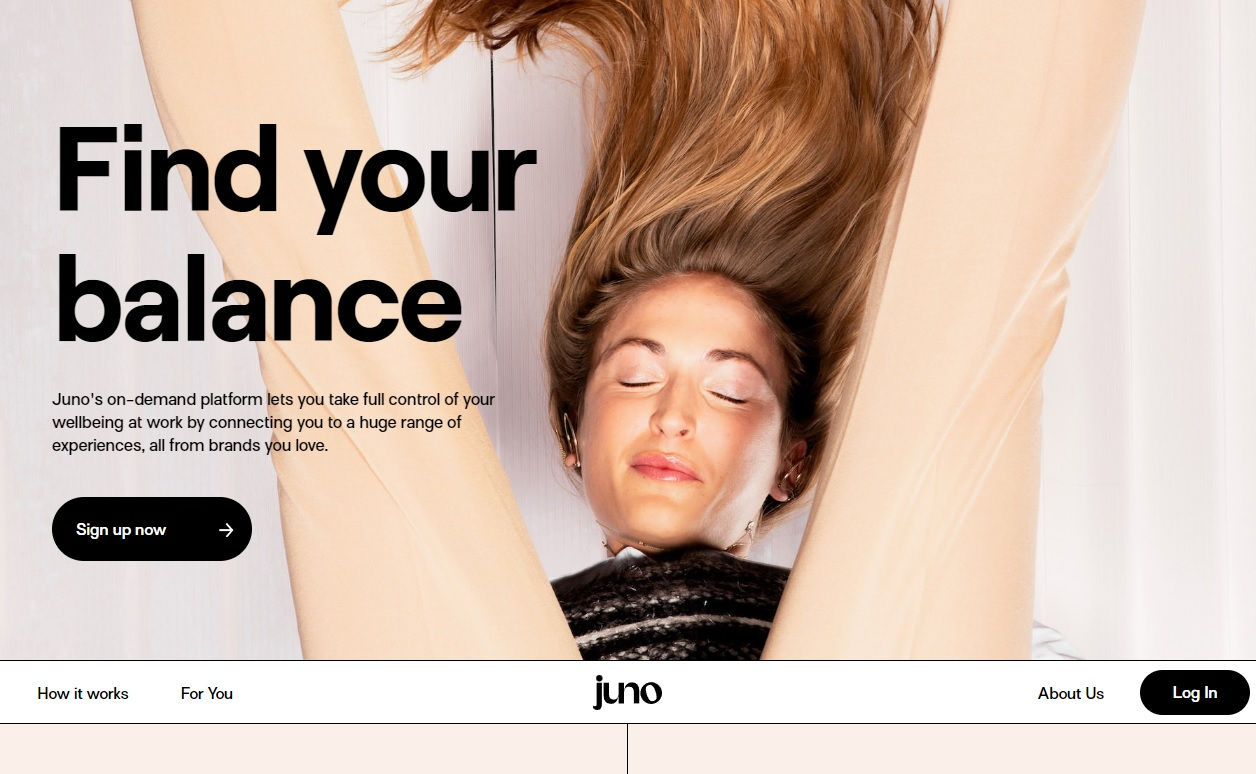
Webflow designer Koysor chose an F-pattern layout for Juno’s website, keeping all text on the left half of the page and reducing the font size as the eye travels from the header to the subheader. When the reader reaches the CTA button, they’ve learned what they need to know to get them to click.
Juno’s background image — an upside-down photo of a woman bending over with her head between her legs — follows the rule of thirds. The placement of the person’s legs divides the page into three near-symmetrical sections, creating points of visual interest while harmoniously balancing the layout with the text on the left side of the screen.
Apply visual hierarchy principles to your website
Visual hierarchy paves the way for your visitors’ experiences and tells them the story you want them to know. Learn more about this design concept with Webflow University’s freelance web design boot camp, which includes a course on visual hierarchy. And Webflow’s visual site builder lets you focus on creating a cohesive user journey without worrying about coding.