Typography matters.
In his classic The Elements of Typographic Style, Robert Bringhurst defines typography as “the craft of endowing human language with a durable visual form.” In most cases, that visual form needs to be legible and readable, and it must set the right tone. If your typography makes a text difficult or downright impossible to read, then it’s useless—no matter how amazing it looks.
Just imagine how different history might be if the Bible, for example, had been typeset in green Indie Flower on a blue background:

I’m not sure people would have taken it as seriously.
Which brings us to three key concepts in typography: tone, readability, and legibility
Tone is the mood or feeling that your typography conveys visually, which is distinct from the tone of the content itself. Tone ranges across a spectrum from informal to formal, and you’ll want to make sure your typography sets the right tone for the message and brand. The typesetting above illustrates this beautifully. The young, playful feel of the font just can't support the gravitas of the quote.
Legibility defines how easy it is to distinguish between individual letterforms (the shapes of the letters), and is a vital consideration for setting type in user interfaces. For instance, some fonts make it difficult to distinguish between an uppercase I and a lowercase l. (See what I mean?) This is usually a function of the font’s design, though certain design choices, such as setting letter-spacing too high or low, or setting text in all caps, can impact legibility.
Readability defines how easy it is to read paragraph content. It’s determined by the font's design and your own design choices, including sizing, spacing, and color.
I’ll cover all of these aspects in more detail, but let’s start with one of the most important decisions: the fonts themselves.
The many types of fonts
Typographers categorize fonts in many different ways, but the following categories are the most common in the world of web typography:
Serif – The undisputed king of printed content, serif fonts feature small lines called “serifs” on the ends (or “terminals”) of individual letters. Examples: Times New Roman, Georgia, Droid Serif
Sans Serif – As the name suggests, sans serif fonts lack serifs. They've become the standard for the web because early computer screens had a hard time rendering serifs crisply. Examples: Arial, Verdana, Droid Sans
Monospaced – Every character in a monospaced font takes up the same width. Created back when typewriters were all the rage, these fonts have experienced a renaissance due to their use in text editors. Example: Inconsolata
Cursive – Cursive fonts mimic handwriting. They tend to emphasize visual interest over legibility, making them better suited for titles and headings than body text. Examples: Indie Flower, Great Vibes
Display – Display fonts tend to be either big and bold or hairline thin, and they often have highly complex letterforms. Due to their attention-grabbing impact, they’re best used in headlines. Example: Changa One
The vast majority of fonts you see in books, documents, and webpages are either serif or sans serif. (Since this post is just an intro to typography, we’ll focus on these two.)
To serif, or not to serif?
If serifs and sans serifs constitute the standard, go-to font types, then how do you decide between the two? The answer, as it so often is in the world of design, is: it depends.

Many people believe that serifs increase legibility in printed materials, but in the digital world, they have a reputation for ruining legibility due to the low resolution of older digital screens. With retina and 4K displays becoming standard, this has become less of a concern, but if your audience uses a wide variety of devices to view your site, you might be better off playing it safe with a sans serif for body text.
Don’t get me wrong. Serif fonts remain relevant on the web, but they’re better suited for headings and other short, large-set blocks of text. Due to their more ornate appearance, serifs can impart a more formal, professional tone to your designs, making them ideal for certain brands.
For example, news outlets and professional blogs often use serif fonts for body text. This is of particular interest to newspaper sites, where serif fonts keep the site looking and feeling like a newspaper. Many people also maintain that serif fonts are better for long-form reading, though that may be more of a function of familiarity than of scientific fact.
TL; DR: Lean towards sans serif fonts for your body text to maximize legibility, and consider using serifs for headings and shorter content. But keep in mind that a serif might be just right for your brand or industry.
Each font has a voice of its own
Every font has its own tone, whether it’s professional, playful, classic, or aggressive. That means using the wrong font in the wrong place can lead to silly results:

The U.S. Constitution looks ridiculous when set in a font with a highly informal tone like Comic Sans. It just doesn’t make sense for such a serious document!
Of course, no specific set of font characteristics determines a font’s tone. It’s more of a feeling you get from looking at or reading it. That's why it’s best to start your typography explorations with a few distinct options and test each of them in context. For each sample setting, ask yourself: Does this font convey the tone I’m looking for? Does that tone match the content and its medium? You’ll also want to try them out with friends, colleagues, and people in your target audience.
TL;DR: Trust your eye, and match the tone to the content. Ask others to look at the font in context and tell you what tone they set. Their answers might surprise you.
Playing matchmaker: creating the perfect font pairing
When you use more than one font on a page, you need to consider how they pair up. Some fonts will just clash, while others look like they were made to be together (and sometimes, literally were).
For more on font pairing, check out how to pick the nicest font for your site. Otherwise, experiment with a few different pairings in your designs and see how they look together. Typegenius can be super handy for this.
Pro tips: Be careful mixing sans serif and serif fonts unless you’re confident in your pairing abilities, as they can easily clash. You’ll also want to steer clear of pairing two fonts of the same type (i.e., two sans serifs, or two serifs), as they're often too similar to be easily distinguishable.
Just don’t get carried away with your font pairing endeavors: stick to a maximum of three different fonts in your designs. Anything more tends to look busy and can confuse users about your hierarchy.
Useful font resources
Places to find fonts
Typekit – This service hosts and serves a vast collection of premium fonts for websites. And they’re easy to integrate into Webflow.
Google Web Fonts – This massive collection of free fonts includes its fair share of duds, but it also boasts some beautiful and flexible gems, like Open Sans and Alegreya.
Behance and Dribbble – Many designers create and share their own awesome fonts for you to download for free.
Places to get typography inspiration
Awwwards Picked Typography Sites
Hello Happy – Beautiful Web Type
Hand-picked tales from Aesop's Fables with hand-picked type from Google Fonts
FontPair – A fantastic tool for testing your font pairings
On contrast
For obvious reasons, contrast between text and its background is critical for legibility.
But it might surprise you to learn that the best color combination for legibility is dark grey text on a light grey background—not pure black (#000) on pure white (#fff). That’s because black text on a stark white background causes subtle blurring and color bleeding due to the reflective and absorptive properties of the colors. And, let's face it, pure white can strain the eyes after a while.

Although it's tempting, try to avoid setting light text on a dark background for long passages. Light text reflects light, causing it to blur slightly, while black text absorbs light, making it crisper.

If you insist on setting light type on a dark background, or you’re displaying text over an image, make the background as dark as you can, and consider adding a slight text-shadow on the white text to make it pop. And keep such passages short to limit eye strain.

TL;DR: For long passages of text, use dark type on a light background—preferably dark grey on light grey. If you're displaying text on a color or an image, make the background as dark as possible and consider adding a subtle text shadow.
Keep an eye on line length
Line length measures the number of characters per line of text. As desktop monitors reach sizes of 30” or more, this has become of increasing concern.
How long is too long? Would it be comfortable to read a book that spanned the entire width of your laptop screen or desktop monitor? I think not. Nor would it be comfortable to read a book that was the width of a bookmark.
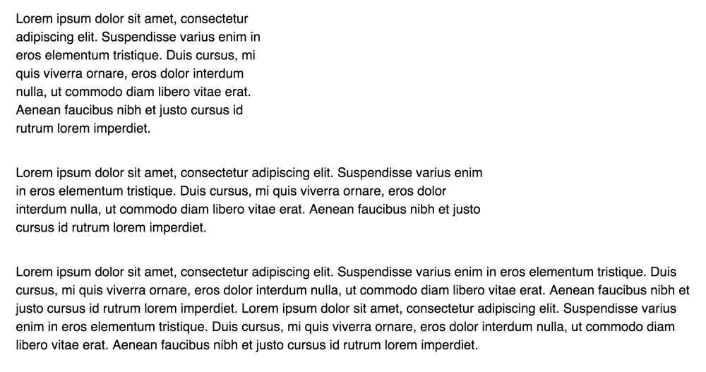
In general, limit your line length to 45–60 characters per line—although many typographers consider up to 80 characters per line acceptable. Anything less and your readers will get tired from bouncing back and forth across lines. Anything more, and the reader might lose their place—shuttling from the end of one line to the beginning of the next.
For reference, Arial set at 11px in Google Docs runs to about 80 characters per line, as does the body text in this article.
Maintaining legibility across device sizes requires striking a balance between font size and line length. The bigger you set your font, the fewer characters per line you’ll get. On small devices, this could lead to very few characters per line.
TL;DR: Aim for a line length of 45–80 characters per line. That's about 30em, if you're working on a responsive design.
Watch your font weight
Font weight defines the thickness (or boldness) of each individual letter. The default font weight is 400, whereas bold is 700. Many fonts have weights ranging from 100 to 900 in increments of 100, with 100 being super thin and 900 being super thick.
.png)
TL;DR: Use a bolder weight to emphasize or add drama to particular passages, and avoid using thin weights outside of large display settings. For web design, you’ll want to pick which weights you use carefully: loading all nine weights of Exo 2 could seriously slow down your pages.
Get your units right
In print applications, people often talk of font sizes in terms of “points,” but on the web, we tend to use the pixel (px). It’s a similar concept.
But with responsive designs, it’s actually best to set all size and spacing properties using relative units like ems and percentages, rather than absolute units like pixels.
An em is a relative unit of measurement equal to the current font size of the HTML element in question (default of 16px for paragraphs). So, 2em would be double this size (32px for a default paragraph).
Why? Two reasons: First, spacing needs change as font sizes change. A line height of 24px might work beautifully when the font is set to 16px, but at 32px tall, that height would be far too cramped:

Second, relative units make responsive design (altering layout and styling to accommodate various devices) a little easier. If you design everything relative to the base font size, you can change that base font size down the line, and the rest of your site will automatically adjust, saving you a lot of manual tweaking.
And you certainly will need to tweak, as pixel sizes vary wildly across devices. For example, an iPhone can display a 16px font at about 60% the size of a 16px font on a Macbook—making it very difficult to read.
Using whitespace in web typography
Proper spacing makes content much, much easier to read. Inadequate spacing can cause lines, letters, or words to blur together, creating a cramped feeling. The three types of spacing you need to be concerned with to maximize legibility are letter spacing (tracking), line height (leading), and word spacing (this doesn’t have a fancy term).
Letter spacing (tracking)
Letter-spacing (or tracking, in print design) defines the distance between each letter in a word, and can either increase or decrease the legibility of your text. Note that tracking (letter-spacing) differs from kerning in that tracking sets a single distance between all letters, while kerning allows for custom spacing between different letters.

TL;DR: In general, the default value is the right value: it represents what the font designer envisioned as the perfect spacing. But when you're setting text in block capitals (all-caps), which decreases legibility, you may need to add tracking to help readers better distinguish between individual letters.
Word spacing
Word spacing dictates the distance between words in a sentence. The best word spacing clearly distinguishes different words without forcing the eye to travel too far between them.
TL;DR: You won't usually need to tweak word spacing, unless you find that words set at large sizes appear too close together.
Making the most of line height
Line height (leading, in print design) defines the vertical space between each line of text, and is measured from baseline to baseline (the red line in the images below), ignoring ascenders and descenders.
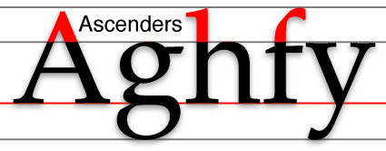
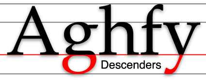
Insufficient leading not only feels claustrophobic, but it can also leave you reading the same line over and over again. We’ve all been there. In contrast, too much leading can make your content look disjointed.
TL;DR: A good rule of thumb is to set your line-height to around 1.5em (or 1.5 times the body text size). To maintain vertical rhythm, paragraph spacing (margin-bottom) should match the leading (line-height).
Size matters
Font size conveys relative importance, creates drama, and plays a big part in determining readability.
Large things attract our attention more than small ones—especially when they’re bigger than expected. A normally sized German shepherd isn't going to catch your attention. But a German shepherd that's the size of a small horse? That you’ll be Instragramming in no time.
It signals importance
We also assign more importance to larger things. Headings are almost always larger than body paragraphs, which themselves are larger than footnotes. Size differences help us decide what to focus on and what to ignore.
It adds drama (not the high school kind)
Size can also be used to create impact and drama. A line of copy set all-caps in tall, bold letters spanning the page can make a more powerful statement than one set lowercase, italicized, and small.
TL;DR: If you want to draw eyes to an element, make it noticeably bigger. This is why calls to action (CTAs) like email subscription boxes, “buy now” buttons, and headlines tend to be much larger than the rest of the page’s elements.
It improves readability
Have you ever tried to read a book set in a 6pt font? I did. It was Lord of the Rings: Return of the King. It strained my eyes the entire time, and was impossible to read in anything but ideal lighting. Luckily, I was 20 years old and didn’t need glasses, but imagine what it would have been like for your dear grandmother and her bifocals.
The web’s default font size for paragraphs is 16px, but the most common sizes used on the internet are 12px, 13px, and 14px. I recommend never going below 14px for body text, as anything less can make for tough reading.
Note: As a rule of thumb, set your main heading (H1) to twice the size of your body font. For the rest of your headings (H2 and down), just lower your size by about 25% per level. So, if your body text is set at 16px, your H1 would be 32px, your H2 would be 24px, etc. Tim Brown's Modular Scale is a super-handy tool for creating type hierarchies with a little more mathematical rigor.
Now that you know the basics of typography...
There’s a whole lot more you can dive into, especially when it comes to the world of fonts. Here are some useful resources to learn more about typography:
- Hack Design – This detailed course covers just about all things web design, including typography.
- Tuts+ – A great web design course focused on typography.
- Design for Hackers – This is a great introductory book on design, featuring an analytical point of view and a fantastic section on typography.
Now get out there and make the Internet’s type something to behold!
Have any great examples of typography done right? Or any questions on the art of type? Let’s see them in the comments below, and I promise to weigh in.


Free ebook: Web design 101
Master the fundamental concepts of web design, including typography, color theory, visual design, and so much more.
