How you design your ecommerce site is just as important as the products you’re selling.
Every day we’re thrilled to see new online stores using the Webflow ecommerce platform. We love seeing how creators map out their category pages, shopping carts, and the overall user experience on their websites.
We’ve compiled 9 examples of great ecommerce website design to help you build an ecommerce site that keeps potential customers engaged from homepage all the way to the checkout process.
1. Noonbrew.co
Most of us are used to downing sugary and caffeinated beverages to keep us going through the day. Noonbrew offers a low caffeine and healthier alternative.
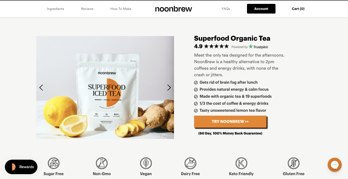
The opening section lays out the main benefits of switching to Noonbrew along with a carousel of product images featuring additional details.
Smartly, Noonbrew also includes a section for photos and reviews for customers. This allows Noonbrew’s own customers to rave about different products, give a stamp of approval to their favorites and allow customers to add any advice or tips for the product that they might have.
Rounding it out with testimonials and an FAQ at the bottom, Noonbrew communicates everything one would want to know about their tea, all in a tidy one page web design.
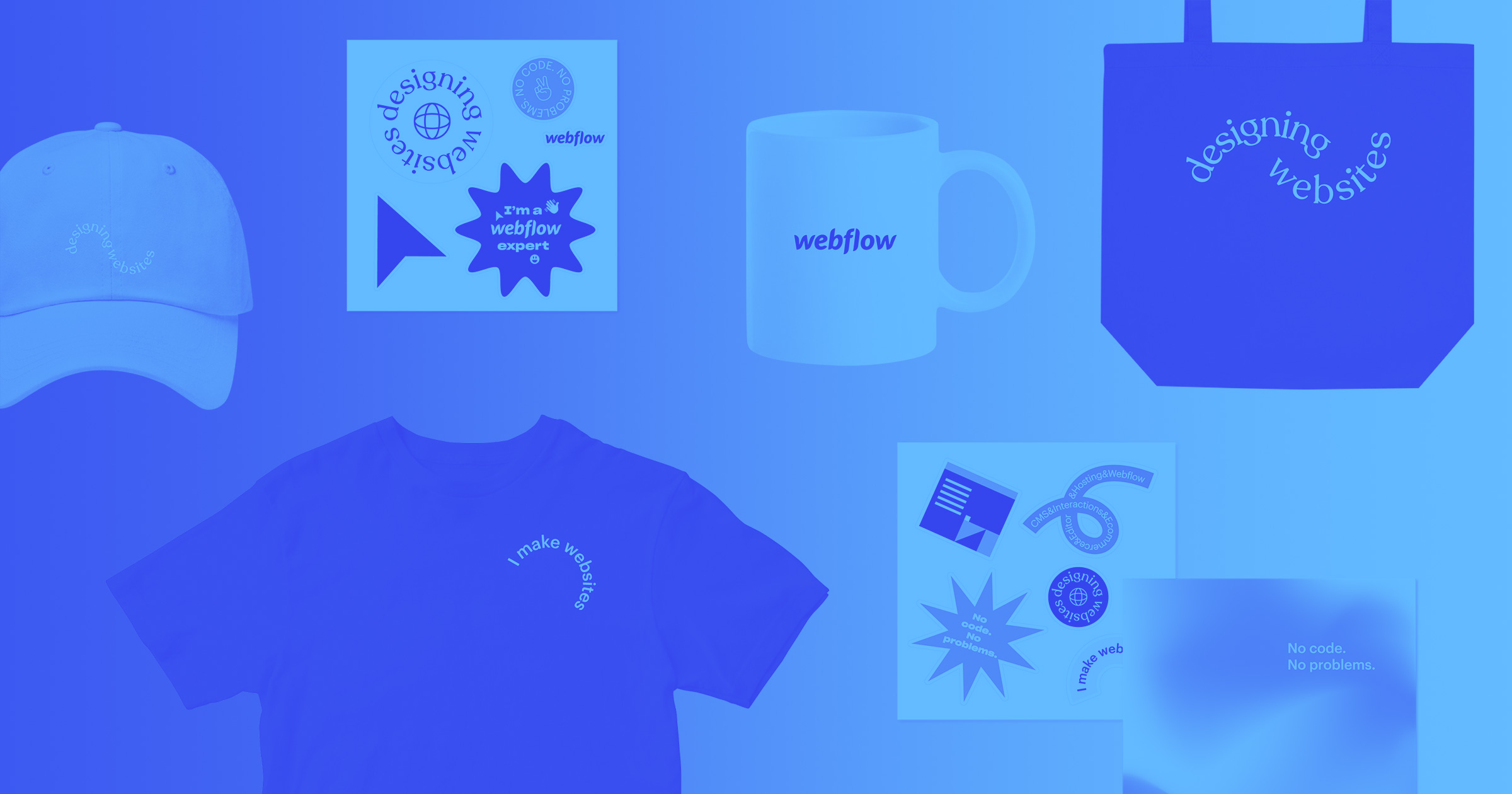
2. Webflow Merch Store
When designing an ecommerce store, organization is key. We’ve divided our own merch store into the sections: “Collections” and “Categories.”
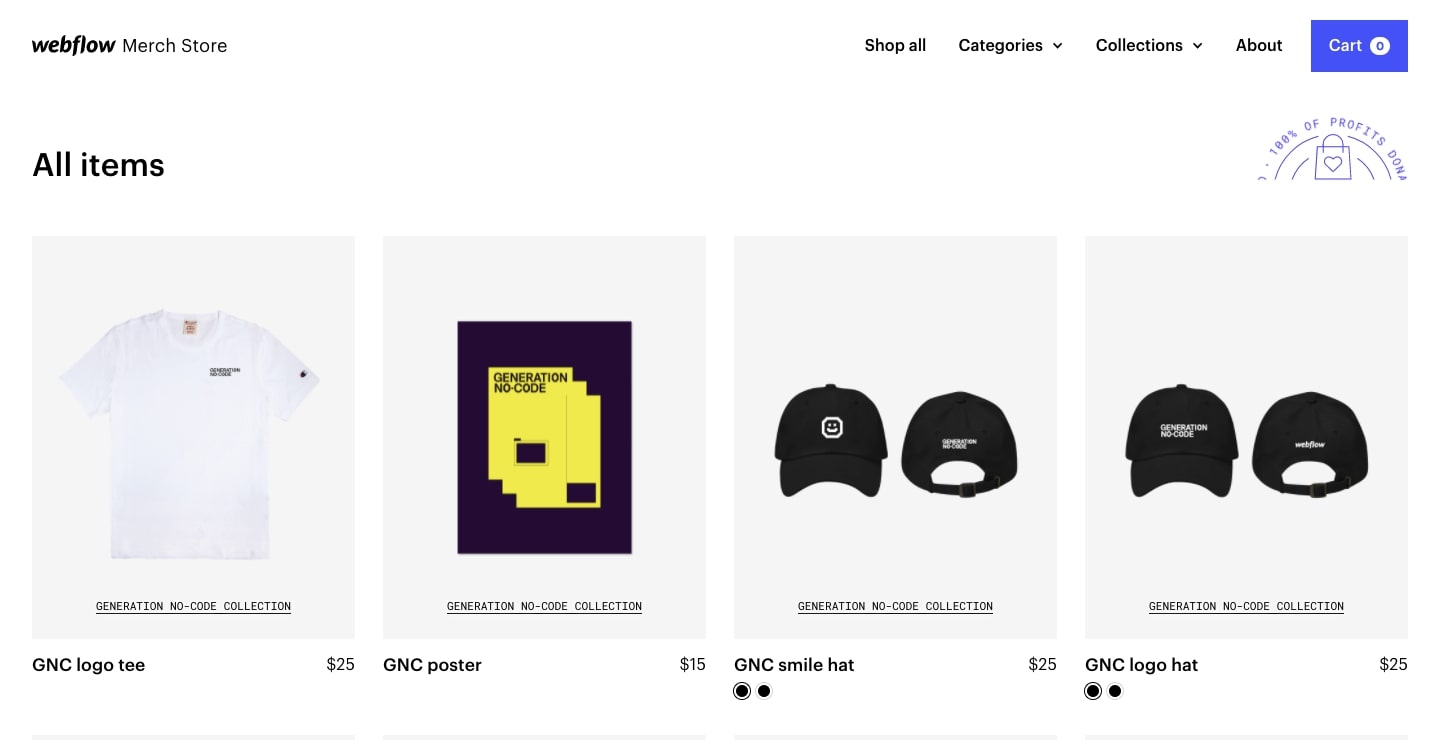
Collections represents our products organized based on theme. Here you’ll find different Webflow gear grouped by collections such as Generation No-Code, Essentials, Pride, and Accessibility.
Categories — on the other hand — represents type of merchandise and is sorted by Accessories, Artwork, Clothing, and Collaboration. When designing the merch store, we prioritized creating the easiest way for site visitors to discover products — and our site design reflects that.
Often, ecommerce stores are just unmoving grids of items. To liven our store up and to add more dimension, we added a hover effect that changes the background from light to gray, and gently animates each product.
3. L’intendance
With a lightweight color palette, touches of green, and simple photos showing off their different food items, L’intendance feels like browsing through the aisles at a high-end grocery store.
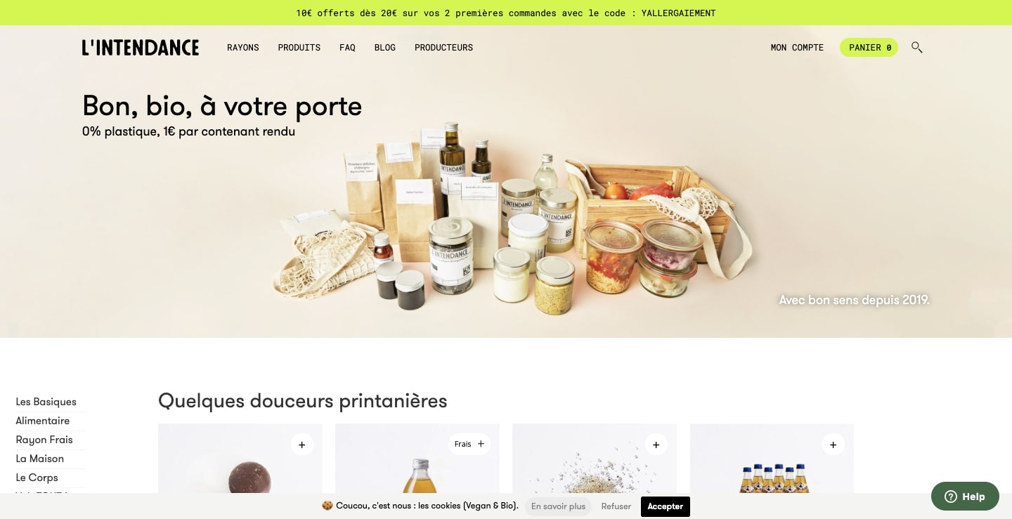
The neutrality of the design works well. There’s nothing here to distract from the jams, spices, pasta, and other delectable items. Additionally, the small plus signs in the right corner of each image creates a user-friendly shopping experience by instantly adding products to your cart.
L’intendance boasts not just quality photos and organic products, but also a commitment to limiting packaging waste. The homepage design puts a heavy emphasis on this mission with the text “Good, organic, at your doorstep 0% plastic, €1 per container returned” prominently displayed.
4. Minimalist Space Posters
The name Minimalist Space Posters perfectly encapsulates this ecommerce business. Their business is centered around selling posters depicting the trajectories of probes moving through space that have simple concentric circles and dotted lines set against black backgrounds.
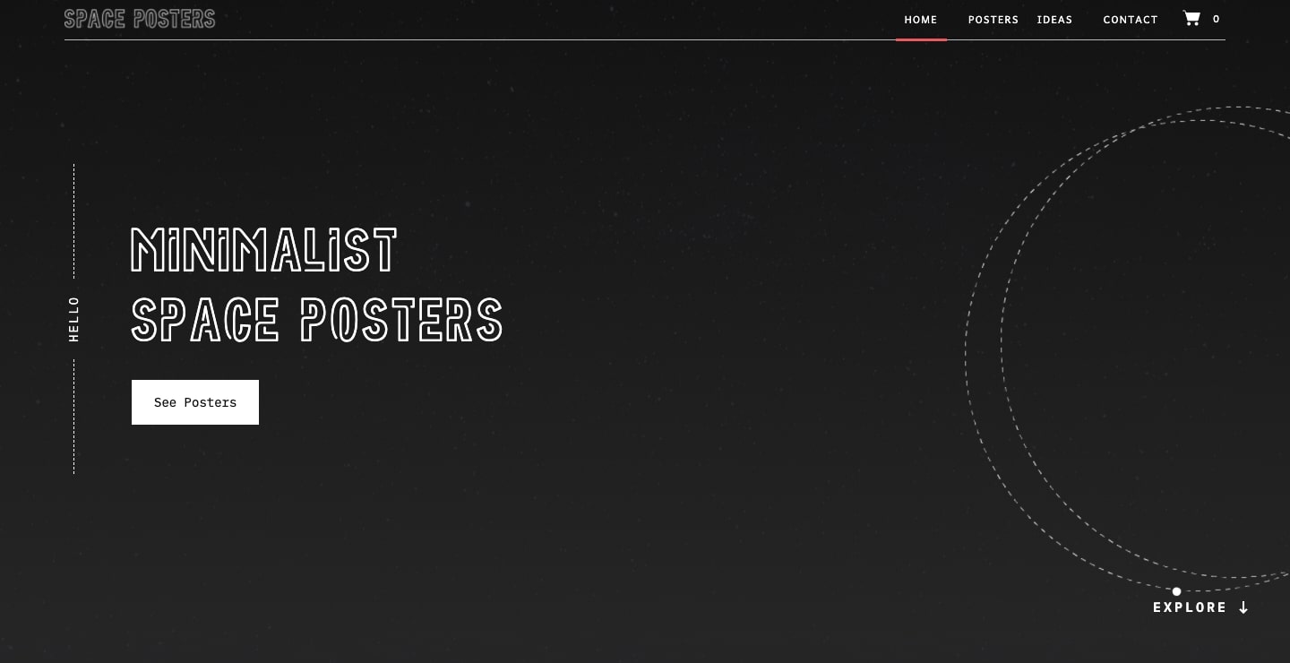
The stark black and white of this website combined with the typeface IBM Plex Mono, makes you feel like you’re sitting behind a terminal screen at mission control. Plus, the call to action gets right to the point. Together, the design and layout of this website combine an on-brand visual aesthetic and user functionality.
5. Twigs
Twigs offers cards and other products made from recycled paper, non-toxic inks and non-toxic toners. Their website design features a gentle color scheme, friendly typography, paper textures, and plenty of negative space for an open and inviting user experience.
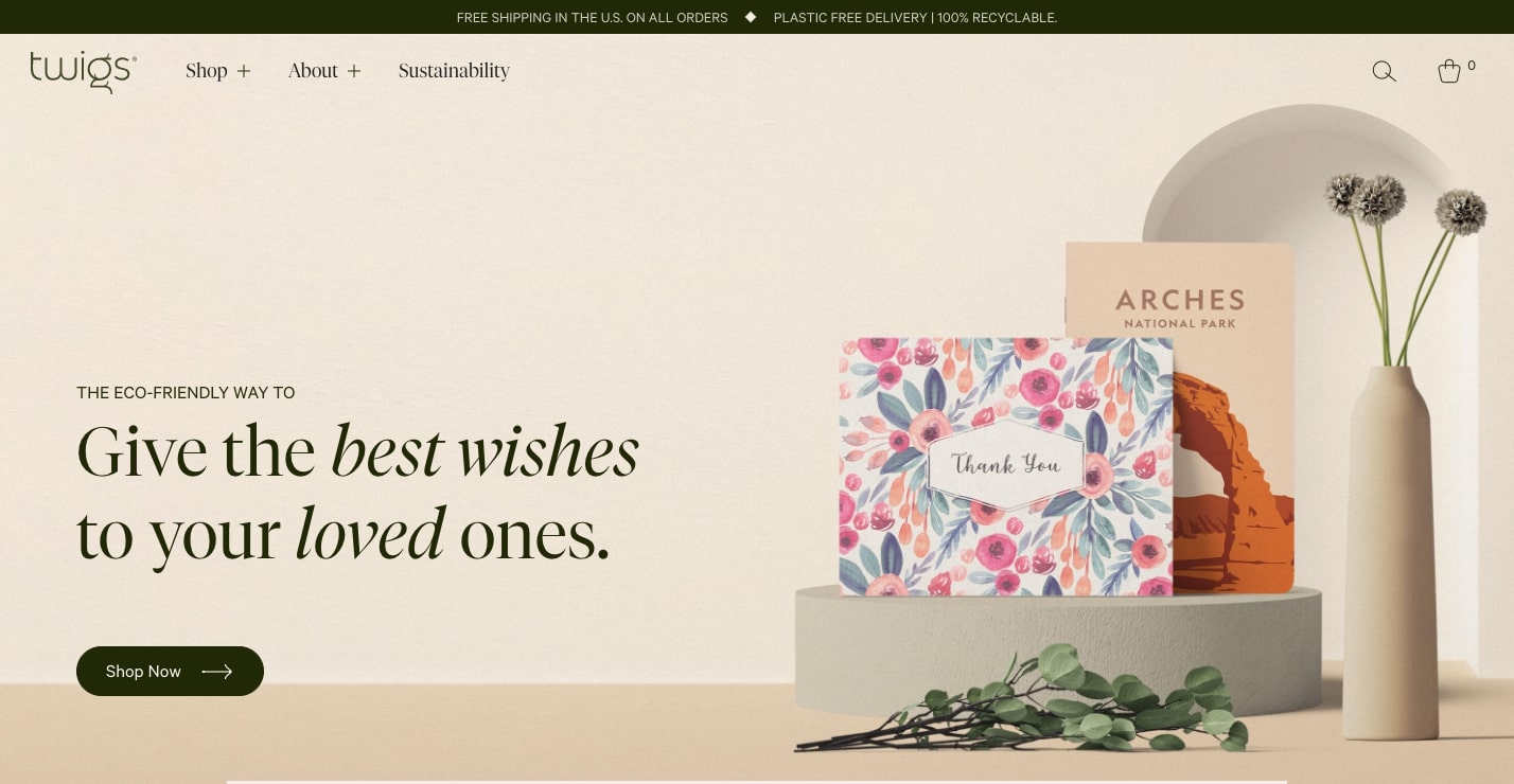
We love the elegant simplicity of the product page. Each section rolls out three featured product photos, with hand-drawn arrows at the top right guiding you to check out other available products. It has a smooth feel, fitting right in with the organic theme of this design.


Get started for free
Create custom, scalable websites — without writing code. Start building in Webflow.
6. Wannabe
With a shop stocked with FunkoPops, manga figurines, and other collectables and toys, Wannabe appeals to a wide range of fans. This design has a quirky vibe that anyone who enjoys comics, toys, and collectibles will definitely appreciate.
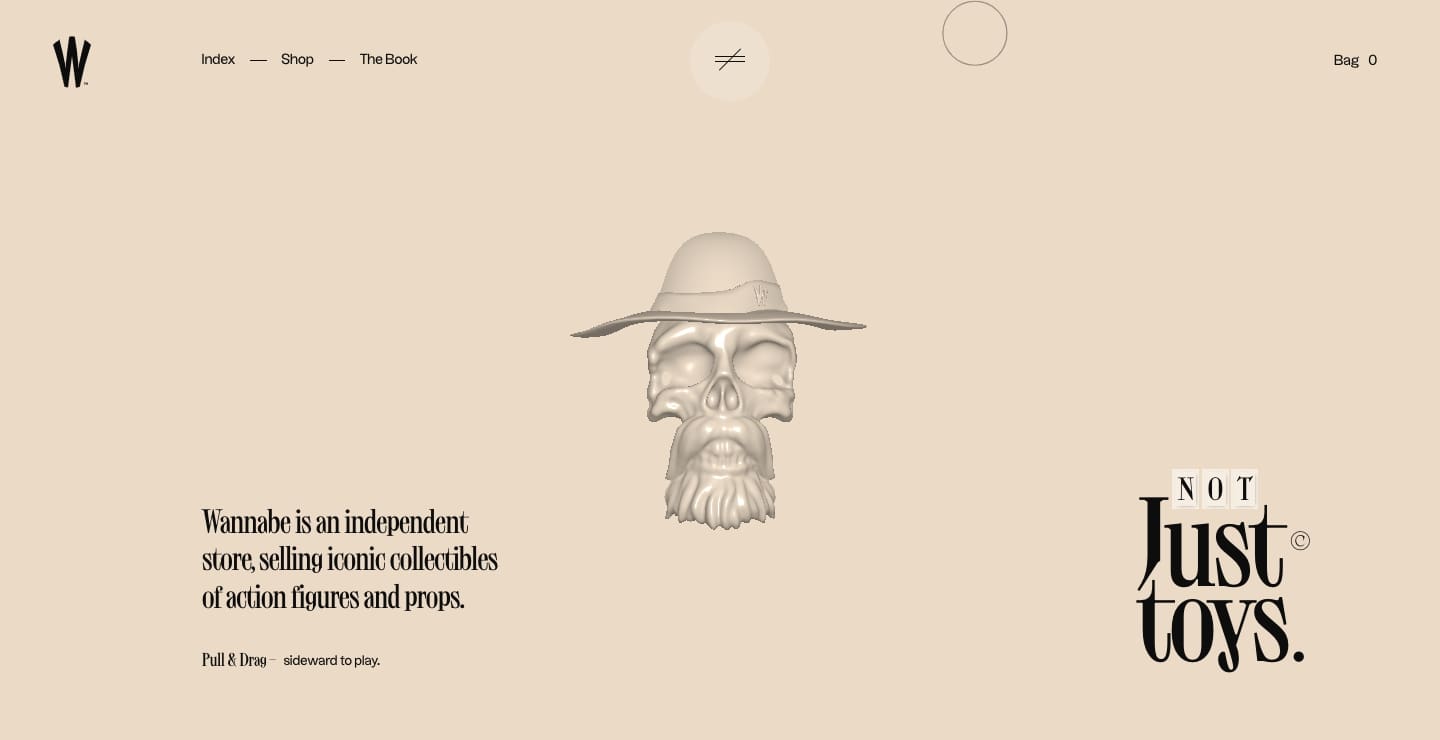
The opening landing page features a translucent skull that materializes into a skull with more dimensionality and weight the longer you click on it. This doesn’t provide any functionality, but it’s a weird and fun element that draws you right into this eccentric site design.
This is one of the best ecommerce website designs when it comes to creativity and interactivity. We especially love how the product categories are organized into a rotary phone-like navigation and how the products respond to the cursor as you browse.
7. Midwest Mutt Shop
Midwest Mutt Shop takes a minimalist approach with liberal use of white space. Large, colorful images of their products and cute photos of doggos are sure to please.
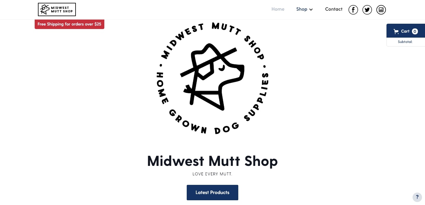
The product photography shows off their products in-depth and their descriptions include all of the important details, like sizing and measurement information to make sure dogs can be outfitted properly.
Midwest Mutt Shop also keeps it simple with their checkout process — once you get to your shopping cart, you only have to fill in information on a single page. Limiting the number of clicks customers have to go through to make a purchase can be a game changer when it comes to increasing your conversion rates.
8. Walden
Walden makes a great first impression with its silhouettes set against rich colored backgrounds. This establishes a sense of calm, which works well with the meditation and other mindfulness products that Walden offers.
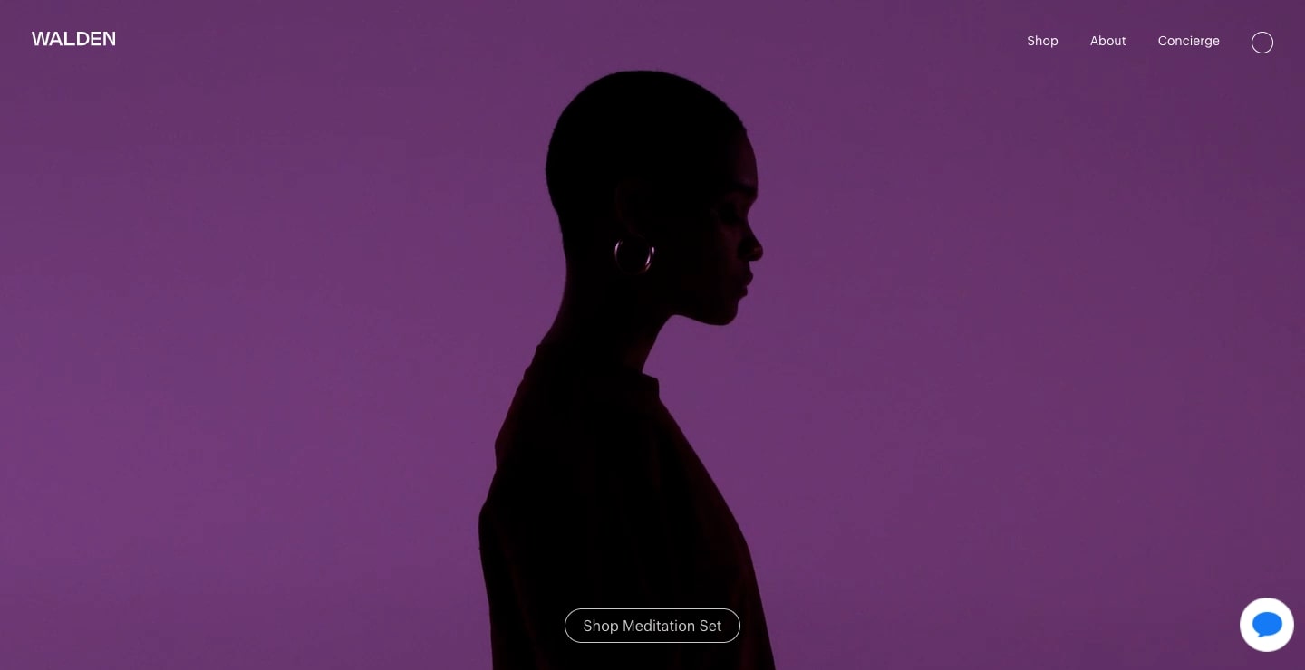
In addition to high-quality images, Walden also features product descriptions that describe the specific purpose and benefit of each item as it pertains to meditation and relaxation.
Walden’s site is free of unnecessary design elements — every visual or section of text feels intentional, so the site projects a zen-like harmony.
9. Berkshire Nerds
Berkshire Nerds may be the most oddly specific Webflow website we’ve come across. This store is for hardcore fans of Berkshire Hathaway.
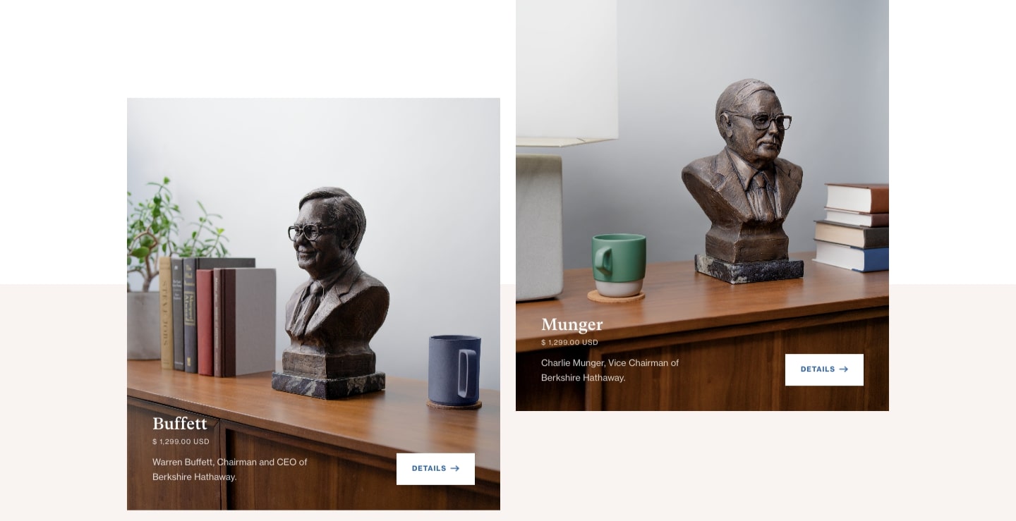
If you’ve ever wanted a bust of Warren Buffet, CEO and Chairman, or of Charles Munger, Vice Chairman, this website offers these two items as its only products. You can even get them as a set. It’s all simple and straightforward.
With just two products, aimed at a very narrow audience, this is actually a great example in how having a well defined niche can help you in setting up your own online store.
Open your own online shop
Webflow Ecommerce makes selling your products online easy. Stay tuned for new developments — we’re always listening to our community feedback and working on improvements.


