


Web forms. They’re the heart of product design (most products are, from the user standpoint, just a bunch of forms) and usually the most important part of any web page they appear on. Given that importance, you’d think that, after 25 years of building them, we’d have forms nailed.
But we totally don’t.
Or rather, we do have forms pretty well figured out, but the good word seems to have spread somewhat … unevenly. So let’s take a look at some of the most common problems web forms present us, and dig into how to do things better.
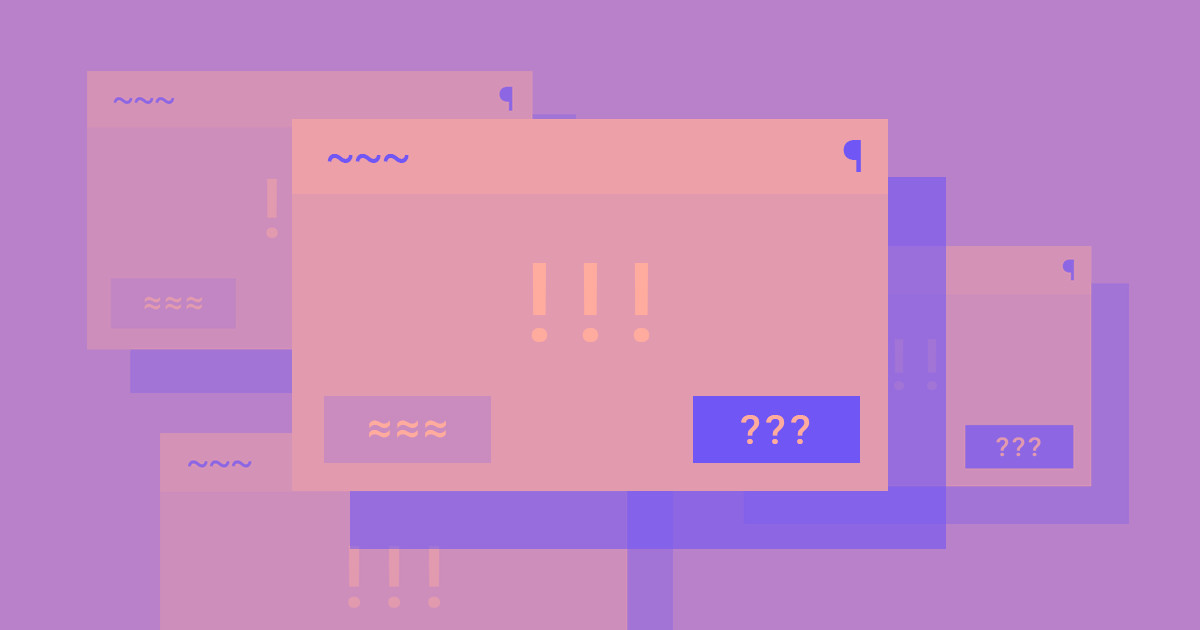
Label all the things, in the field
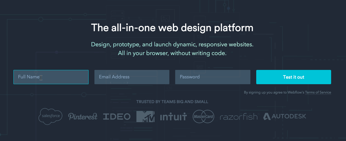
You know what I love? Field labels that disappear when I click into the field. Because I totally do remember what it was asking me.
Sure, in-field labels feel like an elegant solution to the problems of form design. Forms are often the most important thing on a page. But because they’re far from aesthetically pleasing, it’s not hard to imagine why you’d want to save a little space on the page.
In fact, I bet the first designer to move those field labels into the field felt like a damned genius for a day. Actually, I genuinely hope they did.
But like many seemingly genius ideas put into practice, this one falls flat. It poses significant accessibility issues for the cognitively impaired — and, honestly, for the rest of us. Because most of the time when we’re filling out forms, we’re on autopilot. We’re not carefully attending to each field’s label and what we’re entering into that field.
So having the field visually present to remind me what I’m doing is super-handy. Helps me achieve my goal faster, and ensures I don’t have to delete or cut entries I’ve already made just to be sure I put the right content there.
Now, this doesn’t mean you have to just stick with standard form design practices. It’s all good if you want to magically whisk the label out of the field and settle it above when I click in. If you feel that’s a good use of your time, go for it, buddy.
But I, for one, honestly don’t care.
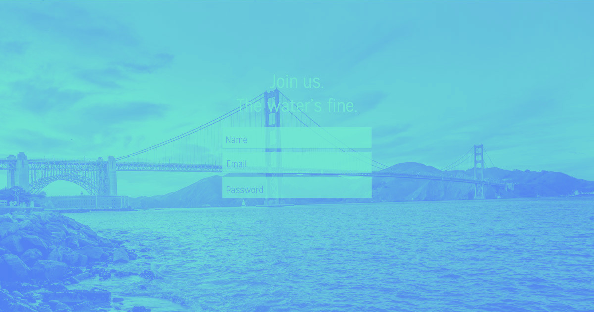
Definitely don’t allow me to sign in with social
Because seriously, who wants something so convenient as one-click sign-in?
Okay, so I probably shouldn’t feel so free handing out my social credentials to any ole app that wants them. And I agree that it’s not the most future-friendly of possibilities. As the recent closure of Vine should remind us all, these “networks” we practically live on can vanish in a moment.
But damn it’s satisfying. Using a social login feels like I’ve got a key to the whole internet. I’ll I have to do is let you use it, and bam! I’m in. So much nicer than filling out a bunch of fields.

Granted, there’s lots of reasons not to use social login, so I don’t score too heavily on this one. But I hope you at least considered making things this easy on me.
Oh—and if you do use social sign in, make sure to also:
- Give me the option to do it with email instead, in case I don’t feel like handing you the keys to my social data
- Directly address what you will and won’t do with that access to my social account(s) — with the big one being, of course, addressing whether or not you’ll post to my account without my express permission


The modern web design process
Discover the processes and tools behind high-performing websites in this free ebook.
Totally use terms like “invalid” in error messages
Sure, go ahead and be the arbiter of validity. I’m sure you’ve checked what sorts of “special” characters actually are used in people’s names, right?
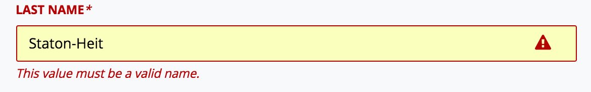
I wrote about the use of terms like invalid in error messages at some length recently, so I won’t go too deeply into this here. But the important thing to note when writing error messages is to be informative and helpful. Telling me an entry is “invalid” is not only potentially offensive, but also isn’t helpful, because it doesn’t explain what a “valid” entry looks like. So just tell me what you want already.
Telling me an entry is “invalid” is not only potentially offensive, but also isn’t helpful, because it doesn’t explain what a “valid” entry looks like.
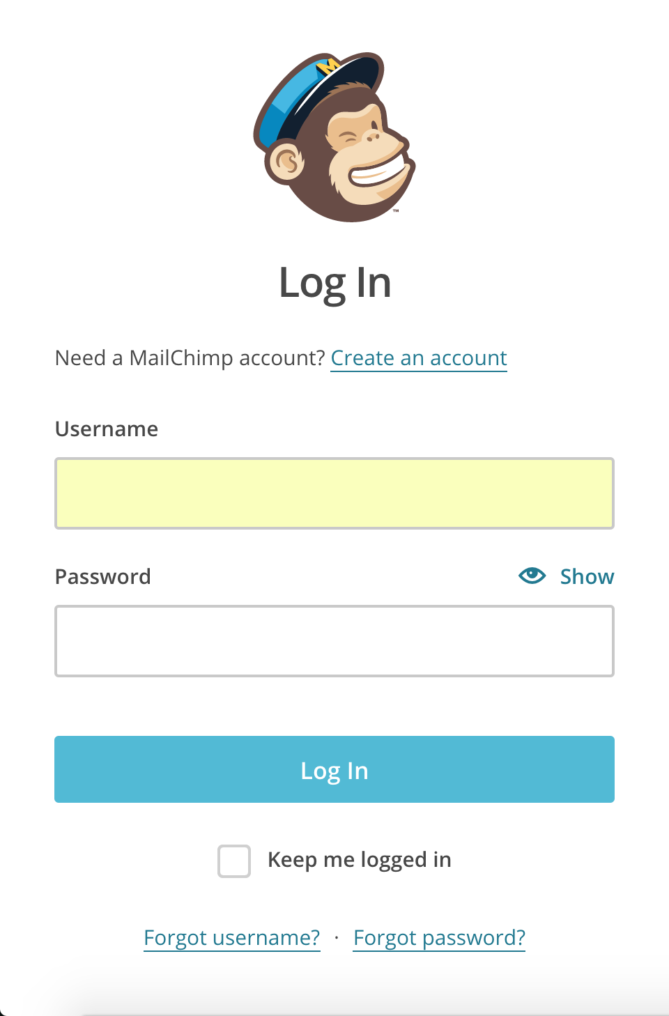
Yes, ask me for a “username”
Because I definitely do want something else to try to remember, besides the emails and passwords for the 120 other websites I’ve signed up for.
What, are we in the 90s or something?
News flash: the appeal of the anonymous internet has been explored and deemed negligible, so unless your site needs some layer between my avatar and my identity, please ditch this abstraction. It just adds unnecessary cognitive load, and dramatically ramps up my need to click that “help me log in” button.
Granted, there are websites where anonymity (or its tantalizing possibility) definitely is part of the value prop. You all keep on going on with your bad selves. And I can imagine security reasons for requesting a username, in that it’s one more layer between a hacker and my account.
But for most sites and forms, this is just a needless annoyance. And for those sites that do need it, a quick explanation like …
Creating a username helps keep your account more secure, as it’s harder to discover than an email address.
Could go a long way to allaying my feeling that you’re just making life harder for me. Remember: your customers don’t know what you do, or why you do what you do. So what’s the harm in telling them?
By all means, hide need-to-know information from me
Have you ever finished filling out a form, clicked submit, and then been hit with the important detail about how to create a password for this particularly site that you flubbed because they totally didn’t tell you?
Because, yes, I do want to find out that I did something wrong with my password after I totally thought I was in. Good plan.
As mentioned above, I get the lure of a leaner, meaner, cleaner form design. But if my password absolutely has to have one capital letter, one lowercase letter, and one “special” character, than really, shouldn’t you just, you know, tell me?
This also goes beyond login form design: anywhere you need specific information, entered in a particular way, letting people know ahead of time will streamline their workflow, and lower frustration.
Don’t let me see what I’m typing
I get it. The bullets are there in place of the characters I’m typing so nobody can practice the oldest hack in the book: looking over my shoulder.
But surely you could give me the option to risk it, right? I mean, here I am in the office, in a nice cozy womb chair, nobody looming. Can I just take a peek?
Improving our web forms
Looking through all my complaints about form experiences, one thing comes through loud and clear: excellent forms require excellent communication.
Making labels persistent and not vanishing them on a click: that’s clear communication. Avoiding terms like “invalid”? Bingo, communication. Revealing need-to-know info to me before I make a mistake? Yup, you guessed it.
Communication even comes into the mix with the security issues I’ve called out. Without knowing that these things are done to protect me, they just seem unnecessarily annoying. But if these sites took a moment to inform me of their purpose … well, that could be a really positive moment for my relationship with the brand, couldn’t it?
Of course, the other key ingredient is simplifying things for me — lowering my cognitive load by letting me sign in with a social network, providing helpful error messages, etc. So don’t forget to keep an eye out for ways to streamline your forms, including limiting the questions to need-to-know info.