Podcasting goes beyond just producing a quality show. It means reaching those people who want to hear it. A website is a valuable tool in bringing in new listeners and giving them something more.
If your podcast listeners don’t go beyond your friends and family you’re not doing it right.
Planning, recording, and putting out podcasts on a regular schedule requires a great deal of time and effort. You don’t want to feel like you’re wasting your time if you don’t have an audience.
Expanding a listener base can be difficult. A website makes this easier. Through a breadth of content and a library of episodes it gives people an idea of what you're about, and opportunities to listen.
Don't miss out on growing your audience — putting together a website for your podcast doesn’t have to be complicated.
Own your brand
Successful podcasts have a purpose. Whether they cover tech, discuss cult movies, or sports there's a focus and consistency from one episode to the next. People know what to expect. Your favorite football podcast won't drop an episode dedicated to Nikola Tesla's scientific achievements. Not that there isn't crossover between football fans and science nerds, but this would be a confusing shift.
The topics and themes carried throughout every episode are a huge part of its identity. But subject matter alone isn't the only defining trait.
The people behind a podcast are as much of a podcast’s brand as the topics that are discussed. Their personalities, perspectives, and expertise are a major reason why people listen.
Owning your brand means recognizing what your podcast is about, who you are, and what you value. A podcast website needs to communicate all of these points.
Think of some of the biggest podcasts.
Marc Maron interviews a host of big names on his WTF podcast. He’s a comedian known for his vulnerability, and he gets many of his guests to open up in ways they wouldn’t regularly. His brand of brash honesty connects with people, and sets his podcast apart. Even if you’re a stranger to his work, this graphic of Marc surround by images like a plane on fire, guitar, and smiling clown convery so much of his personality and what the show is about.

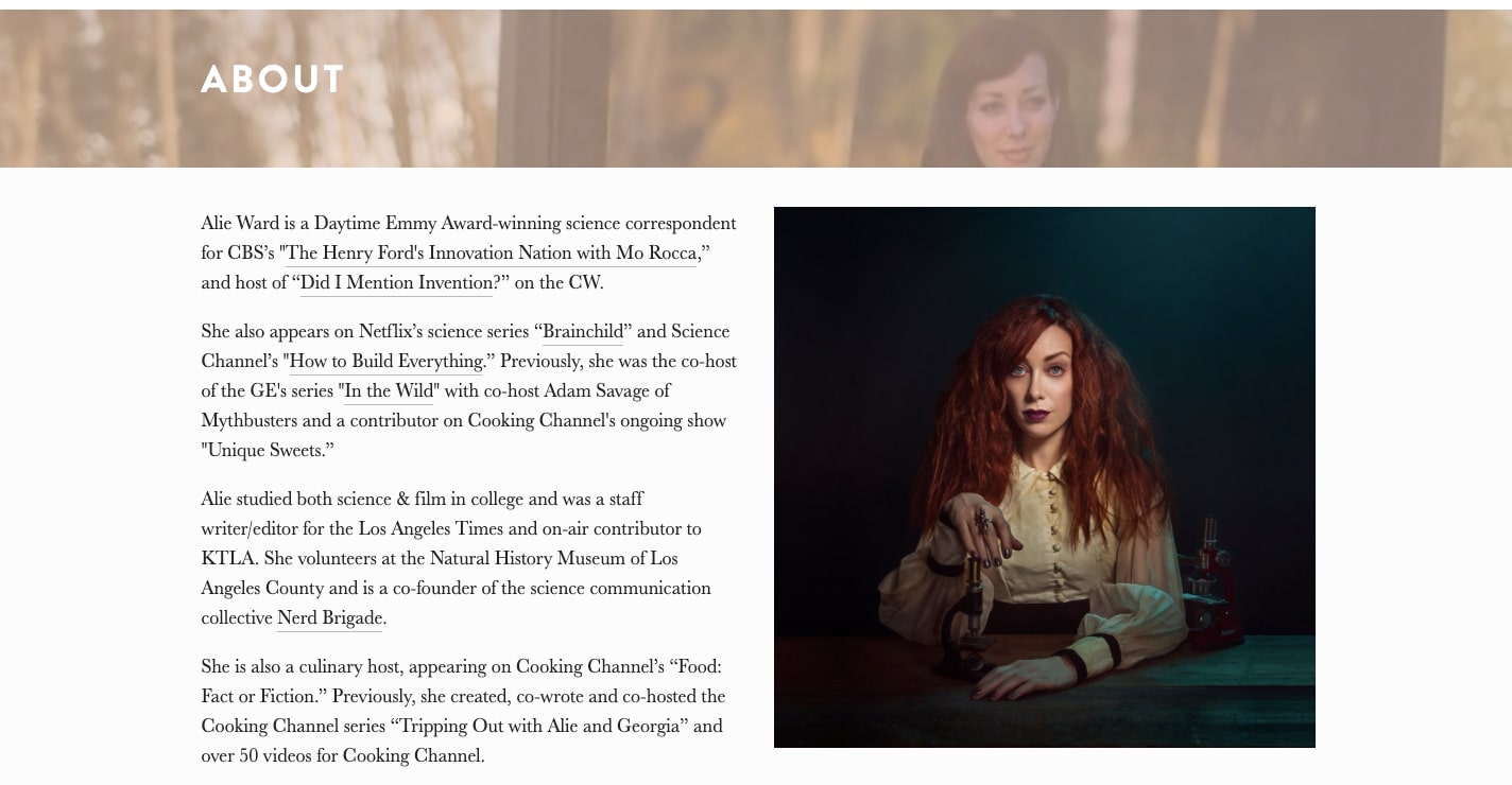
Alie Ward, who hosts the comedy science podcast Ologies, talks about her accomplishments, and has this quirky photo of herself on her About page. She’s not decked out in a lab coat or what we would expect from someone hosting a science podcast. We know right away that she’s not someone bound to conventions and that her show is anything what we might expect from a podcast about science.
A website lets you amplify your personal brand. When creating a website for your podcast make sure to communicate all of the traits that make you and your show unique.


Get started for free
Create custom, scalable websites — without writing code. Start building in Webflow.
Come up with a visual identity
Pick a color scheme that’s easy to look at. Choose fonts for major blocks of content that are readable. Have someone design a logo that captures the essence what your show’s about. Put everything together in a layout that’s easy to scroll through with content that’s easy to find.
You don’t have to go too overboard with the visuals of your design.
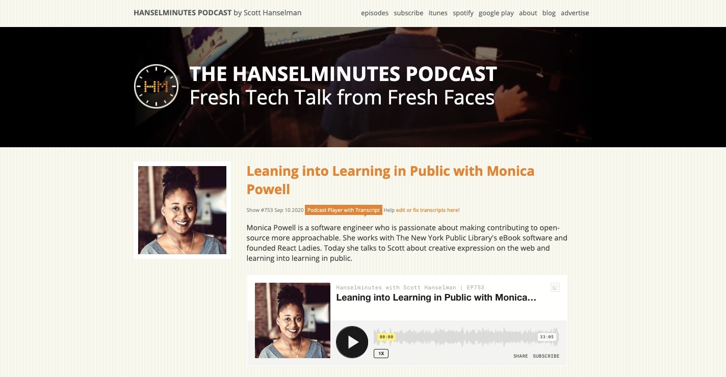
The tech podcast, The Hanselminutes, pulls off a well structured website with an eye on simplicity. The golden brownish hue for the podcast titles stands out well, and the design makes use of a light texture for the background. The logo, which resembles a watch, ties in perfectly to the name of the podcast. Everything comes together in harmony.
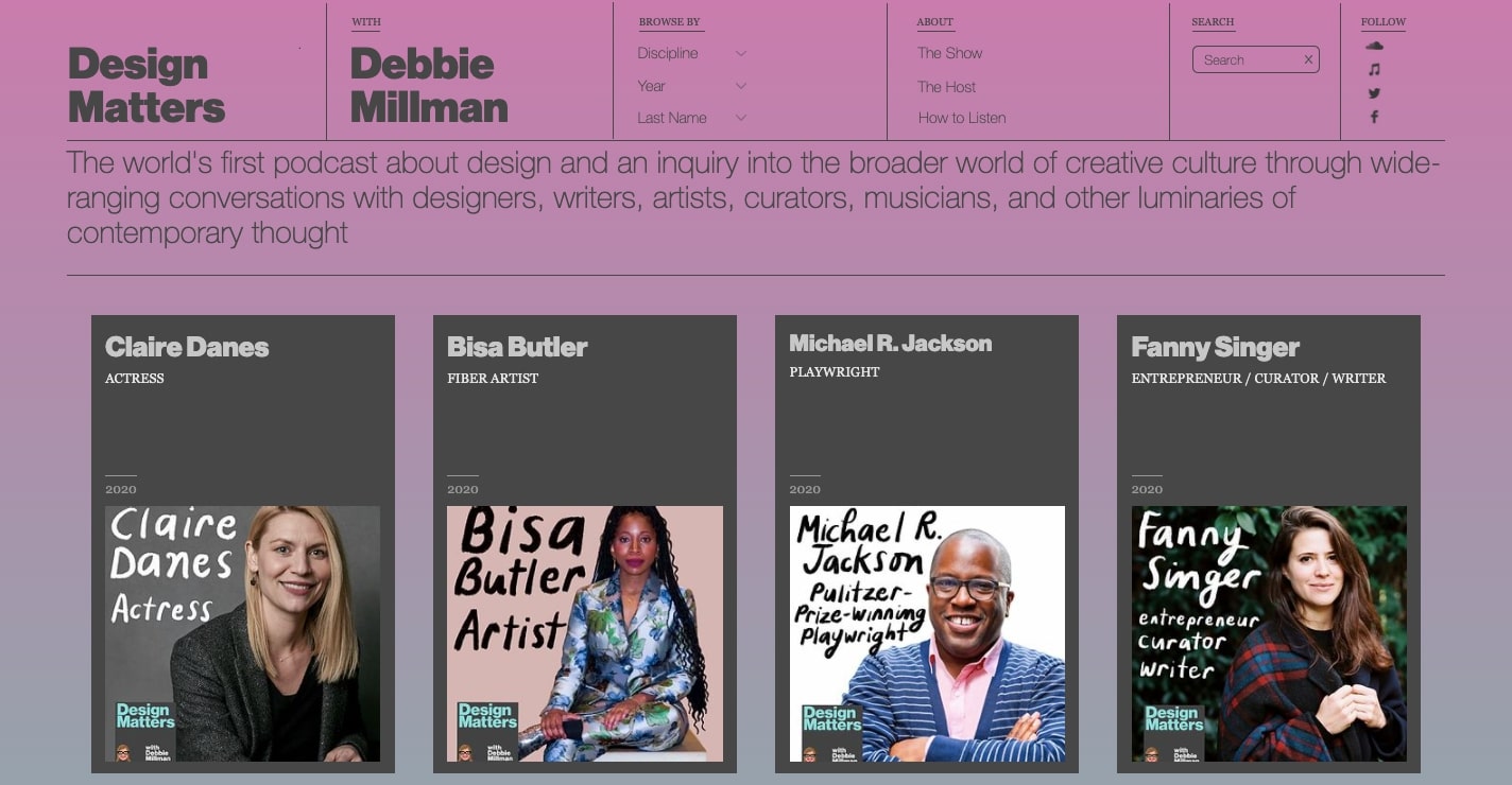
But don’t feel like you can’t add a bit of stylization. Design Matters, which as the name implies is all about creativity and design, takes a more modern approach, with a smart sense of minimalism and an artful layout.
The visual design of a website creates a structure and experience. It both guides and makes someone feel something. If you’d like to go deeper in learning about the principles of visual design, please check out this chapter from our Web Design 101 ebook.
You can get a quick start in putting together your own website with our solid selection of Webflow templates you can use and customize for a look all your own.
Make it easy to listen
Instead of the crunch of tiny text that streaming platforms like Spotify use to list episodes, a website affords you ample space. You can include more lengthy descriptions, use bigger typography, and put in visuals like an image to accompany each episode. You have complete control over how you showcase your work. And when there’s an eye-catching play button embedded, it makes listening to a given episode instantaneous. In the layout for your own website make sure that each episode stands out.
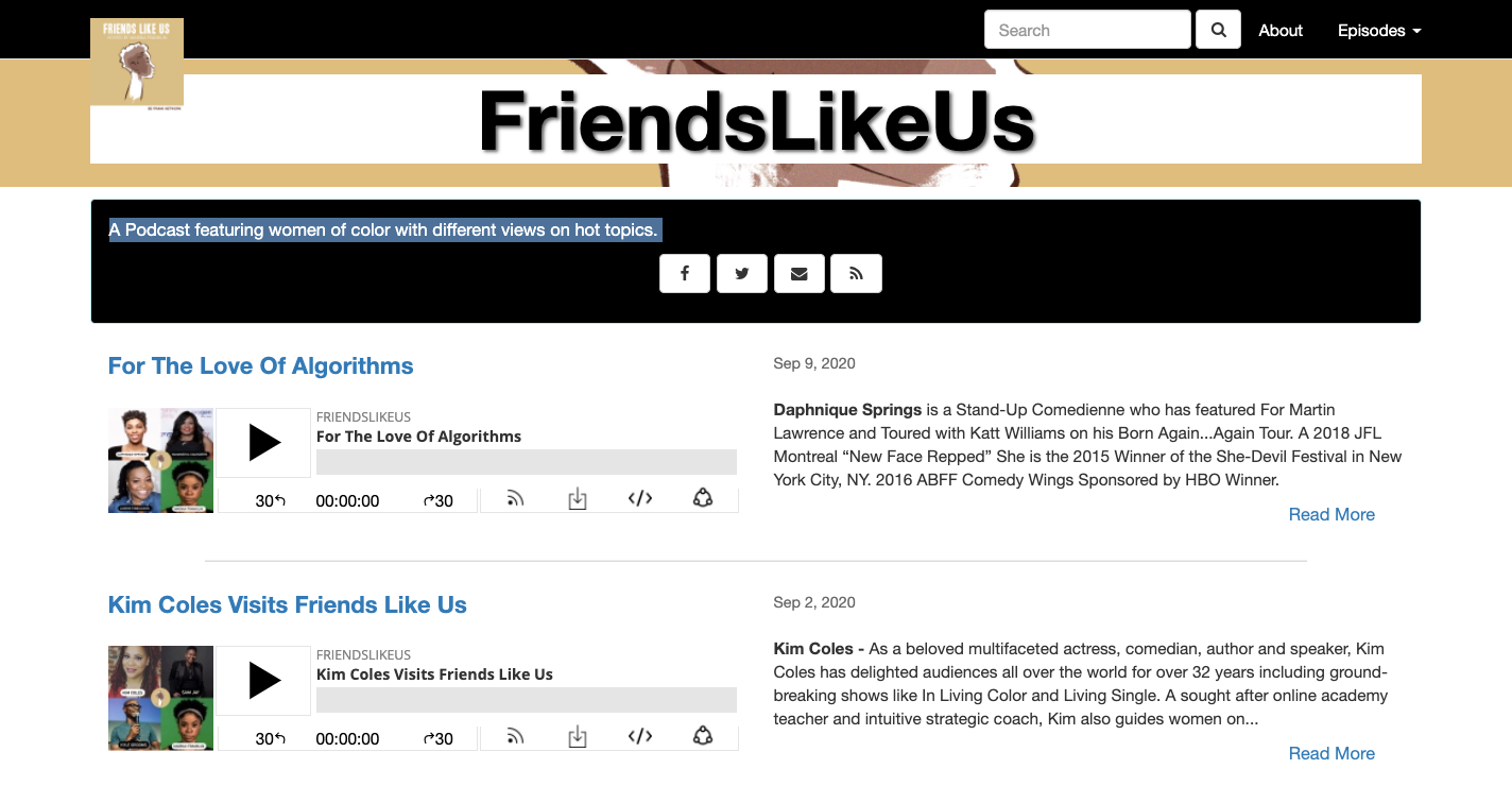
The FriendsLikeUs podcast, which describes itself as, “A podcast featuring women of color with different views on hot topics” lays out their episodes with just the right amount of negative space, and a big play button. Along with concise episode descriptions, their library of episodes is an easy scroll.
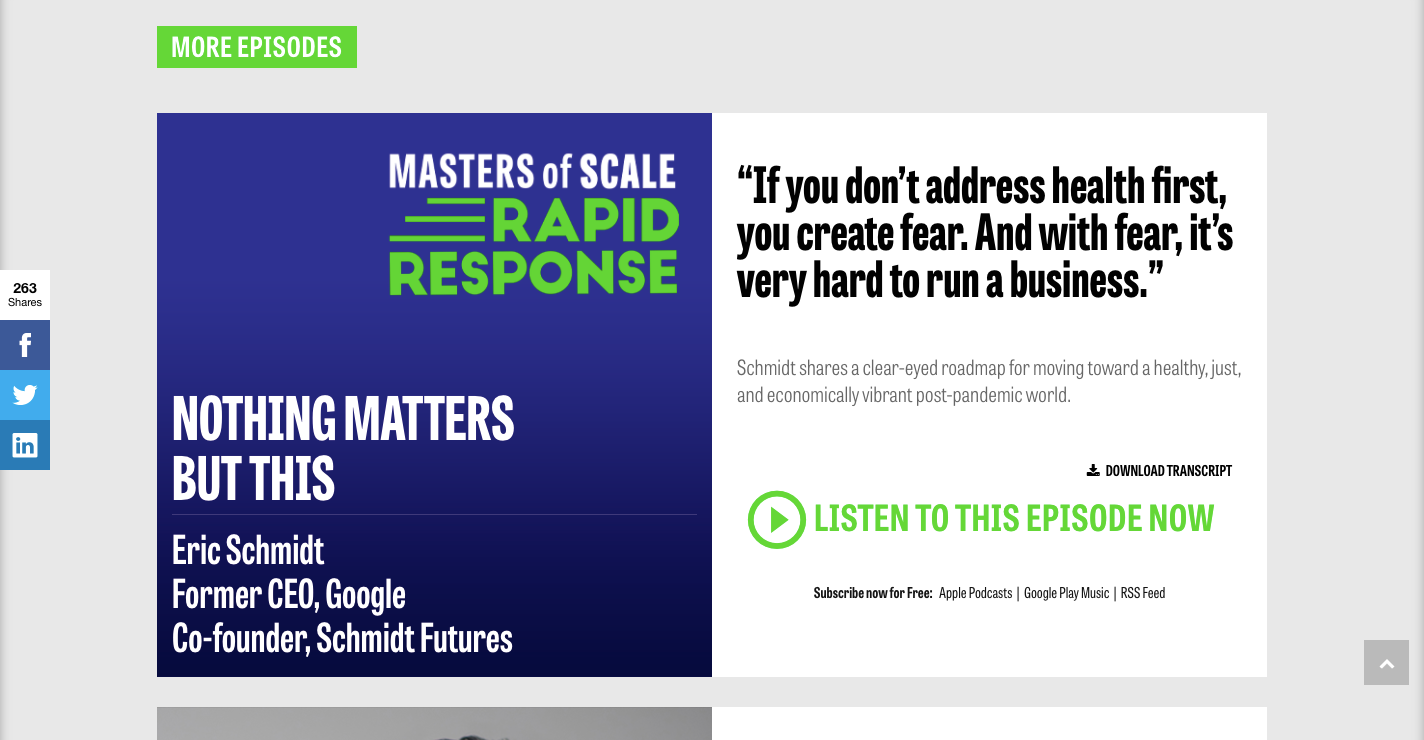
You have the freedom to go bigger in your design choices. The Masters of Scale podcast, which explores the ups and downs of startups dedicates a huge amount of screen space to each episode. The bright green call to action to listen to an episode and play button leaps from the page.
Most major streaming services give you code snippets you can use to put an audio player right into your layout, linked to specific episodes.
Webflow makes it pretty easy to integrate these code snippets. Check out how you can embed audio players with Webflow in this blog post.
Give people a way to subscribe
A website not only acts as a portal to all of your episodes, but also is a tool in gaining more subscribers and growing your audience.
Use links and official streaming badges throughout your design to shuttle people over to the platforms you’re on so that they can subscribe.
You can put in a block at the top of every page, under each individual episode, or wherever else may be appropriate. It’s great to get people to come to your website to listen, but to add them as subscribers is just as important.
Logo Geek, a podcast dedicated to logo design puts four badges at the top of their design for Spotify, Apple Podcasts, Stitcher, and Google. Pointing people to listen on these platforms brings them that much closer to hitting the subscribe button.

Give new listeners a starting point
Someone who has never listened to your podcast before needs an easy way to get started. Find a few episodes that best represent your show. Dedicate space in your layout to showcase these episodes.
The Women in Tech show puts four episodes right at the top of their design. They waste no time giving someone options on where to begin in listening.

Offer great content
Give people content related to your podcast that they won’t be able to get anywhere else.
Provide descriptive episode summaries. Write blogs that explore related topics. Post videos of you and your guests. Offer all the media that your followers would be interested in.
Not only will you be giving your listeners something more, but you’ll also give web crawlers a wealth of valuable keywords. Getting a boost in organic search rankings may bring people to your podcast who wouldn’t be able to find it otherwise.
Bookfight, a literary podcast that isn’t afraid to poke fun at themselves, does an excellent job with their episode descriptions. In the same erudite, yet lighthearted tone they use on their show, they tell us what each episode covers. The bottom section offers a bit of Tom and Mike’s personalities for a bit of comedic relief.
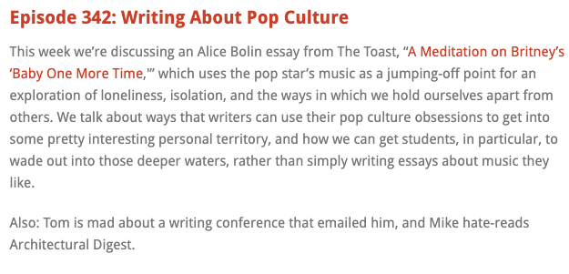
Write descriptions that hit the major points of each episode showing people why they should listen.
Including bonus content lets you connect with your audience on a deeper level.
The Moth, which is both a storytelling podcast and radio show, gives their listeners a glimpse behind the scenes. There’s plenty of photos of their storytellers as well as interviews. We get more than just the wonderful audio of their stories, but learn more about their lives.
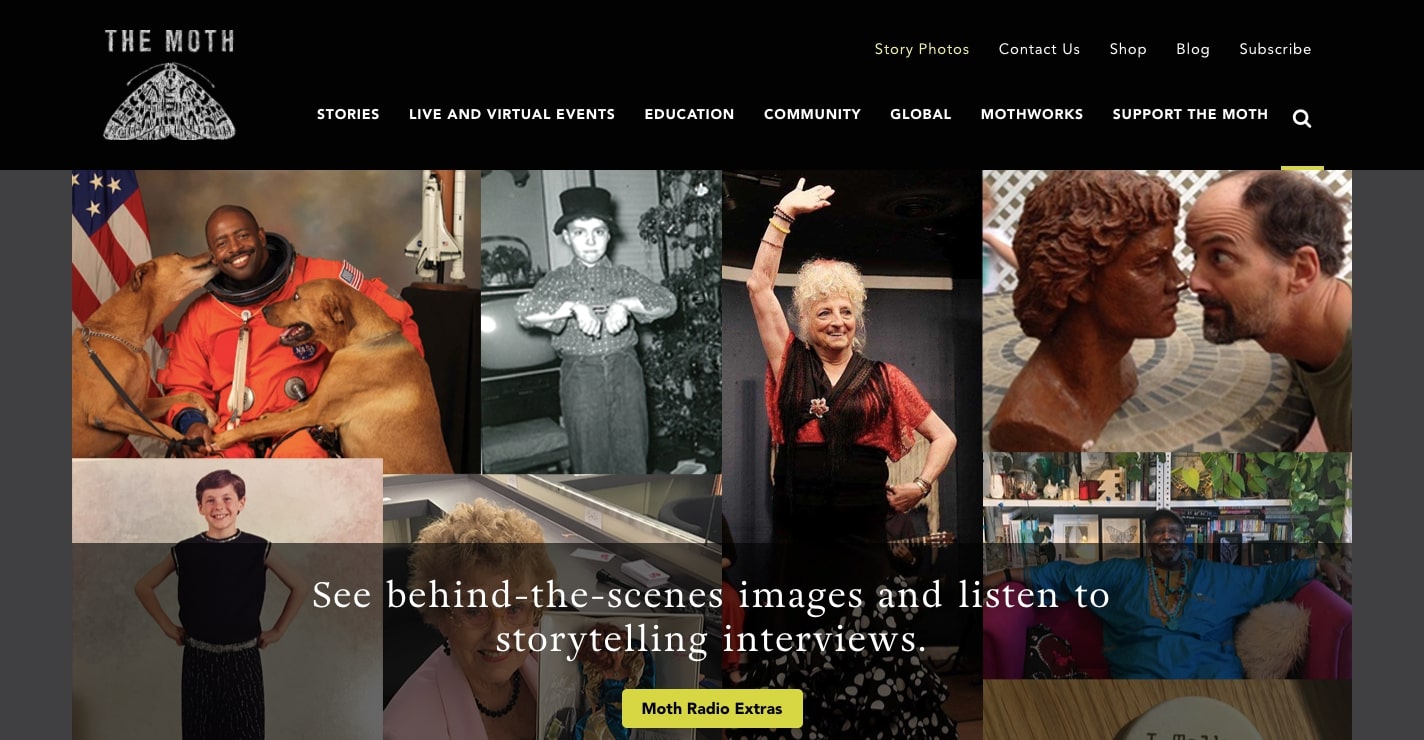
Deliver additional content to your listeners that gives them more depth behind your shows and expands their appreciation.
Give listeners a way to further connect
Your audience wants to be more than passive listeners, they want a way to interact.
Put in social media blocks and links in your layout to gain new followers. Give your listeners the opportunity to comment, like, and send you questions or comments through the immediacy of social media.
The food podcast Copper and Heat includes a section to follow them on Instagram as well as a Twitter feed. The calls to action to “‘Gram with us” and to “Tweet @ us” are friendly invitations to engage.
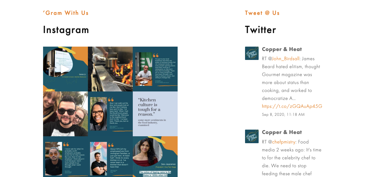
The preeminent podcast of chain restaurants and comedy, Doughboys, puts links out to their social media at the top of their website, right underneath the badges for the streaming services they’re on.

Podcast fans want a way to interact with the shows they love. Include links to social media, stay active on these platforms, and give your listeners an experience that goes beyond being just a listener.
Build a website and build your audience
Your podcast may be distributed across a wide variety platforms but may still be lacking a fan base. A website provides potential listeners with the reasons why to subscribe. It gives them informative content. It shows them the personalities of those behind it. And it offers them an experience they can’t get on streaming services alone.
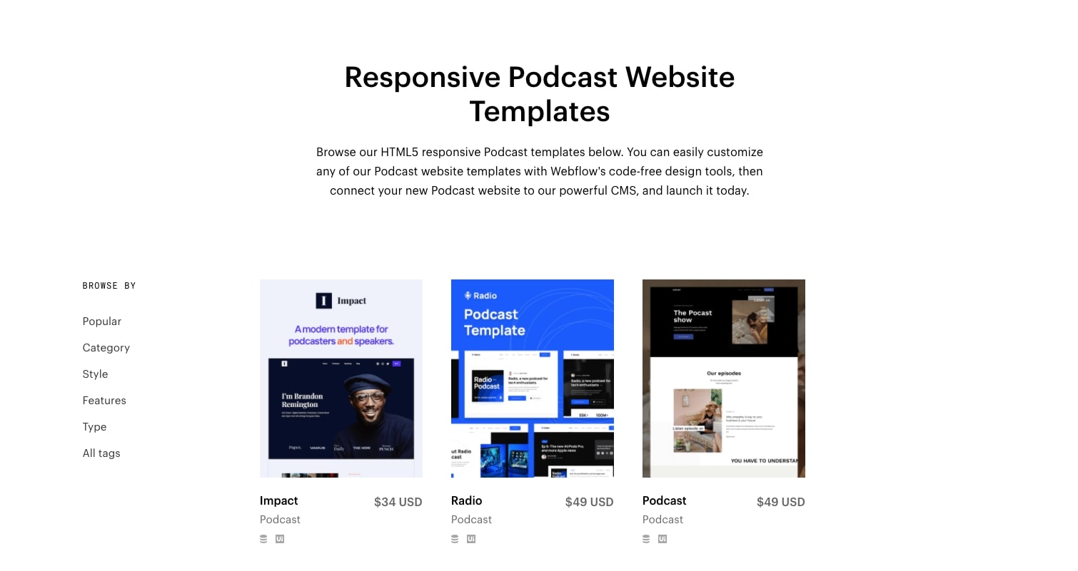
If you haven’t created a website yet, check out our podcast templates. Wishing you much success on your podcasting journey!
Related read: 5 Design & development podcasts worth listening to


