Hi, I’m Gary Gaspar and I’m the CEO and co-founder of Marker.io.
Before starting Marker.io, I owned an agency that designed and developed websites. The idea for Marker.io came from a lot of the challenges we faced at our agency. At the time, it was difficult to get feedback from clients about their new websites, and our team was constantly sending emails and setting up meetings just to get simple feedback.
So, we came up with the idea for Marker.io, which is a simple widget that allows clients to send feedback without leaving their website.
Marker.io is used by over 5,000 agencies and product teams all over the world to collect website feedback from clients and colleagues with screenshots, annotations, and technical meta-data.
Before Webflow
We didn’t initially launch our marketing website on Webflow. Instead, we went for a custom coded-site. While we knew about no-code tools like Webflow, Wix, and Squarespace, we felt that they weren't powerful enough for our needs.
After being built, the marketing website was owned by the engineering team. Engineers would write the code for the site and ask the marketing team to “provide copy” or the design team to “provide assets” when needed.
This became a huge problem for two reasons. First, developers are expensive and scarce in a startup. And second, developers don’t understand (or need to understand) customers in the same way that the marketing team does.
By 2020, we were hearing more and more praise about Webflow in the web design community. It seemed to be different from all the other no-code tools and builders out there. We decided to give it a fair shot and were amazed after playing with it for a couple of hours. It solved all the problems with our marketing website, which was slowing down our growth.
Moving fast, dreaming big, and owning our brand
Once we moved our marketing site over to Webflow, our pain points either disappeared or dramatically changed for the better. For us, it’s because Webflow enabled and unlocked the following three things for our team: ownership, empowerment, and speed.
Ownership
The marketing team was finally able to own the website, which is ultimately the cornerstone of our brand. We freed up our engineering team to focus on more complex work in the actual product, and allowed our marketing team to make changes and iterate as needed.
Webflow also made it easier for other teams to collaborate on the marketing site, so that when input or expertise was needed from other teams, it was seamless. This has allowed our teams to act quickly on new ideas and embrace an experimental mindset. For example, if we test a new paid campaign idea, one person can create a dedicated landing page and the other can monitor results to ensure it’s landing with our audience.
Empowerment
At Marker.io, we really love Webflow University. With it, every marketer can develop Webflow superpowers and learn how to build on the platform. For me personally, taking classes on Webflow University and developing skills around concepts like flexbox, allowed me to create entire landing pages without any help. As a small startup fighting for resources, this is extremely impactful. The more my team can focus on making the product better, the more successful our business will be.
Speed
We “hit the publish button” multiple times a week for new landing pages for paid campaigns or new blog posts for our SEO efforts. In most cases, we don’t need any help from the design or engineering team. This means we can grow our business and get more people in the door as quickly as possible.
The speed of Webflow also has saved us a ton of money and efficiency. For us, not using Webflow would be much more expensive than the yearly subscription we pay for it.
Getting started on your marketing site
Building your own marketing site can be daunting, but it doesn’t have to be. From our experience at Marker.io, here’s how we would approach it and some things you should consider.
Pre-launch
Before you actually build anything — it’s important to start off with customer research, design inspiration, and implementation choices.
Here’s how we approach splitting up duties between marketing, design, and developers at the pre-launch stage:
- Marketing should ensure the site reflects the needs of the customer, but also every other team in the company.
- Design should own and craft the brand identity, help with the decision of whether to start from a template or not, and create a design system.
- Developers should make sure that the transition from the website to the product is seamless.
During this phase, everyone should ask questions like:
- What's the goal of our website?
- Who's our ideal customer?
- What should our customers take away from our website?
- What's the main call to action?
- What should our navigation and sitemap look like?
- What's our brand identity?
- How should we use social proof?
- How should we present our product?
The next step is to prototype (we love Whimsical as a tool for this), with the focus being on positioning and copy first. Everything else comes second.
Our team started from an existing Webflow template, rather than from scratch. This is a great option because even if you end up changing it, it’ll give you a backbone to work from.
To learn about all of the ins and outs of how we revamped our marketing website with Webflow, check out our webinar:
Post-launch
You might think that Webflow becomes less important once the website is “done,” But this could not be further from the truth.
The power of Webflow becomes more important once the website is live because of the ease and speed at which you can publish new content and pages.
Here are some of our favorite features that we use on Webflow to optimize our business.
CMS
As a product-led company, we use content marketing and SEO to drive people to our website. Webflow allows us to publish new blog posts in a few clicks and constantly make changes to the layout based on feedback and analytics.
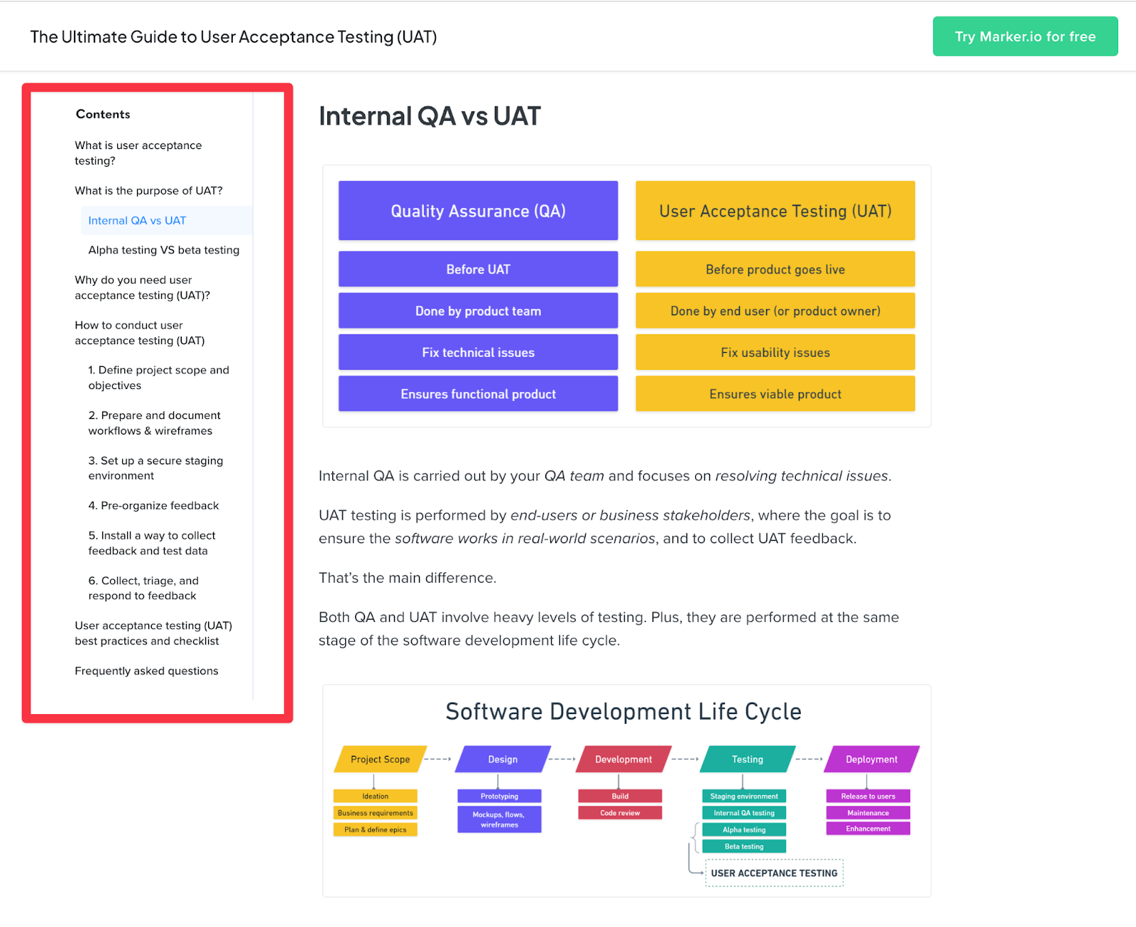
For example, this article about user acceptance testing is one of our most popular blog posts, but it’s also quite technical and information-heavy. When we looked at the metrics, we noticed that people bounced off quite a bit.
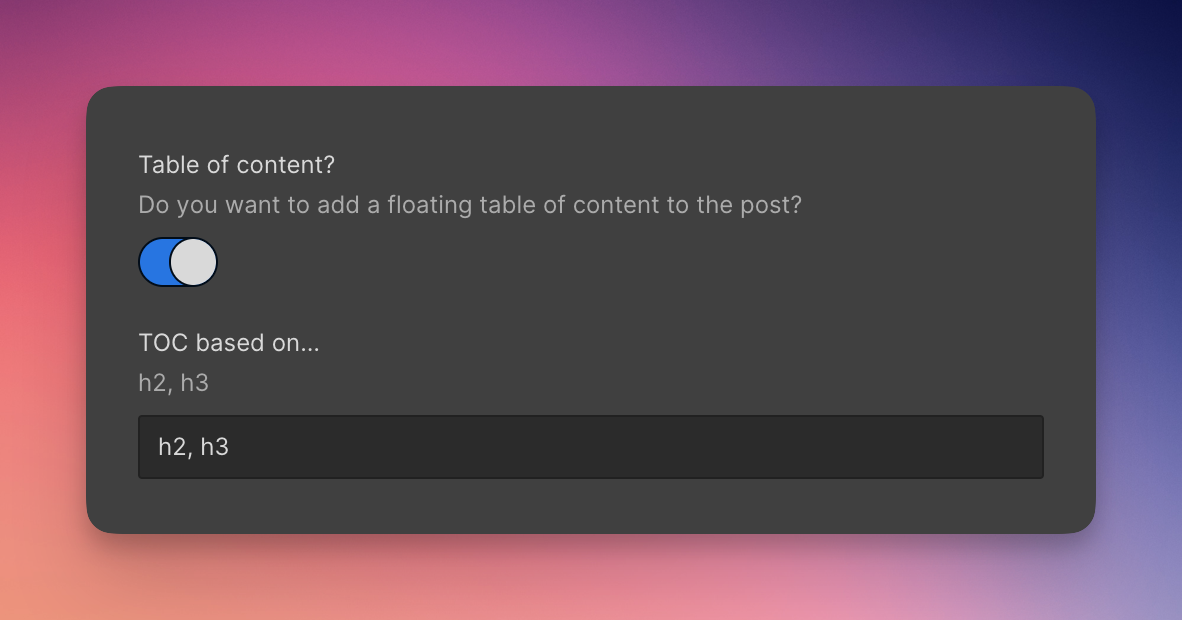
That’s when we came up with the idea of a sticky sidebar with a table of contents that auto-generates based on the content’s H2s and H3s — making it more engaging and curated for the reader. And with a simple custom field setup in Webflow, post authors can decide to enable or disable the sidebar on specific posts.


Landing pages
Webflow empowers us to constantly create new landing pages and tweak existing ones. For example, if we discover a high-performing pay-per-click keyword, we’re able to move fast and spin up a new landing page in less than a day, which previously took at least 2 weeks.
We also use components with variables so that each landing page is unique and not repetitive. Webflow’s ease of use and speed makes it easy to keep up with an ever-changing environment.
What’s next for Marker.io
Our strategy relies on product-led growth and inbound traffic to attract people to our website and product. We don’t have a sales team to rely on, so our marketing website is our most important “salesperson.”
That’s why Webflow is such an essential marketing asset. It’s at the center of our universe with everything we do. Every visitor, lead, prospect, and customer will go to our website at one point.
In the past, just having a decent-looking website put you ahead of most businesses. But as the barrier to entry to build a good-looking website lowers, it’s the teams that put effort into customer research and iterate on feedback who will win.
At Marker.io, we are focused on continuing to improve our product and expanding our customer base through our website and beyond. Later this year, you’ll see some new features launched that will be key in driving this mission. We want to become the go-to platform for visual feedback and collaboration, and we’re committed to delivering the best product and user experience possible to achieve that goal.


The marketer’s website
Our free ebook exclusively for marketers. Discover how no-code eliminates developer bottlenecks and empowers modern marketing teams to truly own the website.


