

Having a reserve of website design inspiration and web design ideas is key to creating an effective design workflow.
As websites evolve each year, staying inspired helps you create forward-thinking designs in 2025. These examples can spark new layouts, color palettes, and creative UX approaches that resonate with modern audiences.
Whether you're a beginner or an experienced web designer, a go-to list of website design ideas and web design inspiration can jumpstart your projects. Explore new solutions and design trends to push your creativity and better meet client demands.
Before we jump in, here's a quick look at how these sources might help you:
- Award galleries for curated excellence
- Designer communities with visual case studies
- Sections devoted to specific design elements (like navbars or footers)
- Platforms featuring portfolios for easy browsing
This breakdown can guide you to the most relevant source for your next project.
18 websites for design inspiration
Jump straight to the site you want and explore examples that spark your imagination. We’ve got you covered with these 18 web inspiration websites. Each of these websites have their own unique features — including community-voted galleries, super-specific search and filtering features, and deep dives into design processes. Find a design to kickstart your next website project.
1. Best Website Gallery
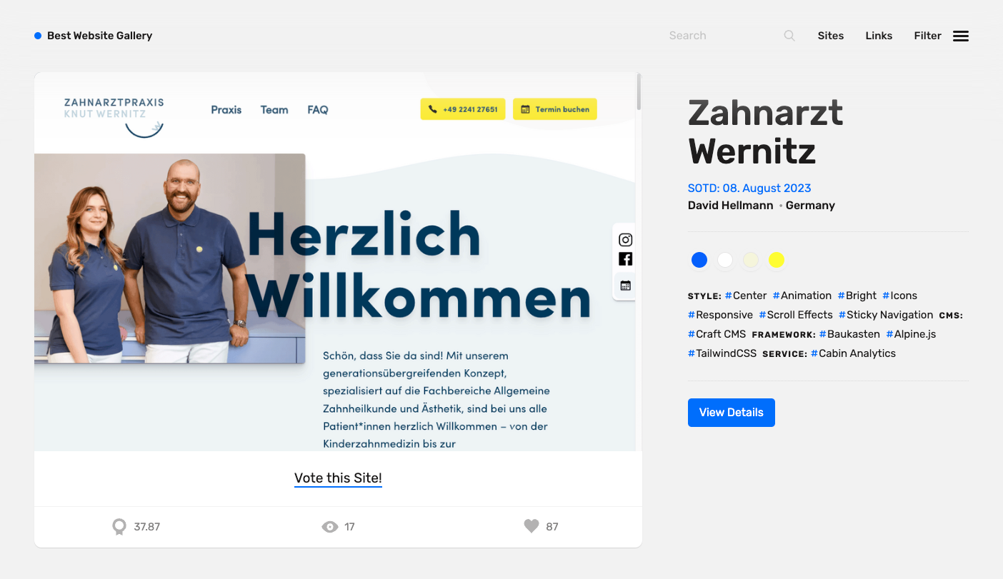
Best Website Gallery, or BWG, is a highly curated gallery of hand-selected web design inspiration by David Hellmann. David started this side project in 2008, and it's still going strong.
BWG boasts an expansive, carefully selected, curated gallery complete with search, a robust tagging system, and a screenshot archive so you can quickly find sites based on their color, CMS, style, and framework, regardless of whether the site is still live. And with over 2,630 sites to peruse, this search function comes in handy.
You might love it for:
- Designer, design agency, and photography portfolio websites. BWG offers comprehensive tags for designer portfolios, agency websites, and photography portfolios. This feature is incredibly handy for any designer, especially for those who've spent hours searching online to find inspiration for their portfolio's design.
- Color palette inspiration. Along with filtering by style, CMS, and framework, BWG also allows visitors to filter sites by color. Each entry features a color palette of the site's design, making it easy to find and filter palettes for any project.
2. Behance

Behance is a comprehensive platform that helps creators showcase their best work, making it easy to explore and discover new design ideas, including web design inspiration. Its detailed filtering options can help you find just about anything you’re looking for, from the latest hot typography from Japan to the most-discussed UI designs coming out of Mexico to the best copywriting out of your own hometown. For example, here are Behance’s most appreciated projects made with Webflow.
Given that it's part of Adobe, Behance boasts perhaps the world’s largest and most active creative community — and with its online job and freelancer marketplace, it's understandable why designers and hirers alike flock to the platform.
You might love Behance for:
- Community-driven feedback: Behance's 'Most Appreciated' filter shows what creatives love
- The "Tools Used" filter: Explore projects by the platforms or software used, including Webflow
3. Awwwards

If you're looking for an award-winning website for web design ideas and website inspiration, look no further. Awwwards is an industry-respected web design inspiration platform that features and awards award-winning websites.
Awwwards remains one of the top destinations for web design inspiration, especially if you want to see how today's designers break new ground with parallax effects, micro animations, and interactive storytelling.
Whether you're researching the most impressive website design or seeking the best web page layout ideas, Awwwards is where you'll find a range of top-rated projects.
- Expert jury voting. A jury of experts scores each site on design, usability, creativity, and content, ensuring they don't just evaluate a site based on how 'pretty' it is.
- Breakdowns in detail pages. Awwwards displays each jury member’s scoring across all four dimensions, including scores from regular community members, to ensure platform transparency.
- Extensive tagging. Awwwards tags each site with a host of terms detailing different elements like frameworks and platforms used, dominant colors, and industry and vertical details.
4. CSS Nectar

CSS Nectar is another popular platform for finding website design ideas and inspiration, specifically for CSS sites. The platform features triple-vetted paid website submissions from both web designers and developers.
With a submission fee and a team of creatives reviewing each entry before it goes live, you can expect CSS Nectar to demonstrate a broad range of high-caliber designs.
Great reasons to check CSS Nectar:
- Triple-vetted submissions for top CSS designs
- Organized by category, feature, and color for quick browsing
5. Abduzeedo
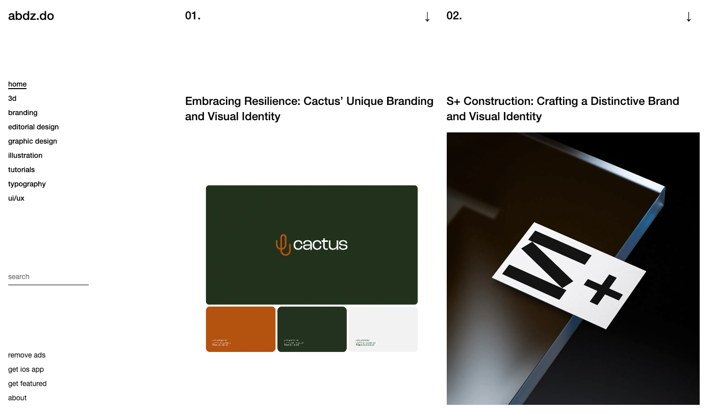
Abduzeedo offers design ideas and website inspiration daily, allowing designers to keep up with the latest design and web design trends.
Abduzeedo features everything from 3D design to branding, editorial design, graphic design, illustration, tutorials, typography, and UI/UX design. As any creative knows, breadth and variety of inspiration can stimulate whole new ways of approaching any problem.
You might love Abduzeedo for:
- Case study entries. Each submission on Abduzeedo is featured as a case study complete with detailed background on the project, client (or brand), design approach and decisions, and design elements.
- Simple & clean UI. Abduzeedo's design is simplistic, clean, and minimal, making navigation a breeze.
6. siteInspire

Run by Daniel Howells of Howells Studio, siteInspire boasts a huge library of inspirational websites, a true showcase of the world's finest web design. Quick tip: Just like siteInspire's advanced filtering, keep notes on what visual elements you like (such as minimal layouts or bright color palettes) to help guide your design direction.
You might love siteInspire for:
- Subject-based inspiration. For industry or business vertical-specific inspiration, siteInspire's subject tags cover a wide range of design categories like product design, user experience, interior design, photography, and interactive design.
- Submissions directory. siteInspire includes a directory of agency, studio, and freelancer submissions from across the globe.
7. Landbook

Landbook markets itself as having “the finest hand picked website inspirations,” and with good reason. Landbook offers a wide showcase of website design ideas and inspiration, featuring websites, web components, and hand-picked Webflow templates.
The platform boasts a wide range of design inspiration, from SaaS landing pages to agency websites, portfolios, e-commerce, case studies, and web apps. Whether you're looking for retro designs, inspiration for social media, or working on user interfaces, Landbook is a good place to explore your options.
Landbook’s library of website templates allows users to save collections of website designs to reference later — and even upload their own.
8. Footer

For more targeted website design ideas and inspiration, Footer provides a gallery of footer designs. The site is simple in design, allowing users to navigate footers by type or style.
Browse by type or style with tags ranging from 3D to 420, AI, architecture, book, colorful, construction, dark, fitness, fun, iOS, landscaping, MacOS, monochromatic, news, startup, typography, unusual layout, and WatchOS.
9. Dribbble

Depending on how often you look for website design inspiration, you’ve probably come across Dribbble. Dribbble is a community of designers that share, grow their skills, and find design work — all in one marketplace. It’s a great resource for any designer looking for design ideas and inspiration.
Sometimes the best website design ideas come from trying something completely new. Dribbble has a diverse variety of designs across multiple fields to help you get creative. If you're looking for inspiration for UX design, or even web development, Dribbble is a great place to browse screenshots, explore creative builds, and get inspired.


Ultimate web design
From 101 to advanced, learn how to build sites in Webflow with over 100 lessons — including the basics of HTML and CSS.
10. The Great Discontent

Sometimes, inspiration doesn’t come from a visual source; nor is it limited to a specific project. Instead, an unassuming story can be the unexpected medium for design inspiration.
For those moments, The Great Discontent’s interviews can kindle your creative fire. Jump into Q&As with successful designers, art directors, and illustrators. Gather insight into what makes them, and their careers, tick.
The Great Discontent’s key feature are its intimate interviews with design industry leaders. Sometimes, the design industry can hyper-focus on concrete things like deliverables, workflows, tools, and best practices. While these factors are essential, they can often obscure the real human beings behind the pixels — and the stories that led them to their dream careers.
The Great Discontent affords us a rare, personal glimpse behind the screens to explore topics like the links between creativity and vulnerability, the power of stories, and the often-difficult art of saying no.
11. Brutalist Websites
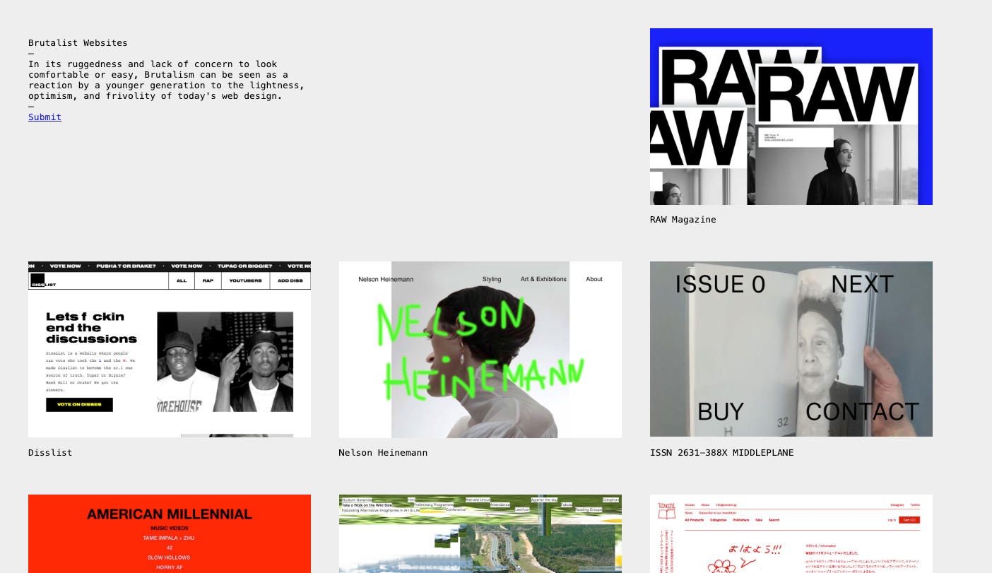
Brutalist Websites offer a glimpse of a web design genre that isn’t focused on driving conversions. And while brutalism is certainly not the only way to explore that theme, it is a compelling one.
You might love Brutalist Websites for:
- Artistic inspiration. Most of the web is not about self-expression. Instead, it’s about growth: new readers, new subscribers, new customers. The works Brutalism creates eschew all the optimization advice and best practices lists in favor of looks and effects that live in the jarring.
- Fun design inspiration. The other great thing about Brutalist Websites is how weirdly riveting these unpolished designs can be. It’s easy to get lost in the sites it curates, like marveling at just how downright good a site like Internet Warriors is.
12. Admire The Web
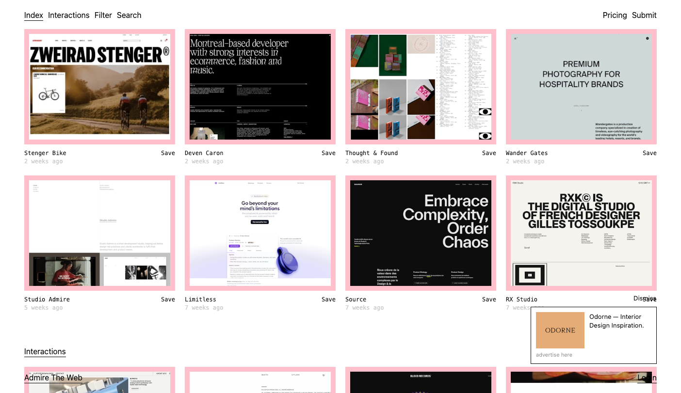
Admire The Web is another great resource for web design inspiration.
Browse through tags to uncover themed inspiration in no time, or sign up for an account to view their library of interaction design elements.
13. Subscribeworthy

Subscribeworthy is an elite collection of subscribe-worthy unlimited services. The platform houses a library of on-demand and unlimited subscription services from reputable companies, cataloging services from AI, developments, graphic design, marketing, and web design.
Subscribeworthy is the go-to source for subscription service research, ideas, and direction. It features detailed reviews of vetted top subscription services, with company information, pricing tiers, brand and web design sample work, and more.
14. Pttrns
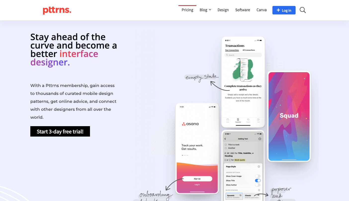
Pttrns is a platform focused on mobile app designs. It’s the perfect place to find responsive designs that look great on both web and mobile devices.
The mobile app designs on Pttrns can inspire your smaller breakpoint designs. It’s not at all hard to imagine how a mobile design pattern might influence your larger-screen designs.
Pttrns stands out because it:
- Focuses on patterns. Unlike many other sites, Pttrns focuses on design patterns, divvying up featured app categories like ‘confirmation,’ ‘ask permission,’ and ‘activity feed.’ If you’re looking for inspiration within a small subset of interaction or flow, Pttrns will serve you the best collection of results.
- Prioritizes mobile-web design. While many of the designs and breakdowns in Pttrns are native apps, mobile web is pretty much on par with native these days, so pulling mobile web layout inspiration from here is great.
- Has more curated screens. Pttrns features multiple screens from each curated app, so you can easily get a broader sense of how design patterns play out across an entire design flow.
15. Designspiration

Designspiration is like the Pinterest of the design world— a massive community-curated design feed you can explore for hours. Head to the Explore page and sort by categories, everything, popular, or discover topics to find a vast catalog of community-curated design inspiration.
Instead of focusing on ephemeral, project-based inspiration, Designspiration lets you build up a personal cache of website inspiration and adjusts its feed based on your preferences.
16. Navbar Gallery
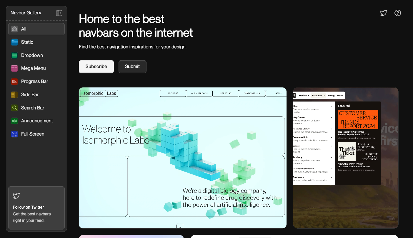
Navbar Gallery is a web design inspiration platform featuring unique navigation bar designs. As the “home to the best navbars on the internet,” the platform showcases a wide range of navbar design.
If you have a design you'd like featured on the gallery, submit an entry for your site's navbar design — and subscribe for on-demand navbar inspiration.
Navbar Gallery has everything you could ask for when looking for navbar design inspiration, from static to drop downs, mega menus, progress bars, side bars, search bars, announcements, and full-screen layouts.
17. Unsection

Unsection is an online platform featuring a library for website section design (i.e. web components). The platform's catalog is quite resourceful, featuring categories like feature section design, hero section design, and CTA section design.
Unsection also boasts a catalog featuring a diverse range of hover effects, including animation and interaction designs.
Unsection offers:
- Comprehensive filter and tagging system. Unsection allows users to discover designs by section-specific categories like feature, hero, CTA, footer, testimonial, and blog. You can filter using the platform's comprehensive tagging system for design elements like animated, light, text-heavy, black & white, and table view.
- Custom color SVGs. For scribbles, waves, line art, and more, Unsection also boasts a collection of ready-to-download SVGs you can recolor.
18. Made in Webflow
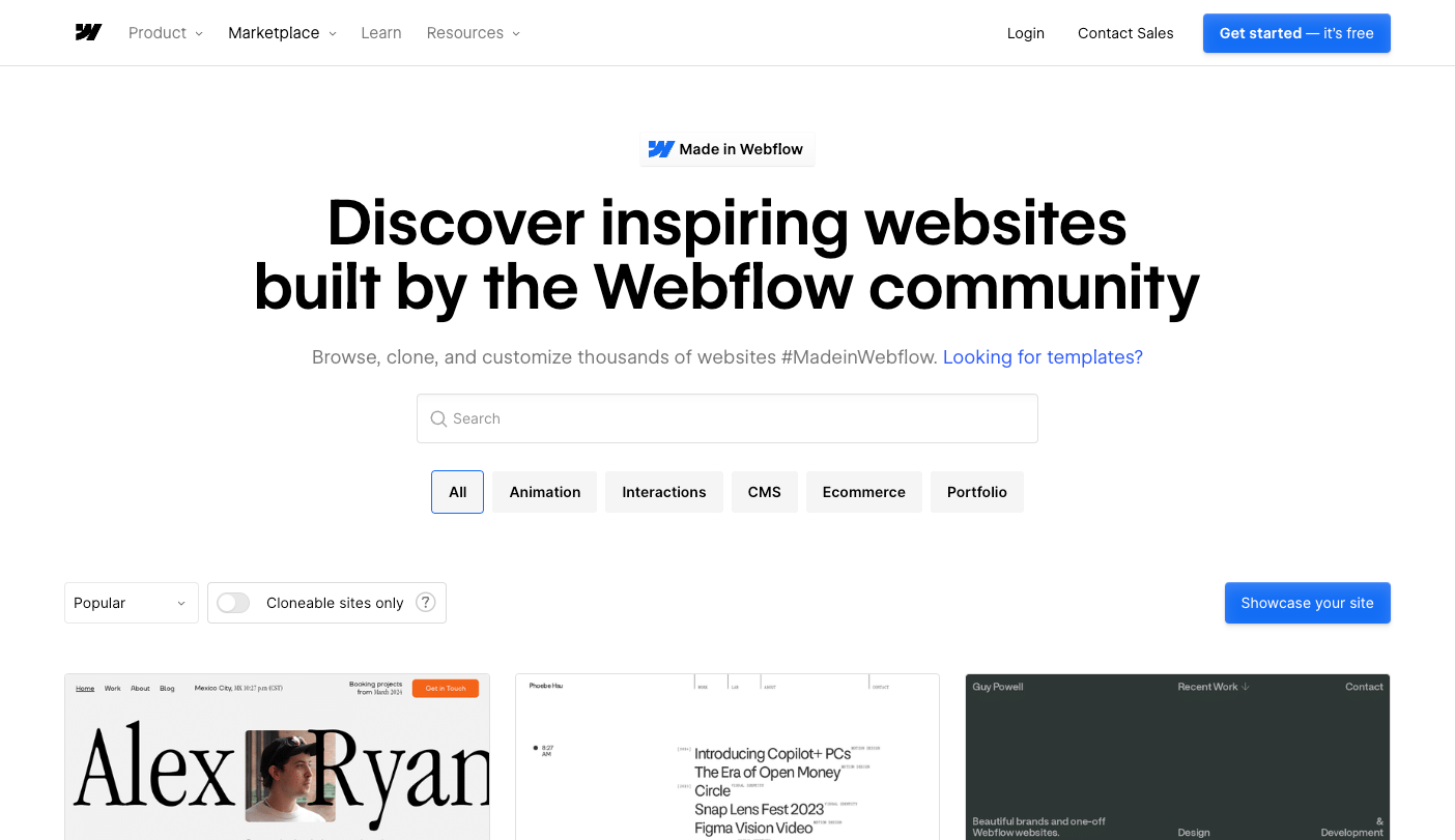
Made in Webflow is our community showcase featuring thousands of websites for visitors to browse, clone, and customize for their next design.
Explore by Popular, Recent, or Most Liked and filter by a wide range of design tags. From full site builds like design portfolios and company websites to individual design elements such as carousel sliders, buttons, animations, and interactions, you can find everything you’re looking for.
Made in Webflow is especially handy if you want to:
- Cloneables. Many designs are cloneable, meaning you can copy and experiment with different projects with a simple toggle.
- Find more sites by similar types. By clicking a project's page, visitors can view more sites by the designer, including similar sites of the project's category.
How to use these sites for your next project
Take notes on the unique elements, layouts, or interactions that catch your eye. The next time you're starting a new design, reference your notes or bookmarks for a quick spark of creativity.
Get inspired & showcase your next web design
Use your preferred inspiration sites for brainstorming, then bring your ideas to life in Webflow. Dive in and experiment until you land on the perfect aesthetic for 2025.
Consider submitting your projects to some of these websites if you're proud of what you’ve built. You may win an award or two; and if you're using Webflow, we'd love to see you showcase your design projects in Made in Webflow.
Using Webflow's visual development platform, you can bring these design inspirations to life without heavy coding.
Discover inspiring design work from the Webflow community
Made in Webflow is the place to browse, clone, and customize the latest websites built by the Webflow community.