Build a brand identity that accurately represents your company with thoughtful website design.
Making design decisions to communicate your brand identity is about more than a name or a logo. This identity conveys your company’s values through a unified, instantly recognizable aesthetic. That means every aspect of the company should align with this identity, including advertisements, website branding, product packaging, and more.
Designing a brand is challenging — especially if you’re starting from zero. That’s why we’re here to offer some inspiration to help you start building.
6 websites to check out for inspiration
Finding the right source of inspiration is tough, especially for beginners. And with so many decisions, finding a starting point gets overwhelming. We’ve put together a few of the best resources to give you design branding ideas for your next client project or personal portfolio.
1. BP&O
BP&O — short for Branding, Packaging, and Opinion — is a creative blog full of handpicked design articles, tools, and examples that acts as a catch-all resource for those building a brand. The beautifully designed site is a source of high-quality, curated designs with insights straight from the minds of experts.
Each featured design includes context, constructive criticism, and commentary on the creative process behind the genius. BP&O’s founder, Richard Baird, is a designer himself and regularly provides opinions on brands and campaigns.
2. Pinterest
Pinterest is an excellent platform for finding art, design, and fashion inspiration. Its popularity among designers means constant streams of new content that’ll never leave you short on ideas.
Pinterest’s algorithm displays images based on your activity and search history. As you sift through design work, its feed shifts to display content in line with your tastes and interests.
One of Pinterest's unique features is "pinning" posts to specific "boards" to curate and organize content that interests you. Boards are shareable and collaborative, meaning team members and clients can access your brainstorms or add their ideas. You could also create separate inspiration boards for logos, typography, and packaging to organize different elements of brand identity across teams.
3. Behance
Behance is a creative media platform owned by Adobe. Anyone with an Adobe Creative Cloud subscription can post their design work on Behance. Many big-name designers display their portfolios on the platform — making it an excellent spot to search for cutting-edge ideas. Behance’s popularity means more creators share their work, giving you more opportunities to find diverse cross-industry inspiration.
Behance allows you to post multiple images and designs linked to a single project. This is excellent for showcasing a complete brand design that includes logos, typography, color combinations, and more.
4. Typewolf
Typography is essential to branding, and finding the right fonts is time-consuming. Thankfully, Typewolf is a go-to resource for designers looking for high-quality fonts, lookbooks, and educational content. Its vast selection of fonts offers ideas to round out the fine details of your branding website.
Typewolf displays trending fonts in an organized manner, complete with mockups. The platform also offers information on similar fonts, suggested font pairings, and the best alternatives for paid and free use. Instead of spending hours digging through font foundries, try using Typewolf for all your typography needs.
5. Mindsparkle Mag
Mindsparkle Mag is an online design magazine and blog that offers a collection of the best trends in graphic design, web design, and video. The team behind Mindsparkle is selective about the work they highlight, so you're sure to find featured designs from the most talented creative professionals.
If you're looking for specific inspiration, browse the "Collections" page for the type of design work you're doing. You’ll discover over 25 categories, including logo creation, animations, and interior design.
6. Dribbble
Dribbble is home to some of the best portfolios in the design world. As an exclusive, invitation-based platform, the quality of work on Dribbble is top-notch.
Invitees are the only people allowed to post content, but anyone can view examples. Dribbble's large community means more brand representation across several categories, including product design and print.


Get started for free
Create custom, scalable websites — without writing code. Start building in Webflow.
Examples of branding done right
These brand design examples make substantial use of web elements like color, typography, and shape to express each company’s unique look and feel.
Branding for Barco Verde by Celia Grandhomme
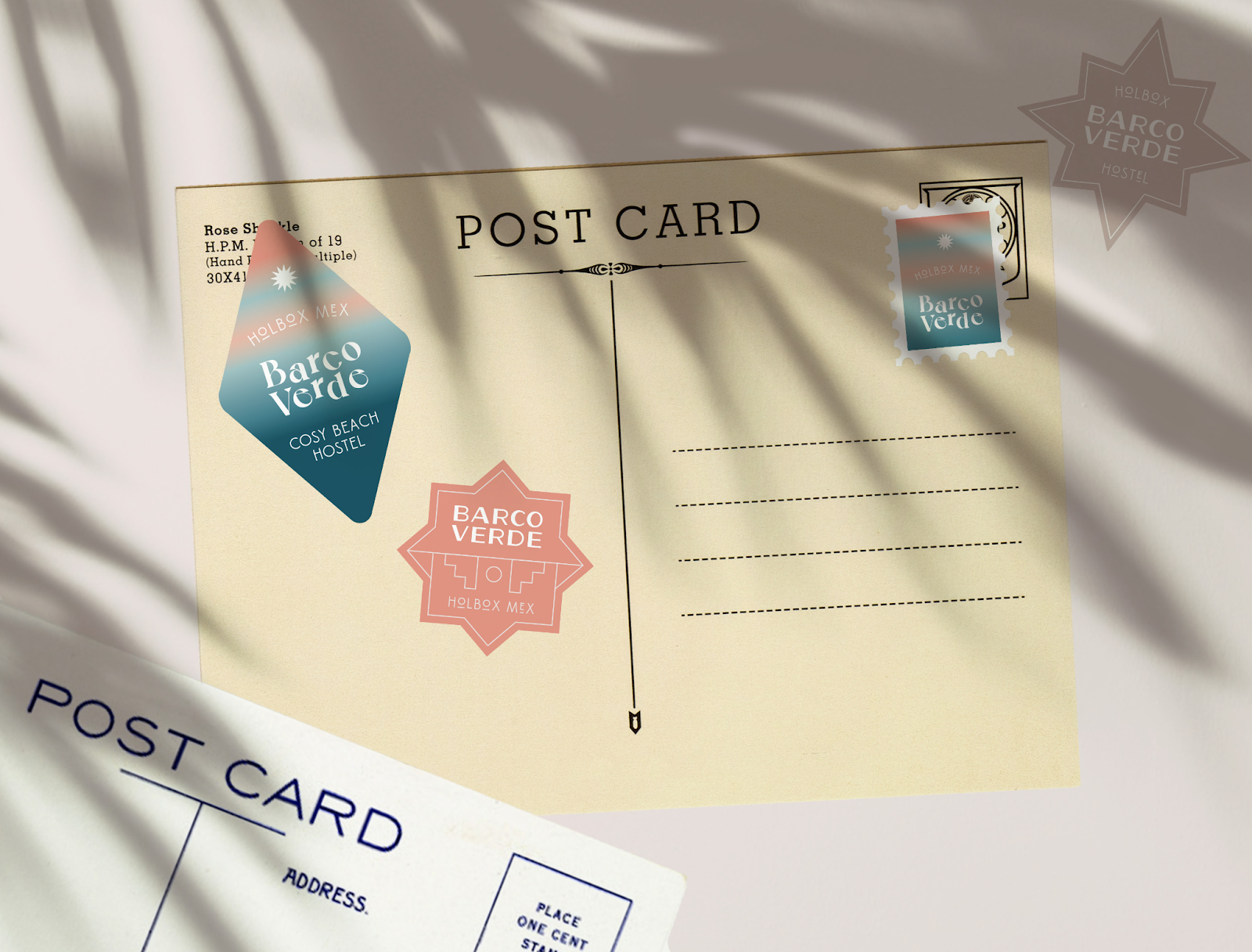
Barco Verde is a beach hostel on Mexico's Holbox island. Celia Grandhomme's branding for this retreat is motivated by the laid-back island atmosphere, the warmth of a setting sun on the beach, and the relaxed pace of a slow lifestyle.
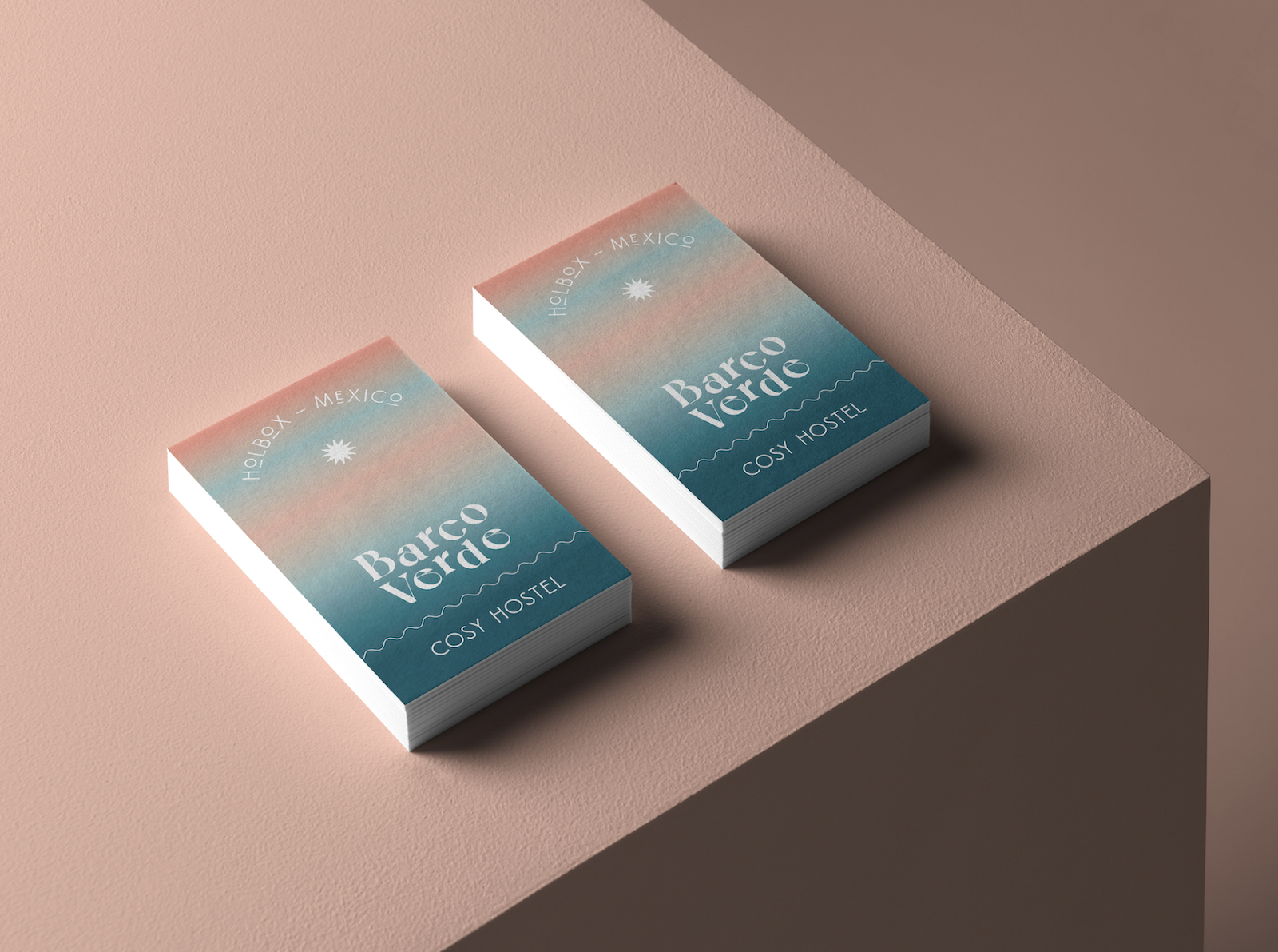
Barco Verde’s packaging design uses an artistic font with an orange and teal gradient that mimics the appearance of the sea and sand meeting on a beach. The minimalist design and tasteful color scheme make for versatile branding that works for postcards, notepads, and other souvenirs.
The sun at the top and bottom of the notepad depicts the hostel’s warmth and hospitality, while a single wavy line is reminiscent of the ocean’s waves. The consistent branding across Barco Verde’s products creates a cohesive and recognizable image that aligns with its identity.
Branding for My Karrot Jar by Celia Grandhomme
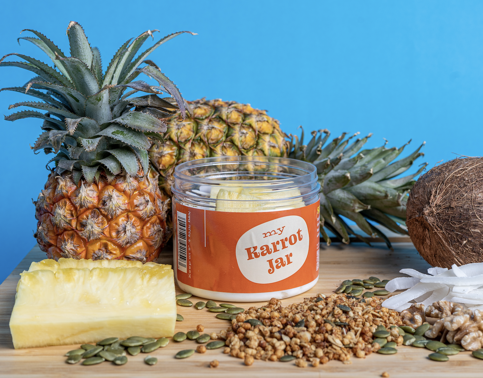
Celia Grandhomme is also responsible for the distinctive brand identity of My Karrot Jar, a salad delivery service in Saudi Arabia. The logo design is reminiscent of the stickers on supermarket produce, and the bright colors of the packaging project a feeling of vibrancy and freshness.

The cartoon-style animal drawings on My Karrot Jar's branding help parents encourage their children to enjoy salad and other healthy foods. The font combination gives the brand a whimsical, farm-like vibe. It balances clean, professional design with playful imagery and typefaces to offer a relaxed appearance that mirrors the brand’s identity.
Branding for Steinitz Chess Club by Davide Mascioli
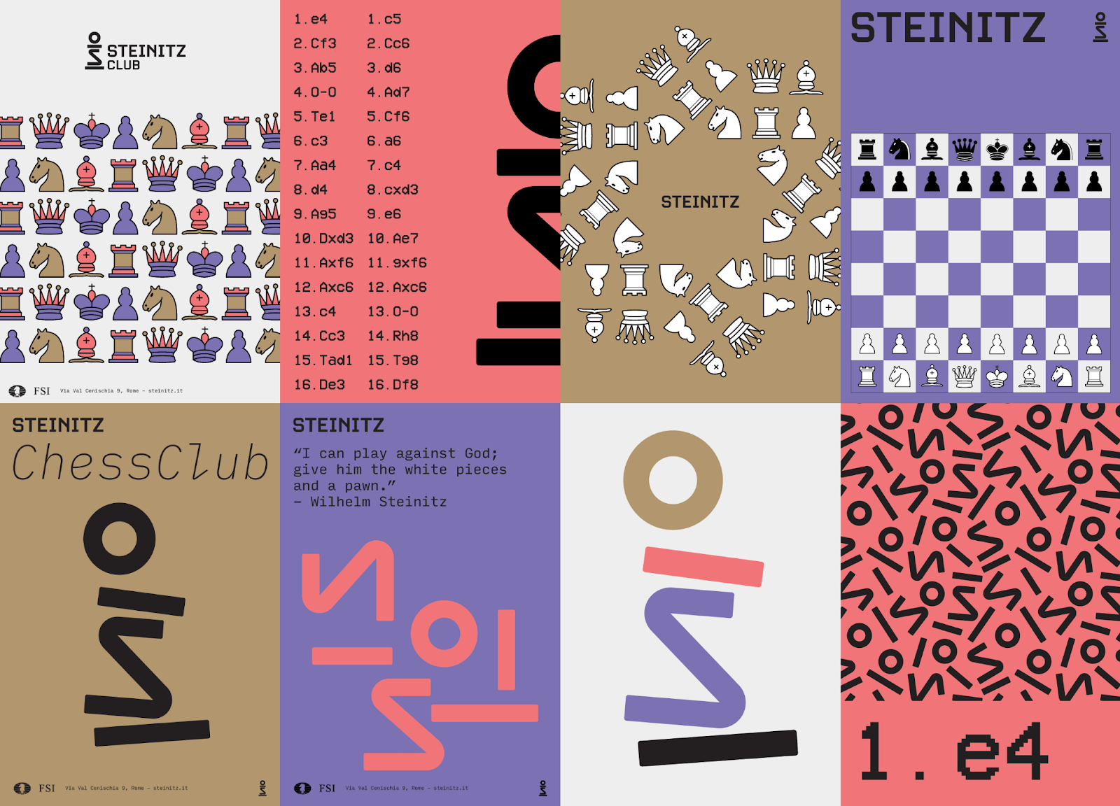
Steinitz Chess Club is a club in Cape Town, South Africa, formed in 1976. They aim to build grassroots support for budding South African chess players. Legendary Austrian-American chess player William Steinitz, the first official World Chess Champion from 1886 to 1894, was the inspiration for their name.
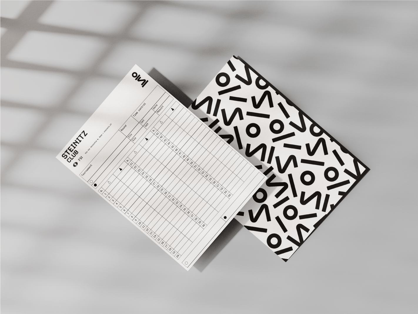
Davide Mascioli is the creative professional responsible for Steinitz Chess Club’s rebranding. Davide used a minimalist approach with a color palette of brown, purple, salmon pink, black, and light gray.
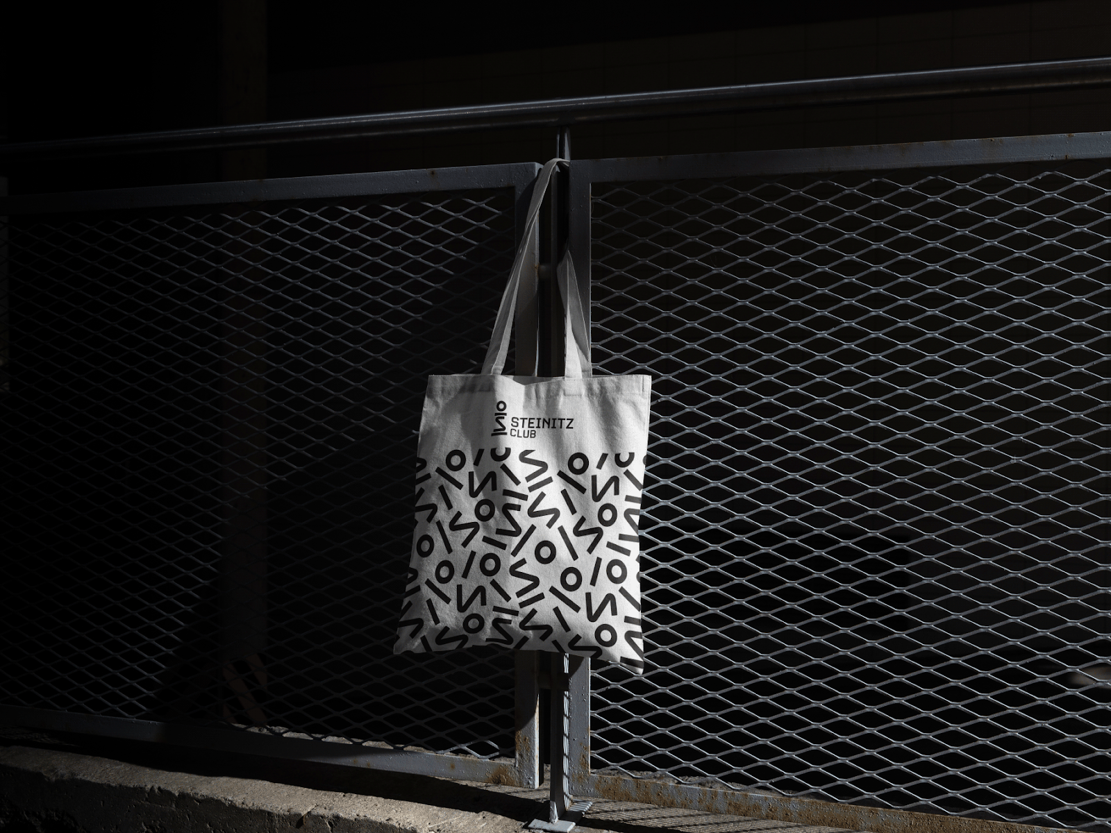
The most innovative part of Steinitz’s branding is the new logo: a chess pawn using the letter “S.” This combines the most common chess piece with the “S” from Steinitz’s name and brand. Davide separates the logo’s four elements for packaging and offline branding. The logo elements, pictured in black and white, create an abstract pattern that balances the classic nature of grayscale and chess with modern design.
Adding the final touches with Webflow
Once you've found inspiration for your website’s brand design, you need a platform to create an attractive website and build the foundation for your company's identity.
At Webflow, we offer stunning templates, guides, and a visual web development platform to help you create the perfect platform for your brand. Browse through our collection and start building your website today.


