Web design is a crucial component of the web development process.
If you're interested in web design, we're guessing you have a creative streak. And how could you not be excited about jumping in and making your first website? Web design is about crafting a functional piece of art — but where do you start? If you're wondering what you need to know before you begin, this is a simple web design guide that will help you start.
Choose something basic for your first site design
This seems like a no brainer, right? But sometimes we can get overly ambitious and end up discouraged. For your first project, it’s a good idea to choose something simple and fun. An ecommerce site is more complicated and would be better to tackle once you have more experience.
A blog is a great place to start. It will be a good design exercise and you’ll learn how a Content Management System (CMS) works, which will be important to know for future site designs. Best of all — you don’t have to start from scratch. There are plenty of blog templates that make it easy to put one together.
Templates are a valuable learning tool. Watching how HTML, CSS, and Javascript elements are styled and come together will give you deeper insight into what makes a design work. You can use templates as a foundation to make changes and customizations.
Maybe you don't want to start a blog — try pulling from your creative pursuits or hobbies. How about building a showcase for your photography skills or for your collection of short stories? Creating a design to feature a passion of yours makes for an enjoyable first project.
Find inspiration from other designers

You've no doubt come across websites that have wowed you with their stunning design.
Create an inspiration doc with links to sites you love, or bookmark them as you go. Pinterest is a great place to find great site design — you can find and pins illustrations, book covers, posters, blogs, and other types of design work to refer to. Designers use the term "mood board" for these collections. Mood boards are a quick reference resource if you find yourself stuck. Which you will.
Outside the discoveries you make on your own, there are some curated collections you should check out.
- Awwwards always has new and fresh work and a variety of themed collections
- Behance is a fantastic compilation of website design work, where the focus is on quality and creativity
- Dribbble focuses on individual designers, providing a forum to get feedback and communicate with others about their work
And of course, head over to Made in Webflow to see the variety of ways people are using our design platform. There’s so much cool stuff to check out and so many templates available to clone as your very own.
Look outside the web for sources of inspiration
Web design is informed by a visual language that can be found anywhere, like the cover of a graphic novel or the digital kiosk at your bank. Develop an eye for recognizing good design and start analyzing why something works or doesn’t work, whatever the medium.
Pay attention to typography
We often read without even being aware of typefaces. Pay attention to the effect type has on as you consume content. Is that font on the menu readable? What makes that hand-lettered sign for the local business work so well? Letters are everywhere. Make note of both good and bad uses of typography.
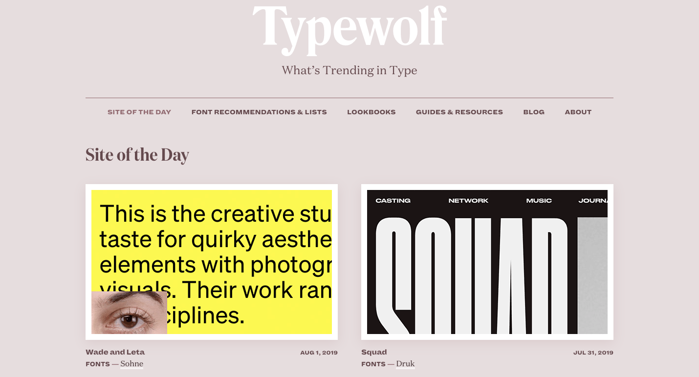
Typewolf is an excellent resource to keep tabs on popular fonts. It has plenty of lists to explore, a featured site of the day, and lookbooks that have spectacular font combinations. It’s helpful to see actual examples of typography being used, and websites like Typewolf are a great place to see their practical applications. Getting familiar with different fonts will help you pick the right type for your first site design.
Let the fine arts influence you
Oh, did we mention there’s an entire history of art to draw from? So many movements and artists still shape the work of creatives today — especially web designers. Take a stroll through our Web design and art history piece to discover many monumental artistic achievements. Not only is filled with valuable information, it’s an excellent example of how content and artistry can come together to tell a story.

Research different types of design
There are so many disciplines of design to be familiar with. A knowledge of product design, illustration, and even branding can further develop your creative senses.
For inspiration that goes beyond web design, Abduzeedo offers brilliant examples. Whether it’s poster art, luggage, or furniture, you’ll see fantastic examples of design done right. Be open to different types of design and actively seek out inspiration. The more knowledge you have, the easier it will be to design your first website. Education informs intuition.

Have content ready before you start
Putting content first means having content ready to work with before you start designing your first website.
It doesn’t have to be perfect. You can always edit and optimize for Google SEO (search engine optimization) later. But having at least a rough draft of what will go live will help make sure the design is laid out to accommodate it. Designing with real content gives you a better representation of how the website will look and function. It also gives you the opportunity to make changes earlier in the design process.
For blogs, you’ll need to have a post ready to test in the CMS. Having a couple posts written before you launch will save scrambling to write something after the fact.
Keep your design simple and intuitive
Whether it's writing, navigation, or CTAs, no one wants to struggle with your design.
Your design approach should be rooted in simplicity and order. Logic should guide someone through the site with ease. And since we’re talking about those people who will interact with what you’ve created, this is a good place to introduce UX.
Understand user experience (UX) basics
A website is more than just floating text in space. The color scheme, content, typography, layout, and imagery all come together to serve your audience and stir emotion. Someone wandering through the digital space you’ve created should have a clear path free from obstacles.
UX focuses on understanding your audience. What are they looking for — and how will your design make finding it easy? UX is about getting into the heads of your audience and seeing your design through their eyes.
When building your first website, keep these guiding UX principles in mind:
- Make things simple and intuitive
- Communicate concepts in a logical succession
- Meet your audience’s needs and resist the temptation to showboat your skills at the expense of usability
Learning about your audience will help you craft a design that’s tailored to their wants and needs. Check out our Beginner’s guide to user research for more insights on how to do this.
Understand user interface (UI) basics
If you’re new to web design, you might be confused by the difference between UI and UX. Most of us were. Know this — they’re two distinct concepts.
Where UX is concerned with the overall feel of a design, UI is about the specifics. If you were in an elevator, UI would be the size and arrangement of the floor buttons, while UX would encompass the colors, textures, and other interior design choices of the elevator space. UI is about giving someone the tools they need to experience your website free from complications.
When constructing your first website, keep these UI principles in mind:
- Functionality of interactive elements should be obvious
- Uniformity must guide usability — actions should follow logical patterns
- Design choices should be made with a clear purpose
Take a look at 10 essential UI design tips for a deeper dive into UI.


Grow your freelance business
Take on more clients and build websites faster. Webflow empowers freelancers to design and deliver with confidence, while keeping full creative control.
Use the principles of design for web starters
Effective design is guided by certain rules and it’s important to understand essential web design skills before you start. There are standard practices that will simplify the process and make for a more refined final product.
Layout
If you want to design and build websites, understanding good layout is key. We suggest keeping things minimal and working with only a few elements to focus on the perfect placement.
When you first start designing, think grids. Grids align elements, like div blocks and images on a web page, in a way that creates order.
The structure of a layout should follow a visual hierarchy. What are the important ideas you want people to see and in what order? Visual hierarchy needs to adhere to the common patterns people use when reading. There are two paths people’s eyes generally follow on the web: the F-pattern and the Z-pattern. Being familiar with how these patterns work will help you organize your own content.
The F-pattern is more common for designs with dense blocks of content. People’s eyes will scan down the left side of a layout until things catch their attention and then read from left to right. Imagine looking through the menu at a restaurant — you may skip over the bold names of dishes aligned on the left until you come to something that grabs you, which will prompt you to read the supporting details explaining that specific dish.
Most people will read through something like a blog post in this F-pattern. With left-aligned text and bulleted sentences, Nelson Abalos takes advantage of this design technique, making his posts easy to navigate and follow.

The Z-pattern is associated with less text-heavy design. Many landing pages conform to this pattern. All the major elements on the Conservation Guide site adhere to the Z-pattern. If you’re a beginner web designer, this is a simple layout trick to help usability.

Color

You have the colors of the rainbow and beyond available to you. And we all know that "with great power comes great responsibility." The power of the color picker can be wielded for good or evil.
Here are a couple straightforward approaches in choosing a color scheme for your first website.
Monochrome
Use a single color as the base, vary the amount of saturation, include lights and darks, and play with various hues for a uniform color scheme. Regardless of your niche, a monochrome site is a smart design choice. And remember, whatever color you choose for the text, make sure you’re thoughtful about readability.
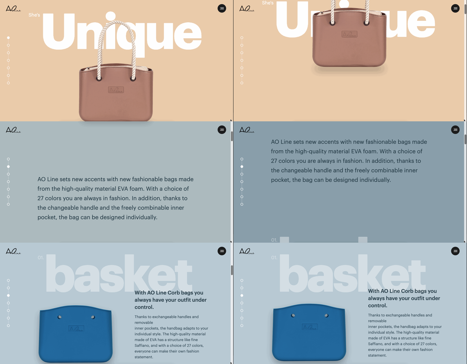
In this example from Unique, each section is delineated by a monochromatic color scheme. You don’t have to get this fancy in your beginner designs, but it’s nice to see their use of different monochromatic color variations. Notice how each section is made of colors related to the featured bags? This is a nice design trick that makes for a harmonious color scheme.
Complementary
Take colors that are opposite on the color wheel and combine them. Easy enough, right?
Use complementary colors with care. In this design below from the Ignisis website, the designer used blue and orange in different combinations along with whitespace and greys for a layout that never tires the eyes. The contrast feels crisp and refreshing.

Typography
Typography is two-dimensional architecture, based on experience and imagination, and guided by rules and readability.
-Hermann Zapf
So what are the rules that you, the neophyte designer, need to know?
Typography informs tone
Think of a wedding invitation or a funeral announcement. Both are profound life events — one a joyful celebration and the other typically more somber. Where an ornate flowery typeface works well for a wedding, it’s not well-suited for a funeral.
When designing your first website, keep tone in mind. If you’re going for a lighthearted vibe, like a food blog, weaving in playful fonts makes sense. But if you’re crafting a website for a law firm, stick to more professional typefaces.
Serifs versus non-serifs
A common mistake of new designers is to mix up serif and non-serif fonts. You can tell them apart because the ends of serif letters have an extra line or stroke added vertically or horizontally.
Check out the differences between PT Serif and PT Sans (without the serif).
Here’s PT Serif:

And here’s PT Sans:

Serifs are an artifact from the time of printing presses when most of the words we read were printed with ink on paper. Serifs anchored words onto the page and made them easier to read. In the earlier days of the web, serifs were shunned by web designers because lower screen resolutions diluted them. Now that screens are better optimized for typography with serifs, they’ve made a comeback.
Those small lines make a huge difference. You’ll notice the above PT Serif typeface feels more formal and the sans-serif version seems lighter and looser.
Since serif fonts are more complicated, they’re best used in moderation. Headers are an ideal place for serif fonts, and larger blocks of content benefit from a more simplified font without serifs.
Ornamentation versus practicality
The loops and whorls of a flourished font will add personality and elegance to a design, but don’t overuse frilly fonts. A website is about communicating to an audience through content. As Hermann Zapf said, readability is one of a font’s most important characteristics.
Typography technicalities
There’s a lot to learn with typography. As you progress as a designer, you’ll need to know how to use line height, kerning, and different weights in your typography. But don’t get too caught up in tweaking all the intricacies for your first site. Focus on making sure everything is readable — you can experiment fine-tuning the details later.
Start designing
Tutorials and research are invaluable to your learning, but you’ll eventually just need to dig in and get designing. Even if you create something no one will ever see, it's still an exercise problem solving and applying what you've learned. Don't worry if it's not amazing. But be proud of crossing that threshold from aspiring designer to actually being one — you’re on your way!
Get feedback
You finished your first design — congratulations! You worked hard and you’re ready to show it to the world. But before you hit publish, get some outside perspective on what you made.
Getting constructive criticism can be uncomfortable. Creating something, whether it’s an essay, a painting, or a website is an act of vulnerability. The things you put into the world are an extension of who you are and what you’re capable of. To be told what you made could be better or is wrong might feel like a personal attack.
In web design, feedback is a normal and necessary part of the process. Learn how to set your ego aside and separate the feedback from your self-worth. As you gain experience, you’ll be able to identify and implement practical, useful feedback and let go of the rest. You’ll find that more experienced designers know what it’s like to be a beginner — they’re excited to see less-experienced designers succeed.
If you’re designing with Webflow, share your work in the Webflow Showcase or request help in the Webflow design forum. As you progress, you’ll want to submit to places like Dribbble and Behance to get more eyes on your work. Not only will you get constructive criticism, you’ll get feedback on what you’re doing well — which always feels great.
Webflow makes web design for beginners accessible
Gone are the days of having to learn complex front-end code to build a website. In the past, you had to depend on a developer to bring your designs to life. Today, you can design, build, and launch complex websites in just a few hours using Webflow.
Knowing a few key concepts, and being able to know the difference between good and bad design will give you the confidence and skills to craft your first website. Webflow frees you up from having to code, opens up your creative bandwidth, and let’s you start designing immediately.

Get started for free
Create custom, scalable websites — without writing code. Start building in Webflow.





.jpeg)


