


Motion can make a website stand out — for better or worse. Here’s how to design a site with motion that’s enjoyable for as many people as possible.
With great power comes great responsibility. That old chestnut is true for Spiderman, but also for web designers.
As one of Webflow’s Senior Brand Designers for the web, my literal job is to use Webflow to build things for Webflow — and to push the boundaries of our platform, exploring and innovating as I go.
So I think about the timeless advice from Spiderman’s Uncle Ben a lot. Webflow is a really powerful platform, and you can use it to create some beautiful experiences. Especially with motion, as we’ll dig into shortly. But I have to stop and think that just because I can do something doesn’t mean I should. (Now we’re entering Dr. Ian Malcom territory, but you get my drift.)
Because as web designers, we have a responsibility to consider the potential for harm in everything we build. And part of the reason I love my job is that Webflow cares a lot about doing good in the world, especially when it comes to accessibility. We want everything we create to be accessible to as many people as possible.
So, when I was tasked with collaborating on the website for our No-Code Conf 2021, I had both innovation and accessibility on my mind. And I ended up learning some new techniques that are pretty darn effective at both.
When motion makes sense — and when it can cause harm
As I mentioned, you can build pretty complex animations and interactions on your Webflow site without needing to know a lick of CSS or Javascript. But, as we designers are wont to do, I’ve seen some of our community members get a taste of the power of interactions and take the design trend of motion-heavy sites too far. Sometimes, we forget to use animation tastefully and neglect to consider all audiences, not just our fellow designers.
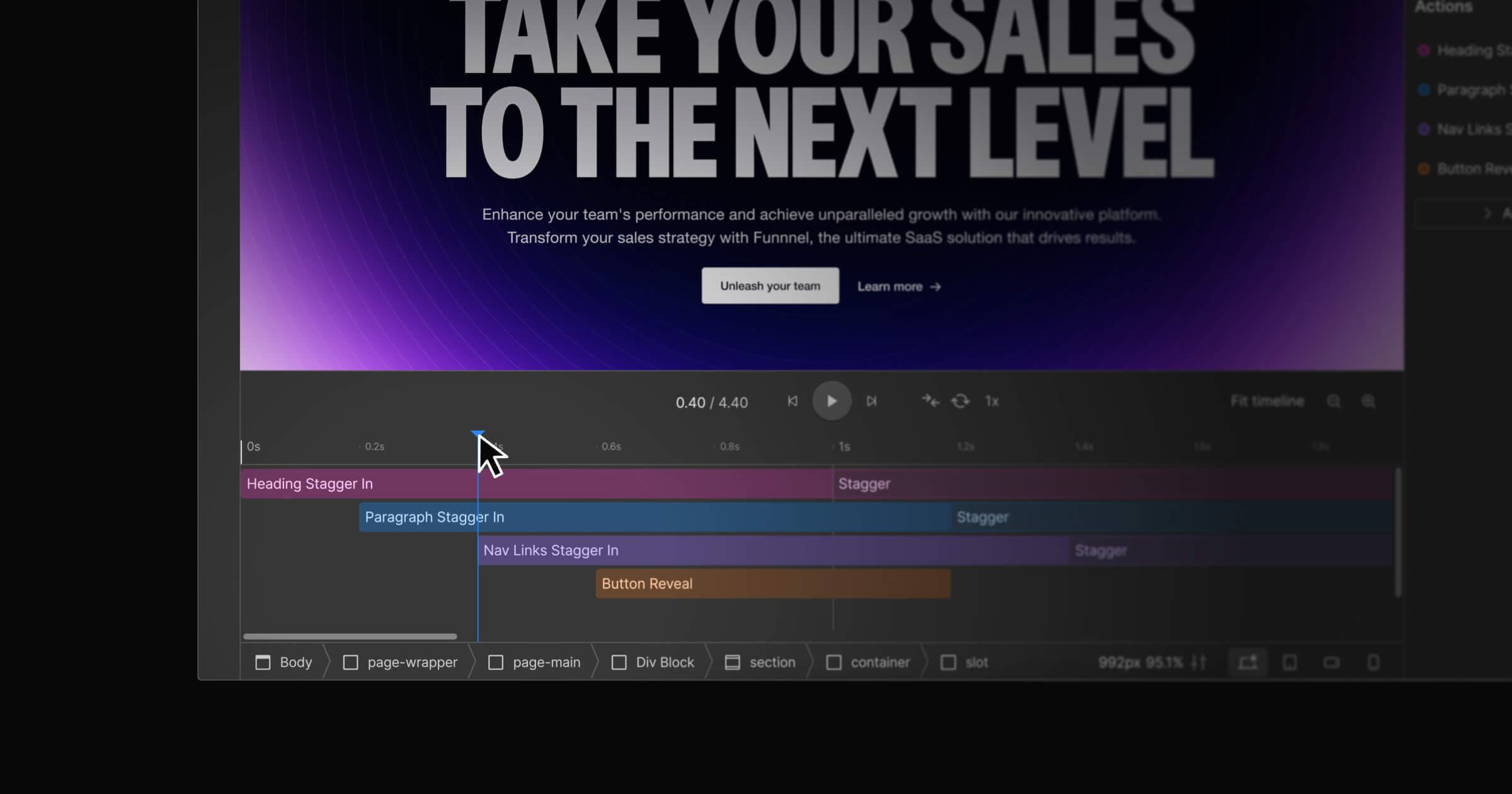
I had this temptation in mind when I started working on the No-Code Conf website. But the creative team had developed some nifty illustrations to represent the building blocks and elements of the no-code framework, showing how these pieces are intended to fit together and work in concert to craft something greater than the sum of their parts.
And those illustrations were begging for motion. I knew we could tell this story more fully if visitors could see these elements spring to life — coming together, interacting with one another, and building something beautiful.
So this was one instance where motion made sense. It was thematic, it was important, and — with Webflow’s design interface — it was possible.
But we needed to think about accessibility. People with motion sensitivities can experience vertigo or otherwise be made physically ill by interactive designs on the web. Examples of excessive motion can include: mouse-triggered scaling, 3D zoom and blur, parallax effects, variable speed scrolling, plane-shifted scrolling, and flashing content.
That’s why most major mobile and desktop operating systems now have accessibility settings that allow users to reduce the amount of motion they experience when using their devices, like parallax effects for icons and auto-playing video previews.
Unfortunately, as I was building the No-Code Conf site, we didn’t yet have an easy way to help our websites accommodate those settings. Note: We’re actively working on making accessibility related to motion easier to manage. In April 2021, we released an update that ensures smooth-scroll animation will respect the site visitor’s preferences to disable animations. Stay tuned for more improvements from our accessibility team.
But while my colleagues in engineering continue to build more accessibility functionalities into the platform itself, I wanted to find a way to use a low-code solution to bridge the gap and provide a better experience for more people— the same approach we encourage our community to use in our accessibility checklist.
After some experimentation, I landed on a low-code solution that allowed me to design a page for everyone. By creating each frame of my interactions as SVGs and using a short CSS media query, I could automatically replace the animations with a static illustration for people who were already telling me through their OS settings that they didn’t want motion. For everyone else, they saw the interactions come to life when they landed on the website.
Here’s how it works:
Create the animation as SVG files
Step 1: Frame the full illustration, ensuring the outer dimensions are an aspect ratio that works well for where it will be used. I used Figma, but you could use Sketch, Illustrator, Adobe XD, etc.
Step 2: Duplicate the frame for each element that will move. You may also need an extra frame for any elements that will overlay an element that will move.
Step 3: In each duplicate frame, remove all elements of the illustration except for the elements that will be moving or overlaying another element.
Step 4: Export the frames as SVG files.


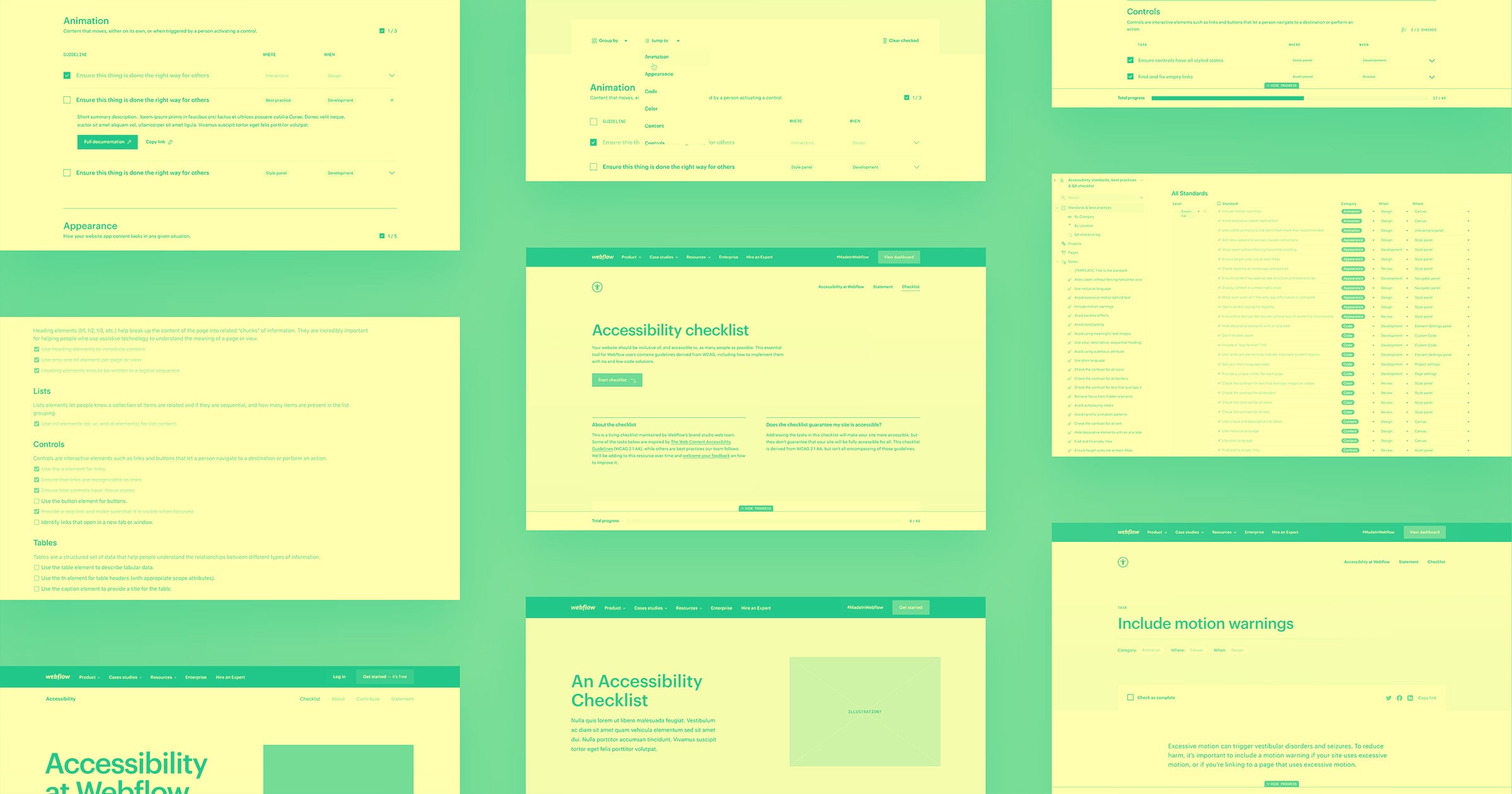
Accessibility at Webflow
Learn about our commitment to web accessibility and how you can build more accessible online experiences.
Build the animation in Webflow
Step 5: Absolute position all the frames on top of each other in Webflow.
Get a brief refresher on absolute positioning.
Step 6: Animate each SVG as desired from the various Interactions triggers available within Webflow.
Use a media query to hide animations
Step 7: Add the custom CSS in your project settings for the prefers-reduced-motion media query and a couple of classes to toggle visibility of items with it.
Here's the sample code I used:
/*Hide/Show things if reduced motion is on in persons OS*/
@media (prefers-reduced-motion) {
  .a11y-reduce-motion-show {
    display: block;
  }
  .a11y-reduce-motion-hide {
    display: none;
  }
}
Learn more about using custom code in Webflow.
Step 8: Use the new custom classes you added to project settings in Designer on a Div that wraps both the animated group of SVGs and a full, static version of the illustration.
Now, when a site visitor has the “reduce motion” OS setting turned on, you’ll automatically present a static version of the illustration. And, as a bonus, if you want to change your interactions down the road, you can just edit the files in Figma and swap those out in Webflow — no need to hunt down and edit an entire animation file.
Deliver delightful experiences
In the end, the No-Code Conf website received great feedback and even won an Awwward. We found that recognition especially meaningful, because it shows that you can prioritize accessibility while creating a beautiful website.
It’s worth noting that the movement on the No-Code Conf website works well because it’s relatively subtle. Just because Webflow supports prefers-reduced-motion, doesn’t mean designers should overload sites with excessive motion and assume user settings will take care of the rest. Relying too heavily on those settings puts the burden on your site visitors — creating accessible websites should be the designer’s responsibility.
Bottom line: using subtle details of motion can help tell a brand story. But make sure you have a good reason for using motion in the first place — and verify that the experience you’re delivering will actually be delightful, and not harmful, for as many people as possible.
Additional resources
This article covers one specific aspect of accessibility and designing with motion. For more information about making sites with motion more accessible, check out these resources:
- WCAG 2.1 - 2.2.2 Pause, Stop, Hide
- WCAG 2.1 - 2.3.1 Three Flashes or Below Threshold
- WCAG 2.1 - 2.3.3 Animation from Interactions
Learn more about building an accessible site in Webflow.