Designers do so much more than make a website look beautiful.
In fact, creating accessible web experiences is one of the most valuable contributions a designer can make. That’s because, as Italian artist Bruno Munari once said, “A designer is a planner with aesthetic sense.”
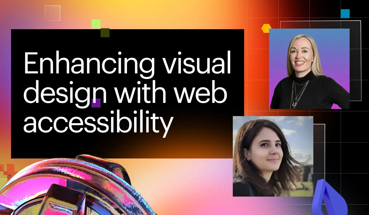
How designers can make their work more accessible and why it matters was a topic tackled at Webflow Conf 2022. Mirela Prifti, co-founder at Matechs, and Carmia Weideman, creative director at Approachable Systems, shared their methods for centering user experiences and how having the right tools in place can make the process an intentional habit rather than a chore.
Here are some of their takeaways that you can apply to your own design work.
A more accessible web is good for everyone
Accessible design is, first and foremost, a human-centered approach. It’s the practice of making a website usable by as many people as possible. Your user is your customer, and being able to navigate your site to explore your offerings should be a seamless experience for every user. And while making the web accessible for all is the right thing to do, it’s also something that will positively impact your business.
Reach more users
Entire populations of users are shut out when sites aren’t optimized for accessibility. When you neglect to add alt text to your images, for example, people with visual disabilities will be denied the full experience you have built. And when people don’t feel welcomed by a space — physical or digital — they’re less likely to return. “Visual design is not complete without accessibility,” said Carmia. “You're not taking full advantage of the web if you do not reach all possible users.”
Provide a better experience
There are many design elements that seem purely visual but actually help users navigate your site more easily. Because text and non-text design elements, such as icons, are meant to help users understand how to complete actions on your site, you want to make sure these elements are as accessible as possible. For example, a navigational element should never be described in alt text simply with sensory characteristics like “the blue button,” as this isn’t a directive that will work for every user. Instead, considerations like a consistent, straightforward layout for all pages or ensuring all controls have styled states make navigation easy to find and obvious when selected. Make it simple for anyone to move throughout your website.
Improve your site’s performance
Accessibility doesn’t just improve a user’s experience — it can have positive business implications, too. For example, the more accessible your site is, the greater its SEO value becomes. Perform an audit panel, which points out things like missing image alt-text and descriptive, working links, to ensure you’re not missing any key elements that could affect your Google performance or your site’s functionality. “We receive important leads through our site forms, and we need to ensure that they work 100%,” said Carmia. “This includes making them easy to understand and to complete for a successful submission.”
Take advantage of the right tools
In order to build accessible web experiences without having to overhaul your entire website, you need the right tools. Mirela and Carmia both use Webflow at their organizations because of the platform’s built-in suite of tools and features that help designers address all areas of web accessibility without needing to learn how to code.
Use tools like Webflow to improve the accessibility of the following elements:
Color and font
Color contrast is a big concern in accessible design. Webflow has built-in tools to help designers test where their contrast falls on the spectrum, which is essential for people who are colorblind. Similarly, for other visual disabilities, Webflow provides a blurry vision lens that helps designers test their fonts to ensure they’re readable at the chosen size.
Reading comprehension and page layout
Content should always be scanned by a writer to ensure readability and clarity for as wide of a user base as possible. How content is displayed can play a key role in conveying messages effectively. Webflow’s templates help designers signal what’s most important and ensure that information is placed logically for users to find. “This improves semantic flow,” said Mirela. “Styling should always follow a logical structural meaning.”
Mobile readiness
Not every issue of access is related to physical or mental ability. Access is also about optimizing all the ways that people might access your site, depending on the technology they have available to them. Webflow enables responsive design so mobile, tablet, and desktop versions of your site can be edited together with ease. “Mobile readiness is something I focus on quite heavily for my web performance,” said Carmia. “Coming from South Africa, I know not everyone has a desktop computer, so this is essential for the mobile-only users of the world.”
Create guidelines for your team
“There’s no such thing as building a 100% accessible website all the time,” said Mirela. That’s why it’s important for leaders to guide their teams, provide parameters and structure, and allow automated processes to help designers build accessible web experiences as easily as possible.
Assign responsibilities
In order to make a website more accessible, each feature and page must be carefully considered, and each area should have an owner. “Accessibility is a team effort,” Mirela explains. Copywriters might take on alt text, UX/UI designers might oversee color contrast, and designers might own navigation and site audits. Having a clear view of all the areas that need to be considered and ensuring relevant people are accountable for each will ensure all of your design bases are covered.
Build systems
Creating a more accessible web experience for your users is not a one-time gig — the changes you make must be sustainable. Building systems and automation into your processes is one way to make that happen. “It's important to create systems that support and facilitate accessibility for our projects in the long term,” said Mirela. Similarly, laying those systems out clearly will eliminate any unconscious biases that might come up in the design stage. “Don’t rely on personal preferences,” said Carmia. “Provide guidelines.”
Establish checks and balances
Even with all the planning in the world, it’s easy to miss something small that could make a big difference. Tools like Webflow’s audit panel show when pages are missing things like descriptive links. Other tools, like annotations, help from earlier stages by establishing a standard to measure from. “Even if you're using your own simple guideline systems, you can always leverage annotations to provide a baseline for accessible design and development,” said Carmia.
The best web experience is an accessible one
When designers are given the tools they need to build not only something beautiful but something that works for everyone, the web experience is elevated exponentially. That’s part of what accessible web pages bring to the table — they’re not only the most inclusive approach, they also create a more visually pleasant and user-friendly experience. “Design with accessibility in mind, not as an afterthought or checklist item,” said Carmia.
Now that we’ve hopefully convinced you to design with accessibility in mind, learn how Webflow can help you do it.


Accessibility at Webflow
Learn about our commitment to web accessibility and how you can build more accessible online experiences.


