

Margins and padding are essential elements of spacing when it comes to web design.
If you know when and how to leverage each one, you’ll be well on your way to creating stunning, responsive websites that look great on any device. But mastering them can take some practice.
If you’re new to CSS or interested in learning more about margins vs padding, read on to learn precisely what they are and how to decide when to use each one.
Web design and coding basics
Before we dive into the nuances of margins and padding, let’s quickly review the basics of web development: HTML and CSS .
HTML (HyperText Markup Language) tells your web browser how to display a web page. CSS (Cascading Style Sheets) provides a set of rules that are applied to HTML and govern the style of a website. You rely on HTML to define the specific text for a header on a page, but you can use CSS to set a consistent font, text size, and color for all headers in the same class across a website.
The invention of CSS was a game changer for web development because it eliminated the need to write or rewrite an individual line of styling code for each element on every page of a website. CSS enables you to set consistent parameters for elements in the same classand make changes to an entire class all at the same time.
What is the CSS box model?
CSS uses what’s called the box model to tell web browsers how to display and space different elements on a web page. All websites are made up of a series of boxes and these boxes have four major components.

- Content - The innermost part of the box. Content could be an image, text, heading, or something else.
- Padding - The inner space between the content and the border of your box.
- Border - The perimeter of the box. Borders can be invisible or they could be a thick colored line like the green one pictured above.
- Margin - The outer space (or lack of space) surrounding the box.
You can align CSS boxes vertically or horizontally. You can place them side-by-side, nest them inside one another, or even overlap them.
What’s the difference between margin and padding in CSS?
The main difference between padding and margin is that padding controls how much breathing room exists within a box, while margin controls how much breathing room or whitespace exists outside of a box.
- Margin: Affects outside space, can be set to auto or negative values, doesn't affect an element's background.
- Padding: Affects inside space, increases element box size, extends background or color behind the content.

You can set padding to zero pixels or above. By adjusting padding, you can change the element's size and impact how much of a fill color or background image is visible within a box.
Margins, on the other hand, are essentially invisible barriers around a box. They define how your element interacts with adjacent elements or the edge of a screen. You can set margins to zero and abovejust like padding. But unlike padding, you can also set margins to auto and even negative values.
Similarities between margin vs padding
In certain situations, you can use either margin or padding to achieve similar results — and this is what makes the box model a bit confusing. Here’s an example.
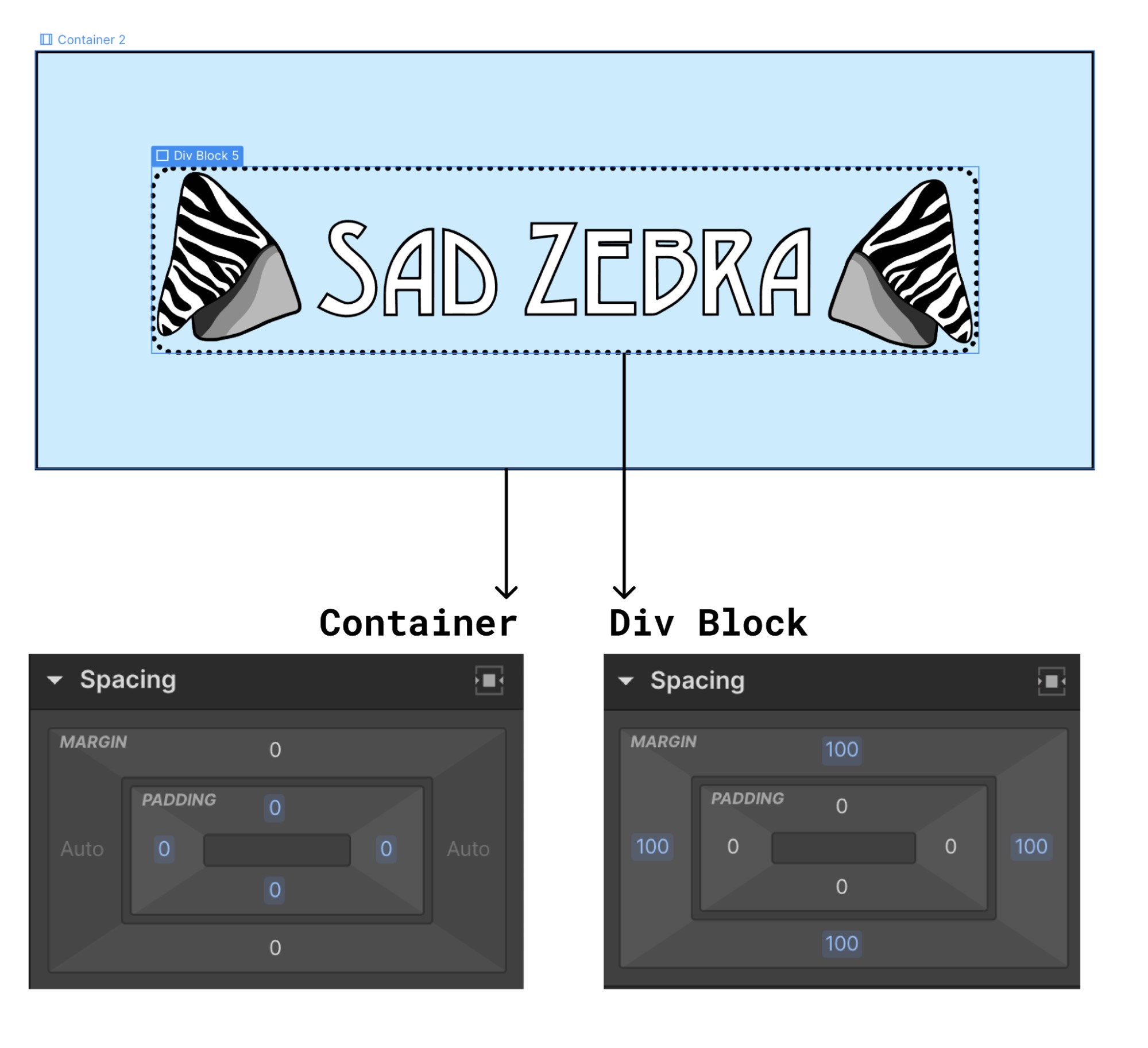
The image above shows a set of nested boxes and their corresponding spacing in Webflow. We have a container box with a solid black border and light blue fill or background color. Within that container, there’s a div block containing a logo image (content), zero pixels of padding, a dotted black border, and a 100 pixel margin.
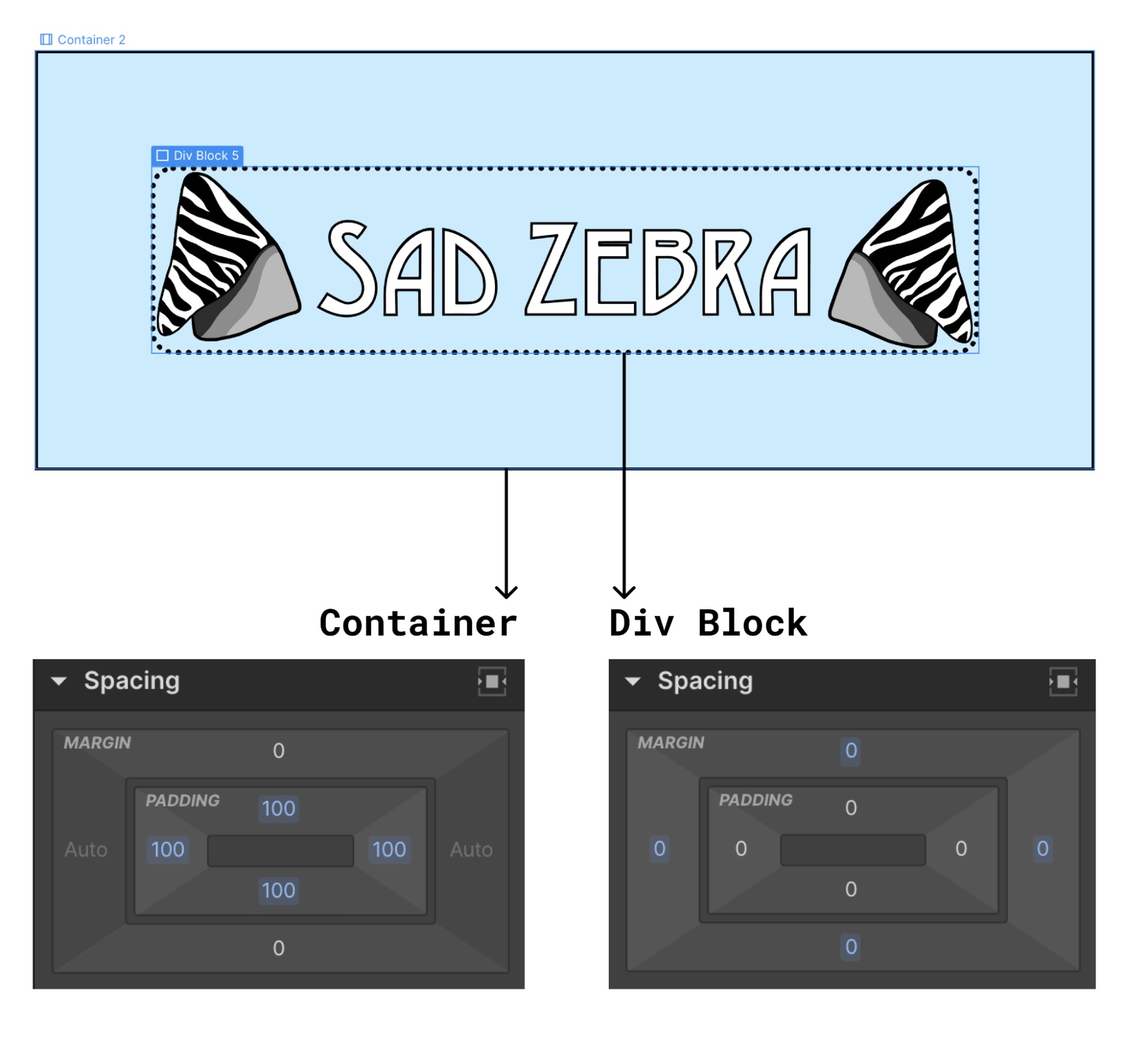
But you could achieve the exact same appearance using the container box’s padding instead of the div block’s margin. In the image below, we’ve increased the container’s padding from zero to 100 pixels and decreased the div block’s margin from 100 pixels to zero.
Sometimes, there isn’t one correct answer as to whether you should use margin or padding. So, don’t be afraid to play around with both options. Just make sure you review the appearance of your design on different screen sizes and adjust as needed to ensure your responsive web design looks great on any device.
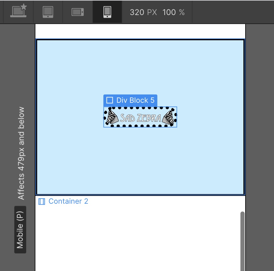
As you can see in the image above, while 100 pixels of margin can look great on a large computer screen, your content may become imperceptibly small when viewed on a cell phone.
Understanding how margin and padding impact your CSS layout is essential if you want consistent, responsive design spacing on any device.
When to Use CSS Margin vs. Padding
You can use CSS padding to:
- adjust breathing space directly around content
- adjust the size of boxes or html elements
Let’s take a look at some examples.
Adjust breathing room around content
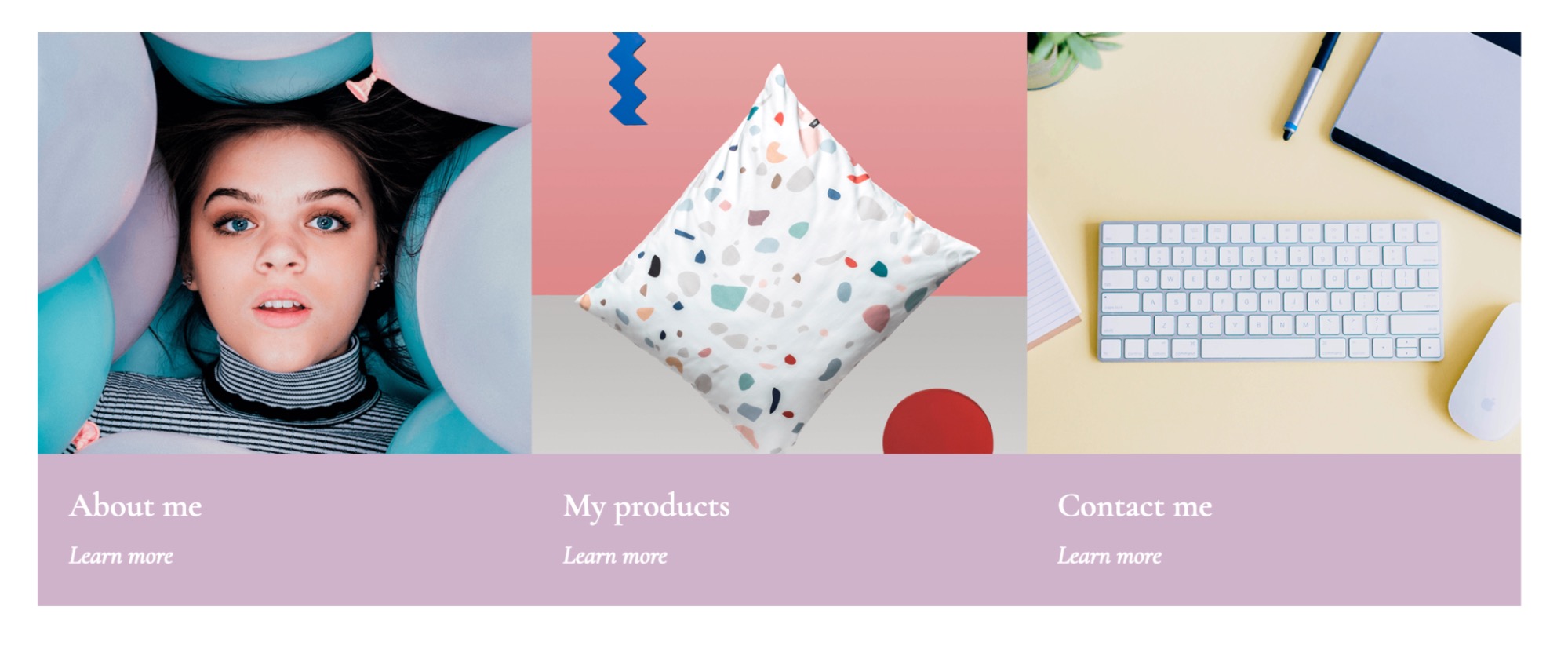
You can use padding to easily adjust breathing room around content within an element, such as a button or information card. Here’s an example using the Mariela Retail Website Template. This template comes with a beautiful intro section on the homepage that shows three “Intro Boxes.”

The “Intro Boxes” contain an image and an “Intro Text Box.” You could add more white space — or in this case, more Medium Thistle Hue space — around the text by increasing the “Intro Text Box” padding. Here’s what that looks like.

And because you’ve used the same class (Intro Text Box) for all three cards, you only need to adjust this once in Webflow and the change will be replicated across all three cards. You could also add some breathing room around the images by adding padding to the image box. Here’s what that looks like.

Finally, you could add breathing room within the “Intro Text Boxes” evenly by selecting the whole box, holding down the shift key and dragging the padding control in Webflow.
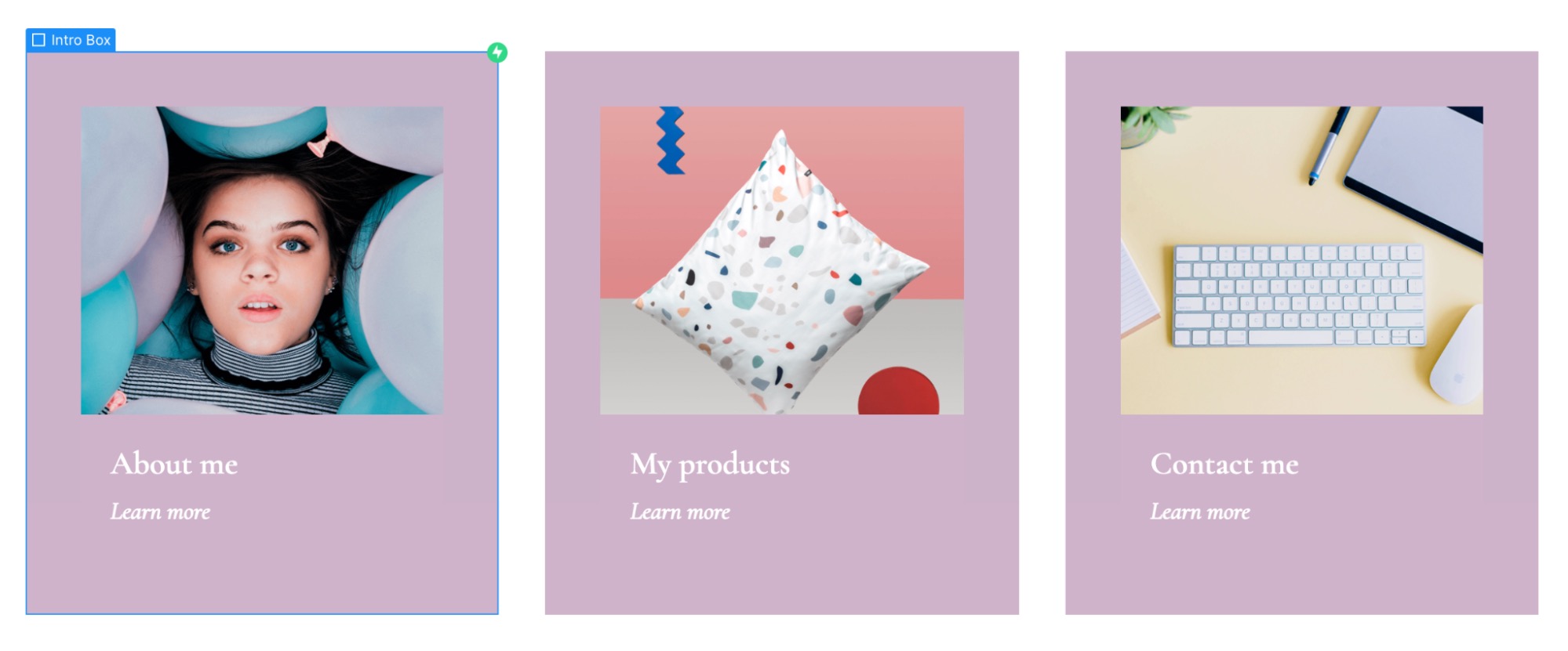
As you can see, adding padding to different elements creates space directly around content inside of a box.


Get our 100 video course on web design — for free
From the fundamentals to advanced topics — learn how to build sites in Webflow and become the designer you always wanted to be.
Adjust the overall size of an element
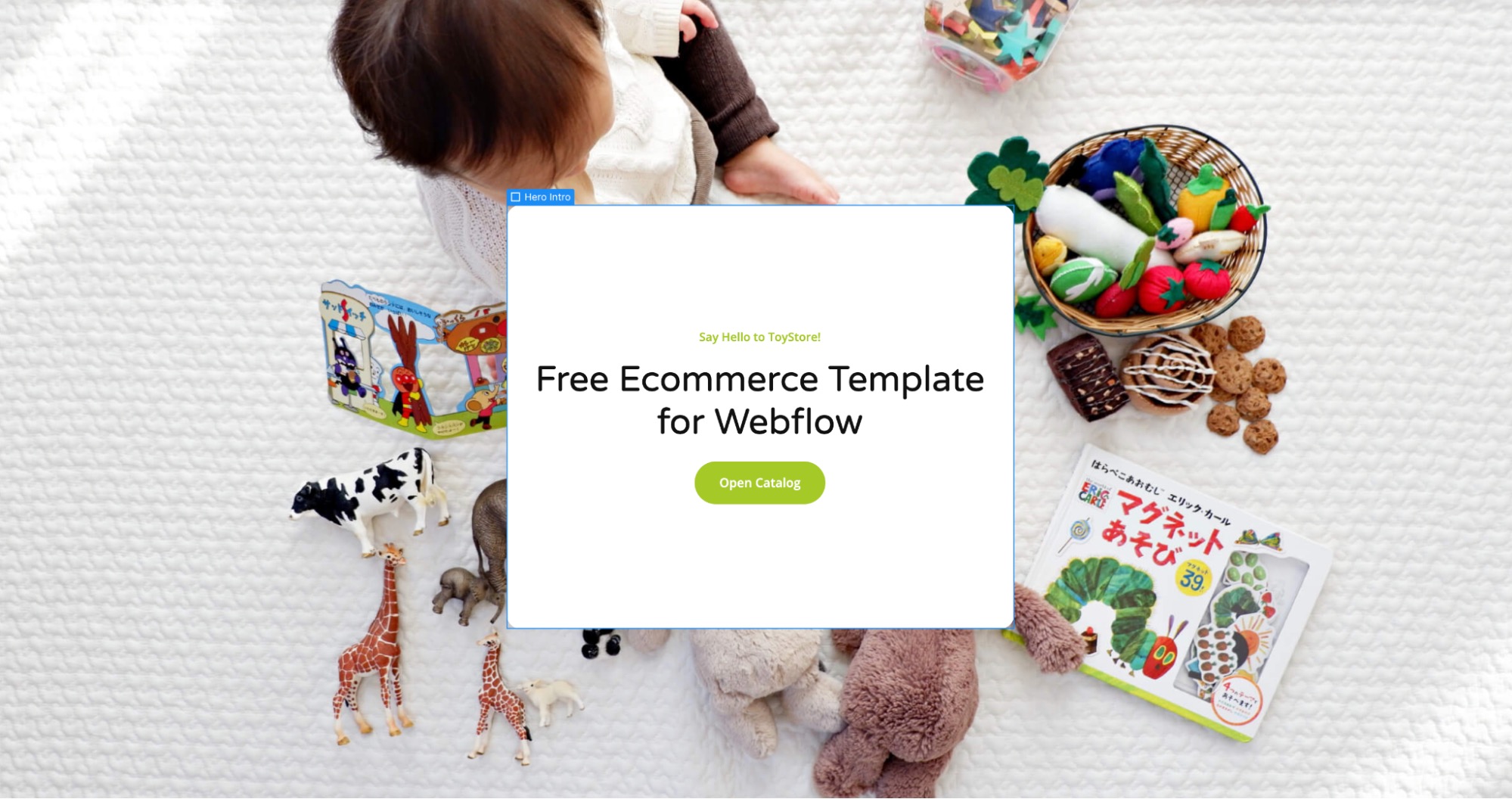
You can also use padding to adjust the size of elements. Here’s an example using the Toystore Retail Website Template. This template has a “Hero Intro'' div block at the top with a white background color.
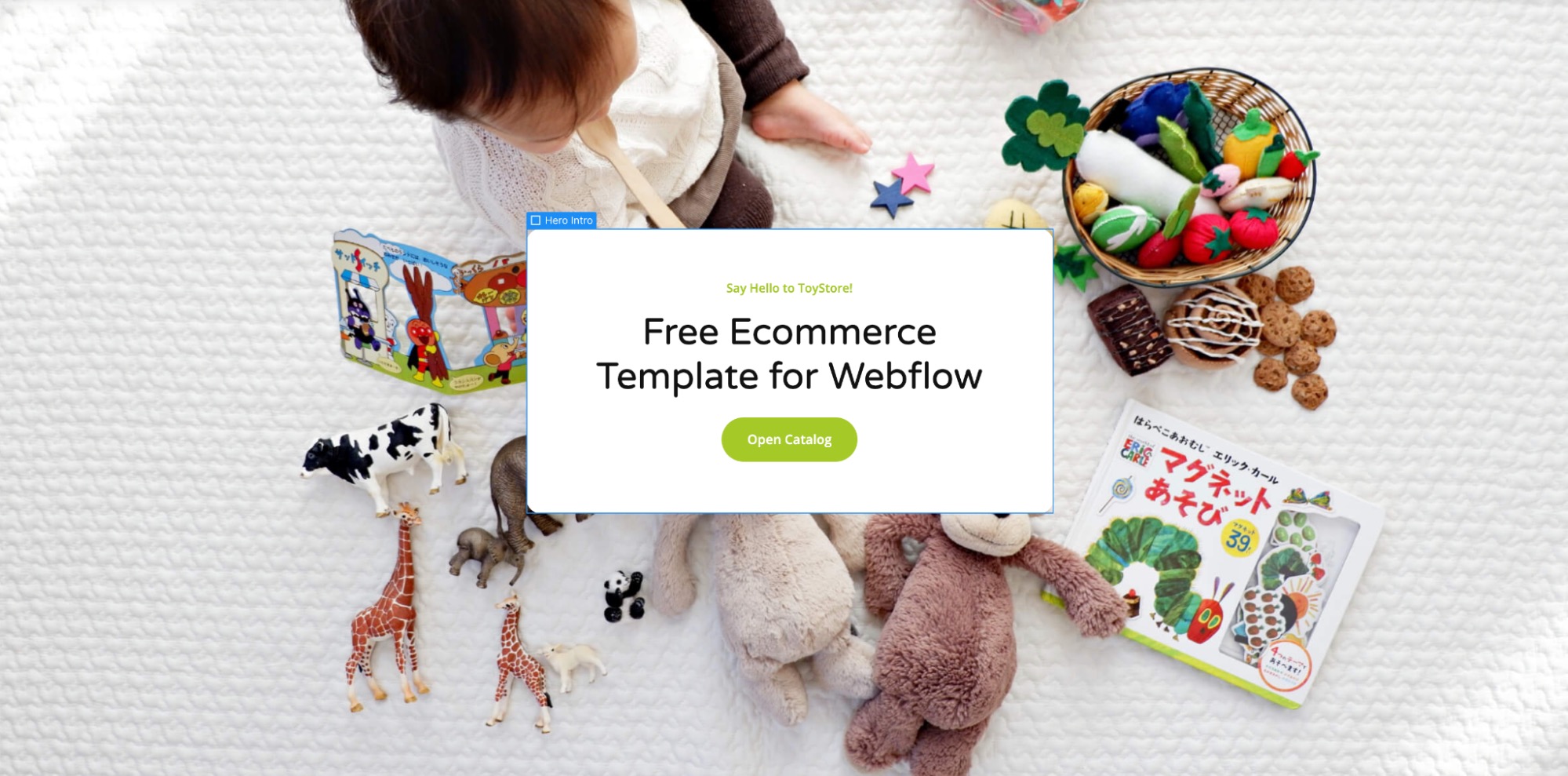
You can make the white box smaller by decreasing the padding (which comes preset to 24 pixels). Below you can see what it looks like if you change the padding to 5 pixels on all sides.

Or, you can make the box bigger by increasing the padding. Below you can see what happens when you increase the padding to 100 pixels on all sides.

If you prefer a more asymmetric look, you can also use padding to add whitespace to just one or two sides. Here’s what happens when you set padding-top and padding-bottom to 140 pixels but leave padding-left and padding-right at 24 pixels.
You wind up with more whitespace on the top and bottom of your box but less on the sides.
Now that you've explored how padding can reshape an element, let's see how margin plays a distinct role in positioning and spacing.
When to use CSS margin
You can use CSS margin to:
- center boxes
- adjust breathing room surrounding boxes
- overlap elements
Let’s take a look at some examples.
Center elements on a web page
To horizontally center items on a page using margin, you just set margin-right and margin-left to Auto. You can see examples of this technique all over the web but here’s an example you can play with in Webflow. Open up the Method Brand Website Template and click on the Hero Container at the top.

You’ll notice that the right and left margins are set to Auto.
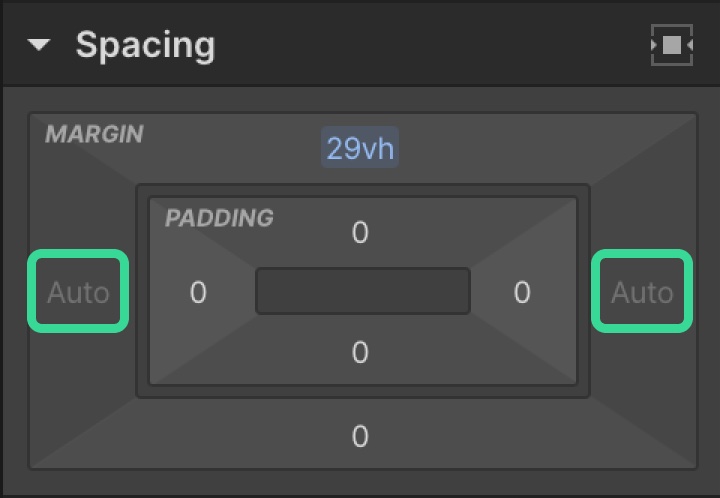
This is how Container boxes work in Webflow, too. When you add a new Container to a project on the canvas the right and left margins are preset to Auto to center the Container.
Adjust breathing room outside of boxes
To demonstrate how you can use margin to adjust the breathing room or whitespace outside of boxes, let’s refer back to the Mariela Retail Website Template. Once again, here’s what the “Intro Boxes” look like when you first open up the template in Webflow.
The “Intro Boxes” come preset with a 3% margin-right on the first two boxes from left to right. Here’s what it looks like if you set all of the margin values to zero.
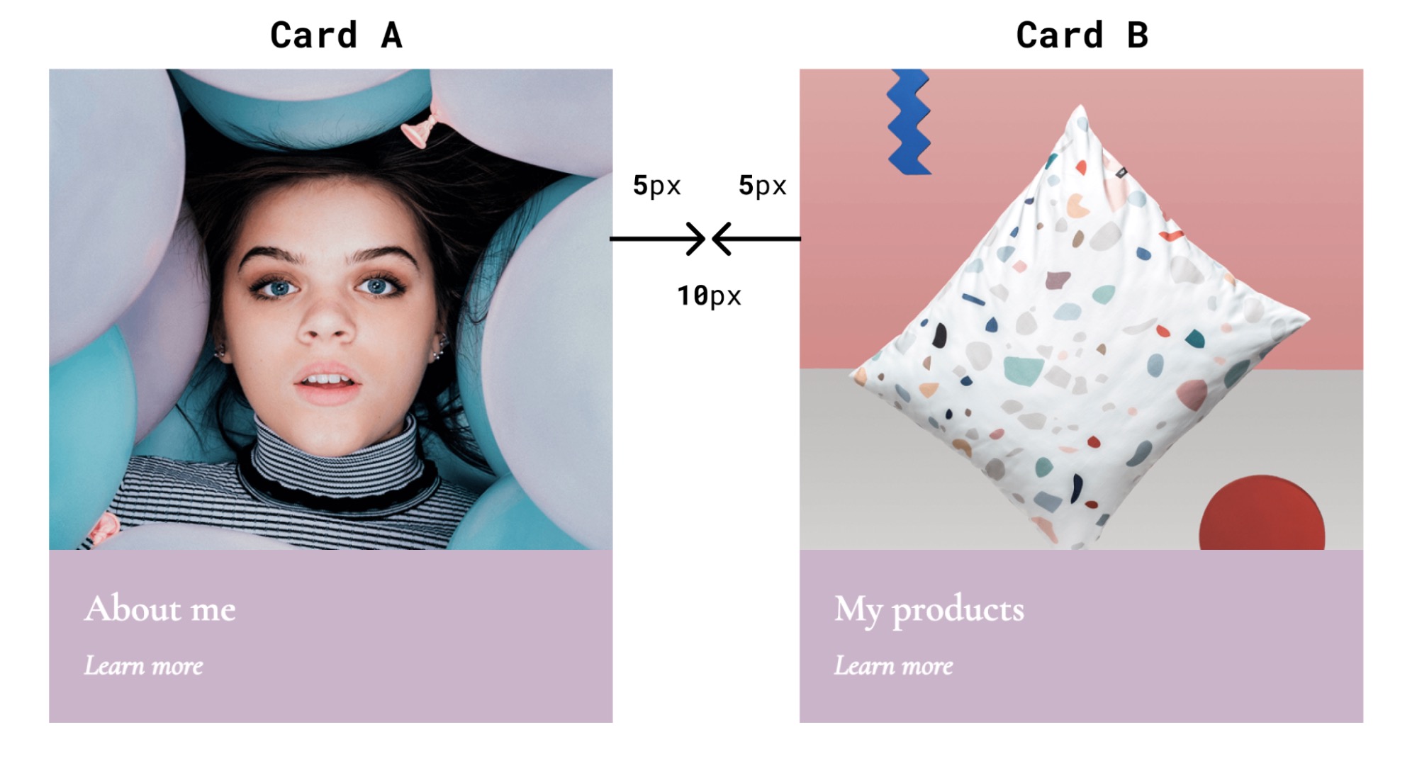
You can add margins to one side of a box, or as many as you’d like. But there’s one thing to be mindful of when playing with margins — margin collapse.
In many cases, if you have two adjacent items, the margins of each item will be added together and the displayed margin will be the sum of the two numbers.
So, if card A has a margin-right set to 5 pixels and card B (positioned on the right side of card A) has a margin-left set to 5 pixels the whitespace between the cards will be 10 pixels.
But in certain cases, particularly when two elements are stacked on top of one another, the larger margin will be honored and the smaller margin will be collapsed, or treated as though it were set to zero. You can see an example of margin collapse in the text boxes above the “Intro Boxes” in the Mariela Retail Website Template. If you click on each box in Webflow you can see that the margin-bottom for the “Mini Title” is set to 10 pixels and the margin-top is set to zero pixels for the “Intro Paragraph.”
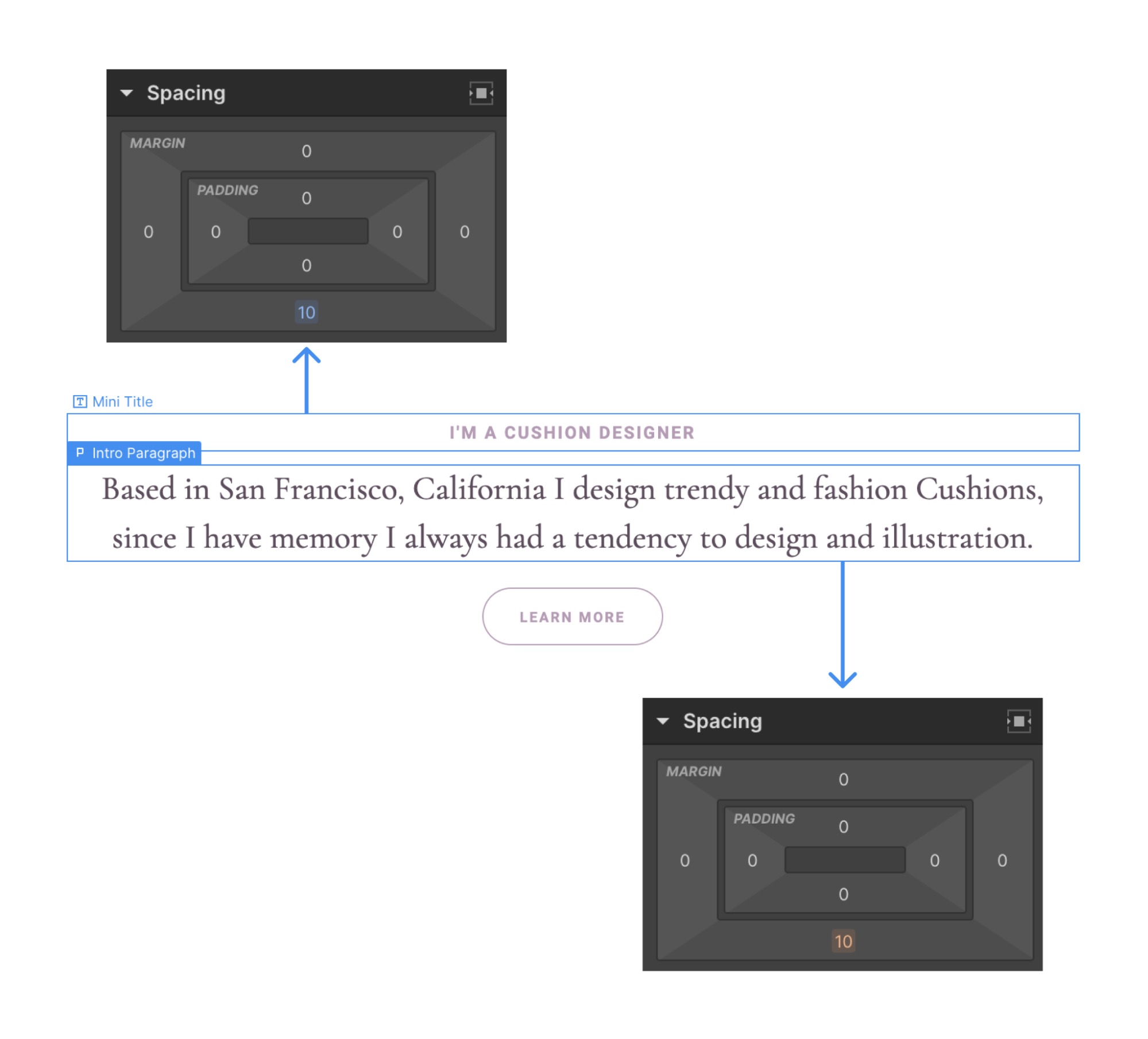
And if you add anything fewer than 11 pixels to the top margin of the “Intro Paragraph,” nothing happens. This is because the smaller margin is being collapsed.
Using margins for overlapping elements
One of the cool things about margins is that you can use them to overlap boxes or elements on a web page. Here’s an example from the Donerun Mobile Website Template . The iPhone image overlaps with the solid brown band, which gives it depth and makes it look like it’s sitting on top of the rest of the page.
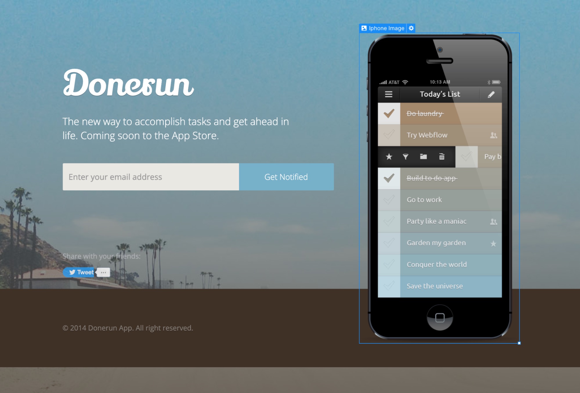
This effect was achieved using negative margins on the top and bottom of the image. For comparison, here’s what happens when you set the iPhone image margins to zero on all sides.

The iPhone no longer overlaps with the colored strip at the bottom of the page and it now appears parallel with the header to the left of the image.
Negative margins can shift elements upward or sideways, allowing creative layouts. However, use them carefully to avoid unintended overlap.
When not to use margin or padding
Margin and padding properties are awesome for creating breathing room or space in your design. But they aren’t the only controls available to you. And sometimes, neither one is your best bet. If you’re not already familiar with CSS position controls and Flexbox, check out some of the lessons on those topics in Webflow University. If the layout is still tricky, explore advanced positioning methods like Flexbox or CSS Grid to keep your design clean and user-friendly.
Get started for free
Create custom, scalable websites — without writing code. Start building in Webflow.