Even for those who are experienced in design and imagery, vibrance vs saturation can be confusing.
Ready to see your photos in a whole new way? Let’s explore how vibrance and saturation can change your final look.
In most photo editing software — from Photoshop and Lightroom to smartphone apps — saturation affects every color, while vibrance selectively boosts less intense hues.
When you move the saturation slider, every color in the photograph becomes more or less intense. Even a subtle boost can have a strong visual effect, so try previewing each step to avoid unnatural results.
On the other hand, vibrance refers to a type of saturation in Photoshop or other photo editing software like Adobe Lightroom or the image editing tools built into smartphones. When vibrance is intensified, the colors that are duller are saturated at a higher intensity than colors in the image that are naturally more saturated to begin with.
Given their similarities, it might be difficult to know which one to use when editing images. Let’s take a closer look at each and unpack which should be used in different use cases.
Key Insights
- Saturation boosts all colors evenly, often leading to intense, sometimes unnatural results.
- Vibrance selectively enhances muted colors and protects skin tones, making it ideal for portraits and natural edits.
- Use saturation for bold, uniform impact, and vibrance for subtle, balanced enhancements.
What is saturation?
Saturation refers to the intensities of all of the colors in an image. When you’re using the saturation slider in photo editing software like Photoshop, you’re making adjustments that touch every pixel of the image.
For example, let’s take this photo of some members of our community at Webflow Conf.

As saturation increases, all of the colors become more intense, as shown below.
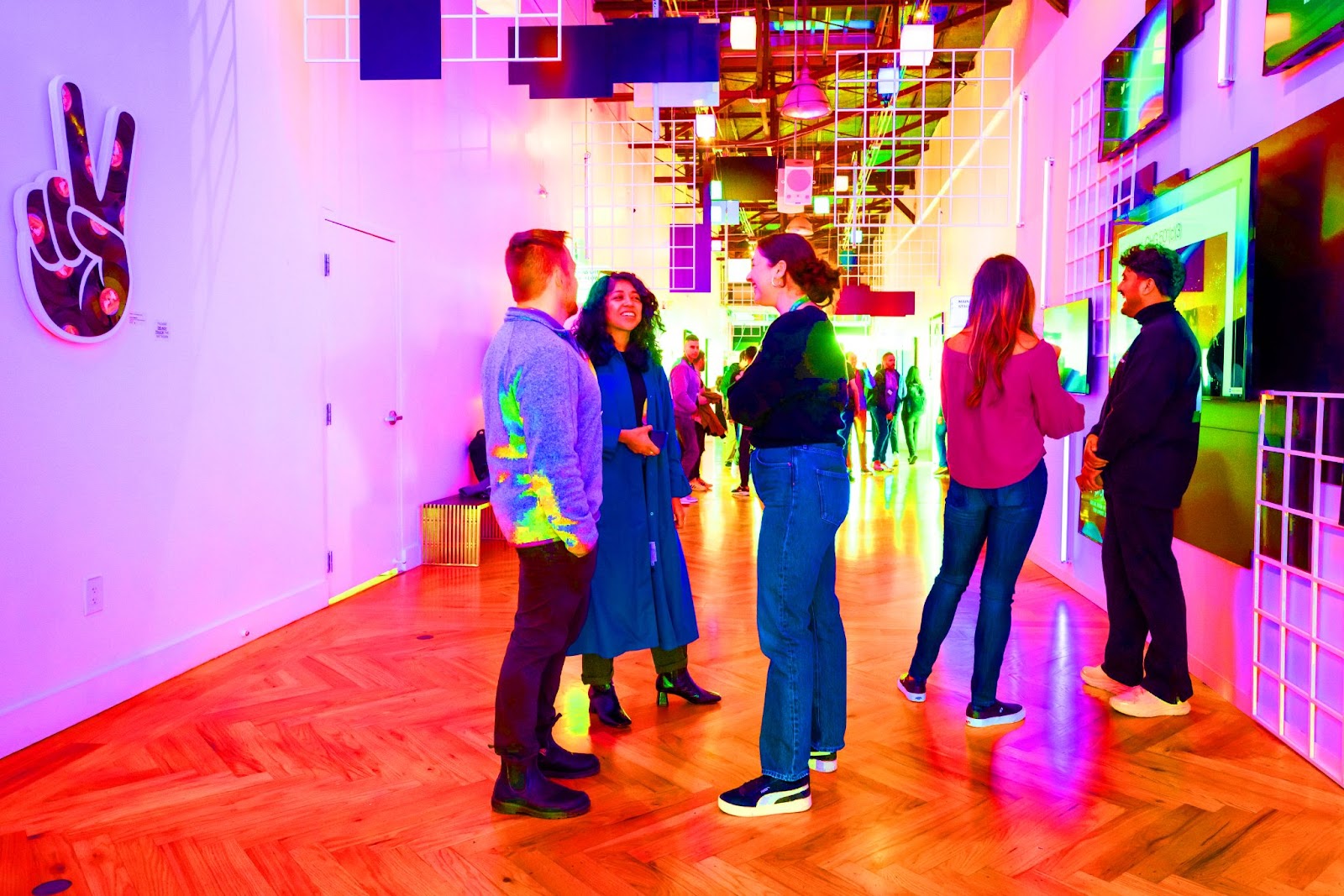
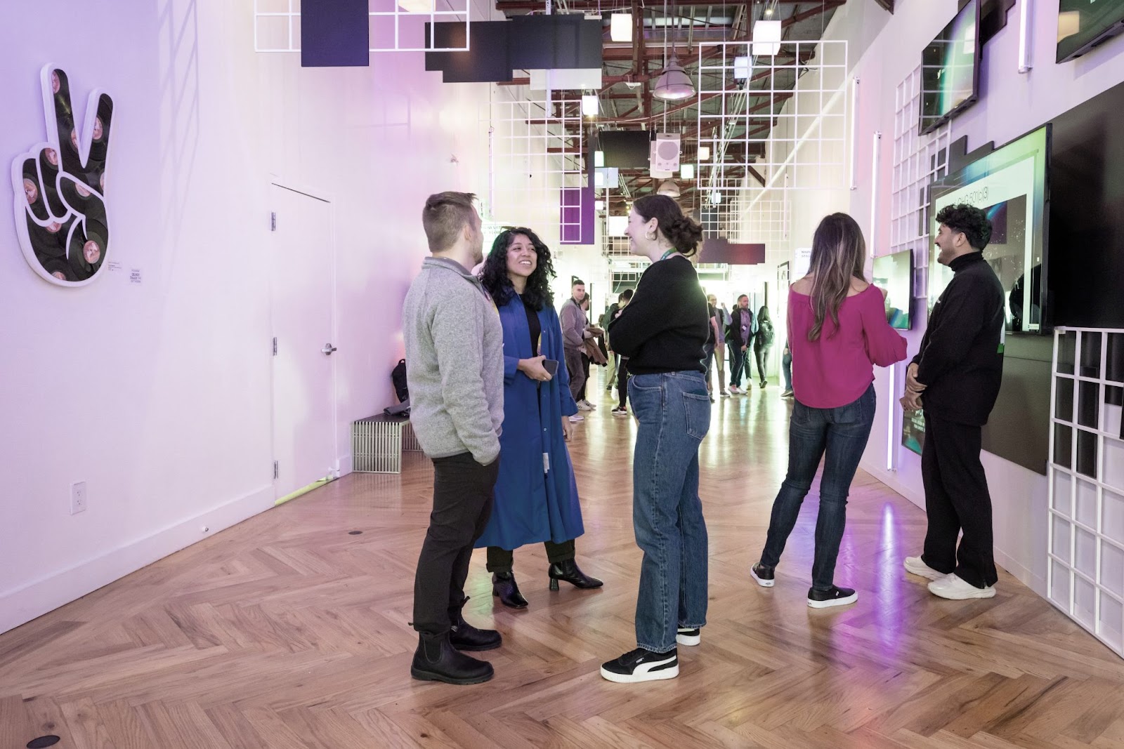
On the other hand, if we were to turn down the saturation of this photo, all the colors would appear dull.
Because it makes overall adjustments to the intensities of every color, even small changes in saturation can dramatically change an image. It’s important to be mindful of how you want the picture to appear — and make your adjustments based on the image look you’re going for.
Oversaturation makes images appear unnatural and fake, whereas undersaturated colors can make photos appear dull and lifeless. Pushing saturation too far can hide the finer details of the original image.


Ultimate web design
From 101 to advanced, learn how to build sites in Webflow with over 100 lessons — including the basics of HTML and CSS.
What is vibrance?
Vibrance takes it a step further. It’s a type of saturation adjustment that lets you laser focus on the muted colors in a picture.
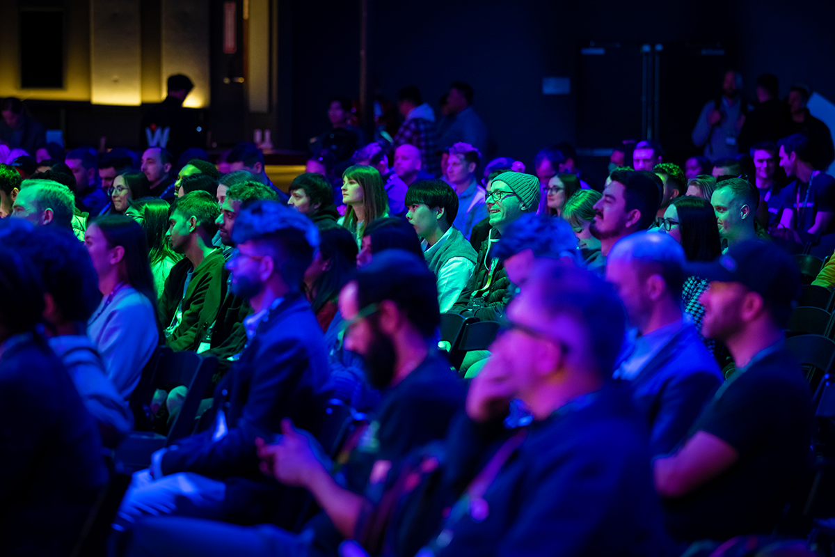
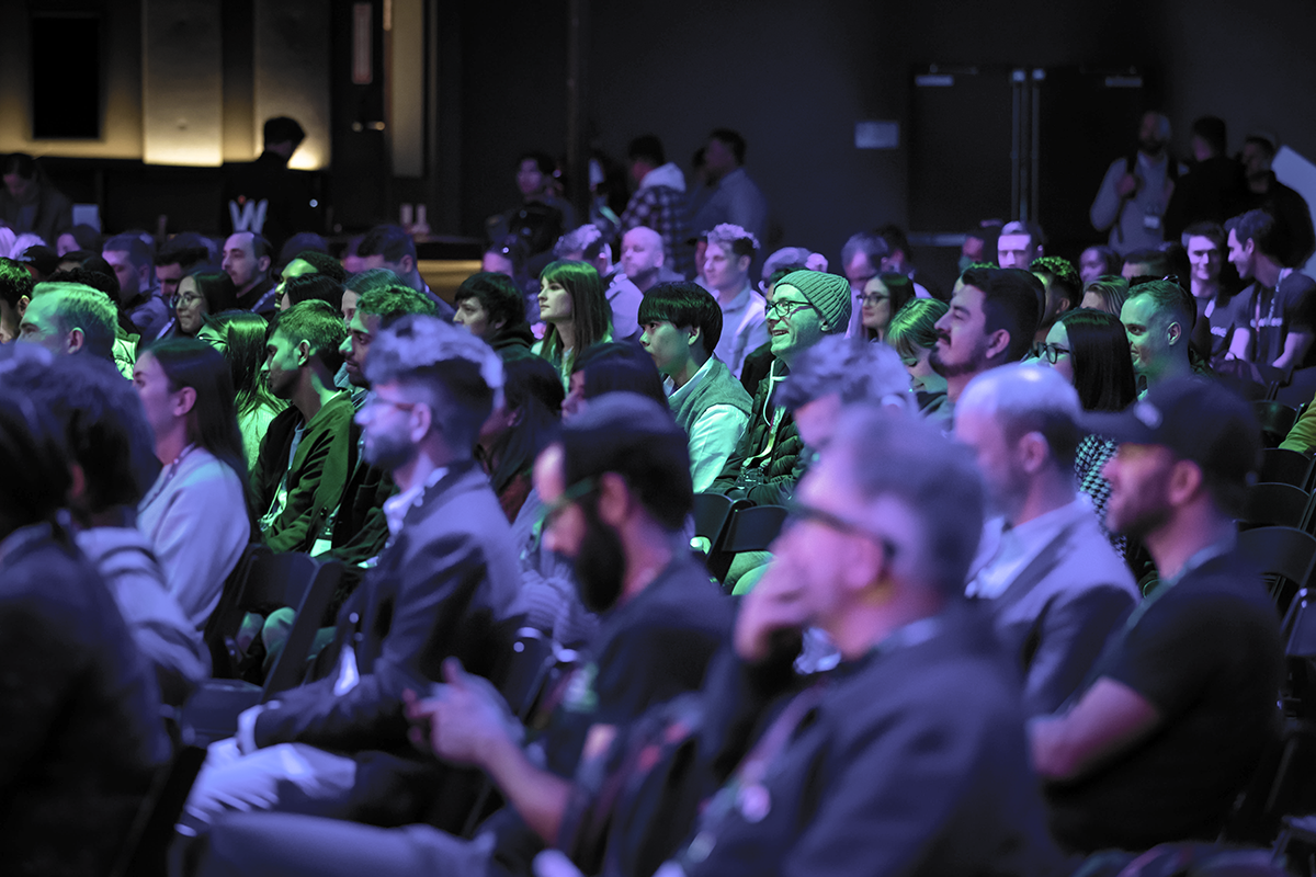
Take for example, this crowd shot from a past Webflow Conf in which green stands out as the most vibrant color. In the context of the photo, blue and purple are the more muted colors.
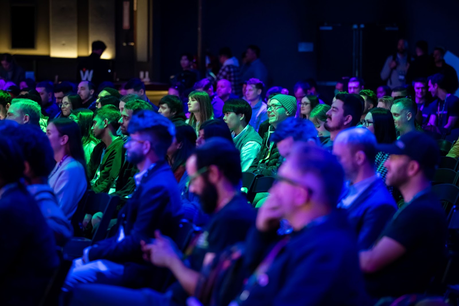
With vibrance, you’ll be able to adjust the saturation of the more muted tones like in the blues and purples in the photo.
When we bump up the vibrance in the photo, you’ll see that the green remains the same, whereas the blues and purples become more saturated, as shown below.
Likewise, if we decrease the vibrance in the photo, the green remains the same and the blues and purples become more muted, as shown below.
Saturation vs vibrance: deciding which to adjust first
Determining whether you should adjust saturation or vibrance can be tricky. Both saturation and vibrance can be used to alter the intensities of colors in a photo or image, with vibrance being more specific and saturation affecting all pixels in a picture.
According to Adobe, the best way to use saturation is when you want to make an entire image less dull and want all of the colors to “pop.”
On the other hand, vibrance has a gentler touch. It works especially well for editing photos that have people in them, making it possible to make color adjustments to skin tones, without changing the rest of the colors in an image.One reason vibrance is popular with portraits: it avoids over-tinting skin tones.
Color editing tips for balanced results
When you’re refining color in images, small slider moves can mean big changes. You can make creative decisions to find the right balance for each project.
- Use smaller increments for more control
- Watch people’s faces to avoid unnatural skin tones
- Test different monitors to catch color inconsistencies
- Pair with contrast adjustments for a well-rounded look
If you’ve fine-tuned your images with the right balance of vibrance and saturation, consider exploring other color essentials to take your designs further.
Bring more color to your designs
There are so many nuances to color and ways it can be used to enhance your web designs. If you’d like to learn more, find more resources on the Webflow Blog, including:
- Color theory for designers: a beginner's guide
- How color plays into generational marketing
- Color meanings: the psychology of using different colors
If you’re exploring color correction tips, remember how vibrance and saturation can shape the final look of your images.
Build websites that get results.
Build visually, publish instantly, and scale safely and quickly — without writing a line of code. All with Webflow's website experience platform.