

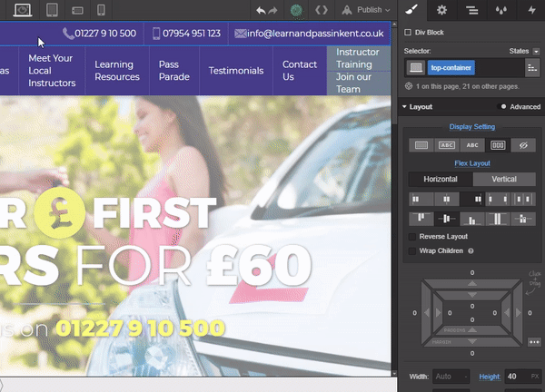
The web designer’s life is full of tiny design tweaks that can end up taking inordinate amounts of time. These 4 tiny but powerful classes — which we like to think of as “helper” classes — can simplify and speed up those changes, whether you’re clearing out default styles or simply reversing text colors.
Now, on to the classes:
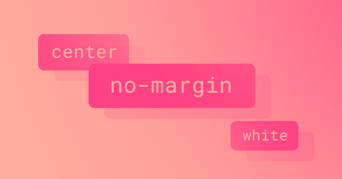
No margin
When you’ve carefully crafted your website’s living style guide, adding just the right amount of margin to your headlines and indents to your paragraphs, the last thing you want to do is start adding a million different combo-classes to your elements.
This will not only bloat your CSS, increasing load times, but also make global changes much harder to pull off down the road.
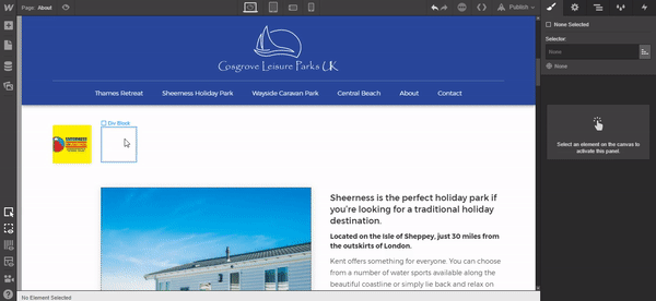
No margin in use
Let’s say you need to add an H3 and and an H5 next to a logo for a case study page. Given the design shown below, you want them to stack tightly, line up with the logo to maintain the compositional balance.
The solution? Add a class called “No Margin” where we’ll set the margin on all sides to 0px.
And the value of this little class isn’t limited to headings. In fact, you can use it anytime you need to remove the margins from any element.
Taking no margin further
To take this “no margin” concept even further, you can create classes to remove margins from just one side, two opposing sides, etc. I often add “No Margin Bottom,” “No Margin Top,” and “No Margin Left” to projects to do just that.
Center
Generally speaking, if your language runs left to right, it’s best to set your text content flush left, rag right (like this blog). Especially for longer passages.
That said, you’ll definitely find yourself wanting or needing to center text every now and again.
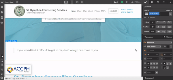
Taking the below for example, we have a hero section followed by a quote section. The block quote element is flush left, rag right by default, but I want this quote block to be centered. As I don’t want to add a brand-new unique class to the already styled quote block, we can set up a global helper class of “Center.”
It’s as simple as adding a new combo-class of “Center,” then setting the text align to center. Easy, right?
Center in use
Taking center further
You can easily take this concept further with a variety of typographic styles.
Say you only title case the top headline on your pages, leaving the rest in sentence case. Create a “Title Case” helper class and bam — you don’t have to touch your type hierarchy. Or maybe your editors like the classic tongue-in-cheek strikethrough style? Same idea: just create a helper class of “Strikethrough,” and you’ll be crossing words out in no time.


Design interactions and animations without code
Build complex interactions and animations without even looking at code.
White
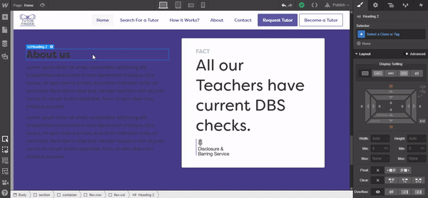
Few websites stick to a single text color across the site. For example, you might use #666 for body text, but some of your headlines are overlaid on background images. Or you may use colored call-out boxes for CTAs and blockquotes.
In those moments, you’ll likely need to “reverse” text — i.e., make it white (or another high-contrast color) to stand out against a dark background.
This is where a helper class of “White” comes in, set up a combo-class called “White” and simply change the textcolor to #ffffff, this can then be used over and over throughout your site without ever affecting any of your carefully styled text elements, it’ll only ever change the font color.
The "white" class in use
Margin right
So by now, you’re probably getting a feel for how you can use Helper Classes in your workflow. But before we go, here’s one more I use regularly.
When working with icons, I add a global class of “Icon” and change the width. Typically, because the structure of a page defines its position in relation to other elements, changing the width is enough. But sometimes I place an icon in a flexbox layout, so it sits inline with a text element — this eliminates the space between the two and doesn’t look great. To fix this, I add a helper of “Margin Right” with a width of 5px.
And now you can use this Helper Class throughout the site on many elements without messing with additional styles.
Margin right in use
Extending the margin right idea
I often set up a few different helper classes around this idea of margins.
For example, 5 pixels might not always be enough, so I’ll create a “Margin Right 20,” with a right margin of 20 pixels (surprisingly enough!). You can expand this idea in all directions and any value. The key is being able to reuse a class over and over on many elements.
Do you use helper classes?
This concept is very extensible and the above offers just a few of the most common helpers I use throughout my builds. I hope this article helps streamline your workflow. And if you’ve stumbled on this idea yourself, let us know which you find most useful in the comments!

