


Whether it's criss crossing streets of the suburban landscape, or the layout of a newspaper, grids bring order and organization. They also allow designers to group elements in a website layout. Flexbox and CSS grid layouts are both useful in corralling content and graphics, but they work in very different ways. We're going to take a look at what makes these layout methods different, how you can apply them in your own web designs, and how to use them together.
Getting started with flexbox

Before the development of flexbox, there was darkness. Designers wrestled with CSS floats in their efforts to create grid layouts, with no guarantees they’d work on different screen sizes. Then, out of this darkness came flexbox, a beam of light allowing designers to create grid-like dimensional layouts and help further the evolution of responsive design.
Flexbox was developed to make it easier to align content using one-dimensional layouts, either vertically or horizontally. Elements in a flexbox layout can have their height or width set to accommodate different screen sizes.
A flexbox layout consists of two elements:
- The flex container (or flex parent): This is the top-level or parent element. Think of it like a big box that houses a bunch of smaller one.
- The flex children: These are the contents of the flex container — the little boxes in the big box.
Webflow makes it easy to set the styles for both the flex container and the flex children. Let’s take a look at the flex layout UI:

Once you’ve created a container in Webflow and nested div blocks inside, you can then set its display property to flexbox, which transforms these div blocks into flex children. The flex layout settings control how the children display. After selecting either horizontal or vertical, you can then align and justify the flex children, controlling how they’re distributed within their parent container.
Alignment: This places elements on the cross axis (i.e., the opposite direction you set for the parent). If the main axis is horizontal, then the cross axis will be vertical and vice versa.
Justification: This is the alignment of the content on the main axis (i.e., the direction you set for the parent).

Here, the flex container is set to horizontal, with alignment set to stretch vertically, and justification set to start at the container’s origin.
The easiest way to understand how this styling works in Webflow is to try out our Flexbox game tutorial. It’s super helpful to go through the tutorial a couple times to get a feel for how these different controls work. We’re going to take a look at a couple examples from it and — spoiler alert — give you some of the answers.
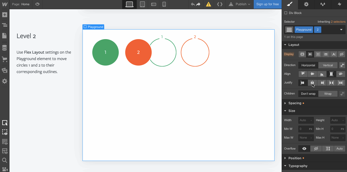
Okay, let’s have a quick look at how we can align vertically arranged elements. This is from Level 8 of the flexbox tutorial.
After the flex layout is set to vertical, we align the elements to the end (the button that looks like right justify), then justify the spacing so they’re evenly distributed. This places the colored circles all the way to the right, and spreads them evenly across the vertical space.

Flexbox’s nature is right there in its name: it's flexible. Its strength is its elasticity, stretching or shrinking depending on the available space. Another important part of this adaptability is the option to wrap flex children. If there’s not enough space to accomodate all of a container’s children, flexbox can push some children to the next line.
Here’s another example from our tutorial showing how wrapping affects flex children. Without selecting this option, there are way too many elements on a single line — wrapping the children gives them more space and helps unclutter your layout.

Flexbox works best for simple layouts, or smaller features like a top navigation bar. If you want to create a split-screen, a sidebar, or a hero cover, flexbox offers a quick solution. Learn about other flexbox applications in our Intro to flexbox.
For more advanced grids, where you need control on both the vertical and horizontal axis, CSS grid gives you the power you crave.


Learn flexbox the fun way...
Master the basics of flexbox in 28 increasingly challenging — and fun!— levels, without writing a line of code.
CSS grid fundamentals

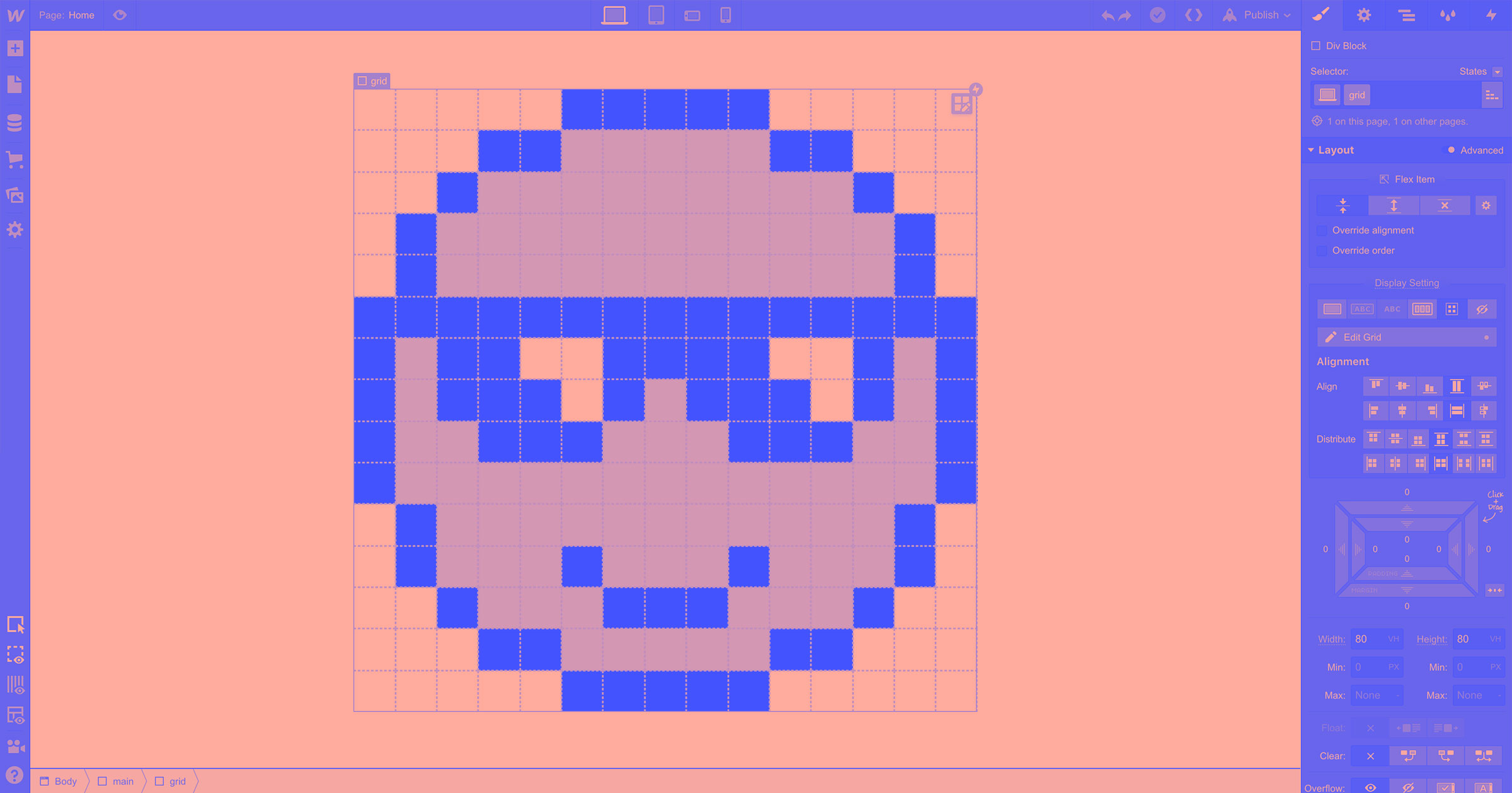
CSS grid gives you control over grid-template columns and rows, letting you create “pixels” like this retro smiley face.
CSS grid allows for more complex layouts than flexbox, because it organizes content on both the horizontal and vertical axes — columns and rows. This smiling emoji wouldn’t be possible in flexbox. The pixels, or blocks, have a set position in two dimensions. There’s no wrapping of elements like we see with a flexbox.
CSS grid layout settings look a lot like flexbox at first glance. It allows you to change the alignment, the distribution of the blocks, and how they’re displayed.

CSS grid works best for more complicated layouts. Think of CSS grid as a way to anchor multiple elements onto a page. Grid is practical for layouts that have multiple blocks of content and images that you need to organize. Flexbox isn’t as useful for these more involved layouts, because it only lets you control how the elements are arranged in a single direction.
Of course CSS grid and flexbox can work together in a layout. You can use flexbox inside CSS grid and vice versa.
For instance, you could use flexbox to center an element like a button both vertically and horizontally within a particular grid cell (since centering with other CSS methods is … tricky).
And you could also flip this scenario, using grid to control the placement of data within cards whose layout is determined, at a higher level, by flexbox. This can be really handy for combining the flexibility of flexbox with the precision of grid for cards that contain a wealth of data, such as you might need for real estate listings.
You can learn much more about using flexbox and grid together in this video:
Note: although the UI has changed for these layout modules, the underlying concepts remain unchanged.
To learn more about grid, check out our CSS grid page — it features 6 free, cloneable grid layouts so you can make your own!
CSS grid and flexbox: 2 different ways of organizing content
Flexbox and CSS grid might feel clunky when you first start out as a designer. The best thing to do is to start designing. A little experimentation and some problem solving will help you master both.
And if you get stuck, the Webflow community is here to help.