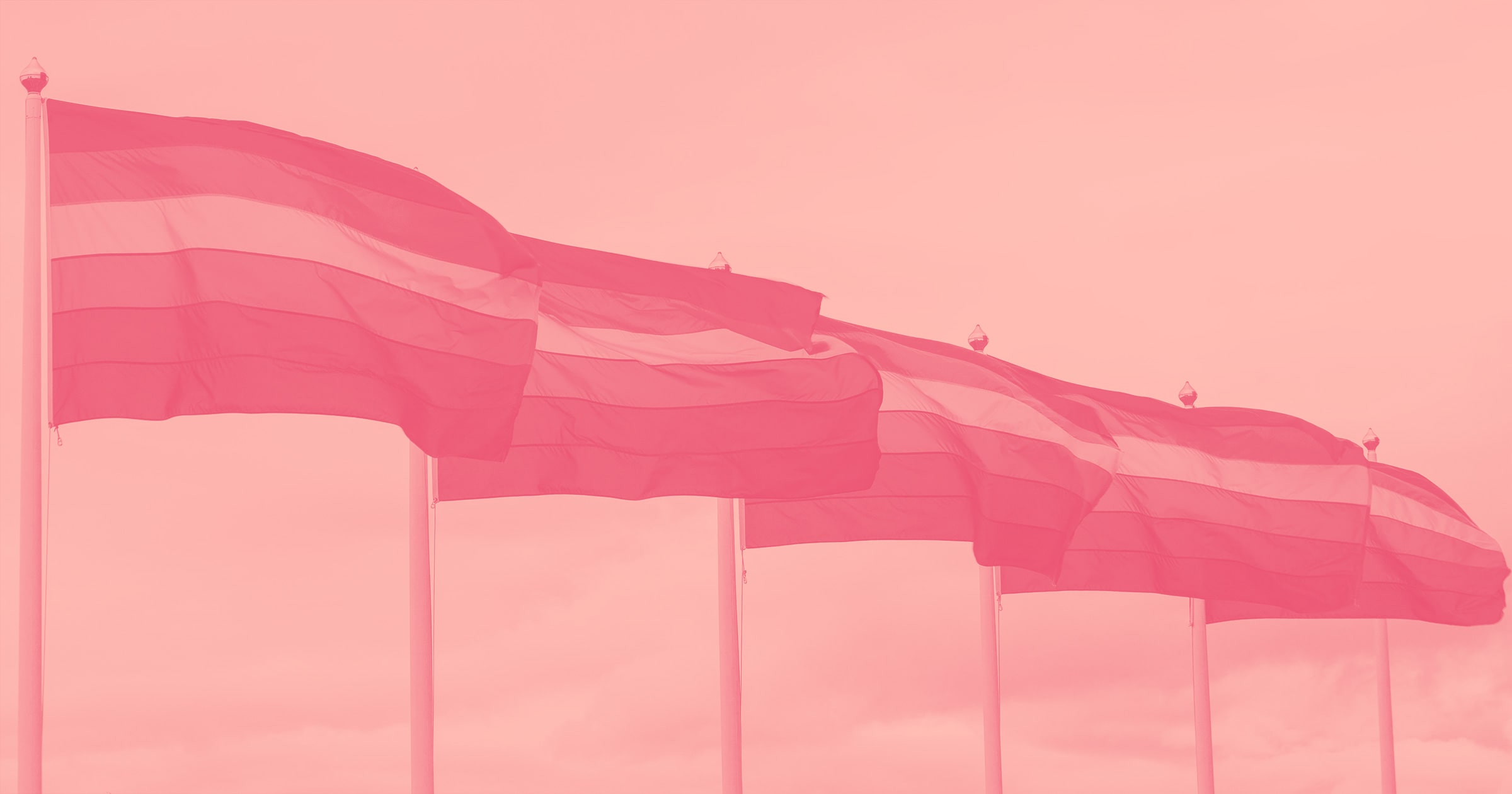
For Pride month, we wanted to deep dive into the history of the Pride flag — an iconic design that has represented freedom and power for more than 40 years.
As we look toward the future — and as the definition of Pride continues to grow far beyond the binary — we wanted to explore the Pride flag’s evolution and the key ways that everyone can ensure inclusivity in design.
Origins of the Pride flag

Gilbert Baker, a gay man and drag queen from San Francisco, created the first iteration of the Pride flag in 1978. Kansas-born, Gilbert was an army medic that went to San Francisco on assignment and remained there after his service ended in 1972.
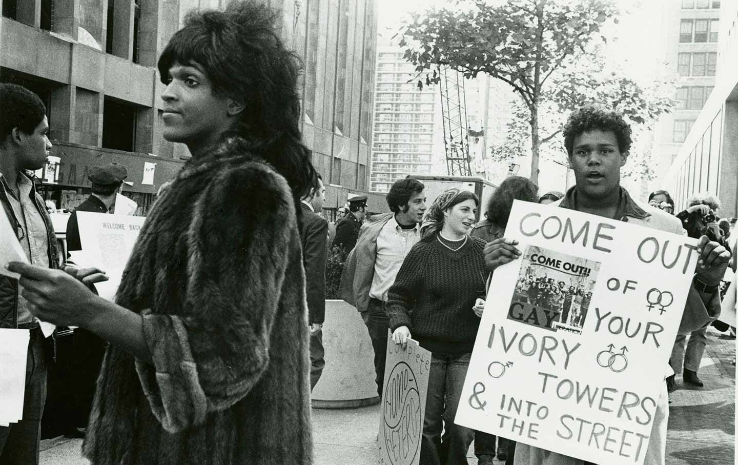
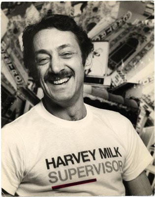
As the gay rights movement gained steam, civil rights leader Harvey Milk asked Gilbert to create a symbol of the movement.
In the attic of the San Francisco Gay Community Center, Gilbert and other volunteers carefully filled trash cans with rainbow-colored dye and created the first flags of the Pride movement. For the first prototype created in the attic that day, Gilbert and his volunteers landed on 8 different colors that each had a distinct meaning.
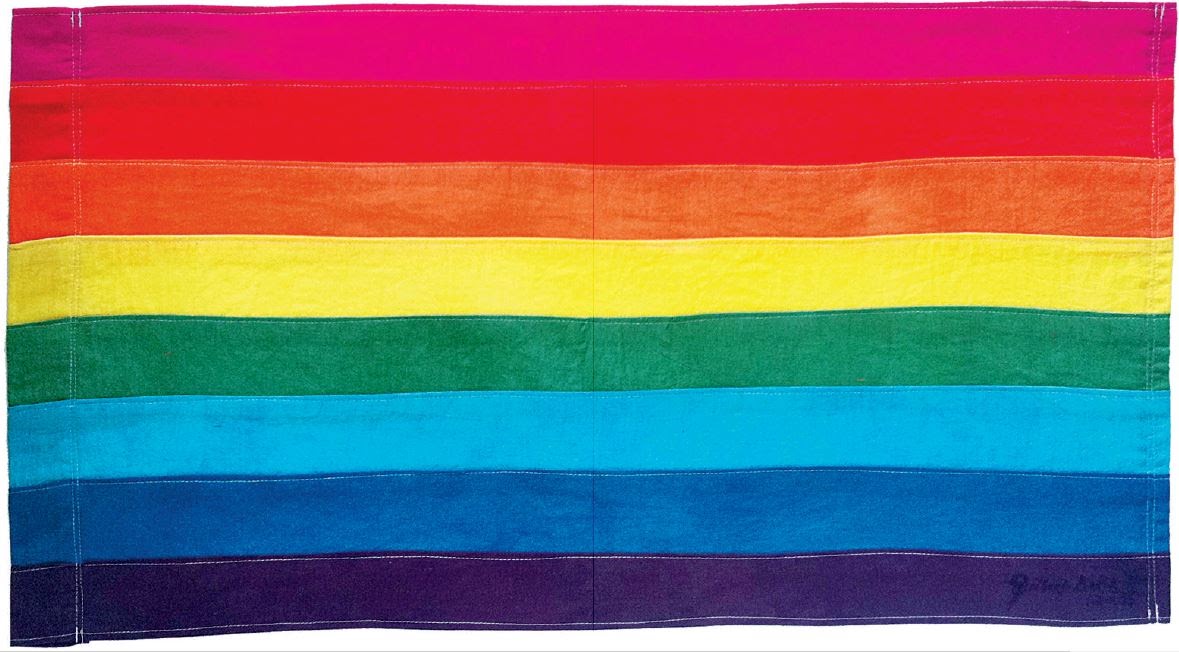
- Hot pink for sex
- Red for life
- Orange for healing
- Yellow for sunlight
- Green for nature
- Turquoise for art
- Indigo for harmony
- Violet for spirit
While the original design included eight colors, there were production issues with two of the colors and the final flag ended up having six.

- Red for life
- Orange for healing
- Yellow for sunlight
- Green for nature
- Blue for harmony
- Violet for spirit
“Our job as gay people was to come out, to be visible, to live in the truth, as I say, to get out of the lie,” Gilbert said in a later interview. “A flag really fit that mission, because that’s a way of proclaiming your visibility or saying, ‘This is who I am!’”
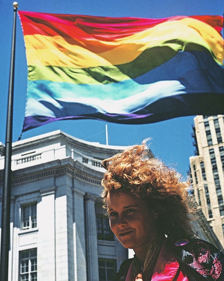
The Pride flag was not officially recognized until Gilbert created a mile-long version of it on the 25th anniversary of the Stonewall riots. From then on, the flag has been used as a symbol for Pride in both good and bad times for the LGBTQIA+ community.
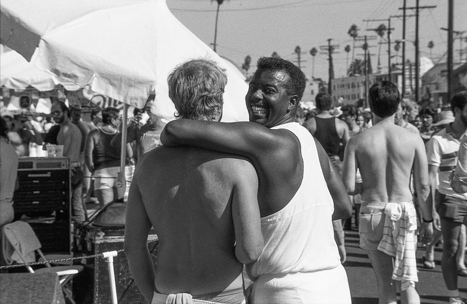
The Pride flag today
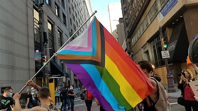
As time has gone on, the community has created variations of the Pride flag to be more inclusive — including a more modern iteration, created by Daniel Quasar in 2018, called the Progress Pride Flag.
In addition to the rainbow stripes of Gilbert’s original flag, the Progress Pride Flag includes black and brown stripes in a chevron shape to represent queer people of color, those we’ve lost to HIV/AIDS, and those currently living with AIDS. In that same chevron shape there are light blue, pink, and white stripes to represent the trans community.
According to Daniel, the chevron itself represents forward movement. This is meant to emphasize the parts of the community that need to be focused on the most in today’s world.
A newer version of the Progress Pride Flag, designed by Valentino Vecchietti, was announced in June 2021. It includes a yellow triangle and purple circle inside of the chevron shape to represent the intersex community.
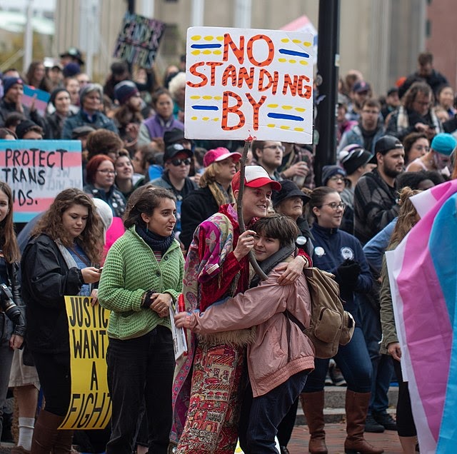
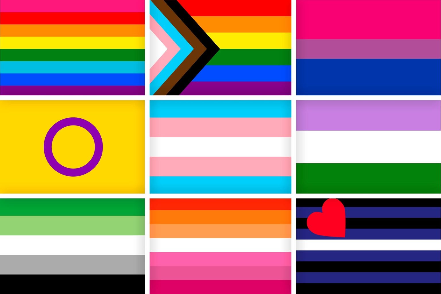
Along with the Progress Pride Flag, there are 22 different pride flags that specifically represent different identities in the LGBTQIA+ community. Some of these flags include:
The Bisexual Flag: Created by Michael Page in 1998, this flag includes:
- Pink to represent being gay or lesbian
- Blue to represent being straight
- Purple to represent a mix of the two — bisexuality
The Trans Flag: Created by Monica Helms in 1999, this flag includes:
- Light blue to represent the traditional color for baby boys
- Light pink to represent the traditional color for baby girls
- White in the middle to represent those who are transitioning, or have a neutral or fluid gender
The Lesbian Flag: Though there hasn’t been an officially accepted Lesbian pride flag, there have been many different iterations created and used by the community. These include:
- The Labrys Lesbian Flag created by Sean Campbell in 1999. The design features a labrys — a double-bitted axe that has been a symbol of lesbianism since the 1970s — set on an inverted black triangle (a symbol of lesbianism in Nazi concentration camps) and a purple background.
- The Lipstick Lesbian Flag created by This Lesbian Life in 2010. The flag, which features red, pink, and white — occasionally with a kiss mark in the upper left-hand corner — represents lesbian women with a more feminine gender expression.
- The Orange-Pink Lesbian Flag created by Emily Gwen in 2018 includes:
- Orange for independence
- Light Orange for community
- White for unique relationships to womanhood
- Pink for serenity and peace
- Dusty pink for love and sex
- Dark rose for femininity
The Intersex Flag: Created by Morgan Carpenter in 2013. The design features a purple circle on a yellow background which represents — in Morgan’s words — “unbroken and unornamented, symbolising wholeness and completeness, and our potentialities. We are still fighting for bodily autonomy and genital integrity, and this symbolizes the right to be who and how we want to be.”
This small list does not fully represent the breadth of Pride flags that currently exist, and new flags are always being created to represent and create a symbol of community and belonging for more and more people..


Join the global Webflow Community
Connect and build with 85,000+ community members around the world — whether you're new to Webflow or a seasoned designer, there's a place for you.
How to make your designs more inclusive for the queer community
Acceptance of the LGBTQIA+ community has come a long way since Gilbert Baker first envisioned the original Pride flag 42 years ago. Although significant hurdles have been crossed, including gay marriage being legal in the United States and other countries including Taiwan, Ecuador, and Switzerland, the LGBTQIA+ community still faces an uphill battle.
According to a 2020 study done by the Center for American Progress, more than 1 in 3 LGBTQIA+ Americans still faced harrasment or discrimination of some kind in the past year, including more than 3 in 5 transgender Americans.
As more and more people worldwide self-identify within the LGBTQIA+ community, making spaces more inclusive through design is more important than ever. Just like the more inclusive Progress Pride Flag of today, here are some ways you can ensure inclusivity and diversity in your design.
Center your user’s experiences in design
As you start the design process, be sure to recognize that your users may come from different backgrounds, lived experiences, and identities. This means that certain design elements and words may be harmful, inaccessible, or unsafe. This also means that showcasing heteronormative ideals and imagery can be unrelatable and othering.
You can avoid a discriminatory or othering experience in your design by:
- Including imagery or graphics of people from a diverse LGBTQIA+ background
- Understand that your LGBTQIA+ users may need different considerations than your straight, cis users. An example of this is a travel website that includes blog posts and landing pages about safe travel locations for LGBTQIA+ travelers.
- Allowing for people to list their pronouns in a form
- Making it easy for users to change their names and edit profiles. This helps users to create and edit profiles in ways that best represent them, and avoid traumatic experiences like deadnaming.
Avoid the gender binary
The gender binary — male or female — does not apply to millions of people in the world today. Regardless of what you’re designing, or who you’re designing for, many of your users will not identify within this binary. So, it’s imperative for all designers to include design elements that allow for representation of all people.
Use these tips to avoid designing within the gender binary:
- When indicating gender is necessary, allow for options beyond male and female. For example, on official forms such as drivers licenses, the State of California has a third gender option: non-binary.
- Avoid using stereotypical imagery to represent gender and sex, such as blue for male or pink for female.
- Avoid using gendered terms. For example, a website centered around parenthood should recognize that people beyond cis women can have children, parenthood can happen in many different ways, and all people can be parents. Instead of saying “mother,” for example, the website should use the gender-neutral term “parent.”
For an ever-evolving list of words to avoid, why to avoid them, and their alternatives, visit our inclusive language guidelines.
Always be learning
When creating and designing for other human beings, it’s important to always be learning about the diversity of people’s lived experiences. A key component of being a great designer is that your designs strive to be inclusive of everyone — not just certain people.
The only way to ensure inclusivity is to be aware, open, and accepting of feedback from your diverse audiences — and, most importantly, actually implementing inclusive practices in your design and content.


