

It’s easy to be fascinated by colors and textures.
These design elements demand attention; they’re intricate and exciting in the possibilities they offer. In comparison, lines might feel lacking or boring in their simplicity.
But how often do you stop to really consider lines? To study how they make you feel? To wonder how they affect your opinion of an image? This seemingly inconsequential element is foundational in art and design. Lines are the first stroke of the brush on a blank canvas, the primary ingredient of our visual perception.
Straight or curved, thick or thin—lines are everywhere, shaping the framework of our physical world.
So let us go back to the basics and explore the curious world of lines, the psychology behind them, and how they help some of the world’s most iconic brands tell their stories.
What are lines, and how are they used in design?
In geometry class, you probably learned that a line is a one-dimensional object that extends infinitely in both directions. While that’s technically correct, this bland definition does lines a disservice.
Lines are so much more than that. For starters, they’re building blocks and a versatile tool for visual communication. From structuring to conveying meaning, lines play diverse and equally important roles in design. For example:
- They establish separate sections within a design to add structure
- They create a path for visual movement by leading the eye from one point to another
- They form the outlines of shapes, contributing to overall form
- They convey mood and emotion, adding energy, rhythm, and dynamism
- They can create patterns (repeating lines) or textures (varied lines) to add depth and dimension

The psychology of lines
Lines can carry impressive psychological weight. Our brains process different types of lines in different ways, and derive specific meanings from that interpretation. Given this, lines can become storytellers that impart a brand’s unique identity, narrative, values, and mission.
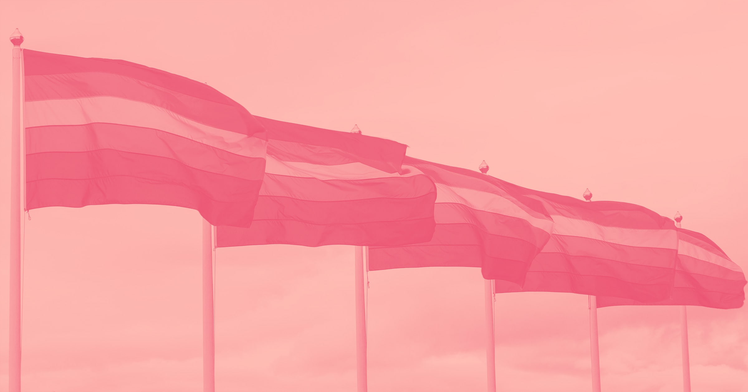
Horizontal lines, for instance, can communicate tranquility. Picture a calm landscape, with a flat horizon. The main emotion you feel is likely peace. For brands that want to project an image of stability and groundedness, horizontal lines are ideal, as they help the viewer feel secure and at ease—say, wellness companies, yoga studios, or mattress brands.

Vertical lines on the other hand elicit feelings of strength, prominence, and formality. Imagine an iconic building like the Empire State, an ancient oak tree standing tall, or a soldier at attention. Brands that want to transmit dignity and power to make viewers perceive them as reliable and professional often use vertical lines—think of banks or insurance companies, for example.

Diagonal lines are all about movement. Think about a shooting star crashing through the sky or a bird setting flight and how their movements communicate dynamism, energy, and action. Diagonal lines are perfect design elements for brands that want to come across as energetic and lively, such as fitness companies, travel agencies, or tech startups.
Curved lines convey feelings of softness, reminiscent of the human body and rolling hills, but they also communicate fluidity and continuity. They’re a common choice for brands who want to transmit a welcoming, familiar feel, like organic produce companies or ergonomic design brands.

While horizontal, vertical, diagonal, and curved are the basic forms, lines aren’t restricted to these directions. Think of zigzag lines and how they indicate action or even conflict, or wavy lines and their evocation of freedom and rhythm.
Variations like width, length, weight, texture, and style also affect the psychology of lines. Studies have shown that dashed lines convey vagueness or impermanence, thin lines express delicacy and elegance, while thick lines suggest boldness and dominance. A smooth line imparts sophistication whereas a jagged line more easily communicates edginess.
The beauty of design elements is that they don’t exist in a vacuum. This principle extends to the use of lines—they interact with each other, and with color, space, along with personal and societal associations. All of these elements come together to allow designers to manipulate the tone and feel of an image and influence how a brand is perceived by the public.
The role of lines in iconic brand stories
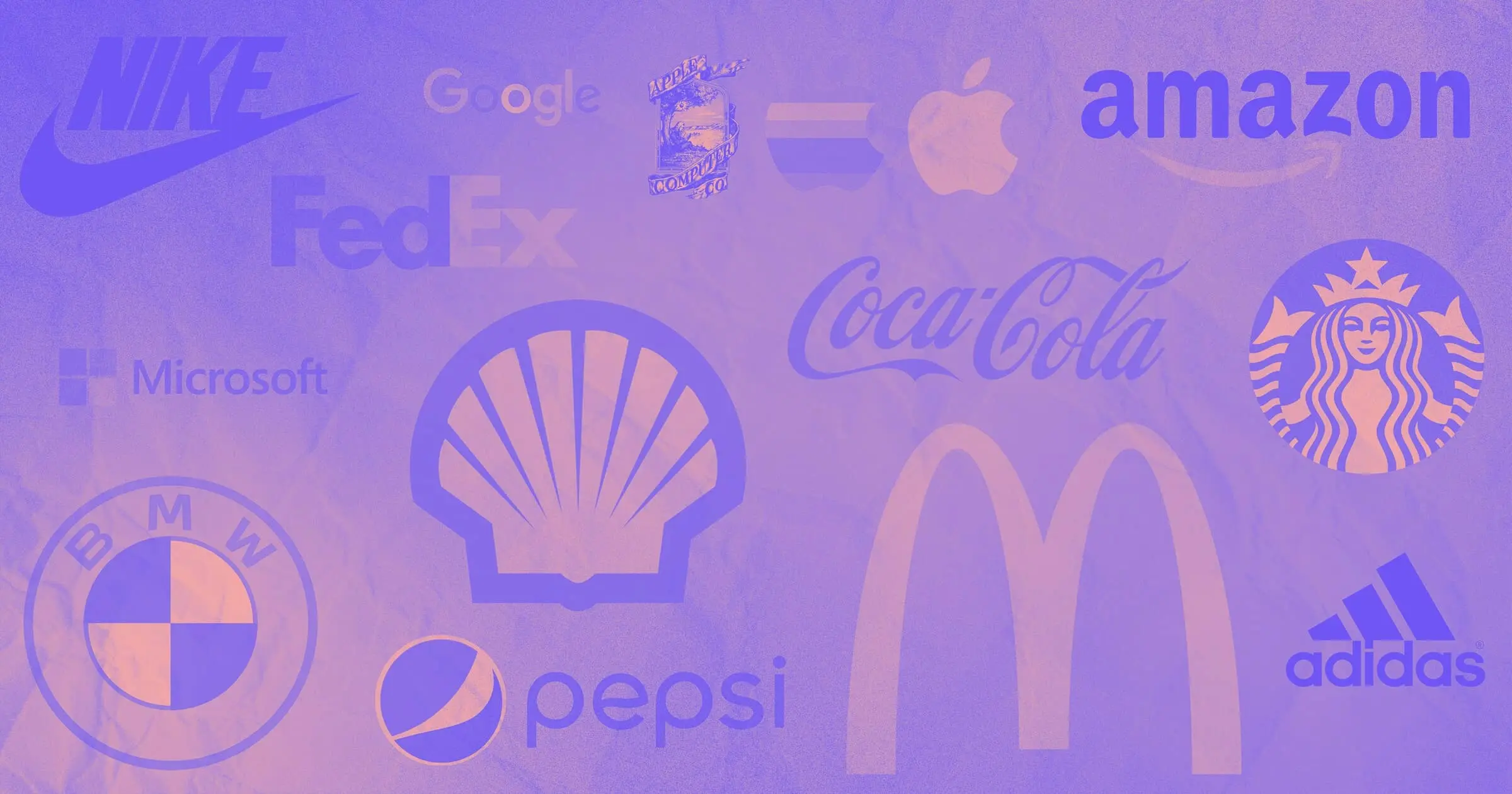
As a staple of design, lines are ever-present in the world of branding. They’re crucial for companies who wish to carve a place in our collective consciousness. From leading footwear company Adidas to property rental giant Airbnb, here’s how lines help leading global brands tell iconic stories.
Adidas
Since its inception in 1949, Adidas has introduced the world to several iterations of its logo. The most memorable and instantly recognizable variations share a series of common traits—including the presence and clever use of lines to convey the brand’s values and identity.
The three stripes have long been a staple of the brand. They’re a model of simplicity, creating a distinct, easily identifiable brand mark that makes Adidas instantly recognizable.
In 1972 the lines were paired with a trefoil, stretching across the new visual. The introduction of the logo coincided with Adidas broadening its product catalog to include apparel. This updated identity looked to convey a sense of expansiveness, reflecting Adidas’ growth, while maintaining the core element that had become integral to brand recognition—the three stripes.

The Equipment logo, brainchild of legendary designer Peter Moore, was introduced to the public in 1991. The stripes were still present, but they were now diagonal lines stacked in a pyramid shape to represent a mountain. The lines in this logo are dynamic, suggesting upward movement and progress. They create a sense of aspiration, aligning with Adidas’ commitment to helping athletes overcome their obstacles.
Adidas uses variations of each of these logos for different product lines. But according to the brand itself, if there’s one constant you can always recognize and expect to see, it’s the three stripes. The trademark lines have “come to represent quality products that are rooted in sport.”
IBM
This multinational tech corporation has been around since the early 1910s, but it wasn’t until 1924 that it adopted the name International Business Machines (IBM). The first logo to use this name was ornate, rather complex and very different from the iterations consumers associate with IBM today.
In 1947, the company was facing the transition from the punched-card tabulating business to computers. The logo had to keep up with and reflect this change. A now familiar version was launched, with a more modern look featuring sleek, solid lines to form the letters IBM. The design was clean, leveraging strong horizontal lines to create a sense of stability and professionalism.

In 1956, designer Paul Rand stepped in and simplified the logo further, opting for a bold, straightforward typeface called Beton Bold that gave the brand “a more solid, grounded and balanced appearance.”
The IBM logo consumers know today was also designed by Paul Rand in 1972, and took the concept of lines to a whole new level. The acronym IBM is still present, but it’s formed from eight horizontal stripes that give the logo a sense of security, aligning with IBM's reputation as a reliable and steady presence in the tech sector. Simultaneously, the use of several lines suggests “speed and dynamism” to support the idea of innovation and progress—the driving forces of a technology company like IBM.
Airbnb
Compared to Adidas and IBM, Airbnb is a newcomer on the brand scene. Its logo has only seen two iterations since the company was founded in 2008, and the original is likely a distant memory for many consumers. The blue, curved letters of the first logo gave it a friendly, casual, and approachable feel, but as Airbnb grew and matured, its brand identity also needed to evolve.

Cut to 2014, when Airbnb introduced the now iconic “Bélo” logo, developed in collaboration with DesignStudio. The name is short for belonging, which is the idea that defines the company. “For so long, people thought Airbnb was about renting houses,” explained CEO Brian Chesky. “But really, we’re about home. You see, a house is just a space, but a home is where you belong.”

To reflect this, DesignStudio created a symbol that merges the idea of people, places, love, and, of course, Airbnb. The continuous line mirrors the concepts of connectedness and journey, while the curvature gives the logo a sense of warmth, inclusivity, and openness.
Go where the lines take you
Lines—unassuming, yet brimming with potential. They have a profound impact in communicating a brand's personality, values, and vision. They're the undercurrent, guiding our understanding and emotional response to a brand.
Next time you find yourself at the drawing board, crafting a memorable visual story, don’t dismiss lines. Instead, remember their silent power, consider their psychology and narrative potential. Make good use of their versatility to create designs that don’t just look right, but feel right in the context of a brand’s story.
Draw the first line, and see where inspiration takes you!


Build websites that get results.
Build visually, publish instantly, and scale safely and quickly — without writing a line of code. All with Webflow's website experience platform.