Reactions to the color pink have tended to be divided and contradictory.
It’s too soft and too shocking. It’s too feminine and too queer. It’s traditional, associated with stuffy gender roles, and it’s transgressive, camp, and in bad taste. Pink is childish. It’s tacky. It’s luxurious. It’s erotic.
We can’t seem to make up our minds.
“Pink provokes exceptionally strong feelings of both attraction and repulsion. Indeed, it has been called the most divisive of colors,” said Dr. Valerie Steele, discussing the show Pink: The History of a Punk, Pretty, Powerful Color at the Fashion Institute of Technology (FIT).
Despite its polarizing nature — or perhaps because of it — pink has been popular in some form through nearly every decade. In recent years, millennial pink and the rising popularity of Gen Z brights have made pink ubiquitous. The new approach is changing our associations, though, and making pink less gendered, less stereotyped, and more varied in its uses.
Pink’s many associations and meanings make it a rich visual communicator. For creatives, designers, and brands, pink can be used to communicate complex messages and evoke strong emotions. It’s an important part of any design toolkit — especially if you want to provoke a response or make a bold statement.
Look deeply into pink’s history, associations, psychological layers, and current controversies. The better you understand what you’re working with, the better you can use it.
Pink’s shifting identity through history
Pink has a surprisingly short and rocky history, and the gendering of the color is a truly modern phenomenon. Tracing its social implications over the last few hundred years paints an interesting picture of a color that has impacted fashion, design, and society as a whole.
1400s and On — Painters use pink as allusion and metaphor
In the 1400s, painter Fra Angelico depicted the Annunciation with archangel Gabriel draped in pink robes. Artist and writer Kelly Grovier describes how “Fra Angelico fleshes the Archangel out as a being of body and blood, breaking down the distinction between holy spirit and ephemeral flesh.”
The color had previously been used mainly for skin tones, but the fresco was influential, and pink gained popularity as a religious color in paintings. Throughout the Renaissance, both Jesus and the Virgin Mary were frequently depicted draped in pink fabric.

In the 1700s, pink began to take on a more scandalous association, perhaps because of its reflection of European flesh tones and the suggestive hue of flushed skin. Women who were mistresses would commonly be painted in pink, inferring seduction.
Examples include George Romney’s painting of Lady Hamilton, known to be a mistress of Admiral Horatio Nelson, and Degas’ paintings of young ballerinas who were expected to be “companions” to the wealthy patrons of the Paris Opera.
1700s — Aristocracy dressed in pink
Pink clothing first gained popularity in the West with European aristocrats in the mid-1700s. It was and continues to be commonly seen in clothing for men and women in many cultures globally, especially in India. In Europe, pink fabric dyes were incredibly challenging to produce with the natural dyes that existed at the time, so the color was an indicator of class and luxury, bedecking wealthy men and women alike.
The color was so popular with the chief mistress of Louis XV, Madame de Pompadour at the French court, that porcelain company Sèvres developed a soft pink glaze for her in 1757, naming it Rose Pompadour.

Early 1900s — Pink becomes more widely accessible
Pink started becoming more accessible to the masses when synthetic dyes were introduced in the early 20th century. However, pink wasn’t gendered as feminine during this period in time. In fact, boys were more often dressed in pink since it was seen as “light red” and took on those militaristic associations.
In fact, an article in Earnshaw's Infants' Department trade publication in June of 1918 specified that “The generally accepted rule is pink for the boys, and blue for the girls.”
In 1937, Elsa Schiaparelli introduced Shocking Pink as her signature color. It was a rich, bright pink that set Schiaparelli’s already avante-garde fashion apart from the more muted styles popular during World War II. The color caused a sensation, and hot pinks became fashionable for daring women.

1950s-1960s — Pink is linked with femininity
It was during World War II that men began wearing more somber, serious colors as a rule. Bright, cheerful colors were relegated to women and children. Women had participated in the workforce during wartime, and afterwards, there was a push to put women back in the home and reinstate more “traditional” gender roles.
In her book As Long as It's Pink, Penny Sparke ascribes pink’s overwhelming popularity in women’s fashion and product design as part of "the emphasis on distinctive gendering that underpinned 1950s society."'

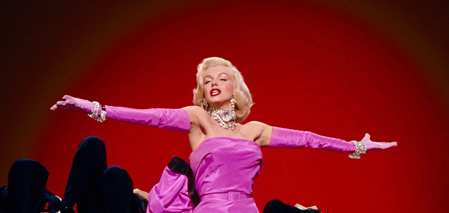
Pink became truly iconic in these decades. Gentlemen Prefer Blondes was released in 1953, and Marilyn’s pink dress showed the color as the epitome of sensual femininity. Barbie was released in 1959, making the Barbie-pink logo a long-lasting cultural touchstone. Pink flamingo lawn decorations were invented in 1957, uniting pink with kitsch forevermore.
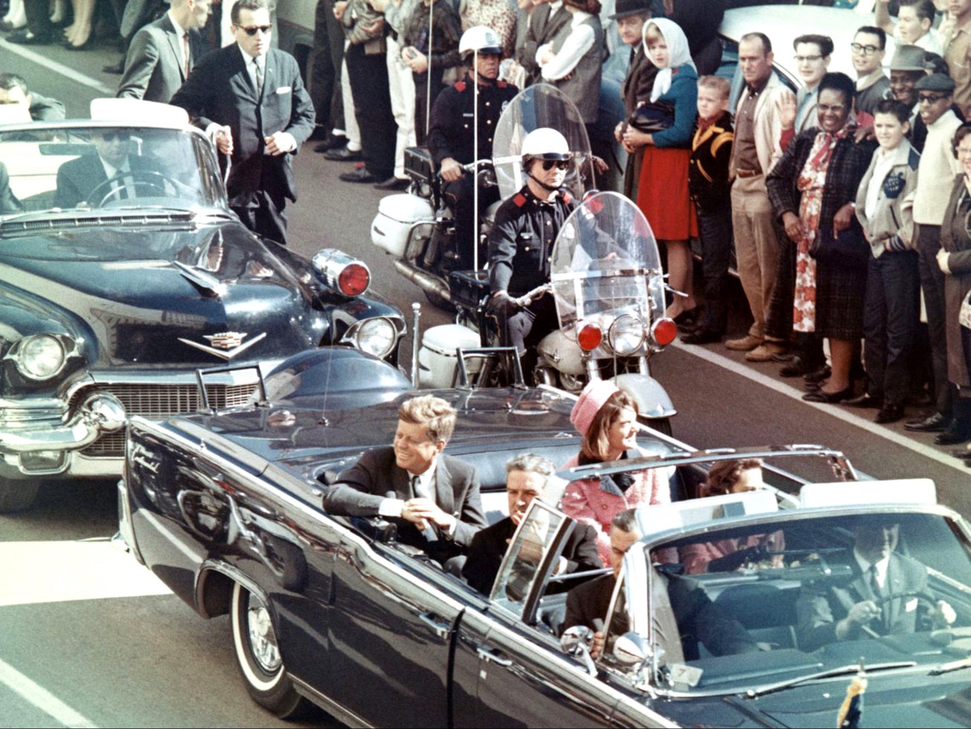
In 1963, Jackie Kennedy was wearing a pink suit modeled after Chanel when her husband was assassinated in the seat beside her. Lady Bird Johnson, riding in a car behind them, described her in the aftermath as “a bundle of pink, just like a drift of blossoms, lying on the back seat.”
Afterward, she refused to take off the bloodied dress for President Johnson’s emergency inauguration and the associated press photos. She said she wanted them to “see what they have done.” That moment and the pink dress made her not just an icon of femininity but also one of strength during a time of national tragedy.
1970s-1980s — Pink transgresses
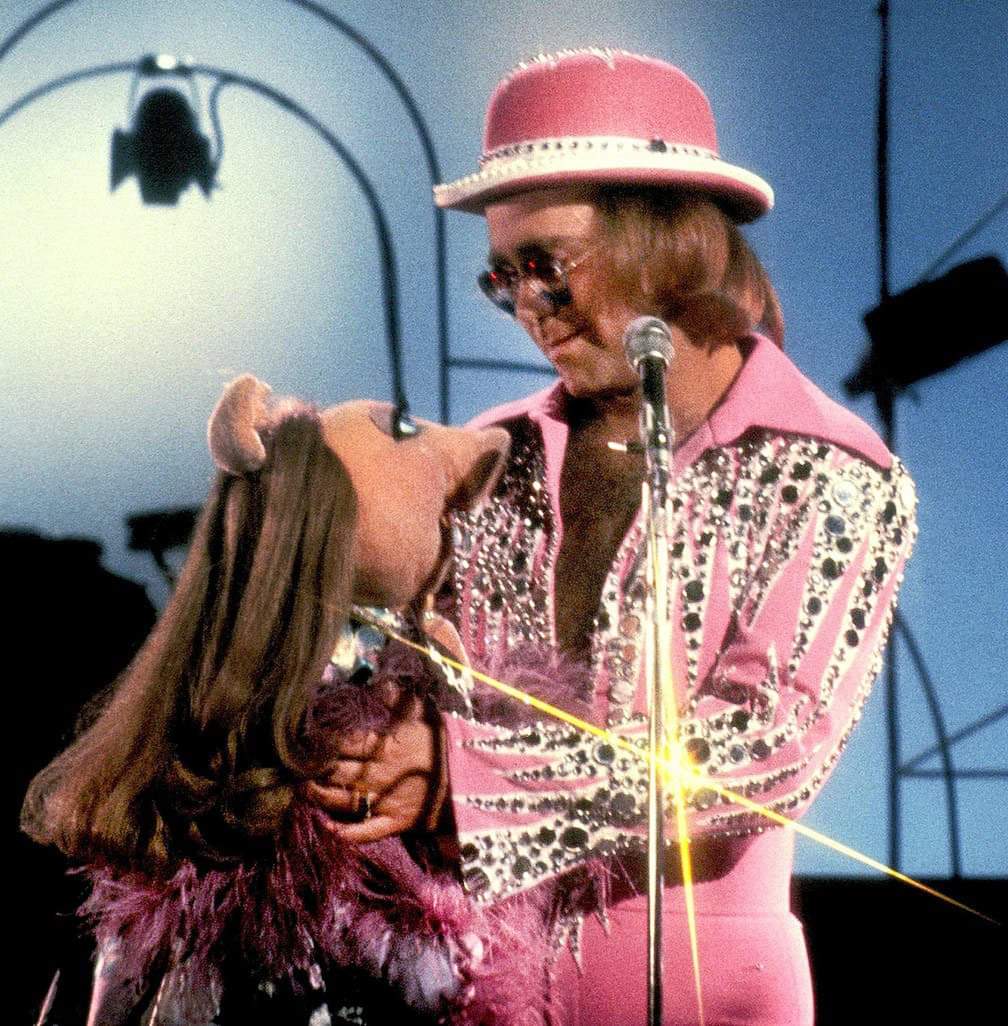
In the ’70s and ’80s, flamboyance and androgyny took the stage with glam, disco, and rockstars like Bowie and Elton John. Pink began to transgress the gender binary a little more alongside them. Men’s fashion embraced pink, whether a sporty neon parachute look, a preppy pink sweater around the shoulders, or a beachy Miami Vice aesthetic.
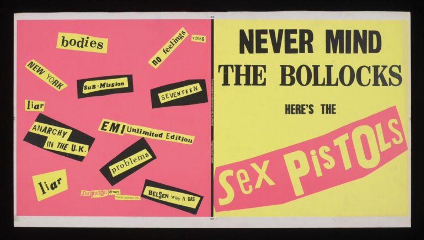
Punks used bright pink and black in clothing, zines, and posters for the shock value. Punk was in your face, and pink expressed that attitude. Artist and anarchist Jamie Ried designed the album cover for the Sex Pistol’s 1977 release Never Mind the Bollocks, Here’s the Sex Pistols. It took inspiration from the work of the 1920’s Dadaist collage maker Hannah Hoch and gave it a vibrant ’70s makeover.
Fashion and design in the ’80s became big and bold, with everything from clothes and product packaging to interior design using “hypercolor” brights and neons. Duotone effects — especially with hot pink and blue — were popular in graphic design. Color trends may have been a reaction to the funky browns and oranges of the ’70s, as well as an embrace of Cold War-era nationalism and a booming economy.
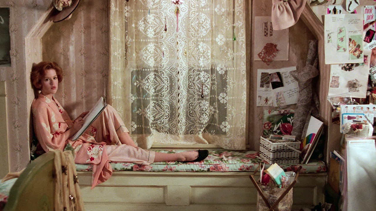
Prenatal testing and a consumerist wave in the ’80s led to a resurgence in the popularity of gendered baby clothing. With twice as many options, businesses could sell more clothes to parents. After a long period of more gender-neutral kid’s clothes, the pink vs. blue division was back.
2000s — Blondes, rap stars, and preppies
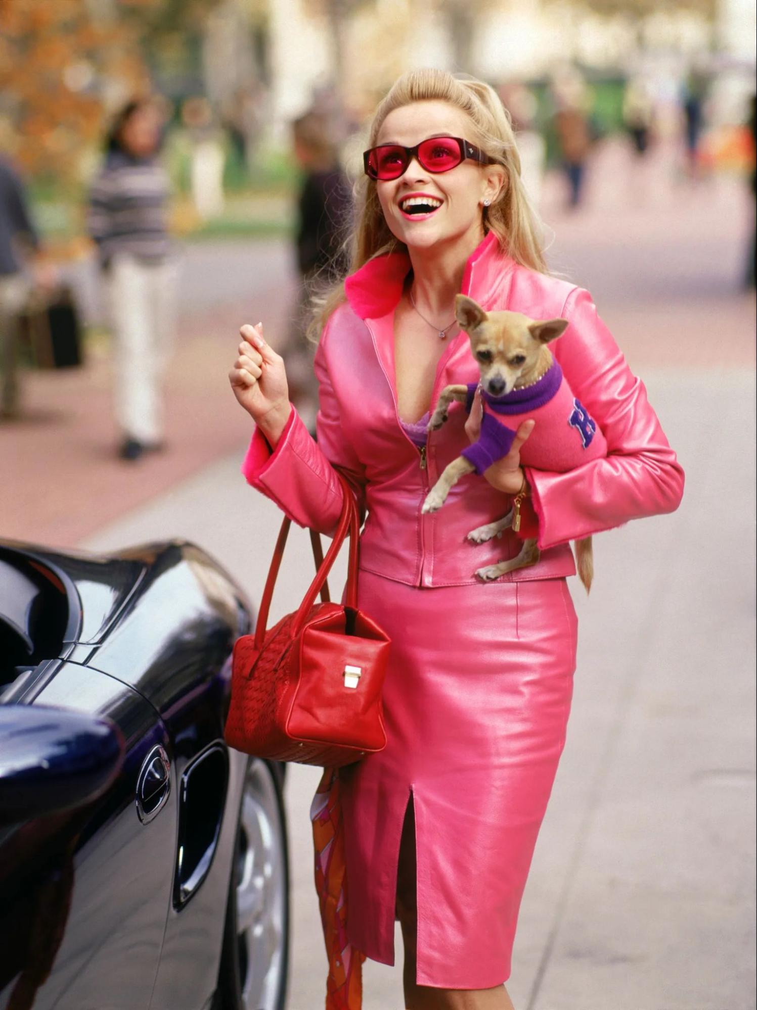
At the beginning of the millennium, hot pink had a very specific connotation. Elle Woods in 2001’s Legally Blonde made pink her signature look. The character was adored, but her use of pink was very explicitly gendered and associated with a certain type of girly “Barbie” blonde. Pantone’s second-ever color of the year for 2001 was the similarly bright Fuschia Rose.
In 2002, rapper Cam’ron wore a full pink outfit to Mercedes-Benz Fashion Week, complete with a pink fur coat and flip phone. The moment set off a wildfire trend of men and women in hip-hop sporting all kinds of pink. Pink was a popular trend for rappers throughout the 2000s, evoking preppiness, luxury, and a certain shock value.
Preppy men adopted “salmon shorts” — an evolution of Nantucket Red intended to mimic the kind of sun-fading one might get from being out on a yacht. An entire Tumblr account, Whiteboysinsalmonshorts, was dedicated to documenting the Vineyard Vines-driven trend.
2010s — The rise of millennial pink
In 2014, Wes Anderson and the twee aesthetic reached a peak with the monochrome pink setting of The Grand Budapest Hotel. In 2015, Apple introduced the rose gold iPhone. Brands like Thinx and Glossier used pink across their products and ecommerce stores, appealing to young millennial women. Design styles like Corporate Memphis used a pastel color palette for ads and websites. Rosé wine was a summer staple, and even the slushy Frosé had a moment.
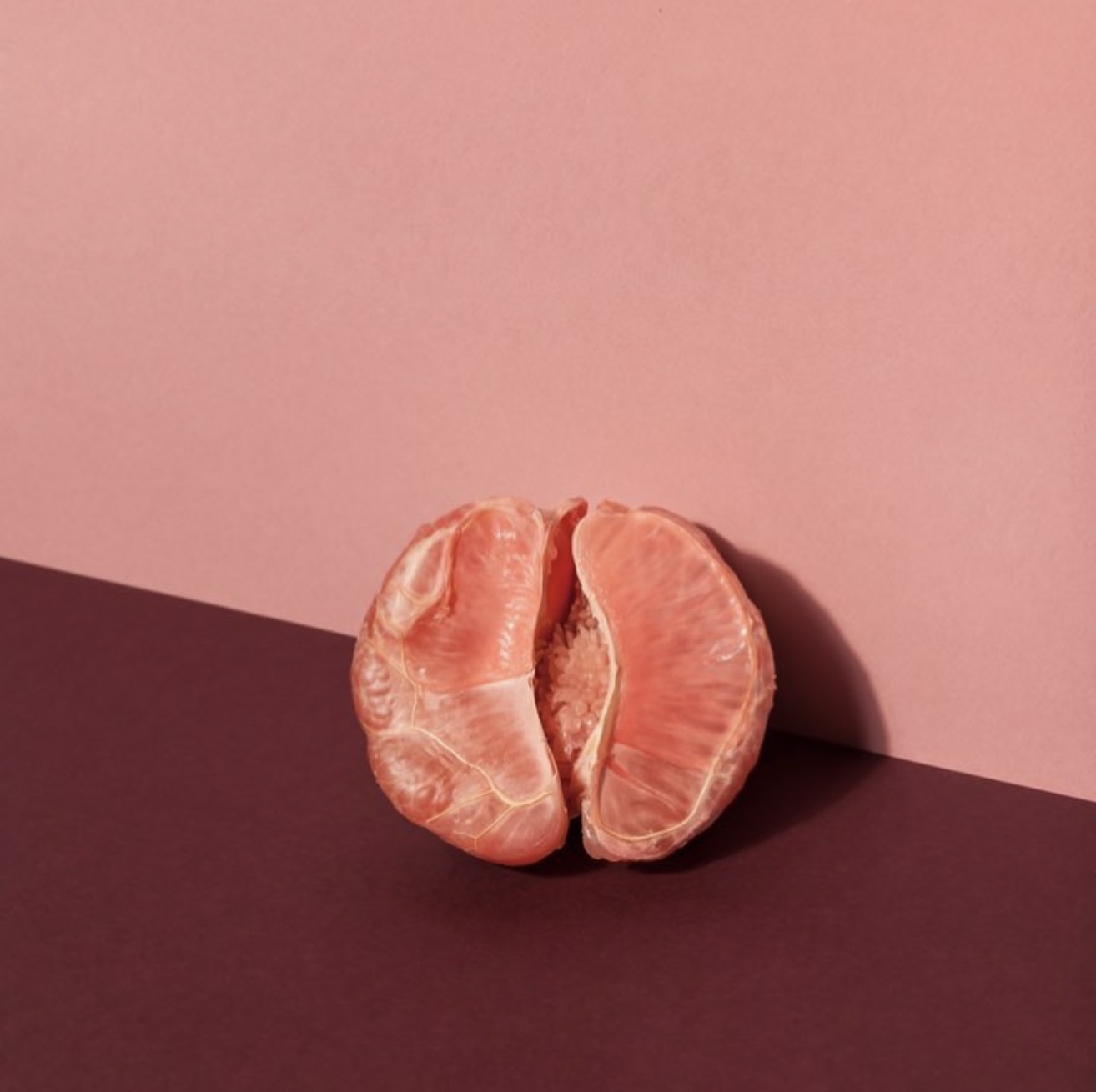
Millennial aesthetics, carefully curated with soft tones, natural fibers, and curved geometric shapes, took over interior design, ads, and social media. Since the inception of “Color of the Year” in 2000, pink has been highlighted as Pantone’s Color of the Year a whopping five times. That’s 22% of the new millennium. In the 2010s, we saw Honeysuckle; in 2011, Radiant Orchid; in 2014, and Rose Quartz — paired with Serenity in 2016.
Pink had somehow moved away from being seen culturally as a derision-worthy display of vapid girliness. It was now symbolizing a more feminist reclamation of gender and a modern genderlessness, albeit one that was expressed through consumerism and Instagram aesthetics.
And by 2021, Curbed declared the millennial aesthetic over.
2020s — Gen Z and the bold look
Hot pink is back as we move into the 2020s, but it has lost its association with bubblegum-Barbie femininity. The Gen Z color palette is brash and bright. It’s distinctly retro, pulling from many different eras at once.
Some fashion publications have named Gen Z yellow as the color of the generation, but pink is still vibrantly relevant. Pantone has named Viva Magenta the color of the year for 2023 — a redder, more richly hued, and more in-your-face version of hot pink.
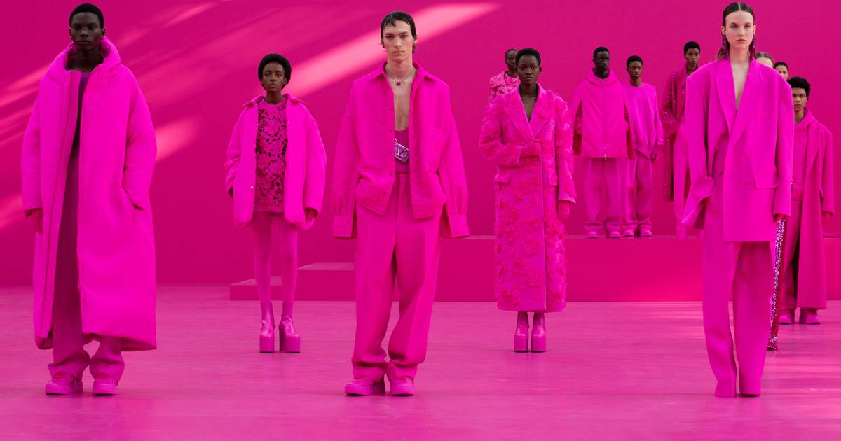
For Fall-Winter 2022-2023, Valentino made a huge impact on the fashion world with their Pink PP Collection. They send models of all genders and gender identities down a hot pink runway, dressed monochromatically from head-to-toe in the intense shade of pink. The color felt aggressive, overwhelming, and decidedly un-gendered.

Lil’ Nas X exploded into fame in 2019 with his single Old Town Road. He wore a hot pink cowboy suit to the 2020 Grammys, which cemented his image as someone to watch in fashion, but also made him the target of homophobic pushback. For the 2023 Golden Globes, queer style icon and performer Billy Porter wore a spectacular hot pink velvet tuxedo-gown by Christian Siriano.
These fashion moments show that while pink color palettes are being embraced more widely, the hue also maintains its ability to shock. There remains an element of defiant femininity and queer rebellion to the color that challenges the status quo and excites.



Build websites that get results.
Build visually, publish instantly, and scale safely and quickly — without writing a line of code. All with Webflow's website experience platform.
Pink as protest, advocacy, and lightning rod
Pink has been and continues to be a color of transgression. The social power that pink wields has made it a color commonly used for activism and advocacy, as well as a source of social controversy.
Queer rights and AIDS activism
During World War II, the Nazis used colors and symbols to categorize various “undesirable” groups of human beings. For sexual “undesirables” — gay and bi-men and trans-women — a pink triangle was worn on their sleeves to identify them.
It’s unclear how many queer people died during the Holocaust, but the liberation of camps often didn’t end their persecution. Many of them continued to be imprisoned after the war for their orientation.
During the early AIDS epidemic in the 1980s, gay activists, including ACT UP, reclaimed the pink triangle, flipped it the other way, and used it as a symbol of resistance and strength. They called attention to the devaluing of queer life by the American government and the population at large.
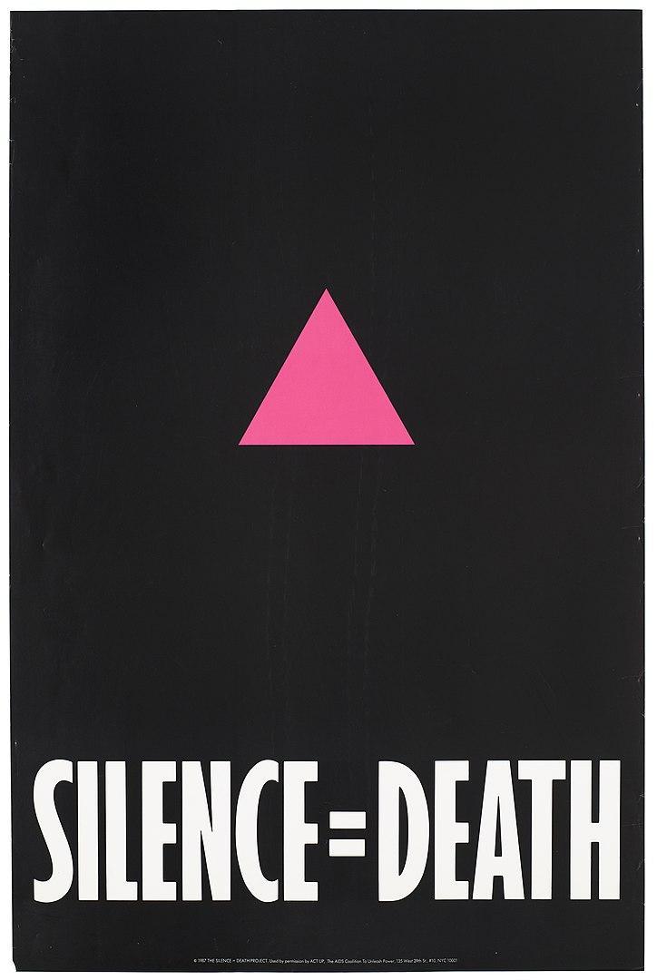
On the Stonewall website, activist Josh Bradlow explains, “The pink triangle symbolizes the power of remembering the past, reflecting on the injustices that persist today, and the possibility of a future where people are not demonised for their difference.”
Pink symbolized a reclamation of oppression and an open embracing of femininity against gender norms. It became a symbolic color for queerness and resistance. Today, many pride flags use pink, including the transgender flag, lesbian flag, bisexual flag, and pan flag.
Pink as a social conditioner
In 1979, research scientist Alexander Schauss performed a study that seemed to show that a specific shade of pink reduced aggression. He named it Baker-Miller Pink, also known colloquially as drunk-tank pink.

Throughout the ’80s, prisons and mental hospitals began painting their facilities with the color. Some football teams even painted their visitors’ locker rooms the color to reduce their opponents’ aggression and make them feel emasculated. However, a follow-up study on Baker-Miller Pink 30 years later showed it had no pacifying effect whatsoever.
Still, the color saw a resurgence in 2017 when model Kendall Jenner reported that she’d painted her living room Baker-Miller Pink for its calming effect. She was criticized extensively for also praising its appetite-suppressant effect and ended up taking down all mentions of it on social media.
Breast cancer awareness

In the early ’90s, individuals and organizations promoting women’s health began to use a pink ribbon to promote breast cancer awareness. The breast cancer ribbon is instantly recognizable and has been used by organizations such as the Susan G. Komen foundation to promote funding, screening, and investment in women’s health.
The symbol became increasingly common in products and advertising, provoking criticism that it was “pinkwashing” by commercializing and profiting off of women’s suffering. In recent years, advocates have encouraged consumers to think more critically about where their money is going and find more direct ways to support the people in their lives affected by breast cancer.
The Gulabi Gang

Beginning in Uttar Pradesh, India, in 2010, a group of women formed a “gang” to defend against domestic abuse and violence against women. They called themselves the Gulabi Gang, from the word gulabi, meaning "pink" in Hindi. The group has grown over the years, and a documentary was made about their practices.
The Gulabi Gang wear distinctive pink sarees and train in the martial art of Lathi Khela, using sticks to overcome size differences. Mistrustful of local governments, the group used vigilante methods initially. However, their work has made huge differences at all levels of local government, including fighting child marriages and passing a law reserving 33% of parliamentary seats for women.
Pink toenails provoke gendered backlash
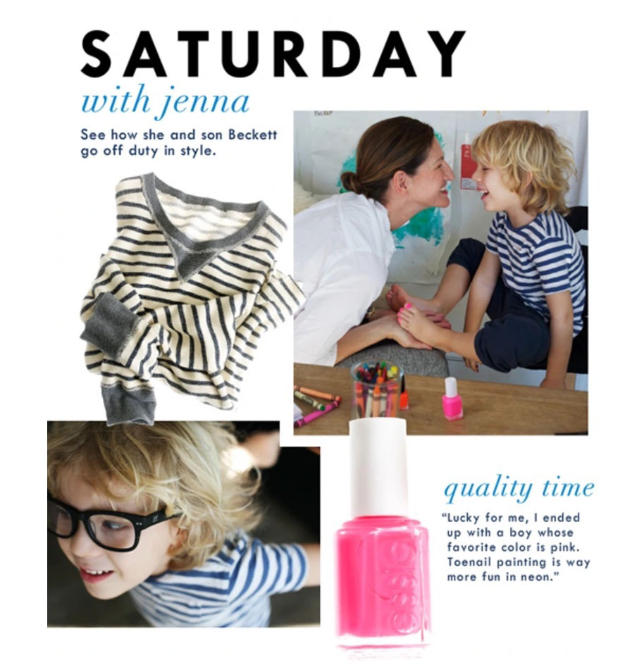
In 2011, J. Crew creative director Jenna Lyons published a mailer featuring a photograph of her painting her young son’s toenails pink. There was an immediate backlash where she was accused of everything from pushing her boy into transgressing gender norms to undermining the very foundations of gender in society.
It’s clear that pink retains its power to make a statement and continues to be tied to a deep social construct of what gender means to us as a society.
Pink’s role in a major artist’s feud
In 2014, Surrey NanoSystems (SNS) invented the blackest color in the world, naming it Vantablack. They promptly managed to anger the entire art world by granting divisive artist Anish Kapoor exclusive creative rights to the substance.
Artist Stuart Semple responded in a conceptual and practical way by inventing the “Pinkest Pink” and giving all people the right to purchase and use the pigment — except for Anish Kapoor. In order to purchase it, you are required to assert that you are not Anish Kapoor and you will not give the pigment to Anish Kapoor.
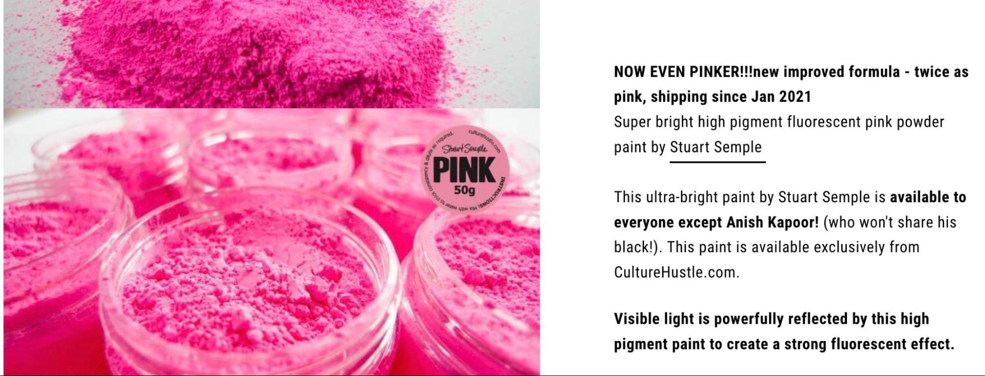
Semple talked about selecting the color for its overt sexuality. “Pink is a really powerful color and this particular pink is extremely vibrant, so it felt like the logical choice to make the point I was hoping to make,” said Semple. He used the color to protest elitism, commercialization, and privatization, ultimately earning him the nickname “The Robin Hood of the Rainbow”.
Anish Kapoor did eventually gain access to the color, posting an image to his Instagram account of his middle finger coated in the pink pigment. He was promptly dragged through the mud in the comment section.
Semple followed up with a full series of pigments banned from use by Anish Kapoor, including “the most glittery glitter,” “the whitest white,” multiple Vantablack alternatives, and an even pinker pink. The feud appears to continue to this day.
Use the power of pink to communicate through design
Looking at this history, what’s interesting is that although we strongly associate pink with femininity, men have popularly been wearing pink for most of its history. Even during the peak gender essentialism of the 1950s, masculine icon Elvis still drove his pink Cadillac.
The exhibition at FIT quotes color historian Michel Pastoureau: "It is society that 'makes' color, defines it, gives it meaning." Society has placed layers of contradicting meanings on a simple color. That gives pink a unique power when used to communicate complexity and emotional depth. We can be inspired by it, whether we are drawing on designs from the past or embracing 2023’s Viva Magenta.
This might be a classic case of “knowing the rules to break the rules.” Once we understand what pink can imply, we can play with those implications. We can reverse them, subvert them, lean into them, or ignore them entirely. In our designs, our businesses, and our personal dress and grooming, we can speak through color and have fun doing it.


