


With a one-page website, sometimes less is more.
Instead of spreading your content across multiple pages, a one-page website easily guides and explains what your client does, why it matters, and why they should consider working with them. Like taking out a full-page ad, a single-page website should convince viewers to reach out without much effort.
Read on to explore the best one-page website examples and learn the best practices for creating them.
Why make a single-page website?
A one-page website is a smart layout choice if you want to share a specific message, showcase a portfolio, or promote a single service. Everything lives in one place, giving visitors an uninterrupted path through your content in a single scroll.
Consider the following pros and cons to see if this style might suit your needs.
Pros
- Streamlined user experience. With all your content in one continuous passage, visitors can efficiently absorb your client’s narrative. They won’t have to click through multiple pages, so the information they need is likely easier to find.
- Mobile-friendly. A one-page layout minimizes loading time, and mobile-users avoid having to click through multiple pages to navigate your content.
- User-friendly navigation. Scrolling on one page makes sections easier to explore and lets you add highly visible anchors like buttons and calls to action (CTAs).
- Easier to build and maintain. Fewer pages means the website is easier to manage, from designing mobile and desktop view differences to regular product updates.
Cons
- Limited space. Too much information on one page can overwhelm readers. One-page websites aren’t ideal if you need multiple dedicated service pages, detailed resources, or a blog.
- Search engine optimization (SEO) trade-offs. Only having one page to optimize makes it harder for your website to rank for multiple topics or keywords.
- Long load times. Adding too many visuals or animations on one page can make its loading time sluggish.
- Scalability issues. A one-page website may require a redesign if it needs to be expanded into a multi-service or content-heavy site in the future.
How to create an effective one-page website
It takes thoughtful planning to design an effective one-pager. Every element needs to be placed with purpose, so it can add to the bigger picture without overwhelming other important features on the site — or visitors.
Here are a few tips to consider when building a one-page site.
Choose a template
Templates can save you time with pre-made, customizable design themes. They give a site structure with sections that naturally flow into each other and optimize the scrolling experience. In Webflow, you can browse thousands of templates and find one that matches your client’s brand identity.
Develop a content strategy
Websites are a linear story, and each section should build on the previous one, guiding people toward your CTA. With limited space, it is important to prioritize the essential elements: who your client is, what they offer, and why potential customers should consider their services.
Incorporate scrolling effects
Parallax scrolling, hover-triggered effects, and subtle transitions keep visitors engaged as they move through your website. Parallax scrolling imitates three-dimensional depth, while hovering over specific elements encourages interaction.
When used sparingly, these effects add visual interest. However, including too many animations can slow your site down and distract from your client’s primary message.
Showcase your creativity
You have one page to make an impression on potential clients. It helps to use bold visuals, unique typography, and interactive elements to express your client’s style and give people a memorable browsing experience. A creative one-page portfolio website for a freelance visual artist might include animated adaptations of original work. Alternatively, a website for a new consulting agency might use visual dividers with thick borders to separate case studies.
Use logical navigation
Even without multiple pages, visitors should be able to quickly move between sections. Use anchor links or sticky menus to improve navigation, so viewers can avoid wasting time searching for information. It also encourages them to browse the entire page’s content, giving them more opportunities to engage.
Add a strong CTA
CTAs are prompts that direct people toward an intended outcome, like contacting your client or buying a digital service. Place your CTA prominently and subtly repeat it strategically throughout the page. Use action-oriented language like “Sign up for our newsletter” or “Buy now” and use contrasting colors to make the button stand out.
Apply SEO best practices
SEO is trickier to perfect on a one-page website, but there are still effective tactics you can use. Here are some tips to help with traffic flow:
- Structure content using well-researched, relevant keywords and descriptive headings throughout the page.
- Include alt text for images so your page is more accessible for screen readers.
- Improve your site’s loading speed through lazy loading and image compression.
Make your site mobile-friendly
Over 60% of visitors to your site are likely accessing it on a mobile device like a smartphone or tablet. Therefore, it is important to build a responsive layout to accommodate as many visitors as possible. Prioritize fast loading times, legible typography, and touch-friendly buttons for phone screens.
You can also choose a responsive template in Webflow that automatically adapts to different screen sizes and tests your site to ensure everything looks and works properly, no matter the device.
10 examples of one-page website design inspiration
Here are 10 standout one-page websites that show how design and strategy can combine to create memorable user experiences and convert potential clients.
1. Jords+Co
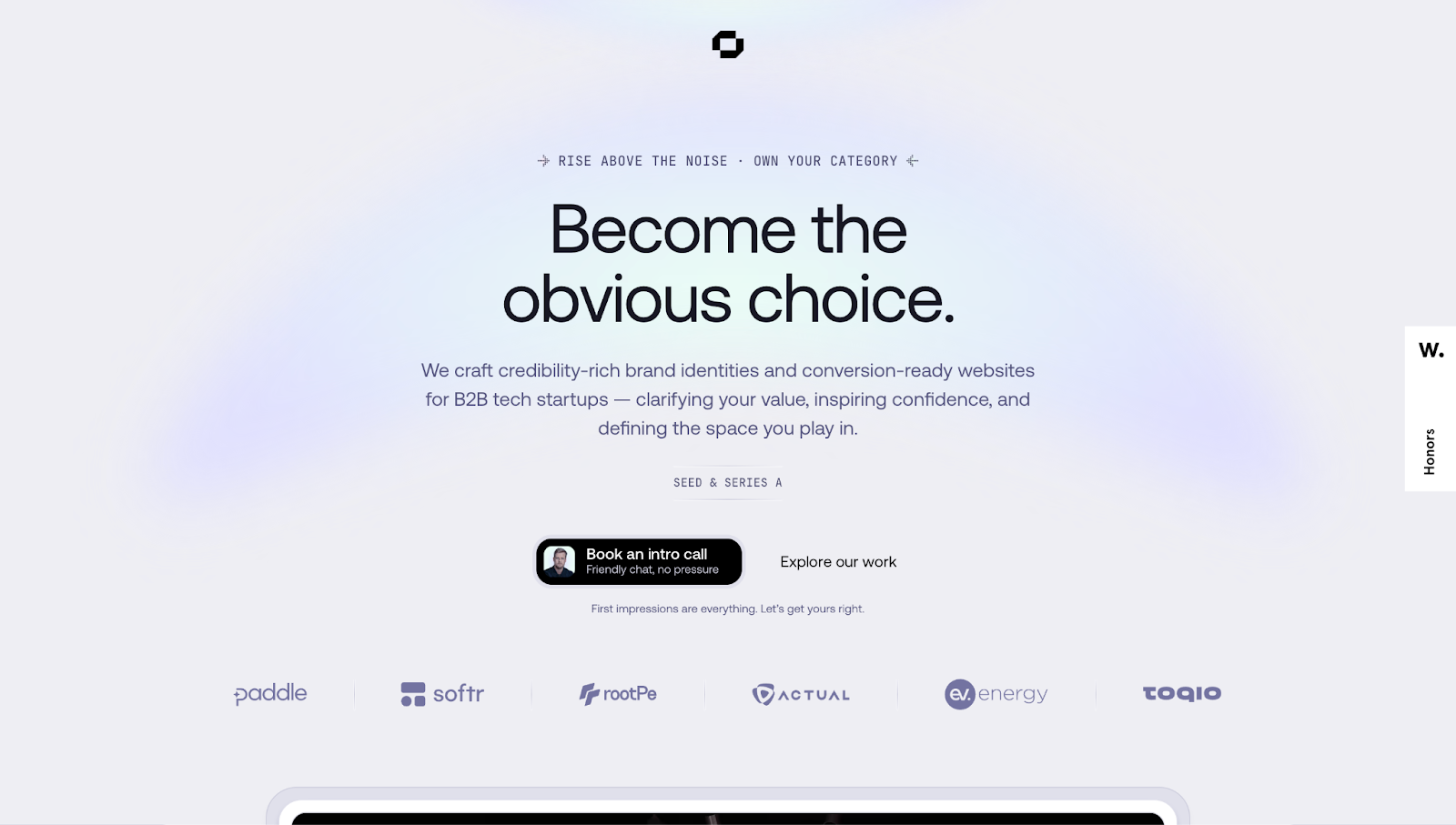
Jords+Co’s website pairs a minimal, modern aesthetic with directive copy like “Become the obvious choice.” More detailed text below makes it clear that the Jords+Co team specializes in B2B tech branding and web conversions. Combined with their authoritative tone, this website’s simplicity creates a confidence-inspiring blank slate for potential clients to imagine their own upgrade through Jords+Co.
The simple navigation using anchor links allows you to quickly jump between sections. The content flows logically, so it’s easy to follow as you scroll.
2. Actor Seth Hampton’s portfolio

Seth Hampton’s portfolio, designed by Adam Fox, has a lively color scheme to reflect the actor’s vibrant personality. The primary colors and rectangular shapes also invoke the artist Piet Mondrian’s work to bring in similar modern, artistic feelings.
The single-page flow has distinct sections — About, Gallery, Press, and Contact — guiding you through Seth’s story. By the time you reach the bottom of the page, not only is his talent evident, but so are his CTAs.
3. Amsterdam Chemistry Innovation Day (ACID)
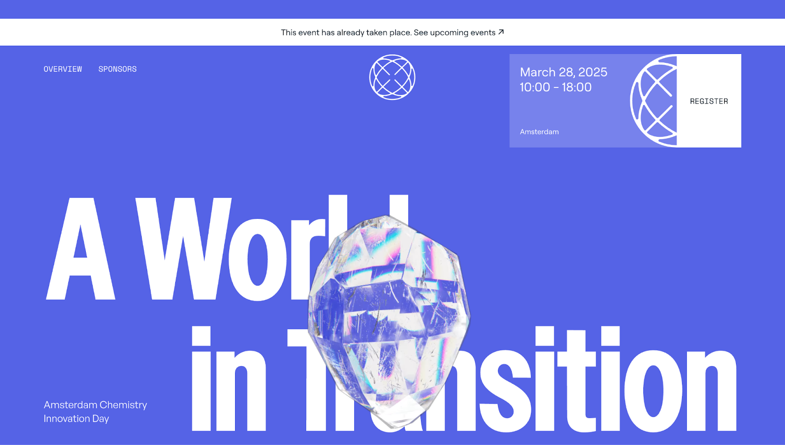
ACID is an annual networking event for chemists and life scientists, with speakers, panels, and keynotes. ACID’s website uses a clean, two-tone color palette and sans-serif typography to create a professional appearance that simultaneously feels less formal.
The site’s dynamic design includes interactive details, like hover effects and parallax scrolling, to break through the limitations of a minimalist aesthetic. Spinning crystals scattered throughout add visual interest and keep readers moving through the page. The simple and engaging design adds energy and builds excitement for the event, encouraging those interested to sign up.
4. PrimeLINK

PrimeLINK’s single-page site, designed by Aleksandr D., has a sleek interface tailored to cryptocurrency creators and Web3 project designers. Clear section breaks, brief service descriptions, and a simple blue-and-beige color palette make information easy to scan.
A scrolling list of client logos act as social proof of PrimeLINK’s effective services, as do summaries of their services in large bubbles, such as “P&L analysis” and “Quick setup.” Subtle animations like rising text and hover-triggered blocks give the page’s background some visual interest and make them feel approachable. With minimal clutter, this is a highly accessible and targeted one-page business website.


Build websites that get results.
Build visually, publish instantly, and scale safely and quickly — without writing a line of code. All with Webflow's website experience platform.
5. Micro Interactions
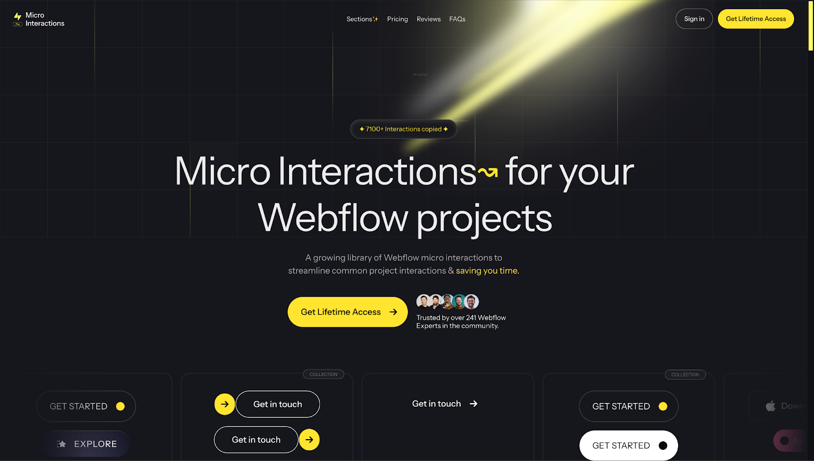
Micro Interactions is a one-page, ready-to-use library for Webflow created by Hafiz Manzoor. The attention-grabbing layout features a high-contrast black-and-yellow color scheme, immediately making the “Get Lifetime Access” CTA buttons stand out.
Throughout the page, the site provides examples of their products in action, backed by free download links. Parallax effects in key moments — like the scrolling CTA list under the header and a wall of testimonials — provide interest and pull viewers’ attention toward actionable steps. Toward the bottom, transparent pricing details encourage conversions after viewers are convinced of Micro Interactions’ worth.
6. Dropbox Dash x McLaren
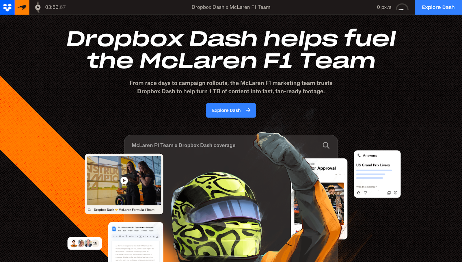
Dropbox Dash x McLaren’s case study-style one-page design combines high-octane visuals, thematically appropriate copy, and narrative storytelling to emphasize the collaboration with McLaren’s Formula One racing team. The site uses moving UI cards and scroll-triggered animations to showcase the marketing team’s creative approaches to specific and unique digital assets. And, mirroring their client’s identity, the site prioritizes performance and speed.
7. DesignCraft
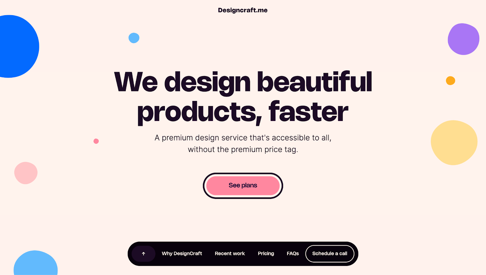
DesignCraft’s single-page site, designed by Jennifer J., blends bright, high-contrast colors with playful circular visuals to give the site a vibrant and friendly personality. Lively statements peppered throughout the page reinforce this brand personality.
The website’s visual hierarchy presents DesignCraft’s services first, followed by specific details like turn-around time and testimonials, to instill confidence in the product early on. Each section flows smoothly into the next, creating a digestible experience and keeping the work centered over the bright, bold branding. A sticky menu on the bottom of the page, which only appears when scrolling upward, ensures anchor links are always accessible but never distracting.
8. Master Gorgeous UI Design
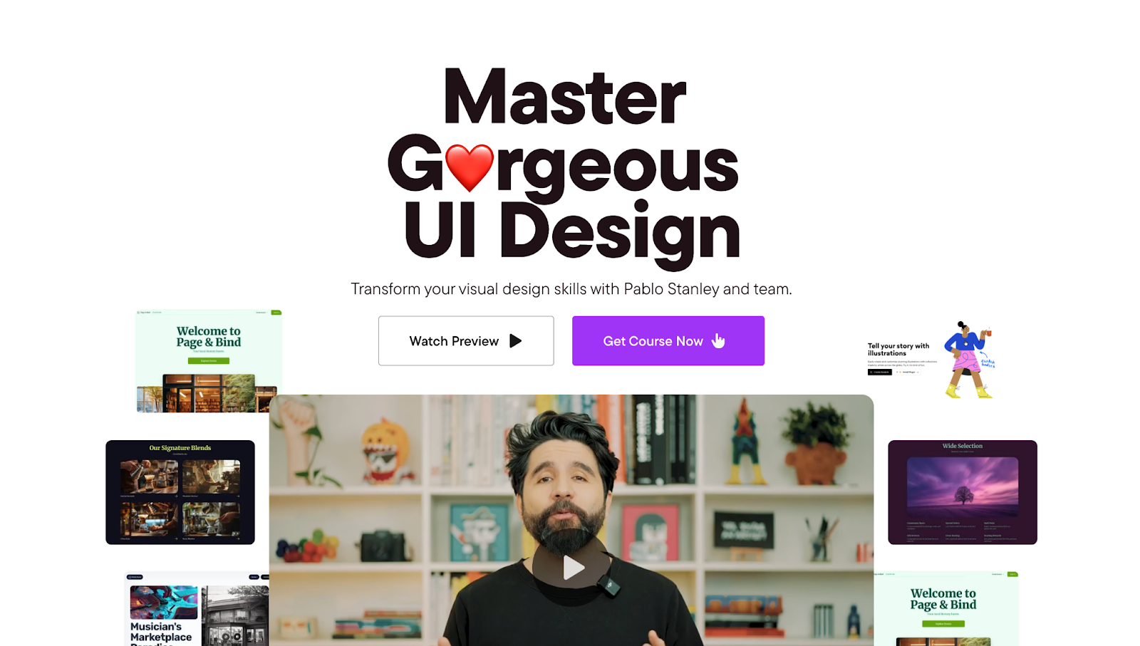
Master Gorgeous UI Design is a course page showcasing Pablo Stanley’s design expertise. His skillset is expertly highlighted on this website with playful emojis, generous whitespace, and hover-triggered animations. His casual yet knowledgeable voice is visible in all of the site’s copy.
Toward the bottom of the page near a major CTA, design blocks briefly outline what students will learn, while testimonials from students and fellow industry professionals showcase Pablo’s credibility.
9. Hyper
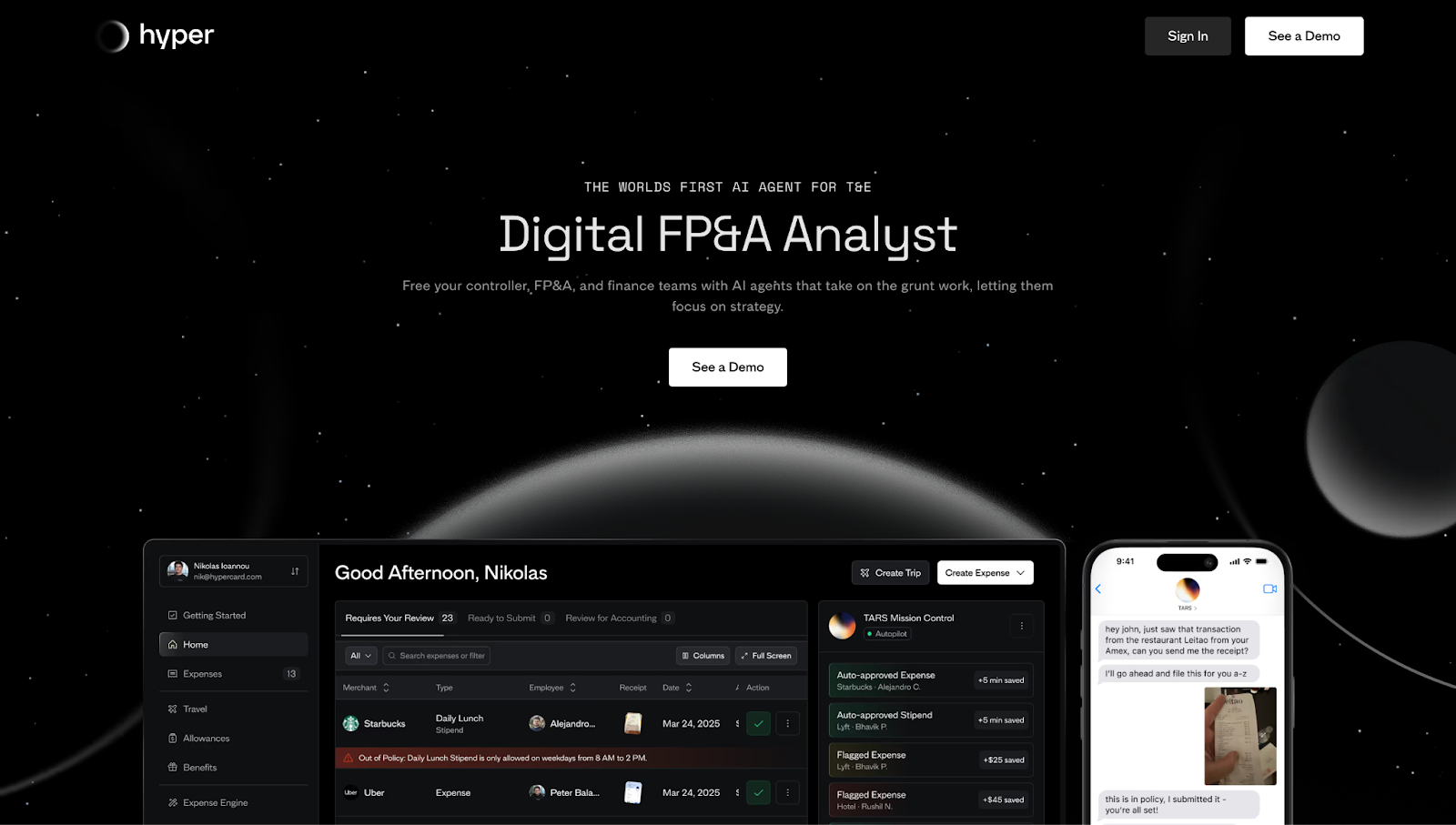
Hyper’s single-page site leads with a mockup of the platform’s tool, immediately highlighting speed, savings, and efficiency. The dark grayscale background featuring an array of planets also gives the page an attention-grabbing, futuristic aesthetic.
The webpage details Hyper’s specific tools and features throughout the page. The bottom of the page has a set sticky menu with “Schedule a demo” and “Get started” CTAs, making conversions accessible at any point.
10. Atoms
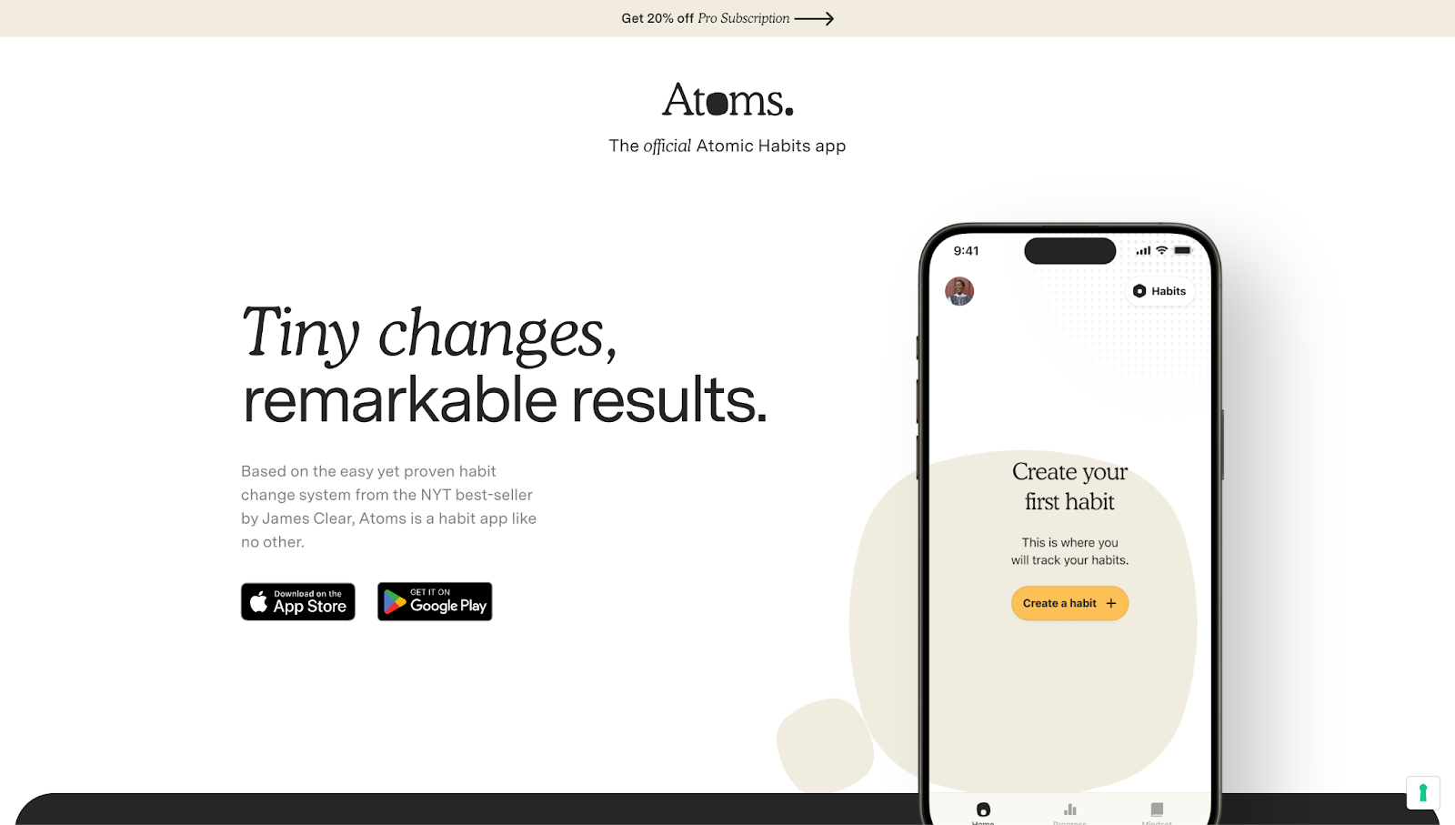
The landing page for Atoms, a mobile habit-tracking app associated with James Clear’s best-selling book Atomic Habits, features a warm, cream-toned palette that mirrors Atomic Habit’s cover art. This visual design places readers in the product itself without presenting an overwhelming amount of information.
On the righthand side of the page, there’s a smartphone mockup with a gold CTA button and text prompting you to “Create your first habit” as a visual reminder of the app’s purpose. Throughout the site, CTA buttons take you to the App Store or Google Play Store where you can download the app.
Design your one-page website with Webflow
A well-made one-page site fits creativity and value into a small layout. With thoughtful design, you can deliver an effective website that shares your client’s message in an engaging format that’s easy to explore.
You can start designing your single-page site in Webflow from scratch or choose between thousands of templates. No matter your goals, Webflow’s website builder has everything you need to get started.
Get started for free
Create custom, scalable websites — without writing code. Start building in Webflow.