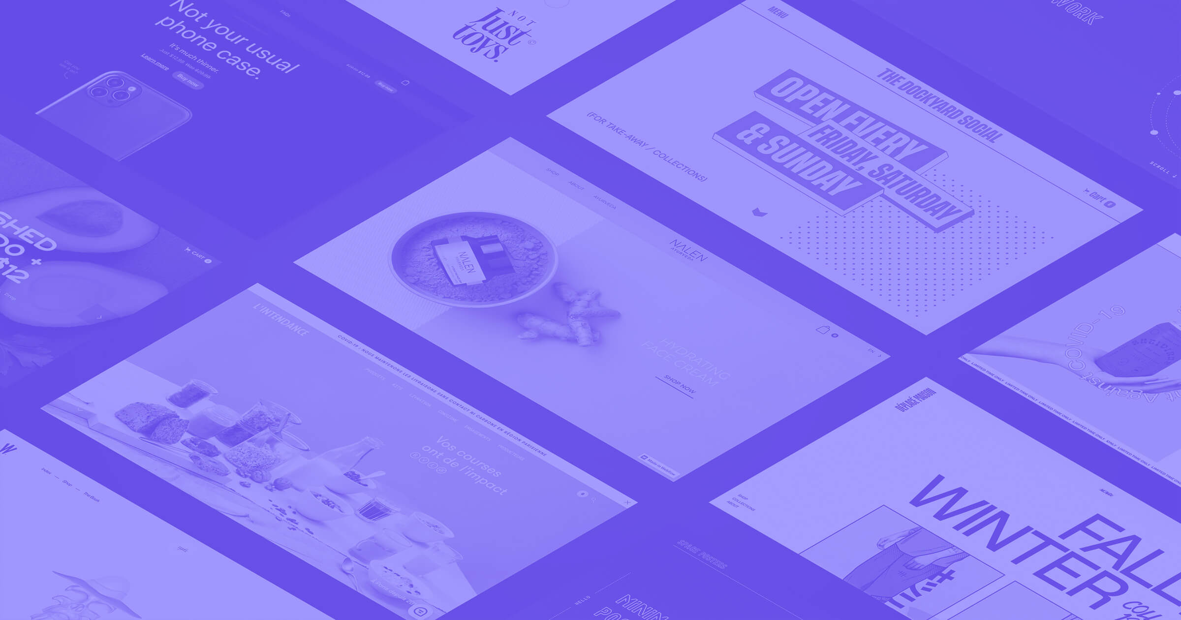
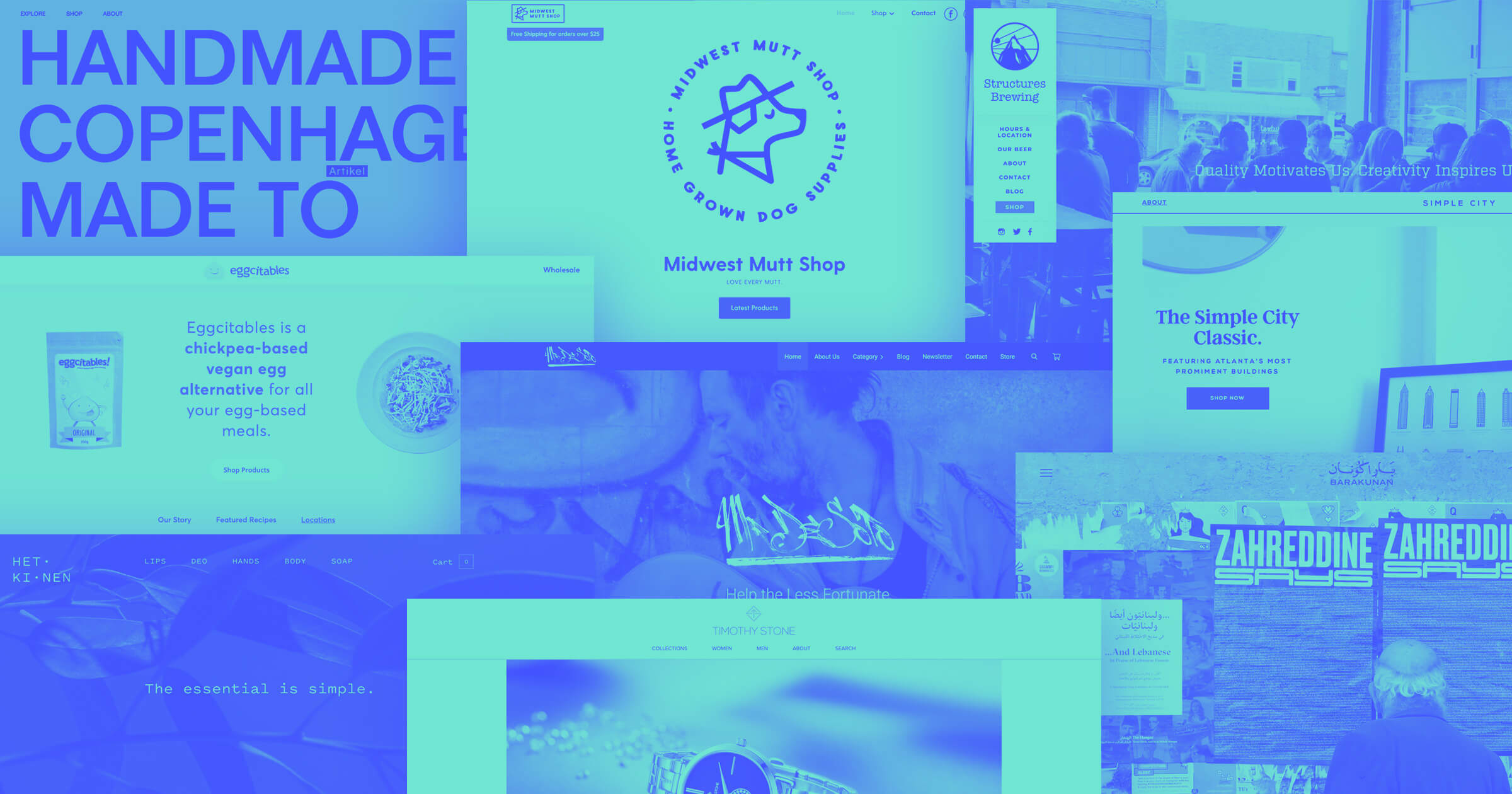
There are so many different realms of ecommerce, as well as approaches to designing an online shop. We’ve collected 25 ecommerce website examples, all made in Webflow, who are doing things right in their own special way.
Putting together and running an online business is a multifaceted pursuit, with many important elements requiring attention.
The visuals and content of an ecommerce website need to both inform and inspire. The shopping cart and checkout process need to be intuitive. And the website should have a responsive design, making it a consistent experience whether it's viewed on mobile devices or a desktop.
That's why we made a comprehensive list of some ecommerce websites with great designs. Because, at the end of the day, it’s not just about building a store, it’s about building a brand.
25 creative ecommerce website examples
Here are 25 examples of ecommerce websites that are sure to inspire your own:
1. Space Posters
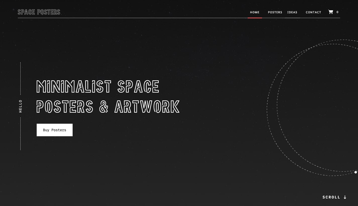
Would you like to hang a poster on your wall showing the satellite Voyager One’s path as it swung by Jupiter and Saturn on its arc out of our solar system? Space Posters offers a number of cool posters great for anyone who gets excited about the cosmos with this online store.
Their posters are beautifully minimalist, and everything in this ecommerce website design is consistent with its style. There’s no full color depictions of planets, or other ostentatious illustrations. There’s black, and there’s white.
This is a perfect example of visuals tying in directly to the products being sold. Ecommerce sites need to have a design aesthetic that matches their products, and Space Posters delivers a shopping experience that anyone excited by space will find enjoyable.
2. Désplacé Maison
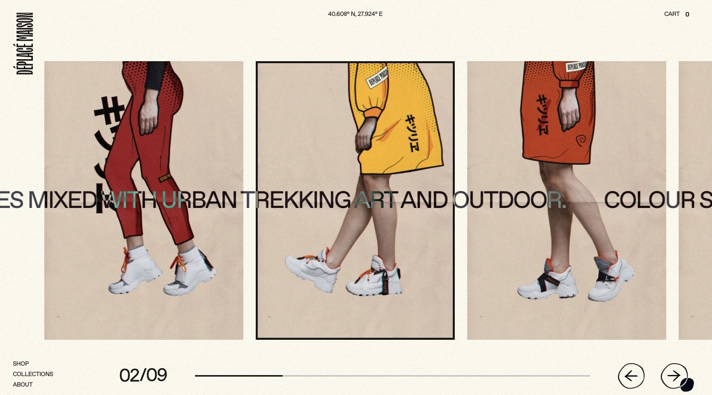
Désplacé Maison sells shoes, but not the all too familiar designs we see dotting the shelves at mainstream shoe stores. Their footwear looks like they were beamed in from the future with a time machine.
There are so many ecommerce stores that look and function the same, and it’s hard not to emulate something like Zappos or Amazon. Désplacé Maison’s branding is unique and their website transcends the normal arrangement of orderly rows of products and blocks of content. From the paper like textures, to the splotchy dot of ink that’s your cursor, there’s a lot that ties into the organic world, giving it a sense of warmth and personality.
This sense of originality also extends to their product pages. Here we see two rows that move in opposition to another, making for a unique way to navigate through their stylish shoes:
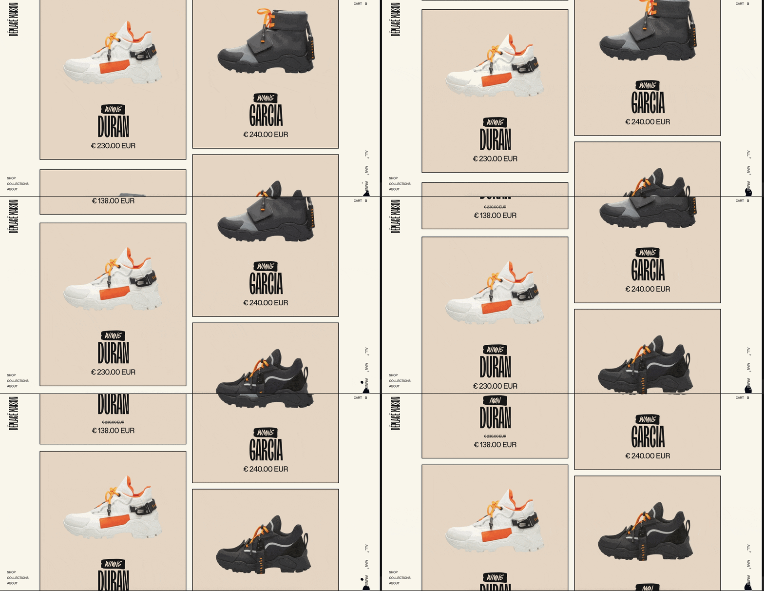
With creative visuals, fun micro-interactions, and a strong visual identity, Désplacé Maison provides great inspiration for those who want to design ecommerce websites that don’t follow what everyone else is doing.
3. The Dockyard Social

Straight out of Scotland, The Dockyard Social, sells comfort food and drinks. This homepage not only shows off their belly warming food and snazzy beverages, but also functions to sell vouchers and gift cards for their business. Not many restaurant websites feature any sort of ecommerce functionality, and this is a nice touch in bringing in additional revenue.
Most restaurants just throw up a website that has only a menu, location, and contact information. The Dockyard Social puts a lot of effort into their web design. With scroll triggered parallax effects, and a hip color palette, it has a distinct look, standing out from the multitudes of boring, cookie cutter restaurant websites.
This is yet another small business web design that shows how far originality can go in differentiating your brand from the rest.
4. Nalen Ayurveda
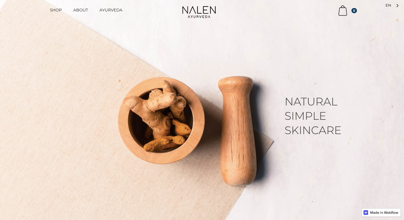
Nalen Ayurveda offers skin care products for those who want something different compared to what one would find at the local drugstore, with an online business full of wonderful product categories of natural cosmetics.
The home page sets the tone, with a simple, well composed product image of ginger root, resting in a wooden pestle and mortar. It’s a strong visual — you can almost smell the sweet spiciness of this root.
The entire web design has a fresh and airy layout. This simplicity reflects so well the nature of their skin care products. Nalen Ayurveda projects a naturalistic, healing vibe throughout their ecommerce store.
The product descriptions aren’t dry recitations of details, but hit customers on an emotional level. They describe one hydrating face cream as, “Aabha is glowing and radiant in Sanskrit. This tri-doshic healing and hydrating cream is your best friend, every single day.” We’re fans of creative copy, and this hits all the marks in making a personal connection with their audience.
5. L’intendance
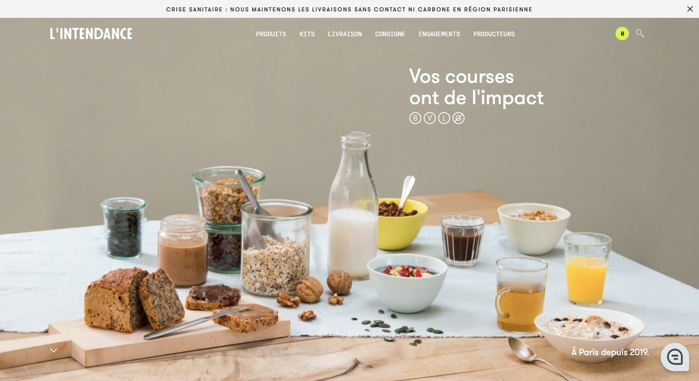
With a table full of rustic bread, crunchy granola, tea, orange juice, and other neatly ordered food and utensils, you’re going to feel hungry immediately landing on the L’intendance website. Their ecommerce store offers food storage kits, as well as individual ingredients like spices, flours, and oils among other culinary goodies.
Product photography matters. L’intendance puts on display superb product images of all that they carry with attention to the details.
With mouth watering visuals, clear product categories, and a user-friendly interface, L’intendance provides an ecommerce experience that will inspire you to step up your own cooking skills.
6. Wannabe Toys
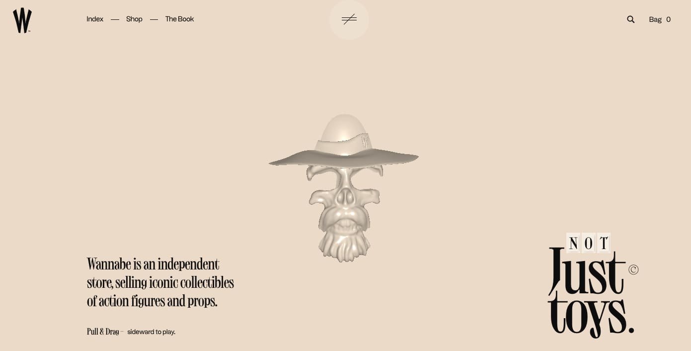
Whether you’re fandom is Marvel super heroes, Dragon Ball Z, or even Laurel and Hardy, Wannabe Toys carries action figures and other collectables that will fulfill whatever your area of nerdom in this quirky online store.
What makes this design special is the product page. Yes, they’re arranged in a grid, but each product pokes up out of the top of each square. Like taking an action figure out of a box, this effectively lifts each product out of its digital square, bringing each one step closer to actually being in a fan’s hands.
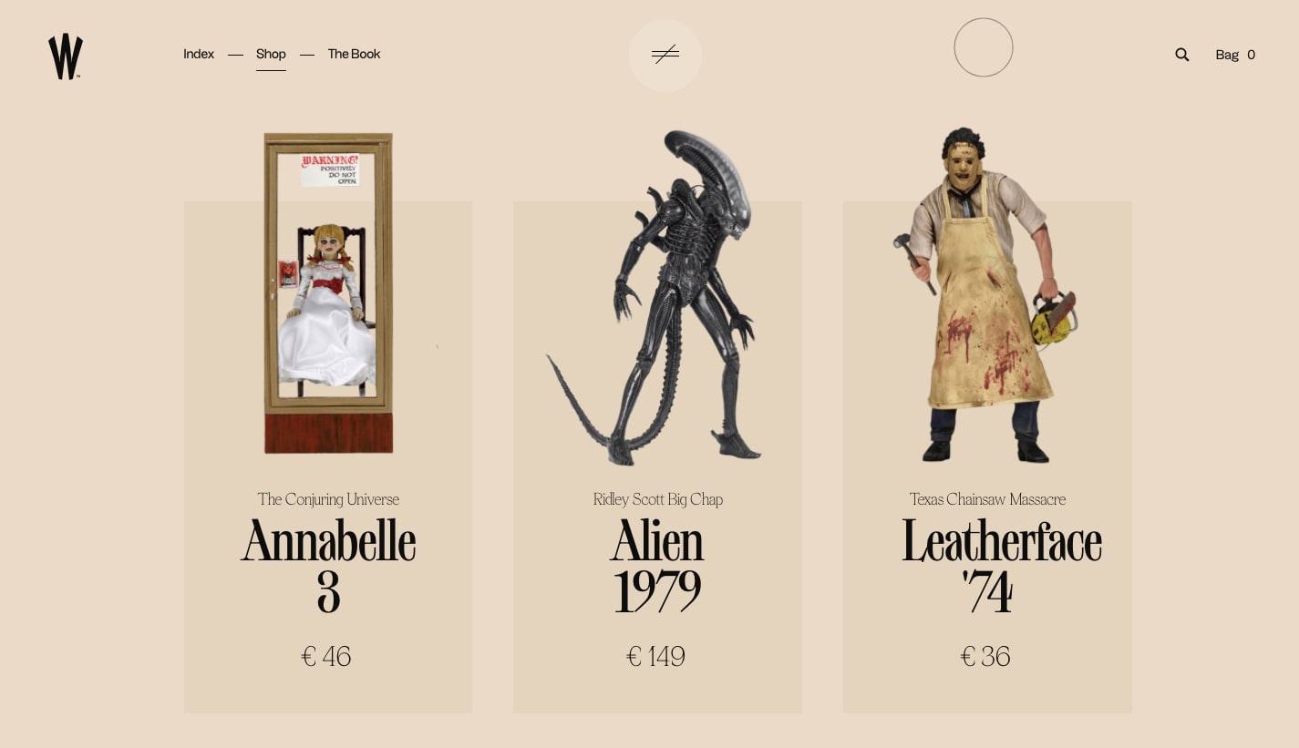
Wannabe Toys demonstrates that product pages don’t have to be confined by straight lines, and that there are subtle ways to subvert the grid.
7. Die Arbeit
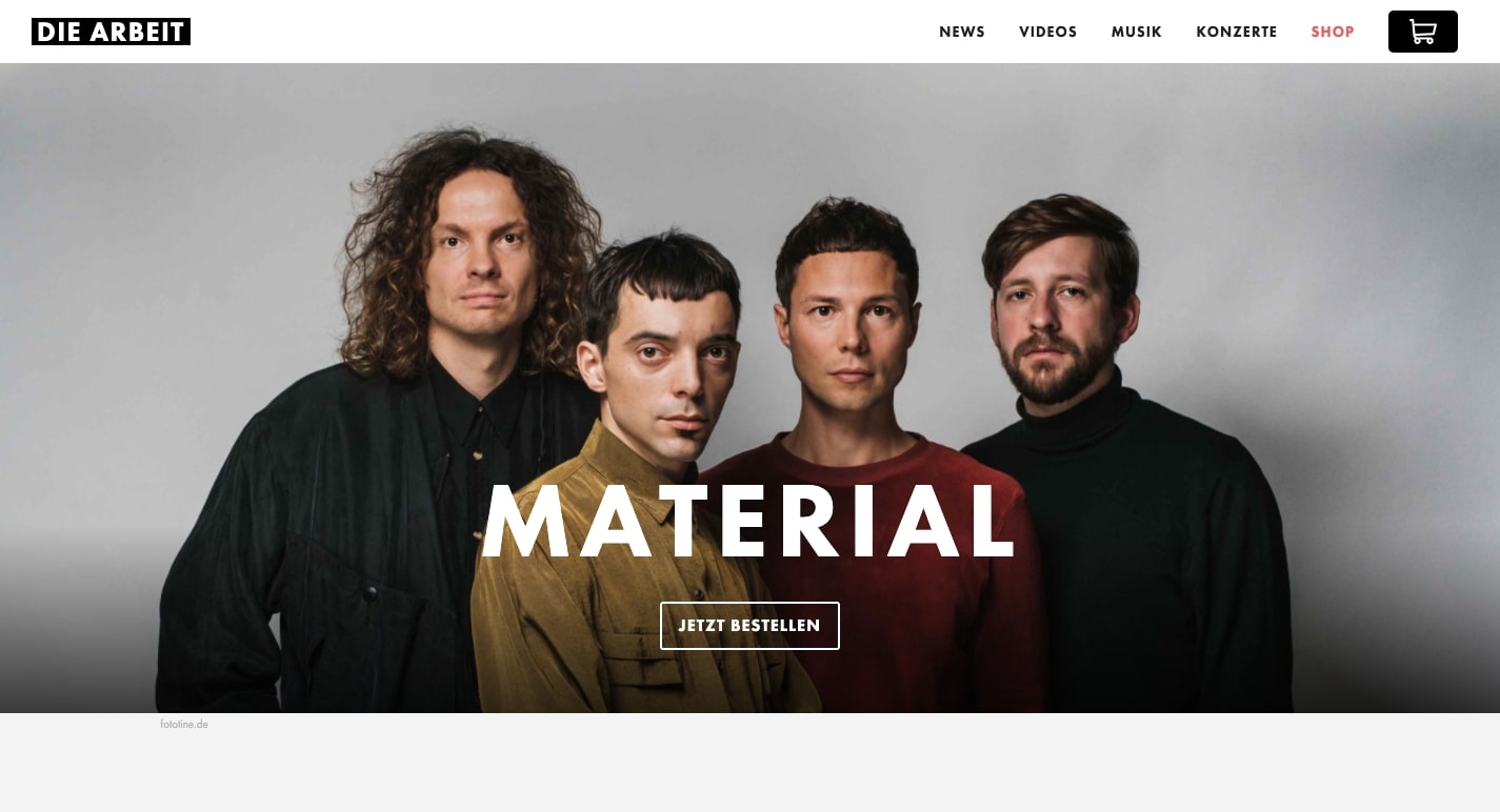
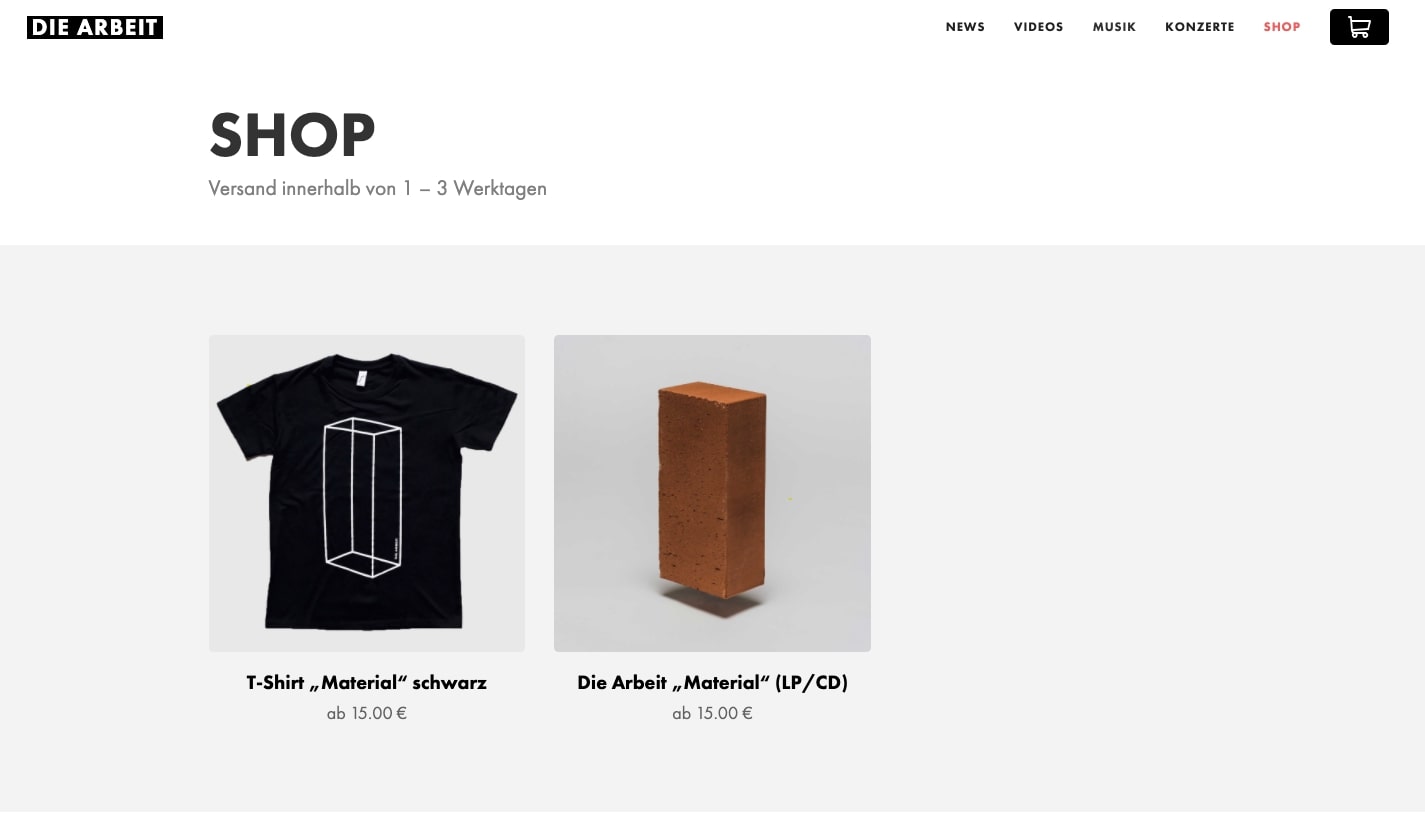
With musical influences rooted in 80’s post punk, this German band adds a bit of polish and sheen. Die Arbeit never stray from these abrasive influences, but their bass driven rock pleases the ears with pop sensibilities. This web design is rich in music and videos, giving anyone who wants to check out their sound plenty of material to take in.
Merchandise can be a big part of a band’s revenue, and this site has a straightforward ecommerce section that makes ordering records and t-shirts easy. This web design shows that ecommerce, even for bands, doesn’t have to be an overly complicated endeavor.
8. Rullus
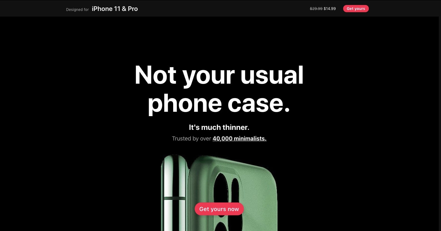
Rullus offers high-quality wallets and lightweight cases for iPhones, with this modern ecommerce website design.
Along with some slick scroll triggered animations, this web design has huge photos across its layout. This captures all of the curves and eye candy that make Rullus’ products different from bland generic cases. Rullus shows the impact that superbly shot, gigantic photos can make in showing off items in enticing people to buy them.

9. Cloe Cassandro
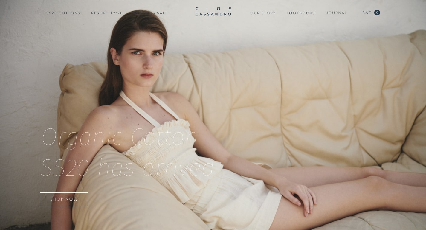
Do you want to hit the beach decked out in swimwear not made in a factory? Cloe Cassandro offers beachwear with a conscience, handmade in Bali, with their ecommerce business.
With beachwear that’s gentle flowy like an ocean breeze, this design has a light touch with ample white space. Whether it’s the thin lines of the SHOP NOW button, or ample amounts of negative space, this ecommerce website design has plenty of breathing room.
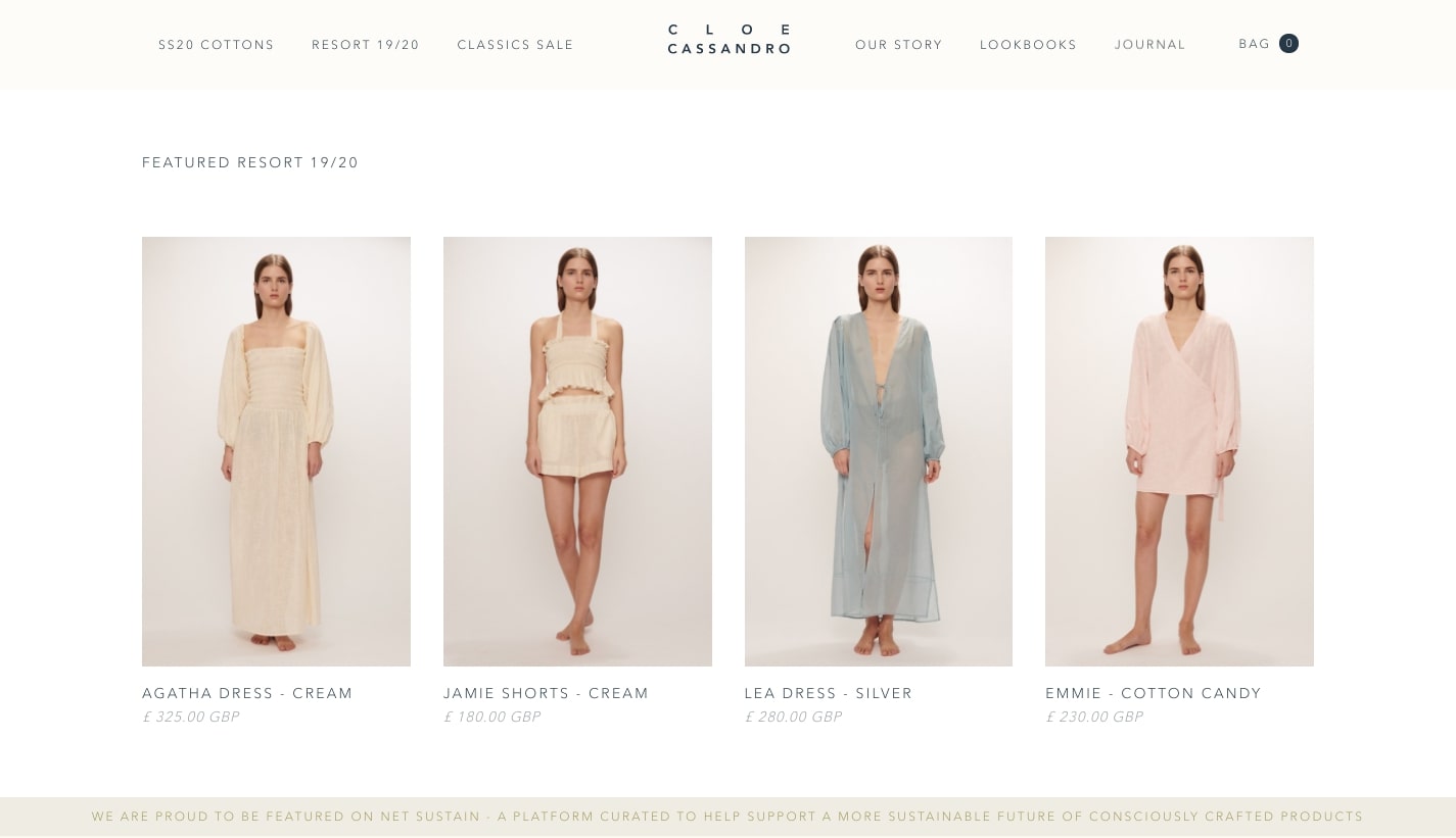
As designers, it’s easy to want to cram everything in. Cloe Cassandro shows how a bit of restraint goes far in creating a smooth user experience.
10. UDX
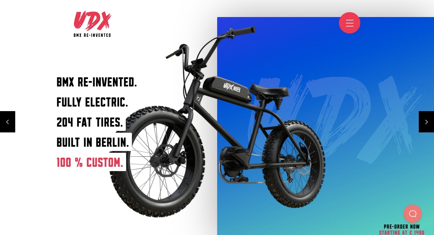
UDX inhabits a specialized niche in offering fat tired, electric bikes. For those who want to hit the dirt with a bit of modern technology, these are the bikes you want to ride.
Just like their bikes, this ecommerce design has motion. With horizontally shifting text, parallax effects, and bike frames popping into the foreground, there’s not a block of content that doesn’t have some sort of dynamic effect put into place. In addition, the product photography captures not only the toughness of these bikes but also the sleek sophistication in being equipped with electric motors.
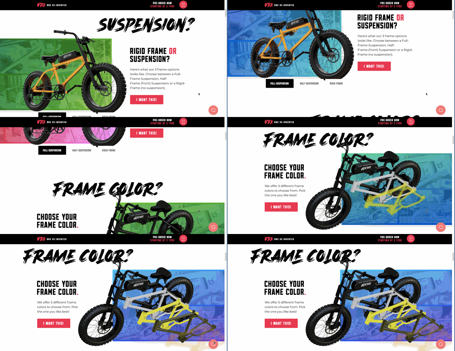
Often ecommerce websites may be a long scroll through static content. UDX bikes shows how animation, and other dynamic ornamentation can really bring a design to life.
11. Friendsday
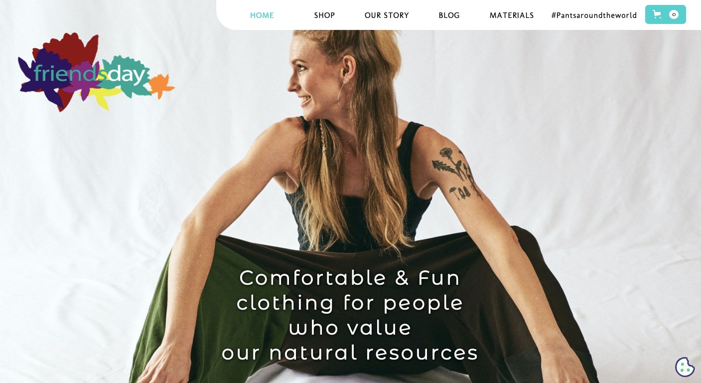
Friendsday offers fashion with lively patterns made from sustainable organic cotton materials. There's an earthiness to all of their clothing designs, but with a high fashion sensibility making this outerwear for the only most sophisticated of nature lovers.
Friendsday’s branding ties into nature with flowers popping up throughout this design. They’re in the hands of models, sit in the background, and in the patterns of the clothing. This connection to the outside world represents so much who they are. This ecommerce website transcends just being blocks of product offerings, but gives us a good sense into who the people are behind the company.
12. Cafe Two 14

Avocado toast. Coffee. And Milkshakes. There’s so much yumminess to be had at Cafe Two 14. But along with enticing us with their delectable food and drinks, they also have a solid ecommerce store dedicated to coffee beans, t-shirts, and even a way to donate a meal to someone in need.
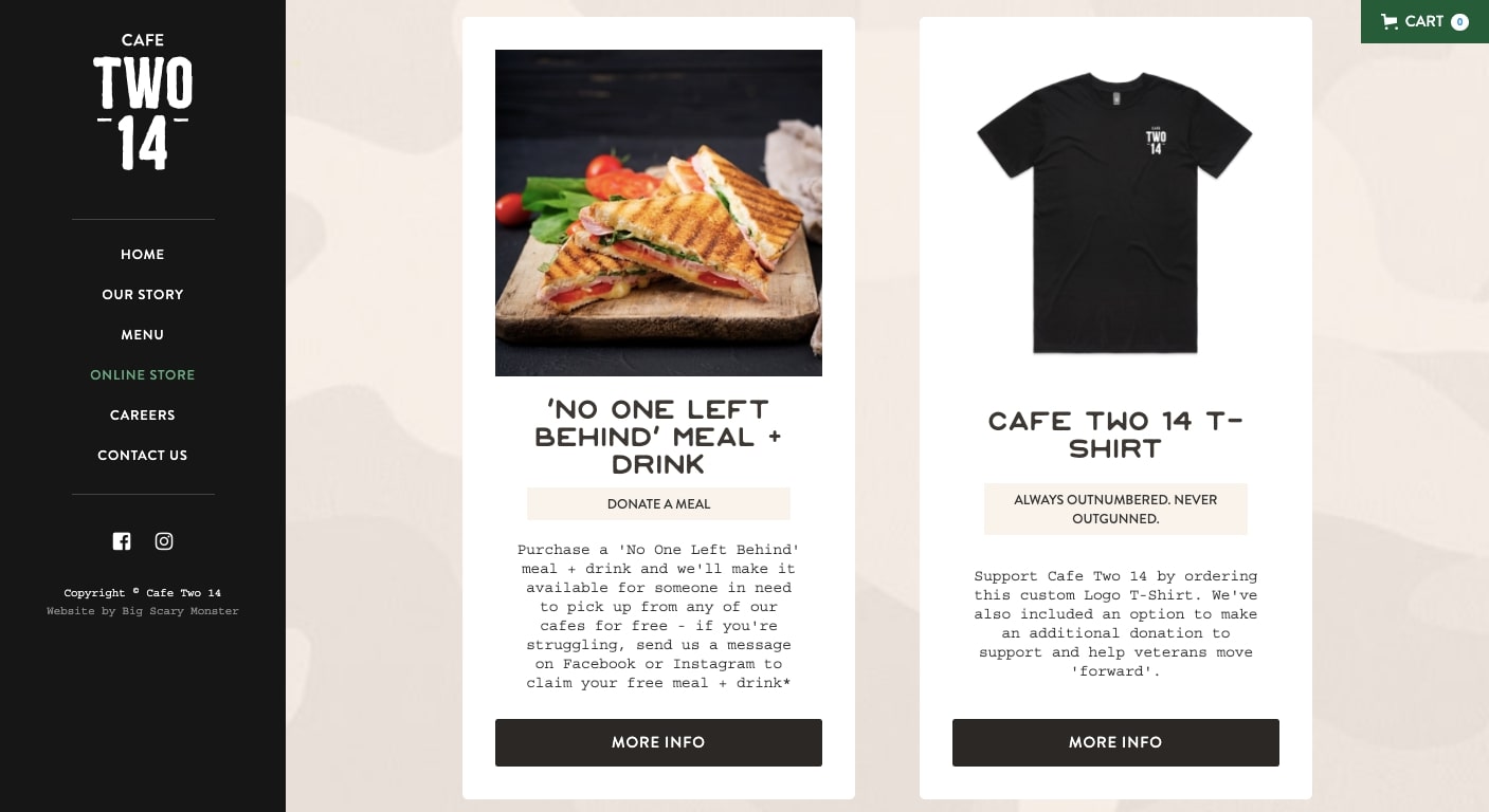
It’s not an overly complicated layout, but it’s artfully done to show off their culinary creations and products. This is a great example of how simplicity can go a long way in making a user’s experience easy.


Get started for free
Create custom, scalable websites — without writing code. Start building in Webflow.
13. Mystery

How many of us get stuck in the same boring routines? There’s that coffee shop we go to every morning. And that ramen place we eat at almost every friday. Mystery comes through with an app to break through this monotony, and generate customized new adventures for people to experience in their cities.
They sell Mystery Gift Cards in an online shop that’s straight to the point. One click brings someone to a combination product/checkout page, making purchasing these gift cards a speedy process. There’s no shopping cart to deal with, everything to complete a transaction is right there.
This homepage is a great example in how to make conversions in the least amount of steps.
14. Roots Catering

Eating a plant based diet doesn’t mean being limited to tofu and garbanzo beans. Roots Catering offers a variety of tasty vegan dishes, with meal delivery, as well as take away in ordering their plant based foods.
There is no lack of veggies in this homepage design, from the carrot in their logo, to the fresh vegetables in their meals, there’s no mistake that they’re committed to providing the best meals they can, free from animal products.
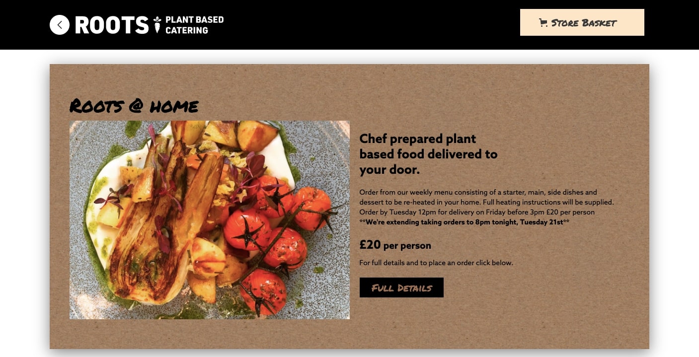
With organic textures, drop shadows, and plenty of veggie goodness, this design shows how subtle design choices can transform a digital space into something that feels real.
15. Sobremesa

Offering a variety of cooking classes, Sobremesa not only teaches how to cook, but offers a social experience in connecting with other gourmands.
Background videos are an iffy design element. They can be a distraction, especially if they don’t look good. But here, these moving visuals work so well in complimenting the content. The hero video opens with a woman putting on an apron, which is such a good metaphor for landing on this website, and getting prepared to sign up for one of their classes.
The images of smiling people sprinkling ingredients and cooking together shows not only the quality of the food that they’ll be preparing but for the opportunity to get to know others who share the same love of cooking.
16. The Nuff
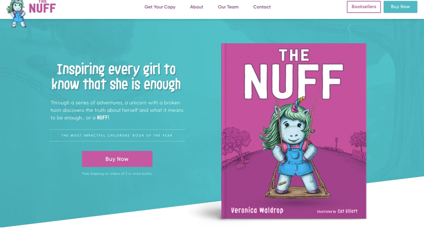
Promoting a book may take many different avenues, with having a website being just one route that people may use to find it.
The Nuff is a book about a unicorn and her journey of self esteem. The design has a child-like feel, with purples, blue, and playful typography. But all of these elements show an intelligence. This isn’t a book for babies, but rather for children who will understand the messaging of this story.
Along with this fun design is plenty of content that will help parents make the decision to purchase this book for their child. The many “Buy Now” call to action buttons are easy to spot and well placed throughout this website’s design.
The sneak peak section offers a glimpse into this tale, with an animated opening of the book letting one leaf through the pages. This is such a nice little detail, showing how web designers can go beyond standard practices in creating something extra that adds to the user experience.
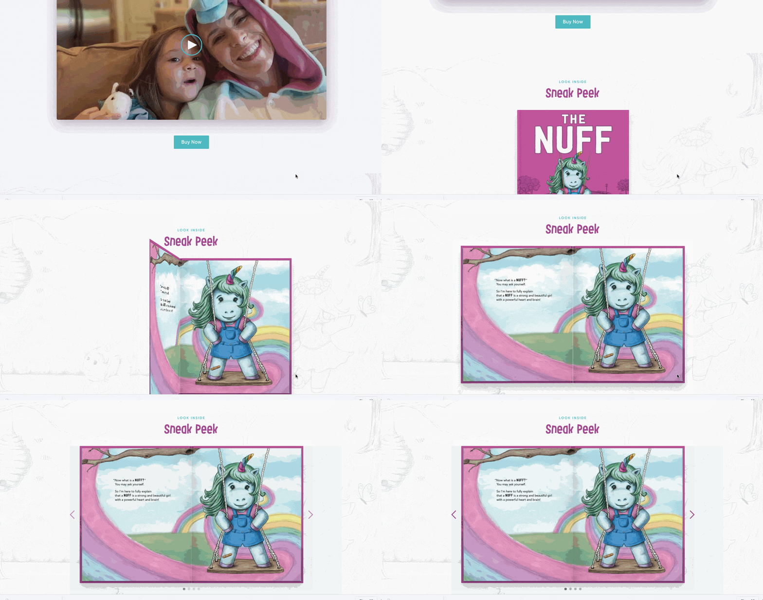
This homepage does a fantastic job in not dumbing down their design, with an aesthetic that captures the intelligence and spirit of the Unicorn hero of its story.
17. Insane Boats
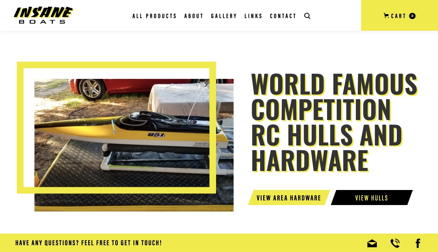
Are you looking for competition level radio controlled boats? Insane Boats carries a variety of fast models, as well as parts and other accessories.
“Insane” is a bold statement to have in your business name, and the yellow and black color scheme certainly backs up this proclamation. These boats don’t gently glide on water, but buzz across the surface with ferocity. This color scheme works perfectly. Insane Boats shows how matching the energy of a design with that of its products, makes for a strong impression.
18. The Camera Company
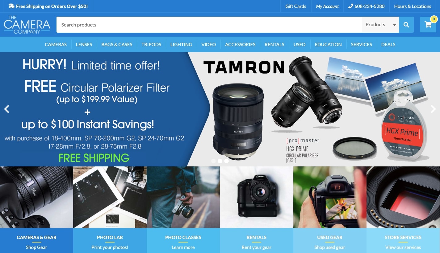
Whether you’re a beginner behind the lens, or the next Ansel Adams, The Camera Company has everything a shutterbug could want in pursuing their art.
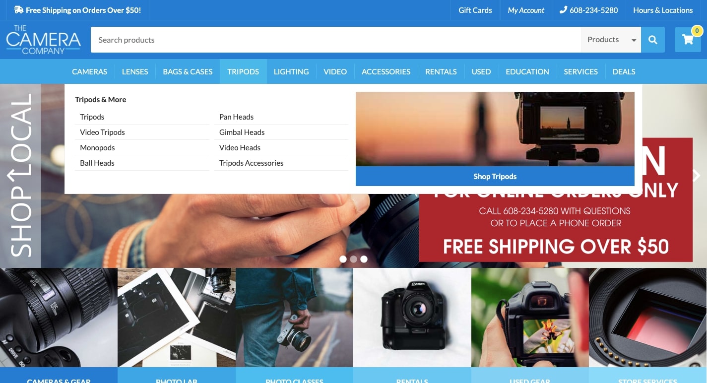
They carry many different cameras, lenses and accessories. Though they sell many products, their drop down navigation keeps everything in order, with a clear organization of product categories. All of their products are but a few clicks away. This is a best practice for any big commerce online business. Well planned product categories and their organization is important for a good user experience and improving conversion rates.
19. RespiTech
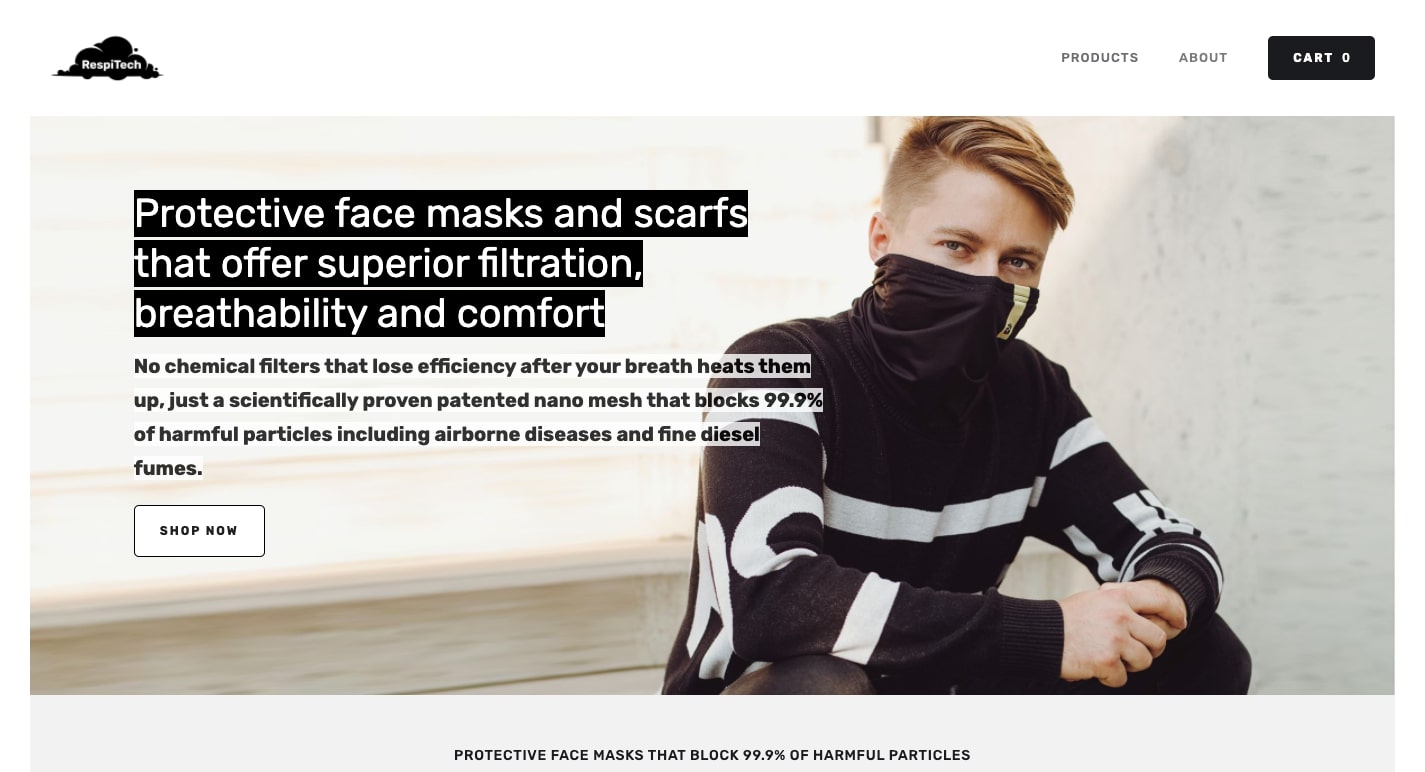
RespiTech sells scarves and masks that not only will protect people, but also look good.
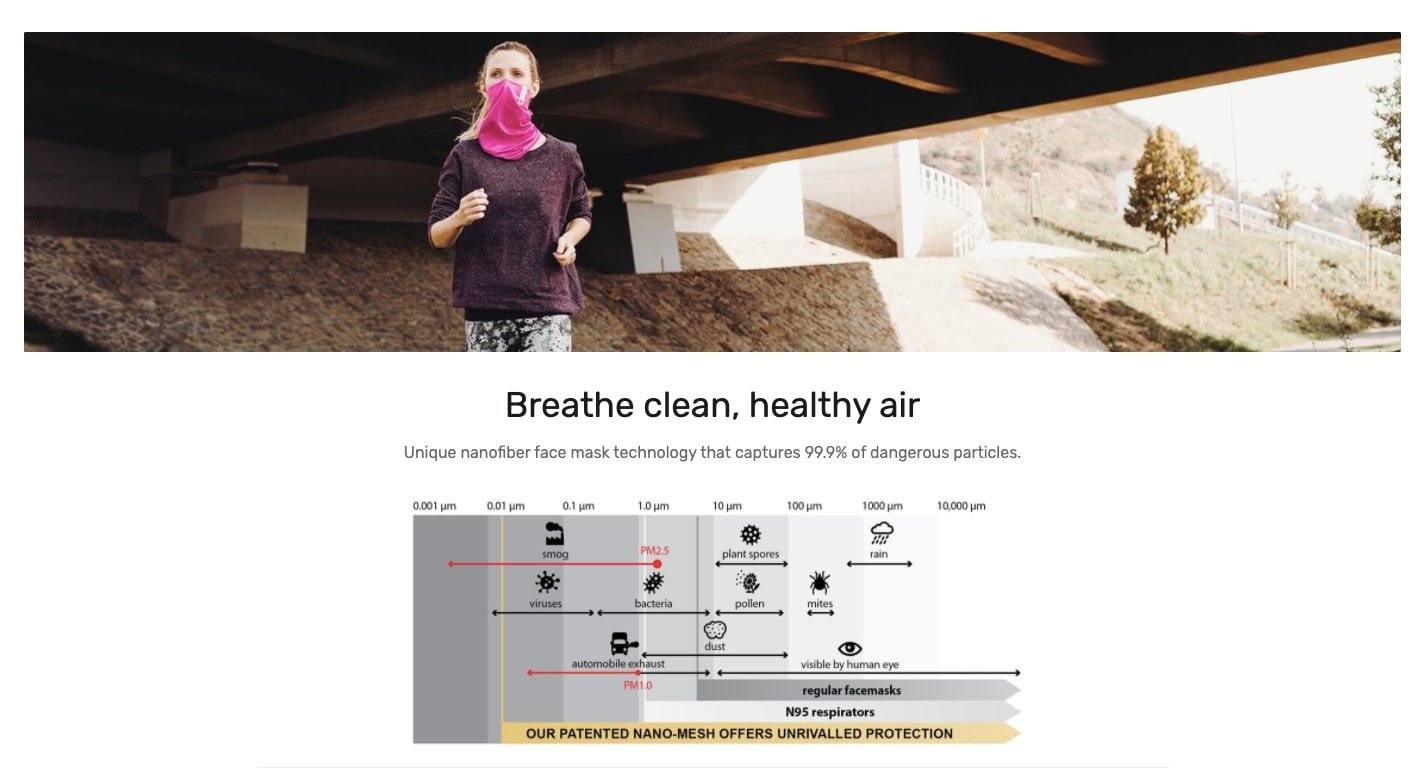
Let’s face it. Respiratory masks aren’t the most glamorous of items. But RespiTech makes ones that have style. Their web design avoids the sterility of the many medical device websites out there, and is as fashionable as the masks that they sell. This is proof that good design, no matter the ecommerce platform, matters in keeping people engaged.
20. Feed the Front Line NOLA
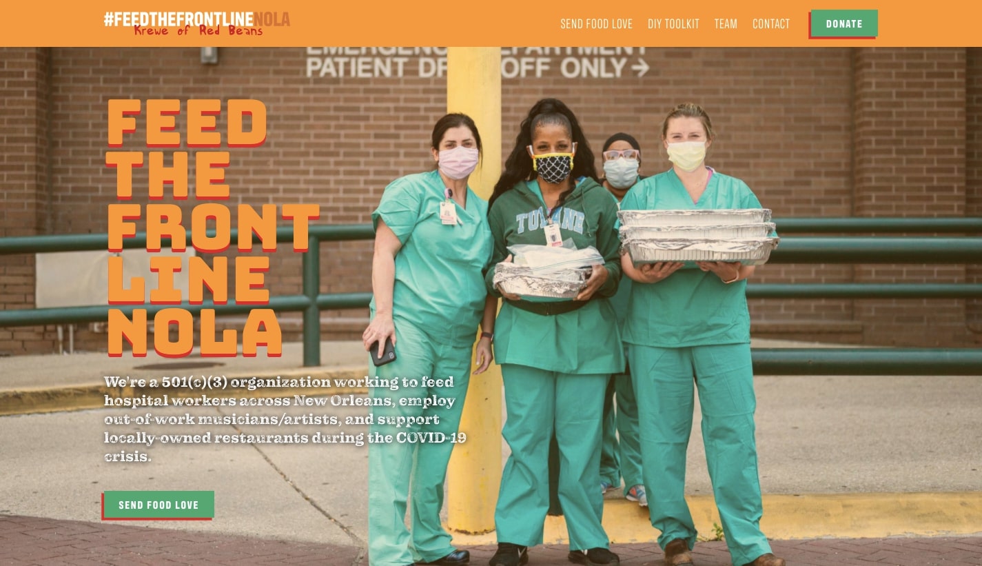
What’s more noble than wanting to feed hospital workers, whose job is to put themselves in harm’s way in order to save people’s lives? Feed the Front Line NOLA is a non-profit dedicated to helping out these medical workers in New Orleans.
With a colorful design, nice contrasts in typography, and photos of the medical workers they help, this design has a warmth and sense of humanity. One of the most important aspects of a web design is to connect with its audience on a personal level and Feed the frontline NOLA does this so well.
The call to action buttons to “SEND FOOD LOVE” and “DONATE” are never lost in this well ordered layout, making it easy for people to lend their support.
21. Standstill Tea
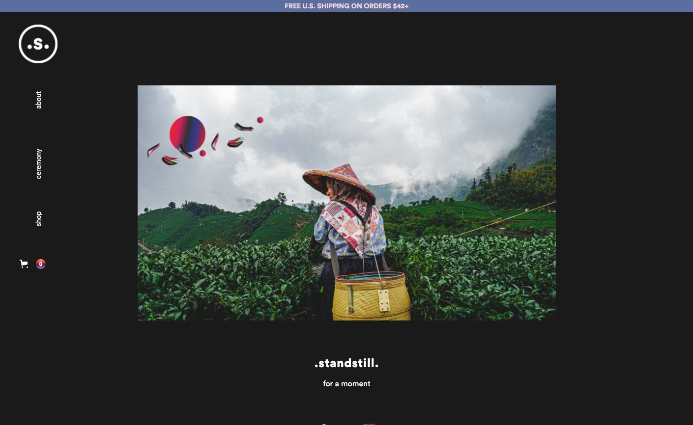
Landing on this page for the online tea seller Standstill Tea. you’re greeted with the message to stand still for a moment. This cue gives a bit of a pause, letting you take in the lush landscape of tea that lies before you in the hero image. A scroll down brings motion with a parallax animation, raining down the shapes in the top left and opening up the story about this tea company.

Much like tea itself, there are nuances to this design that aren’t overpowering. There’s the gentle parallax, which adds a note of originality. There’s also other nice touches like the horizontal left hand navigation and subtle scroll triggered zoom in on the photos. These elements could have been distracting, but are used tastefully, adding so much to the design. There’s a zen like calm that fits so well with the teas that they sell.
22. Eliqs
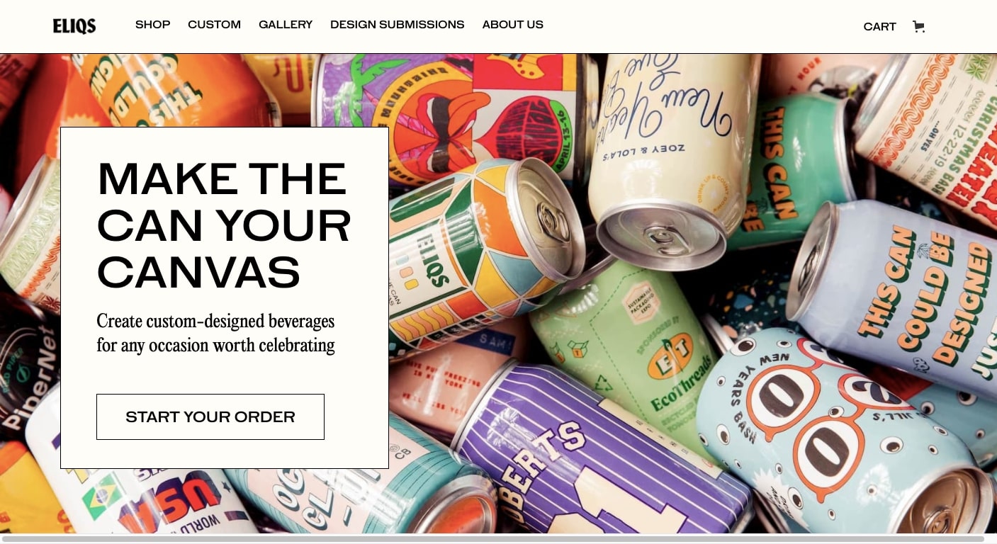
How fun would it be to have cans of brew at your wedding reception with a design celebrating getting hitched? Or how about cans with your company logo to give to your friends and clients? Eliqs gives you the tools to create your own custom beer.
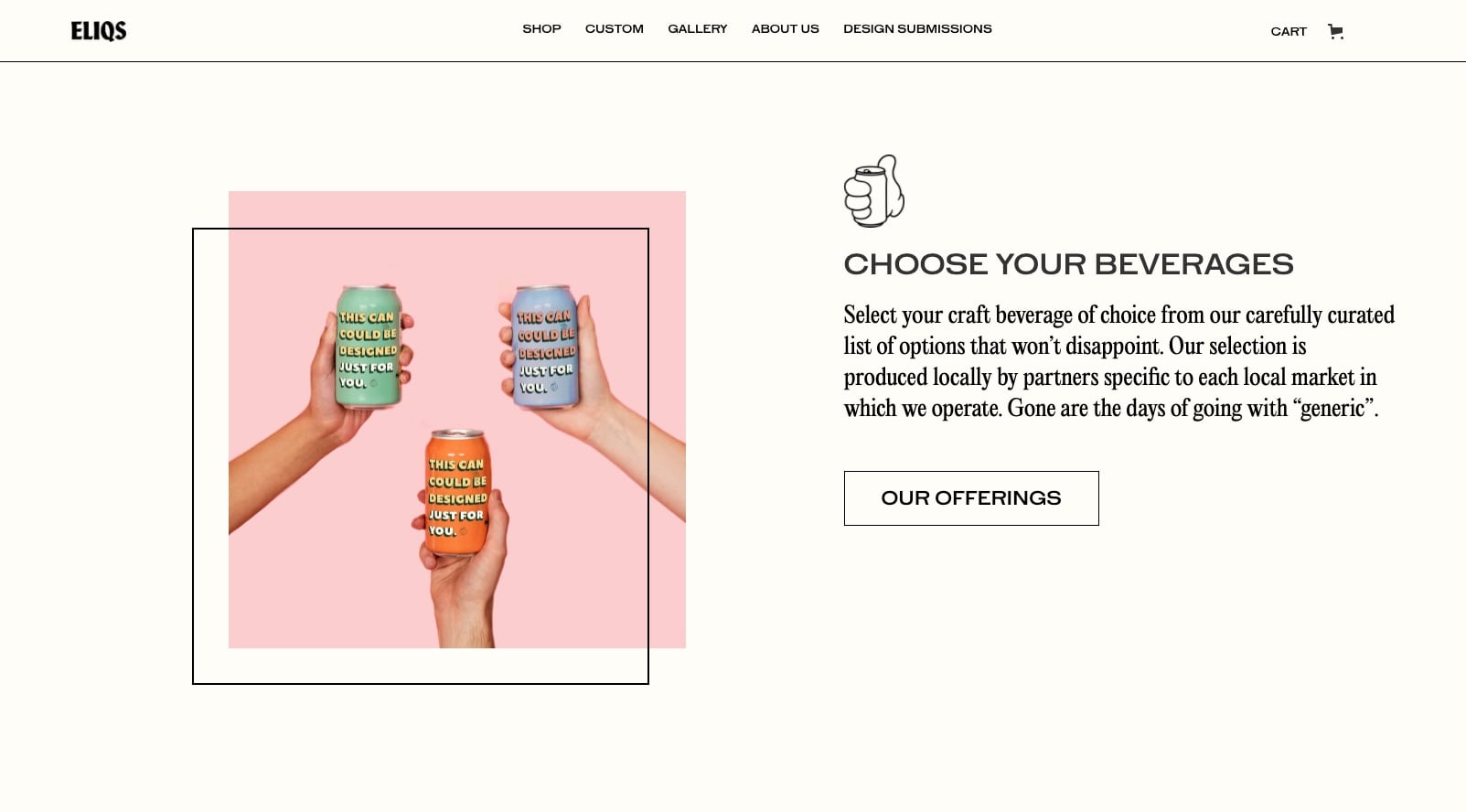
This design relies much on photos of actual cans they’ve created. Seeing the colors, and quality of the end results, really shows that they’re great at what they do. There’s a sense of fun throughout this design, and the playful background colors on many of the images adds to this sense of celebration.
23. Provincial Spirits
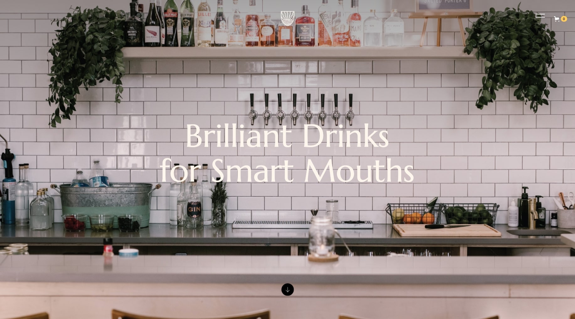
Provincial Spirits manages to pull off a clean design for a craft brand that avoids all of the cliches we often see in websites of this type. With bottled cocktails like Cranberry, Mint, and Orange Vodka or Smoke Rosemary Vodka, these are definitely “artisanal” styled beverages. But there isn’t a single bearded dude, or bespectacled foodie to be found.
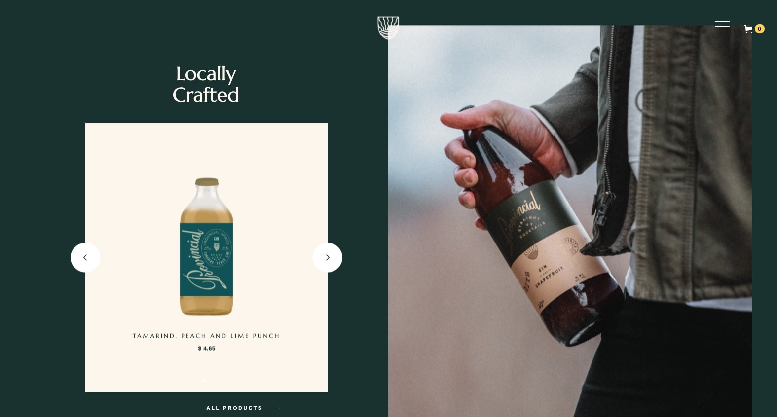
Instead we get close up photos of people with bottles in hand. We see the timeless design of the labels as well as the textures of the clothing. It all feels very organic and personal. Along with liberal use of forest green in the layout we further feel a sense of being connected to the natural world.
This design is hip, without being hip. And isn’t that the most hip thing of them all? We think so.
24. PL Media
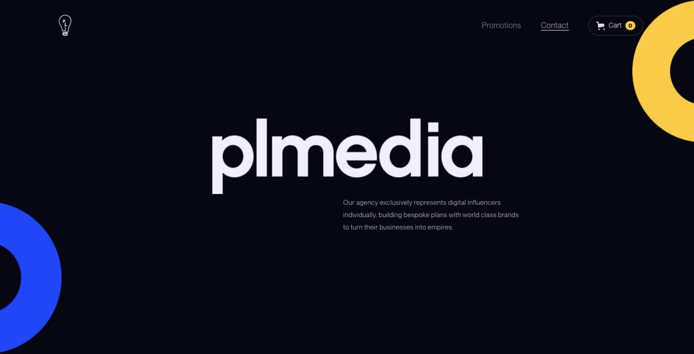
Okay, this is technically an agency website, but PL Media sells the product of social influencer marketing. Not many agencies let you sign up for their services by adding it to cart, but PL Media lets you add the influencer of your choice to your cart and get started.
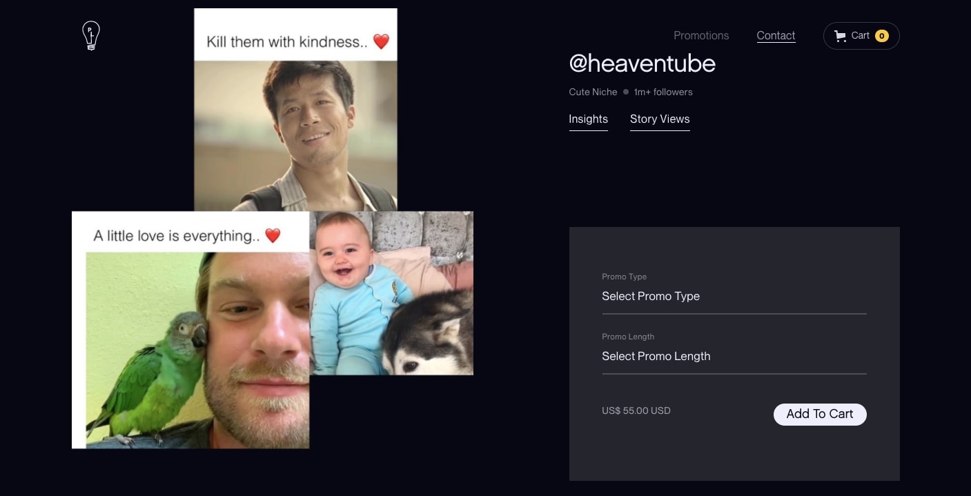
The core of their business is fostering new business relationships between influencers and brands. This is such a new area of marketing, and this design feels very of the moment, making it a solid design for their services.
25. Faves
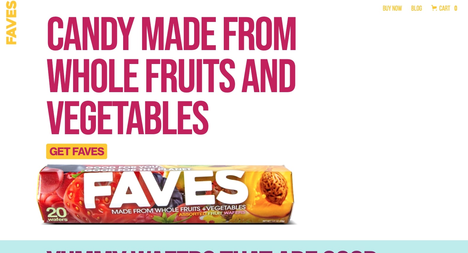
How many of us as children received a box of raisins, and in trying to alleviate our disappointment were told that what we had was “nature’s candy?” Faves pulls off making candies made from fruits and vegetables that actually look good to eat. Sorry, raisins.
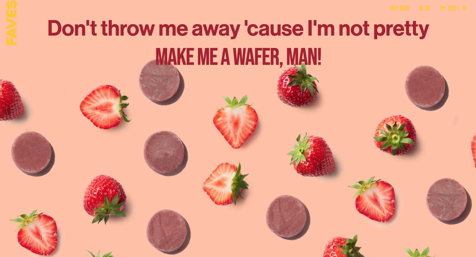
Their landing page has bright colors, big text, and plenty of great shots of the candy wafers they craft, this is everything that a candy website should be. But this company is more than a purveyor of sweets, but are also purpose driven. They’re about reducing food wastes, and are able to weave this messaging in a way that’s never heavy handed.
Interested in seeing more ecommerce websites? Check them out in the Webflow Showcase!
Build your own ecommerce website design with a strong foundation
Taking a brand-first commerce approach will yield you the best ecommerce website design that is sure to give your visitors a great first impression.
Along with all of these design elements that need to be taken care of, digital marketing, social media campaigns, and search engine optimization (SEO) need also to be well crafted to bring potential customers through the doors of a given digital storefront.
The best online stores find just the right balance between all these different components, resulting in a strong brand, and higher conversion rates.
Don’t forget to check out Webflow Ecommerce to help build your own brand, and check out our ecommerce templates make a memorable experience for your customers.


