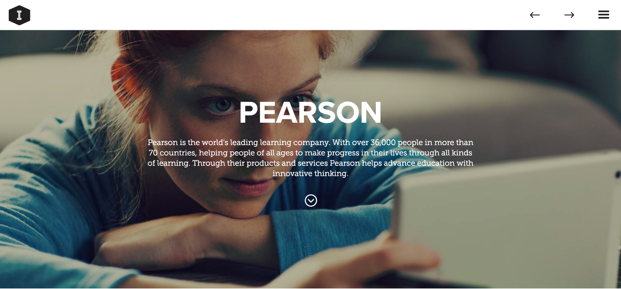
Salt is a branding agency based in San Francisco and New York. They’ve done work for a few names you might’ve heard of — so long as Google, Disney, Microsoft, Coca-Cola, HP, Twitter, and XBox ring any bells.
And Salt has no in-house developers. That’s right: 0.
Before Creative Director Chris Inclenrock discovered Webflow, that meant working with outside development teams, either contractors, or their client’s own teams. And that meant revenue loss of up to 50% for a big enterprise site.
But like I said, that was before Webflow.

How Chris’ view of web design has evolved over time
Chris has worked in web design since 2000, and in that time, his view of of how digital design works has evolved, just as the internet itself has.
He’s seen the web move from a design-first ethos, where everyone was trying to reproduce the static beauty of print. Then came the rise of interactivity and responsiveness, where it was all about bringing the static to life, whether through Flash (groan) or JavaScript.
Today, content is the fuel that powers the web. Super-simple sites geared toward delivering great content have become the name of the game. This final step represents a kind of convergence, for while the focus is now on content, beautiful design and engaging motion make content a more immersive experience.

This evolution is paralleled in the tools web creators have used over the years. Designers work in Photoshop and Sketch, uniting design and content. Developers work in code, focusing on functionality over design and content.
But with Webflow, Salt can bring all three pillars of web creativity together in a single platform, uniting design, functionality, and content in one beautiful tool.
Why Salt uses Webflow
Creative director Chris Inclenrock says the Salt Branding team uses Webflow because it:
Webflow unites form, function, and content
Today, most design workflows reinforce a silo’d mindset, with design, dev, and content teams all working in isolation on their particular areas of expertise. With this type of workflow, collaboration becomes an extra step teams have to take the initiative to kick off.
But with Webflow, form, function, and content unite seamlessly — just as they should on the final live website.
Today, content is the fuel that powers the web. This represents a kind of convergence, for while the focus is now on content, beautiful design and engaging motion make content a more immersive experience.
Webflow helps save tons of time
With Webflow, Salt’s designers aren’t stuck iterating on hundreds of static mocks, then speccing them for dev, then setting up prototypes to illustrate flows and interactions.
Instead, designers can move straight from mocks to a live prototype, which they can easily:
- Share with clients to get detailed feedback
- Share with devs to illustrate flows, interactions, and specs — all without creating unnecessary artifacts
- Publish to the web — or export for dev
Webflow simplifies communication
When your “prototype” is an actual responsive website, there’s no need to explain user workflows, interactions, or “where this link goes.” It’s all right there, ready to experience on any device, in any browser. All of which makes communication easier, and helps designers get much better feedback.


Get started for free
Create custom, scalable websites — without writing code. Start building in Webflow.
How Salt uses Webflow
Salt Branding’s teams have found Webflow to be an incredibly powerful tool for:
1. Quick landing page executions
When a client needs a new campaign landing page, like, yesterday, Salt turns to Webflow to quickly design and build beautiful, high-converting experiences.
2. UX design with wireframes and prototypes
Most every design starts with wireframes and/or prototypes, and Salt’s designers use Webflow to bring these early-stage designs to beautiful, fully interactive life. That way, they can quickly gauge the quality of experience and identify problems before investing too much in a design.
With Webflow, designers can ship code, not just static mocks.
3. User interface (UI) design comps
Many of Salt’s clients have their own in-house development teams, and just need Salt to create beautiful designs for the engineers to build. With Webflow, they can design, export the code, then hand it off to the client’s developers to use whatever they need. It’s a lot easier than turning layers on and off in a 20-layer PSD!
4. Widget/element design
In design, as with the devil, it’s all about the details. And sometimes that means that all a design needs is a new or refreshed design pattern. With Webflow, Salt’s designers can quickly built out isolated elements complete with interactivity in no time.
5. Simpler internal and user testing
Webflow’s also proven ideal for building out quick concepts to test both internally and with external clients, so it’s easier to discover if an idea is a diamond in the rough, or one for the cutting room floor.

The benefits of using Webflow
Chris has seen a variety of benefits arise from his team’s use of Webflow:
1. Speed
Webflow gives Salt’s designers the ability to execute web creative much more quickly than the old-school wireframe, mock up, hand off to dev flow.
2. Education
With Webflow, Salt’s designers can now use a tool that teaches them about the web design process and fundamentals — without taking them away from their work.
3. Un-siloing
Webflow has benefitted Salt’s entire team because of its ease of use. And when we say entire, we mean everybody. Content writers and editors can easily drop their content into designs, see how their work impacts the design, and collaborate more effectively to ensure seamless integration of design and content. Even account managers and producers benefit, as they can easily optimize for search, set up analytics, and manage form elements — without bothering designers or devs.
Want your team to try Webflow?
It's free to get started, and once you're all convinced, it's just $78 a month — a fraction of the cost to have your team on Adobe CC.


