It can be a hassle for marketers on small startup teams to get development and design time. A clunky CMS with minimal access can create long wait times for updates and improvements. Webflow removes this barrier and lets marketers do what they do best — magic (we think).
We all know the effect a beautiful, highly usable website can have on generating leads. But a well-designed, high-converting site will quickly become outdated and ineffective if neglected.
BugHerd is a lean team of product managers, developers, and designers, with minimal technical resources for marketing efforts. Our marketing team was repeatedly blocked from much-needed site development time. A focus on our paying customers and product support took priority over site updates.
When things got busy at BugHerd, it wasn’t uncommon for updates to be stalled for a month or more. And with some fairly aggressive goals for growth, this lack of speed and site optimisation was leaving our marketing team frustrated. We needed a way to power forward without development slowing us down.
That’s where Webflow came to the rescue.
Handing over the website keys
Beyond its strengths in design flexibility, Webflow’s greatest strength is its learnability — our team members picked it up in minutes.
It’s super easy for anyone with a basic level of HTML/CSS knowledge to tweak the site as needed. The CMS is intuitive, which made it easy for the marketing team to play around and make changes.
And without having to pester developers to publish changes, the marketing team knocked out new landing pages in minutes. This autonomy saved us weeks of wait time.
Harnessing our new-found power
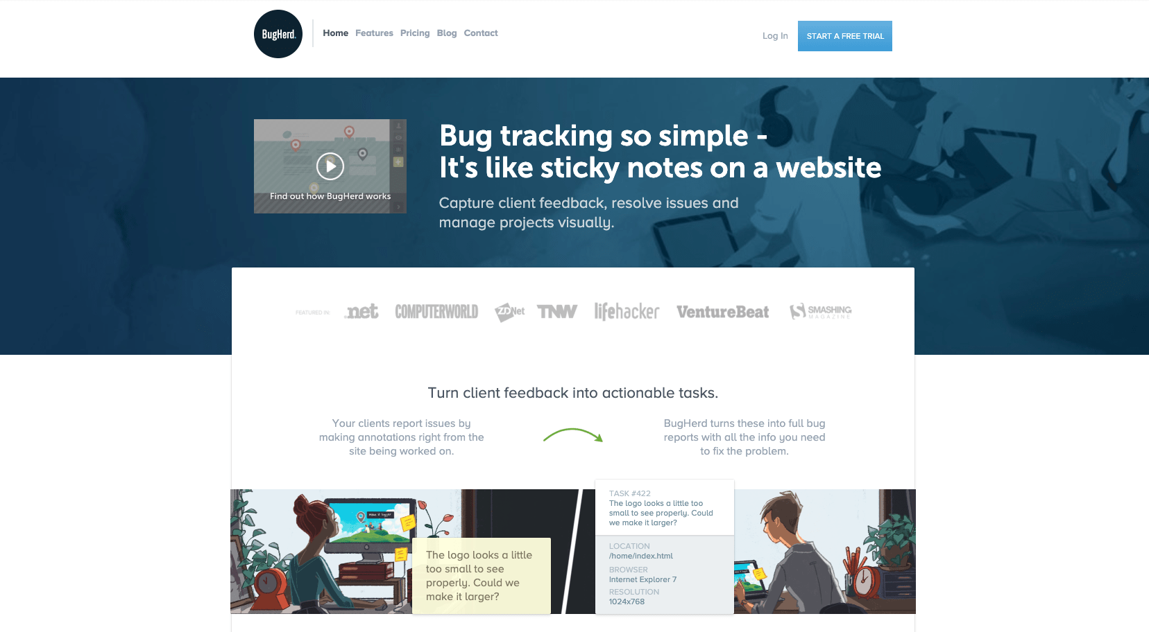
We started off using Webflow to initiate testing and iterate on small site changes. We tackled testing on our landing page first, keeping the original design from 2016.

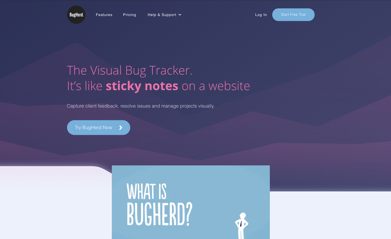
The original site was turning visitors into leads, but at a declining rate — our iterations were no longer scalable or effective. We quickly decided it was time for a full, site-wide refresh. And using Webflow meant the developers didn’t need to do anything at all!


The modern web design process
Discover the processes and tools behind high-performing websites in this free ebook.
Redesigning in Webflow without bugging our devs
The hardest part, as always, was choosing a design direction.
Our incredible in-house designer created the initial concepts for a few key pages. We found and contracted help for the rest of the site thanks to the Webflow Experts site.
After the updated BugHerd design was locked in, the team hired a second Webflow Expert to pull it together. This could have easily been done in-house, but we decided outsourcing a few important templates — homepage, pricing page, and our features page — was our best route.

Trusting the (conversion) numbers
Since our relaunch, the BugHerd site has experienced a 65.1% increase in conversion rate (based on numbers from the previous year). Conversion rates from dedicated landing pages are traditionally higher than generic homepages — in our case, more than 5% higher.
Webflow allows for ongoing creation of dedicated landing pages on the fly, which means we can continually test and improve our content — without bothering our developers.
Winning!
Lessons learned
Nothing is without compromise. We learned two things:
- WordPress and Webflow don’t play nice. After years of blogging, good domain authority wasn’t something we were willing to mess with. (Though others have seen the switch actually improve their SEO performance.) This meant we needed some manual developer intervention to launch the site refresh.
- It’s helpful to get designers and marketers up to speed with responsive design and HTML/CSS. In our case, the developer build time was partially replaced with designer time in Webflow. So be sure to factor this into your design team’s workload. On the upside, designers had more bandwidth than the developers and were quicker at pulling together the elements.
All in all?
Webflow has made things dreamy for the BugHerd team. If you’ve been on the fence, hop off and head straight for Webflow. You won’t be sorry!


