As we look forward to 2017 — a year that hopefully won’t be plagued by the passing of so many of the world’s greatest artists and performers — the big question on every designer’s mind has to be: what will define design in 2017?
Check out our latest post: 11 engaging web design trends for 2024
So with that in mind, I decided to ask Webflow’s own designers what trends they think will dominate the world of digital design in 2017. (And wrote up a little commentary on their thoughts.)
First, let’s hear from Webflow’s Chief Design Officer, Sergie Magdalin.
1. Layouts that let content shine
The arrangement of design elements within a given structure should allow the reader to easily focus on the message, without slowing down the speed of his reading
–Hermann Zapf
The last few years have seen a sea change in how people view design’s role in business. Design has shifted from a late-in-the-process “optimization” stage where designers swooped in to sprinkle on some “pretty” like mystical fairy dust to a real competitive advantage.
It’s been an amazing evolution to watch.
And a fascinating element of that evolution has been the shift back toward a focus on content: the meat on the bones of the web. Designers worldwide have realized that people visit websites for their content — whether it’s raging tweetstorms, thoughtful long-reads, or the latest “user-generated” meme — and that design’s ultimate role is to present content in an intuitive, efficient, and “delightful” way.
That’s one reason for the shift away from skeuomorphic design toward “flatter,” more minimalist design approaches, as seen in Google’s Material aesthetic, and really, across the web and our various devices.
Of course, as Newton’s third law states, for every action, there’s an equal and opposite reaction. Many designers feel that the flat design trend has taken the “soul” out of design. We expect to see this conversation continue across 2017, but look forward to it becoming a productive dialogue that never loses sight of the heart of our design work: the content.
2. Better collaboration between designers, and between designers and developers
As design has taken a greater and more influential role in shaping businesses, more and more attention has been paid to designers’ collaboration with both their fellow designers, and their developer colleagues.
The emphasis on designer collaboration has arisen in part from the massiveness of the web and mobile apps we’re building these days. Gigantic platforms like Google, Facebook, Twitter, and LinkedIn require not only huge design teams working on disparate aspects of the platform, but also better ways for designers to stay on the same page — and that means more collaboration, and better communication.
All kinds of tools have arisen to help facilitate that collaboration, from the shared templates and dashboards in Webflow’s workspace plans to the real-time, shared canvas of Figma — and you can bet 2017 will bring both improvements to those platforms, and all-new options.
On the designer-developer collaboration front, lots of attention has been focused on the all-important handoff stage. Where designers used to hand off massive packages of static images and specs, they’re now sharing dynamic visualizations enabled by tools like InVision, Marvel, and UXPin — or doing one better by exporting real, production-ready code from Webflow.
As Carson Miller recently put it in his TechCrunch article “The future of front-end development is design”:
It is only a matter of time before design and prototyping tools replace front-end development altogether, seamlessly producing a high-quality front-end code base for your framework of choice.
And at Webflow, that’s a future we can get behind. Because we’re helping build it.
3. Improved design-to-development workflows
As design and prototyping tools for the web gain maturity and sophistication, the traditional handoff deliverable has transformed from the aforementioned static files to more dynamic visualizations that range from animated Keynote files to fully functional websites. These more dynamic deliverables shorten the feedback loop, simultaneously improving design and dev team agility and lowering frustration. They also facilitate better communication with clients. In fact, for many users of Webflow, client meetings have become actual live working sessions, where designers are able to quickly bring ideas to life so everyone can experience them almost immediately.
Next up, product designer Gadzhi Kharkharov:
4. Big, bold type
As the design world comes to the consensus that our focus should be on content, more and more websites feature lines of resonant, inspiring copy set in type that’s just as big and bold as the statement itself.
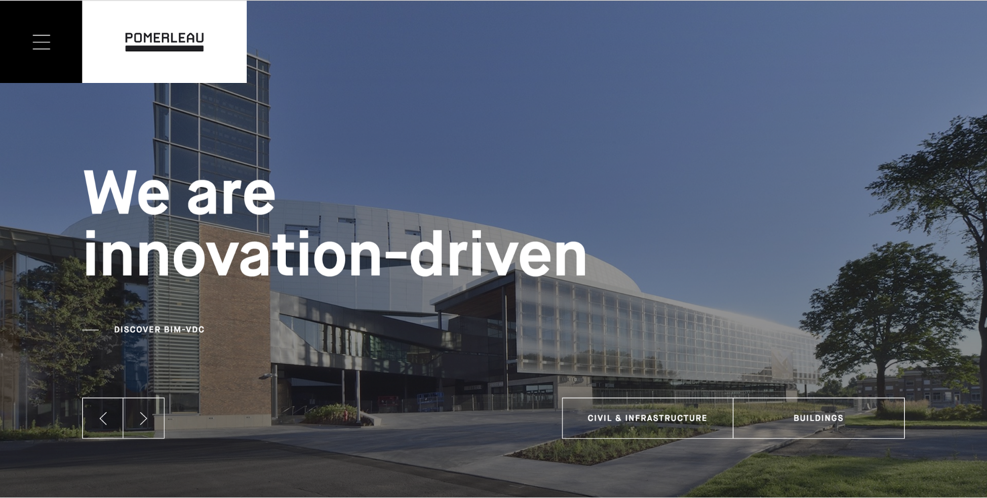
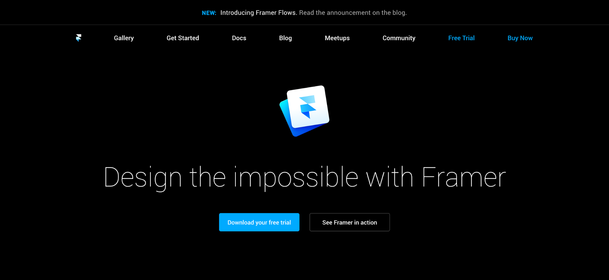
As you’ll have noticed from the sample screenshots, “big” and “bold” doesn’t necessarily refer to the weight of the font! Rather, it’s about dedicating significant screen real estate to a single, simple yet all-encompassing statement about the product or service. And, refreshingly, a lot of these statements seem clear and to-the-point, free of the bloviated claims to disruption and greatness we’ve seen a lot of lately. (Okay, “design the impossible” might be bloviated, granted.)
In a world that’s as fast, busy, and information-overloaded as ours is, these concise yet powerful statements will become bread-and-butter for companies of all kinds.
5. Complex layouts rooted in graphic design principles
If we want to predict the evolution of web design (at least in visual terms), we should refer to the evolution of graphic design.
For the past few years, web design layout has been constrained by CSS’s limitations, but new tools like flexbox and CSS grid will allow for much more expressive layouts on the web.
Our main challenge now: understanding how these new web layout methods should work in the world of responsive design.
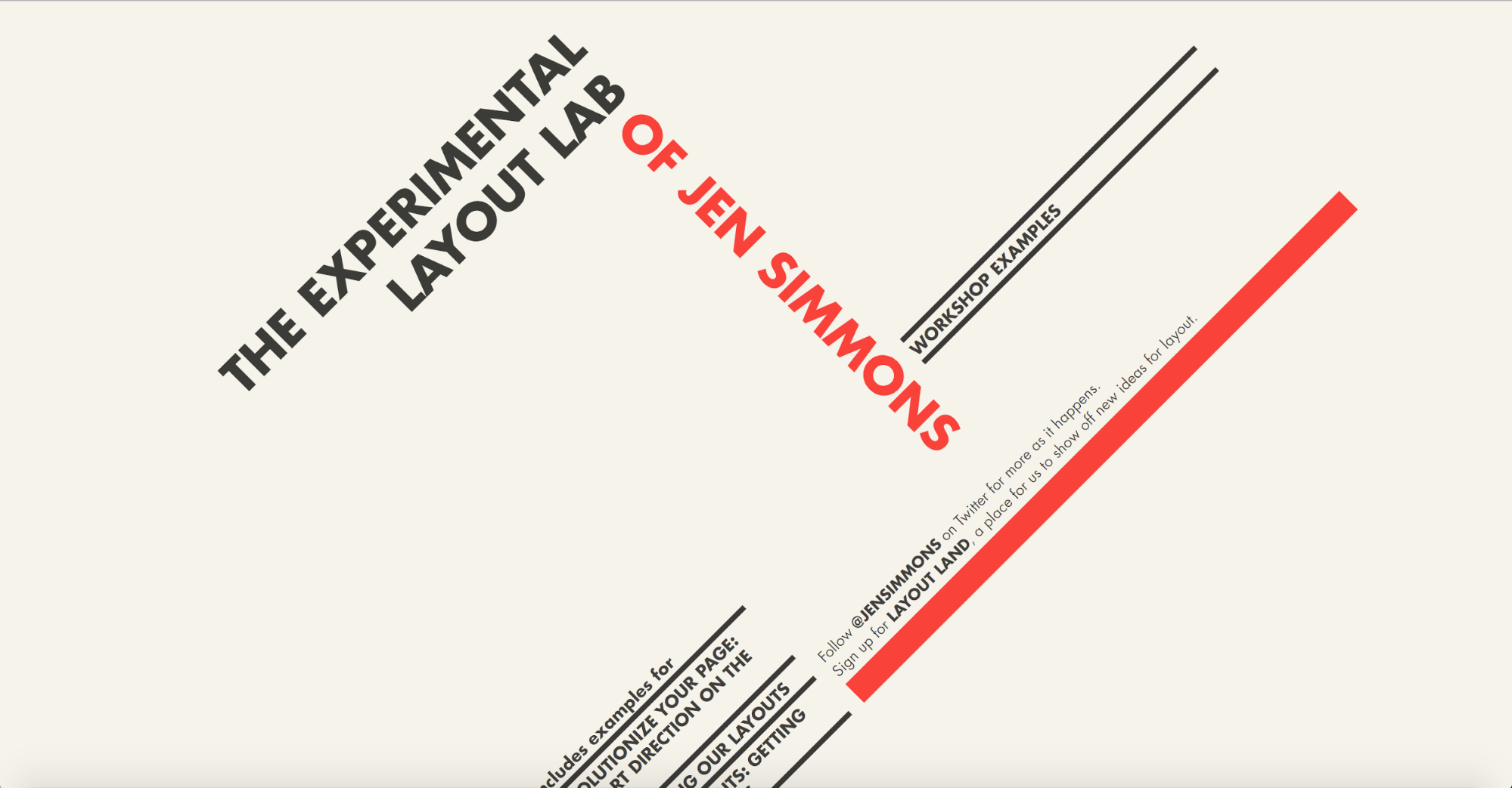
You can see some examples of what we can expect here (as long as you’re using a browser that supports CSS grid, like Firefox Nightly, Safari Technical Preview, or Chrome Canary):
The Experimental Layout Lab of Jen Simmons
Note the Merz-esque style of her hero section, a clear callback to graphic design’s evolution, and its ongoing conversation with aesthetic movements.
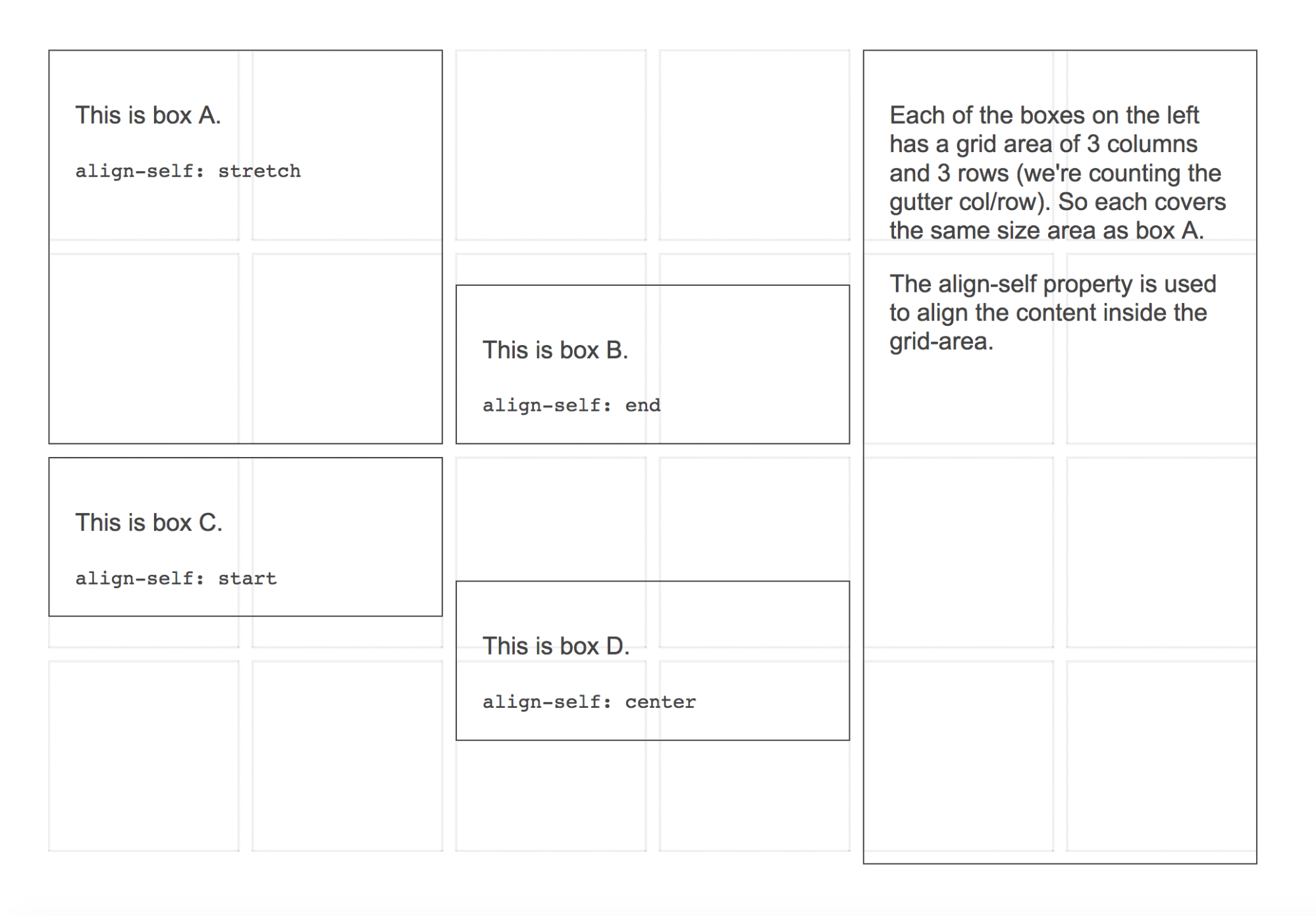
Grid by Example
Head to the Learn Grid Layout page for more examples.
6. More SVGs
SVGs (scalable vector graphics) present web designers and developers with a lot of advantages over more traditional image formats like JPG, PNG, and GIF.
The key advantages of SVGs come through loud and clear in the format name itself: scalable and vector. Instead of being raster or pixel-based, SVGs are composed of vectors: mathematical descriptions of the object’s shape. This means SVGs are resolution-independent, so they’ll look great on any screen, on any device type. No need to worry about making everything retina-ready.
But that’s not all. SVGs also rock because they don’t require any HTTP requests. And if you’ve ever run a page-speed test on one of your websites, you’ve probably noticed that those HTTP requests can really slow down your site. Not so with SVGs!
Plus, you can animate them!
Now let’s hear from product designer Nathan Romero.
7. Constraint-based design tools
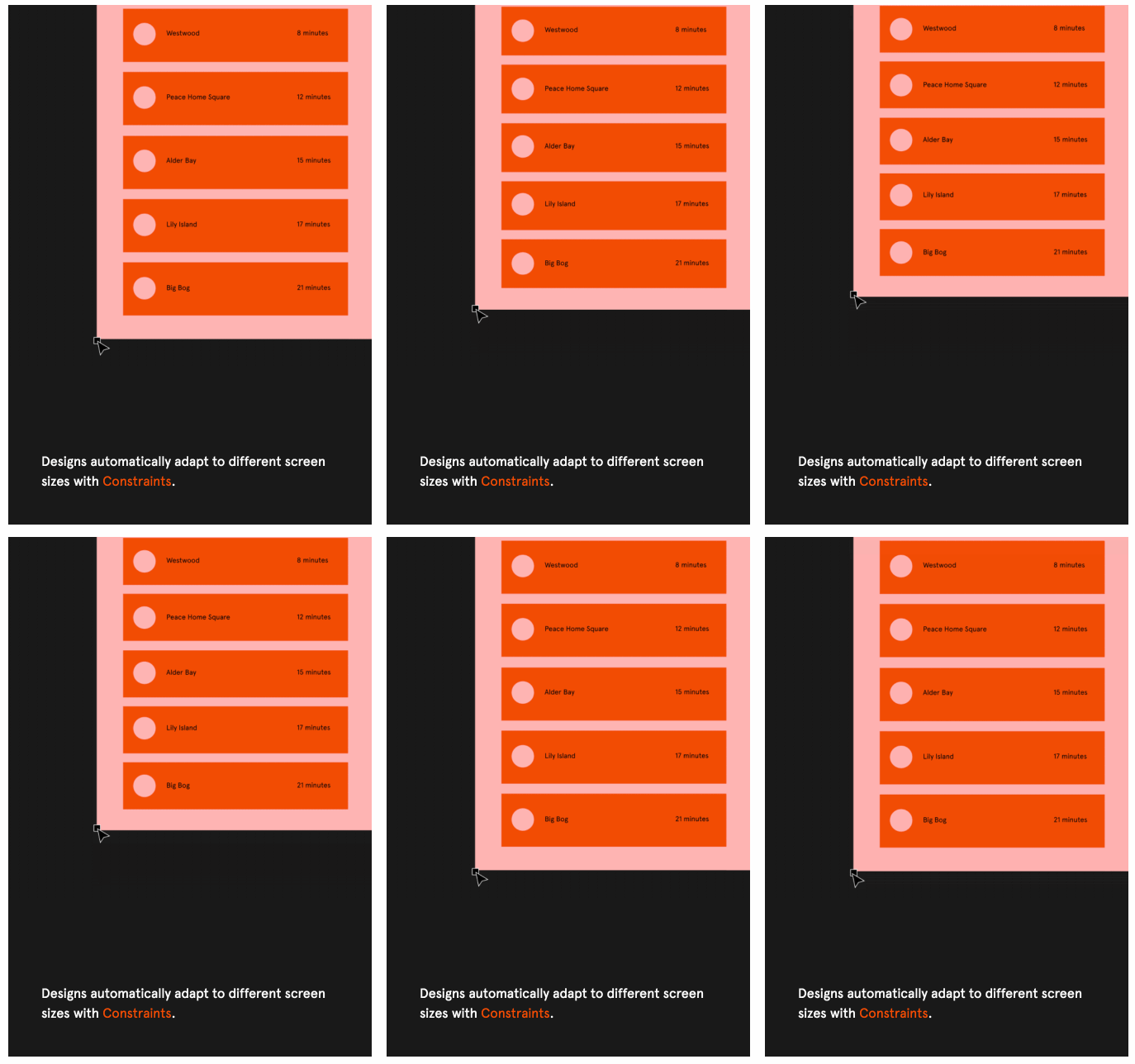
Responsive design has completely transformed how we browse and build for the web.
But, oddly, it hasn’t really changed how design tools work, in general. With obvious exceptions like Webflow, most of the popular design tools require you to simply rebuild the same screen over and over for different device sizes and resolutions.
In an industry that’s all about rapid development, ideation, and launches, that massive time sink just isn’t sustainable.
Hence a new wave of design tools (such as Figma) that use the idea of constraints to lessen the amount of repeated work designers have to do when building cross-device layouts. These tools focus on the spatial relationships between elements and strive to preserve them as composite elements are resized by devices and users.
Less work for designers for the win.
And now, over to Ryan Morrison, senior visual designer.
8. More and brighter color
As movements like minimalism and brutalism came to the fore in 2016, designers sought ways to infuse more personality into their design work that still worked within those stripped-down aesthetics.
And in at least a few cases, bright, bold color became the natural answer.
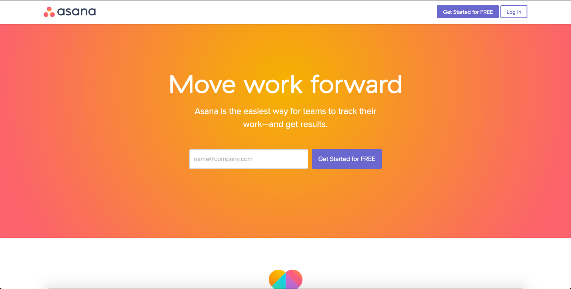
Witness Asana’s color-drenched redesign.
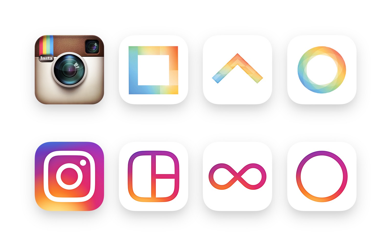
And the much-derided, but undoubtedly brand-revivifying, Instagram app icon redesign.
Not to mention just about everything Stripe does.
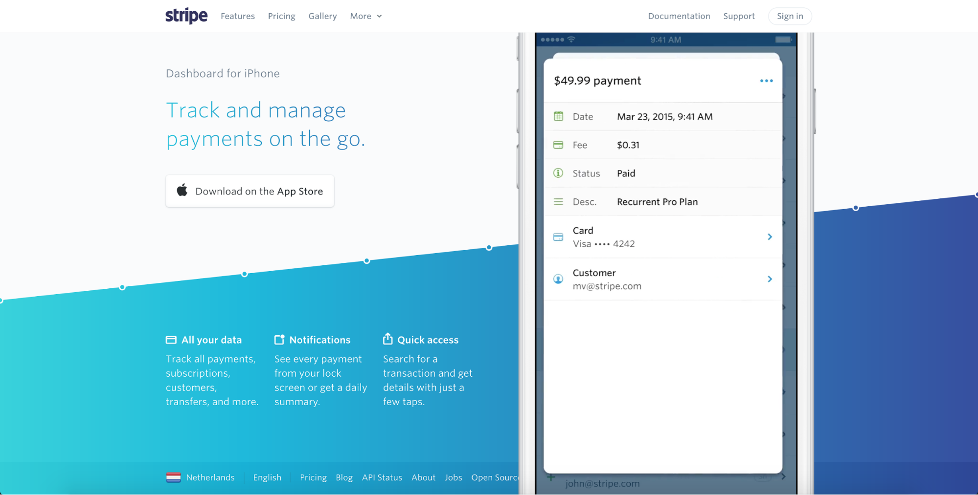
As you can see, it’s not just about bright, enthusiastic color either. Gradients also came back in a big way, blending and blurring those exuberant hues into spectra reminiscent of a noonday sky or a splashy sunset.
There’s a sort of synthesized naturalism to this reemergence of bright hues and bold gradients, and I personally look forward to seeing more of it in 2017.
Though maybe we could turn the brightness back down below 11 this time around? Looking at you, Asana.
9. More focus on animation
Animation has long played a key role in our digital interfaces, and there’s no reason to think that’ll abate in 2017. In fact, as designers get more and more visual tools to help them build engaging and smile-sparking animations, we’re sure to see them become both more prominent and more refined.
The latter characteristic will become particularly important as it becomes easier to create animations. At 2016’s Design & Content Conference, animation guru Val Head stressed that designers should look to their brand voice and tone documentation when building animations to ensure that they reinforce the tone content creators are aiming for. This helps ensure that animations perform meaningful, on-brand functions for users, instead of just inspiring migraines.


The modern web design process
Discover the processes and tools behind high-performing websites in this free ebook.
10. Unique layouts
The year 2016 — much like the last several years preceding it — featured an ongoing debate about web design either dying, or losing its soul.
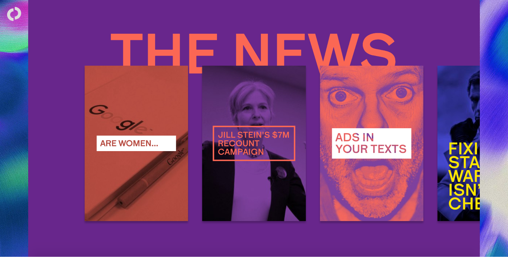
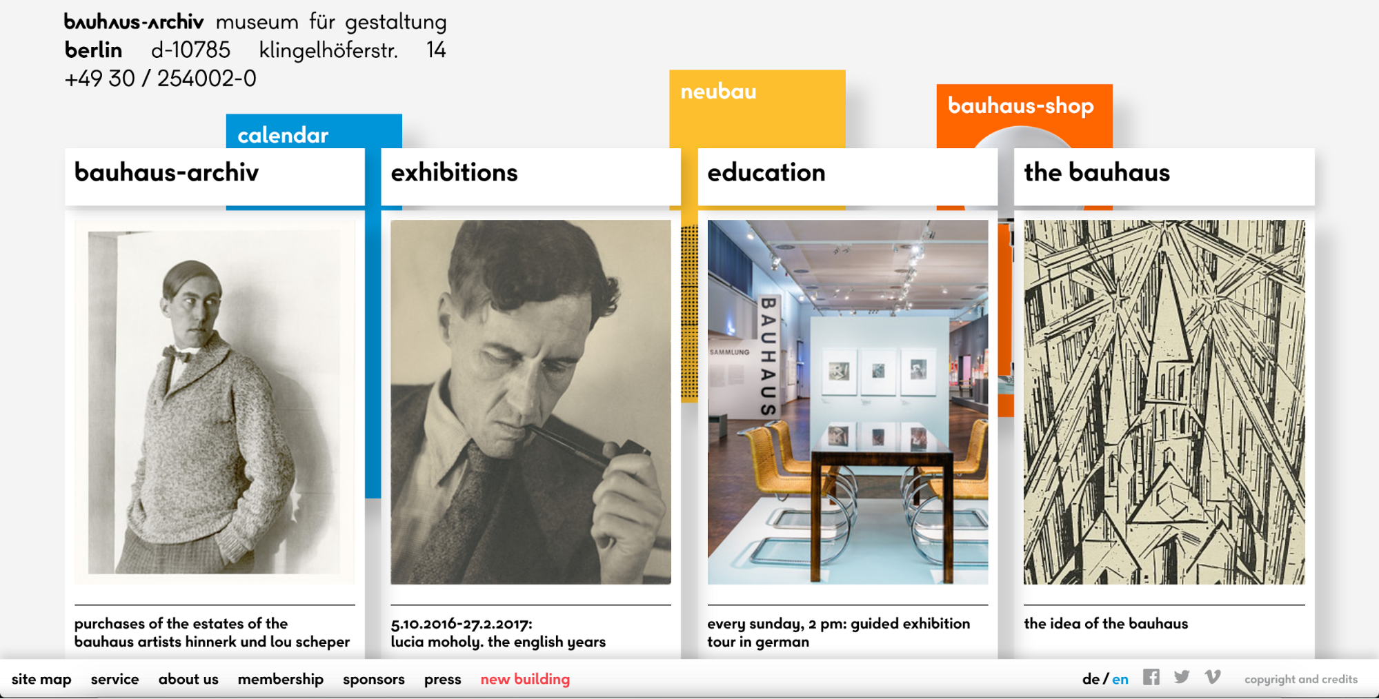
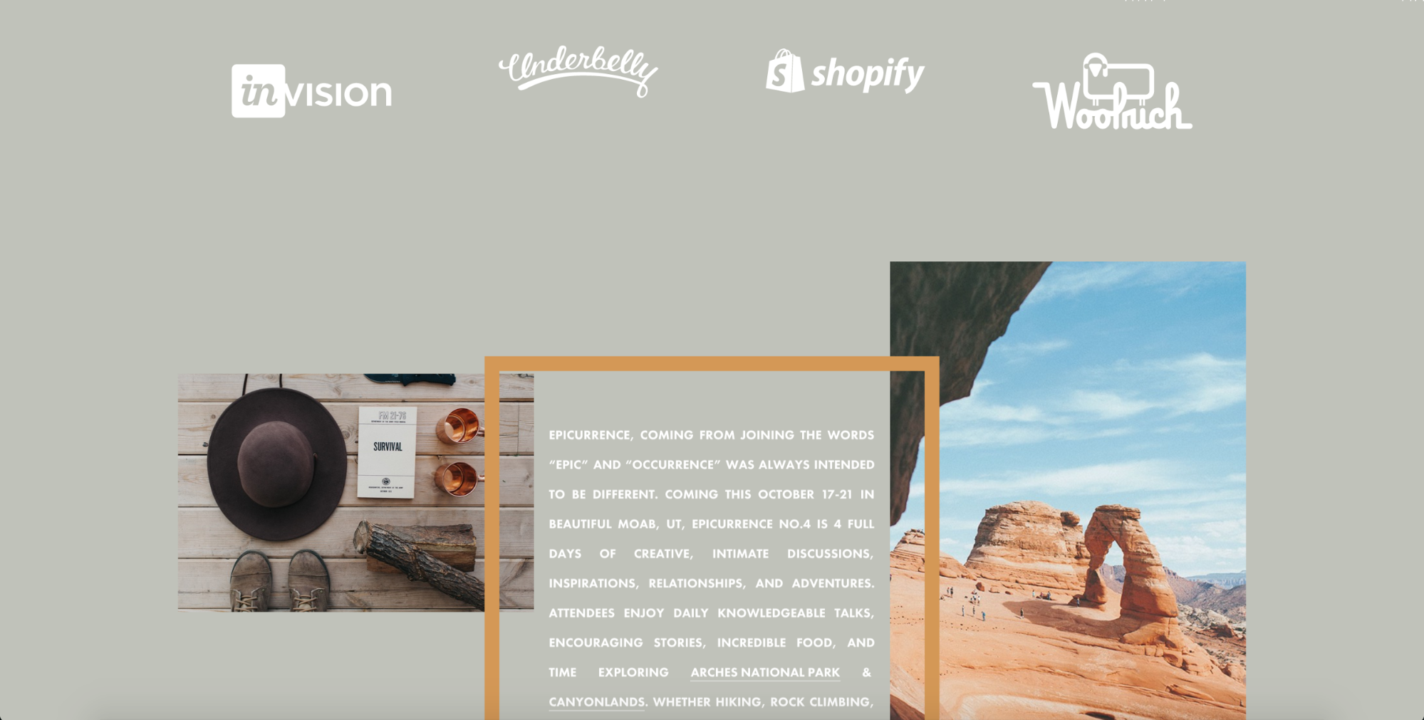
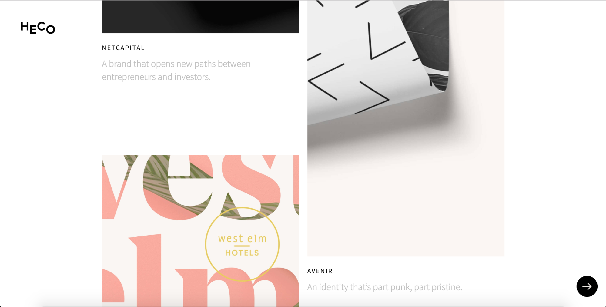
Overdramatic as the web-design-is-dead argument may be, you can’t blame any creative for seeking innovative ways to present content to readers. And one of the most enticing methods for breaking out of the box-centric layouts many blame responsive design for is the broken grid.
This approach seeks a way out of the meticulously aligned and “boxy” layouts we’ve been seeing a lot of lately with a variety of what might seem like visually jarring techniques. These include:
Overlapping typographical and graphical elements, as seen on…
The Outline
Bauhaus-Archiv
Seemingly random image and text placements, as seen on …
Epicurrence
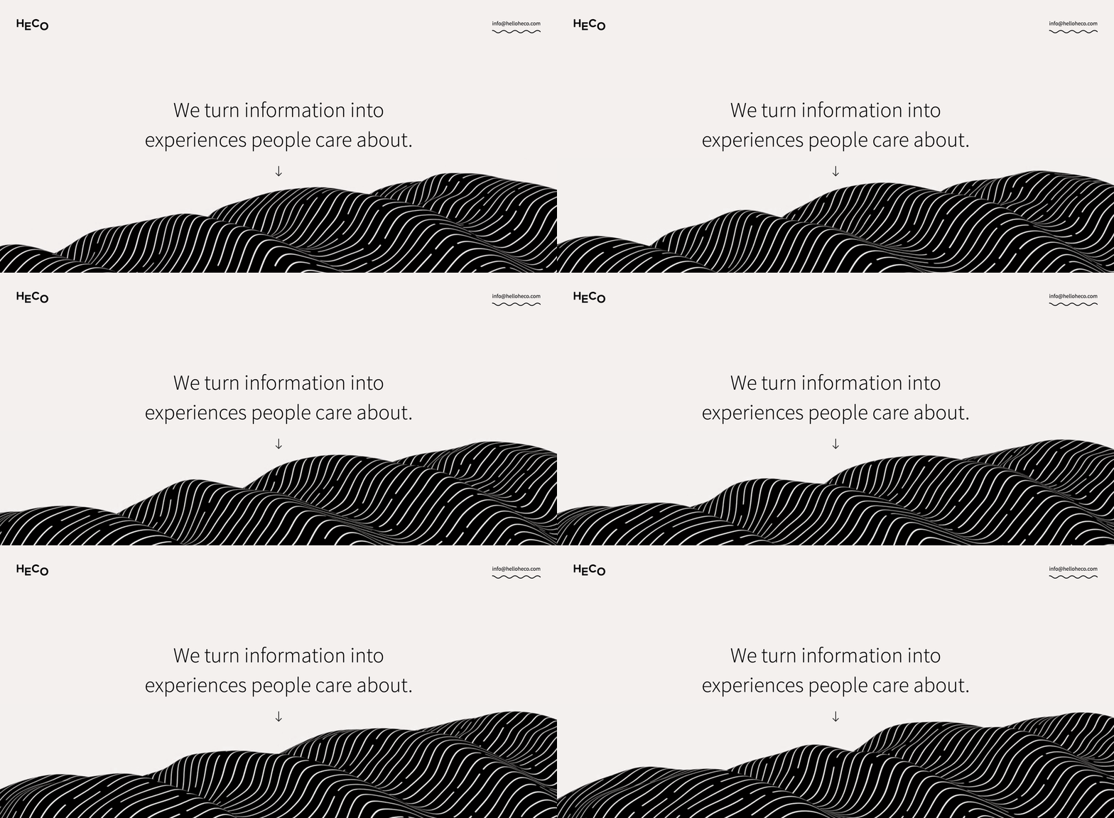
Heco Partners
Next up, Nelson Abalos, Jr., customer support hero and host of the Webflow Workshops
11. Flexbox
If you haven’t dived into flexbox yet, you’re in for a treat. This relatively “new” CSS layout module offers both incredible responsive-friendliness in its functionality, but also makes a lot of sense to visual designers used to manipulating objects on the canvas with the align and distribute tools offered in the likes of Sketch and Illustrator.
And with every modern browser (and no, I’m not counting IE11) now fully supporting flexbox, there’s no reason not to dive in — as long as your audience isn’t full of IE diehards.
Of course, flexbox can take some getting used to if you’re super comfortable with the other, very different layout modules. So if you need some help wrapping your head around flexible boxes, check out Flexbox Game.
Okay, what do you think, Waldo Broodryk, customer happiness hero?
12. Complex CSS grid layouts
Coming up hot on the heels of flexbox in the race for newer, better layout modules is CSS grid. As Chris House, creator of “A Complete Guide to Grid” puts it:
Grid is the very first CSS module created specifically to solve the layout problems we've all been hacking our way around for as long as we've been making websites.
While flexbox helps us solve some seriously aggravating and long-standing web design problems like vertical centering, it really wasn’t intended for use in full-page layouts. (Though it’s certainly capable of them.) Grid, on the other hand, was built for full-page layouts. And like flexbox, it allows you to easily rearrange content order for different media queries.
Grid isn’t yet ready for use in the wild, but that just gives you some time to familiarize yourself with the spec. Which is great, because it’s going to be big.
If you want to start playing with CSS grid today, here’s how:
- In Chrome, go to chrome://flags and enable "experimental web platform features”
- In Opera, go to opera://flags and enable "experimental web platform features”
- In Firefox, enable the layout.css.grid.enabled (or install Firefox Nightly)
13. A focus on designing for content delivery, personalization, and conversion
One consequence of an increased focus on design as a means of effectively delivering content will be a stress on delivering said content to the right person at the right time — all with an eye to increasing desired actions, naturally. (All good news for you content strategists out there!)
Personalization of content has been an extremely hot topic in content circles for quite some time now, but no one seems to have perfectly cracked that nut yet. Essentially, the goal is to serve up content based on characteristics like:
- Demographics: Who is the visitor (professionally and/or personally) and where are they coming from?
- Behavior: What is the visitor doing now? What have they done on your site in the past?
- Context: What device and browser is the visitor using? How did they arrive at your site? Are they logged in or logged out?
We’ve seen some interesting experiments in this direction across the web, many of which revolve around a manual personalization of content recommendations by the user, recommendation of “related” reads, and some algorithmic solutions more akin to what Facebook is capable of doing.
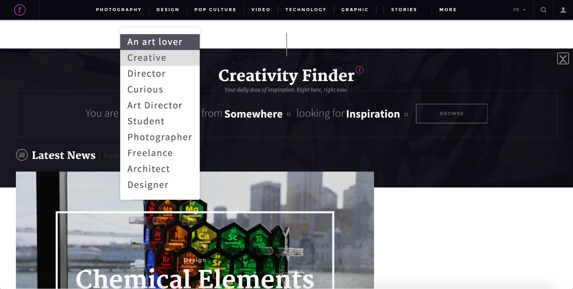
Fubiz features manual personalization through its “Creativity Finder,” a conversational-style form that lets you pick from a range of predetermined options about you, your location, and what you’re looking for. It’s a bit “low tech,” but it does offer a feeling of agency most content platforms don’t really offer.
Fubiz
Redshift
A step up from that is Autodesk’s new Redshift blog, which deepens the level of user agency by offering a range of manual customization options like:
- Following topics and authors
- Customizable feed
- Highlighting for comments and sharing
- Bookmarking
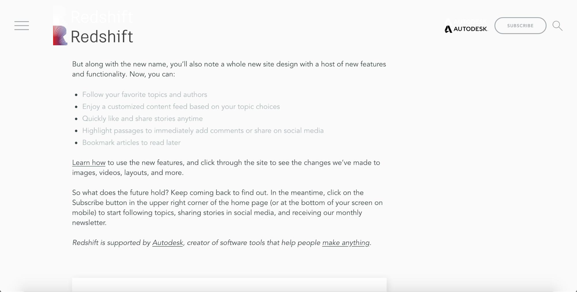
It’s mostly stuff a savvy reader can achieve on their own, but Redshift dramatically simplifies those functions. And more importantly, it represents a shift away from a paradigm that views blog posts as the content version of vaporware, turning it into more of an evergreen learning resource.
If a lot of Redshift’s functionality sounds familiar, it might be because it’s largely replicated from Medium. Unlike Redshift, though, Medium has the advantage of a much larger base of readers and writers, not to mention tight integration with Twitter — all of which boost its ability to algorithmically recommend content to you.
All of these content personalization methods epitomize a view of product design as a method of finding the intersection between user needs and business needs. Readers want to be able to save, share, and customize the content they see — and the company can use that data in a host of ways. So, win-win.
Of course, it’s worth remembering that conversions aren’t the only metric content personalization can drive. Personalization of help documentation can help lower support request volume. Educational materials can lower churn and improve lifetime value. But it’s not like conversions will ever not be valuable.
And now for my two cents:
14. More focus on conversation (yes, bots, but also...)
You might call 2016 the year of the bot — though whether it’s been the beginning of the bots’ triumph or just a somewhat underwhelming launch is very much open to debate.
That said, if the volume of bot-related launches on Product Hunt and Google’s deep integration of Assistant into Android are any indication, 2017’s going to see a lot more bots popping up across your life.
But bots are really just a specific instantiation of a more abstract, and thus more pervasive, idea: that conversation is an interface. And we’re likely to see that idea shape a lot of 2017’s top design work.
What this might mean, exactly, we’ll have to wait and see. But possible impacts include:
- An even greater interest in “human” language (more good news for content strategists!)
- Increased capacities for writers and content strategists to act as UX designers and bot developers
- Even more investment in so-called “user-generated content,” creative communities, fora, etc.
- More conversational/natural-language forms (at present, the form is the fundamental unit of product design — in 2017, we might see that paradigm shift from form to conversation)
- Attempts to transform the comment section from the internet’s sewer into fonts of “engagement” and new content — an effort already kicked off by the Coral Project
Hopefully, this continued interest in bots and AIs will help them better understand what the hell we’re talking about.
15. The fight against fake news
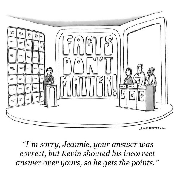
The 2016 U.S. presidential campaign taught us all a lot about how the web can influence sociopolitical realities, and one of the foremost lessons was:
Misinformation is fast, easy, and cheap to produce; super profitable; and capable of severely impacting public perception of candidates.
Obviously not something that (most of us) who create and distribute web content were excited to see revealed.
But every problem represents an opportunity. And true to form, web designers, product designers, and developers worldwide have jumped at the opportunity to fix this particular broken window. Here's just a small sampling:
- Facebook’s Mark Zuckerberg called the percentage of fake news “relatively small,” but went on to outline 7 steps Facebook is taking to help fight misinformation.
- A group of university students has built a Chrome plugin called FiB that labels news stories as “verified” or “unverified” right inside the Facebook UI.
- Google and Facebook have both stated that they’ll limit the flow of ad dollars to fake news sites via their advertising tools.
- Popular Twitter account Saved You A Click launched a spinoff called Saved You A Trick to identify fake news stories.
Ultimately, the more programmatic methods and monetary methods proposed by Facebook, Google, and the FiB team will prove the most scalable and effective. But more human methods like a stronger commitment to journalistic ethics and tools and resources designed to help people be better readers will undoubtedly be needed as well.
Because as with any attempt to control the flow of information, there’s always the possibility of control being exercised the wrong way. And that means it’s ultimately up to us to stop the creation and spread of misinformation.
16. More peeks inside design (and content)
Over the course of 2016, a number of design teams created and popularized their own blogs as a way to offer insights into process and, perhaps, humanize the brand to a certain extent.
Content like this used to be focused primarily on recruitment — attracting new hires by conveying a sense of what’s it like to design, or engineer, or write within a particular company.
But in 2016, the focus appeared to shift in 3 new directions:
- Brand
- Humanization
- Helpfulness
These 3 strains can be pretty hard to untangle, and the most popular of these design blogs do all three with panache. They also tend to have a particular focus that sets them apart as more than “Brand X’s design team blog.” But again, it’s not always obvious.
With the success of the following design-and-content blogs, brace yourself for many more in 2017:
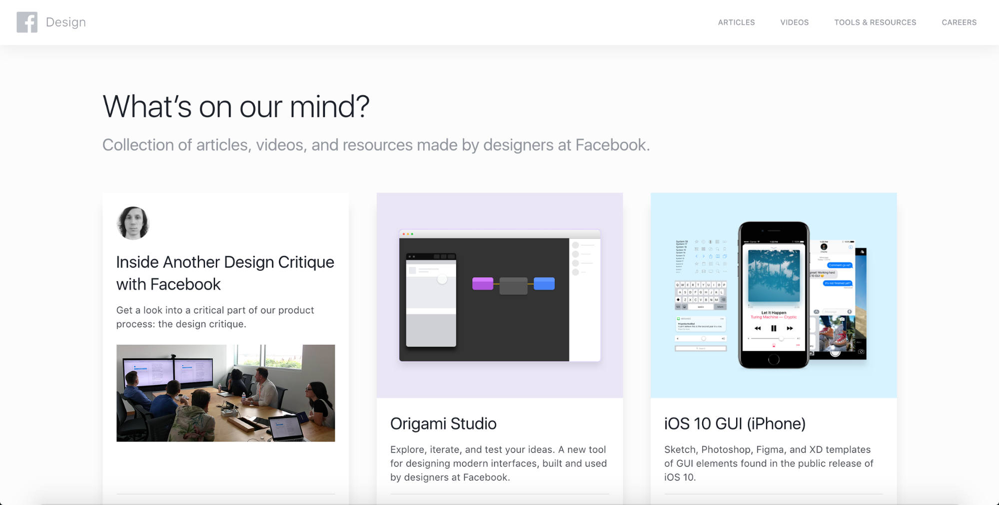
Facebook.design
Foci: Process and tools
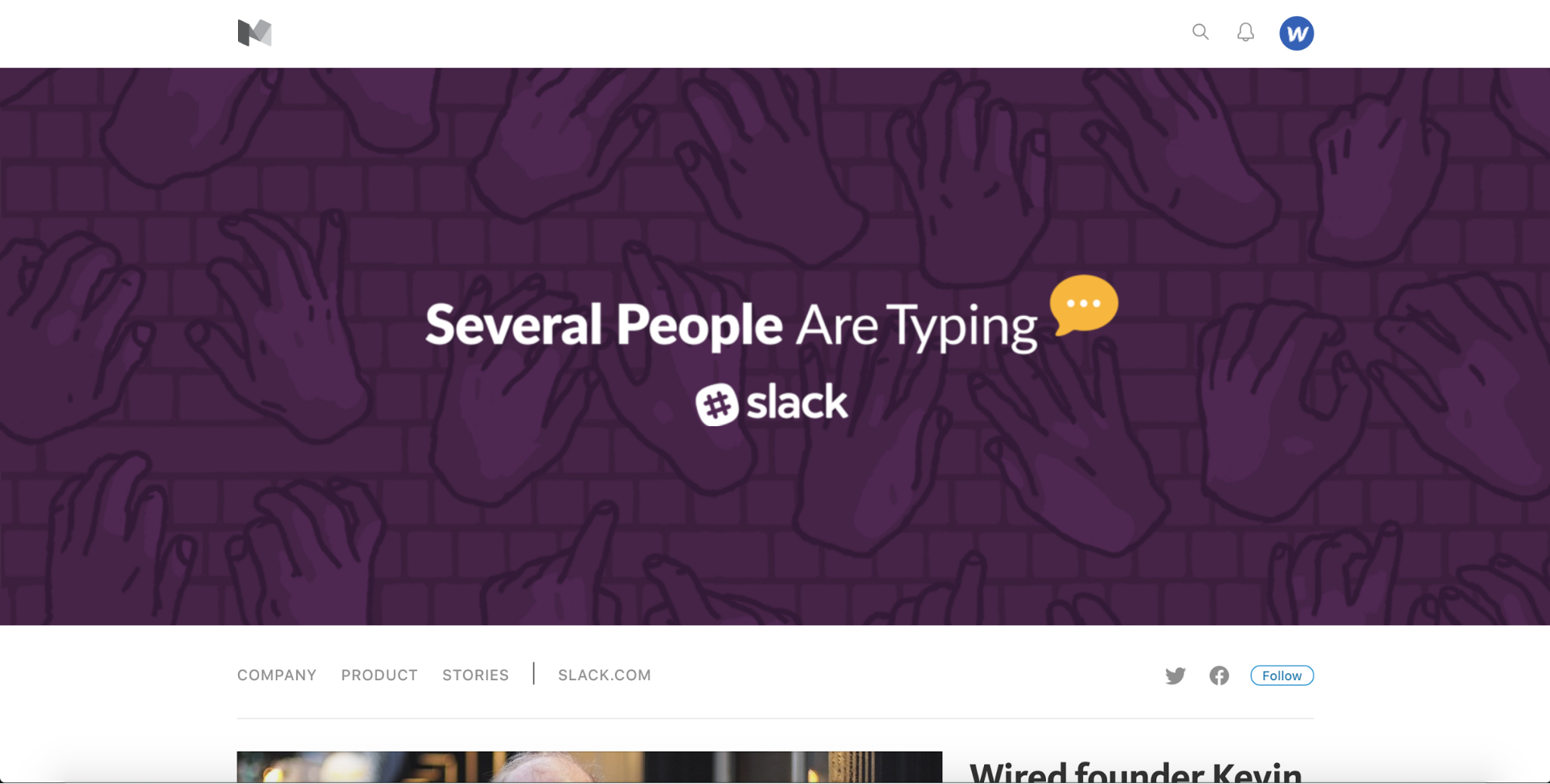
Several People Are Typing
Foci: Slack, workplace productivity, and content strategy
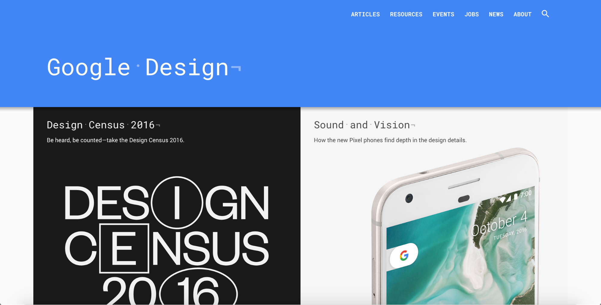
Google Design
Foci: Google, process, tools
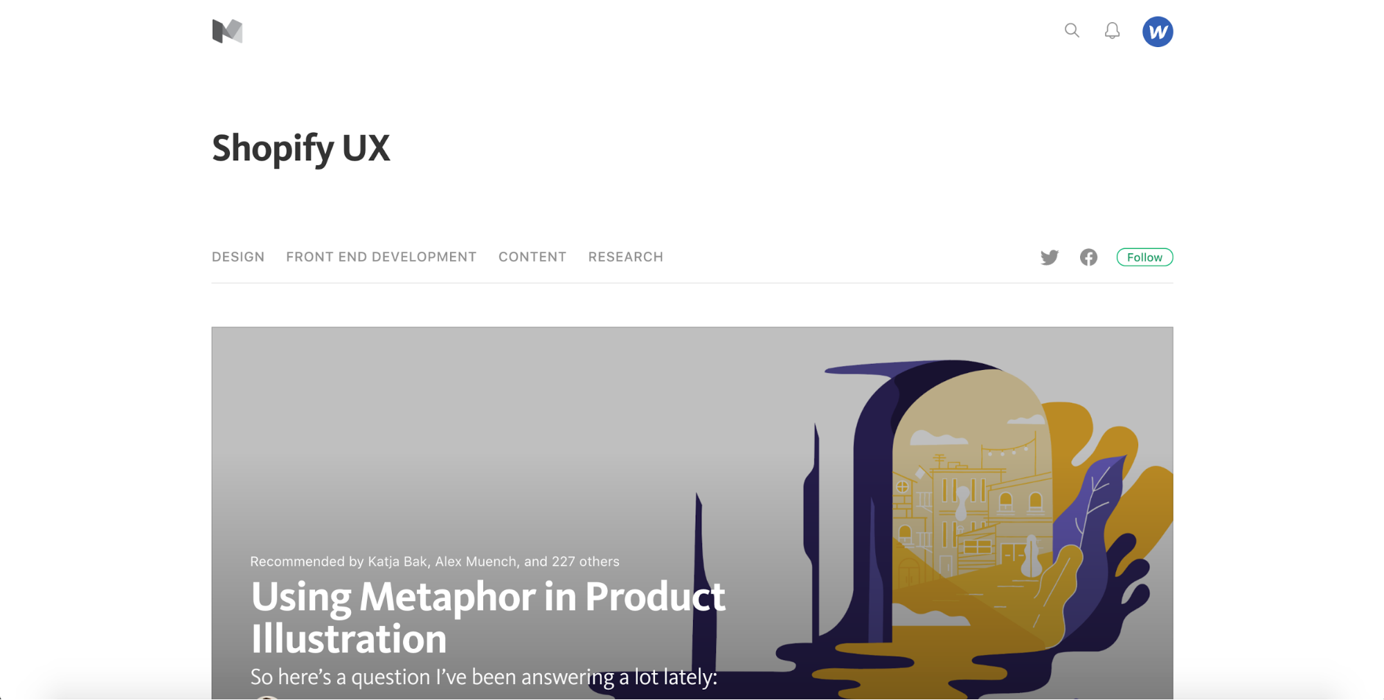
Shopify UX
Foci: UX (i.e., design, content, dev, research)
17. A new designer deliverable — code — created in new ways
In his TechCrunch article “The future of front-end development is design,” Carson Miller writes:
Coding is going to look dramatically different in the future. In fact, the line between design and development may no longer exist.
A conversation about the article sprung up on Twitter, where Austin Knight noted:
Many designers and devs that I know would prefer to work visually, but work in code out of necessity.
There are many drivers behind this emerging reality, including
- The need for fast, iterative product development
- User need for more equivalency between outputs and inputs (i.e., most painters don’t paint with code)
- Increasing sophistication of code-free design tools
And since Webflow’s one of the last, we’re all in on this future.
18. Virtual reality … on the web
Given our already firmly founded tendency to think of the web as a kind of alternate reality, this is a bit inception-y. But there’s no denying that VR is going to affect the web in a big way in 2017 — even if browsers won’t be ready to support it. If you’re eager to try it, check out the Web VR site.
Ready to do your part to define web design in 2017?
Then start building websites with Webflow! It’s free to get started, and you’re going to love the creative freedom it gives you.

Get started for free
Create custom, scalable websites — without writing code. Start building in Webflow.


