Webflow helps you design professional websites with a consistent visitor experience.
With so much competition, it’s important to build unique, high-quality websites. Whether you’re a first-time creator or a seasoned designer, Webflow gives you the tools you need to achieve that goal.
Webflow is an all-in-one, browser-based platform that helps individuals and businesses create full websites from scratch or pre-built templates. You can focus on the visual design process, and Webflow will automatically generate code behind the scenes. This gives you creative control without compromising functionality or requiring advanced design knowledge.
What are the benefits of using Webflow?
Read on to learn more about Webflow’s benefits, and discover how you can take your next web design project from vision to execution.
1. Generate clean, semantic code
Many traditional drag-and-drop website builders generate bloated markup that slows page load times. Webflow avoids this by adhering to modern web standards and widely accepted best practices. This results in code that’s lightweight and readable, which improves your site’s performance.
As you work in the visual web design canvas, Webflow generates W3C-compliant semantic HTML and CSS in the background, so you can design visually without writing any code. Or you can work with the code directly, and even export your website’s assets as a ZIP file for easier design reuse.
With Webflow, you don’t need developer experience or technical expertise to design websites. Regardless of your background, you can create professional designs. Plus, Webflow’s use of semantic code makes your site easier to maintain and improves accessibility, because it provides clear tags like <article> and <nav> that identify the purpose of specific elements.
2. Integrate with third-party tools
Effective website building requires a comprehensive toolset. Fortunately, you can extend your site’s capabilities through Webflow Apps. This is a growing library of third-party integrations that install directly into our visual design platform.
There are tools for automation, analytics, marketing, e-commerce, membership systems, and even AI functionality. Instead of juggling multiple platforms and manually linking apps, you can connect Webflow directly to the tools you need and the ones you already use.
For example, you might add Zapier to use its automation features, or connect with HubSpot for marketing purposes. These integrations streamline your workflow.
3. Edit with real-time visual updates
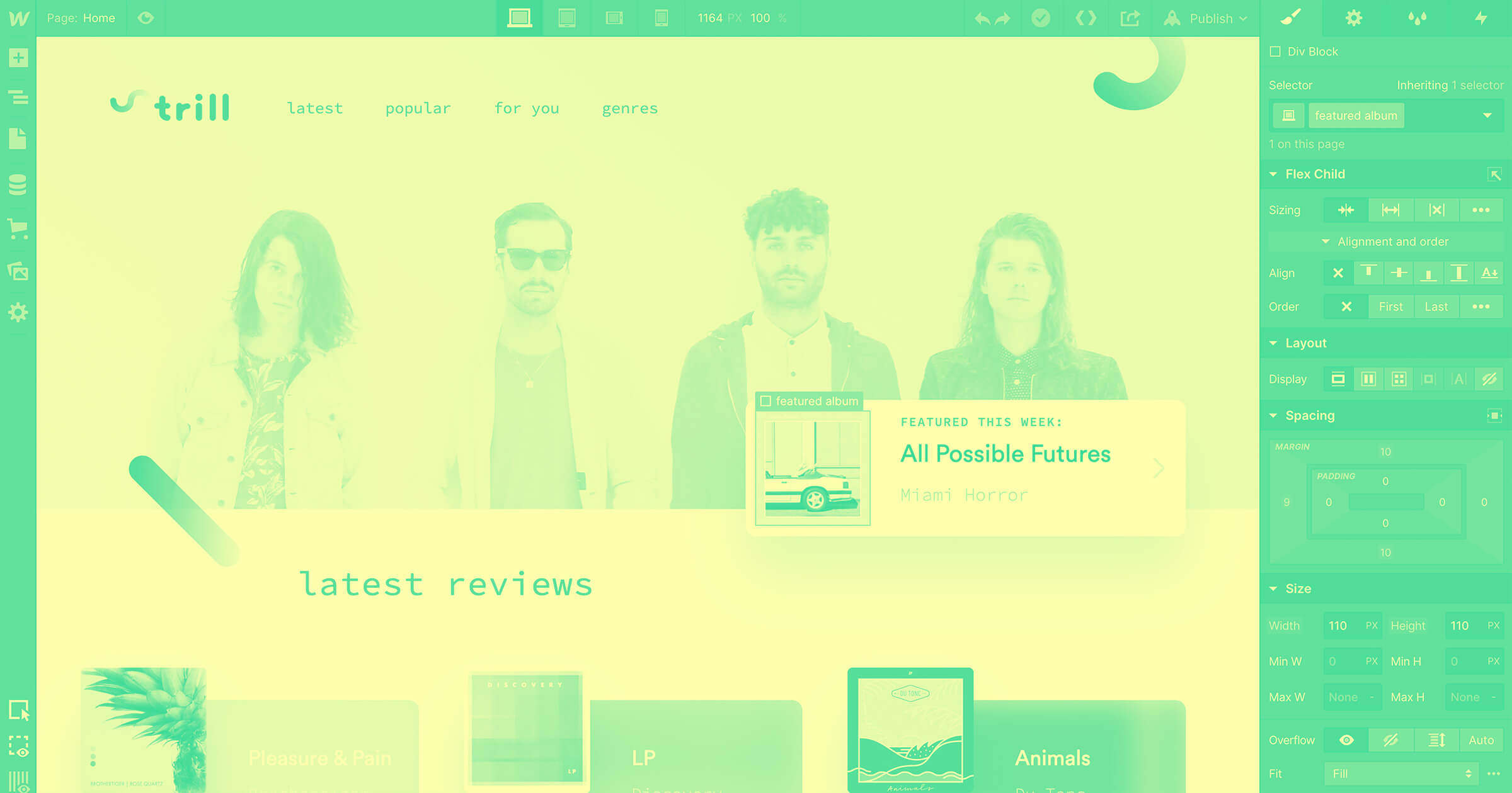
Webflow’s design platform gives you a canvas to build an entire website. You can edit content directly on that canvas, and get an in-context, real-time view of updates as you make adjustments.
You can instantly see how a new headline, image, or animation will appear within the site’s layout. You’re not stuck in a back-end preview; you’re working with the same perspective as real visitors.
All of that means you don’t need to guess where elements will show up and how they’ll work on your website. This speeds up the editing process, especially if you’re not a developer. Plus, you can follow step-by-step tutorials on Webflow University whenever you need help using specific tools or features.
4. Design smarter with reusable components and Shared Libraries

Many websites use the same elements throughout. If you design multiple sites, you may even reuse small pieces of design.
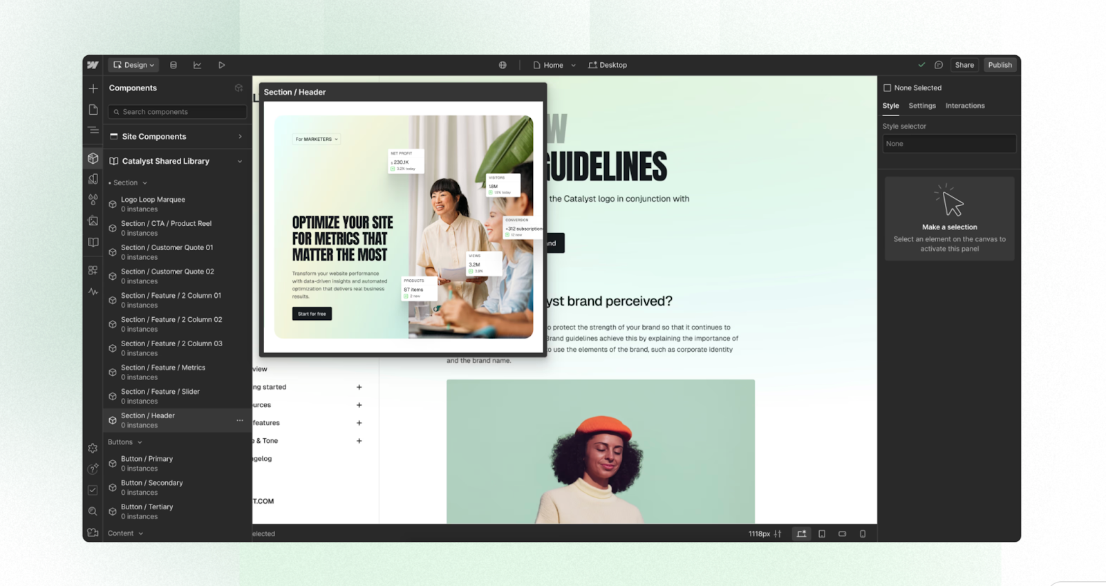
That’s why Webflow lets you create reusable components for just about any content type, from navigation bars to call-to-action buttons. You only have to build an element once — if you want to use it again, there’s no need to start from scratch.
You can also organize collections of these components into Shared Libraries, which work across all the site designs in your workspace, so you don’t have to transfer assets.
When you update a component or style in the source library, it updates the item wherever it occurs in your workspace. This keeps your brand consistent and allows you to scale and manage multiple websites with similar designs or content.
5. Create responsive designs for a consistent user experience
Users access websites via a variety of devices. Your site’s content must appear professional and work properly on desktop computers, tablets, phones, and other smart devices. This requires responsive design, which traditionally takes a lot of work and testing to achieve.
Webflow automatically delivers a responsive design, so your site adapts to any device or screen size, increasing accessibility. Designs for desktop-size layouts intelligently cascade down to tablet and mobile views, which you can refine using visual breakpoints. The result is a consistent user experience without the hassle of rebuilding your site.
6. Keep your site live with a secure hosting infrastructure
Web design tools help you build better sites, but once those sites go online, you need to make sure they perform optimally.
Using Webflow means you automatically have access to fast and secure web hosting through a globally distributed network. With it, Amazon Web Services (AWS) hosts your website, and Cloudflare’s content delivery network ensures fast loading times for visitors.
As for security, our platform includes SSL/TLS encryption, DDoS protection, bot filtering, automatic backups, and vulnerability scanning. This means you don’t have to sacrifice more time and resources to keep your site safe.
7. Enhance AEO & SEO performance with optimization tools
Both answer engine optimization (AEO) and search engine optimization (SEO) plays a key role in helping people find your website. But you don’t have to be an expert on Google’s latest preferences: Webflow includes multiple SEO features.
These include editable meta titles and descriptions, automated XML sitemaps, customizable 301 redirects, automated schema markup, and image alt text. Our visual editor and AI assistant make it easy to keep your website’s structure clear and optimized, helping search engines crawl your site more effectively.
In addition, Webflow lets you optimize performance by minifying HTML and CMS, enabling “lazy loading” for images, and using a global network to deliver content. Faster load times are essential for high ranking and providing visitors with a great experience.


Get started for free
Create custom, scalable websites — without writing code. Start building in Webflow.
8. Scale easily with a structured content management system

Webflow offers a visual, composable CMS for structuring content. For the best results, you need more than a tool for website building; you need a full-featured content management system.
Using this function enables seamless content scaling, even as you include more sections and content types, so you don’t have to recreate layouts each time you add a page. Scalable content repositories adapt to new items, saving you time and effort.
For example, you can define specific and reusable content types, such as blog posts or team profiles. These can be built out with customizable fields for text, dates, references, images, and so on. When you create a new piece of content with the same type, Webflow will automatically apply your template.
9. Customize interactions and animations

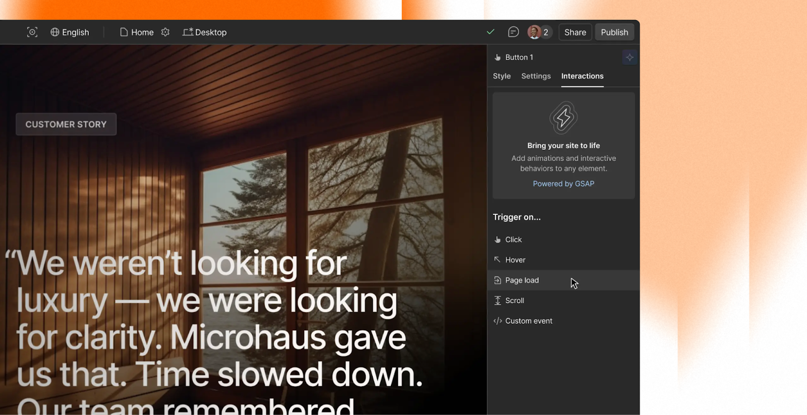
Animations and interactive elements are more engaging and visually dynamic than static web designs. Yet they can be tough to build from scratch. Webflow lets you add these without touching any code, for livelier, more immersive sites.
You can design complex animations and interactions directly within the Webflow design tool. You can define how they’ll trigger, whether on a simple click or when the viewer scrolls to a specific section, keeping design control in your hands.
There’s also a timeline feature that displays your animations in a detailed sequence, so you can play and pause this timeline to see how an effect performs on the front end.
10. Protect your content with automatic site backups
With Webflow, you can save backups of your entire site as you work. This happens automatically every 50th auto-save and during important actions like publishing new pages or restoring previous versions. You can also manually create restore points.
Automatic backups are standard on all free and paid plans, with no storage limits. This is important for preserving your layouts and content. If something goes wrong, either during the initial design or later updates, you can roll back to a previous version of the site.
11. Control access with user roles and permissions
In Webflow, your team’s shared design space, or workspace, has two layers:
- Workspace roles control overall access to billing, account settings, and project management.
- Site roles control what a user can do on the website, such as designing, editing, adding new content, or installing integrations.
The user types you assign (Owner, Admin, Designer, Site Manager, Content Editor, Marketer, or Reviewer) determine which workspace and site roles are available to each individual. This lets your team work together easily, while protecting sensitive elements and data.
Designers get creative control, marketers can focus on content and publishing, and reviewers are able to leave feedback without risking unwanted changes. It gives collaborators the access they need and prevents costly mistakes or bad-faith actions.
Design smarter and launch faster with Webflow
If you want to create websites that are both functional and visually pleasing, you’ll need a large and flexible set of tools. With the features Webflow provides, such as real-time editing and SEO tools, you can design unique, compelling sites that are optimized for performance.
Create more efficient workflows using Webflow’s reusable components and various third-party integrations. In addition, you can save time by using Webflow’s generative AI capabilities. Our AI Assistant guides you through the many features and tools on offer, so you can get started quickly.
Once your site is built, reliable hosting and robust security features keep it up and running 24/7. Use Webflow for your next web design project and bring your boldest ideas to life — without compromise.

Build websites that get results.
Build visually, publish instantly, and scale safely and quickly — without writing a line of code. All with Webflow's website experience platform.


