

Creating a web design that stands out in the competitive world of venture capital firms is essential for investors working today. Find out how Unusual Ventures developed a website that delivers on the promise of their name.
For startups, and other fledgling businesses, venture capital firms are a chance to secure funding and bring on outside experts who can help steer their companies to success. A relationship between a firm and a startup is the beginning of what both parties hope will be a fruitful partnership. Partners invest their money and efforts in exchange for equity that they hope will pay off big, but they often work with companies intensely and over a long period of time — which is why a firm’s first impression on a potential founder is so important.
Many venture capital firms lean on their portfolios to show the value of who they are in their web designs, often ignoring having a higher user experience or a strong visual identity. We see the oft repeated format of a top menu occupied by portfolio, team, and about pages. There’s nothing inherently wrong with this set up, but all too many venture capital companies don’t break free from this conventionality.
Where more established venture capital firms can rely on their reputations and rosters of businesses that they’ve brought up, newer funds must find a way to give their audience something extra. Through creative design and content, they need to energize founders with what’s possible, and their role in helping them.
Unusual Ventures — as the name implies — isn’t your average venture capital firm. We recently sat down with Andy Johns, Partner, and Laura Spaventa Lewis, Director of Marketing, about how they developed a new website with OneNet that set Unusual apart from so many other venture capital firms and heightened their brand identity. This web design, which combines a deep well of content via their Field Guide with a captivating visually-driven user experience, puts Unusual in a category all their own.
Setting the goals for a new company website
Unusual wanted to be more than just a byway in a founders’ search for acquiring knowledge and potential funding. They aspired to be a destination, giving entrepreneurs educational materials as well as talking to founders who might be interested in Unusual’s approach to early stage company building, the Unusual Method.
“When I joined Unusual there was minimum marketing work that had been completed. I had a fresh canvas to work with which was pretty exciting. Building the brand was a focus of mine from day one.”
— Laura Spaventa Lewis
But constructing a brand means more than just a website with a neat list of bullet points, a portfolio, and a couple paragraphs about who you are. It means demonstrating your value, and giving your audience something more. Unusual made it a priority to give entrepreneurs all that they could in guiding the development and decision-making of their own companies, as well as positioning themselves as leaders who could help them realize their business goals.
The right platform to build an online world
“It was always our desire to provide the level of company building, tools, support, and information that’s uncommon in early stage investing, but we didn’t know that we would end up using Webflow to make this all happen.”
— Andy Johns
Like many newer organizations, Unusual put a website up as a placeholder built with a cookie cutter web design builder. It served its purpose, but they knew that they would replace it with something more sophisticated and original.
They approached an external agency. They related their vision of a founder centered website, and the scope of the content they wanted it to encompass.
The agency suggested Webflow as the right tool to build out the online world they wanted to create.
The beginnings of the web design process

“The process started off with a hand drawn illustration of the Field Guide concept from John Vrionis (Co-Founder and Managing Partner). This was his brainchild that he had forming in the back of his mind for years.”
— Laura Spaventa Lewis
A single drawing. And a creative brief. This was all that they had to start with. But sometimes the tiniest of sparks can launch the most inspired of ideas.
They handed these documents off to their creative agency. They also shared with them the websites they found inspiring. Since e-learning was going to be the foundation of their design, they included plenty of examples of what they wanted to do as a reference.


Webflow Enterprise
Trusted by over 300,000 of the world’s leading brands, Webflow Enterprise empowers your team to visually build, manage, and optimize sophisticated web experiences at scale — all backed by enterprise-grade security.
How they created an exceptional user experience

“We wanted a dynamic, engaging, and interactive website that was different from anything else out there. We wanted to put a stake in the ground and do something that lived up to our brand name.”
— Laura Spaventa Lewis
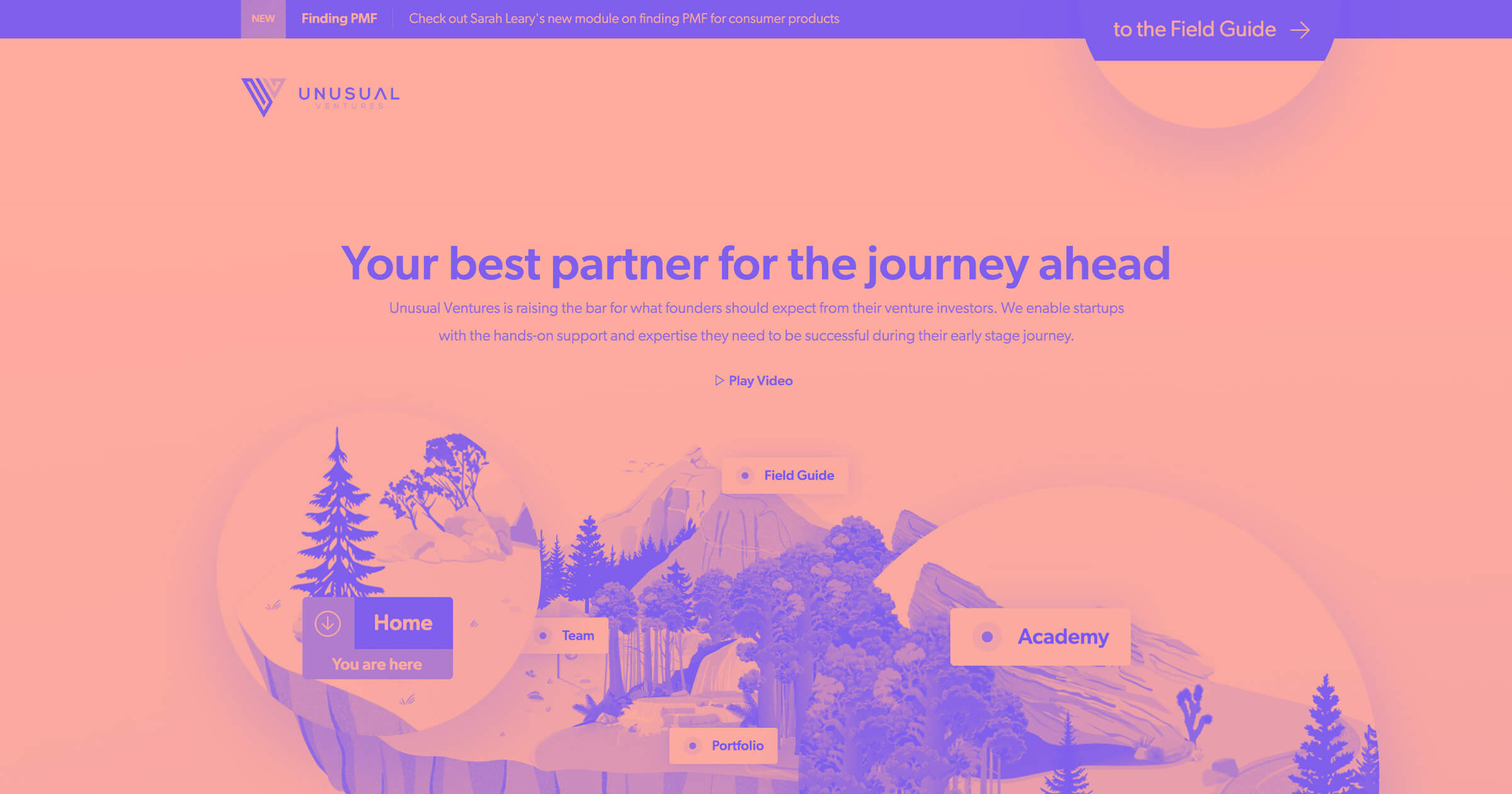
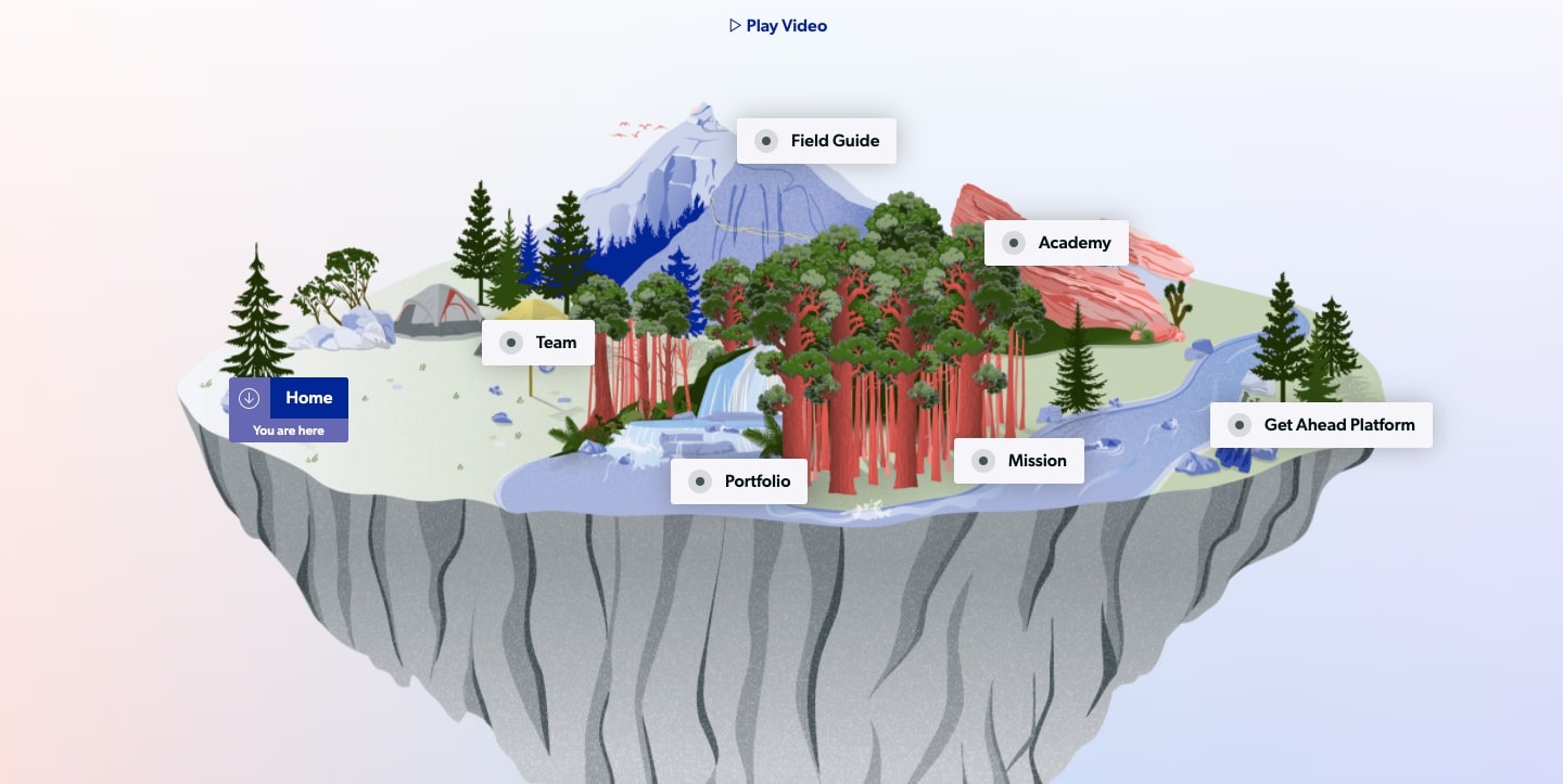
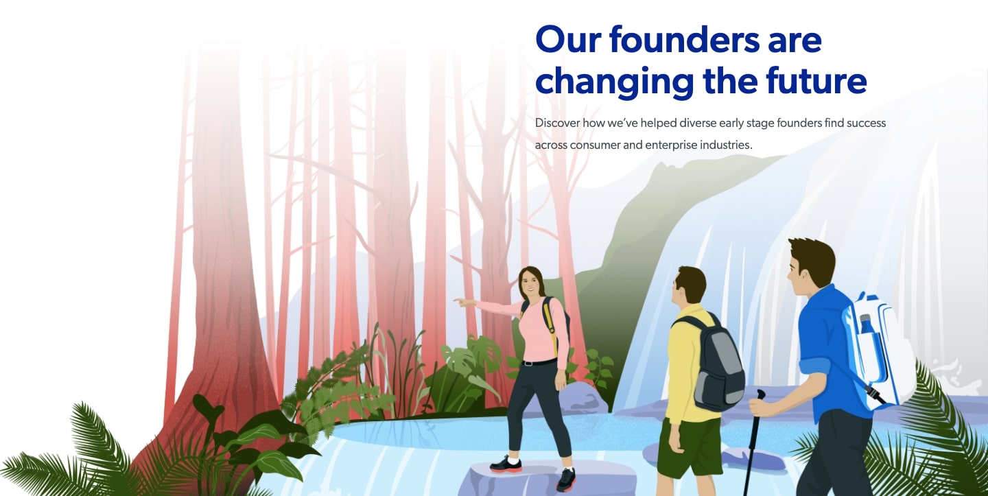
Unusual provides a customer journey — literally. With peaks, trees, and a river flowing, the landscape of their website is dotted with the destinations they want entrepreneurs and founders to trek to.
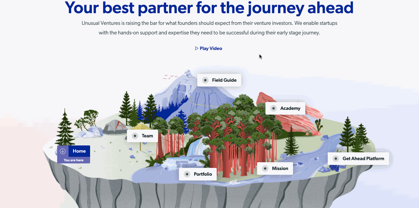
Hovering over any of the main sections makes founders materialize, all caught in a moment of exploration. This ties into so well what a prospective founder is doing behind the keyboard. They’re on an adventure of their own, exploring Unusual’s website. This hover effect puts both the people on the screen, and the individual scrolling through the design, that much closer to the content that Unusual wants them to reach.
“Our concept was the founder’s journey and we felt the map was a creative way to not only bring that concept to life, but to also pull founders in and have them engage with our ‘unusual’ world.”
— Laura Spaventa Lewis
We see this outdoor exploration motif throughout the design. Unusual positions themselves as the helpful guides, showing early stage founders the way on their own paths to success.
Stylized illustrations became a prominent part of their web design
Their original plan was to integrate custom illustrations in just one section. They were meant to be only an embellishment. But as the design unfurled, they realized how important they were in creating a distinct user experience. They soon became the central theme to their design.
These illustrations give an organic feel with their depictions of the natural world. We’re not confined by grids and uniformity. Instead there’s trails, trees, and mountain peaks, giving us open space to roam.
They also helped inform the look of the design in other ways. Blues and pinks were pulled for background gradients and text. Other colors were integrated from the illustrations that can also be seen across their design.
Picking out colors from illustrations can shape the look and feel of a design, giving it a sense of cohesion and visual harmony.
A design rich with content
Having a visually compelling design is important, but there needs to be depth to go along with all of the artistic glitz.
Unusual fills their design with practical information and resources for founders. They show them that a good idea alone isn’t enough to build a successful company. These leaders need to make informed choices, and have a strategy beneath what they do. With a gigantic library of content there’s no lack of useful information that they make available to them.
This content provides plenty of value for founders landing on Unusual’s website. But it also shows that Unusual knows what they’re doing, building trust in their expertise.
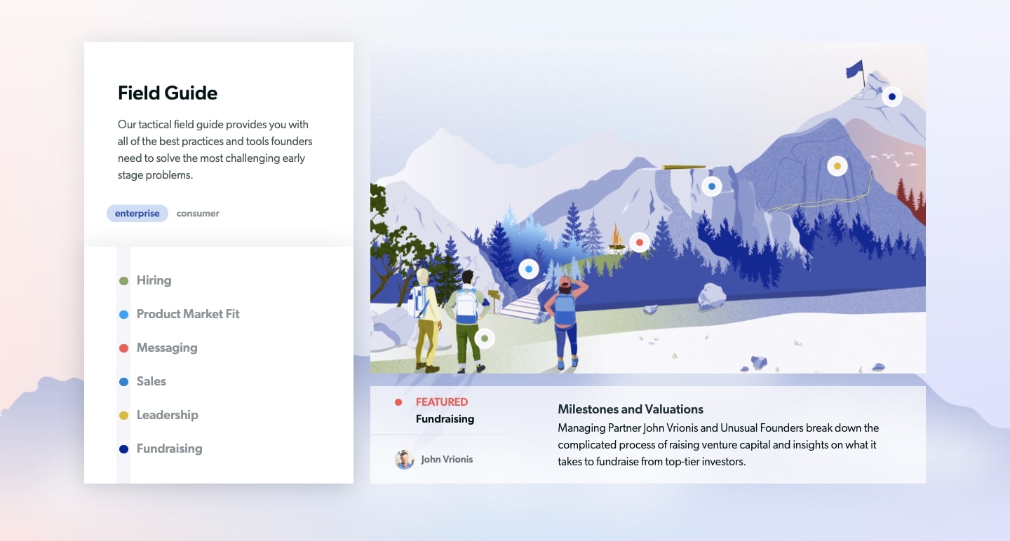
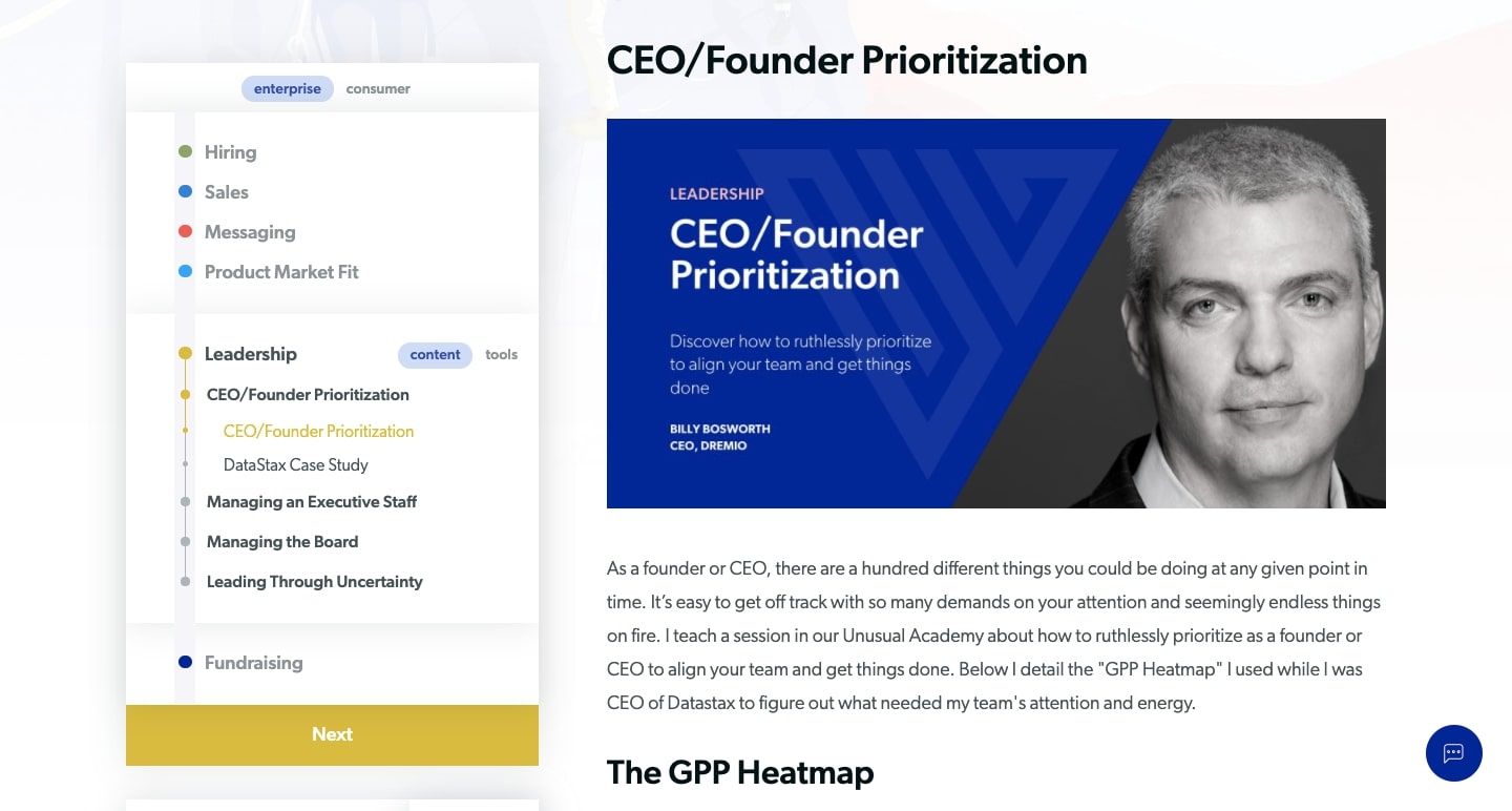
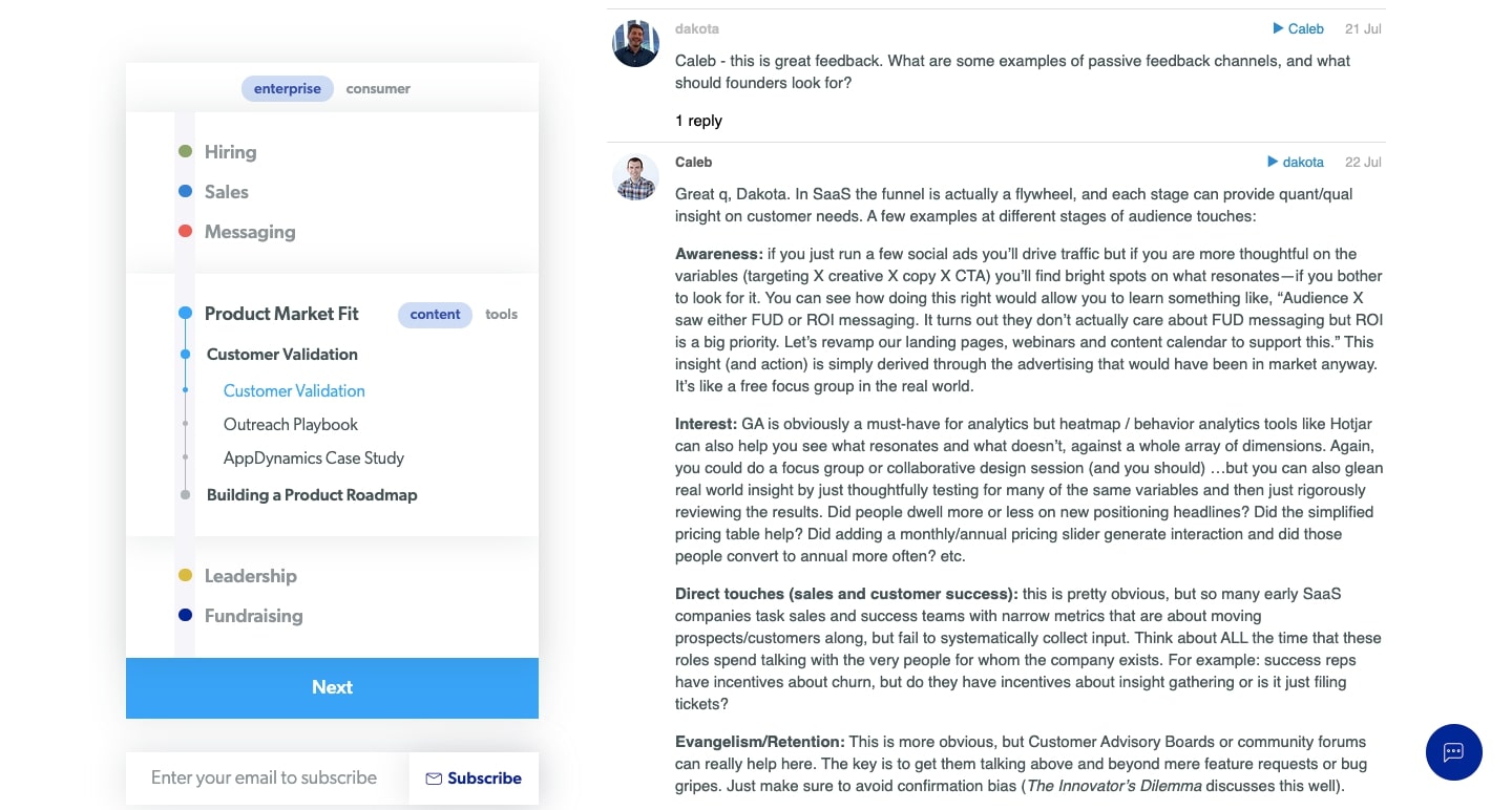
The Field Guide section presents a complete crash course from hiring to fundraising, giving company founders what they need to overcome critical obstacles that every early stage founder faces going from seed to Series A. This isn’t a light read, but rather an in depth look at each phase in developing an early stage startup. Unusual doesn’t keep this content locked away, or require any sort of email information. This comprehensive section is free and immediately accessible to any founder.
They don’t make this a one way form of communication either. They open up each section to questions and comments that they respond to. Unusual opens a dialog with founders (an integration with their Discourse forums), making a more personal connection with them and further demonstrating their breadth of knowledge.
The success of their new website
In the four months since they launched, they’re already seeing results. In just a short time frame they’ve already surpassed the total amount of visits from the entirety of last year.
Their inventive website, laying out a hero’s journey for founders has caught the attention of others operating in the realm of venture capital.
“We’ve had other firms, and founders of other VCs call us to ask what our process was and how we came up with it. The feedback has been very, very positive.”
— Laura Spaventa Lewis
Unusual is part of a growing trend of VCs doing things differently
Unusual Ventures isn’t the only example of a venture capital company that’s isn’t afraid to shake up the norms. Many venture capital firms are giving their designers the free reign to create something distinctive, and offering things that go beyond being just a static outpost on the internet.
We see a sense of creativity in Patra Capital’s application form, where a row of animated lines rolls someone into it. Absent are the generic fields of a standard input form. Instead there’s this open spaced layout, with the call to action to “type.”
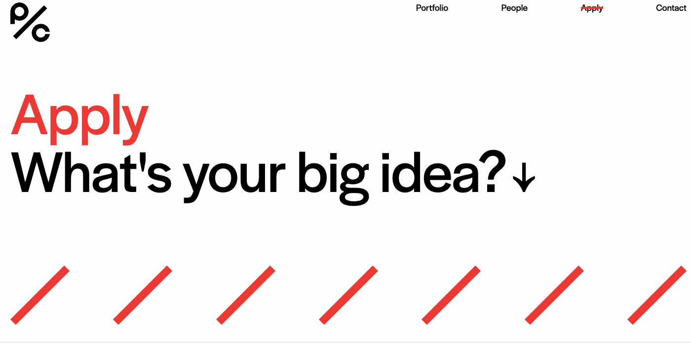
Applying to a venture capital firm in search of funding is an exciting step, worthy of a design that’s more than a boring template. Patra Capital comes through with an active design that captures the excitement of taking this all important leap.
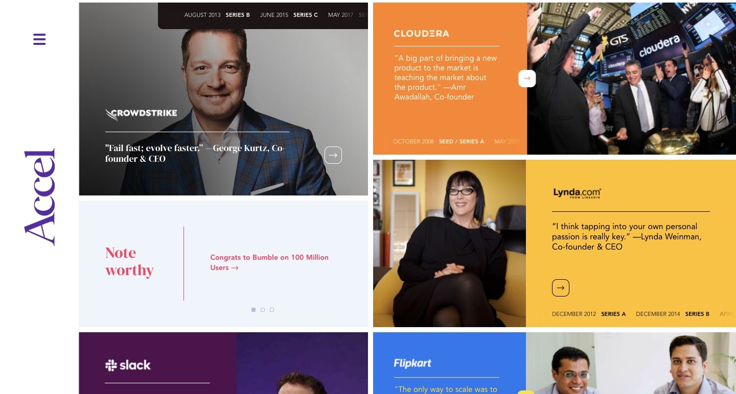
Accel (an investor in Webflow) offers a refreshing layout filled with colored blocks. Their main navigational sections don’t stick to the standard menu options. Instead they’re titled Relationships, People, and Noteworthy. Their front page uses a search engine setup to encourage visitors to find what they’re looking for.
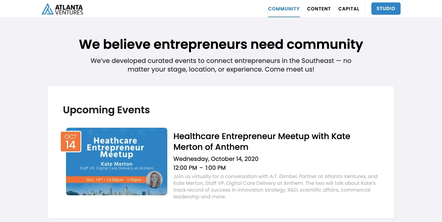
Atlanta Ventures positions themselves as a company going the extra distance in reaching out to company founders with outside events. Having opportunities to meet and find out more about what they do, distinguishes them from other venture capital companies who forego any sort of community outreach.
This spirit of going above and beyond can also be seen in Meritech Capital’s blog, with a huge library on very specific topics that would be of interest to any entrepreneur.
These companies mentioned above, as well as Unusual, earn their distinction by not following what everyone else is doing and offering experiences and information that are hard to find anywhere else.
How Unusual Ventures delivered a website with real value
“We were of the mindset that if we were going to do it, we wanted to do it well.”
— Laura Spaventa Lewis
With a content-driven website that keeps the focus on what founders need, Unusual were able to differentiate themselves from more established firms. Nothing here feels like it was done to meet the bare minimum of expectations and goals they had for it. They created a webspace that not only lived up to their name, but exists as a centralized platform for resources, tools, and information to help company founders.
Right now they’re still in the process of moving their design forward, so you may see some additions to their design. We’re looking forward to what other original elements Unusual will incorporate into an already outstanding design.