


Every click, scroll, and abandoned page on your website tells a story about what's working — and what's costing you conversions.
Customer journey mapping helps you visualize these critical paths, revealing who your users are, what they're trying to accomplish, and where they encounter friction. But the real competitive advantage comes from pairing these insights with behavioral data that shows you exactly how visitors engage with your site. When you can see user behavior directly where you build and manage your website, optimization shifts from guesswork to evidence-based improvements that drive measurable results.
In this guide, you'll learn how to create effective user journey maps, interpret behavioral data to spot opportunities, and implement a proven roadmap for continuously improving conversions. Whether you're mapping journeys for the first time or ready to make your insights more actionable, this comprehensive resource will help you turn user behavior into business growth.
What is a user journey and user journey mapping?
A user journey is a visualization of each step a visitor takes to reach their goal when they arrive on your site.
User journey mapping, also known as customer journey mapping (CJM), maps a visitor’s experience from their perspective. Presented through a visual diagram, the customer journey map charts the user’s path as they seek information, starting at the homepage and tracking their routes across other menus and links.This process helps you spot real fixes for any UX challenges.
To create a customer journey map, you begin by researching who users are, what they want from your site, and how their experiences differ. Consider the following:
- Positive reaction: The user finds relevant information and experiences delight.
- Negative reaction: The user struggles or feels frustration.
It’s important to note the difference between a user journey and a user flow. A user journey incorporates the emotional experience and motivations behind each step, while a user flow typically illustrates the logical path a visitor follows from entry to conversion.
The anatomy of user journeys
A user journey represents the complete path a visitor takes from entry to exit (or conversion) on your website. Consider this common scenario: a visitor discovers your blog through search, reads part of an article, clicks a call-to-action to learn more about your product, but then leaves the product page without downloading a gated asset or requesting a demo.
This journey contains multiple touchpoints worth analyzing:
- How the visitor found your blog content
- How they engaged with your content
- Whether they clicked your CTA
- How far they scrolled on the product page
- At what point they abandoned your site altogether
Each touchpoint presents an opportunity to encourage deeper engagement, reduce bounce rates, increase content relevance, or improve navigation flow.
Why user journeys matter for business results
Understanding how visitors navigate your site directly impacts your bottom line. For decades, researchers like Forrester have documented how a site with well-designed user journeys can achieve up to 200% higher visit-to-order conversion rates than a poorly designed site — while visit-to-lead conversion rates can be more than 400% higher on sites with superior user experience.
These improvements translate directly to revenue growth. When you increase conversion rates, you extract more value from your existing traffic and marketing spend. Every visitor becomes more valuable, and your customer acquisition costs drop while revenue per visitor increases.
There are two main purposes for mapping your customers’ journey.
1. Improve customer experience
This is the ultimate goal of CJM. Site navigation can be especially tricky to assess because you’re already familiar with the layout. A fresh perspective on your site often uncovers overlooked details such as navigation issues or broken links.
By conducting research on UX trends and visually mapping your results, you’ll identify any parts of your design that confuse or frustrate visitors. This process also reveals areas that work well, which you can repurpose elsewhere in the design.
2. Maintains ease-of-use as your site grows
A customer journey map can make even a simple site more straightforward to navigate. When your website or business grows, you may need to add and map content and features to accommodate the expansion. Implementing customer journey mapping helps maintain your website's core flow in a user-friendly manner, even as you grow, so new material and features are easily discoverable and usable.
You may also hear about similar tools, like a "service blueprint" or "experience map." These compare back-end processes or broader touch points.
Key variations of a user journey map
Key variations of a user journey map include current state, future state, and persona-based approaches, each offering unique insights into your users. The end result of each map looks similar, but the focus of each approach differs. Here are these three categories to help you get started.
Current state
The current state map is the most common type. It evaluates your website’s present state to better understand visitors’ current experiences, helping identify improvement opportunities for its existing design.
Future state
A future state map explores a hypothetical "ideal" website, considering the visitor’s experience if every site component were optimized. This map is helpful when planning a total redesign or a specific change. When you collect user research and translate the results into your map, you can present a visual outline to your client or company for a straightforward explanation.
Persona-based
A persona-based map lays out the journey of a single designated type of user, or persona (which we will define below). This type of diagram is useful when optimizing your website for a specific sector of your audience with particular needs.
The 5-step customer journey mapping process
Once you’ve set clear goals for your map’s achievements, you can select the appropriate diagram type. To begin visualizing your user journey, follow this five-step process.
1. Define the map’s scope
Decide whether you're refining a single step or the entire website. Then focus your map to keep the scope realistic.
2. Determine your user personas
A persona describes a particular type of visitor using your site. When imagining and defining these users, you can assign a name to each and include details about who they are, what they’re looking for, and why.
Focus on users who contribute most to your business goals, consulting your marketing or sales teams for insights. To define your customer personas, explore current user behavior through surveys, online reviews, and email list responsiveness.
For example, if you’re creating a website for a store that sells artisanal coffee-making tools, your personas could be:
- The gift giver. This shopper only knows a little about coffee but hopes to impress someone else. They want easy guidance and may use FAQs or a chat feature before checking products.
- The coffee nerd. This person is knowledgeable and always seeks the highest-quality tools, so easily accessible product details and customer reviews are important to them. To support their user experience and encourage them to purchase, ensure these elements are easily discoverable.
- The tourist. This user is on vacation and looking for a cute brick-and-mortar shop to visit. They aren't interested in your online store, but an appealing photo of your physical store with easily accessible hours and location information may convince them to come by in person.
These three types of users have very different needs and goals when visiting your website. To capture all of their business, create a map for each of them so you can keep your site user-friendly for their specific wants and circumstances.
3. Give the personas context
User context is when, how, and why someone is visiting your site. If they’re in a hurry, quick navigation is vital.
Figure out when, how, and in what mindset your personas most commonly visit your site to map their experience accurately. This context has very concrete impacts on your finished design. If visitors tend to look for one specific page whenever in a hurry (like contact or location information), placing those details on the front page or prominently linking to it will smooth the user experience for those users.
Here’s an example of how to place a persona in context.
Persona: Jo is an apartment hunter in her early 20s and is still in college. She's looking for off-campus housing for herself and some roommates. The collective group values location and cost more than apartment features.
Context: Jo is in a hurry and trying to visit as many apartments as possible. She’s looking at property rental websites that clearly state apartment addresses in each listing.
Method: Jo is browsing the sites on her iPhone.
4. List persona touchpoints
Touchpoints mark when the user makes a purchase decision or interacts with your user interface (UI). They include visitors' actions to move toward their goals and consider each associated emotion. The first touchpoint is how they reach your website — such as tapping a social media ad, clicking on a search result, or entering your URL directly.
First, list each action the visitor took and their corresponding emotional reactions. Subsequent touchpoints include instances when they navigate a menu, click a button, scroll through a gallery, or fill out a form. When diagramming the route a user takes, consider both user flows (technical steps) and the broader emotional impact of each interaction. Whenyou diagram the route through your site in an A-to-Z path, you can place yourself in the persona's mind to understand their reactions and choices.
5. Map the customer journey
Illustrate the user journey by mapping these touch points on a visual timeline. This creates a narrative of users’ reactions across your entire service blueprint. To represent your users’ emotional states at each touchpoint, graph their correspondences like this:
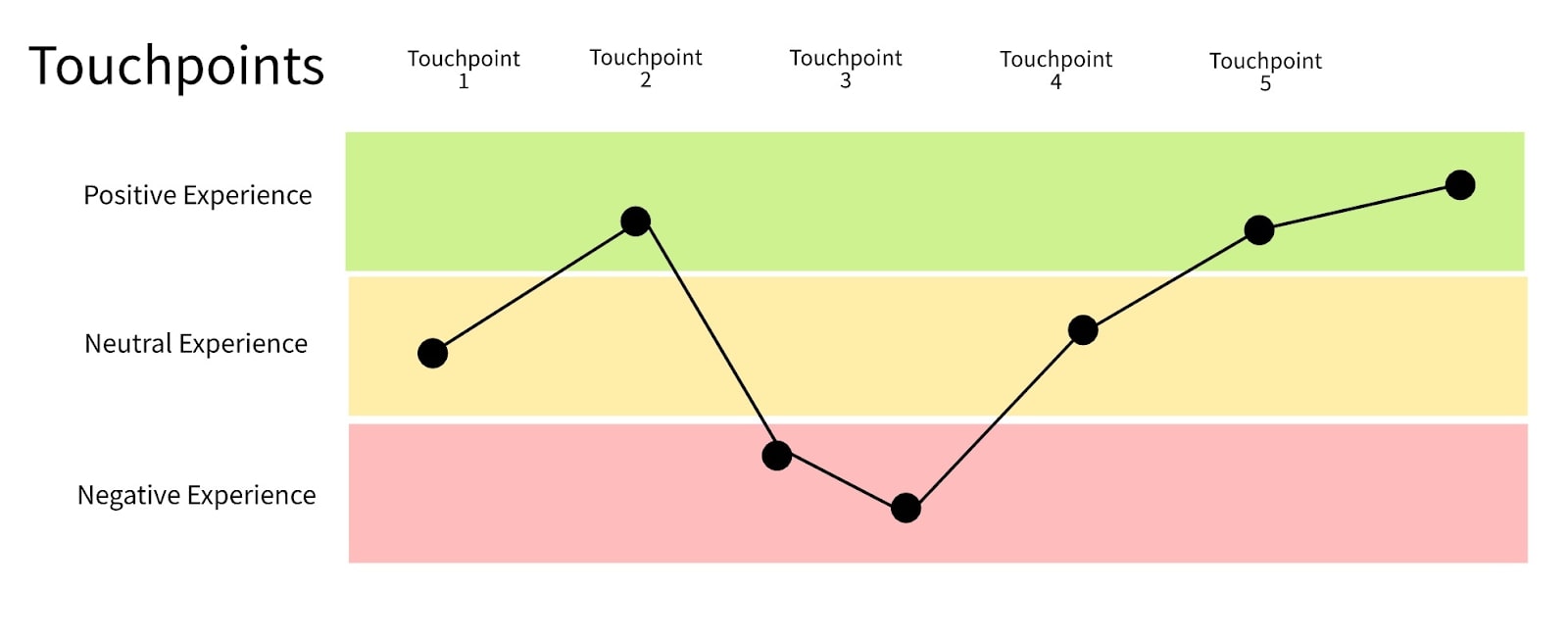
The map helps you understand the customer experience as a whole.
For example, based on the diagram above, touchpoint 3 is the largest navigation challenge on the website. The graph also shows that the user's mood eventually rebounds after the initial setback. Improving the problem element in touchpoint 3 has the biggest impact on elevating the overall user experience.


Bridging the design to development gap
Learn best practices for integrating the workflows between design and development in this free webinar.
Turning maps into action with data
For most marketing organizations, the problem isn't lack of data about user journeys — it's accessibility and timing.
Traditional website analytics platforms weren't designed for the people who actually create websites. These platforms prioritize complex reporting features that serve data analysts and performance marketers well, but leave designers and content creators struggling to get the insights they need when they need them.
When you have to stop your work, log into a separate tool, and decode data before making changes, quick improvements become slow projects — or get missed entirely. The result is a disconnect between data and action: designers place buttons based on instinct rather than evidence, content marketers publish without knowing what actually engages their audience, and teams default to guesswork over user insights.
"When you're going to different tools or people to ask for insights, that adds a lot of friction along the way," says Corey Moen, Manager of Web Design at Webflow. "Especially after a launch, when you're going into the mode of taking the site to the next level, you need to see how people are using it and make actionable, data-driven decisions."
How Webflow Analyze fixes the data disconnect
Visual analytics tools like Webflow Analyze eliminates that friction by putting user behavior data directly where web teams work. Instead of switching between design tools and separate dashboards, you get visual analytics overlaid on your actual site pages.
At the heart of Webflow Analyze are two visualization approaches that make user behavior immediately clear:
Clickmaps show you exactly where people are engaging on your pages. Instead of wondering whether that button placement is working, you can see the heat patterns of actual clicks and taps. You'll quickly spot which elements draw attention and which get completely ignored, plus identify places where visitors expect something to be clickable but find dead zones instead.
Scrollmaps reveal how far down your pages visitors actually go before they lose interest and leave. This answers crucial questions about whether your most important content and calls-to-action are positioned where people will actually see them, or if they're buried too far down the page.
These tools provide a complete picture of the user journey that's easy to understand and act on quickly — no complex dashboards to filter through or abstract metrics to interpret.
Your roadmap to user journey optimization with Webflow Analyze
Webflow Analyze helps you improve user journeys across three key pillars: understanding initial engagement, optimizing CTAs, and improving destination pages. Here's the playbook that web teams are following to turn user behavior data into measurable improvements.
Step 1: Understanding initial engagement
The first few seconds of a visitor's experience make or break their entire journey. Use scroll depth and interaction data to understand how users engage with your landing pages and blog content.
Here’s what to look for:
- Layout adjustments: Move critical CTAs higher on the page if scroll data shows most visitors don't reach them
- Content optimization: Reduce bloat or restructure information hierarchy based on engagement patterns
- Above-the-fold improvements: Strengthen your value proposition in the area where most visitors make stay-or-leave decisions
Case study: As we were testing Webflow Analyze with early users, one team discovered that 70% of visitors were dropping off just before reaching a new feature section they'd positioned mid-page. Using scrollmap data, they repositioned the content higher for better visibility, immediately improving engagement.
Step 2: Optimizing CTA placement and messaging
Call-to-action optimization becomes precision work when you can see exactly where users click and where they don't. Visual click data helps you test different CTA copy, layouts, and positioning while uncovering friction points.
Optimize conversions through:
- CTA repositioning: Move underperforming buttons to spots where visitors are already clicking, based on your clickmap data
- Clickability improvements: Fix elements that look clickable but aren't, or make important elements more obviously interactive
- Message testing: Refine CTA copy based on which versions generate more engagement
Case study: Our own growth team at Webflow experienced this power firsthand on our pricing page. Visual analytics revealed that visitors weren't engaging with plan CTAs as expected. After investigating, they discovered that lengthy header copy was pushing CTAs below the fold for most visitors. The team shortened the header to pull CTAs higher up the page — a simple change that led to a 10% lift in signups.
Step 3. Improving destination pages
Destination pages are the key pages where you want users to convert — product pages, signup forms, contact pages, or important content hubs. Understanding drop-off patterns on these pages helps optimize your entire conversion funnel.
Look for opportunities around:
- Content reordering: Move key information higher up on the page based on where visitors typically stop scrolling
- Friction reduction: Identify and eliminate elements that cause visitors to abandon the page
- Flow optimization*: Improve navigation between related pages to keep visitors moving through your conversion funnel
Use case: A SaaS company might discover that visitors need pricing information earlier in their product page journey, or that technical specifications should come before feature descriptions. An agency might find that case studies work better than service descriptions for keeping visitors engaged.
*Tip: Webflow Analyze provides page-to-page navigation flow data to better understand the user journey, helping you optimize navigation elements and remove friction points that limit conversions.
Best practices for user journey optimization
Now that you understand both the mapping process and the optimization roadmap, here are some best practices to implement when charting and improving your customer journey.
- Set a clear objective for your map: Decide if you want to improve the checkout process, highlight a key product, or solve a specific navigation problem.
- Specify customer journey maps for each persona: To specifically serve each customer persona, consider charting separate paths for each based on their behaviors and interests. This approach is more customer-centric, as not all user types interact with your website the same way.
- Enable collaborative decision-making: Visual analytics create a shared language between marketers, designers, and content creators. When everyone can see the same behavioral data mapped directly to page elements, discussions shift from opinions to evidence-based optimization strategies.
- Use shared visual data to:
- Align teams around user behavior patterns rather than assumptions
- Prioritize optimization efforts based on actual impact opportunities
- Speed up decision-making by eliminating lengthy data interpretation phases
- Use shared visual data to:
- Build continuous optimization workflows: Integrate optimization into your regular design and content workflows rather than treating it as a separate activity. This creates faster feedback loops with fewer blockers, so make reviewing analytics a regular part of your design workflow — just like checking responsive breakpoints or testing functionality.
- Focus on iterative improvements: Use visual analytics to make incremental improvements that compound over time. Small changes informed by user behavior data often deliver outsized results.
- Solicit customer feedback: Surveys, interviews, and direct outreach reveal which elements delight visitors and which features need work.
- Reevaluate your map after company or website changes: As your business scales, your website must evolve — and so will your customer’s path. Also, consider how user behaviors might change over time. Navigational disruptions can frustrate visitors, causing would-be customers to leave your site and seek competitors.
Looking ahead, user journey research is becoming the go-to method for systematic improvements in UX design, helping teams remain agile and user-focused.
How Walker & Dunlop's achieved a 56% form fill increase
Commercial real estate services firm Walker & Dunlop implemented Webflow’s analytics and optimization tools and quickly built a culture of optimization. They drove a 56% increase in form fills and 23% growth in year-over-year organic search traffic, and the marketing team now pushes 10-15 content updates daily — while using real user data to track conversion paths and optimize content for engagement.
As Kokko Tso, Vice President of Digital Marketing, says, "Combined with Webflow's visual-first platform, Optimize and Analyze empower our teams to evolve with our clients, experiment and pivot quickly, and, ultimately, create more personalized digital experiences."
Optimize your user journey map with Webflow
Understanding how visitors move through your website — where they engage, where they get stuck, and where they leave — is critical for improving conversions and business results. But a user journey map is only as effective as the improvements it promotes.
That's where turning insights into action becomes essential. Visual analytics make this understanding accessible to everyone on your web team, not just data specialists. When you can see user behavior data directly on your pages, optimization becomes part of your regular workflow. You spot problems faster, test solutions immediately, and make improvements that streamline the user journey.
Webflow empowers designers and businesses with the tools to bring your vision to life — from comprehensive resources and educational content to enterprise-grade hosting and seamless collaboration features. With Webflow Analyze, you can transform your user experience strategy into a high-performing website that delights visitors and drives measurable business results.
Ready to see exactly how visitors navigate your site? Try Webflow Analyze and discover what your user behavior data can reveal.

Build with Webflow
Webflow Enterprise gives your teams the power to build, ship, and manage sites collaboratively at scale.