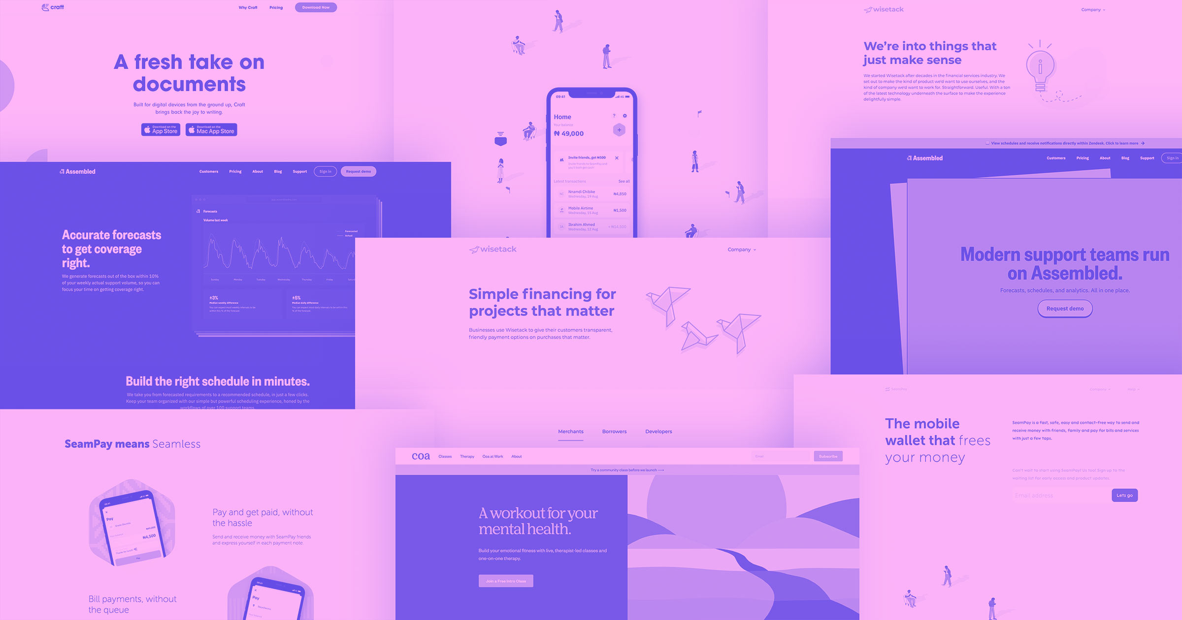
Companies who sell subscription-based packages or services, like SaaS companies, have to communicate their value and point potential customers to the subscription plan that would work best for what they need. It should be apparent how these plans differ and what customers will get when they sign up. We're going to look at 24 different pricing pages that aren’t only examples of great design, but get out all of the right information.
If you’ve designed a website that successfully leads people to a pricing page, you’ve already done something right. But how do you push these potential customers a bit further in making that all important purchase?
Effective pricing pages find the right balance between commerce and creativity. They distill the most important features, communicate the pricing, and target subsets of customers with individual options. Whether pricing plans offer quantity discounts, are based on usage, or are split between yearly or monthly billing, all of this information should be easy to understand. When customers have clarity the buying decision process becomes simple.
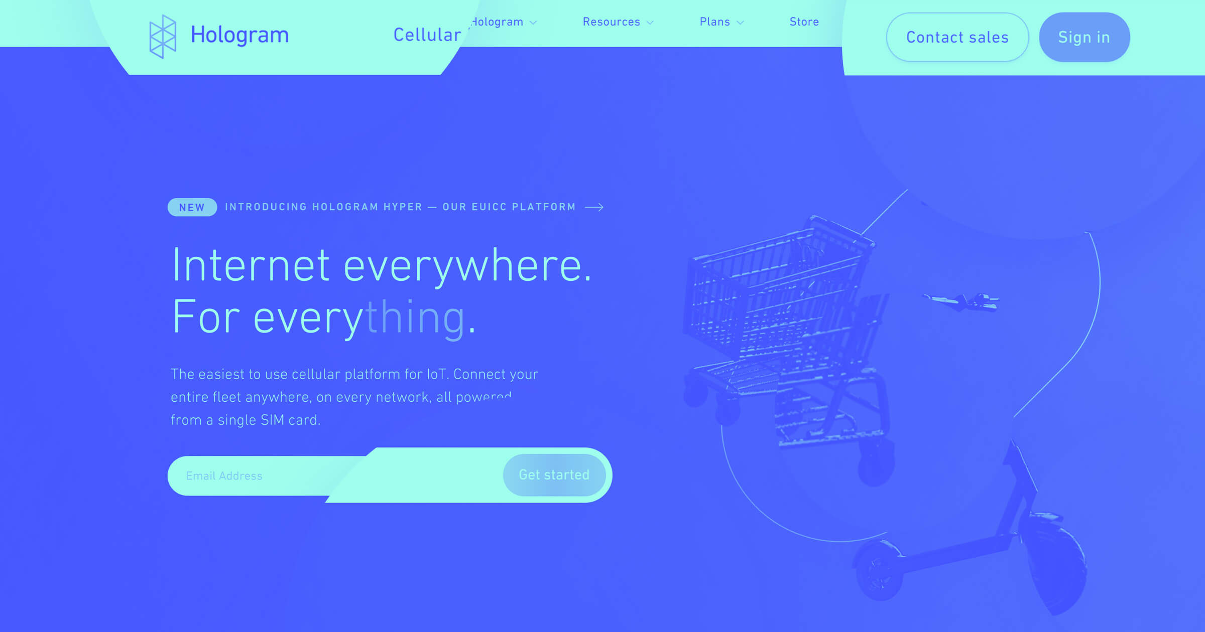
“One of the things that we learned when redesigning our pricing page was making things as transparent as possible, but also as predictable as possible."
— Sean Nelson, Senior Product Designer at Hologram
Keep in mind — pricing options don’t have to be limited. Businesses may offer customized pricing tiers. A bit of content, and a single call to action may be all that’s needed to encourage customers to get in touch with the sales department to learn more about more personalized packages.
24 pricing page examples to inspire your own
Let’s take a look at a variety of pricing page examples, across different industries, that work so well in turning potential customers into conversions.
1. smplrspace
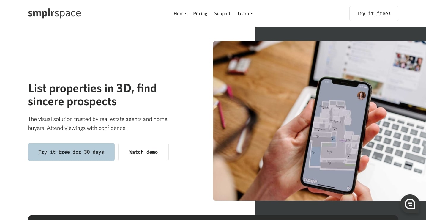
With the functionality to generate 3D renderings from floor plan diagrams, smplrspace gives those working in real estate a high tech tool in helping market their properties. They offer three different pricing plans.

Each pricing option has the number of 3D spaces someone can generate per month listed directly beneath it. This is the main differentiator, with the Lite plan giving someone 5 spaces, up to the Premium plan that can generate up to 120. Right away it’s apparent what makes each one distinct. At the bottom of each pricing plan a dark grey call to action button stands out from the lighter background, immediately catching someone’s attention.
Smplrspace succeeds with a pricing page design that gets right to the point, giving people only the most important information they would need in helping them make a buying decision.
2. Scratchpad

The job of a salesperson involves multiple tasks like taking notes, keeping track of leads, managing contracts, and updating Salesforce. When scattered across multiple software platforms this can get complicated. Scratchpad offers an SaaS solution that keeps track of everything in one place, offering four different pricing plans.

With a blue border surrounding it, the Team plan immediately stands out. Aimed at small to medium sized teams, it's the package that’s most likely to appeal to people landing on their page. A short scroll down brings one to the Productivity Essentials section, which highlights how their software will improve the most important part of a salesperson’s job - maximizing their use of time.
For SaaS companies like Scratchpad, it can be a challenge to communicate all of the functionality of a piece of software without bombarding someone with too many details. In this straightforward layout of pricing tables, Scratchpad presents all of their features, with a clean and simple approach.
3. Vdeo

Pushing out quality video content on social media has become a priority for many brands' marketing efforts. Vdeo offers businesses production services to meet their needs for video content. This is another pricing page example that takes a three column approach.

They highlight their current pricing special of six videos, extending the column upwards into the blue background, giving it a red call to action button that immediately catches one’s eye.
Using contrasting colors in a web design to highlight a particular plan works so well in making it stand out. Small strategic design choices like this can make a huge difference in conversions.
4. Guru

Having a centralized resource for files, assets, and other information gives everyone on a team quick access to what they need. Guru wrangles all of these essentials into one place, and integrates with Gmail, Slack, Salesforce and other apps. There are three different plans on their SaaS pricing page.

This clean web design features an offset double border around each subscription option, giving a sense of depth. Guru takes the familiar three column approach and adds a bit dimensionality and color for a pricing page example that communicates all of the key features, in a visually pleasing design.
5. RightMessage

Offering your customers a more personalized experience can improve the bottom line. Rightmessage lets companies link email lists to their websites, and give their customers a custom tailored experience. At the top of their pricing page they have a slider, which lets someone set how many unique visitors their website gets per month. The two plans then change pricing accordingly. What they’re doing is offering you a personalized experience - which is a smart move in line with their company’s mission.

Let’s scroll down the page for a closer look at these pricing tables.

Clicking on an individual plan changes the bottom call to action button. Instead of cramming two buttons below, they keep things simple. This centered element, with its orange and red jumps out from the layout.
Instead of a passive presentation of features, they bring people right into the user experience, for an active and engaging way to show their different pricing tiers.
6. Designjoy

Designjoy offers subscription based design work. This novel concept lets businesses pay for design work on a monthly basis. They have three plans, with each offering a variety of services and deliverables.
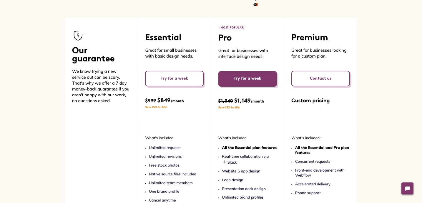
The centerpiece of the design is their Pro plan. The call to action button gets a solid purple fill, with “most popular” floating above it. With these two tiny touches, they bring this pricing plan to the forefront.
Even the smallest shifts in a design can make a huge difference, and Designjoy shows that they know the art of subtly with this well designed pricing page.
7. Yac

Yac’s aim is to facilitate better and faster communication between team members to free them up for what really matters - and that’s productivity. Their SaaS pricing page is split into two buyer personas, with one plan for freelancers and another for startups.

Each section checks off a small list of main features. This pricing page fits so well in their theme of direct and easy communication, getting their own message out there in a quick and concise way.
With an uncomplicated design of dark grey, white and dashes of yellow, Yac succeeds with this simple yet effective pricing page design.
8. Produck

Produck sets themselves apart from other project management tools with a smooth interface and visually pleasing platform. Starting with a free version, there’s two plans to choose from, along with a slider on the right to figure how much the Premium pricing plan will cost per user.

With the headline of “Simple Pricing” Produck delivers on this promise, with a refined user experience free of unnecessary complications.
9. Loom
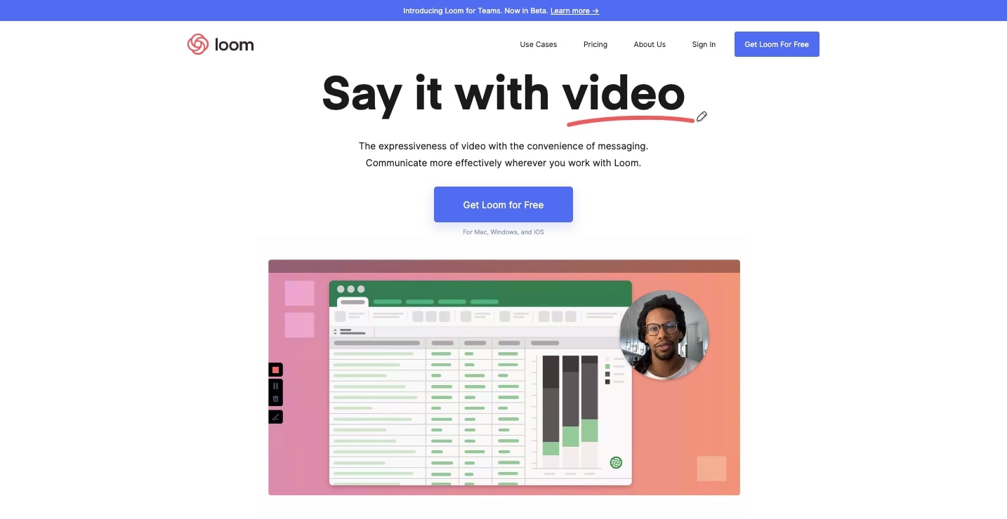
Bringing together video, text, and visuals Loom offers an innovative video messaging system. They divvy up their pricing tiers into two for individuals, as well as two for teams.

The Pro plan for individuals has its call to action button to start a free trial filled out in blue, immediately drawing one’s attention to it. This is the plan where they want to make the most conversions.

There’s also this above pricing table with a sticky header of the four different plans. This could have been a huge confusing array of information - but this scroll, with attached plans makes it so that someone never loses their place.
Loom demonstrates that even with multiple plans and features, a pricing page can still be user friendly.
10. Cenario

Cenario lets businesses tap into their data using AI, and to use it to shape their goals and objectives. On the page of pricing packages, the space is taken up by three columns that extend as one scrolls down the screen.
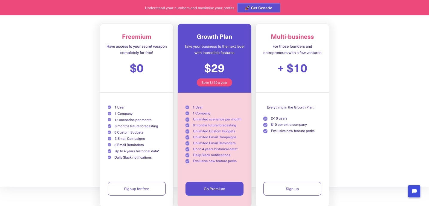
The Growth Plan gets all of the attention, with a space filled out with colors. This is their top level plan, and this design makes it obvious that this is the one that they want people to look to first.
The way a designer uses color can make such a difference on the focal point of a page. Most pricing pages have some sort of visual cue pointing to the preferred plan they want someone to sign up for. Cenario paints this plan in purples, so that it can’t be missed.
11. Freshpaint
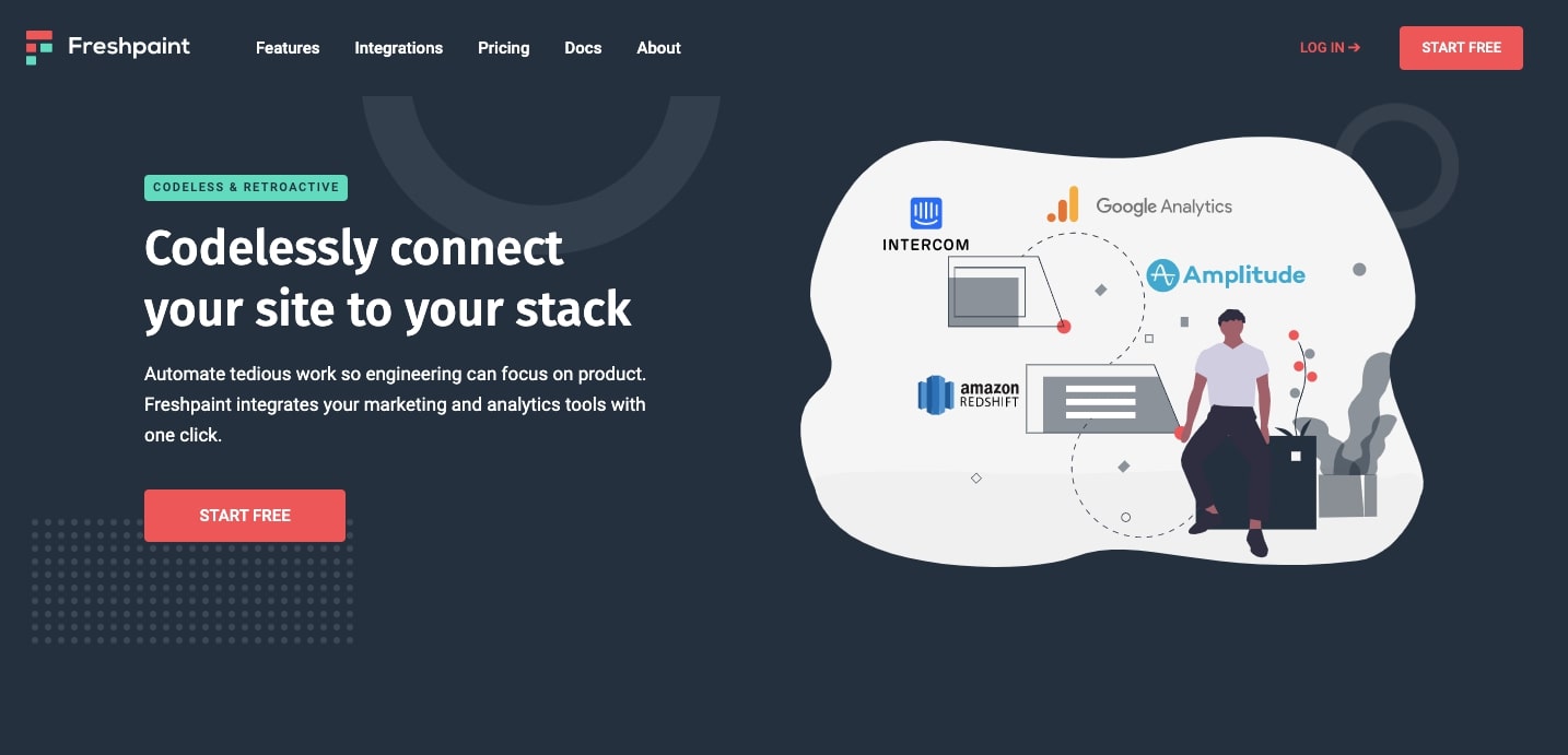
A website generates a wealth of valuable data. From sales, clicks, to interacting with videos and other media, these numbers show where people have taken action. Freshpaint lets companies harness this user data and automatically bring it into a software stack. Landing on their pricing page shows two different plans, with one being free, along with a custom business option. They follow this with an extensive FAQ section, giving further insights into how their app works.

This pricing page could have felt too rigid if it was just an array of grids. The background wave not only loosens up this space, but brings more attention to the plans in the foreground.
Varying the visuals adds pleasing incongruity, keeping a design from feeling too boxed in.
12. Appcues
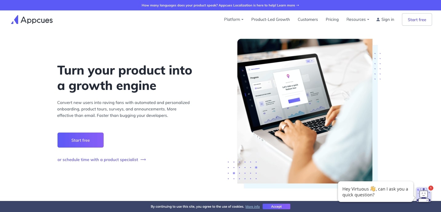
Appcues gives companies the power to improve how they onboard customers. From facilitating sign ups for trial versions of a product, to seeing how users interact and flow through it, Appcues is a multipurpose software application. Their pricing plans occupy a three column layout.

The Growth pricing plan in the center, gets a bit more vertical space, extending upward and downward from the baselines of the other columns. There’s also a bit of a shadow around it, adding to the layered effect, and pushing it to the front of the pricing plan page.
This is another unique pricing page example, demonstrating how varying the look of the visual elements can liven up a layout.


Get started for free
Create custom, scalable websites — without writing code. Start building in Webflow.
13. Liverecover

Abandoned carts are a point of frustration for those running ecommerce sites. To think, someone put in the effort to add these products, only to bail out at the very end. Liverecover offers a service where they call up these customers to see if they can answer any questions, and help to turn these missed opportunities into sales. They offer three different options.

The pricing page takes a bit more of a minimalist approach compared to the landing page that offers a more extensive explanation of what they do. Whoever navigates to this page is already well primed in understanding Liverecover’s services.
Liverecover’s pricing page summarizes the best features of each plan - making it easy for potential customers to identify which plan may be right for them.
14. Lorem
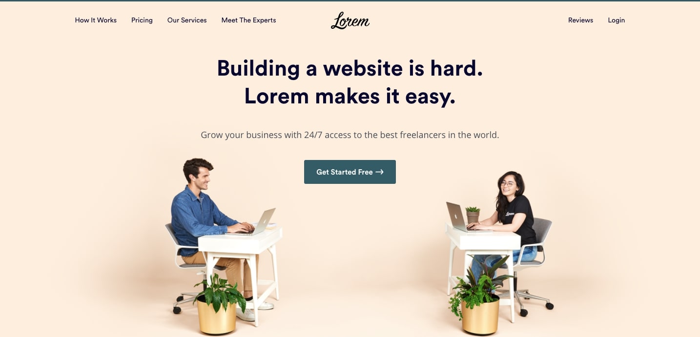
Lorem connects clients with freelancers - offering per project pricing as well as monthly plans. Pricing information starts with their free Access plan, along with Manage and Grow options.

Their pricing strategy targets getting people to sign up for their free Access plan. A thin green border separates this from the rest. Once again we see how the smallest visual touch can make a huge difference in highlighting a particular subscription option.
15. Contractbook

For any business that has a giant pool of contracts to keep track of, Contractbook offers a solution to manage these.
There’s two pricing information categories on their homepage. Clicking on either Business or Law Firms at the top brings up all of the details of these plans.

With a number of different subscription plans, there’s a dense amount of information but it’s well structured, and the sprinkling of colors throughout keeps it from feeling like one giant block of content.
16. Trovata

Trovata’s banking software helps businesses manage their finances and cash flow. Though what they offer is a complex product, they do a fantastic job in making it easy to understand what they do, whoever you are.

They divide up their pricing information depending on the scale of a business. With four different clickable tabs at the top, it takes no time at all to get to the appropriate plan that a business may be after. This page is another great example of how breaking out subscription pricing plans into different sections makes for quicker access.
17. Kajabi

Kajabi gives businesses a comprehensive array of software tools for marketing, ecommerce, integrations, data analysis, among other features. They offer three pricing options. Can you guess which one they want people to purchase?
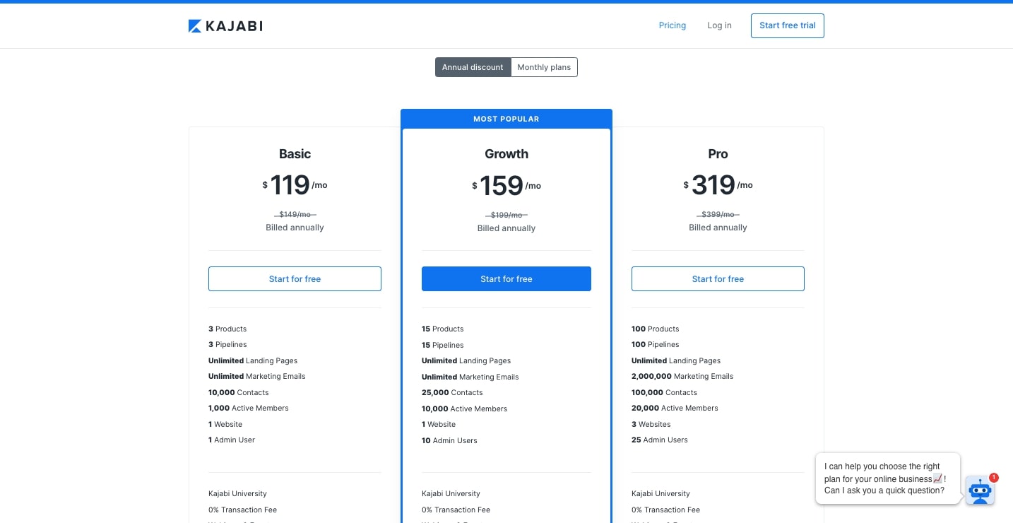
Okay, that blue border and call to action button make it pretty apparent that the Growth plan is the one that they’re pushing, which is the mid level pricing option. This bright blue stands out even more with the white space of the rest of the page.
Kajabi’s pricing page example shows once again, that you don’t have to overdesign a pricing page to make it look good.
18. Streak
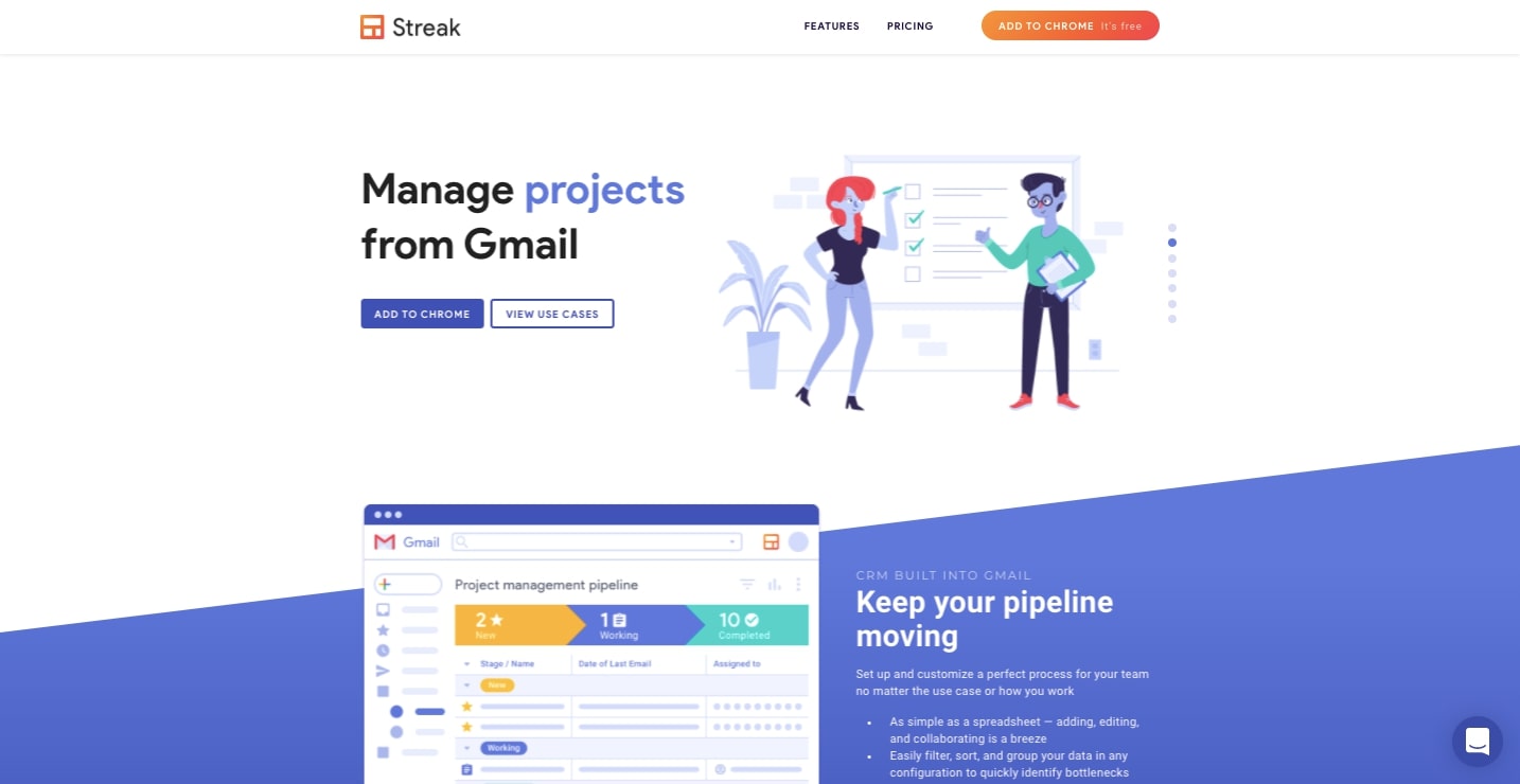
Streak offers a slick CRM tool that connects with Gmail, keeping team members up to date on tasks and facilitating communication.
They neatly divide their plans into four columns. All of the main points of each pricing option are hit at the top, with a pricing table below showing the differences between them.
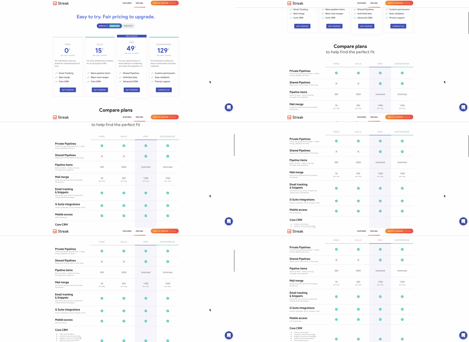
When designing a pricing page you can pack in a great deal of information as long as the layout has a logical structure. Streak shows just how this can be done.
19. Relevon

If you’re looking to automate customized emails for your Shopify ecommerce, Relevon gives you the power to connect with your customers on a more personal level.
Their website design has an airy touch, with plenty of light shades of color and a variety of layered visuals for a bit of depth. This same gentle user experience extends to their pricing page, with a clean layout and a straightforward breakdown of each package’s features.
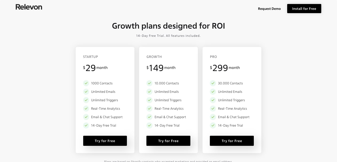
From the landing age to the pricing page, Relevon delivers an effortless user experience, showing how consistency matters.
20. Roger

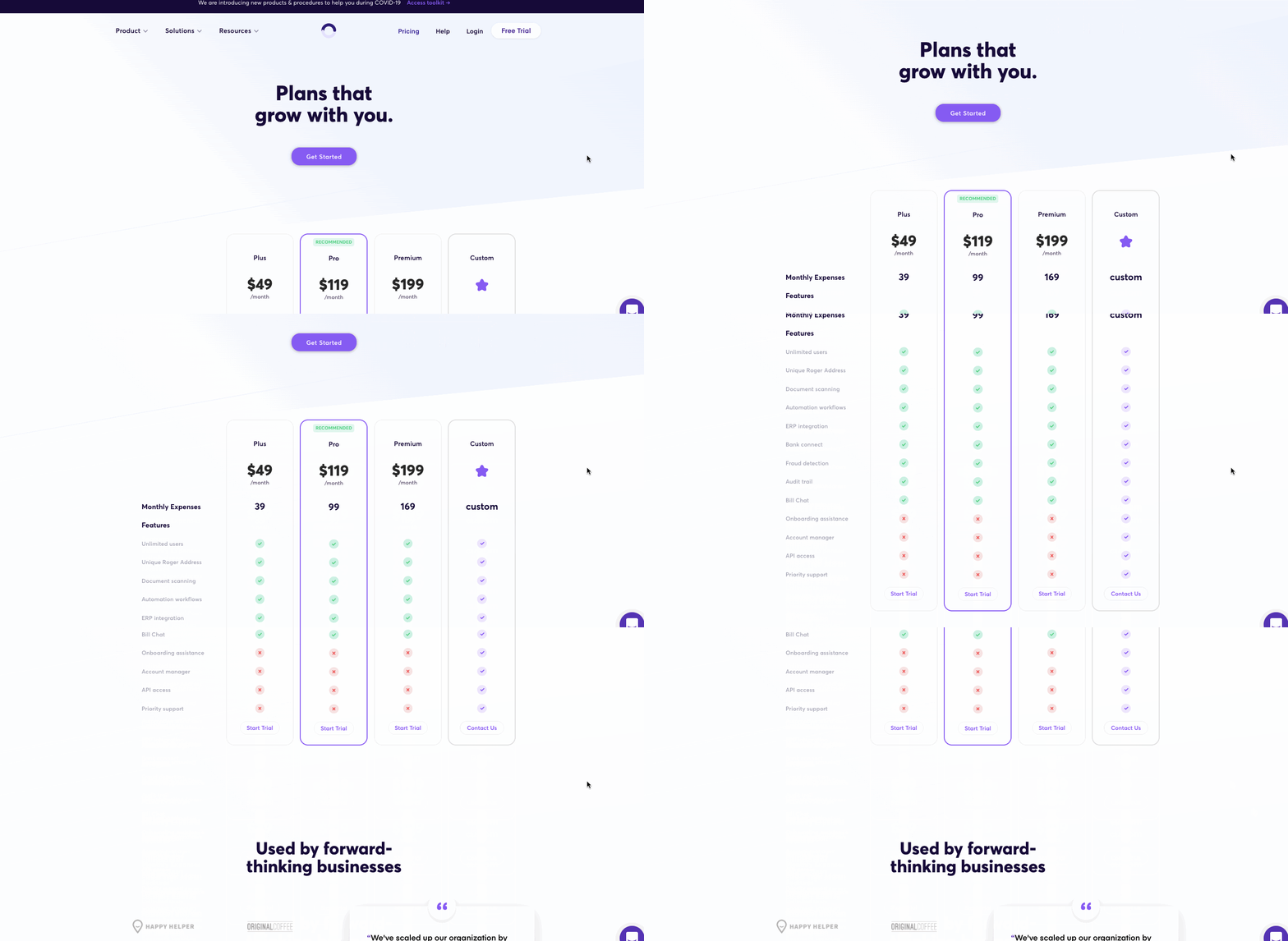
Roger is accounting software driven by data, with an array of automations and integrations that can be put into action. This is another example of how effective design and clear writing can take even the most sophisticated of software products and present it in a way that makes sense. Their pricing plan page is no different, outlining what each pricing tier offers and how it can help out businesses.
21. MURAL

MURAL lets team members sketch out their ideas and utilize diagrams and other visual representations in their communications, offering a creative and effective way for them to stay connected.
MURAL takes the three tiered pricing approach - and livens it up with a nice fade in of features. This neat and well structured pricing page, offers easy navigation.

22. Procurify

For businesses and organizations that need to keep track of their spending and budgets, as well as approve expenses, Procurify offers a software application for managing all of these intricacies. They present three different plans for potential clients to sign up for.
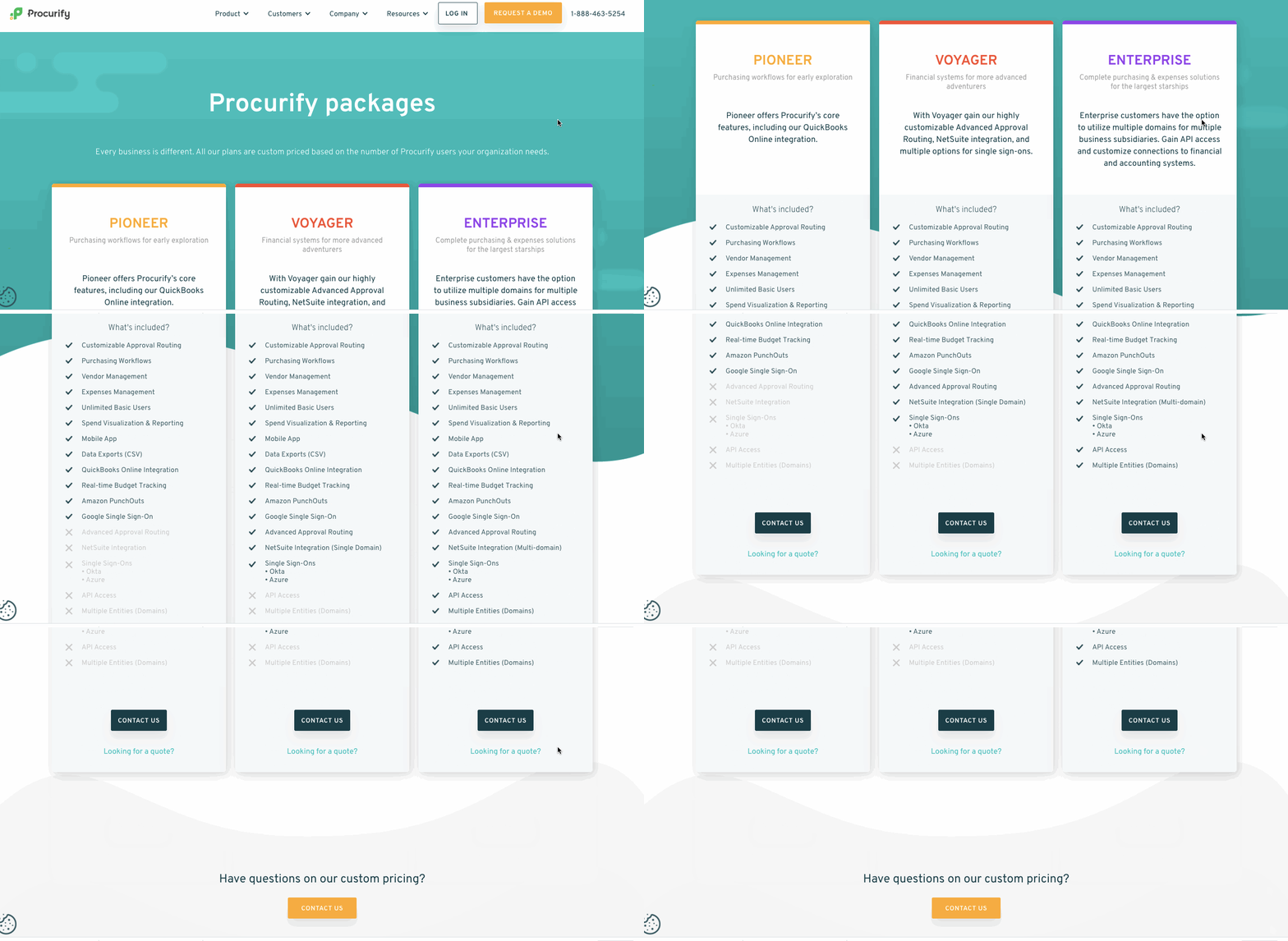
Their website follows a modern design, with custom character illustrations, plenty of color, and layered visuals. Their pricing plan page fits in so well with the rest of the design with its cool palette of colors, and background waves of color.
23. Spocket

Spocket gives those who want to get into the business of drop shipping all the products and tools they need to launch their own business. Their pricing plans of Pro, Empire, and the highest level - that of Unicorn (yay!), illustrates the advantages of each.

We love the inverted color scheme on the Empire package, which is an effective way to make a plan stand out. The stars next to each feature are a break from convention of the standard check mark, adding a splash of style to the design.
24. Hologram
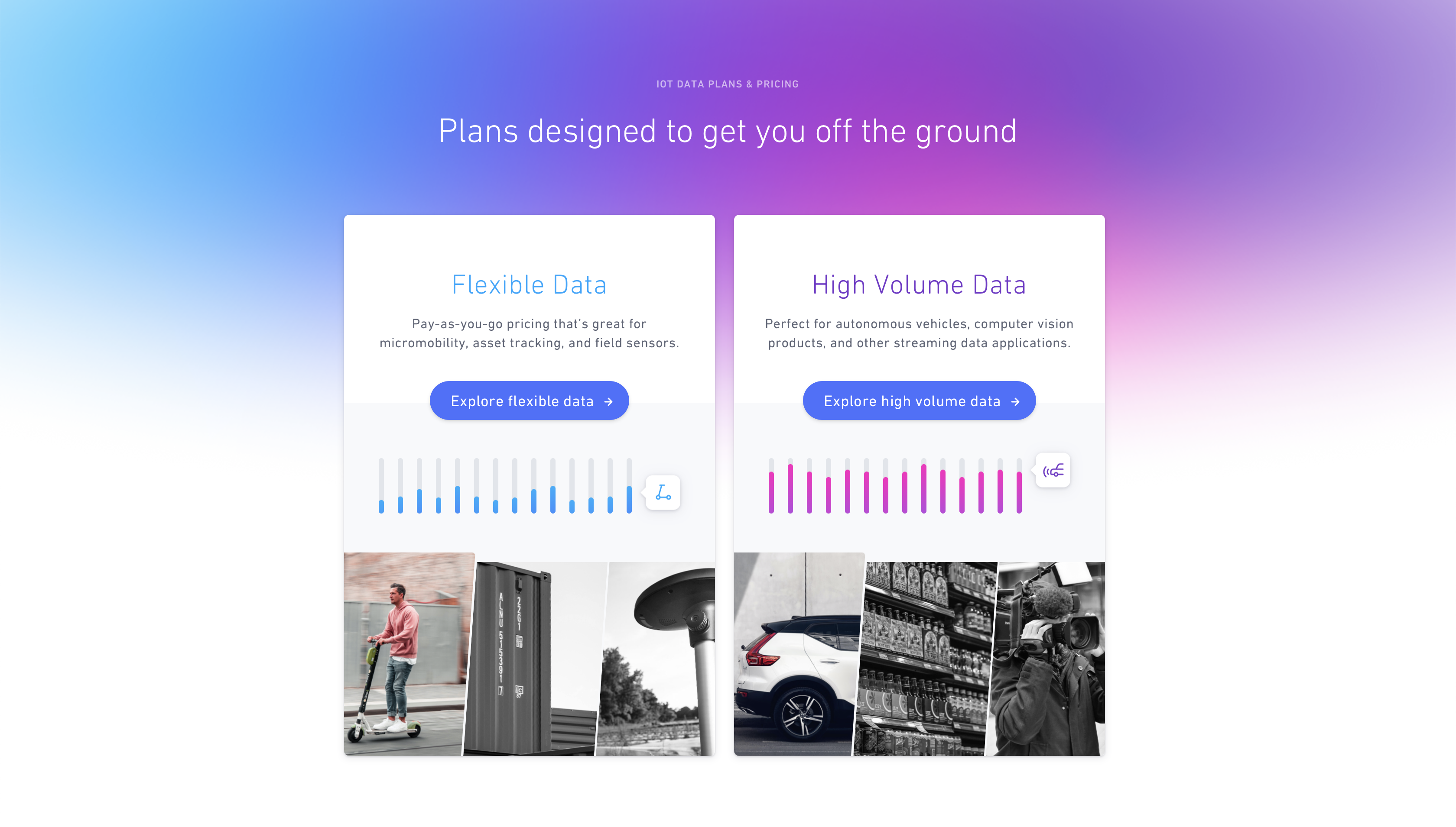
If you’re not familiar with the “cellular internet of things” Hologram may be a bit intimidating. But they provide businesses with what they need to integrate their technologies with cellular networks. This can include anything like ebikes, shopping carts, or even sensors on a refrigerator. The main concern for any company who needs this is the amount of data they get for their money. We can see above Hologram’s plans split into the two major categories of Flexible Data and High Volume Data.
Clicking on the Flexible Data plan brings one to a page that lays out all of the details of this particular pricing tier. The interactive slider functions in showing someone how the pricing changes depending on the number of devices a company requires to have mobile interconnectivity. They’re able to provide so much information to a potential customer through this simple interactive element.

Pricing page design needs to strike a balance
A pricing plan page is the last step between someone navigating through a website and coming to that all important buying decision. There needs to be the right amount of information to help them make an informed choice and at the same time you can’t lose them with a lackluster design.
We’ve covered 24 different subscription plan pages that all carry these good qualities, helping you to see how you should approach designing them for your own web designs.


