The bottom of your website is often the last thing people see — make sure it leaves a lasting impression.
Because headers are often the first thing website visitors see, footers can end up being an afterthought during the design process. However, a well-designed footer is an opportunity to remind website visitors of your value and invite them to take action. It improves your site’s user experience (UX) by offering your visitors easy access links to helpful pages and contact info if they want to reach out.
Read on to learn how to optimize footer designs with inspiration from 20 modern layouts and effective website footer examples.
Understanding website footers
A website footer is the section at the bottom of a website, typically consistent across every page. It might seem like the end of the journey, but it’s also the final opportunity to interact with visitors.
Footers give visitors quick access to important links, contact information, legal disclaimers, and calls to action (CTAs). They let you reengage with users who scroll to the bottom of a page, where you can help them easily find what they need.
The importance of well-designed website footers
Here are a few reasons footers are important for your website:
- Footers mean better navigation. A well-structured footer is like a mini sitemap. It helps people who’ve scrolled through your content quickly jump to other areas without having to scroll back up.
- Website footers communicate relevant information. Many visitors expect to find contact details, opening hours, social media links, and other company info in the footer. Including this information builds trust and makes your site feel approachable and transparent.
- Footers give a final call to action. A well-placed CTA at the bottom of your site, like a newsletter sign-up or free trial button, can convert passive scrollers into active customers. It’s a subtle yet strategic way to guide prospects toward your next goal.
- Footers can boost search engine optimization (SEO). Keyword-rich links and important site pages in the footer help search engines like Google crawl your site more effectively.
What to include in a website footer
A strong footer brings together widgets and other clickable elements people expect to find when they reach the bottom of your site. Here are the essentials to include:
- Contact information. This makes it easy for people to get in touch if they have questions, feedback, or want to do business. Contact info also builds trust by showing there are real people behind your site.
- Navigation links. Including links to popular or secondary pages (like the about page, customer support, and products and services) keeps visitors exploring instead of bouncing — it helps them quickly find what they need, even after browsing.
- Copyright information. Copyright notices are a small yet important detail. They state who owns your content and protect your site from those who steal or copy information without permission.
- CTAs. Adding CTAs like “Get started” or “Try it for free” gives people a final chance to engage, especially those who’ve read all the way through and might be ready to take the next step.
- Newsletter sign-up. A sign-up form (or a link to one) in the footer can subtly capture leads without interrupting the browsing experience. Newsletters are a low-pressure entry point for visitors and are handy for sharing updates, offers, and content.
- Sitemap. A simple sitemap in the footer gives search engines a clear structure of your website and its content, making it easier to index. It also improves navigation by helping visitors find less obvious pages.
- Social media icons. Social media icons for popular platforms like Instagram, TikTok, or X (formerly Twitter) invite people to connect beyond your website and let them know they can engage with you on apps they already use.
- Privacy policy and terms of use. These legal links tell visitors you promote transparency, comply with legal guidelines, and protect their privacy. It’s a must-have in your footer if you collect user data.
20 unique website footer design examples
Here are 20 examples of website footers showing how to effectively tie all your site’s elements together at the bottom of each page.
1. GenRevv
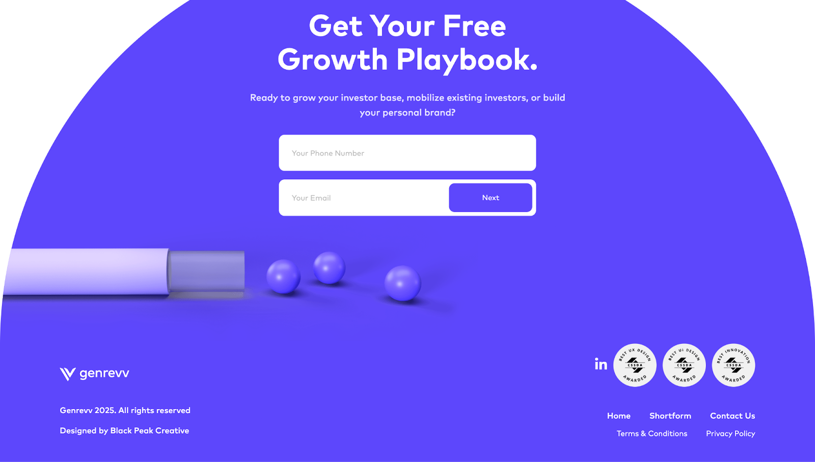
GenRevv’s footer, designed by Black Peak, takes up nearly the whole screen, making it more memorable than typical slab-style footer designs. The curved layout and bold purple background also help it stand out. However, it still includes essentials like contact links, legal info, and even awards, showing GenRevv’s credibility as a marketing agency.
2. Clade Design
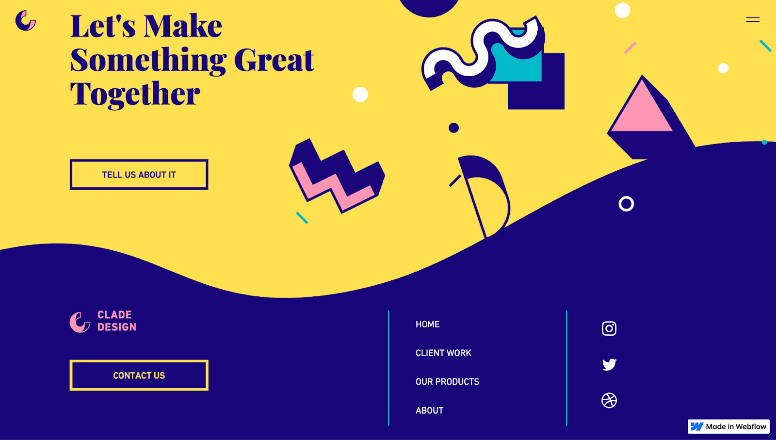
Clade Design’s footer reinforces the brand’s visual identity through bold colors, playful shapes, and a uniquely wavy split cutting through the screen. This distinct style tells people the studio thinks differently and can set themselves apart from the competition. There are important links, social icons, and a contact CTA button in the footer — all neatly organized without overwhelming the design.
3. VSCO
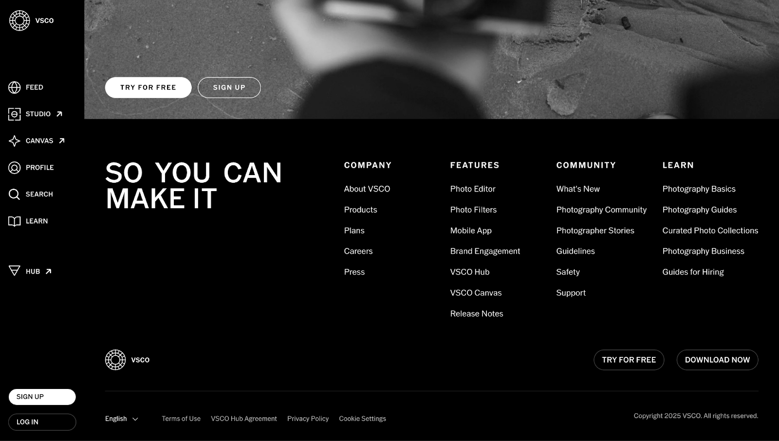
VSCO’s footer, designed by Jan Losert, is clean, content-rich, and well-structured. It mirrors VSCO’s minimalist aesthetic as a photo editing app, with a mini gallery above the footer. Four distinct columns make scanning by these categories easy:
- Company
- Features
- Community
- Learn
You’ll find multiple links to tools, resources, and community content. The stark black-and-white contrast keeps the focus sharp on information, while using softer outlines for CTA buttons avoids feeling pushy.
4. Cecilia
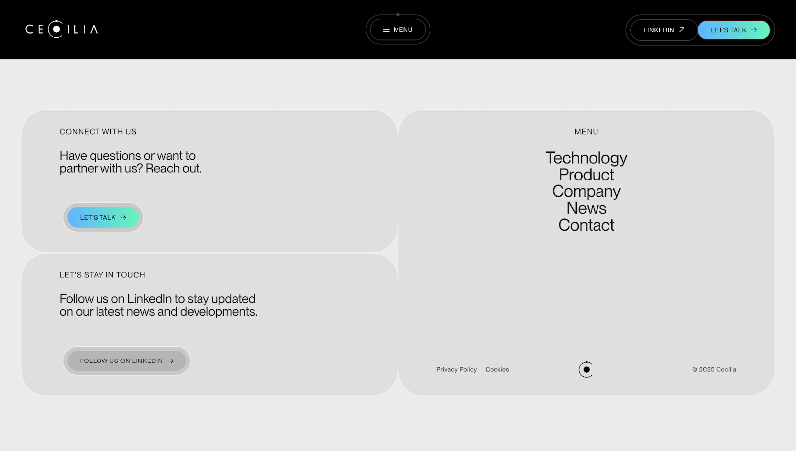
Cecilia’s footer has soft gray tones, rounded corners, and generous spacing to create a calming effect. Instead of pushing salesy CTAs, friendly nudges like “Let’s talk” and “Follow us on LinkedIn” encourage you to connect. Meanwhile, the menu on the right side has its own stage, letting you quickly navigate from here to any main section on the site.
5. Osmo
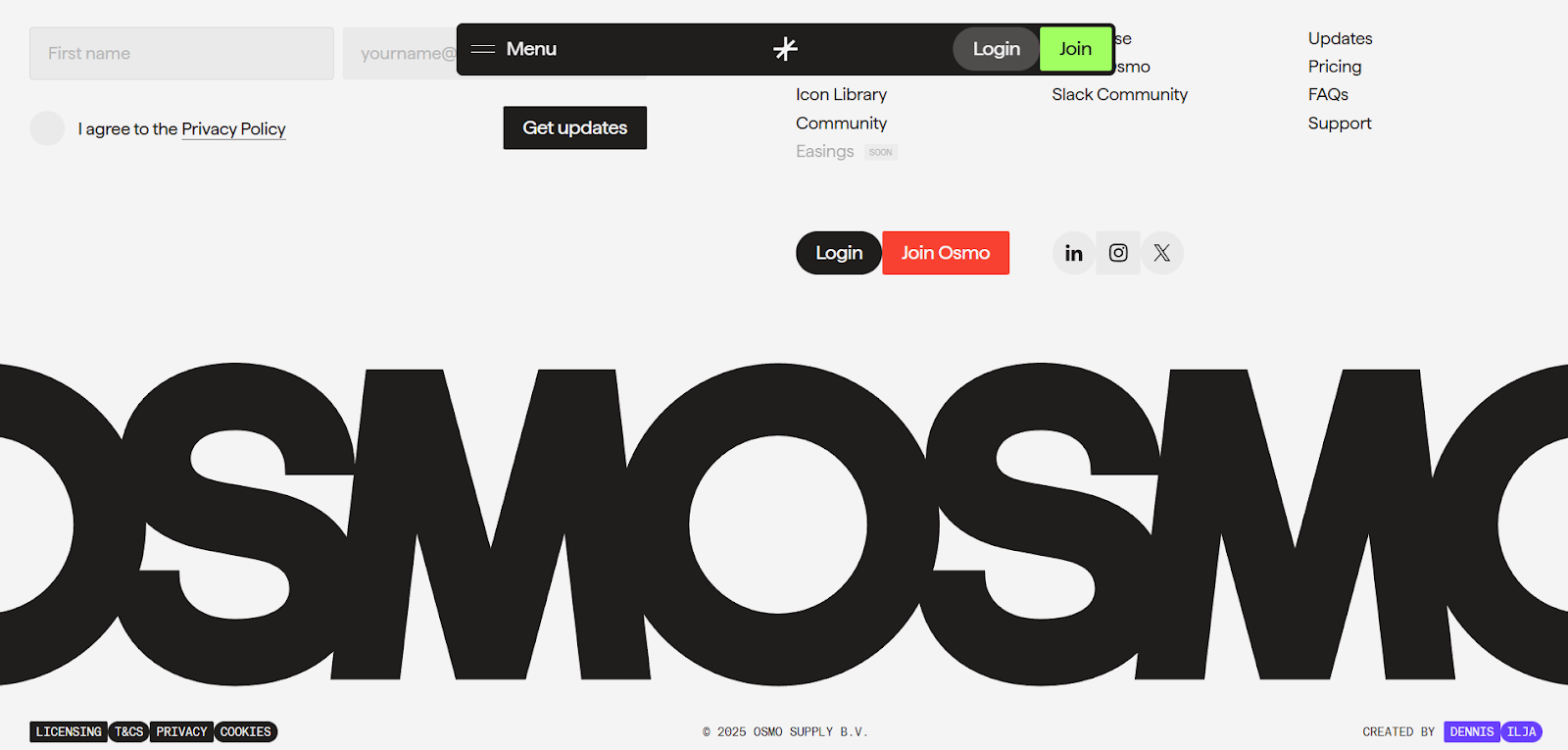
Osmo’s footer design may look busy with its navigation options, social media icons, and CTAs in different sizes and colors, but that’s consistent with their unique, unpredictable designs. This footer incorporates a contact form in the top left but keeps the sticky navigation menu, which leads to some overlapping text. If you have a similar “kitchen sink” approach to your web design, ensure you leave enough spacing so the important elements stay visible.
6. The Resonance
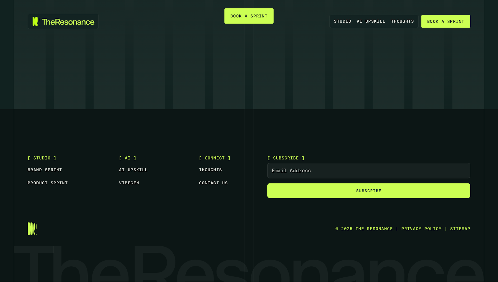
The Resonance’s footer showcases a tech-forward aesthetic. It has a dark, grid-like layout and neon green accents popping against the background, where the colors grab attention but don’t distract from the content. Four neatly divided sections make navigation quick and easy, and the standout neon “Subscribe” button encourages you to sign up for the brand’s mailing list.
7. Astra Security
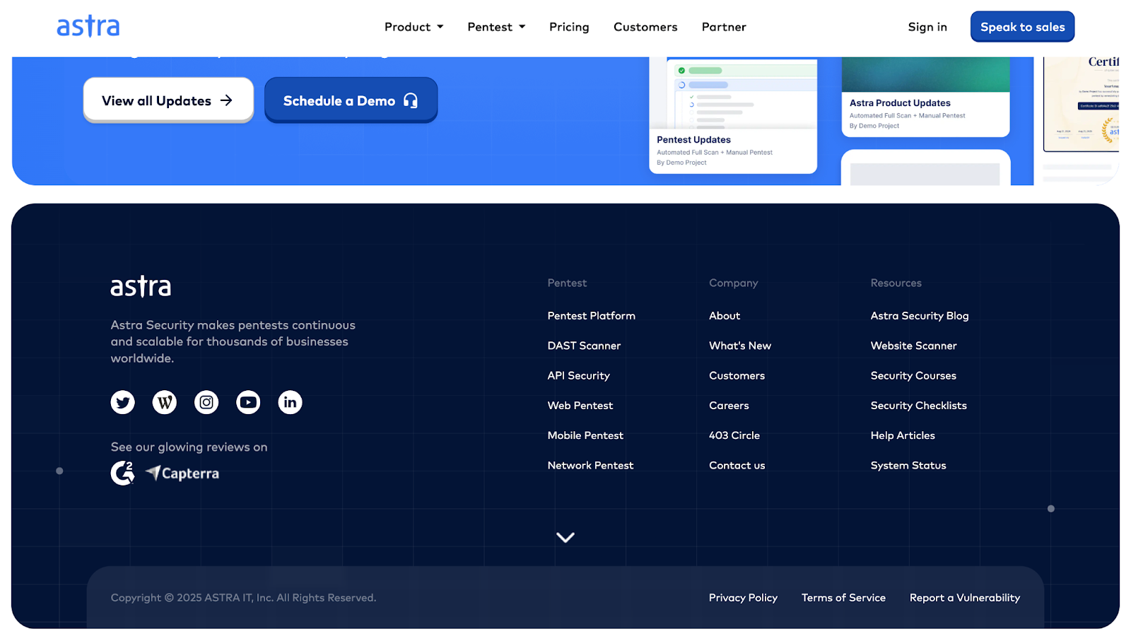
Cloud security company Astra Security’s site footer showcases their credibility. Third-party review badges (like G2 and Capterra) act as testimonials, telling potential customers they can trust Astra’s services.
Additionally, the grid layout separates product, company, and resource links, making it easy to find what you need. While the rest of the site has a light blue theme, Astra’s footer uses a darker blue background and white text to visually separate it from the page above it and keep the focus on the content.
8. Fiddler
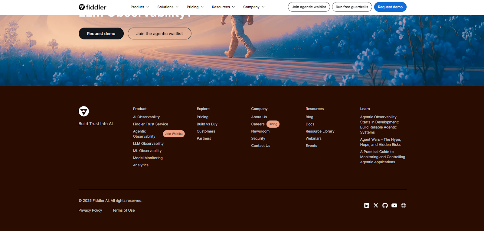
Fiddler’s website footer brings the site’s journey to a close with a background that shares the color of the page’s header. On the homepage, the header and footer are a deep mahogany, while other pages use off-white to clearly contrast the rest of the page.
This is the website footer example to follow if you want a traditional, predictable footer design that puts all the relevant information exactly where website visitors expect it.
9. Brass Hands
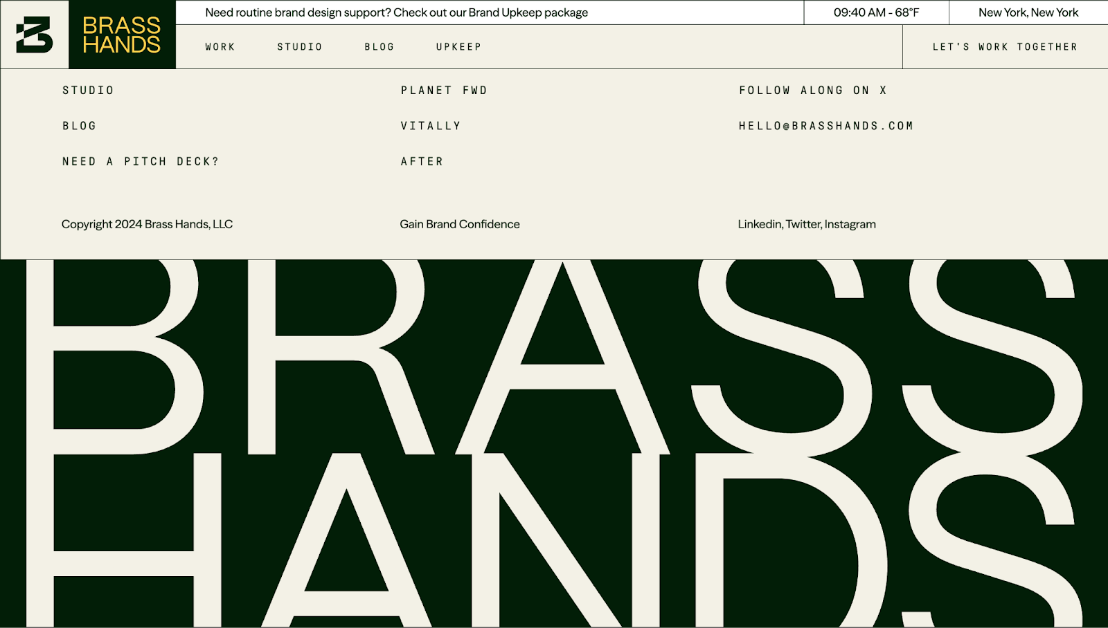
Brass Hands’ footer has dynamic variations in typography, a soothing color palette, and generous spacing that gives multiple links room to breathe. Including real project names lends the website credibility, while the prominent branding at the bottom reinforces Brass Hands’ identity without adding clutter.
10. Junction
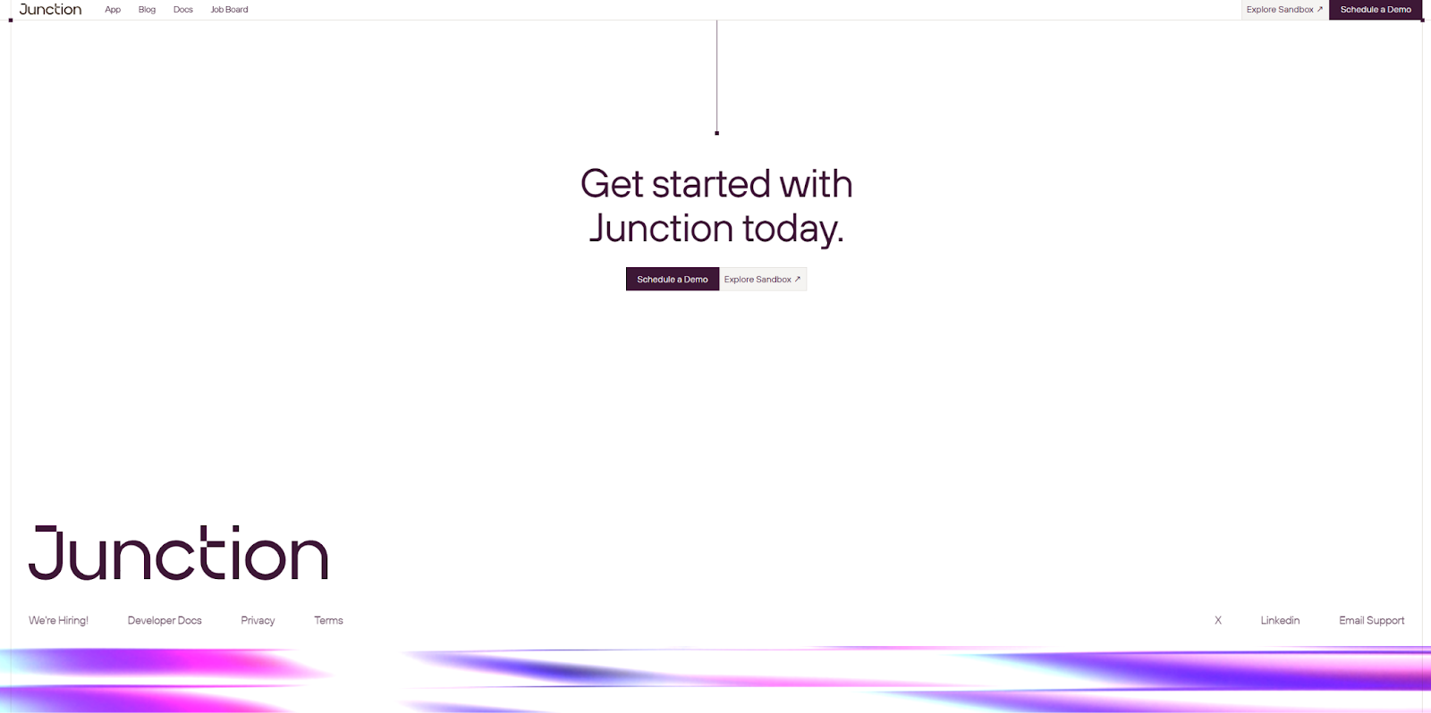
Junction has a basic yet effective footer design: a thin slice at the bottom of each page that begins with their brand name. The horizontally arranged links that follow are small but still clearly visible, as their dark color on a white background improves readability. Those links also translate responsively on mobile. Then, a chrome-like purple effect at the bottom clearly indicates the end of the page. You may want to create a similarly streamlined footer if you have plans to scale your site in the near future and need a versatile option ready for updates.


Ultimate web design
From 101 to advanced, learn how to build sites in Webflow with over 100 lessons — including the basics of HTML and CSS.
11. Diana’s Seafood
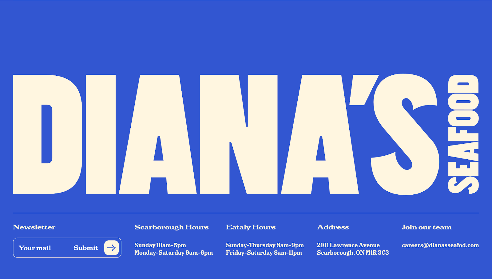
Designer Sam Charpentier used oversized typography and a bold blue-cream color combo to make Diana’s Seafood’s footer loud and unmistakably branded. Despite the text’s massive size, the footer packs a lot of information — store hours, location, a newsletter sign-up form, and a hiring prompt. It shows how an impactful visual identity can coexist with helpful info at the end of a page.
12. Weavy

Weavy’s web design by Edgar Deiner uses a heavily stylized color palette and typography but stops short of extending that to the website footer. While the rest of the site’s pages feature shiny surfaces and full-color images, the footer is primarily a soft, matte gray-green.
This sudden shift into minimalistic design stands out in stark contrast, giving visitors’ eyes a break from Weavy’s detailed visuals. But by the time they reach the footer, they’ll likely have enough momentum that engaging with the footer’s CTA and many internal links is a natural next step.
13. Human Interest
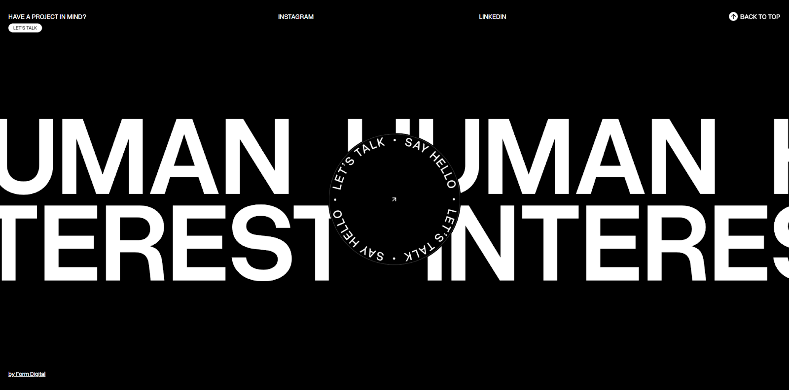
Human Interest’s footer by Form Digital continues the web design’s bold, all-caps typography and black-and-white color palette. It places branding front and center — quite literally — with a unique circular CTA surrounded by much smaller links to their social media.
To keep the footer distraction-free, they opted for a “Back to Top” button rather than a sticky navigation menu. It’s a good alternative to more traditional footers for personal websites, which may not need a place to visibly store details like copyright information, contact information, and privacy policies.
14. Mutiny
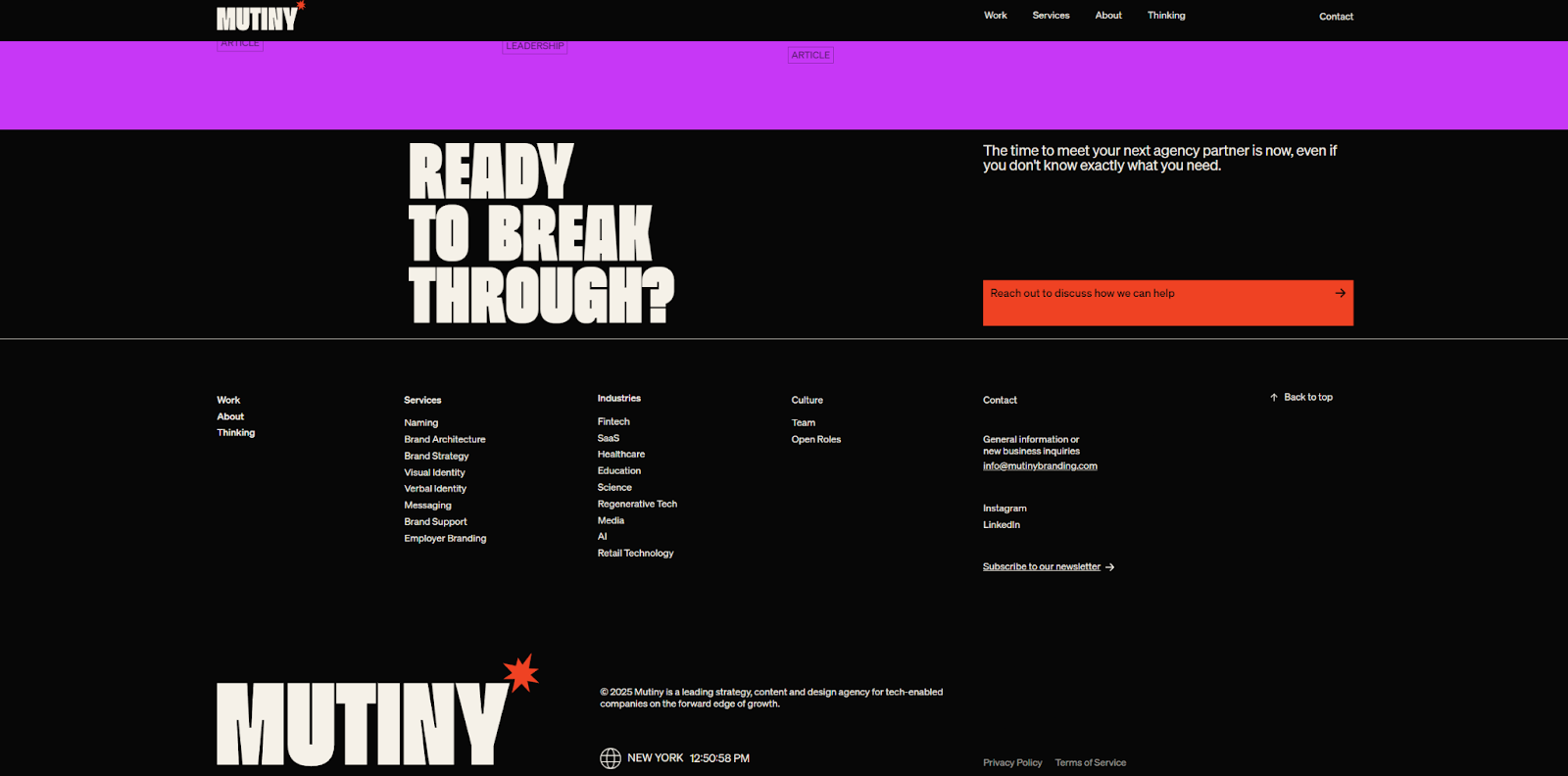
Mutiny is a brand design agency with a broad range of intended audiences with different needs. The website footer Paper Tiger made for Mutiny’s site was designed to direct each audience to the right place. Its detailed sitemap funnels viewers to pages tailored to specific industries and services.
Meanwhile, the footer is a strong follow-through on the rest of the site’s accomplishments. The impactful logo and colorful scrolling section designs earlier on the page accentuate the company’s bold personality so users have a sense of Mutiny’s aesthetic and approach before looking into the ways it’s applied to their field or service needs.
15. Mammoth Murals
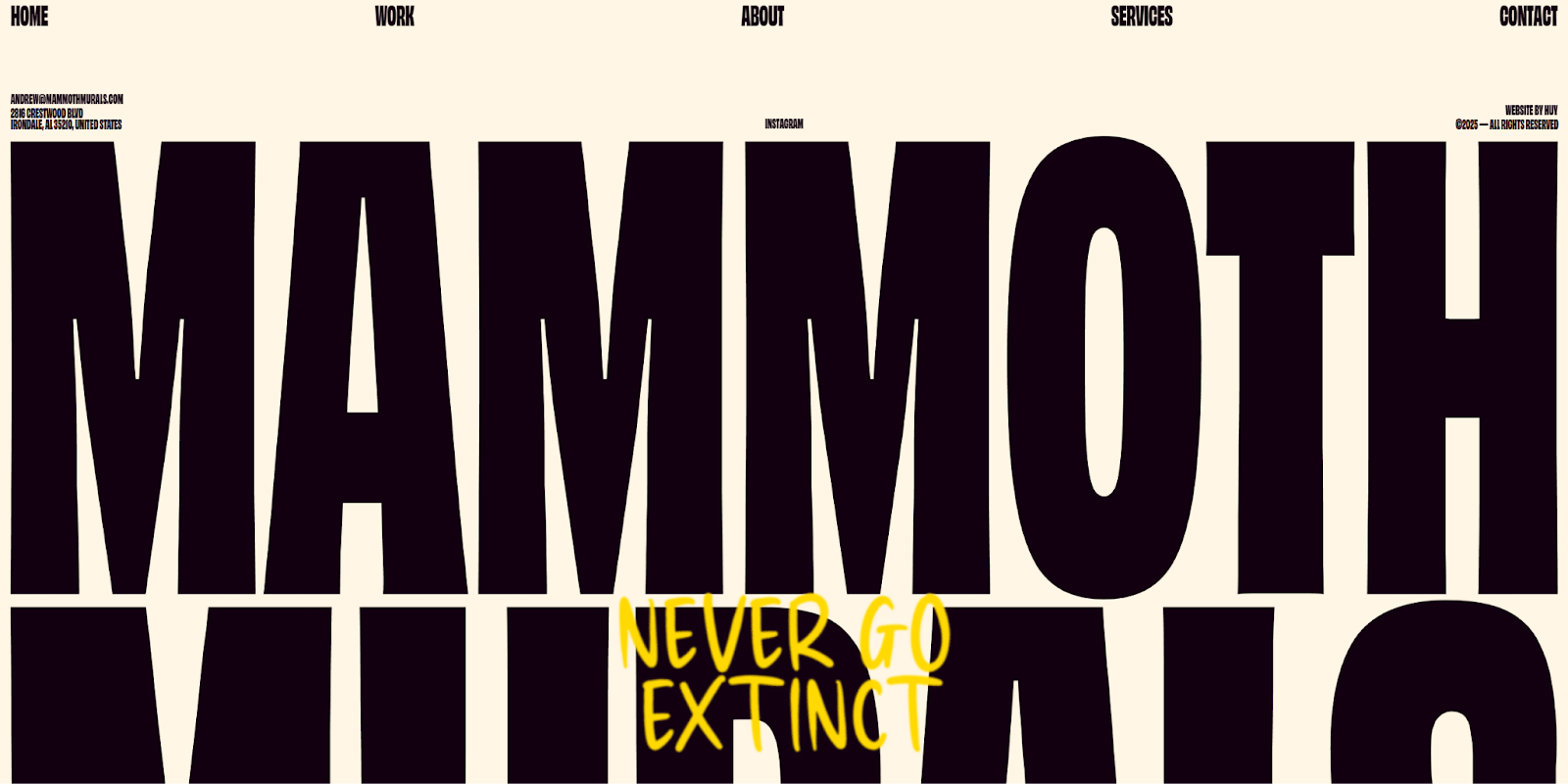
The “mammoth” in Mammoth Murals is no joke. This mural design agency creates gigantic paintings that span whole buildings. By Huy leveraged that penchant for big visuals in this web design that ends with an equally massive footer that doesn’t fit on the average desktop screen.
Most of the footer contains the company’s name in all-caps block letters, with all the more traditional elements squished on top. There, you’ll find contact information, social media links, and a sitemap. Despite its small size, that information is evenly spaced and readable.
16. Nikolai Bain
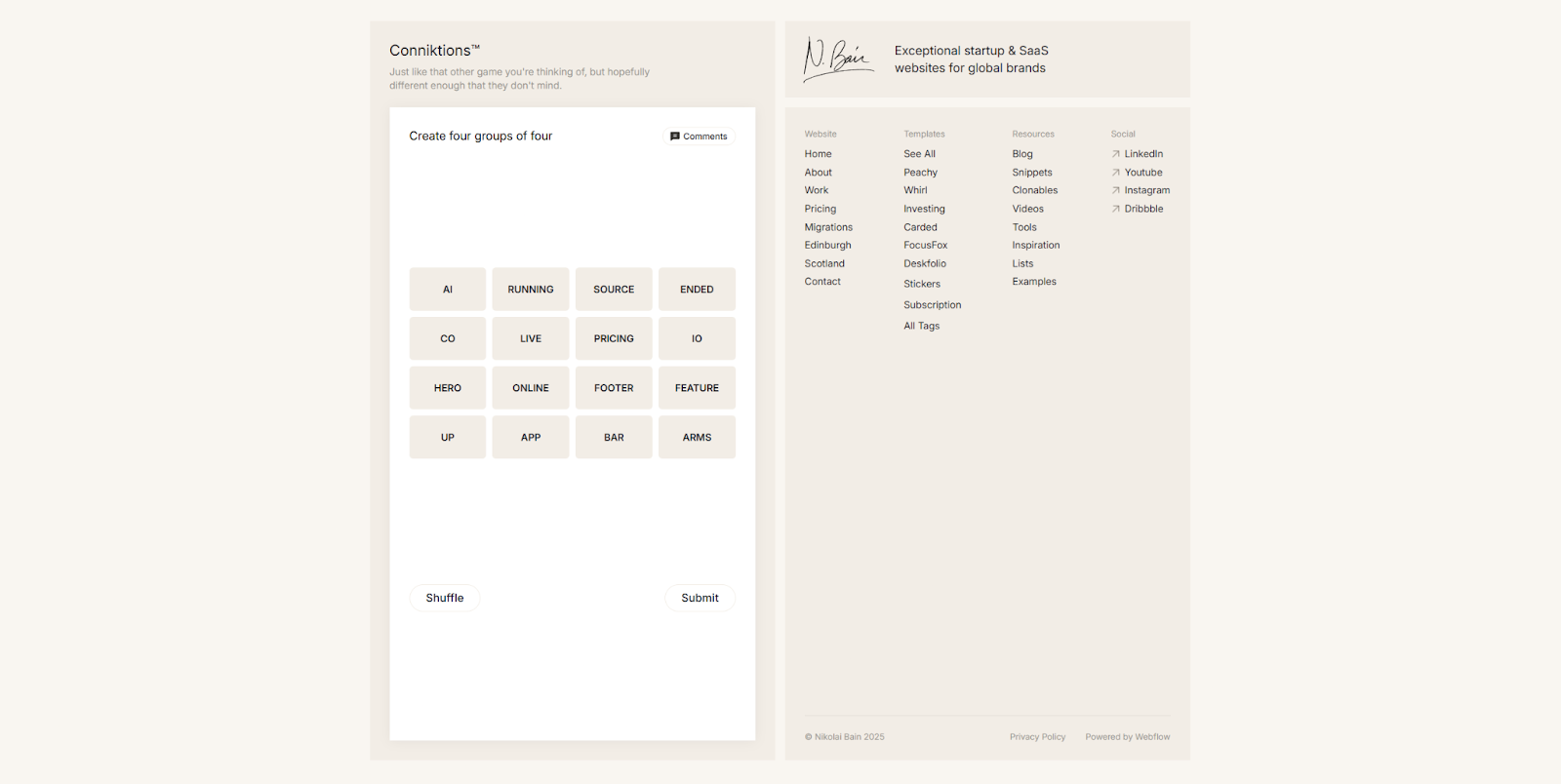
Nikolai Bain’s elegant, minimalist portfolio website ends with an interactive moment. Stylized like the New York Times’ popular Connections puzzle, this microinteraction game on the left side of the footer provides a short, memorable experience for visitors.
Because the game is limited to the left-hand side, the footer still includes all the elements of smart footer design. It has a sitemap, a link to the privacy policy, and links to Nikolai’s social media accounts, all accompanied by a subtle logo and tagline. The even spacing, modern fonts, and elegant neutral color palette keep everything clean and professional.
17. Rare Days
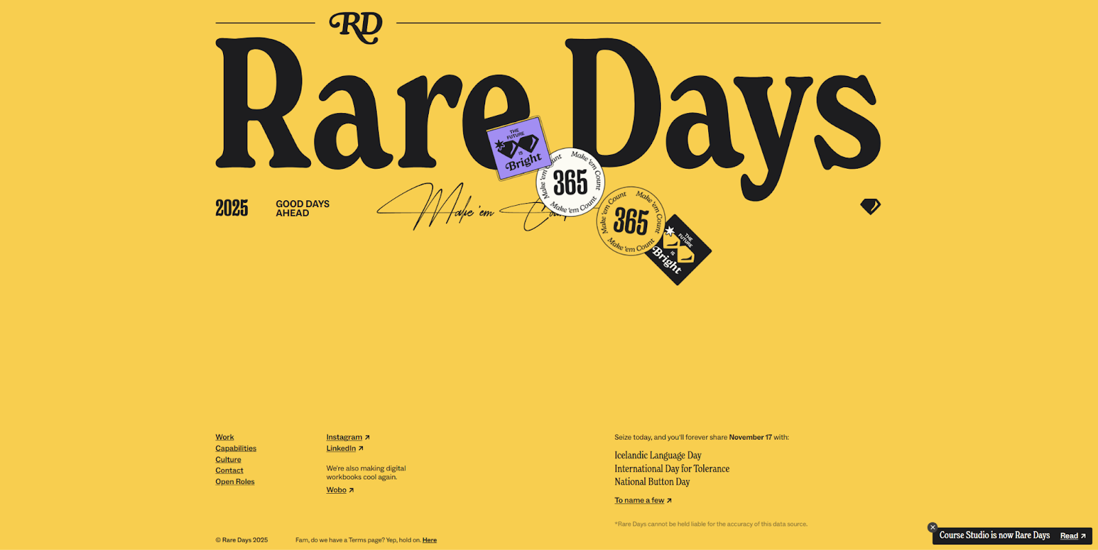
Rare Days’ logo and company name take up the top half of this site’s footer, but it still includes all the necessary elements of a strong footer design. The sitemap and social media links are present, as well as a few extra links designed to entertain visitors. One link points to a national day of the year calendar, and another directs visitors to a separate project of Rare Days’ called Wobo. Including mentions to adjacent projects can improve SEO and draw new visitors (and potential customers) from cross-linked sources.
18. Bevel
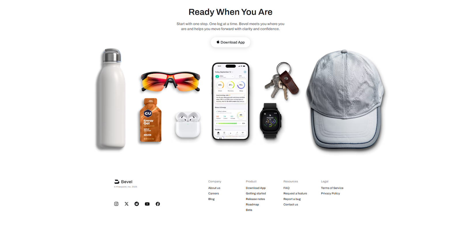
Bevel’s web design relies on a lot of scroll effects and animations, which all come to a sudden stop when you reach the footer. It serves as a finish line where visitors can reflect on what they’ve read, but it’s headed by a CTA reading “Ready When You Are,” clearly signaling that it’s time to make a decision. The following CTA “Download App” puts the next step front and center.
For anyone who isn’t quite ready to take the next step, the sitemap and social media links at the bottom give them a few more places to go so they have time to think while staying engaged a bit longer.
19. OH Architecture
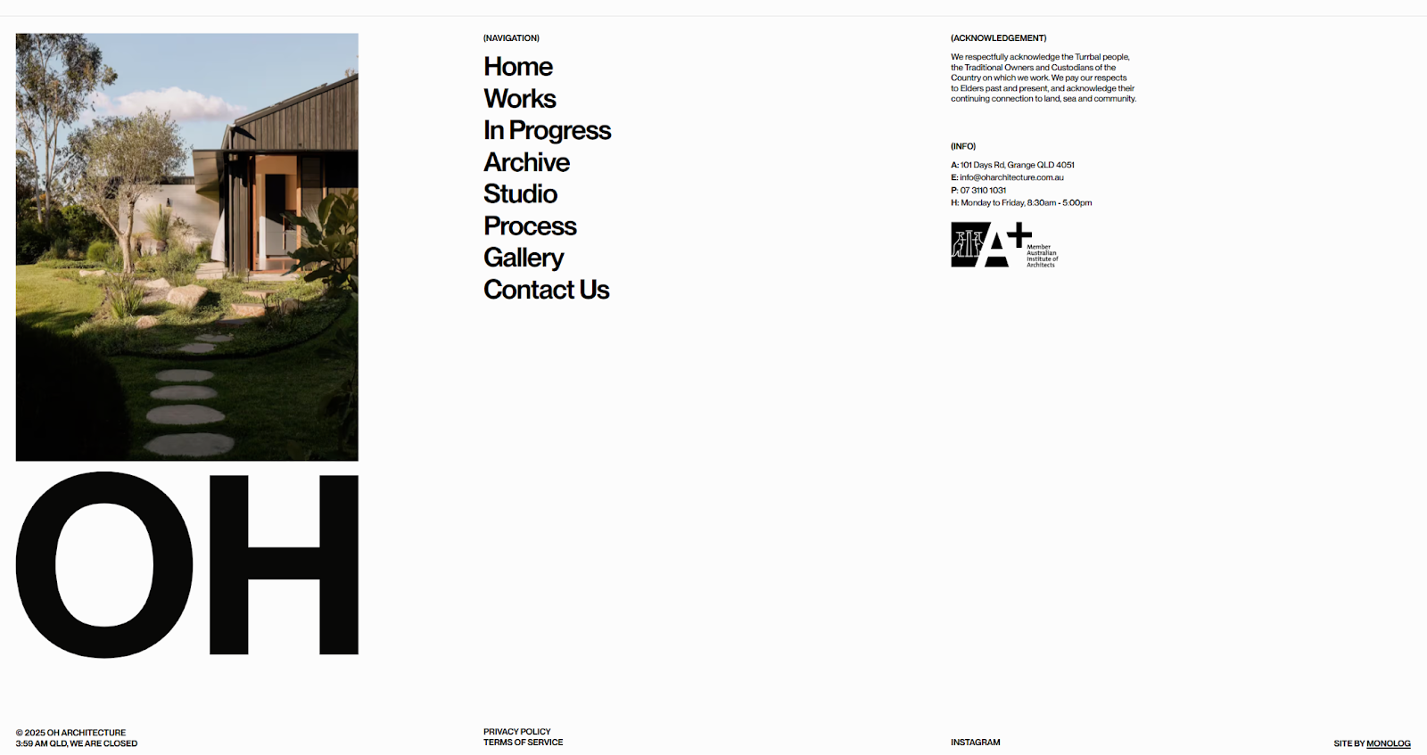
OH Architecture’s brand identity is clearly developed in their footer design. The company prides itself on what it calls “strong, solid forms with subtle elegance,” and that’s exactly what designer Huy Nguyen added to the footer: clean lines and thick sans-serif fonts in black against a white background.
The OH logo sits beneath an image of one of their projects, keeping the page’s visual weight focused on OH’s work. Meanwhile, the sitemap and other typical footer links are laid out with even spacing and professional fonts that are consistent with the rest of the site. In your own footer designs, look for opportunities to creatively showcase the company’s design philosophy like this.
20. Debtfindr
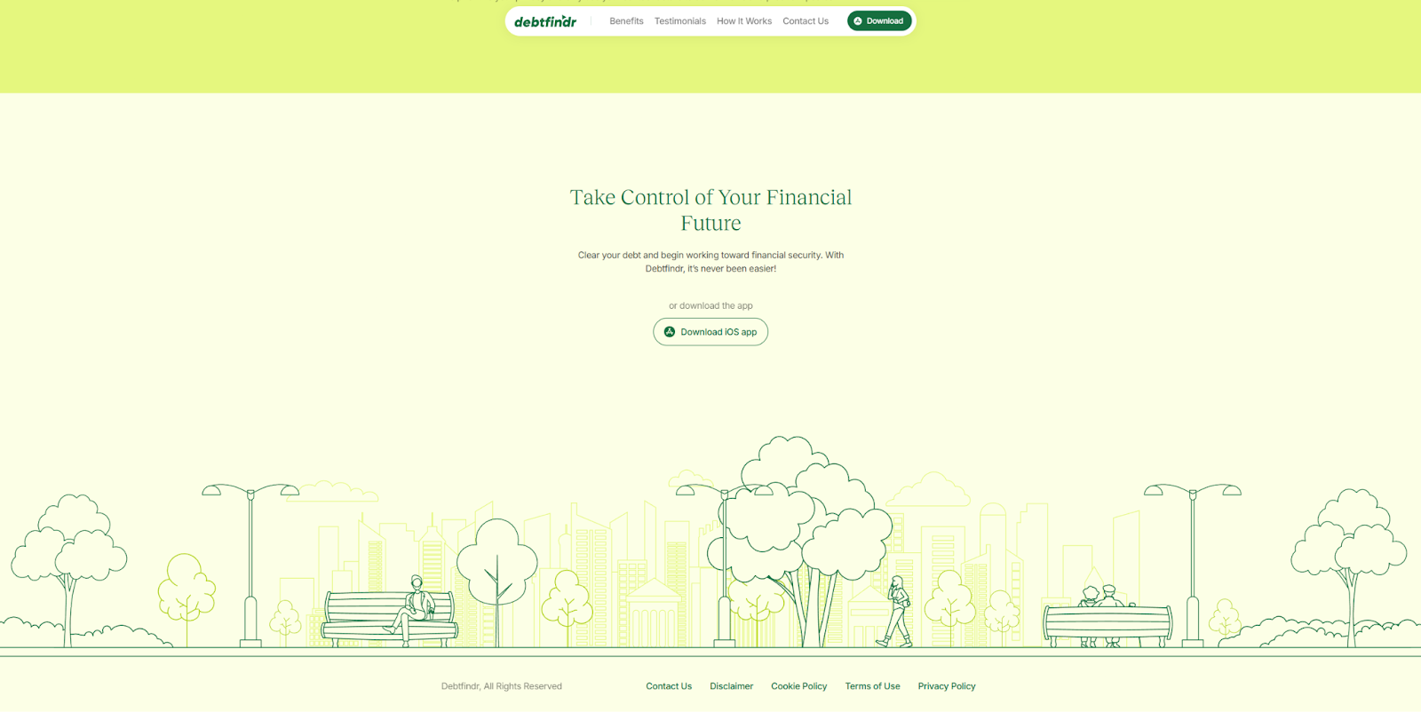
Debtfindr’s footer design by James Baduor leans into the company’s vibrant green color palette, with a decorative line drawing and carefully balanced layout that keeps the various shades visible. The drawing sits at the very bottom of the page, creating a ground floor. Just above that, hovering in the air with ample space around it, is an action-oriented headline and a direct CTA. This footer tells you everything you need to know about the service in a few concise words, driving home the value proposition without major distractions.
Seal the deal with a strong footer
A great website footer wraps up your page while encouraging visitors to take the next step. Whether it includes a sign-up form, contact details, navigation links — or all of the above — a well-crafted footer reinforces your brand and leaves a lasting impression.
With components in Webflow, you can design your footer once and reuse it across every page — no need to recreate or manually update it. Make a change to your footer component, and it updates sitewide.
Explore standout footer designs in the Made in Webflow showcase, or start building with Webflow to turn every scroll to the bottom into a fresh opportunity to engage your audience.
Build websites that get results.
Build visually, publish instantly, and scale safely and quickly — without writing a line of code. All with Webflow's website experience platform.