It's been eight years since Webflow was in the Y Combinator (YC) summer 2013 batch and wow, has the program grown!
With batches numbering in the hundreds, and a wide range of startup ideas across a variety of industries, YC has become an even more exciting space.
For many early-stage YC startups, clearly and creatively defining their brand and values to potential customers is top-of-mind. As a result, many have trusted Webflow in building out their company websites.
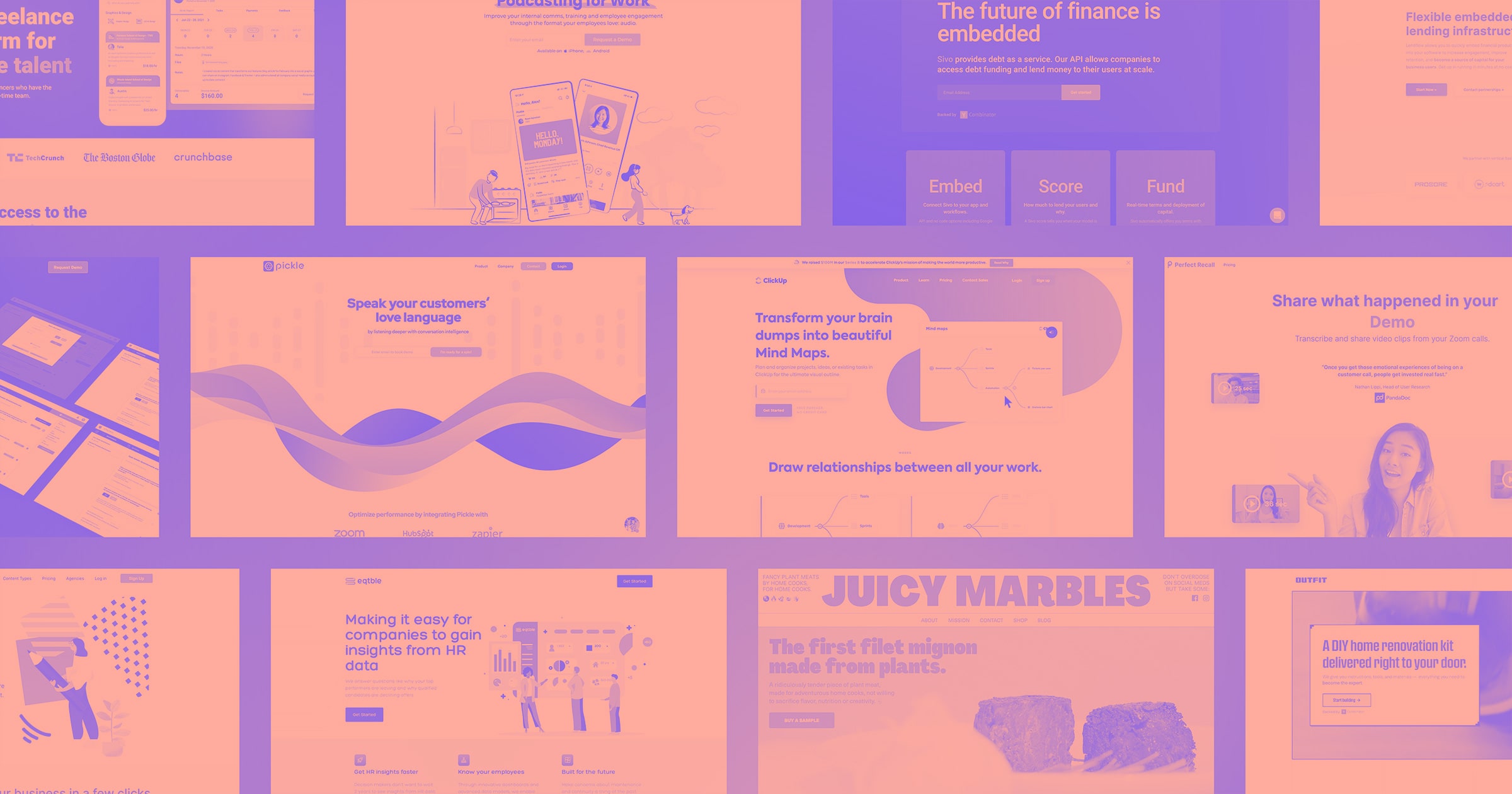
Here are some of our favorite Webflow sites from YC companies from the winter 2021 batch that we’ve loved.
Neuro
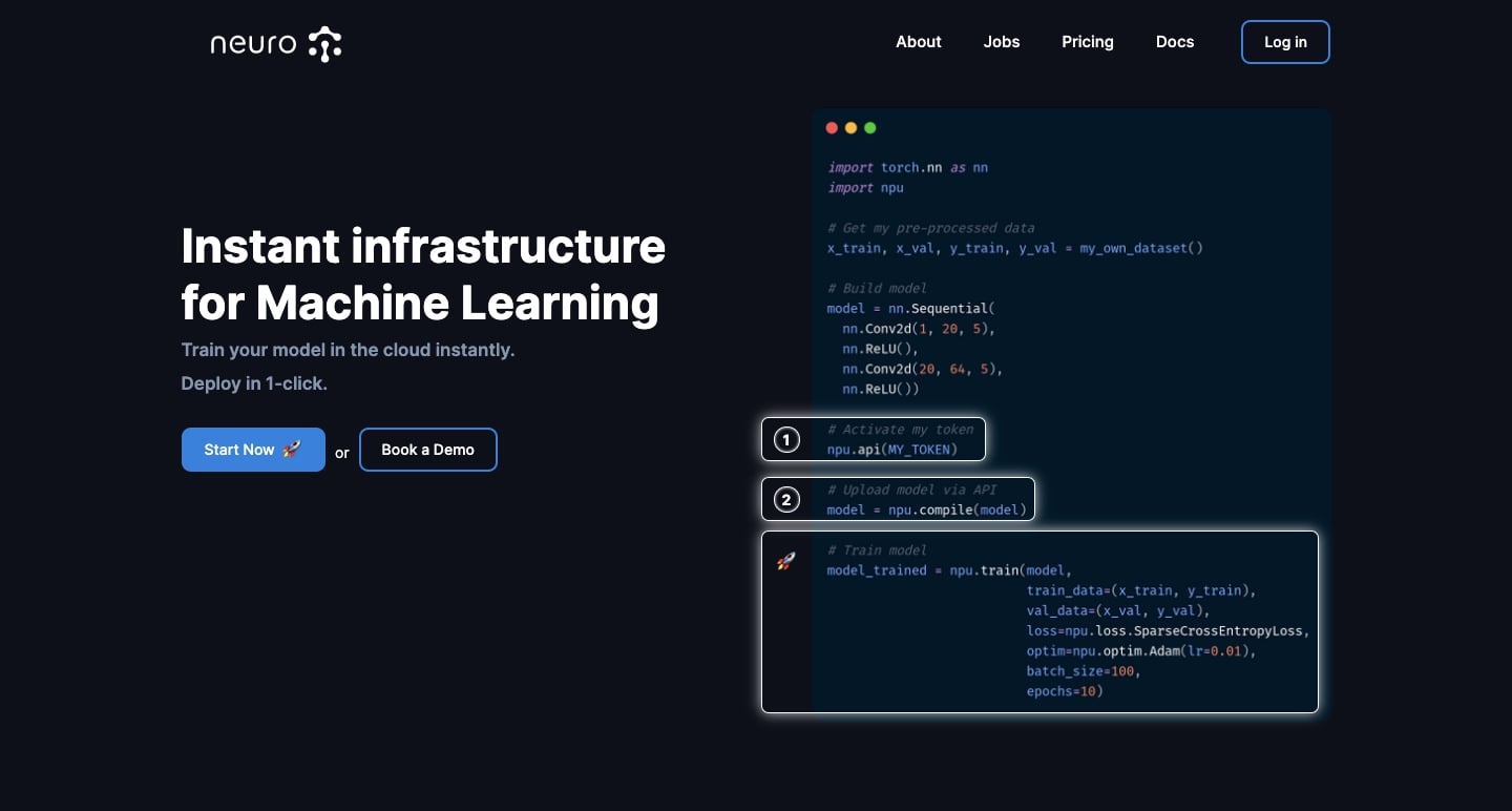
Neuro is a machine learning platform based in Bath, England.
Setting up a server and laying down the necessary components to test and train large datasets for machine learning can be a complicated and timely endeavor. Neuro gives data scientists a serverless way to work with voluminous data sets, with a native API, infrastructure, automation, and everything else they need to get up and running.
The look and feel of Neuro’s web design is tailored perfectly for those working in artificial intelligence and data science. Throughout the website, there are large screenshots of Python code, showing the simple steps that go into utilizing Neuro to deploy machine learning models.
Neuro is a startup with a well-defined audience. Their website perfectly displays what that audience wants to know about the platform in a design that feels modern and tech.
Pangea
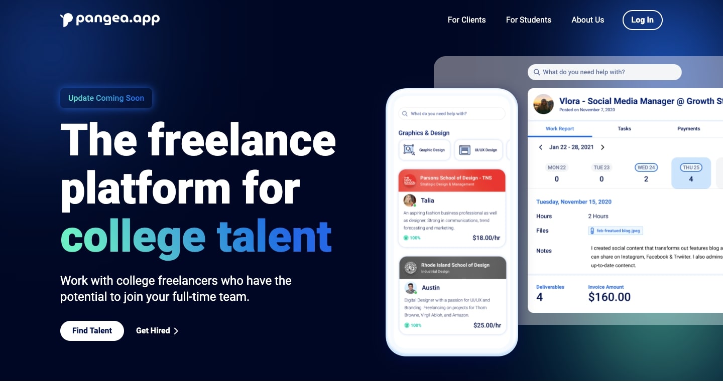
Pangea is a startup whose goal is to connect companies with college student freelancers. Their main message is that these aren’t just short-term positions, but opportunities that could lead to full-time employment.
Pangea’s website is geared toward both freelancers and companies, and effectively communicates how their services help to connect the two.
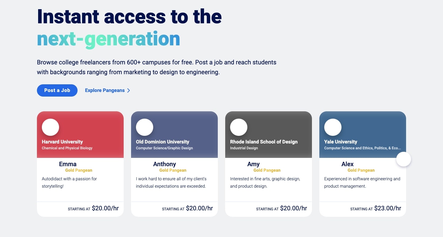
This next-generation design is full of dazzling gradients, touches of color, and animations that make it stand out from the multitudes of stagnant and boring job sites out there.
Corrily
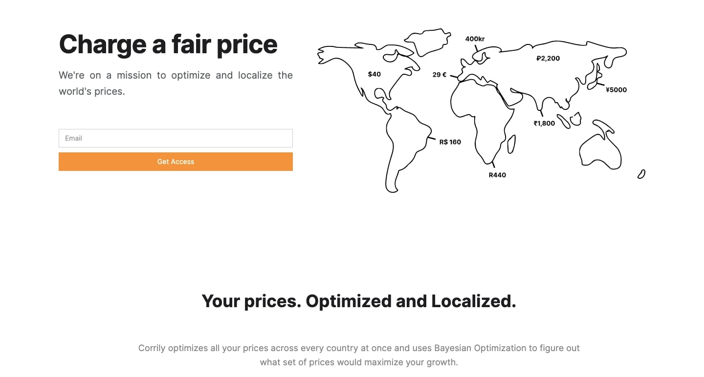
If you run an eCommerce operation — or any other business that has a large global reach — you might be keen to set your product pricing based on where someone is ordering from.
Corrily utilizes metrics and analytics to allow companies to set appropriate pricing (that customers will respond favorably to,) wherever in the world they may be.
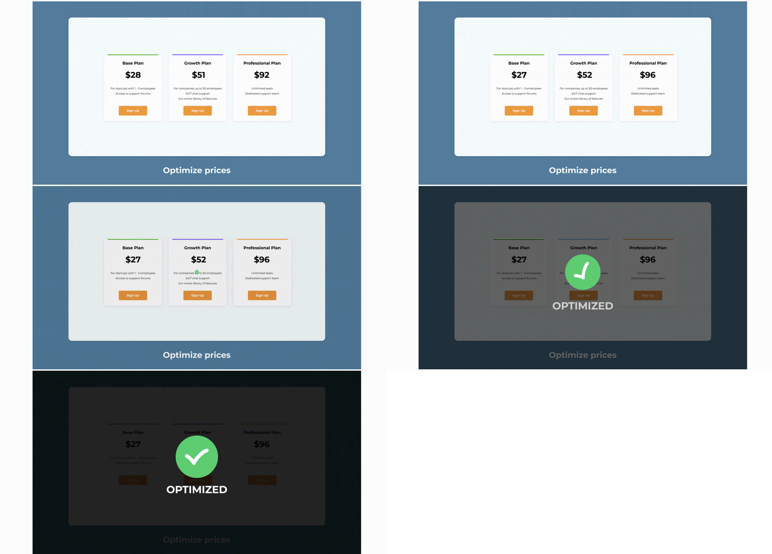
This design gets right into showing how Corrily’s technology works and how it can help companies solve their pricing challenges. Much of this information is shown visually, which enables Corrily to clearly communicate the value of their offerings.
Juicy Marbles
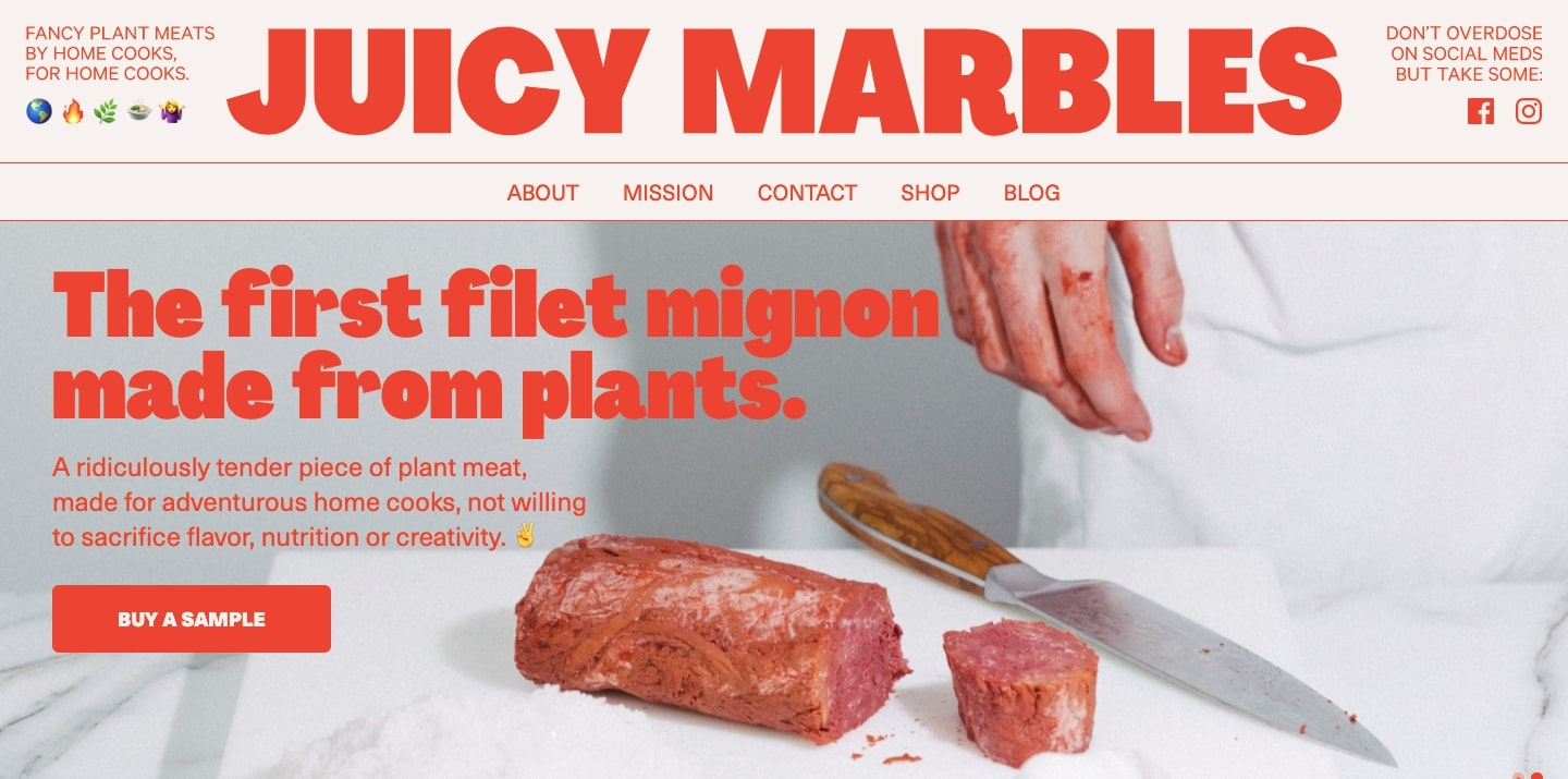
When we think of successful startups, we tend to think of high tech. We associate “startup” with high valuation companies like Airbnb, Stripe, and Dropbox. But not every company that comes out of a startup accelerator like YC exists in the realm of computers and technology. That’s why it’s refreshing to see a non-traditional startup like Juicy Marbles gain momentum.
Juicy Marbles’ “fancy plant meat” looks like it could be wrapped up and handed to you on butcher paper.
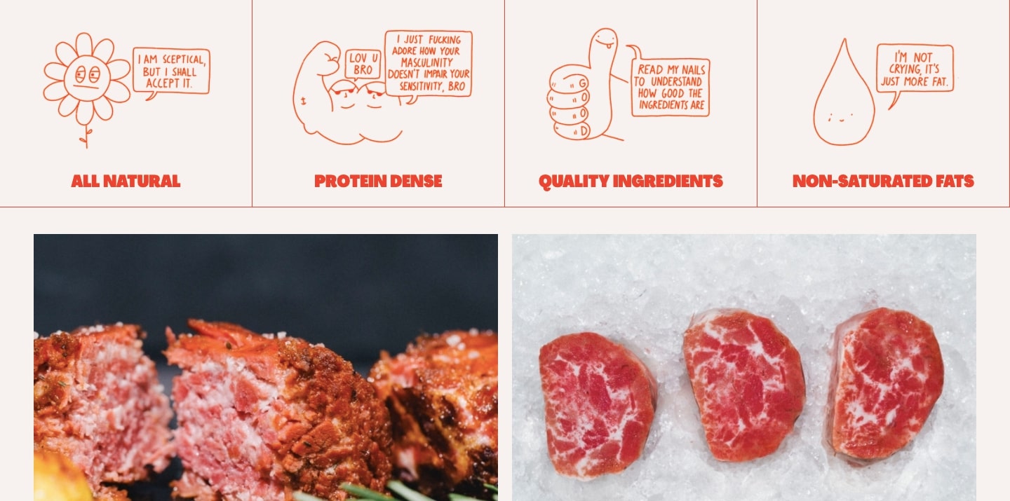
This design is full of meaty personality, with fun illustrations and plenty of food shots. But it also shows that their mission is guided by something bigger, with an entire section dedicated to their mission on sustainability and the negative impact meat consumption has on the planet. They also communicate that they’re a startup whose principles go beyond just making profits.
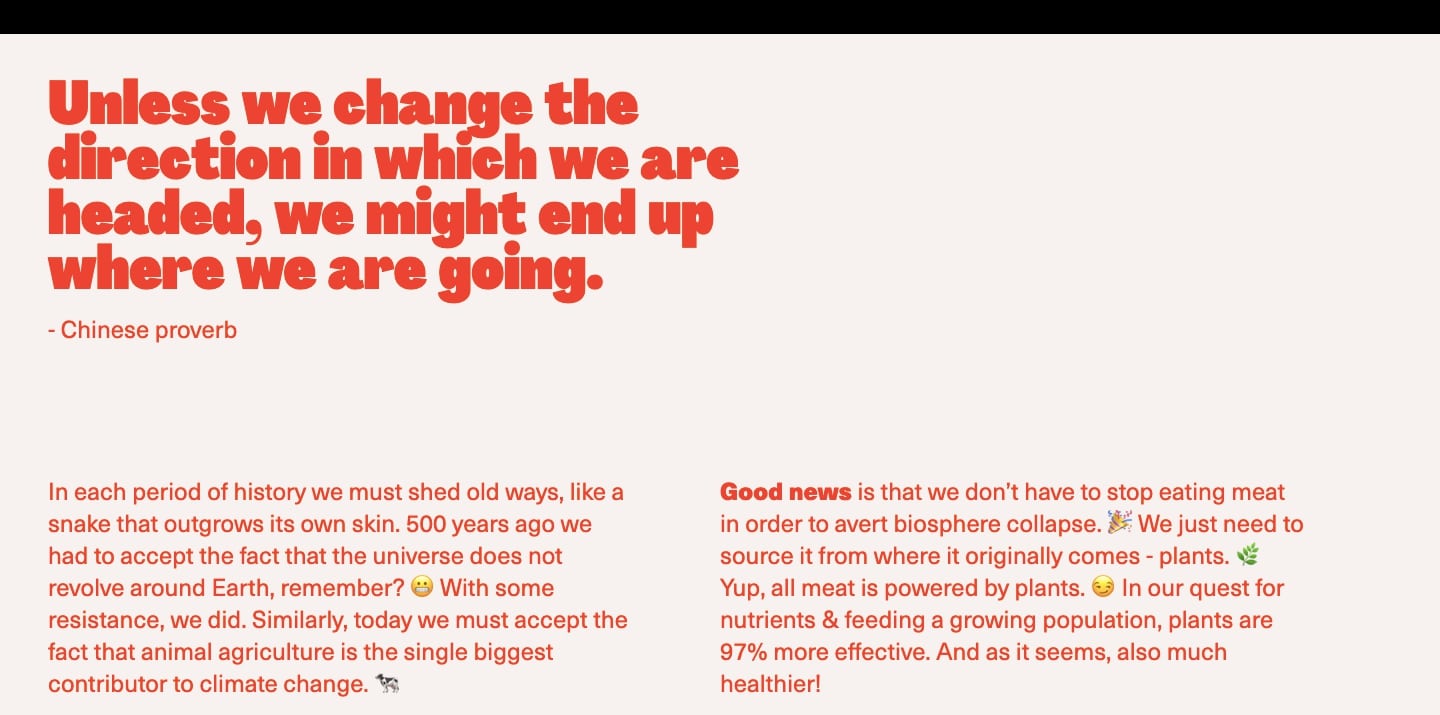
This web design works so well in hitting someone in the tastebuds and appealing to those who want to do better for the planet.
Pickle
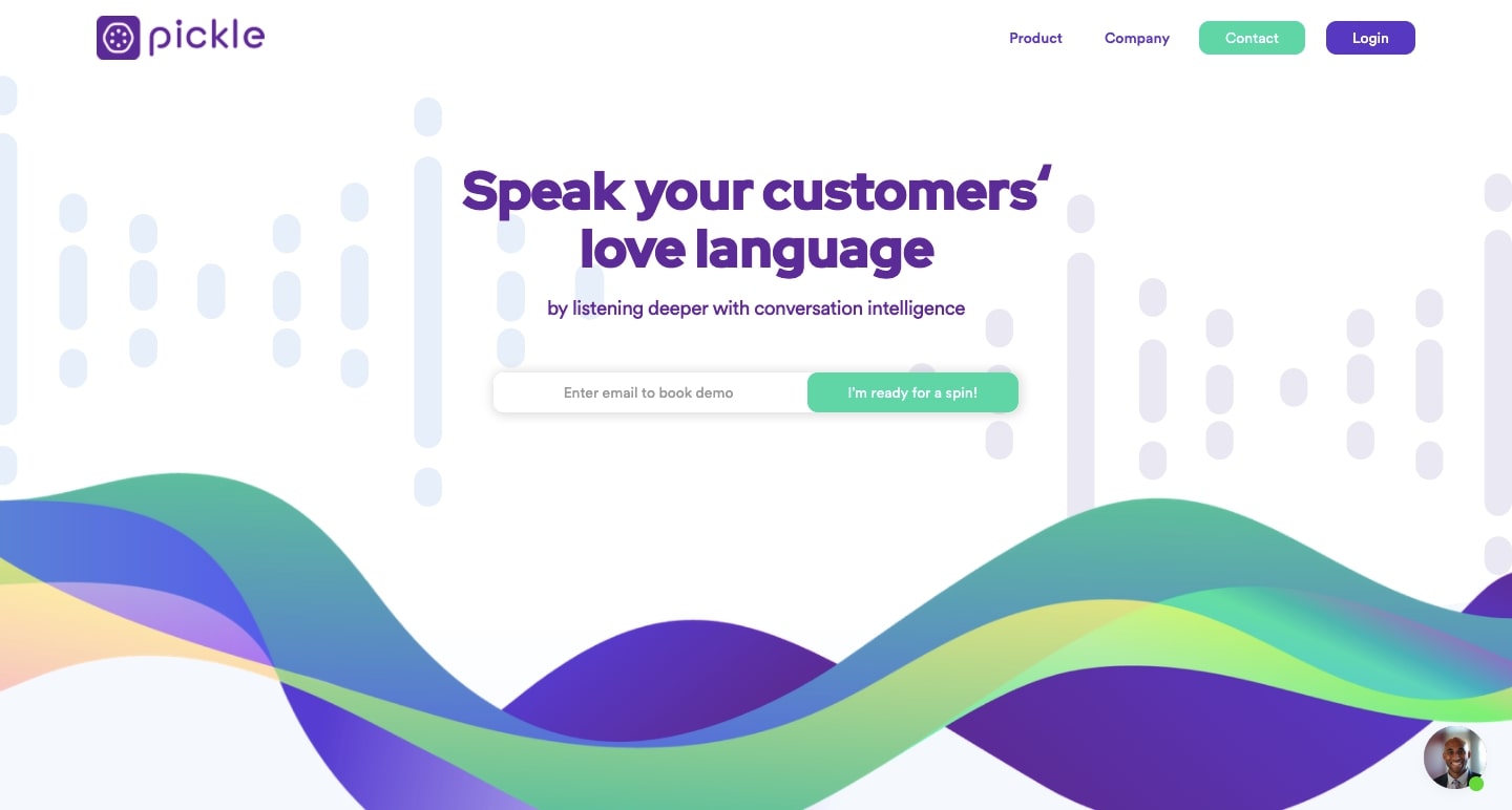
There are quite a few early-stage startups who are implementing artificial intelligence (AI) to create tools that businesses can use to improve customer interactions. Using natural language processing, Pickle analyzes audio (from things like customer calls) and outputs data that can be used to fine-tune a brand voice, refine messaging, and better understand of the needs of customers.
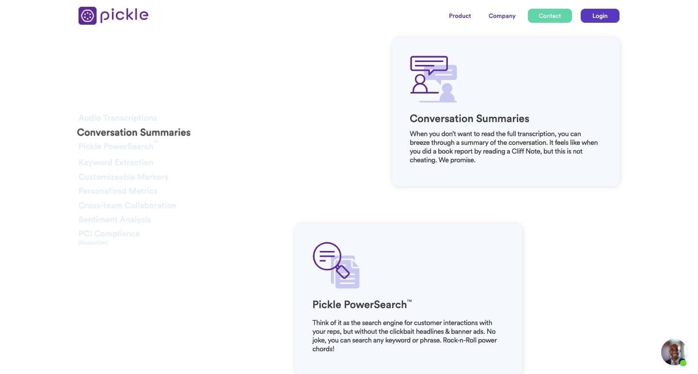
This smart web design of whites, purples, and custom icons fits right in with their cutting-edge, AI-powered technology.
Outfit
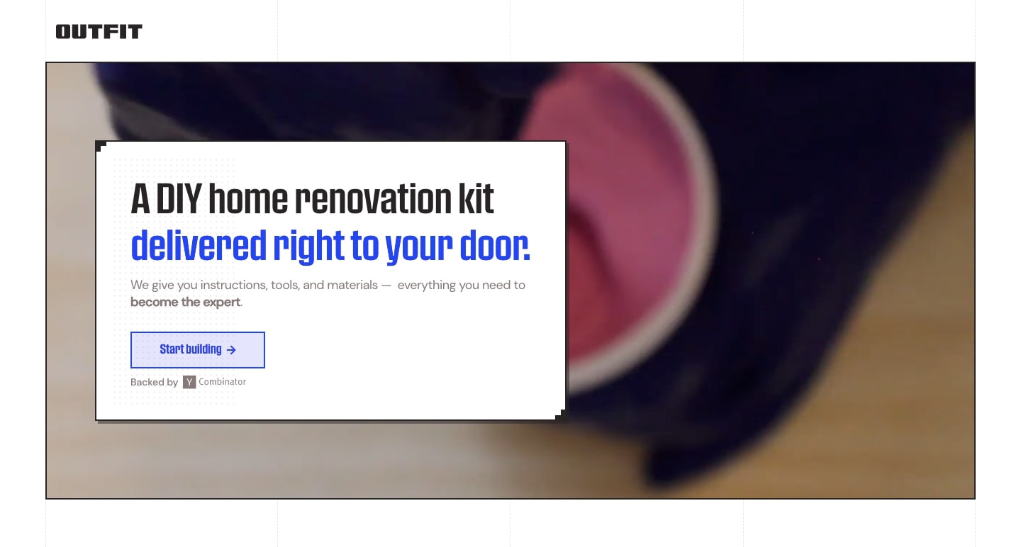
Let’s face it: By the third time you’ve visited the hardware store on the same day for a DIY home project, you’re probably starting to wonder why you didn’t just pay someone else to do it for you. Outfit is a YC startup whose goal is to make DIY home renovations easier by providing customers all of the instructions, materials, tools, and other necessities.
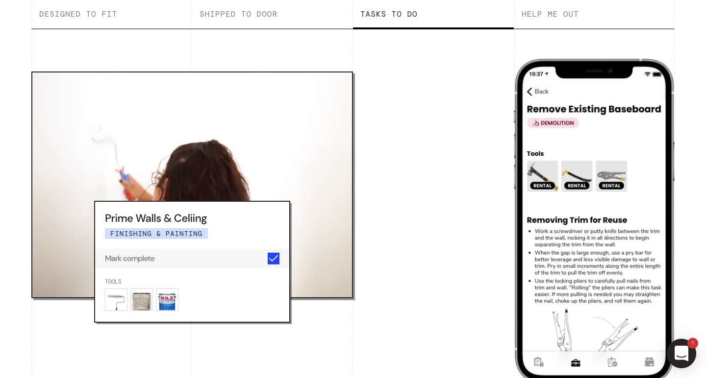
The “under construction” feel of this website offers a UI experience that’s parallel with their product. With light lines in the background reminiscent of blueprints, before and after shots, images of building materials, and other renovation-related visuals, the theme of DIY home improvement can be seen throughout its one-page layout.
Albedo
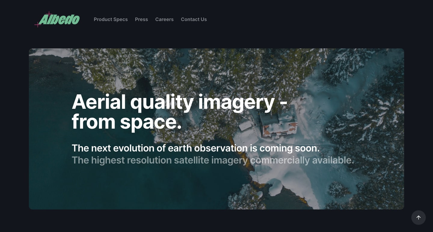
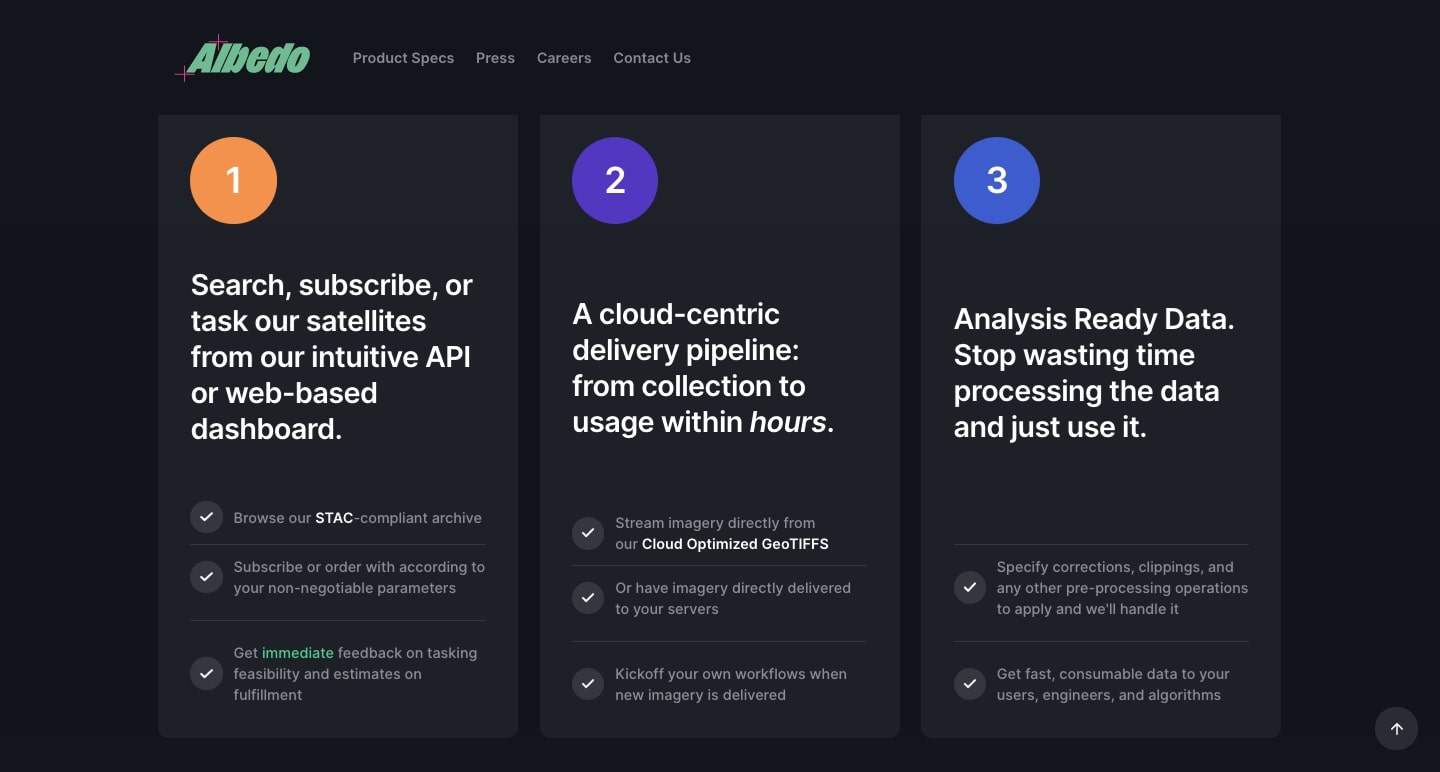
Albedo offers a wide range of aerial photography at an affordable price point. A network of satellites (that they designed) orbit high above the earth, providing high-resolution commercial photography to a variety of customers.
Throughout this design, we see the detailed images that their satellites capture. They also provide interesting insights around what goes into capturing and generating their photos.
Spokn
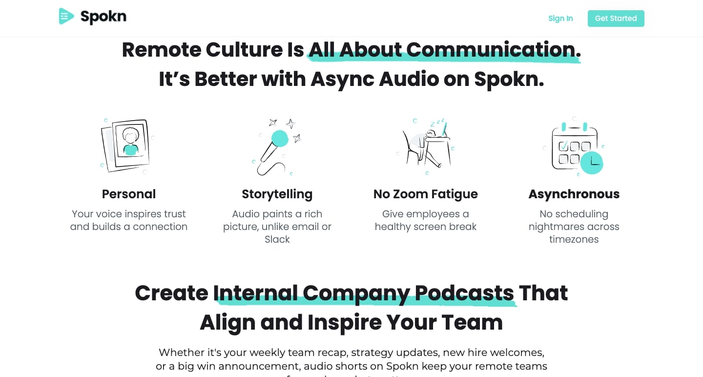
As we’ve all experienced in the past year, it can be difficult to share the same sense of collaboration and connection when working from home. Spokn is an audio messaging app that personalizes the communication between leaders and team members.
Not every bit of information needs to be relayed in a time-consuming video chat. Spokn can also be utilized to make short, pre-recorded audio bites to relay weekly updates to employees, communicate new initiatives, and share other important news. Spokn’s website and copy clearly illustrates how the app works and makes it easy for prospective customers to request a demo.
Regent Craft
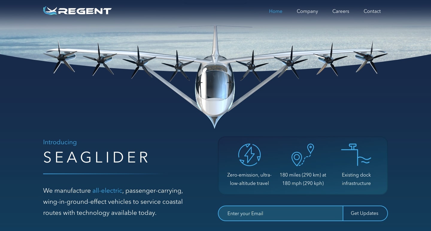
Regent Craft produces aircrafts that fly just above the surface of the water. Powered by electricity and air currents, Regent Craft offers a zero-emissions form of transportation. Their CTA “See It In Action” opens a video with a cinematic feel that shows the Sea Glider flying above the ocean’s surface.
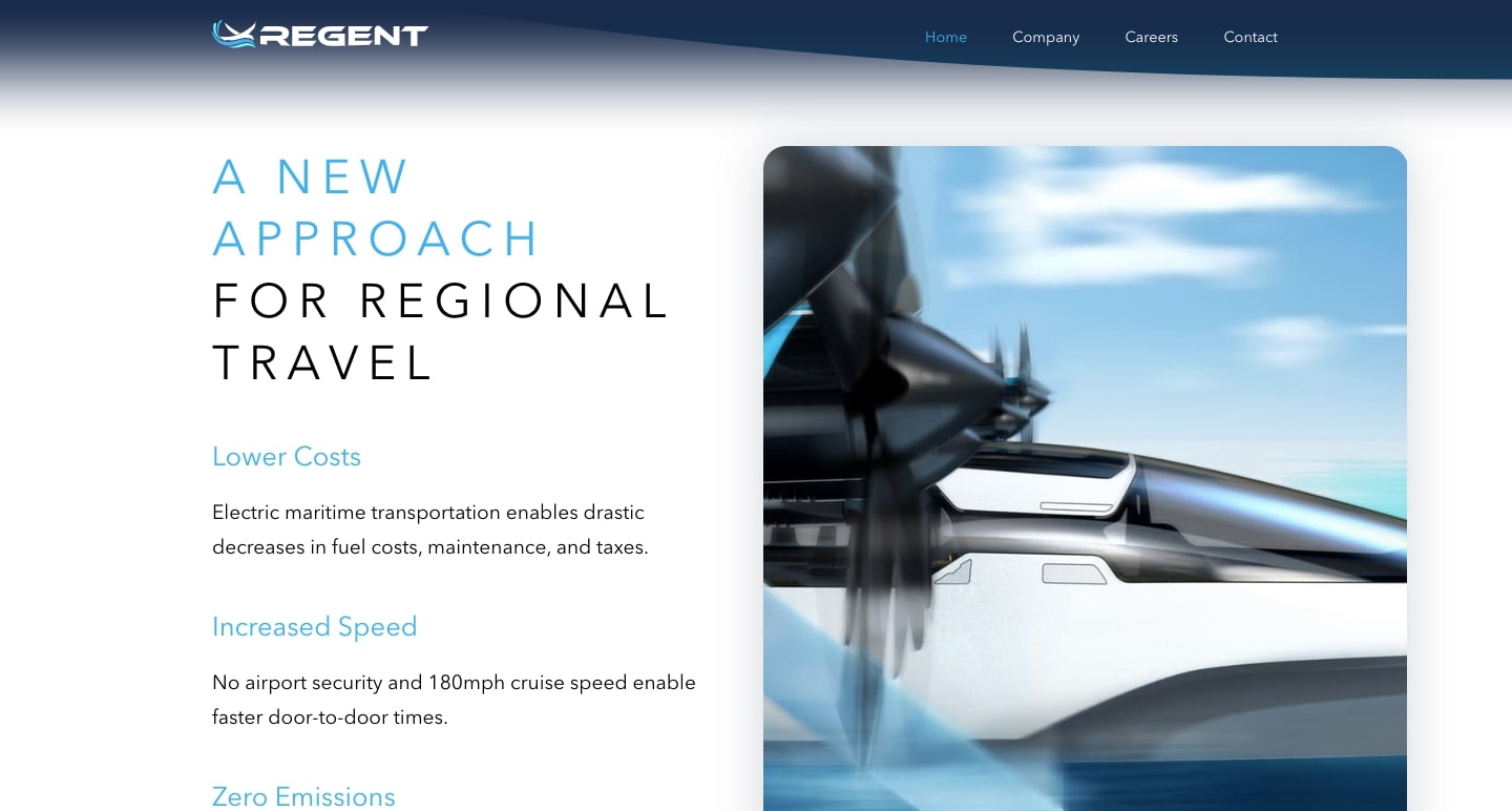
Their website is full of oceanic and sky blues, as well as cloud-like white evoking the duality of the spaces their craft operates in. And of course, there’s the Seaglider itself, a machine of high-tech curves and engineering that works well against this design’s visual backdrop.
Eqtble
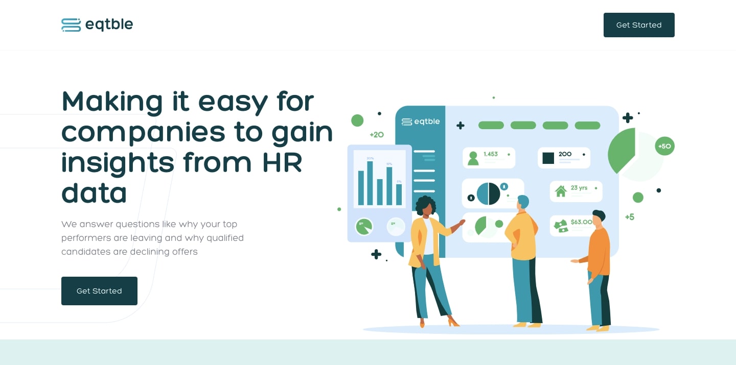
From small businesses to top companies, people teams can run into trouble bringing on and retaining talent. For companies who want to understand better why they have high turnover, or why qualified candidates keep on passing on their job offers, Eqtble provides a technology-based solution. Their platform uses data to illuminate common human resources issues and enables companies to implement solutions that work.
When buy-in at a company can encompass people across different areas of expertise, making sure that everyone can understand your product is essential. Eqtble breaks down how their data analysis works in a simple manner on their website. They also make it so that even those who aren’t technically-minded can understand how their product functions.
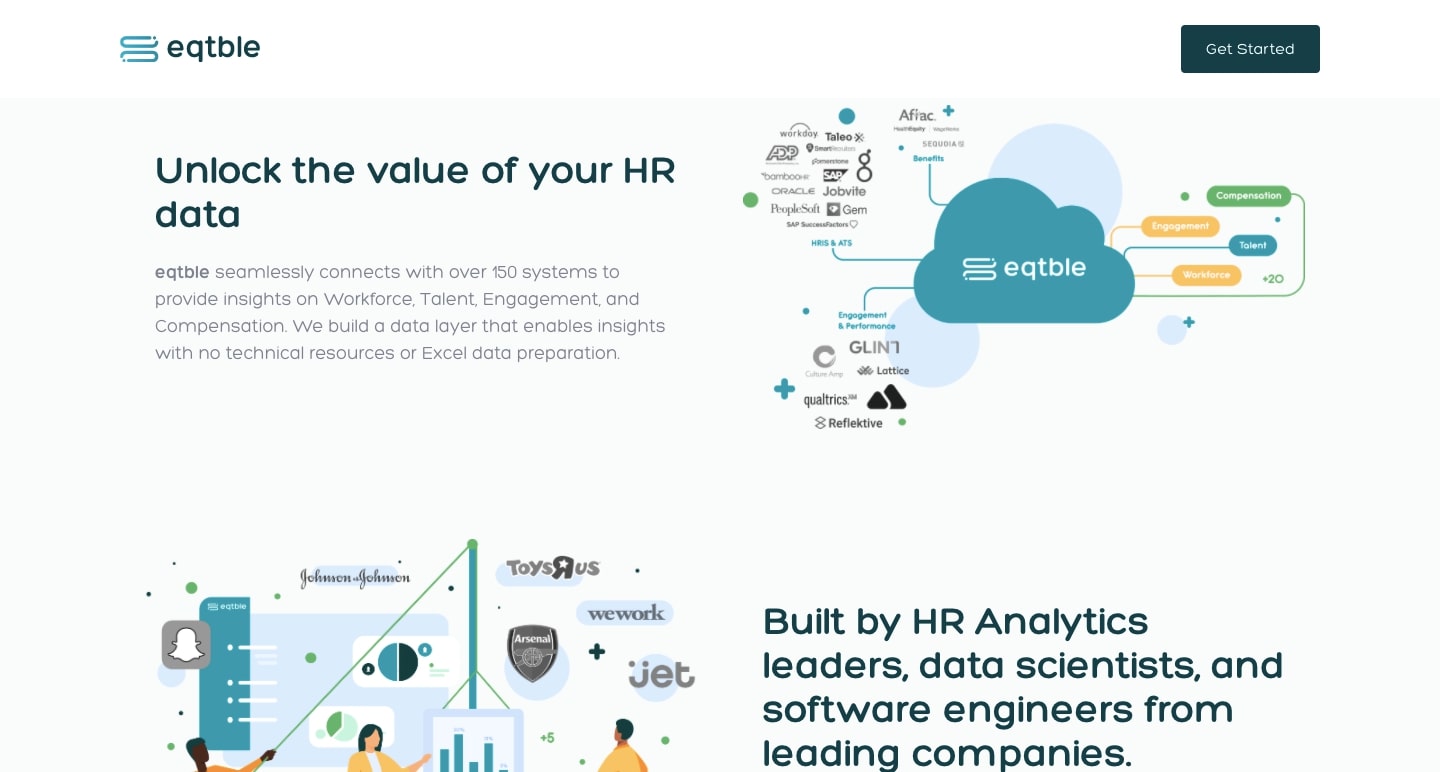
With a white background, friendly color palette of yellows, blues, and greens, and a diverse representation of people in their illustrations, Eqtble pays careful attention to the visual representation of their brand. The website also features a Z-pattern layout that makes navigating through the content a fast and user-friendly experience.
Process Labs
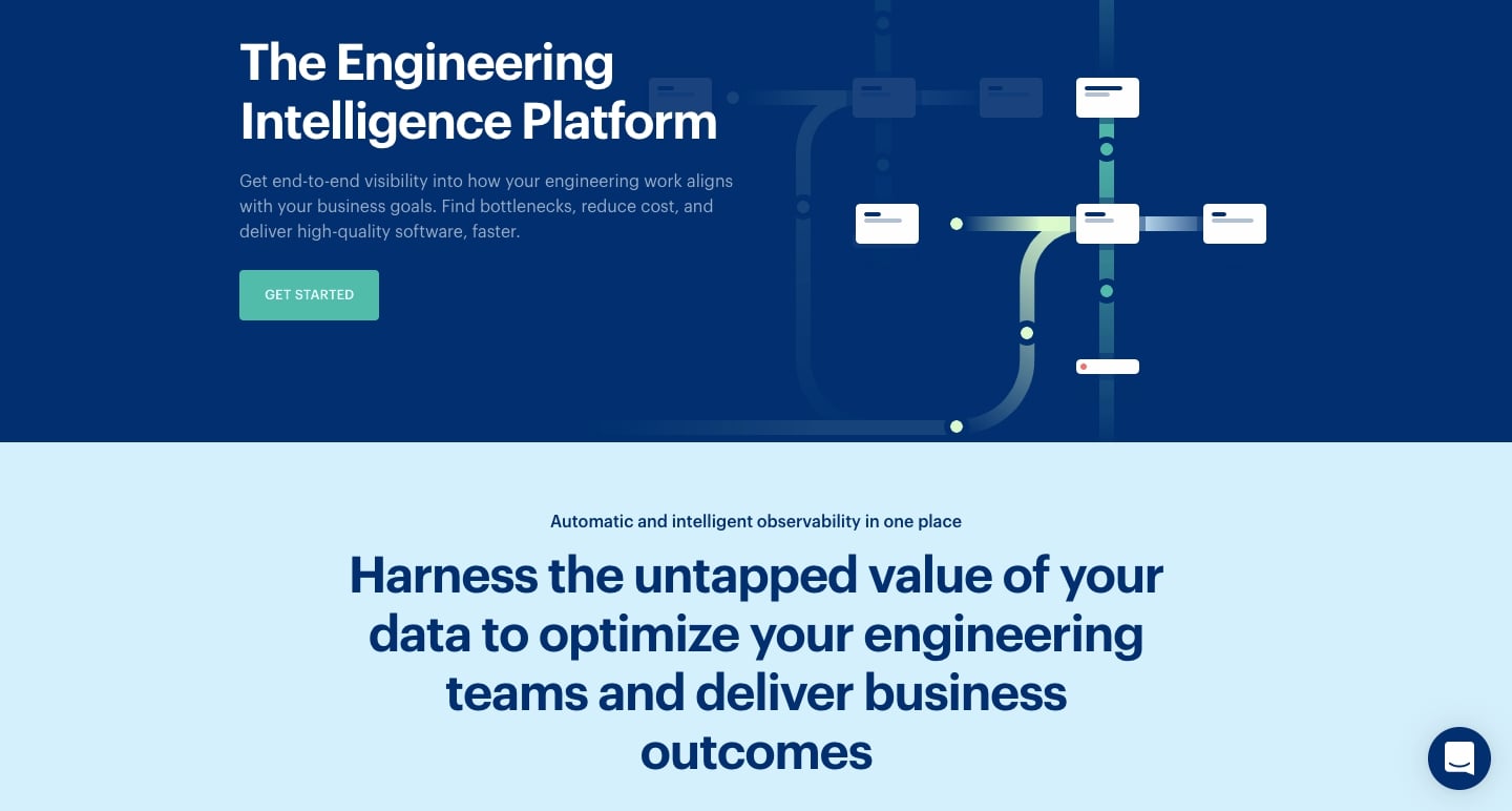
From ideation to deployment, engineering teams rely on data and insights to guide product development. Process Labs generates and brings visibility to this all-important information and how it aligns with a company's strategies and goals.
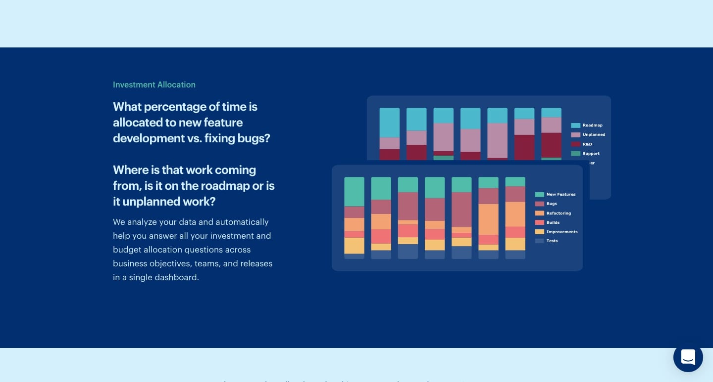
With visuals that evoke the feeling of diagrams and workflows, it’s easy to see that this design is geared toward an engineering audience. The content is also precisely delivered with a tight organization and concise explanations about how their platform functions.
ContentFly
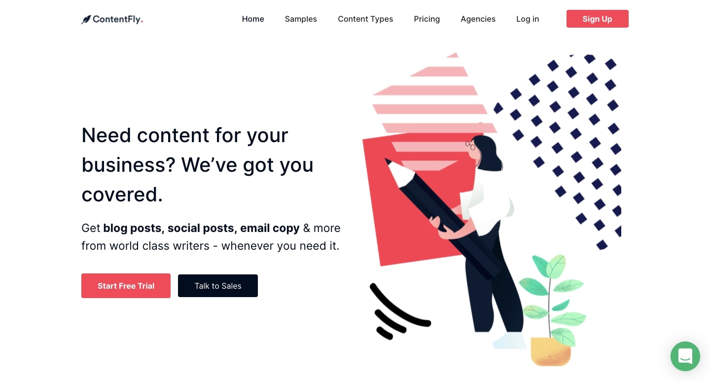
For companies who want quality copywriting, but don’t want to navigate the many freelance websites out there, ContentFly offers a monthly commitment-free subscription service that delivers well-written content on demand.
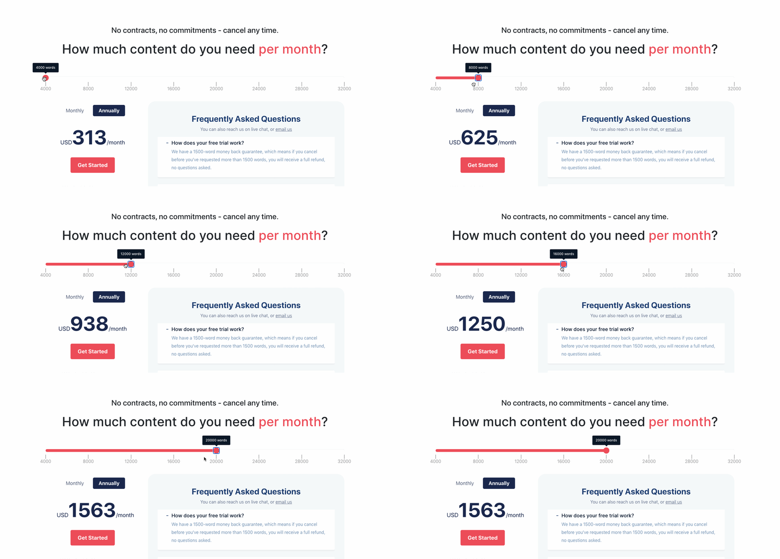
Whether you’re a SaaS company or a service-based business, it’s essential to adequately communicate your pricing options. We really love ContentFly’s sliding scale pricing interaction, which shows monthly cost based on word count.
Perfect Recall
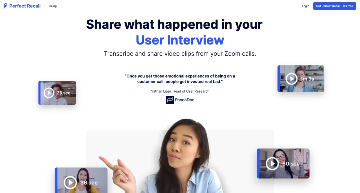
For anyone who has tried to decipher scribbled notes while scrubbing through video call footage — Perfect Recall to the rescue. Their app transcribes Zoom calls and allows for an easy way to timestamp and take notes during the call.
We get plenty of action in this design, with bursts of self-playing screen grabs and parallax effect. In addition, the Perfect Recall website features a clean color palette of blues, black, and yellow against a white background.
There’s careful attention paid to the content structure. In just three steps on the opening page, they communicate how their software works in documenting and transcribing videos and its value to companies.


Build websites that get results.
Build visually, publish instantly, and scale safely and quickly — without writing a line of code. All with Webflow's website experience platform.
Aerotime
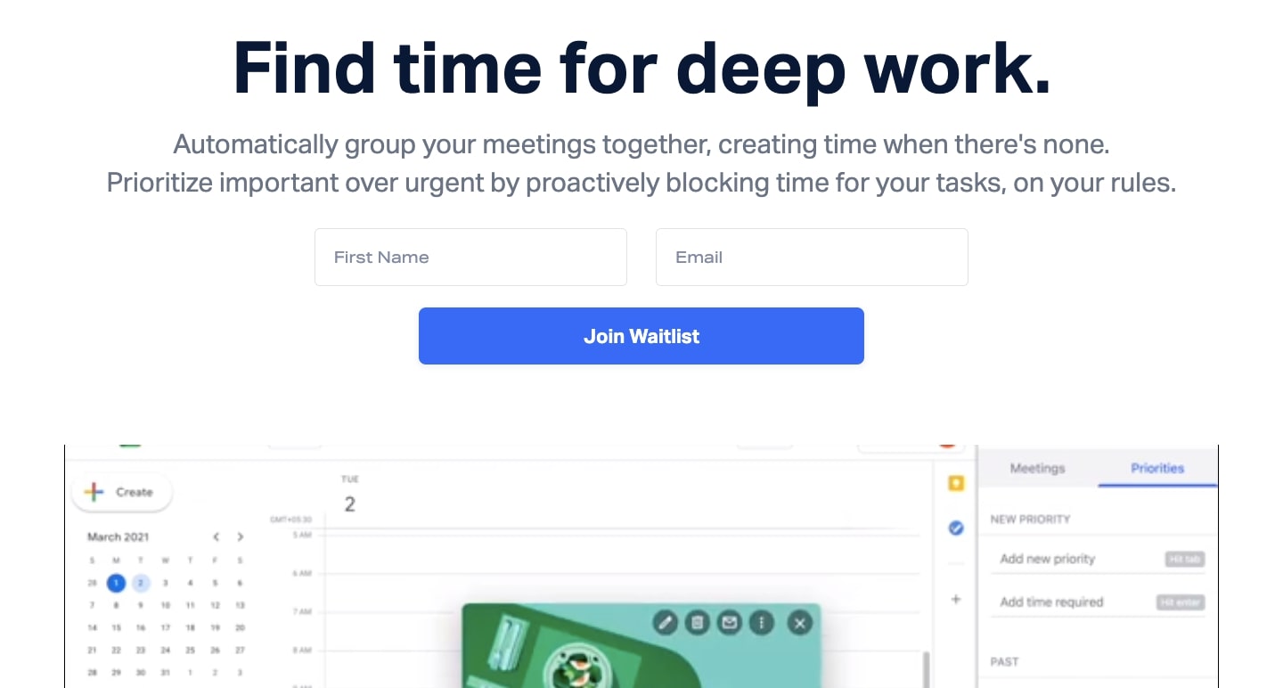
With meetings scheduled at random times throughout the day, an incoming deluge of Slack messages, and the other distractions thrown your way throughout the day, it can be difficult to block off time for uninterrupted and focused work.
Aerotime is a San Francisco-based startup that makes it possible for workers to better arrange their meeting schedules, silence Slack, and set aside the time they need to get their work done.
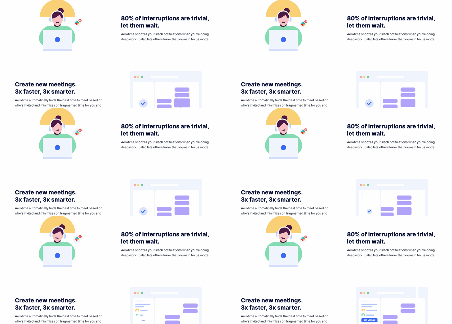
The website itself will put you into a flow state, with a focused user experience that makes it easy to read through the content, free from interruptions.
Lendflow
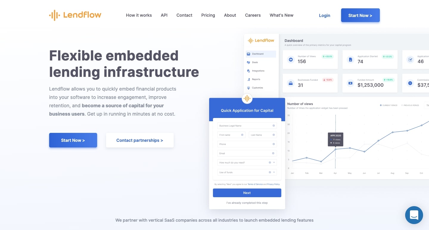
Lendflow is a financial technology (FinTech) product that makes it possible for businesses to offer financial service capabilities embedded in their software through the businesses’ API.
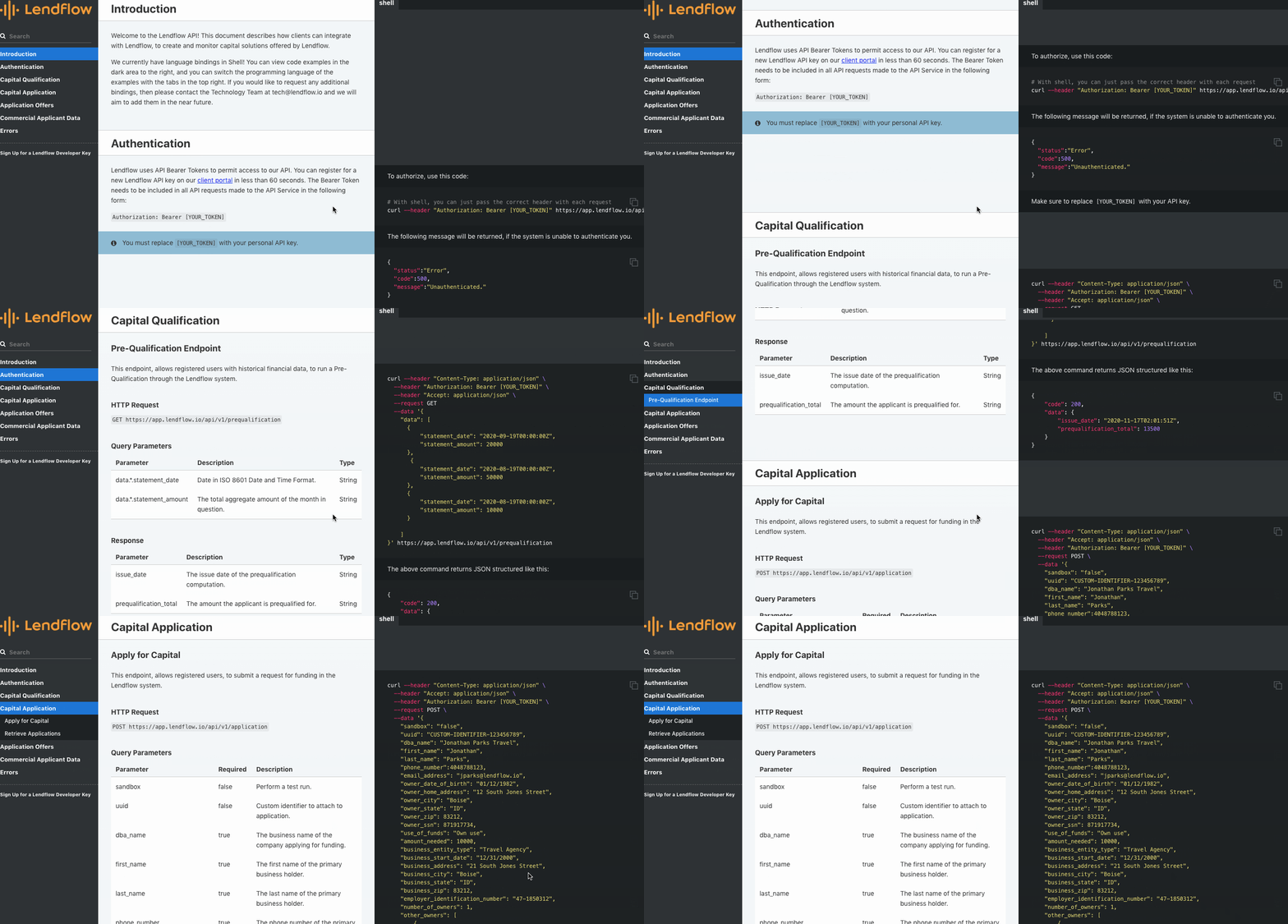
In FinTech, it can be hard to present how your software works in a way that isn’t, for lack of a better word, boring. Lendflow’s website isn’t — it has interesting visuals, including programming-related content, like code snippets. It’s the perfect balance between technical information and captivating design.
Abacum
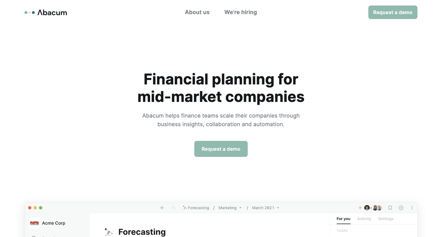
Insights and automation drive Abacum, a digital platform that lets businesses better understand their finances. This website shows potential clients the inner workings of their software solution and its benefits.
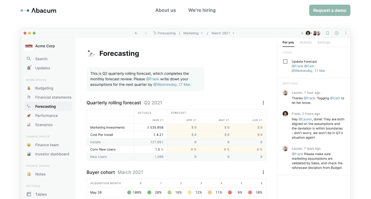
Like many SaaS companies, they rely on screenshots to communicate how their platform operates, which — in their case — is more effective than utilizing long, written blocks of content.
FlutterFlow
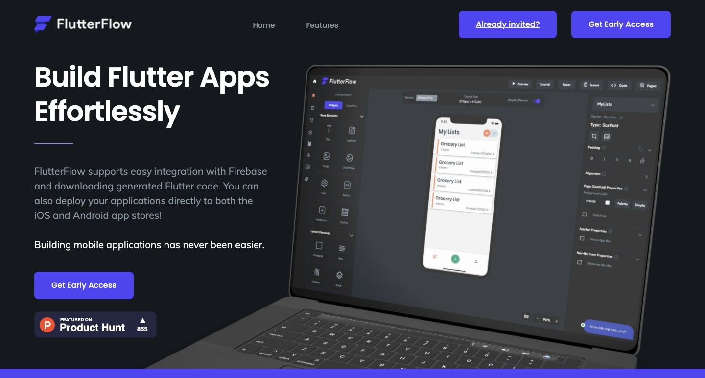
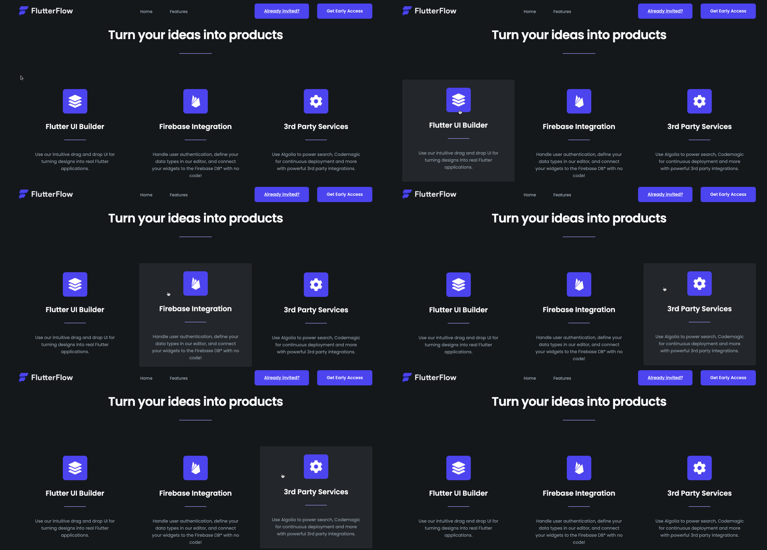
The no-code movement continues to grow, with FlutterFlow being another welcome addition. For those who want to launch an iOS or Android app built with Flutter code, FlutterFlow provides a no-code solution. Just as no-code simplifies building and development, this design provides visitors with a straightforward user experience, making it easy to understand its use-case.
StartPack
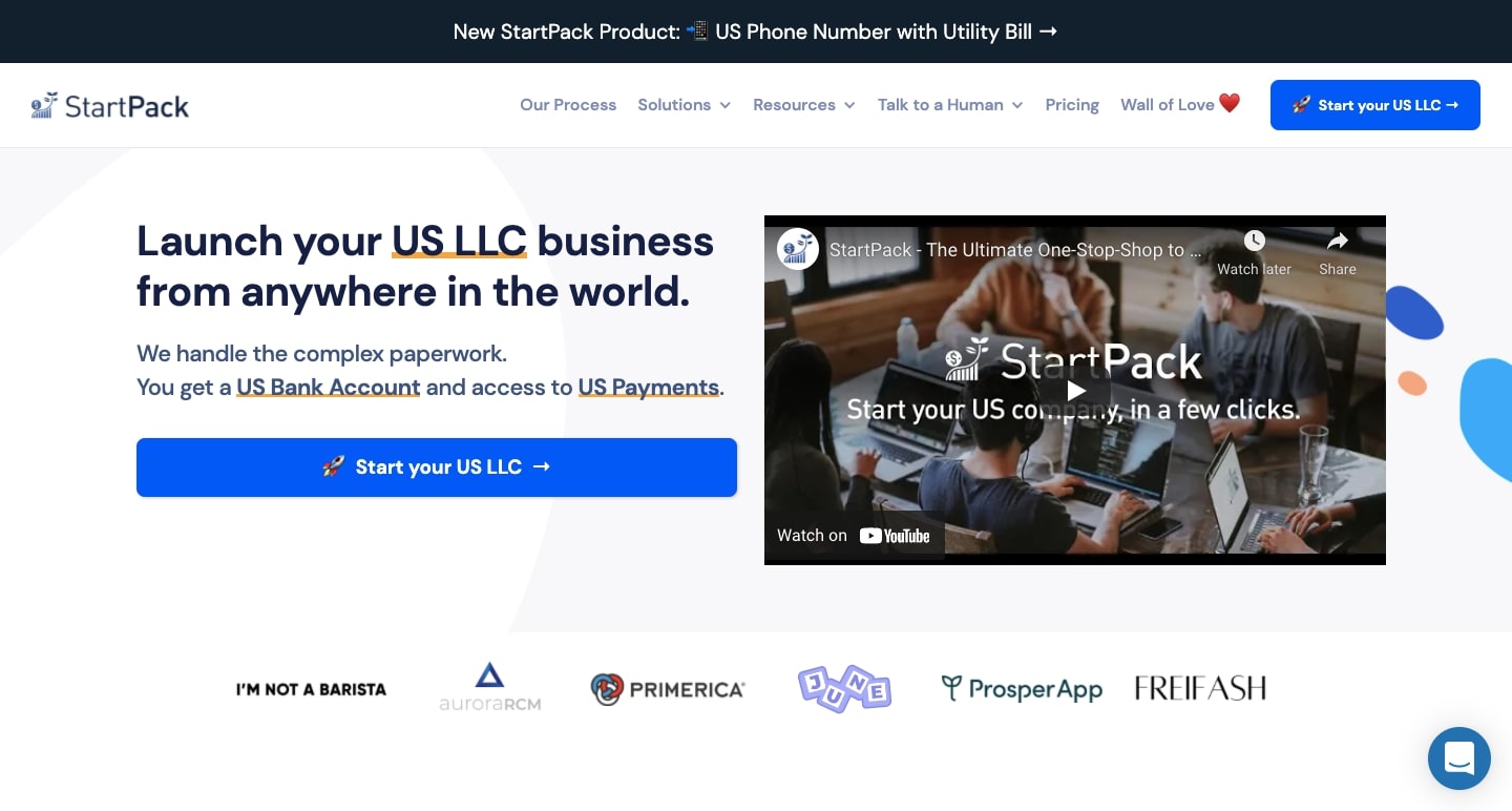
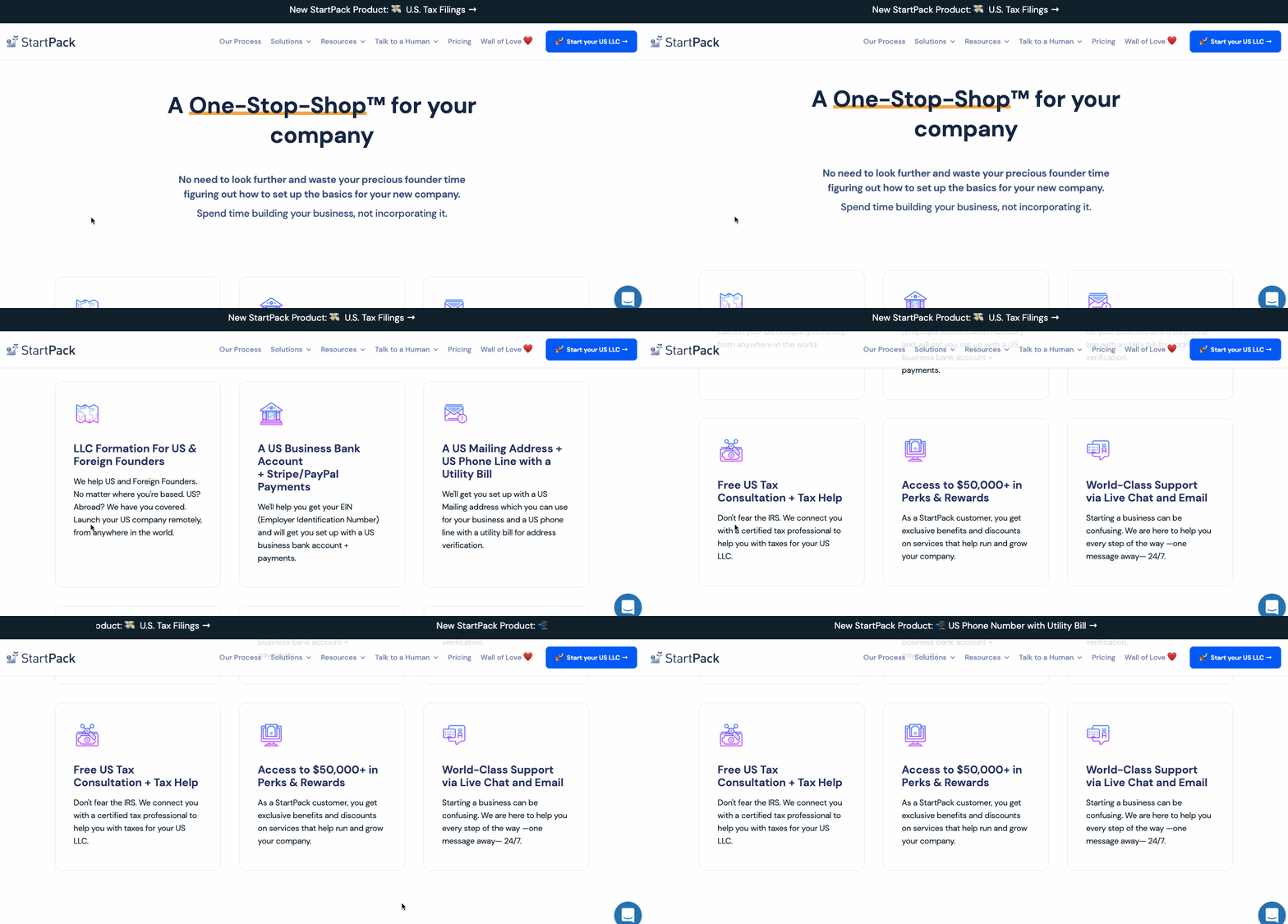
Establishing an LLC is often a confusing process for startup founders, small businesses, and entrepreneurs. StartPack is a “one stop shop,” handling every aspect for customers who need an LLC. They also include great testimonials from businesses they’ve helped.
Sivo
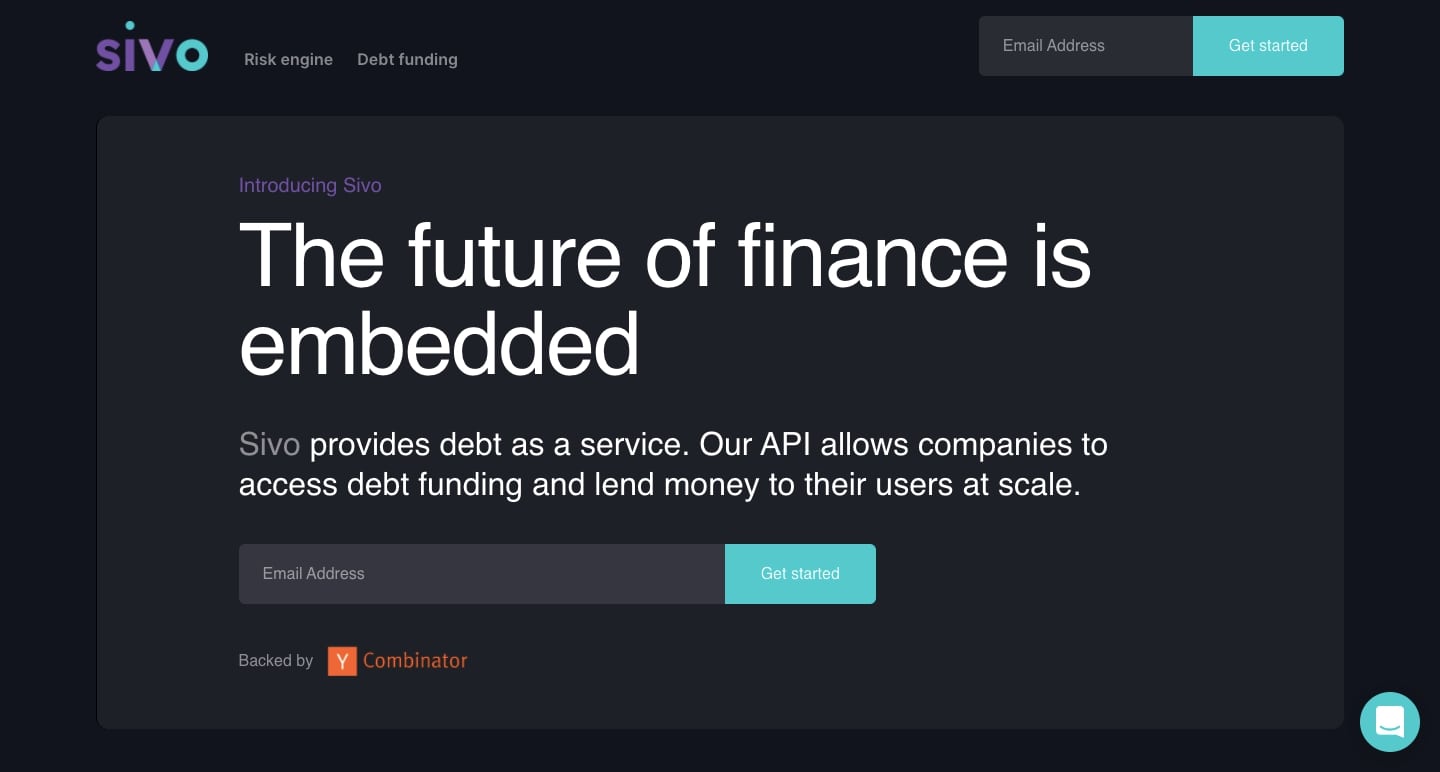
Sivo empowers other companies to offer their clients loans with an API-based platform.
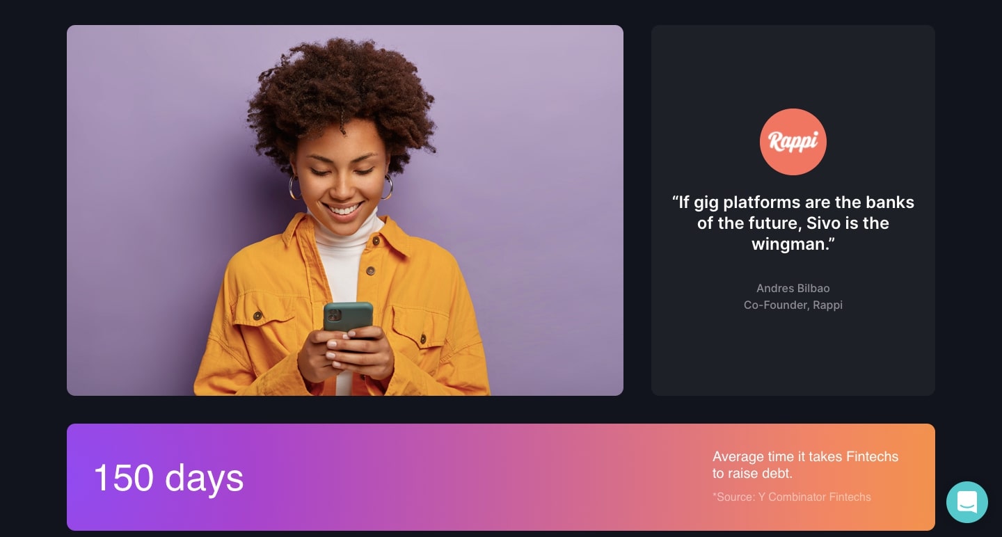
Sivo’s site is far from being another dull finance design. With dark colors, bright buttons, and colorful gradients, there’s an energy to this design that’s often missing from finance-related websites.
Compose AI
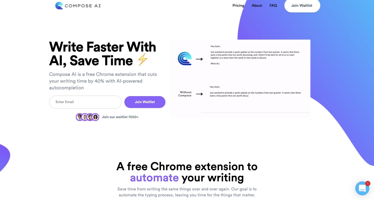
Compose is a Chrome plugin that makes auto-complete text smarter and more precise using the power of artificial intelligence (AI). For anyone who does a great deal of writing at their job, Compose can help make it a speedier process.
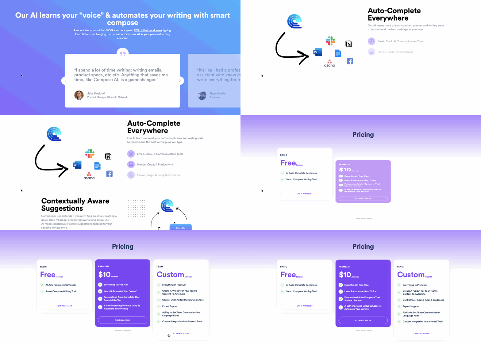
This site features a pleasing color palette of white, blues, and purples, subtly layered visuals, and a logical organization of content. It’s a one-page design that manages to communicate how Compose works, while still providing plenty of breathing room for the elements within it.
Marketbase
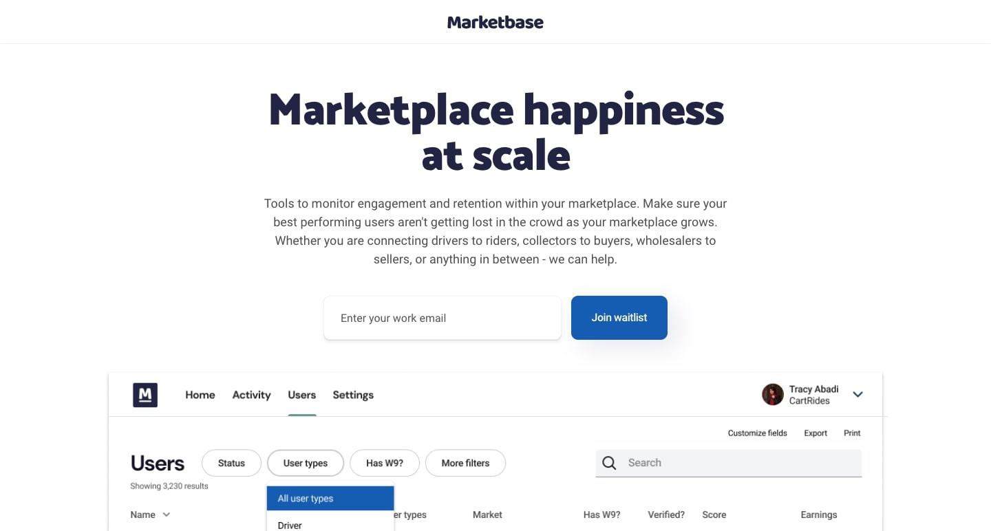
Marketbase is a specialized CRM for eCommerce marketplaces. It gives those who run marketplaces access to data from both the buyers, sellers, and other involved parties.
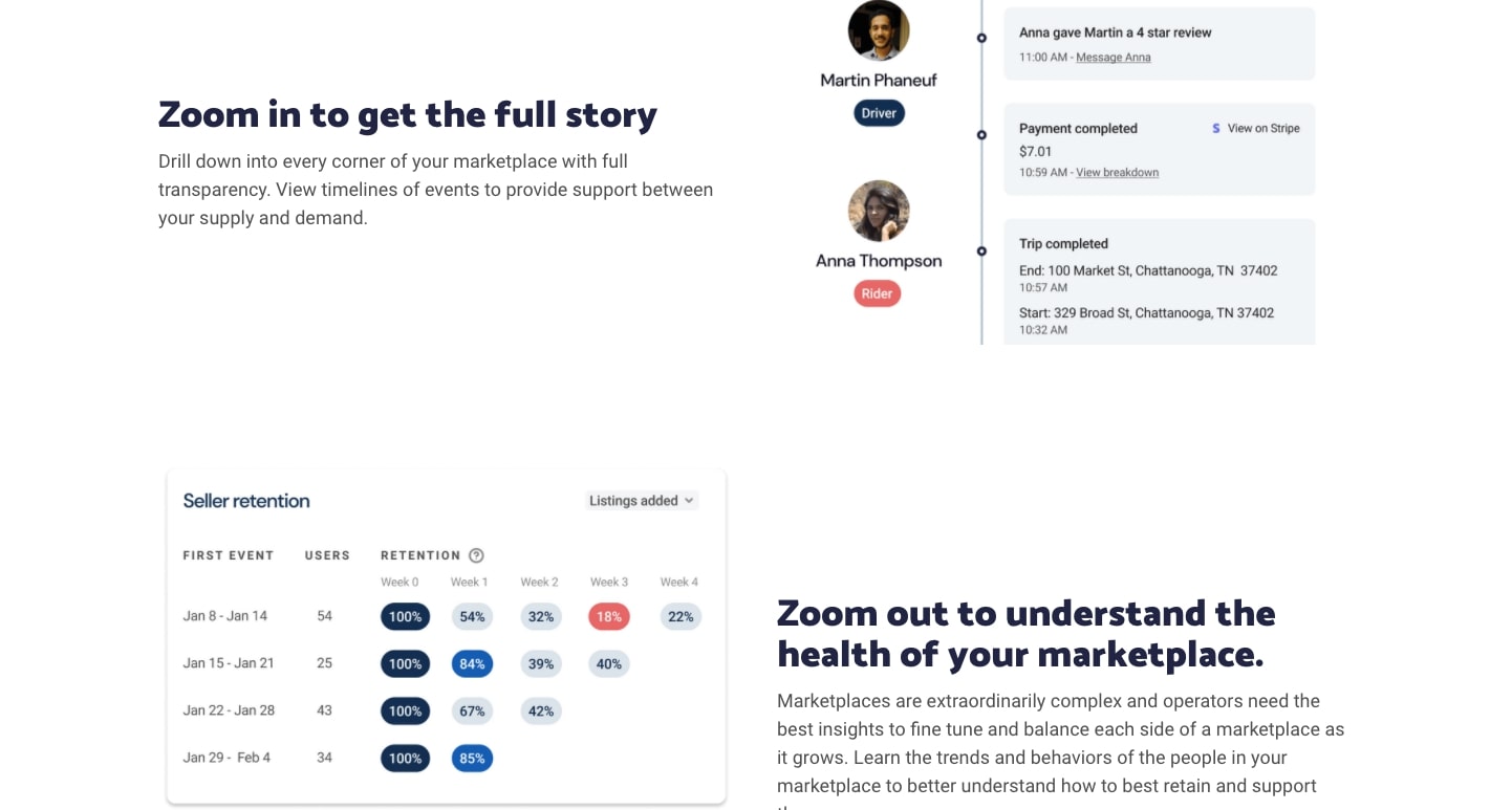
Through diagrams, visuals, and concise copy in an uncomplicated layout, Marketbase gives potential customers an effective snapshot of all that they do.
Partnered
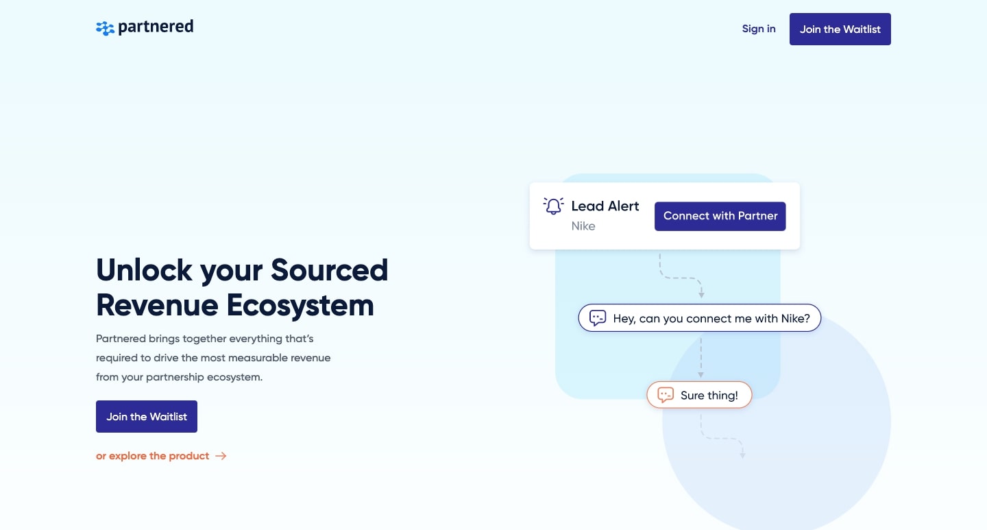
Companies often rely on partnerships to help generate revenue. Partnered is a software platform that optimizes how companies can source new leads and utilize these partnerships.
The message that Partnered is a set of interconnected parts is conveyed throughout the design with diagrams and animations. Those elements show how their different offerings come together to help companiesleverage their partnerships.
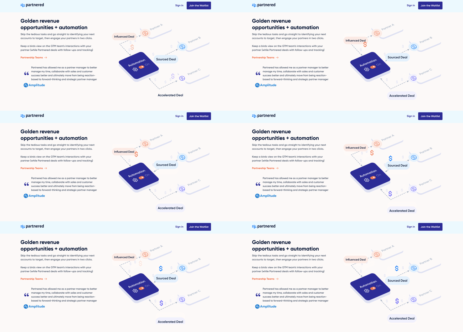
With a palette of light blues and muted violet, and smooth animations, this SaaS web design is full of color and high-tech charm.
Fable
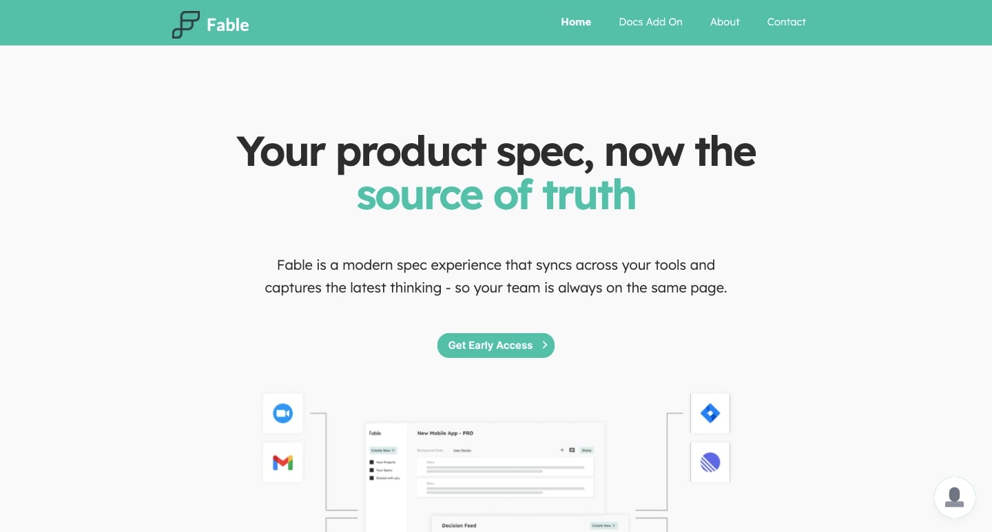
Fable keeps product specs up to date, consistent, and readily available for everyone involved in product development.
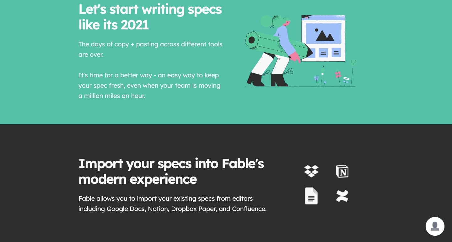
Green, white, and grey instill a sense of freshness in the design, with Fable’s website providing a lively presentation on how their software makes product development easier and keeps teams connected.
Taloflow
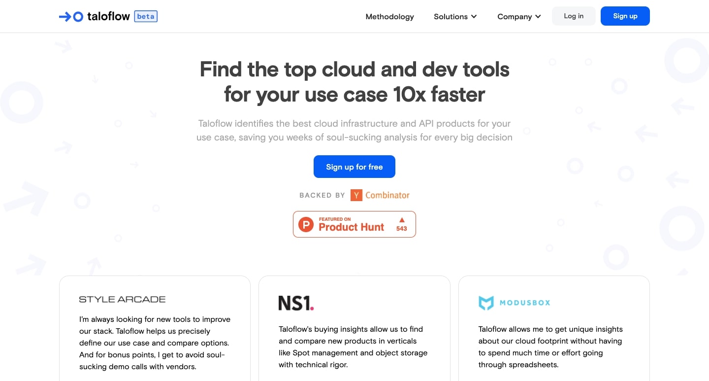
Businesses often have challenges constructing a full stack of tools and cloud technologies to optimize their workflows. Taloflow analyzes their needs and generates customized solutions in helping them build out their technology infrastructures.
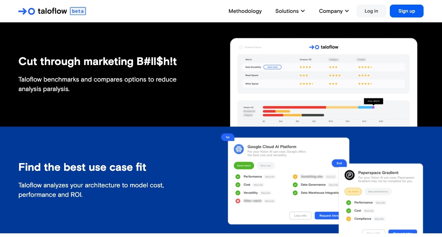
This website reflects the sophistication of Taloflow’s platform and communicates it in a straight-to-the-point way through visuals and text.
Stacksi
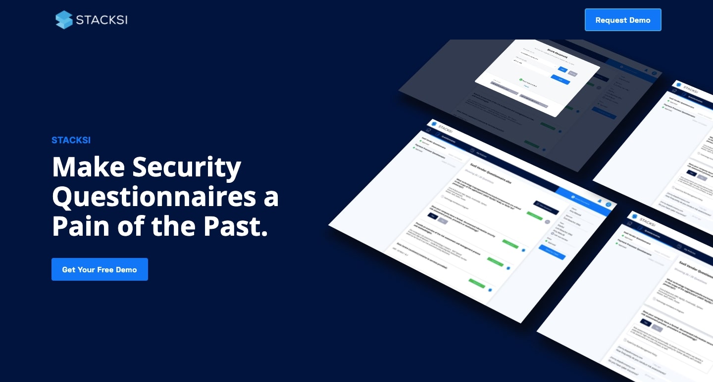
Anyone who has filled out security questionnaires from new business affiliates or vendors knows that the task can take up a huge chunk of time. Stacksi makes it a faster process, drawing upon the security protocols a company currently has in place and making it possible to craft more accurate responses faster. The more security questionnaires you fill out, the better Stacksi gets in providing the answers.
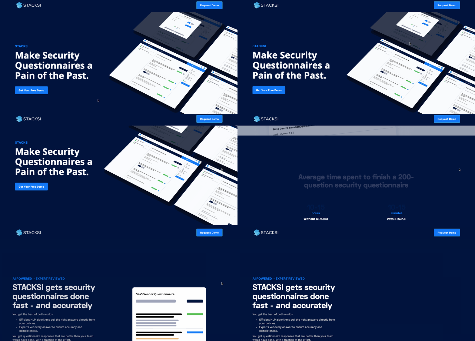
With clear copy, scroll-triggered animations, and a stylish and modern design aesthetic, Stacksi’s design creates excitement within its visitors.
Prequel
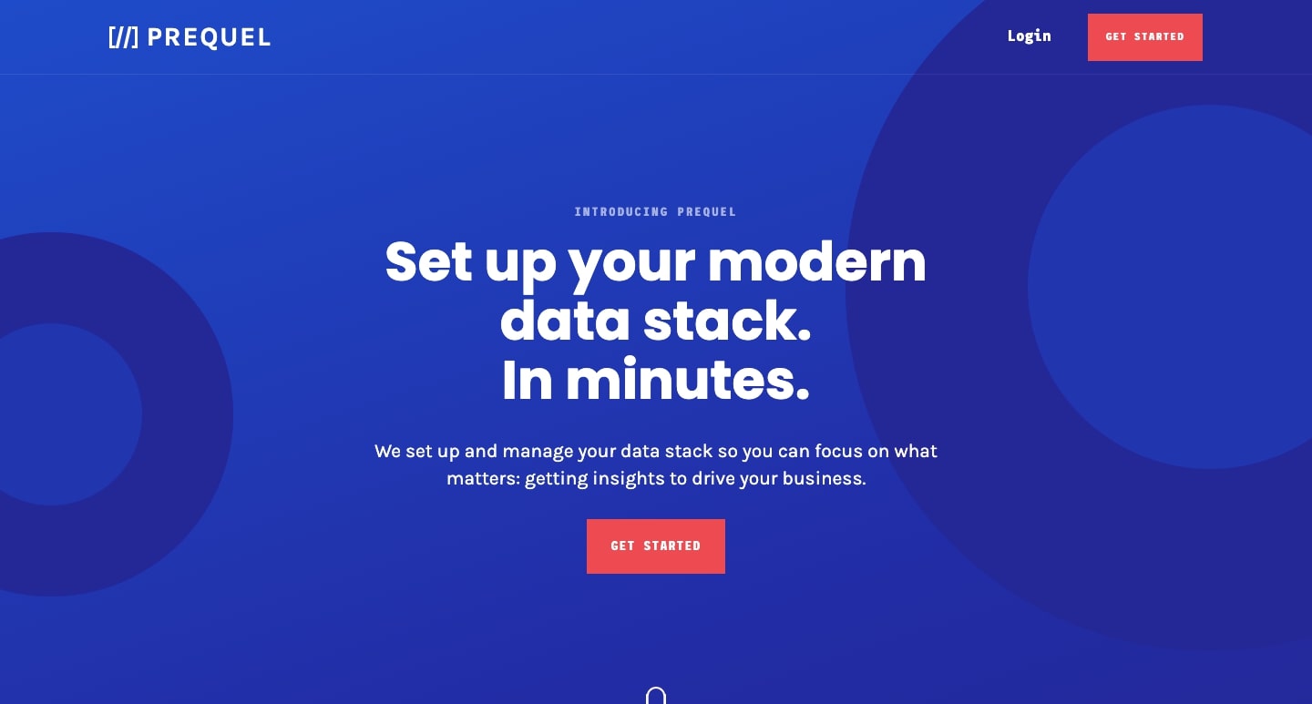
Prequel helps users set up and manage their data stack and garner insights faster than ever before.
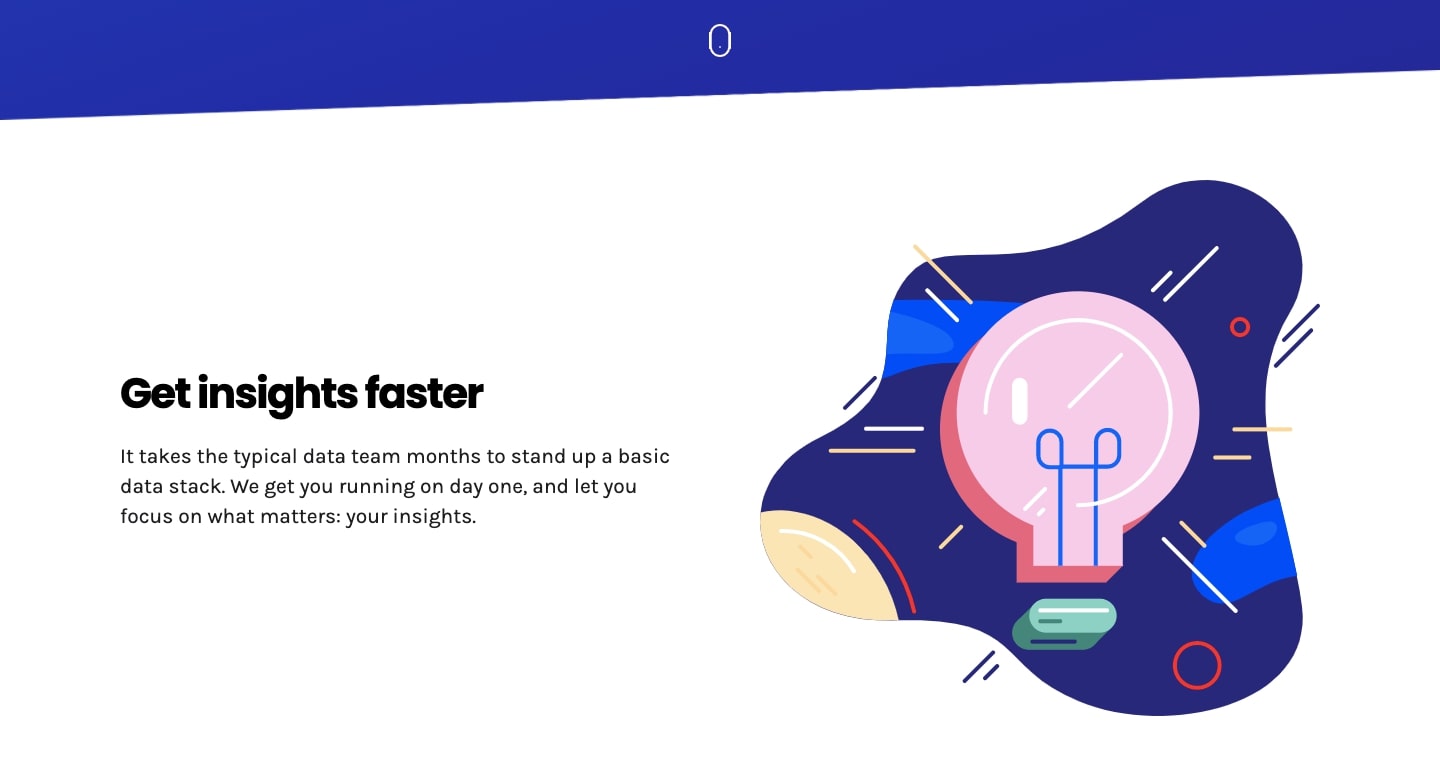
Prequel fills their website design with a lovely assortment of colors and shapes. The illustrations that accompany each block of content offer a delightful user experience and have a degree of artistry that really shines through.
Who will be the next Y Combinator success story?
Top companies like Instacart, Twitch, Amazon, Coinbase, Stripe, and Webflow (heard of it?) all had to start somewhere. Many of the origin stories of up-and-coming companies are now being written. Who will be the next to rise from this primordial soup of YC companies and become the next big thing?
We’re so excited to see what the future brings — and to see early startups utilize Webflow to build up their brands.

Get started for free
Create custom, scalable websites — without writing code. Start building in Webflow.
