There’s a reason those drawn to the visual arts use Webflow. Much like a blank piece of paper and a case of colored pens, Webflow gives you the freedom to express your creativity, but in pixels. Here are nine art-related websites all using Webflow in their own unique ways.
1. Kate O’Sullivan
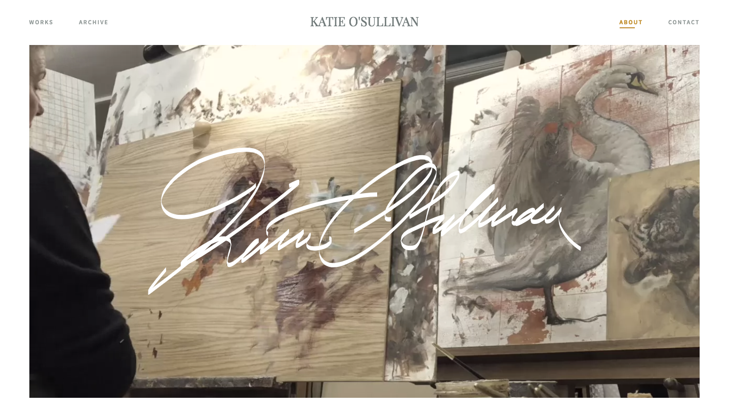
Let's face it — autoplaying background videos isn’t always the right choice. But on Kate O'Sullivan's website, the featured video really serves to communicate her artistic style. We see her creative process in a timelapse video showing her arms in a flurry of strokes, layering paint and adding details to her animal portraits.
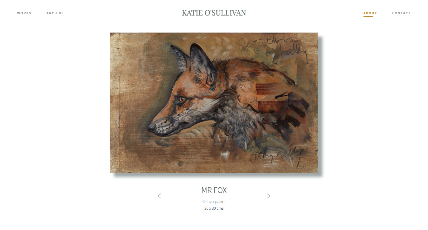
This art website showcases the stylized oil paintings of her animal subjects, with almost every page highlighting an aspect of her artistic talent. Webflow CMS makes it easy to manage galleries of her featured artworks. The site design is minimalistic, but uses dynamic touches like subtle animations and a fade-in effect revealing both text and images on scroll.
This site is a great source of inspiration for any visual artist — check out Katie O'Sullivan's showcase page to see how it was made.
2. R.A.R.E. Digital Art Collection
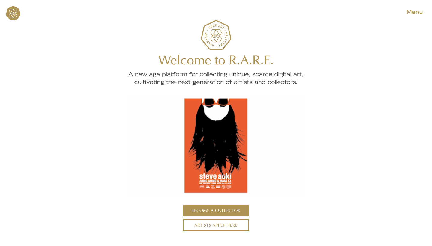
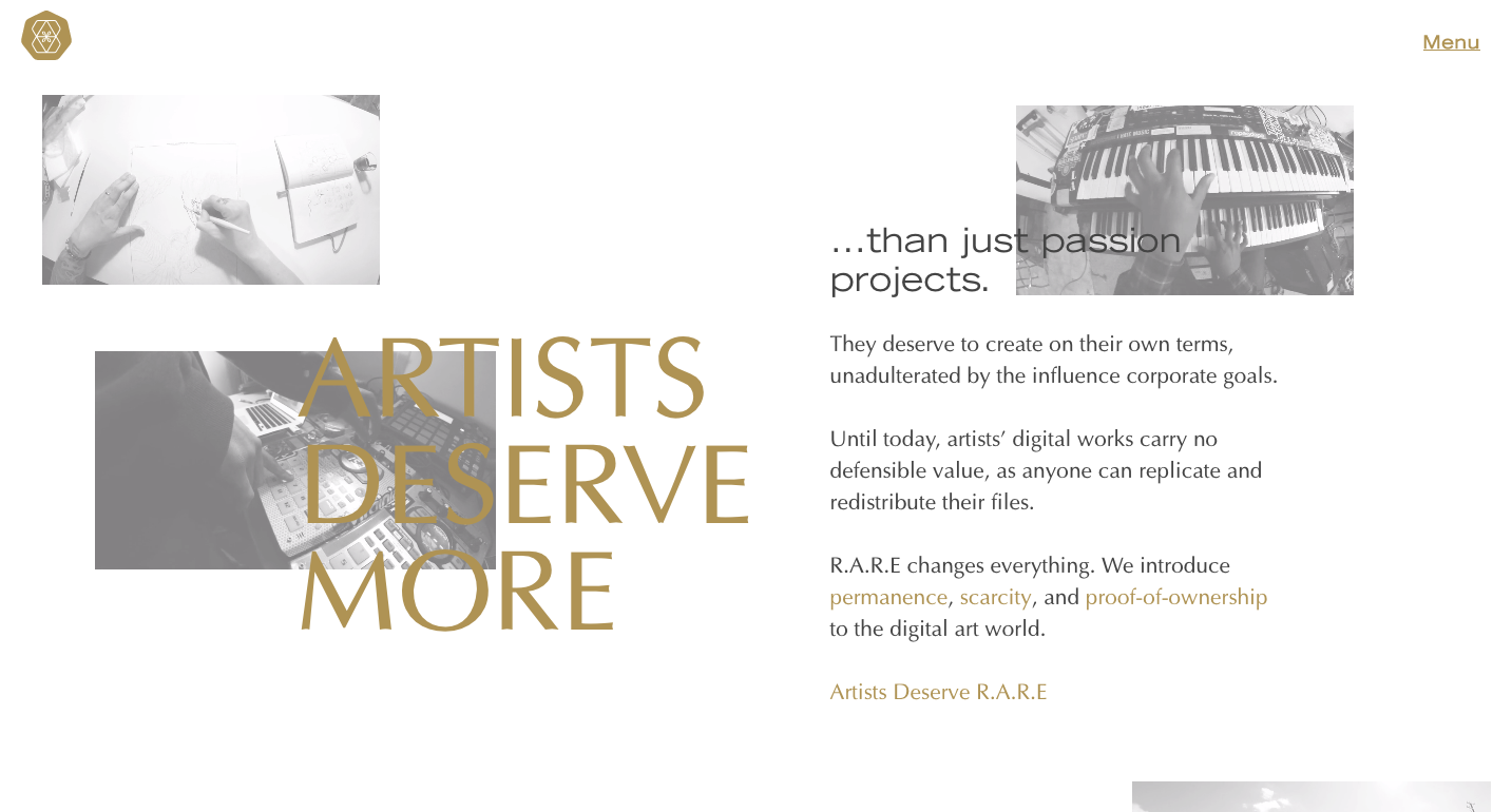
Digital technology has made sharing music, videos, and images lightning-fast and (often) free. The downside of this is the devaluation of art — artists are missing out on receiving royalties on their work. R.A.R.E. is a startup that uses blockchain technology to help artists sell limited editions of their digital works.
It’s a novel concept, and the site’s landing page explains the token-based system in four steps. Both the golden-bronze color palette and their seven-sided polygon logo brings to mind coins and precious metals. This design has a modern aesthetic that reflects the type of artists featured and likely appeals to people willing to unconventionally invest in art.
To see how the R.A.R.E. website came together, take a look at its showcase page.
3. Asheville Art Museum
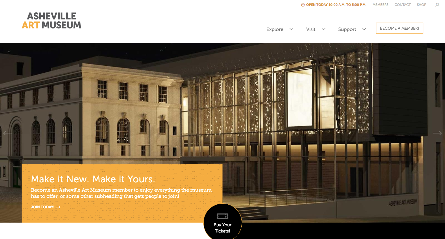
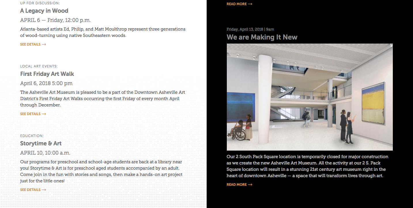
The first thing anyone wants to know when planning a trip to a museum are its current exhibitions and events. The Asheville Art Museum site features events on the hero section of their landing page. Scrolling brings you to a split screen — one side is dedicated to upcoming events and the other displays museum news.
Scrolling further reveals a gallery block with images from the museum’s current exhibitions. The design does a great job using their galleries to both show and tell what’s happening.The gallery is managed with Webflow CMS — a smart move.
Navigation is easy, with only three options — explore, visit, and support — that each lead to uncluttered drop downs. Museum hours for the current day are found at the top of the page — which may seem minor. But how many of us have showed up only to have our artsy aspirations crushed by a sign that says they’re closed on Mondays?
If you’re designing a site for a gallery or a museum, check out how this came together in Webflow.
4. Gaffa Creative Precinct
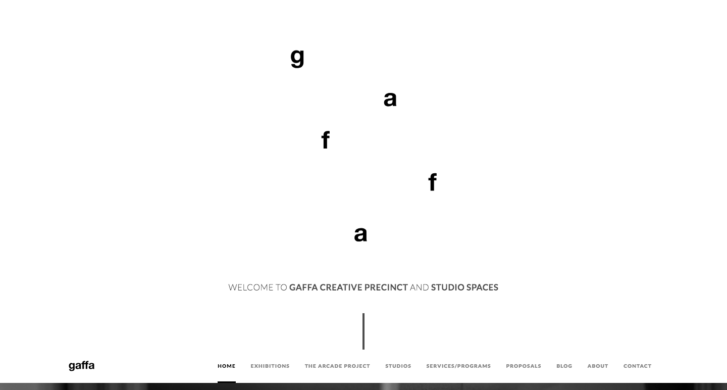
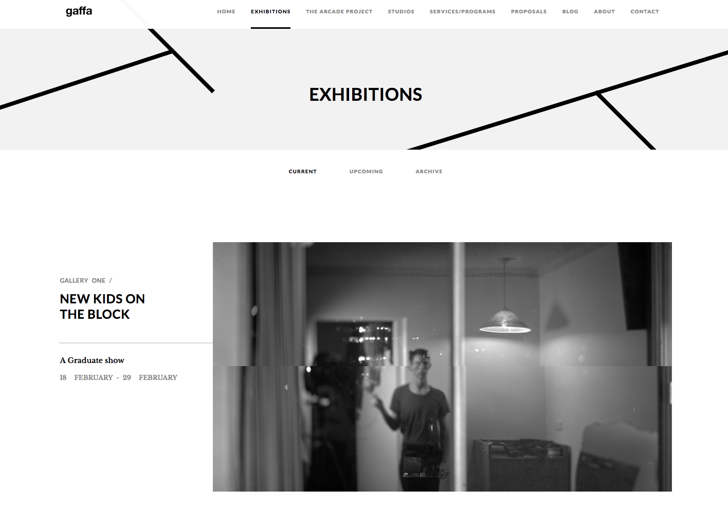
Gaffa Creative Precinct offers art studio spaces, events, and classes in Sydney, Australia. Right from the opening animation that propels the letters of Gaffa to the foreground, there’s something a bit (delightfully) off-kilter about this design.
Though it doesn’t completely break from standard design protocols, there are many, small, eccentric touches. For instance, instead of being neatly lined along the top of the landing page, the nav options float up from the bottom and lock into place with a downward scroll. It’s subtle, but tells us Gaffa values doing things just a bit differently.
Checkout Gaffa’s showcase page in Webflow.
5. Becca Hillburn
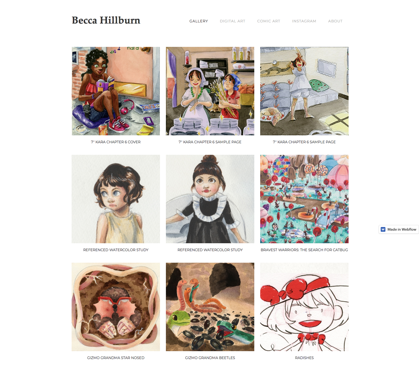
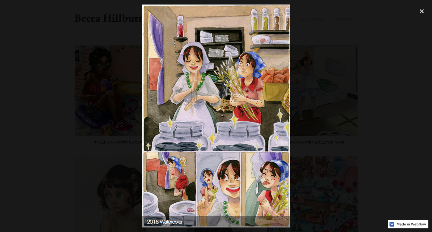
Becca Hilburn creates comics and other illustrative art — digitally, but primarily in watercolor. Her characters have a cartoon-like familiarity with an anime influence. She skillfully uses the fluid medium of watercolor to create characters whose expressions are specific and expressive.
The site has a minimal layout built on Webflow’s free Newport template, but her artwork, with its splashes of watercolor on thick paper, gives the design a very organic feel. This is another example of an artist letting their work speak for them instead of adding a bunch of excessive design ornamentation.


Get started for free
Create custom, scalable websites — without writing code. Start building in Webflow.
6. Ohio University Graphic Design Department
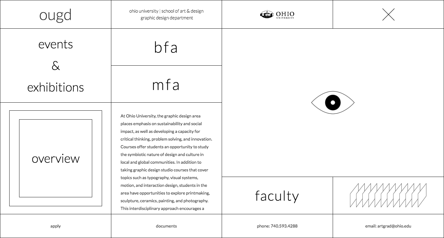
If you’re looking to become a graphic designer, pick a program that wows you. The Ohio University Graphic Design Program (OHGD) makes a strong first impression with a design far removed from the stale standard of academic websites.
OUGD is an artsy, one-page site with an unorthodox navigation via a grid of blocks. Hovering over options like BFA or MFA brings up text about the programs in a feature rectangle, while an adjacent block flashes student work.
This design and its visuals tells us OUGD values originality and imagination. Check out their Webflow showcase page.
7. Alistair Jelks
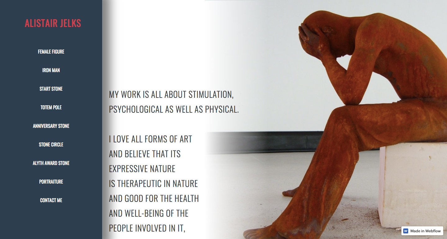
Alistair Jelks is a multi-talented artist whose techniques include sculpture, stone carving, and illustration. His work is “all about stimulation, psychological as well as physical.”
His homepage features an iron-cast sculpture of a man cradling his head — both its rusted raw materials and the man’s despondent pose project a heaviness. Another piece — a totem pole rising from the landscape — stands sturdy in the strength of the animals it features and the wood it was carved from.
Text describing each piece overlaps photographs of featured artwork — a design touch that links the cerebral to the visual. This one-page design puts Alistair’s art and talent front-and-center with a single scroll.
8. David Tinapple
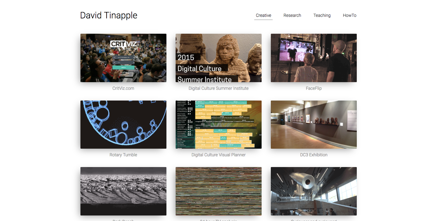
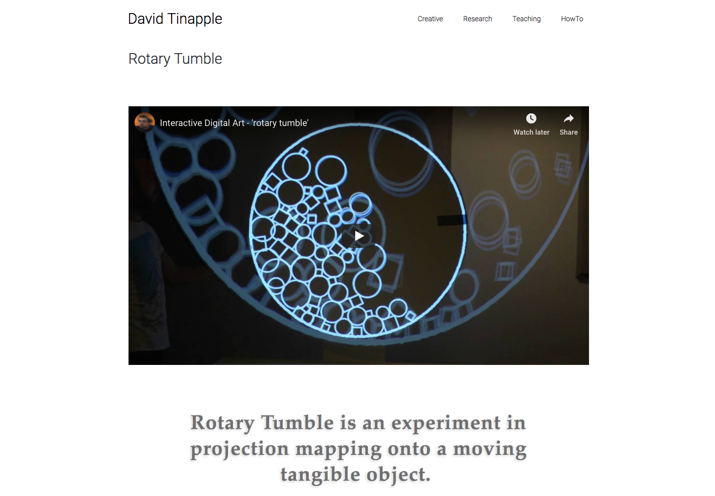
I must confess — I’m a huge fan of digital art. Especially interactive installations that combine visuals and sound. David Tinapple, an Associate Professor at Arizona State University, is an artist, researcher, and teacher whose work uses tools like MAX/MSP (an object-oriented programming language), sensor data, and other technology. Among other innovative pieces, David made his own FaceFlip installation before Face Swap existed.
The site is a great example of how Webflow — regardless of your medium or interest — provides a great platform to promote your work. David’s site design is minimal, but full of examples of his work and helpful content about the technology he uses.
For those in the mainstream, interactive digital artworks may be an esoteric area of interest. But for those who love to nerd out when technology, art, and sound come together, David’s work will be well appreciated.
9. White Art Walk
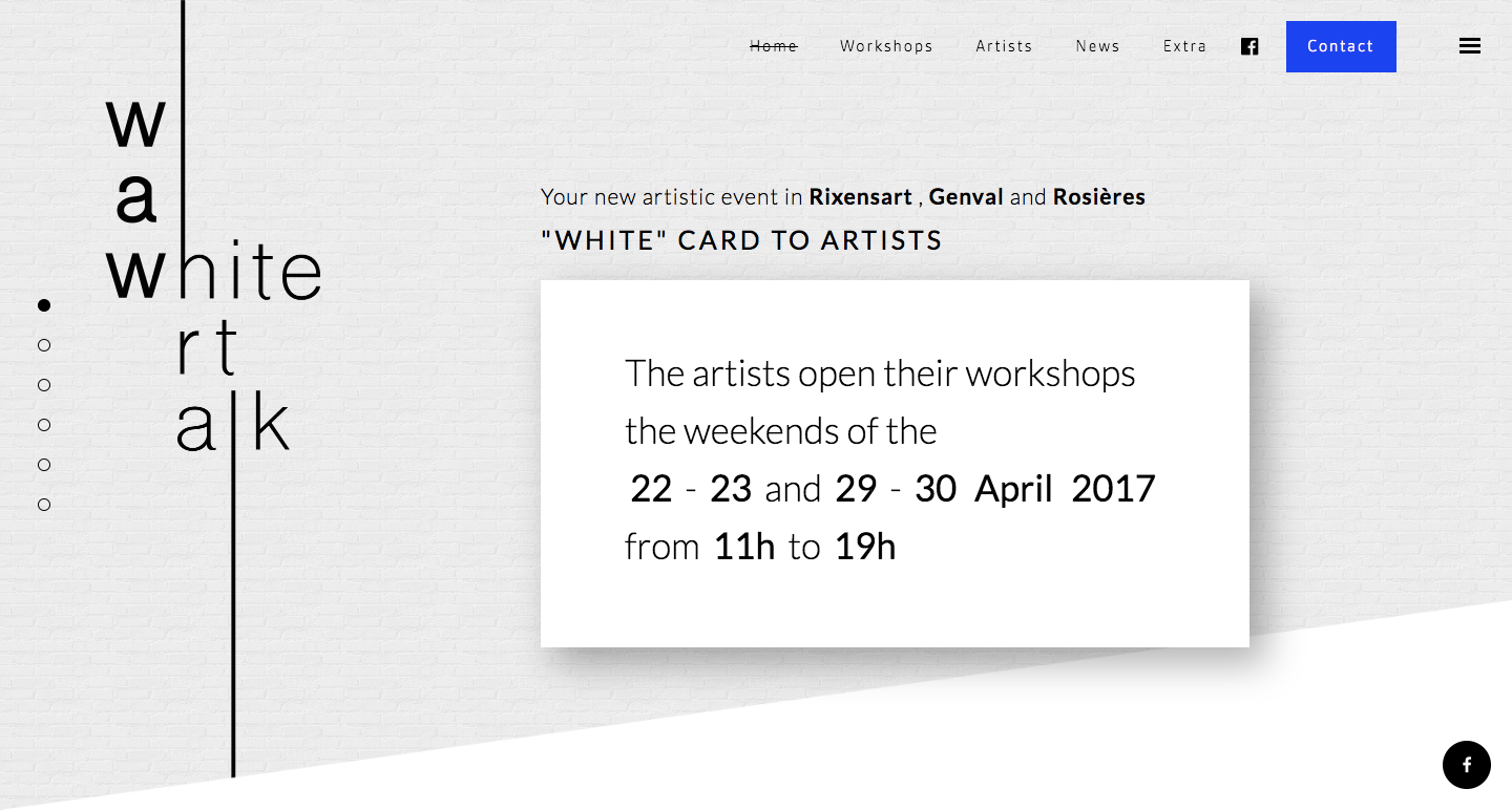
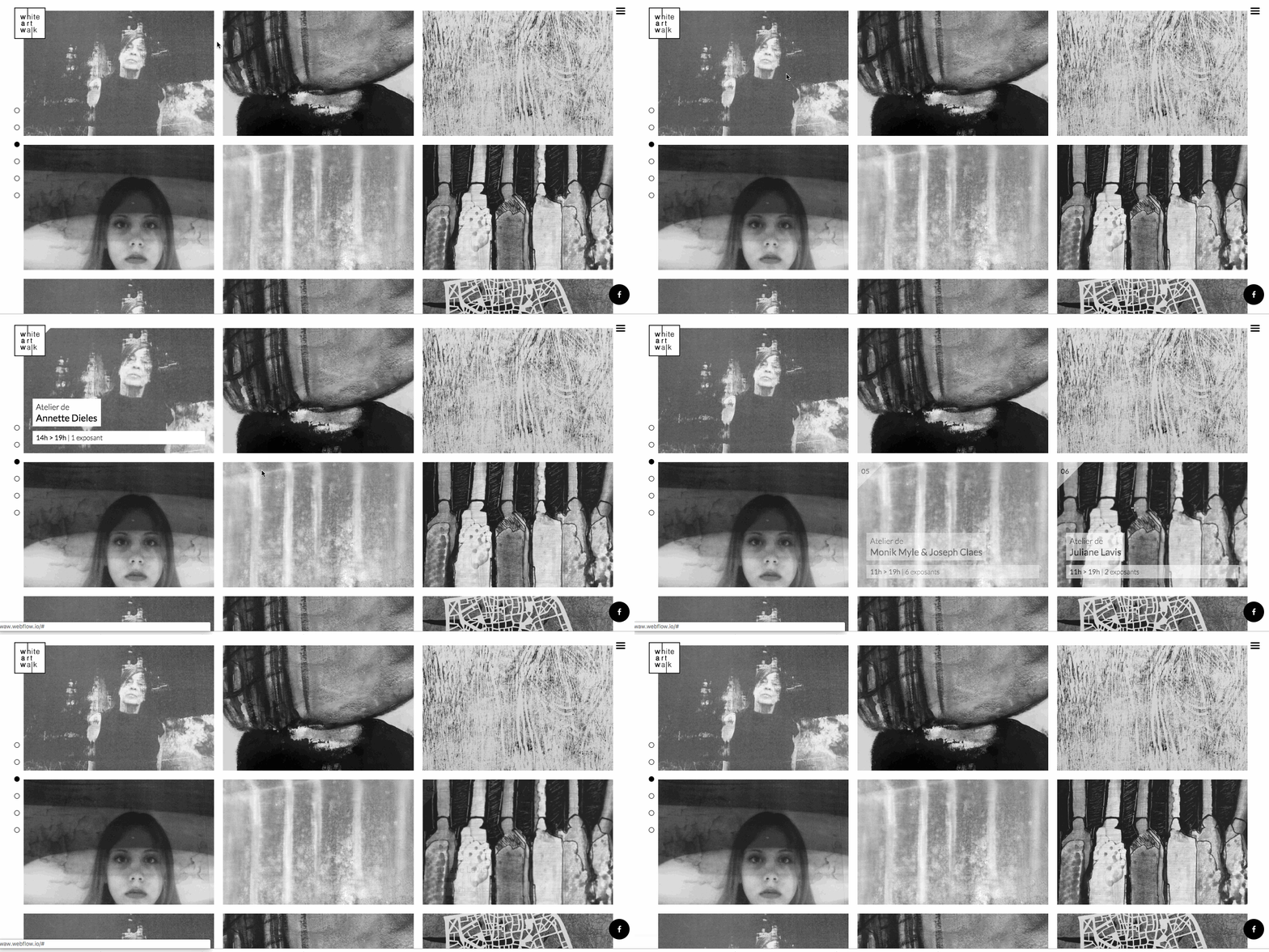
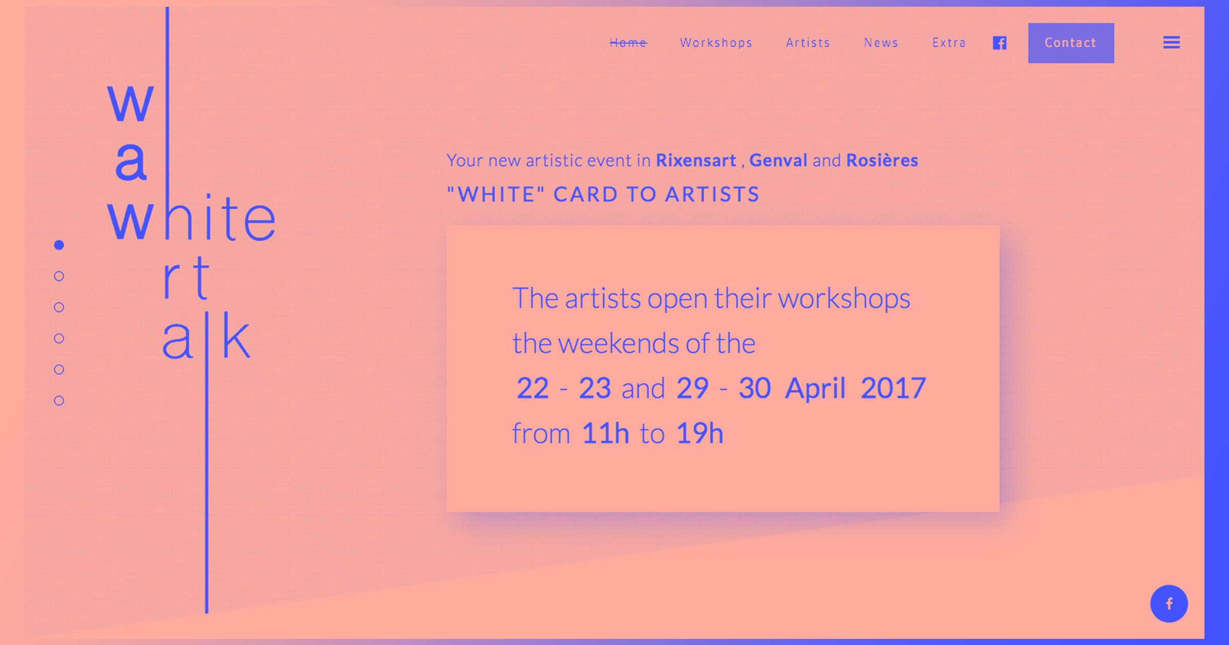
This site design for White Art Walk — a French art walk and studio tour — is a work of art unto itself. The typography, white brick background, and black-and-white palette makes you feel like you’re inside an art gallery. All that’s missing is the smell of oil paint, a charcuterie board, tiny napkins, and a few bottles of wine.
The site gives a comprehensive overview of the White Art Walk, with plenty of information about its workshops and participating artists. Scrolling down the landing page brings you to a grid of workshops with the feel of old black-and-white photos — all managed with Webflow CMS.
A design like this could easily be stiff and sterile, but the site’s microinteractions give it movement that’s most notable in the workshop gallery. Hovering over each square zooms in on the image and reveals additional information.
Don’t forget to check out the White Art Walk Webflow showcase page.
You’re a creator — why not create a website?
Webflow gives anyone — even those who don’t code — the power to design a unique website. If you’re a visual artist, you already have a creative spirit and a flair for the graphical. Why not create a site to promote your work?
Use Webflow to channel your creativity into the digital medium of web design.




.jpeg)
