It’s easy as a startup to get caught up in the excitement of building products. With this rush to launch, marketing websites may take less of a priority. However, a startup website shouldn’t be an afterthought.
Startups, in their race to get their products out to the world, often don't have the time or people to dedicate to creating and maintaining marketing websites. Often they're put up in haste as placeholders, with plans to spruce them up in the future. But a website is often a first impression on a customer, and smart startups know it’s important to be able to iterate quickly.
With fewer resources, startups need to make the most out of what they have. Small teams often require people to take on multiple roles. Because of their technical backgrounds, it’s not uncommon for engineers to become ersatz website coordinators. This can stretch their available bandwidth, and be a distraction from their jobs in product development.
“Startups usually have lean teams, all sharing a single goal. It’s not uncommon for roles to overlap. With Webflow anyone on a team can also take on web design, and help build a marketing website.”
— Bryan Schuldt, Co-Founder and Designer, Tability
Startups go through many changes in the course of developing their businesses. With product updates, shifts in strategies, and other forces coming into play, it’s important to have a web design platform that makes it easy to go in and make updates. Webflow allows anyone on a team to be able to make edits and tweaks, whenever they need to.
Webflow gives startup companies a simple way to scale up their web presence as they grow. We’re going to take a look at some startup websites designed with Webflow and what to keep in mind when designing one of your own.
Startup websites made in Webflow
Wisetack

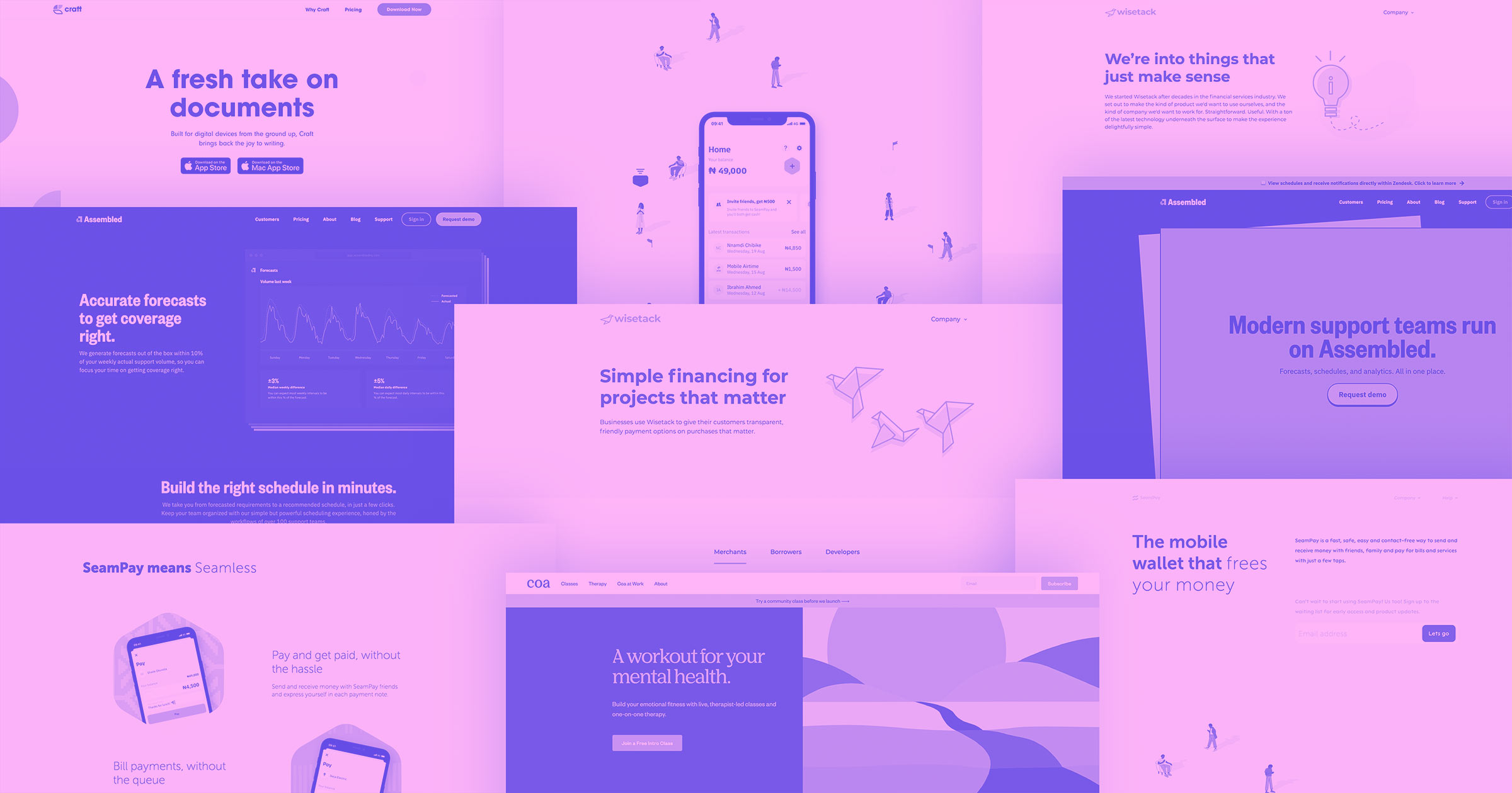
With a focus on businesses that offer offline services (such as auto and home repair), Wisetack provides a solution so that their customers will have financing options. Wisetack uses an economy of words and simple illustrations across their website. With light blues, and plenty of whitespace it has an open and airy feel. A simple dropdown occupies the top right-hand side of the screen. It's uncomplicated, yet gives someone everything they would want to know about their financing software.

One of their guiding principles is transparency. This can be seen across this design, with clear and concise writing communicating what their software does, as well as who they are as a company. This sense of authenticity, combined with a straightforward yet stylized web layout, comes together in demonstrating that they're a reputable company with a solid product to offer.
“We’re growing our audience quickly, and releasing major new features every month. Webflow makes it really easy for us to add content to reflect these updates. Plus, we have more confidence that it will scale with us as we develop more types of content and more complex/interesting design elements.”
— Iris Pfeifer, Head of Marketing and Partnerships, Wisetack
Like any startup, they need to roll with changes and ensure that their website stays current. Webflow provided the framework that their website is built on, as well as providing a gateway for anyone on the team to go in and switch things up in the future.
Coa

Coa puts together a clean design that offers plenty of room to add new content as they scale up.
Offering online mental health support, like classes, as well as 1-on-1 therapy led by trained professionals, they aim to help people lead more emotionally well-balanced lives. The hero graphic of a sun rising, ties in so well with the theme of personal renewal.
Just as we saw in Wisetack’s design, they include only a few navigational elements. As they expand there’s plenty of space to put in new options at the top.
Startups, like any business, need to communicate the value of what they do in a short amount of space. This section below about their therapy sessions breaks down the process of enrolling. With three points, we know everything we need to sign up. They make it super easy to take the first step in changing one’s life.

To reach a potential customer with your message and value, communicate these points in a way that’s direct and doesn’t get lost in a too busy design. Standing out in an often crowded field means giving people an immediate and clear idea about who you are, and how you can help them. Coa succeeds with a straightforward design, with plenty of space to add in new sections and content as they scale up.
Seampay

Seampay wastes no time in telling about what their mobile wallet does, and getting people to sign up to be on the waiting list to get in on using it early.
The great opening headline, ”The mobile wallet that frees your money” and prominent call to action button aren’t buried beneath the fold. They perfectly encapsulate the benefits of using their mobile wallet and immediately get your attention in this tidy space of their hero section.
Longstanding brands have the advantage of having a known identity and reputation. Since startups haven't been up and running for as long, most people arrive on their websites knowing nothing about them. Startups need to make a connection with potential customers right away. Seampay does this within seconds of landing.
Startups need an effective way to market their products to potential customers. But they also need to entice new talent to come aboard. Having a well-designed careers page helps attract the right people. Seamless uses this same concise approach in showing job seekers what they’ll get, and who they’re looking for in their careers section.

With cool visuals, and subtle animations dotting their website, Seampay offers an inspiring user experience. Though they have a bit more visually going on, this design never loses focus in showing how their product functions, and how it can make the lives of their customers easier.
Craft

Whether you're writing a blog post, web copy, or other types of content, you need a writing tool that helps keep your work organized. Craft offers a platform to conceptualize, create, and collaborate. Writing is more than just pretty sentences. Logic and structure must tie it together. Craft allows for linking ideas and connecting pieces of writing together for a more cohesive approach.
There are many splendid visual elements throughout, with floating shapes of color, layered elements with subtle drop shadows, and scroll-triggered animations. Even though there are eye-catching visuals throughout, they never dominate the design. The message about how Craft can help someone as a writer is never lost.
Their pricing page is a great exercise in simplicity. With a compact list of features, you know exactly what you’re getting and how it can help you as a writer.

Craft is another great example showing how startups need to deliver their message and value to potential customers in a way that won’t be missed.
Assembled

Assembled is a customer support platform, giving businesses what they require to better meet the needs of their customers. With a smart arrangement of squares and a handsome color palette of green and black, it provides a smooth and pleasing web experience. Assembled is yet another startup utilizing Webflow to build a website that can easily be expanded in the future.
Their pricing page fits in well with the rest of their design, communicating each pricing package in a straightforward way. The differences between these pricing tiers can be recognized in an instant.

Webflow gives anyone on a team the capabilities to contribute to a website, and Assembled has benefitted from this flexibility. Someone like Kaytlin Louton, whose duties are on more of the business and marketing side of things, can do things like add blog posts and make changes to their website. Webflow gives everyone the chance to contribute.
Kaytlin not only finds Webflow easy to use and she has utilized Webflow’s forums and University to learn more.
“I really like Webflow’s educational resources, the forum is really active — people ask questions and there’s always answers.”
— Kaytlin Louton, Business, Assembled
Employees at startups need to be able to solve their own problems and Webflow provides an easy entryway to web design with a huge and active community as well as educational resources. And if you need expert help, you can always reach out and find someone.
Webflow is there for every stage of your company
Wherever you’re at in your journey as a startup, Webflow gives you what you need to launch and maintain your company’s website, no matter how big you grow.
With Webflow, you’re not stuck with a riddle of a design platform that can only be unlocked by engineers. Any team member can go in, add content, and contribute without fear. For small teams, especially with people taking on a variety of duties and roles, this comes in handy.
We want entrepreneurs, and startups, to be able to get their word out and to grow their brands.


Get started for free
Create custom, scalable websites — without writing code. Start building in Webflow.


.jpeg)


