Since Webflow for Startups launched in January, we’ve seen some amazing startup websites being built, with startups using Webflow to show everything from proof-of-concept to full product offerings.
Check 11 of the best websites built by startups in the program.
Fincent
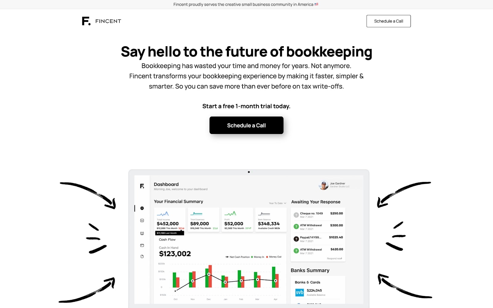
Backed by a leading Silicon Valley venture firm, Fincent is a startup that transforms traditional online bookkeeping into a simpler, smarter process. Fincent removes the barrier that currently exists in many relationships between bookkeepers and their clients. Collaborate with your bookkeeper directly through the app, removing the need for long, confusing, and time-consuming email threads.
Their homepage is simple but sleek. It showcases a screenshot of their product, allowing potential customers to immediately get an idea of its usefulness.
With a mix of product illustrations and illustrations, the website does a great job of maintaining a visitor’s attention. Fincent's website also uses clear copy and relevant jargon throughout, which search engines prefer.
Reclaim
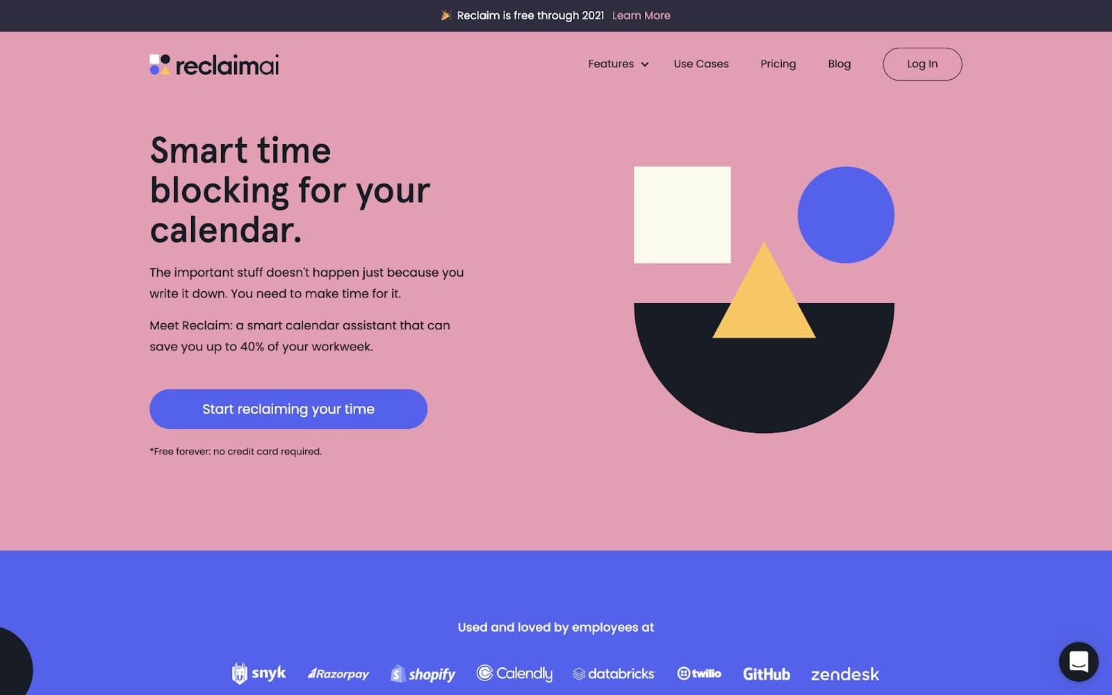
Reclaim is a smart calendar assistant that can save its members a lot of time in their workweek. Instead of filling your calendar with events that quickly get interrupted, Reclaim adapts to changes in your agenda and shifts events from "Free" to "Busy "as schedules fill up.
Reclaim’s website is a joy to scroll through. Their friendly color scheme is fun but consistent, and their animations are clever and engaging with a great user experience.
The testimonial section is perfect for showing potential customers the benefits of their product, and are also great for SEO and increasing site traffic. According to Henry Shapiro — Reclaim's co-founder — the team’s favorite thing about Webflow is that it allows their marketer to go and make changes on content and create blog posts themselves.
Curastory
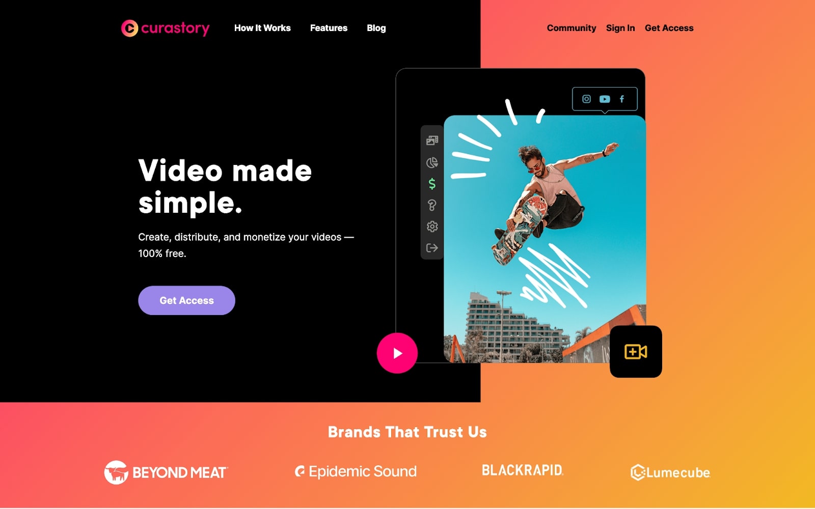
The creator economy is booming, and Curastory is removing a massive barrier to entry to that economy through their business model. Curastory provides video equipment, free editing tools, and a library of music to bring creators’ videos to the next level, regardless of where they’re starting from. They also allow creators to post to their video channels with one click and track their earnings in one easy-to-use dashboard.
Curastory switched from Squarespace to Webflow because they wanted more flexibility and less reliance on templates. As a result, their website is totally unique and custom, utilizing a variety of elements and color to playfully and effectively appeal to creatives.
Rumble Studio
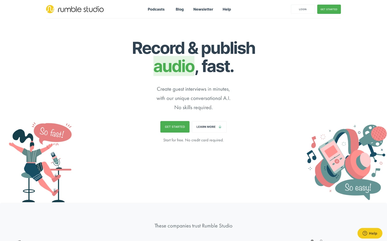
Rumble Studio is an amazing new tool for people or businesses who want to uplevel their podcast game. Rumble offers a unique asynchronous recording experience, and provides automatic editing and audio sparkle.
Rumble's website is beautiful. They utilize white space alongside playful color and animations to create a fun user experience. Animations load upon scrolling and add to the site's personality. Rumble's blog is laid out in a really simple way, and is jam-packed with content that audio creators love. Overall, Rumble's site is a reflection of their playful personality and is a joy to visit.
Dexai
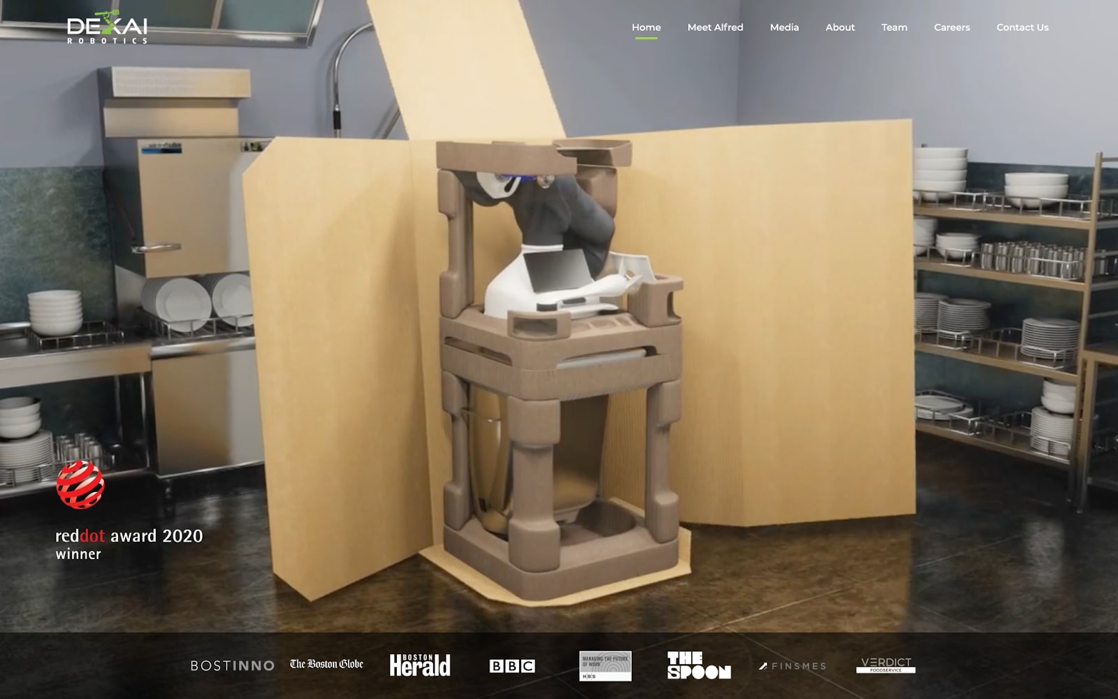
We’d be hard-pressed to find a startup that’s more futuristic than Dexai. Dexai has created a robot, Alfred, that can execute on recipes exactly as outlined by restaurants and chefs. The video on the hero image of their website is a bold and straightforward way to showcase exactly what the robot is and how it works to visitors.
With an interactive website design, Dexai is able to weave together storytelling and the vision of Alfred the robot.
Loola App
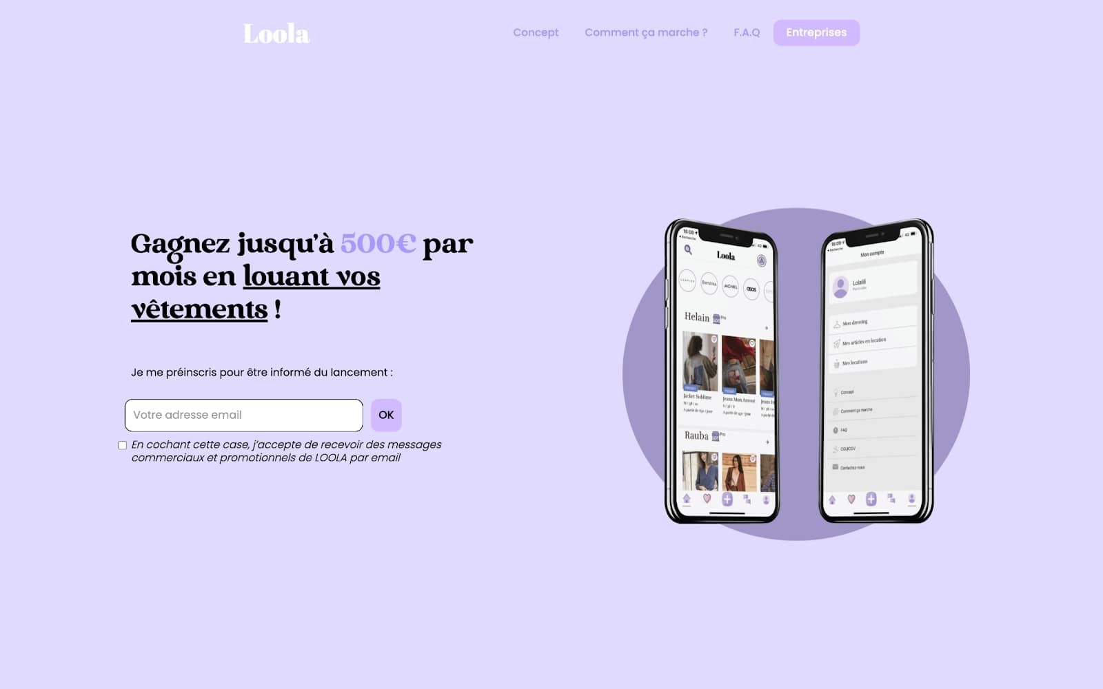
Loola is working with Station F, a fantastic accelerator for startups based in Paris. They've come up with a great product that reflects the necessity for sustainable and ethically-sourced fashion. Members of Loola app can make up to $500 per month by renting out their clothes online. Loola is still in beta, but already has 6,000 users.
After finding Wordpress plugins too time-consuming to manage, and they couldn’t move fast enough to make necessary daily updates to their site, Loola made the move to Webflow. They chose Webflow for their new website because of the fluidity and simplicity it offers. They've also found that testing landing pages is faster and more effective.


Build websites that get results.
Build visually, publish instantly, and scale safely and quickly — without writing a line of code. All with Webflow's website experience platform.
Newslit
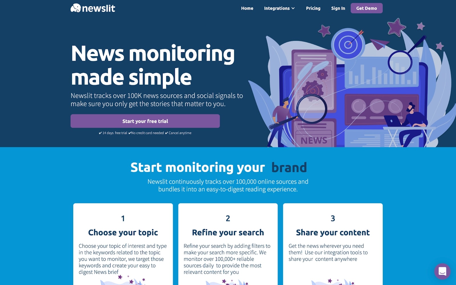
We’ve all fallen victim to information overload online, and know how hard it can be to find reliable information on the stories you’re interested in. Newslit makes monitoring news online simple. It tracks over 100k news sources and social signals to make sure you only get the stories that matter to you.
Whether you're an individual who wants to keep up-to-date with current events, or a team looking for a competitive advantage, Newslit has plans that meet various needs. They've also set up Slack and Zapier integrations to make it easy to get quick access to stories in real-time.
Their website is clear and showcases how the product works. They use cards to show how you can start monitoring news stories, and use an engaging color scheme to keep potential customers interested.
Foreword Live

Learning and development (L&D) is, too often, a resource that startups don’t invest in. Foreword aims to make it as simple as possible for startups to partner with L&D providers to give employees access to the resources that they need to succeed. Foreword provides a network of curated L&D workshops, the perfect solution for teams looking to level up and drive engagement.
Their website is a simple one-pager that uses white space and clever typography to showcase the benefits of their platform. With clear calls to action, it’s hard not to be encouraged to try them out.
Causal App
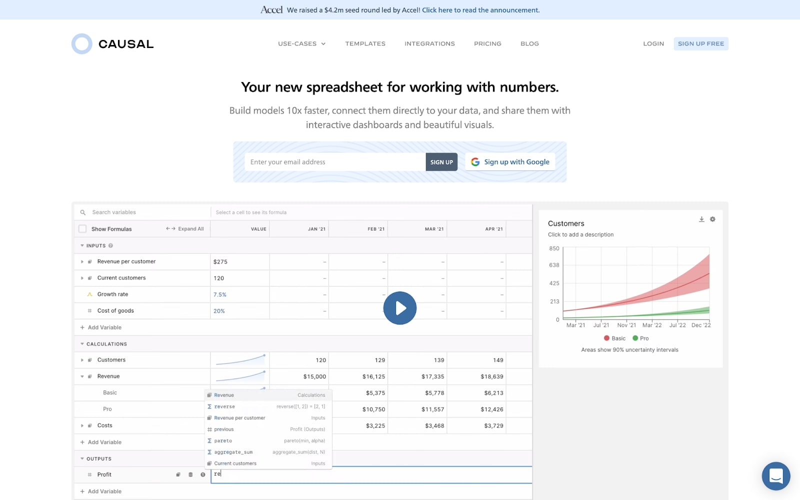
Causal recently raised a whopping $4.2 million seed round, and it’s not hard to see why. They’re offering an alternative to the traditional spreadsheet and have a big dream: to become the de-facto way to work with numbers on a computer.
Not only is Causal a fantastic product, but they understand the importance of a community in building out a successful product that people want to use. The design of the site gets right to the point with effective animations, showcasing the product in action — a great way to encourage prospective users to give it a go.
Castiron
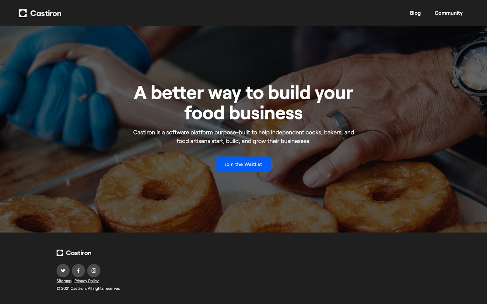
Castiron is a great example of a startup that grew from the adversity of 2020. Their mission is to help chefs, bakers, and small businesses start and grow their businesses.
Castiron’s community, The Kitchen, helps new businesses navigate through the difficulties involved in setting up a food business. The Kitchen provides a space for budding food business entrepreneurs to receive advice from peers in the industry, share their own personal learnings, and connect with other food entrepreneurs. Castiron is planning to launch mid-2021 and we can’t wait to see how they grow and build their community.
Rebank
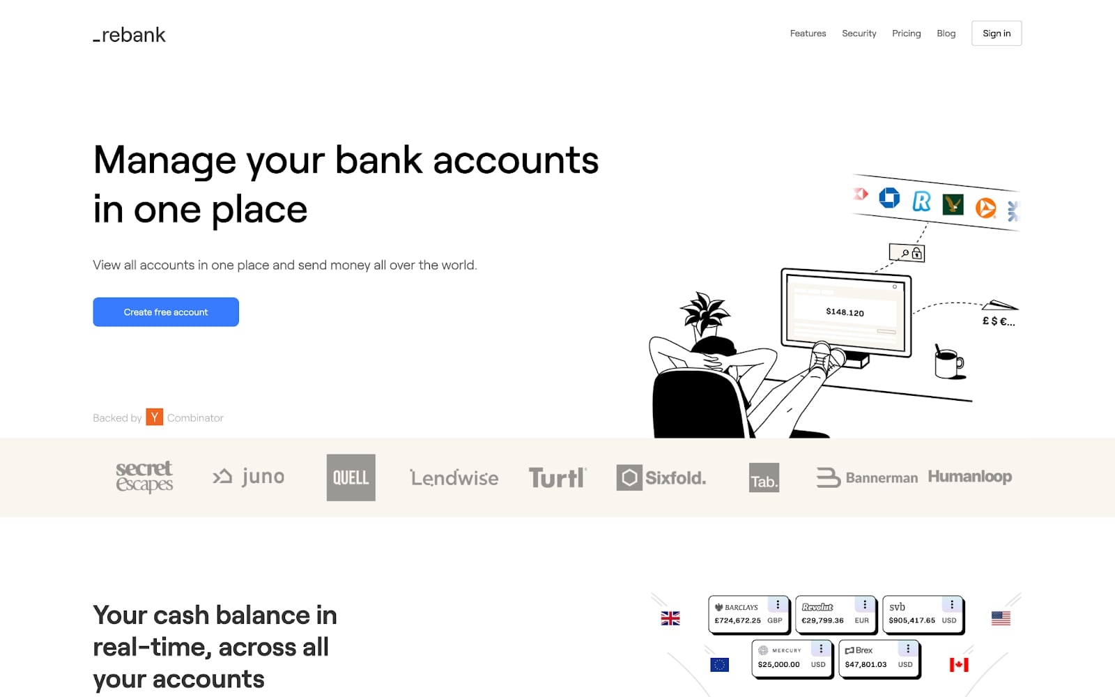
Getting a startup up and running can be daunting, difficult, and confusing. Rebank wants to make startups’ lives a bit easier by letting them manage all of their bank accounts in one place and replace multiple logins with one secure login.
Rebank utilizes cool animations to keep visitors engaged, and they highlight key features with product screenshots and graphics.
Get access to Webflow for Startups
If you’re a VC or accelerator and want to offer Webflow for Startups to your portfolio companies, apply to become a partner today. Or if you’re a startup working with one of our partners, apply to join Webflow for Startups for an exclusive discount!


