

Enhancement
Designer
Modern devices for the canvas
The Webflow canvas ruler now references 30 current devices — phones, tablets, foldables, laptops, and monitors.
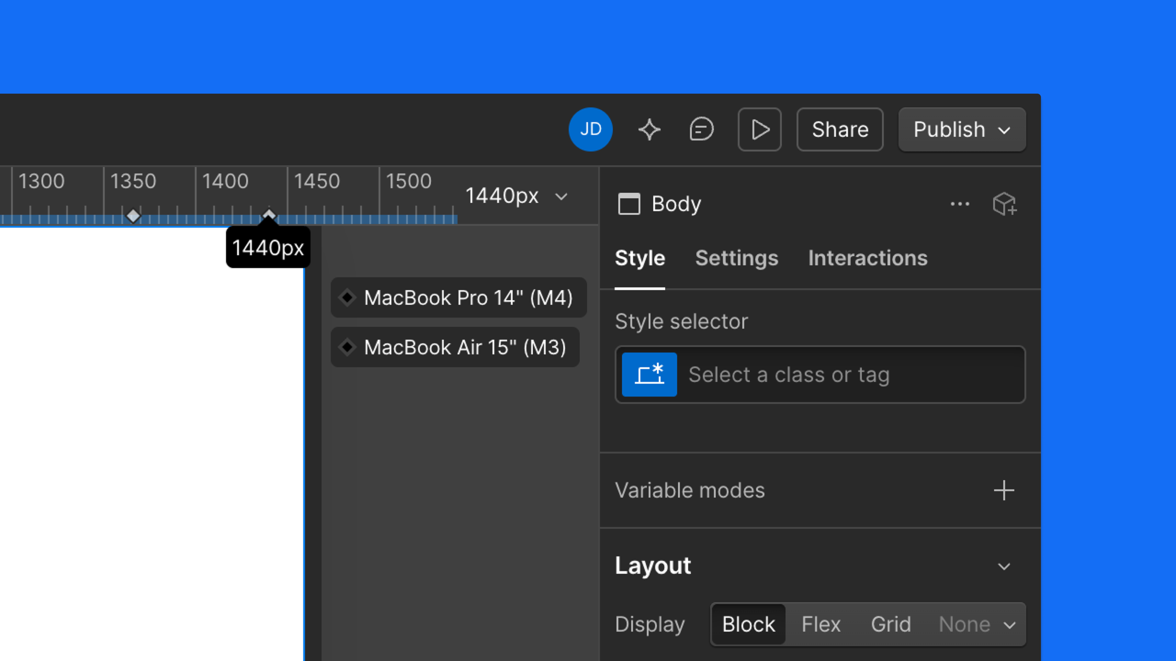
Designing to accurate viewports means fewer surprises between canvas and device. Now, every device marker on the canvas ruler reflects a real, modern screen. Widths are verified against manufacturer specs and on-device testing — 30 devices total, from phones and tablets to foldables, laptops, and monitors.
Default canvas widths have also changed. If your canvas look different at Mobile Portrait, Landscape, or Tablet, here's what shifted:
- Mobile Portrait: 393px (iPhone 16)
- Mobile Landscape: 667px (iPhone SE landscape)
- Tablet: 820px (iPad 10th gen)
Desktop and up are unchanged, and your published sites aren’t affected.
Related updates


Commencez gratuitement
Essayez Webflow aussi longtemps que vous le souhaitez grâce à notre plan Starter gratuit. Achetez un plan de site payant pour publier, héberger et débloquer des fonctionnalités supplémentaires.
Essayez Webflow aussi longtemps que vous le souhaitez grâce à notre plan Starter gratuit. Achetez un plan de site payant pour publier, héberger et débloquer des fonctionnalités supplémentaires.