

Feature
Responsive images
Webflow automatically scales and optimizes inline images for every device size, at every resolution.

Responsive images — for everyone
Starting today, Webflow automatically scales all inline images (both static and dynamic) for every device size, at every resolution. This means your images load a lot faster (as much as 30 times faster, to be precise), since you're no longer serving massive images on tiny devices. We've written a comprehensive overview of this update in our blog post, but here are the basics:
So what's changed?
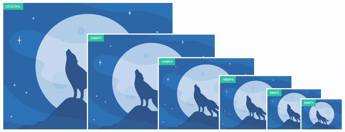
Now when you add an image to your site, Webflow creates different sized variants of the original, then helps your browser determine which one is best and most efficient to render to your site visitors, based on their screen size and resolution.
For existing sites
Next time you open the Designer, we'll run a quick scan of your site to create variants of your existing images and measure the size of the images on your site.
For new sites
This will all take place behind the scenes for you, no extra work required.
Where can I learn more?
We've written a comprehensive overview of the update in our blog post, and have gathered the most important details on our responsive images landing page. We've also put together an FAQ article for our help center which dives a bit further into the details. And as always, our support team is standing by.
Related updates


Get started for free
Try Webflow for as long as you like with our free Starter plan. Purchase a paid Site plan to publish, host, and unlock additional features.
Try Webflow for as long as you like with our free Starter plan. Purchase a paid Site plan to publish, host, and unlock additional features.